Question 1
4
In what ways does your media product use, develop or challenge forms and conventions of real media products? EVALUATIO N
-
Upload
matyaaskew -
Category
Documents
-
view
31 -
download
0
Transcript of Question 1

In what ways does your media product use, develop or challenge forms and conventions of real media products?
EVALUATION

My magazine cover uses typical forms and conventions of real music magazines.I decided to use a typical magazine appearance as it is the most effective in attracting the audience and providing sufficient information of what will be included in the magazine.As you can see, my magazine cover is very similar to the ‘Vibe’ cover. Some influence I took from this magazine is that I used a medium close up image of the main artist/artists featured in the magazine. This is typical of all magazines because it is effective in drawing in the reader if they are interested in the person in the picture and therefore encouraging them to read the magazine.
I also included cover stories on the cover which are very often seen on magazines. This is because they inform the reader of what will be included in the magazine which is useful in encouraging the reader if they are not initially interested in the person pictured on the cover. Similarly, I used the typical form and convention seen on the ‘Vibe’ cover of using kickers of other artists names to encourage a bigger audience as these make the magazine appeal to lots of different fan bases. This is also useful in making it clear which genre my magazine is (rap) because of the clear, bold rapper’s names.I also included the typical big and bold mast head. This is used on all magazines because it makes the name of the magazine easily seen. I also positioned the mast-head behind the image which is often used on magazine covers to make the image stand out.

My magazine contents page also does not challenge forms and conventions of real magazine contents pages.When doing my existing products research I did not find a ‘typical’ or ‘normal’ style of contents page of rap magazines and I found that all contents pages had very different styles and layouts. Here are some examples-
Although I did not find a typical style of contents page I found that the majority of contents pages had the similarity that: they all included images and all included a list of what will be in the magazine.Therefore I decided to give my contents page a simple and standard layout of a few images and a list of articles in the magazine. This meant the contents was clear and easy to read and did not challenge forms and conventions of actual magazines, which made it look more professional and like a real magazine.I also included page numbers in the bottom corners of each page which is what all magazines do to let people navigate easily around the magazine.I used mainly bold, striking fonts which I found was a common occurrence in magazines as it draws your attention and is easy to read. I planned the fonts carefully in order to fit in with my images and stand out effectively against the colours used.
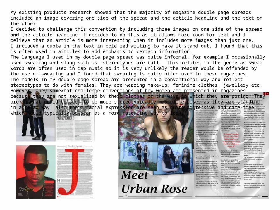
My existing products research showed that the majority of magazine double page spreads included an image covering one side of the spread and the article headline and the text on the other.I decided to challenge this convention by including three images on one side of the spread and the article headline. I decided to do this as it allows more room for text and I believe that an article is more interesting when it includes more images than just one.I included a quote in the text in bold red writing to make it stand out. I found that this is often used in articles to add emphasis to certain information.The language I used in my double page spread was quite informal, for example I occasionally used swearing and slang such as “stereotypes are bull.” This relates to the genre as swear words are often used in rap music so it is very unlikely the reader would be offended by the use of swearing and I found that swearing is quite often used in these magazines. The models in my double page spread are presented in a conventional way and reflect stereotypes to do with females. They are wearing make-up, feminine clothes, jewellery etc. However, they somewhat challenge conventions of how women are presented in magazines because they are not sexualised by their clothes or the ways in which they are posing. They are in what could be seen to be more stereotypically masculine poses as they are standing in a relax way; also their facial expression are seen as quite aggressive and care-free which would typically be seen as a more masculine way to look.