Purpose and impacts
22
Social Action and Community Media Existing Product Research Nicola Kilgallon
-
Upload
nicola-kilgallon -
Category
Health & Medicine
-
view
53 -
download
1
Transcript of Purpose and impacts
Social Action and Community
Media
Existing Product Research
Nicola Kilgallon

Case Study: Action Cancer
Purpose:The purpose of this image is to raise awareness,
change attitudes towards smoking and to create a
local, national and global change against people that
think smoking can make you lose weight and smoking
in general. The poster is to give the vital information
about the truth of smoking to make people stop. This
smoking poster is also to campaign against smokers.
Aims:The aim of this smoking poster is to get smokers to
realise that smoking doesn’t help you lose weight, it
makes you ill and you lose organs and limbs through
cancer and illness’.
2Creative Media Production 2012
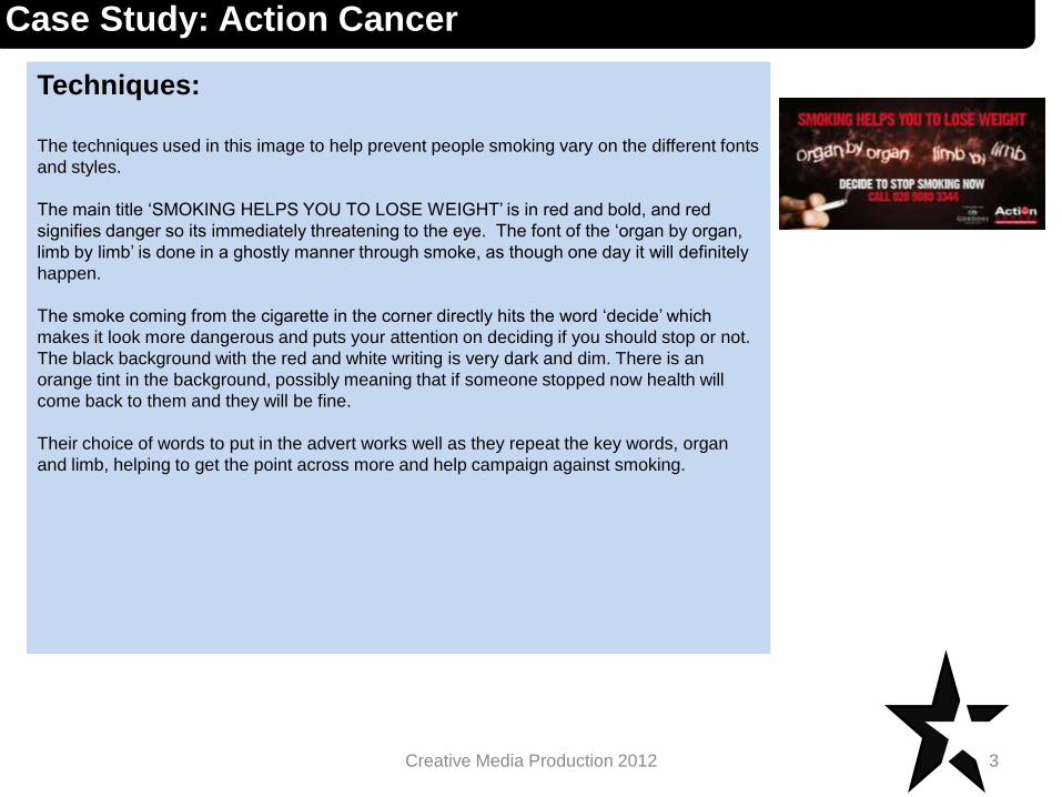
Techniques:
The techniques used in this image to help prevent people smoking vary on the different fonts
and styles.
The main title ‘SMOKING HELPS YOU TO LOSE WEIGHT’ is in red and bold, and red
signifies danger so its immediately threatening to the eye. The font of the ‘organ by organ,
limb by limb’ is done in a ghostly manner through smoke, as though one day it will definitely
happen.
The smoke coming from the cigarette in the corner directly hits the word ‘decide’ which
makes it look more dangerous and puts your attention on deciding if you should stop or not.
The black background with the red and white writing is very dark and dim. There is an
orange tint in the background, possibly meaning that if someone stopped now health will
come back to them and they will be fine.
Their choice of words to put in the advert works well as they repeat the key words, organ
and limb, helping to get the point across more and help campaign against smoking.
3Creative Media Production 2012
Case Study: Action Cancer
Impact: Evidence of any change being brought about through projects
using words and or graphics.
4Creative Media Production 2012
Case Study: Action Cancer
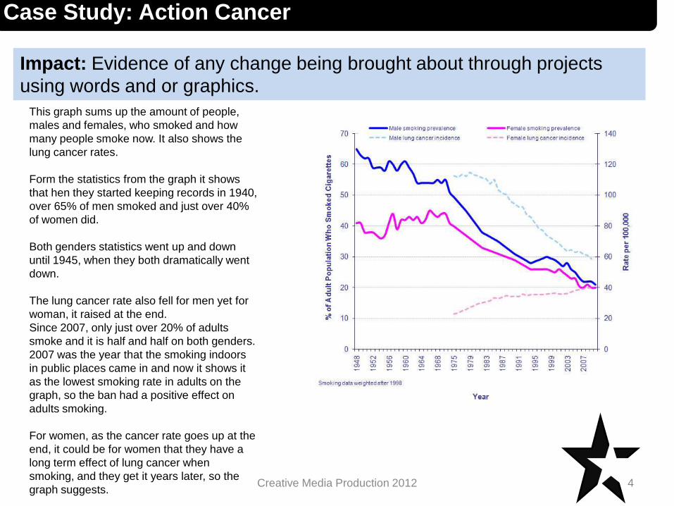
This graph sums up the amount of people,
males and females, who smoked and how
many people smoke now. It also shows the
lung cancer rates.
Form the statistics from the graph it shows
that hen they started keeping records in 1940,
over 65% of men smoked and just over 40%
of women did.
Both genders statistics went up and down
until 1945, when they both dramatically went
down.
The lung cancer rate also fell for men yet for
woman, it raised at the end.
Since 2007, only just over 20% of adults
smoke and it is half and half on both genders.
2007 was the year that the smoking indoors
in public places came in and now it shows it
as the lowest smoking rate in adults on the
graph, so the ban had a positive effect on
adults smoking.
For women, as the cancer rate goes up at the
end, it could be for women that they have a
long term effect of lung cancer when
smoking, and they get it years later, so the
graph suggests.
Case Study: Respect For Animals
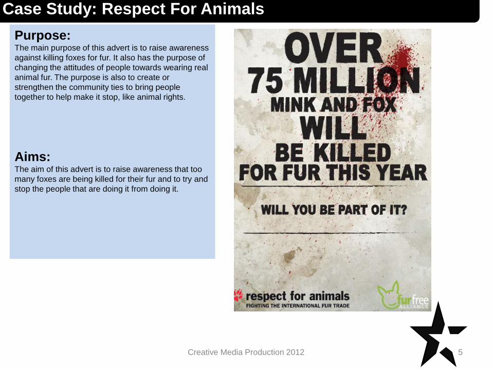
Purpose:The main purpose of this advert is to raise awareness
against killing foxes for fur. It also has the purpose of
changing the attitudes of people towards wearing real
animal fur. The purpose is also to create or
strengthen the community ties to bring people
together to help make it stop, like animal rights.
Aims:The aim of this advert is to raise awareness that too
many foxes are being killed for their fur and to try and
stop the people that are doing it from doing it.
5Creative Media Production 2012
Techniques:
6Creative Media Production 2012
Case Study: Respect For Animals
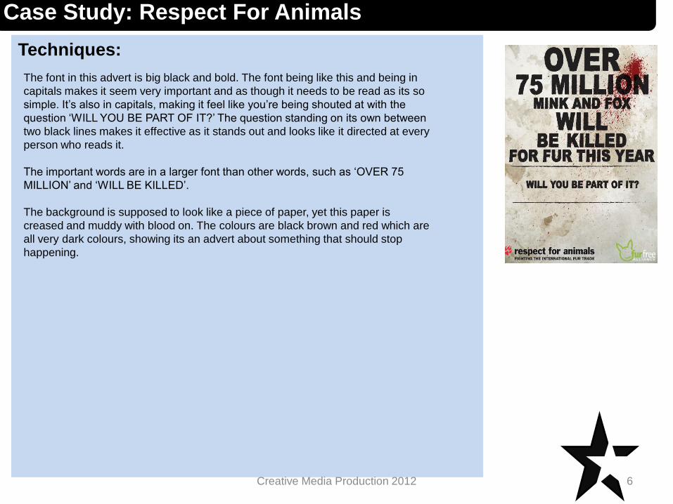
The font in this advert is big black and bold. The font being like this and being in
capitals makes it seem very important and as though it needs to be read as its so
simple. It’s also in capitals, making it feel like you’re being shouted at with the
question ‘WILL YOU BE PART OF IT?’ The question standing on its own between
two black lines makes it effective as it stands out and looks like it directed at every
person who reads it.
The important words are in a larger font than other words, such as ‘OVER 75
MILLION’ and ‘WILL BE KILLED’.
The background is supposed to look like a piece of paper, yet this paper is
creased and muddy with blood on. The colours are black brown and red which are
all very dark colours, showing its an advert about something that should stop
happening.
Impact: Evidence of any change being brought about through projects
using words and or graphics.
7Creative Media Production 2012
Case Study: Respect For Animals
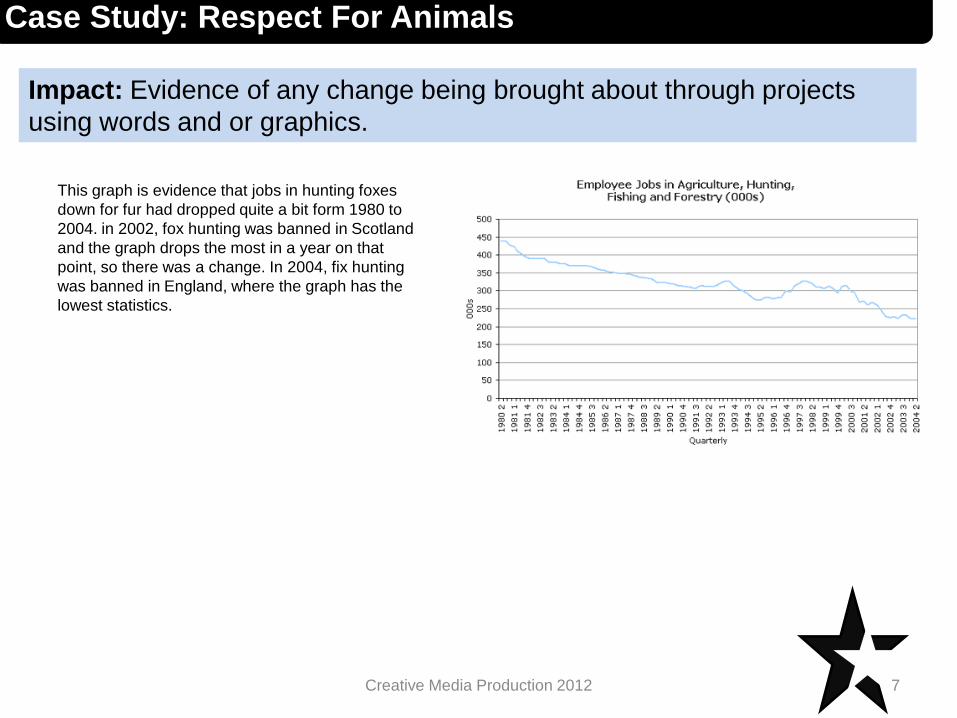
This graph is evidence that jobs in hunting foxes
down for fur had dropped quite a bit form 1980 to
2004. in 2002, fox hunting was banned in Scotland
and the graph drops the most in a year on that
point, so there was a change. In 2004, fix hunting
was banned in England, where the graph has the
lowest statistics.
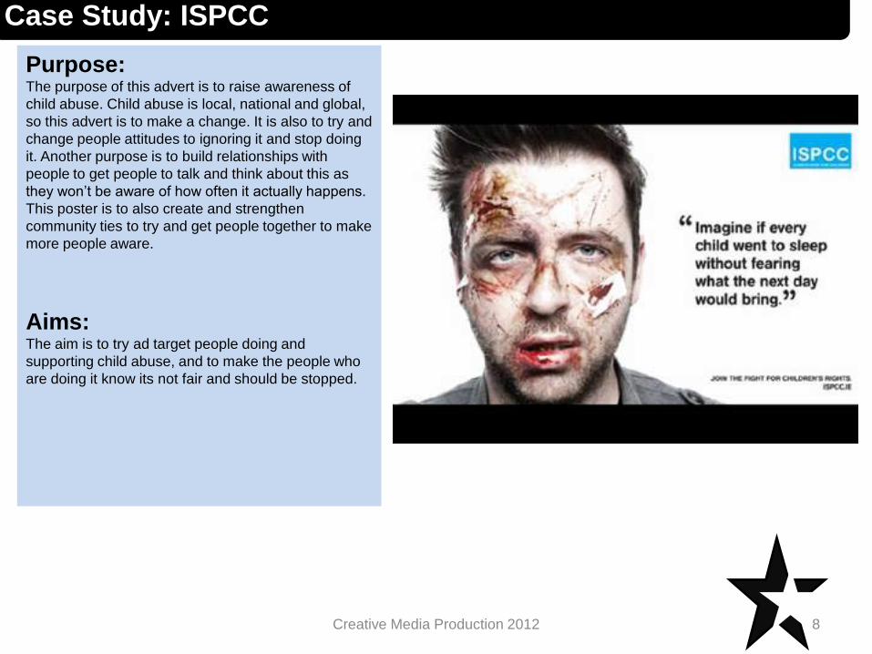
Case Study: ISPCC
Purpose:The purpose of this advert is to raise awareness of
child abuse. Child abuse is local, national and global,
so this advert is to make a change. It is also to try and
change people attitudes to ignoring it and stop doing
it. Another purpose is to build relationships with
people to get people to talk and think about this as
they won’t be aware of how often it actually happens.
This poster is to also create and strengthen
community ties to try and get people together to make
more people aware.
Aims:The aim is to try ad target people doing and
supporting child abuse, and to make the people who
are doing it know its not fair and should be stopped.
8Creative Media Production 2012
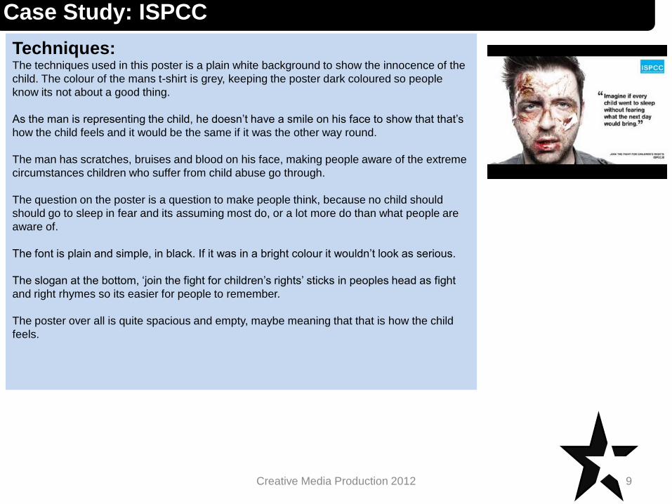
Techniques:The techniques used in this poster is a plain white background to show the innocence of the
child. The colour of the mans t-shirt is grey, keeping the poster dark coloured so people
know its not about a good thing.
As the man is representing the child, he doesn’t have a smile on his face to show that that’s
how the child feels and it would be the same if it was the other way round.
The man has scratches, bruises and blood on his face, making people aware of the extreme
circumstances children who suffer from child abuse go through.
The question on the poster is a question to make people think, because no child should
should go to sleep in fear and its assuming most do, or a lot more do than what people are
aware of.
The font is plain and simple, in black. If it was in a bright colour it wouldn’t look as serious.
The slogan at the bottom, ‘join the fight for children’s rights’ sticks in peoples head as fight
and right rhymes so its easier for people to remember.
The poster over all is quite spacious and empty, maybe meaning that that is how the child
feels.
9Creative Media Production 2012
Case Study: ISPCC
Impact: Evidence of any change being brought about through projects
using words and or graphics.
10Creative Media Production 2012
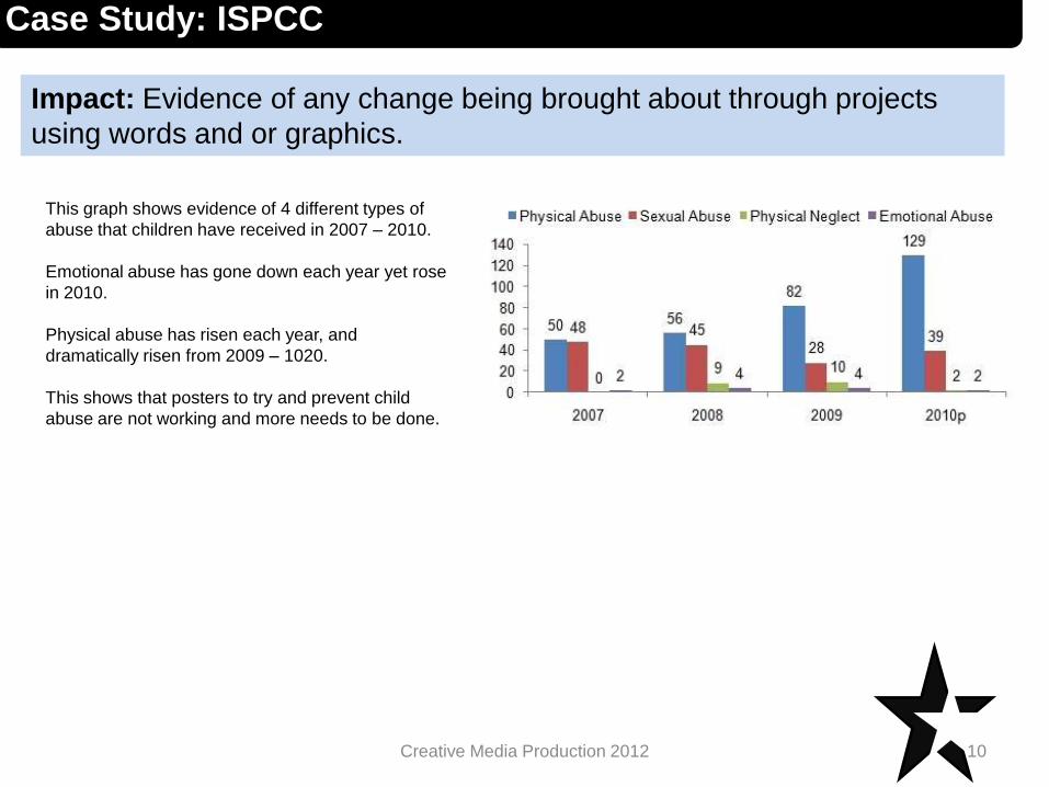
Case Study: ISPCC
This graph shows evidence of 4 different types of
abuse that children have received in 2007 – 2010.
Emotional abuse has gone down each year yet rose
in 2010.
Physical abuse has risen each year, and
dramatically risen from 2009 – 1020.
This shows that posters to try and prevent child
abuse are not working and more needs to be done.
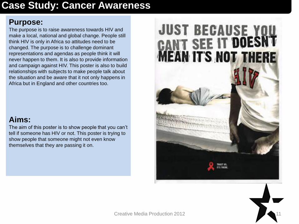
Case Study: Cancer Awareness
Purpose:The purpose is to raise awareness towards HIV and
make a local, national and global change. People still
think HIV is only in Africa so attitudes need to be
changed. The purpose is to challenge dominant
representations and agendas as people think it will
never happen to them. It is also to provide information
and campaign against HIV. This poster is also to build
relationships with subjects to make people talk about
the situation and be aware that it not only happens in
Africa but in England and other countries too.
Aims:The aim of this poster is to show people that you can’t
tell if someone has HIV or not. This poster is trying to
show people that someone might not even know
themselves that they are passing it on.
11Creative Media Production 2012
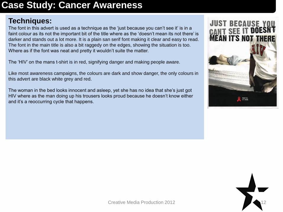
Techniques:The font in this advert is used as a technique as the ‘just because you can’t see it’ is in a
faint colour as its not the important bit of the title where as the ‘doesn’t mean its not there’ is
darker and stands out a lot more. It is a plain san serif font making it clear and easy to read.
The font in the main title is also a bit raggedy on the edges, showing the situation is too.
Where as if the font was neat and pretty it wouldn’t suite the matter.
The ‘HIV’ on the mans t-shirt is in red, signifying danger and making people aware.
Like most awareness campaigns, the colours are dark and show danger, the only colours in
this advert are black white grey and red.
The woman in the bed looks innocent and asleep, yet she has no idea that she’s just got
HIV where as the man doing up his trousers looks proud because he doesn’t know either
and it’s a reoccurring cycle that happens.
12Creative Media Production 2012
Case Study: Cancer Awareness
Impact: Evidence of any change being brought about through projects
using words and or graphics.
13Creative Media Production 2012
Case Study: Cancer Awareness
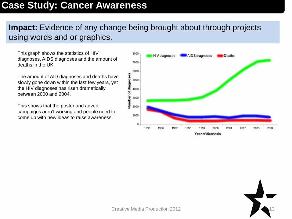
This graph shows the statistics of HIV
diagnoses, AIDS diagnoses and the amount of
deaths in the UK.
The amount of AID diagnoses and deaths have
slowly gone down within the last few years, yet
the HIV diagnoses has risen dramatically
between 2000 and 2004.
This shows that the poster and advert
campaigns aren’t working and people need to
come up with new ideas to raise awareness.

Case Study: savingrhinos.org
Purpose:The purpose of this campaign is to raise awareness
and change attitudes towards slaughtering rhinos.
This poster is to provide information that in fact the
rhino’s horn doesn’t provide any medication and dos
not cure devil possessions.
Aims:The aim of the poster is to make people realise they
are illegally slaughtering rhinos for their horns, that
actually have no purpose for the reasons that they
want.
14Creative Media Production 2012
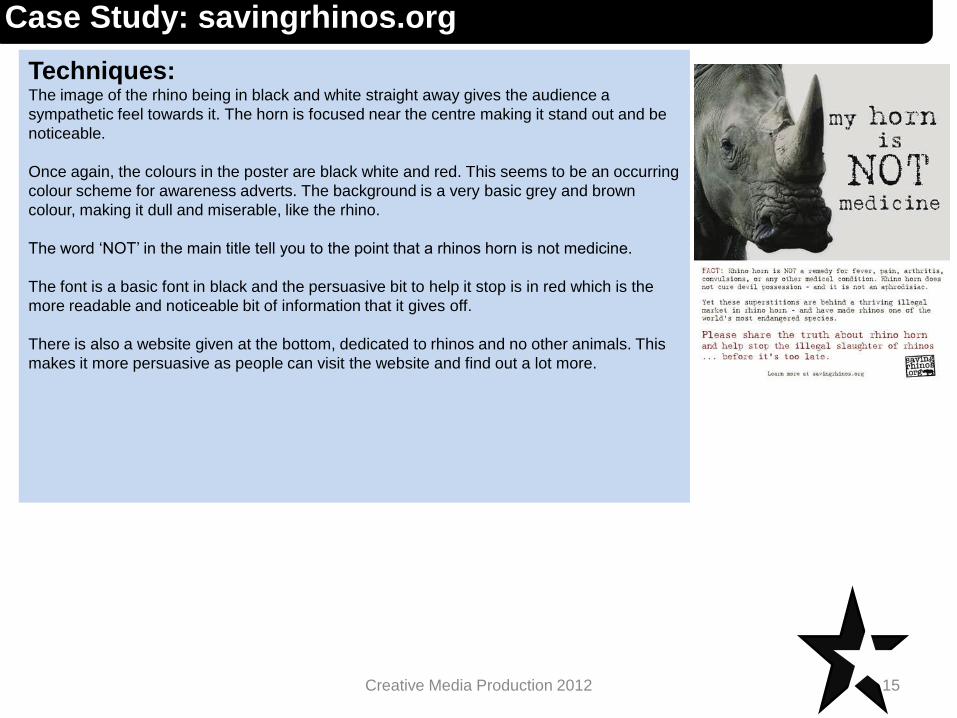
Techniques:The image of the rhino being in black and white straight away gives the audience a
sympathetic feel towards it. The horn is focused near the centre making it stand out and be
noticeable.
Once again, the colours in the poster are black white and red. This seems to be an occurring
colour scheme for awareness adverts. The background is a very basic grey and brown
colour, making it dull and miserable, like the rhino.
The word ‘NOT’ in the main title tell you to the point that a rhinos horn is not medicine.
The font is a basic font in black and the persuasive bit to help it stop is in red which is the
more readable and noticeable bit of information that it gives off.
There is also a website given at the bottom, dedicated to rhinos and no other animals. This
makes it more persuasive as people can visit the website and find out a lot more.
15Creative Media Production 2012
Case Study: savingrhinos.org
Impact: Evidence of any change being brought about through projects
using words and or graphics.
16Creative Media Production 2012
Case Study: savingrhinos.org
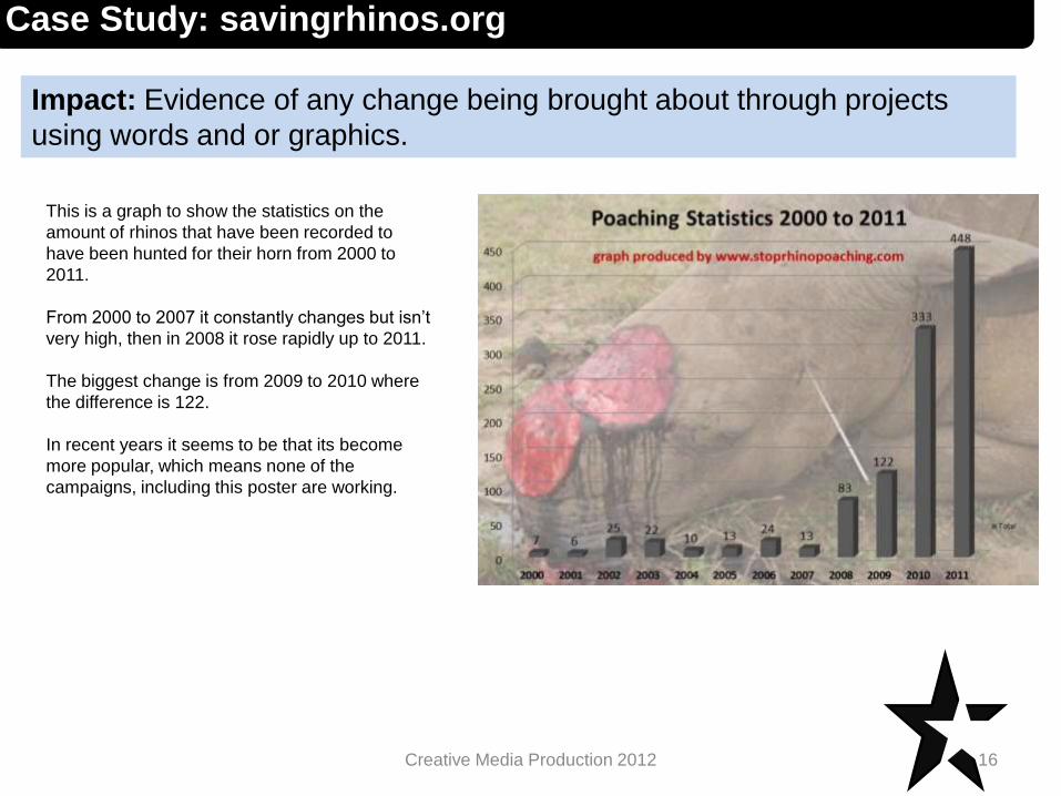
This is a graph to show the statistics on the
amount of rhinos that have been recorded to
have been hunted for their horn from 2000 to
2011.
From 2000 to 2007 it constantly changes but isn’t
very high, then in 2008 it rose rapidly up to 2011.
The biggest change is from 2009 to 2010 where
the difference is 122.
In recent years it seems to be that its become
more popular, which means none of the
campaigns, including this poster are working.

Case Study: Deaffest
Purpose:Thepurpose is to infiltrate mainstream media. By
doing this, they are trying to get a message out to
people to help encourage deaf people to join in in the
festival and get involved. As they are only a small
group, they don’t have much media coverage apart
from the website. The website is to give off
information.
Another purpose is to create access to media
production for non traditional as it allows a disability
group to take part in media.
Aims:The aim of this small group is to encourage deaf
people to get involved with media and try to get
together to make short films.
17Creative Media Production 2012
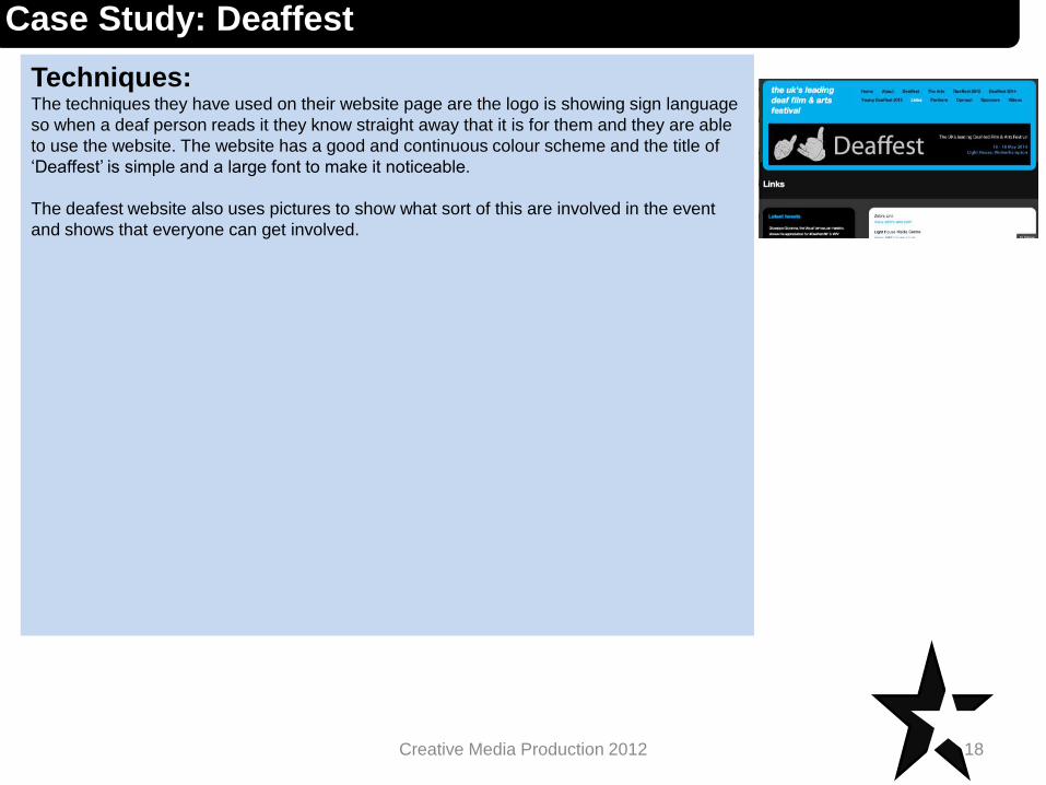
Techniques:The techniques they have used on their website page are the logo is showing sign language
so when a deaf person reads it they know straight away that it is for them and they are able
to use the website. The website has a good and continuous colour scheme and the title of
‘Deaffest’ is simple and a large font to make it noticeable.
The deafest website also uses pictures to show what sort of this are involved in the event
and shows that everyone can get involved.
18Creative Media Production 2012
Case Study: Deaffest
Impact: Evidence of any change being brought about through projects
using words and or graphics.
19Creative Media Production 2012
Case Study: Deaffest
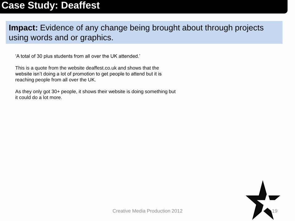
‘A total of 30 plus students from all over the UK attended.’
This is a quote from the website deaffest.co.uk and shows that the
website isn’t doing a lot of promotion to get people to attend but it is
reaching people from all over the UK.
As they only got 30+ people, it shows their website is doing something but
it could do a lot more.
Case Study: Conservatives.com
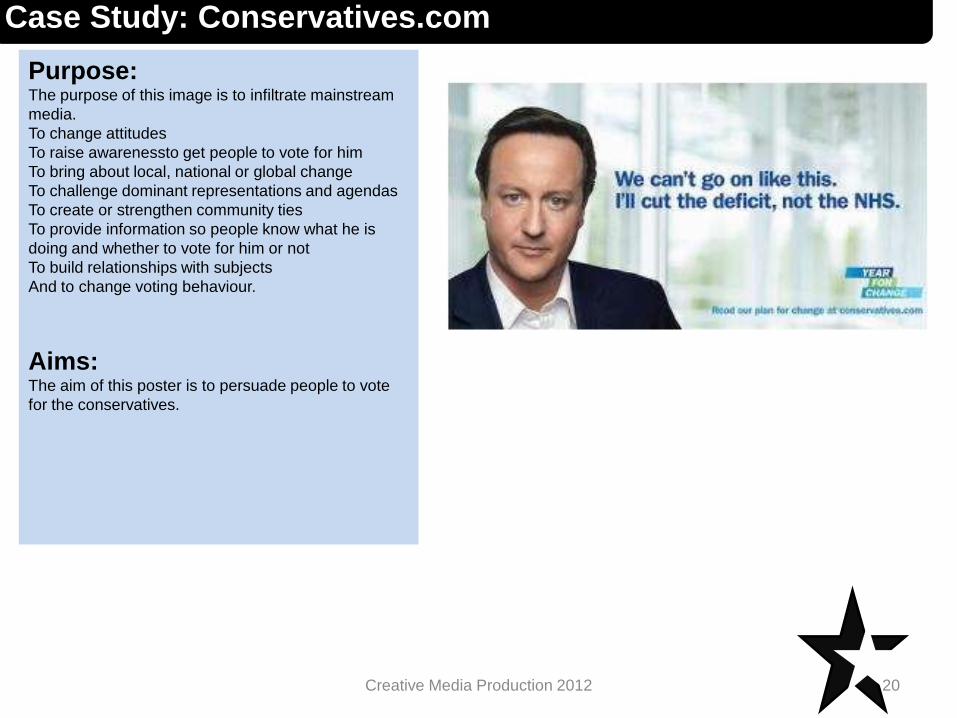
Purpose:The purpose of this image is to infiltrate mainstream
media.
To change attitudes
To raise awarenessto get people to vote for him
To bring about local, national or global change
To challenge dominant representations and agendas
To create or strengthen community ties
To provide information so people know what he is
doing and whether to vote for him or not
To build relationships with subjects
And to change voting behaviour.
Aims:The aim of this poster is to persuade people to vote
for the conservatives.
20Creative Media Production 2012

Techniques:The way the font is used in this poster is a technique as it is a simple font, a nice colour so it
isn’t too dark, the light blue looks inviting. The short sentences are powerful as they get
straight to the point and break it down more.
The ‘Year For Change’ makes you want to vote for him as everybody wants change, it just
depends on what change it is.
The picture of David Cameron is a good technique because he isn’t fully smiling so he also
looks serious, so it looks like he will take his job very seriously and he also looks more
inviting as he doesn’t look overly serious.
The sentence used is a very serious sentence and it matches the picture so overall
everything on the poster fits well.
21Creative Media Production 2012
Case Study: Conservatives.com
Impact: Evidence of any change being brought about through projects
using words and or graphics.
22Creative Media Production 2012
Case Study: Conservatives.com
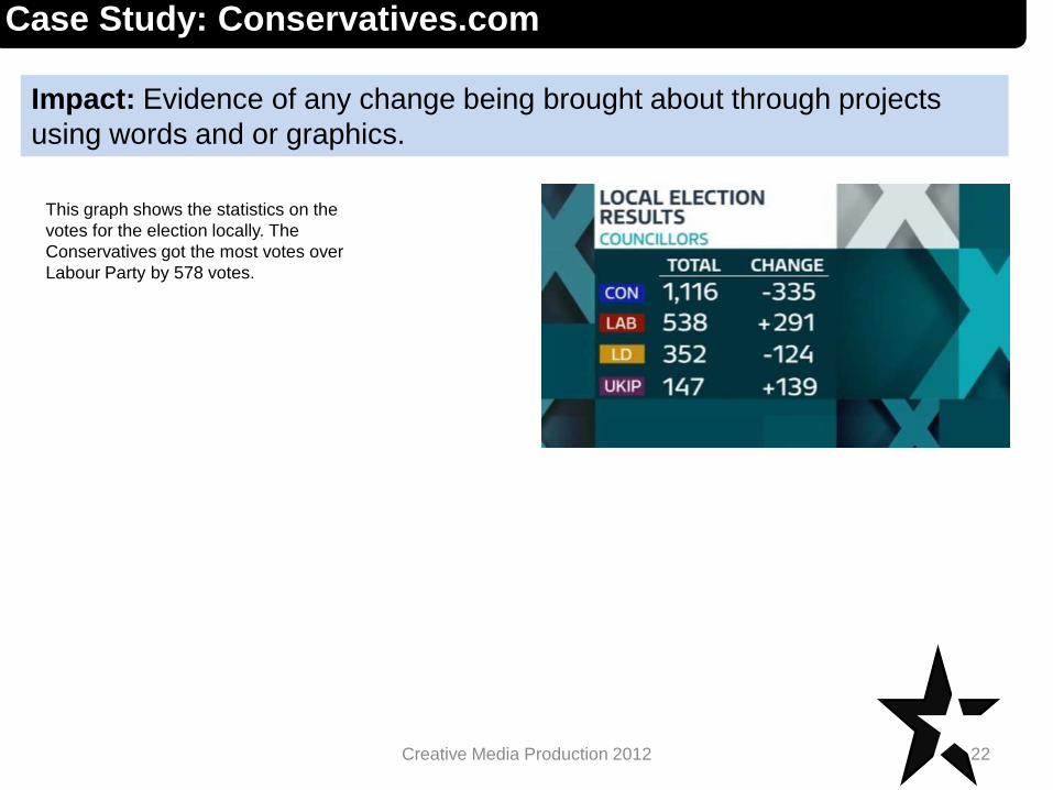
This graph shows the statistics on the
votes for the election locally. The
Conservatives got the most votes over
Labour Party by 578 votes.