Promo Cards EGD
30
HELLO my name is BIOGRAPHY: Originally grown in Pittsburgh, Pennsylvania, I moved to cultural Kent Ohio for school. After four years of strict undergraduate work I continued at Kent for two more years to exhaust the post graduate course catalog. After two brief stints of living in New York, it was then that I got my interests in higher levels of typography and EGD [environmental graphic design]. After Cleveland AIGA gave me an award for my proposal of the Art and Design Building placemaking and wayfinding program, I began consulting for various other environmental projects while working as a creative for AUE Design, a top Cleveland ad agency. Disillusioned by the Midwest agency business model I decided to move back to New York. Since then I have established myself as freelance contributor of EGD and traditional print design. CORNY PERSONAL INFORMATION: I am really fun to have around an office. In the past, people on my team appreciate my “go-getter” excitement and interests in just about everything. Warning: I do get really excited about interviews and tend to scare people with my initial enthusiasm. So far, however, it seems to grow on people. Personal Interests include: Independent music scene, NPR, color theory, illustration, crazy dancing, interior design, beer, Melville, and classic film. 385 TROUTMAN ST APT 403 BROOKLYN, NEW YORK 11237-2643 PHONE 646—706—6434 INTERWEB richielokay.com
-
Upload
richie-lokay-were-hiring -
Category
Documents
-
view
28 -
download
0
Transcript of Promo Cards EGD

H E L L O my name is
B I O G R A P H Y : Originally grown in Pittsburgh, Pennsylvania, I moved to cultural Kent Ohio for school.
After four years of strict undergraduate work I continued at Kent for two more years to exhaust the post
graduate course catalog. After two brief stints of living in New York, it was then that I got my interests
in higher levels of typography and EGD [environmental graphic design]. After Cleveland AIGA gave me
an award for my proposal of the Art and Design Building placemaking and wayfinding program, I began
consulting for various other environmental projects while working as a creative for AUE Design, a top
Cleveland ad agency. Disillusioned by the Midwest agency business model I decided to move back to New
York. Since then I have established myself as freelance contributor of EGD and traditional print design.
C O R N Y P E R S O N A L I N F O R M A T I O N : I am really fun to have around an office. In the
past, people on my team appreciate my “go-getter” excitement and interests in just about everything.
Warning: I do get really excited about interviews and tend to scare people with my initial enthusiasm.
So far, however, it seems to grow on people. Personal Interests include: Independent music scene, NPR,
color theory, illustration, crazy dancing, interior design, beer, Melville, and classic film.
3 8 5 T R O U T M A N S T A P T 4 0 3
B R O O K L Y N , N E W Y O R K
1 1 2 3 7 - 2 6 4 3P H O N E
6 4 6 — 7 0 6 — 6 4 3 4
I N T E R W E B
r i c h i e l o k a y . c o m

RICHARD LOKAY 646.706.6434—385 TROUTMAN ST APT 403, BROOKLYN NY 11237-2643. [email protected]
N O TA B L E E X P E R IE N C E
Mo Lebowitz and the Antique Press: Designed and hosted gallery exhibition and bluegrass concert for
award winning designer and wood typographer Mo Lebowitz.
Ambrosia: The Food of the Gods: Brand identity for an ice cream shop. The project includes marketing
plan, brand naming, sign and uniform design.
Journalism Media Convergence: Attended two summer segd [society of environmental graphic design]
progressive environmental design workshop; Rethinking Sign Systems.
Wayfinding ADA Design Intent: Environmental improvement and signage of Kent State University buildings
in accordance of segd process and American Disabilities Act compliance.
Cranbrook Exhibition Design Conference and Charette: Invited to professional exhibition conference as
a student liaison. Also participated in the Celebrating Cranbrooke design charette.
USA Network hosts the Modern: Contracted to create a design plan of branding, lighting and multimedia
environment solutions for host, USA Networks, advertising Gala at the Museum of Modern Art’s restaurant.
Bronzeville Patina: Placemaking and Identity for a proposed senior housing environment in historic
Chicago. The project includes interdisciplinary development and design.
D E S IG N AWA R D S
AIGA 2004 Annual Design Competition: “Wayfinding ADA” project chosen as one of fifty-two of Cleveland’s
best in its annual design awards show.
UCDA Student Published Exhibition: “Mo Lebowitz and the Antique Press” Design Exhibit chosen in Annual
Design Competition in its category as a winner.
Carnegie Museum of Art 1984 Pet Week Poster Contest: “Helping Each Other” project chosen third
place Kindergarten group [see reverse].
U NI V E R S I T Y E D U C AT IO N
Kent State University Bachelor of Fine Arts School of Visual Communication Design, 3-D design
concentration in Environmental Graphic Design.
R E L E VA N T E M P L O Y M E N T
Freelance Designer: Blue Note Records, NFL, Blister, GQ Magazine, Marie Claire As a contracted
full-time freelance designer I created unique and thoughtful designed advertising and promotions with the
occasional environmental graphic design consultation. New York, NY 2006-2007.
Art Director: AUE Creative As the sole creative designer, I helped reposition the company as a full service
creative solution while retaining its roots as a high-end design boutique. Cleveland, OH 2005.
Art Director: Signum Design As a University student run design studio, I designed and oversaw printing
and fabrication of various ads campaigns, design projects, and university signage projects. Kent, OH 2004.


TRUST IN DIEBOLD TRUST IN DIEBOLD T
RUST
IN D
IEBOLD
U N D E R S T A N D T H E F I N E P R I N T
IN YOU THEY TRUSTIN YOU THEY TRUSTIN YOU THEY TRUST
HEL
PING GOOD RE
STA
UR
A
NTS BECOME GR
EA
T

HEL
PING GOOD RE
STA
UR
A
NTS BECOME GR
EA
T
R I C H I E @ R I C H I E L O K A Y . C O M 6 4 6 . 7 0 6 . 6 4 3 4 . 3 8 5 T R O U T M A N A P T 4 0 3 . B R O O K L Y N , N Y 1 1 2 3 7 .
LOGOTYPES AND OTHER MARKSBranding and Identity: Here are a range of marks, each solving a unique problem.
L
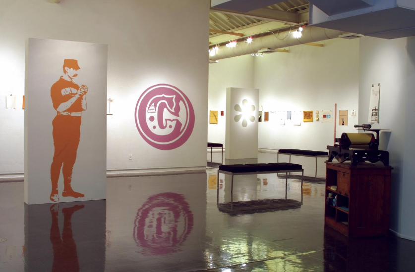

MO LEBOWITZ: ANTIQUE PRESSExhibit Design: For 40 years Mo worked as the “Prop” at the Antique Press where he received endless
awards and touched the lives of many. Mo’s work speaks for itself; furthermore, he is a pretty simple
man, therefore, our design team decided to hang the pieces in a very modest manner. The work was hung
simply from bulldog clips and nails. In the spirit of Mo’s sometimes silly and fun handling of typographic
elements and engravings as imagery, the design team decided to create super graphics on the gallery
walls and baffles. We included some of his favorites, like the baseball player and the pointing finger.
The color palette was chosen to complement and recede back from Mo’s
work. The soft muted palette enabled the design team to be playful with
graphic elements without challenging the work on display.
Along with his presses and body of work, Mo donated his type collection
and engravings to Kent State University.
R I C H I E @ R I C H I E L O K A Y . C O M 6 4 6 . 7 0 6 . 6 4 3 4 . 3 8 5 T R O U T M A N A P T 4 0 3 . B R O O K L Y N , N Y 1 1 2 3 7 .

Cosmic censorship hypothesizes that in all known real
solutions, the singularities would always lie either entirely in
the future (like singularities) or entirely in the past (like the
big bang). Observers are ignorant to the consequences of
the breakdown of space and time when hidden by an event
horizon. Time will come to an end for an astronaut who falls
into a black hole and hits the singularity. One could therefore
speed up the astronaut’s watch as he or she approached the
singularity, so that it still registered an infinite interval of time.
One would find all matter of the universe emerged from a
single point of infinite density: a singularity, the beginning or
end of time.
Bane New WorldStephen Hawking:2003, October 13, Monday 8:00 pm
On sale on Thursday,
September 11, 2003.
Severance Hall Ticket Office
216-231-1111.

STEPHEN HAWKING LECTUREShort-Term Poster Series. I designed this series for use in a back-lit poster encasement to achieve
the math and science teacher over-head transparency look. As a large format poster the detail and color
looked great. I guess it’s pretty obvious really. I did the images, too.
R I C H I E @ R I C H I E L O K A Y . C O M 6 4 6 . 7 0 6 . 1 2 0 6 . 3 8 5 T R O U T M A N A P T 4 0 3 . B R O O K L Y N , N Y 1 1 2 3 7 .


ART AND DESIGN WAYFINDING
Floor One
Grad Studio
Type High Press105
111
105 107 111
109
108 110
112
114 116
117
113C
113B113A
Floor Two
Art OfficeVCD OfficeApple StoreLecture HallArt GalleryGlyph[xYou Are Here
201A231217202201213 220 222 224 226 228
225 227
223
221
217
215B
215A
213
216218
218C 218B 218A
214
206
202
201A 201B
201
231
Floor Three
305B 305C 305D 305E 305F
305G
305H
305I
305J
305K305L
305A
305M305M306
306
305N
308
310
312
314
Directory
AppleStoreArt DepartmentVCD DepartmentElevator
Wayfinding and Placemaking: With my former art and design building as the model, two other graduate
students and I took it upon ourselves to put together a design proposal of what needed to be done with
the current status of our facility. We strictly followed all ADA requirements while creating a primary
sign system and secondary wayfinding method. We focused our design concept architecturally so the
plan was based on the architects original intentions for the building. Our method proposed painting
the exposed utility pipes to guide the visitor from every entrance to any elevator or information desk.
It worked great, but through our research we learned the building had already been compromised and
would be torn down in the years to come.To your right you can see the palette I created to color code the
secondary wayfinding system and code the cognative maps. Heck,
we even got an award from the Cleveland AIGA for the proposal.
R I C H I E @ R I C H I E L O K A Y . C O M 6 4 6 . 7 0 6 . 6 4 3 4 . 3 8 5 T R O U T M A N A P T 4 0 3 . B R O O K L Y N , N Y 1 1 2 3 7 .

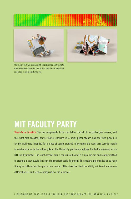
MIT FACULTY PARTY
This insanely small type is no oversight, nor a secret message from me to
others with a similar attraction to detail. Also, it also has no conceptional
connection. It just looks better this way.
Short-Term Identity. The two components to this invitation consist of the poster [see reverse] and
the robot arm decoder [above] that is enclosed in a small prism shaped box and then placed in
faculty mailboxes. Intended for a group of people steeped in invention, the robot arm decoder puzzle
in combination with the hidden joke of the University president captures the techie discovery of an
MIT faculty member. The robot decoder arm is constructed out of a simple die-cut and scoring method
to create a paper puzzle that only the smartest could figure out. The posters are intended to be hung
throughout offices and lounges across campus. This gives the client the ability to interact and see on
different levels and seems appropriate for the audience.
R I C H I E @ R I C H I E L O K A Y . C O M 6 4 6 . 7 0 6 . 6 4 3 4 . 3 8 5 T R O U T M A N A P T 4 0 3 . B R O O K L Y N , N Y 1 1 2 3 7 .


AMBROSIA: FOOD OF THE GODSFood Court Design and Branding: I am proud to say this project would have never happened had I
not convinced the client to do it. From naming through fabrication and installation I saw this ice cream
store through the entire process. I learned to see construction drawings actually come to fruition. The
fun times were choosing and naming the actually products. I had a lot of design control being able to
extend the brand into the decor, design the menus, and later design the uniforms. It was a great real
world project management experience while still in school. The free smoothies were good too.
To the right are two of my early color studies that drove most of
the project. In the ice cream business it did not make much sense
when the colors got too warm or outside traditional ice cream colors.
Since the ice cream had toppings added on the cold marble stone
the idea of greek mythology and the ruins seemed pretty strong.
R I C H I E @ R I C H I E L O K A Y . C O M 6 4 6 . 7 0 6 . 6 4 3 4 . 3 8 5 T R O U T M A N A P T 4 0 3 . B R O O K L Y N , N Y 1 1 2 3 7 .


USA Network at the ModernShort-term Environment: I was contracted by Blister NYC marketing group to aid in creating a corporate
environment for USA Network to celebrate their various advertising clients at the fine dining restaurant
located at the Museum of Modern Art. Using photography from the site and various techniques of
rendering photomontage we created a space easily navigable while keeping the allure of the Modern’s
own furniture. Using colored gels the existing lighting was configured to achieve the soft color scheme
associated with USA Network. In addition to large plasma screens and smaller plasma trees we alluded
to the successfully programing they produce throughout the evening. The tone achieved s
v branding and a more elegant corporate environment.
co nc ept:1
co as te r
napeki nandwind ow
lc dscr een
plasm ascr een
F LOORPLAN CO NCEPT: 1
R I C H I E @ R I C H I E L O K A Y . C O M 6 4 6 . 7 0 6 . 6 4 3 4 . 3 8 5 T R O U T M A N A P T 4 0 3 . B R O O K L Y N , N Y 1 1 2 3 7 .


AUDIO REFRESHMENTSShort-Term Identity. I was asked to do a large wall poster for a calendar of a music series. It uses
imagery that reflects the look of music visualization on an audio equalizer. The solution was bright and
eye catching but since the poster was to be hung for three months it is rich in detail and content. Details
include patterns of change in hummingbird flight and a type texture that give instructions on audio
science experiments. I love the bright pure use of cmyk colors that overlap in moments to really jump
on the brown paper.
R I C H I E @ R I C H I E L O K A Y . C O M 6 4 6 . 7 0 6 . 6 4 3 4 . 3 8 5 T R O U T M A N A P T 4 0 3 . B R O O K L Y N , N Y 1 1 2 3 7 .


SENIOR PORTFOLIO SHOWExhibit Design: Dui blaorpe cidunt nos nullam, con hent landit in vulla facipit aliquipis nulla feu feuis
dolorper sequat. Duismodiam zzriustie exer sectet veliquis et alit at. Duismol sequat. Duis accum nullan
henim quam illuptat amcommod magna commodo consed tis dolorperat. Ut la facipissim iuscip enim
zzrit el iure et in veliqua consequis do ercil ullamcorem ing ex eugiamcon volortionsed tatue tet vero
dolumsan volestionse dolobortin ullan ullandipsum quatisis niscipit ectem quisl ecte modigna feugait
acidunt veliscinisi ex elis nos endrerating ecte feugait adio cons nis nit at, velent ad dolor si tatie
Loreet acinit utat ad tatue velenit niat diam adigna faccum duipisit,
vulputem vero odio od magnis dolenisi tio et laor sustis nummy nostrud
tem nonse eugait prat nim nullan vel eraesequat. Ut dolorem quisisl
delit vel utat nim dolore tat. Ed tis aliqui bla consenibh et lummod
doloborUptat. Ud doloreros ad do commy niamcom molorpe ratincin
R I C H I E @ R I C H I E L O K A Y . C O M 6 4 6 . 7 0 6 . 6 4 3 4 . 3 8 5 T R O U T M A N A P T 4 0 3 . B R O O K L Y N , N Y 1 1 2 3 7 .


RATHSKELLER: THE LOWER LEVEL
(rätsklr) n. A tavern, usually below street level, that serves beer.
Signage and Identity: While working as designer for Kent State University’s design studio, I was able
to reluctantly convince them to update the brand for the campus bar and music venue. We extended
the brand on everything from large-scale signage, advertising, decor, down to event buttons with
the elevator button logo. To me this project has always been about economy, with no budget we were
able to create a highly conceptional mark that also reflects the architecture for which it was intended.
R I C H I E @ R I C H I E L O K A Y . C O M 6 4 6 . 7 0 6 . 6 4 3 4 . 3 8 5 T R O U T M A N A P T 4 0 3 . B R O O K L Y N , N Y 1 1 2 3 7 .


MANTINI’S WOOD FIRED GRILLRestaurant Branding: As an independent consulting job the owner of a soon to be opened Pittsburgh
restaurant came to me for signage and identity help. I recommended they extend it beyond what they
expected by creating match boxes since the signature characteristic for them is a wood fired grill. The
look and tone come completely from the architecture of the old building, yet builds on the paint and
materials choices. The applications are cheap yet give a look and tone compatible with my design
concept. I never ate the food, unfortunately.
This image doesn’t tell you that the restaurant faces a giant concrete
wall of a factory. I heard stories that the men from the factory would eat
their lunches on the wall to watch restaurant customers eat. Weird.
R I C H I E @ R I C H I E L O K A Y . C O M 6 4 6 . 7 0 6 . 6 4 3 4 . 3 8 5 T R O U T M A N A P T 4 0 3 . B R O O K L Y N , N Y 1 1 2 3 7 .


PETRUSHKA AT SEVERANCE HALLEvent Identity: Using an collage illustration method of my own invention, I was able to create a very
emotional piece that at the very core feels like Stravinsky’s music and the tone of the ballet. The color
swatches are the essential emotive device chosen from the traditional Russian ballet sets, but in
addition they look great when hung in the entry of Severance Hall. The illustrations look great as large
format posters and shrunk on the above CD jacket design. The marionette strings and exposed heart
symbolically touch on the fate of unrequited love that is the theme of this production.
R I C H I E @ R I C H I E L O K A Y . C O M 6 4 6 . 7 0 6 . 6 4 3 4 . 3 8 5 T R O U T M A N A P T 4 0 3 . B R O O K L Y N , N Y 1 1 2 3 7 .
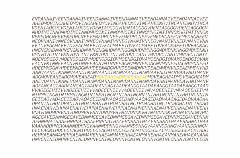

SENIOR SHOW CONCEPTExhibit Design: When proposing my design concept for my senior show exhibition I knew that it had to
be a big idea and produced on a shoe string budget. My solution consisted of wall textures of typography
highlighting the theme of Moving Ahead. To heighten the image these wall textures contain secret
stereoscopic images that when scene through the correct means produce an arrow pointing forward
that contains the highlighted words move ahead. This solution gives the viewer a unique experience in
which to interact with the exhibition and therefore makes it memorable. This experiential effect would
be utilized on invitation postcards, posters, and in the exhibition itself. You can experience the invitation
postcards effect on the reverse side.
R I C H I E @ R I C H I E L O K A Y . C O M 6 4 6 . 7 0 6 . 6 4 3 4 . 3 8 5 T R O U T M A N A P T 4 0 3 . B R O O K L Y N , N Y 1 1 2 3 7 .
THIS PAGE INTENTIONALLY LEFT YELLOW