PROMINENT COLORS Navy/Black combinations, … · PROMINENT COLORS Navy/Black combinations,...
33
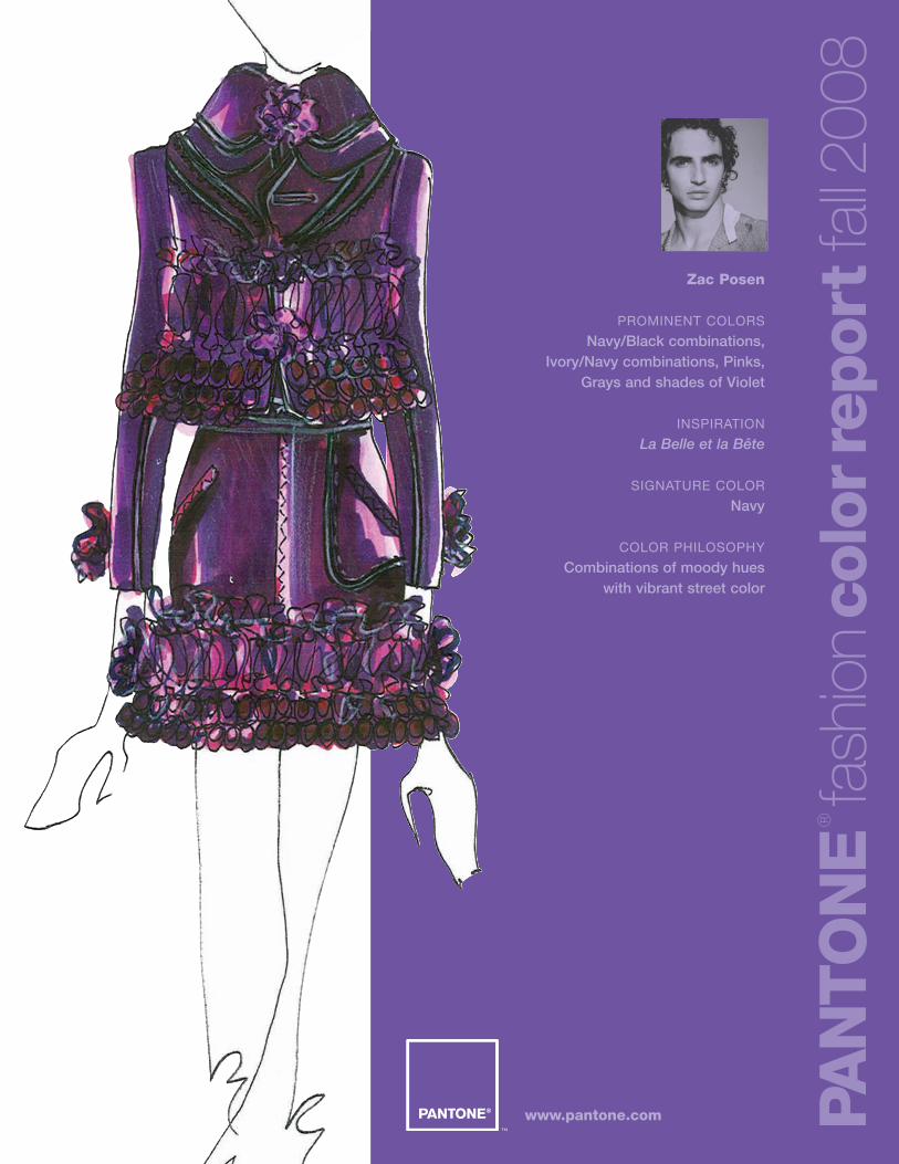
Zac Posen PROMINENT COLORS Navy/Black combinations, Ivory/Navy combinations, Pinks, Grays and shades of Violet INSPIRATION La Belle et la Bête SIGNATURE COLOR Navy COLOR PHILOSOPHY Combinations of moody hues with vibrant street color PANTONE ® fashion color report fall 2008 www.pantone.com
Transcript of PROMINENT COLORS Navy/Black combinations, … · PROMINENT COLORS Navy/Black combinations,...
Zac Posen
PROMINENT COLORS
Navy/Black combinations,Ivory/Navy combinations, Pinks,
Grays and shades of Violet
INSPIRATION
La Belle et la Bête
SIGNATURE COLOR
Navy
COLOR PHILOSOPHY
Combinations of moody hues with vibrant street color
PAN
TO
NE
®
fash
ion
colo
rrep
ort
fall2
008
www.pantone.com
PAN
TO
NE
®
fash
ion
colo
rrep
ort
fall2
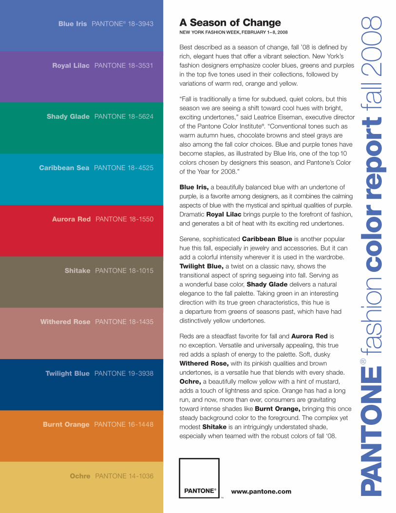
008A Season of Change
NEW YORK FASHION WEEK, FEBRUARY 1– 8, 2008
Best described as a season of change, fall ’08 is defined byrich, elegant hues that offer a vibrant selection. New York’sfashion designers emphasize cooler blues, greens and purplesin the top five tones used in their collections, followed byvariations of warm red, orange and yellow.
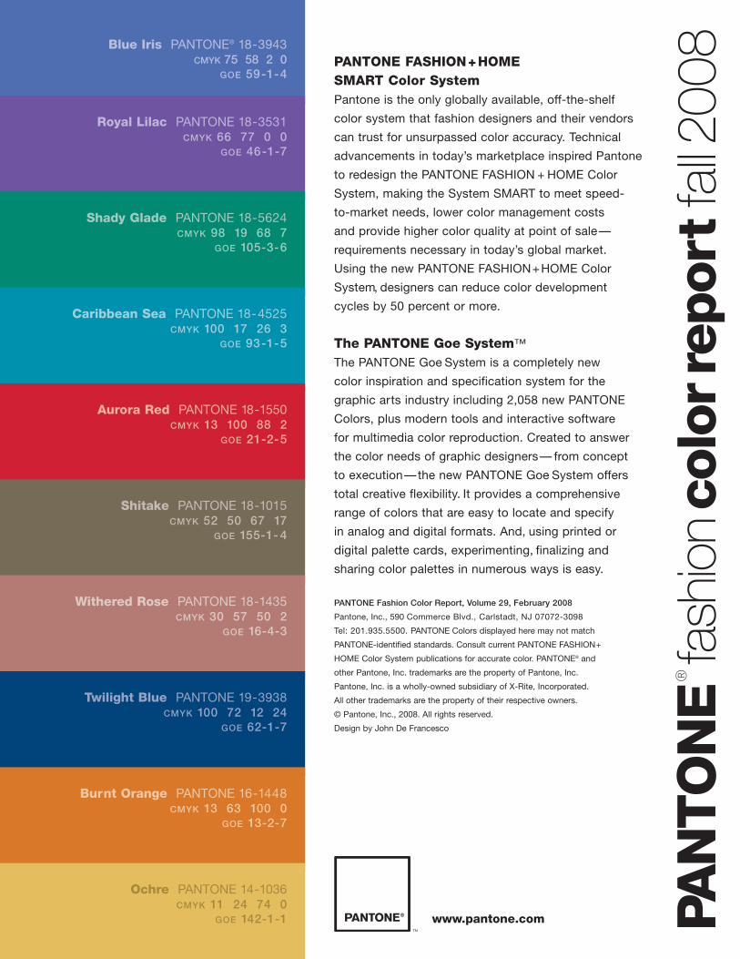
“Fall is traditionally a time for subdued, quiet colors, but thisseason we are seeing a shift toward cool hues with bright,exciting undertones,” said Leatrice Eiseman, executive directorof the Pantone Color Institute®. “Conventional tones such aswarm autumn hues, chocolate browns and steel grays arealso among the fall color choices. Blue and purple tones havebecome staples, as illustrated by Blue Iris, one of the top10colors chosen by designers this season, and Pantone’s Colorof the Year for 2008.”
Blue Iris, a beautifully balanced blue with an undertone ofpurple, is a favorite among designers, as it combines the calmingaspects of blue with the mystical and spiritual qualities of purple.Dramatic Royal Lilac brings purple to the forefront of fashion,and generates a bit of heat with its exciting red undertones.
Serene, sophisticated Caribbean Blue is another popularhue this fall, especially in jewelry and accessories. But it canadd a colorful intensity wherever it is used in the wardrobe.Twilight Blue, a twist on a classic navy, shows thetransitional aspect of spring segueing into fall. Serving as a wonderful base color, Shady Glade delivers a naturalelegance to the fall palette. Taking green in an interestingdirection with its true green characteristics, this hue is a departure from greens of seasons past, which have haddistinctively yellow undertones.
Reds are a steadfast favorite for fall and Aurora Red is no exception. Versatile and universally appealing, this true red adds a splash of energy to the palette. Soft, dusky Withered Rose, with its pinkish qualities and brownundertones, is a versatile hue that blends with every shade.Ochre, a beautifully mellow yellow with a hint of mustard,adds a touch of lightness and spice. Orange has had a longrun, and now, more than ever, consumers are gravitatingtoward intense shades like Burnt Orange, bringing this oncesteady background color to the foreground. The complex yetmodest Shitake is an intriguingly understated shade,especially when teamed with the robust colors of fall ‘08.
Blue Iris PANTONE® 18-3943
Royal Lilac PANTONE 18-3531
Shady Glade PANTONE 18-5624
Caribbean Sea PANTONE 18-4525
Aurora Red PANTONE 18-1550
Shitake PANTONE 18-1015
Withered Rose PANTONE 18-1435
Twilight Blue PANTONE 19-3938
Burnt Orange PANTONE 16-1448
Ochre PANTONE 14-1036
www.pantone.com
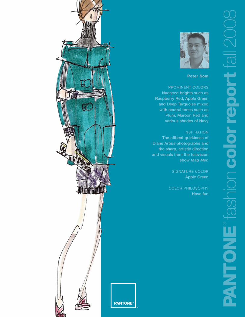
Peter Som
PROMINENT COLORS
Nuanced brights such asRaspberry Red, Apple Green
and Deep Turquoise mixed with neutral tones such as
Plum, Maroon Red and various shades of Navy
INSPIRATION
The offbeat quirkiness of Diane Arbus photographs and
the sharp, artistic direction and visuals from the television
show Mad Men
SIGNATURE COLOR
Apple Green
COLOR PHILOSOPHY
Have fun
PAN
TO
NE
®
fash
ion
colo
rrep
ort
fall2
008
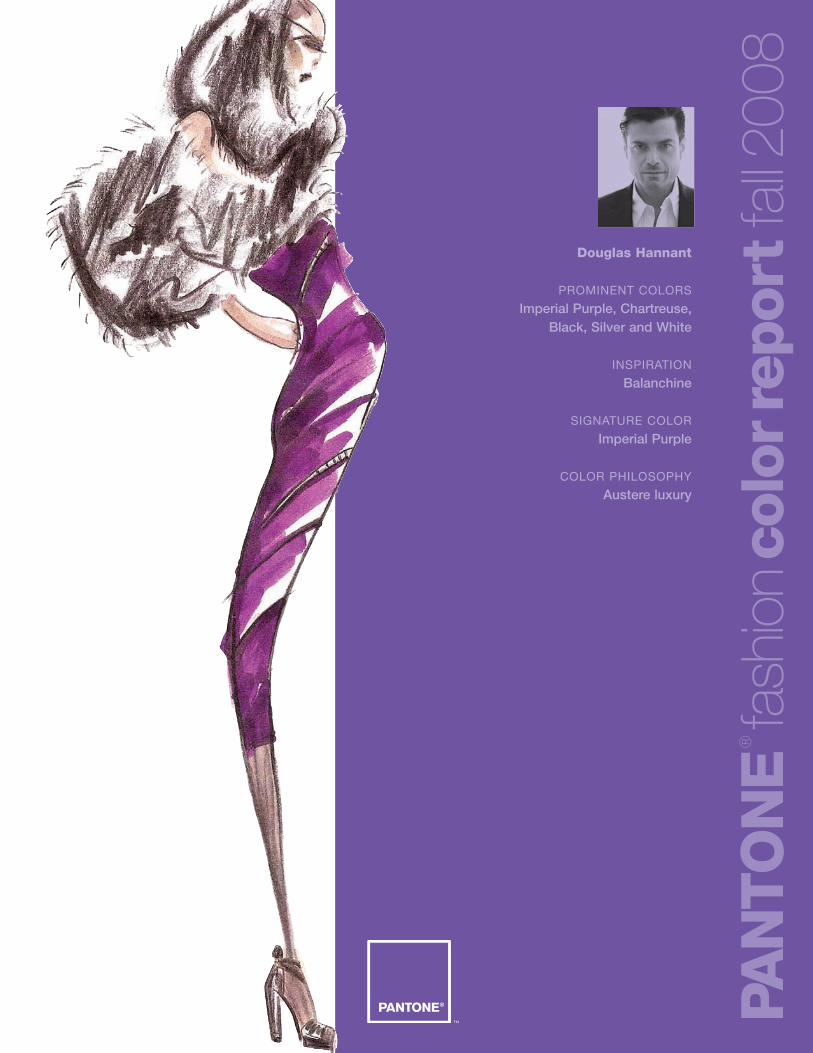
Douglas Hannant
PROMINENT COLORS
Imperial Purple, Chartreuse,Black, Silver and White
INSPIRATION
Balanchine
SIGNATURE COLOR
Imperial Purple
COLOR PHILOSOPHY
Austere luxury
PAN
TO
NE
®
fash
ion
colo
rrep
ort
fall2
008
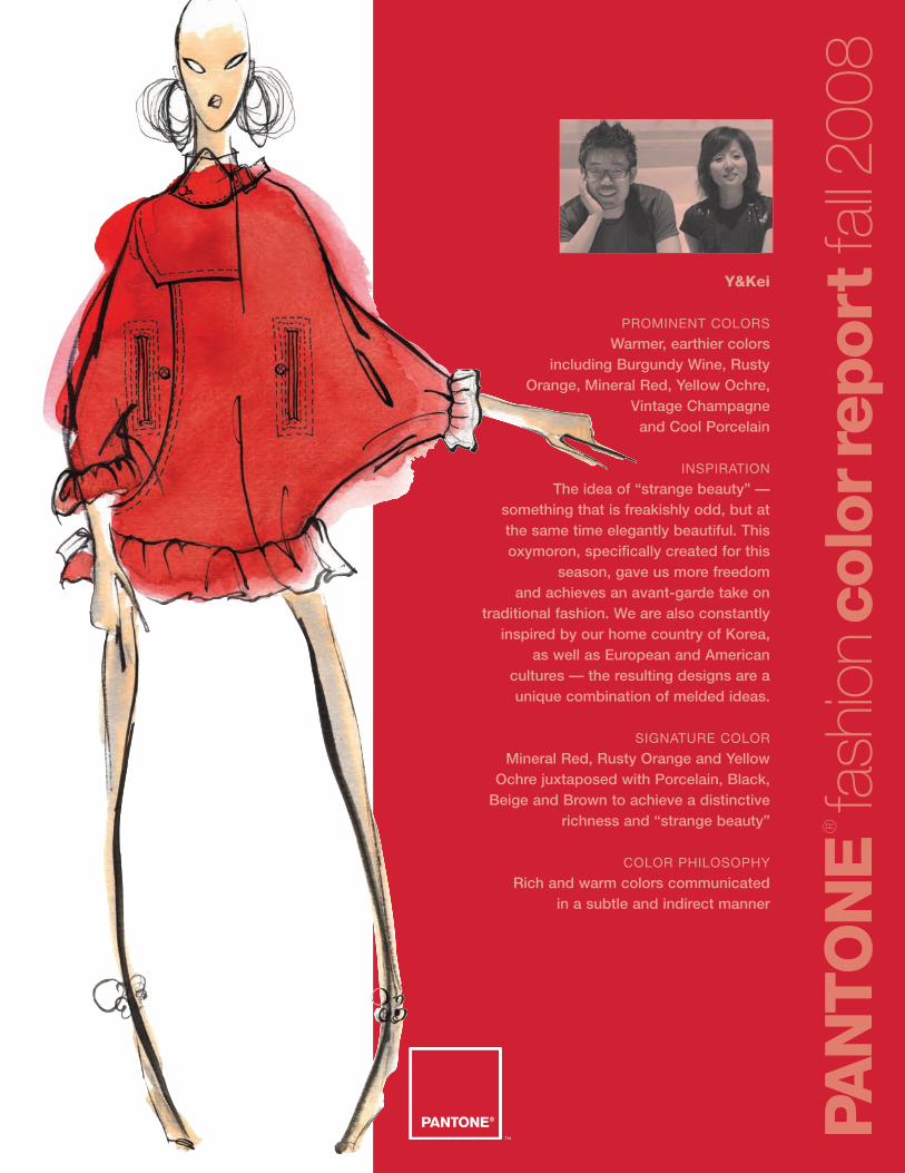
Y&Kei
PROMINENT COLORS
Warmer, earthier colors including Burgundy Wine, Rusty
Orange, Mineral Red, Yellow Ochre, Vintage Champagne
and Cool Porcelain
INSPIRATION
The idea of “strange beauty” — something that is freakishly odd, but at the same time elegantly beautiful. Thisoxymoron, specifically created for this
season, gave us more freedom and achieves an avant-garde take on
traditional fashion. We are also constantlyinspired by our home country of Korea,
as well as European and American cultures — the resulting designs are aunique combination of melded ideas.
SIGNATURE COLOR
Mineral Red, Rusty Orange and YellowOchre juxtaposed with Porcelain, Black,
Beige and Brown to achieve a distinctiverichness and “strange beauty”
COLOR PHILOSOPHY
Rich and warm colors communicated in a subtle and indirect manner
PAN
TO
NE
®
fash
ion
colo
rrep
ort
fall2
008
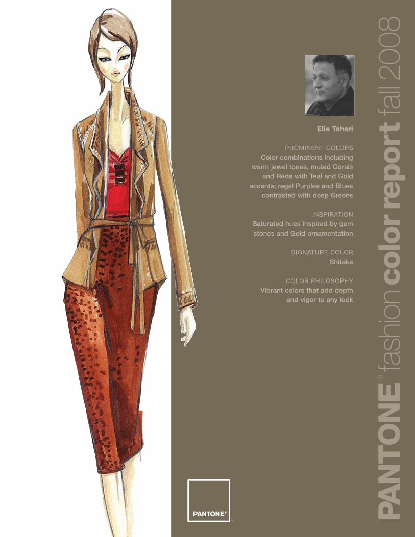
Elie Tahari
PROMINENT COLORS
Color combinations includingwarm jewel tones, muted Corals
and Reds with Teal and Goldaccents; regal Purples and Blues
contrasted with deep Greens
INSPIRATION
Saturated hues inspired by gemstones and Gold ornamentation
SIGNATURE COLOR
Shitake
COLOR PHILOSOPHY
Vibrant colors that add depth and vigor to any look
PAN
TO
NE
®
fash
ion
colo
rrep
ort
fall2
008
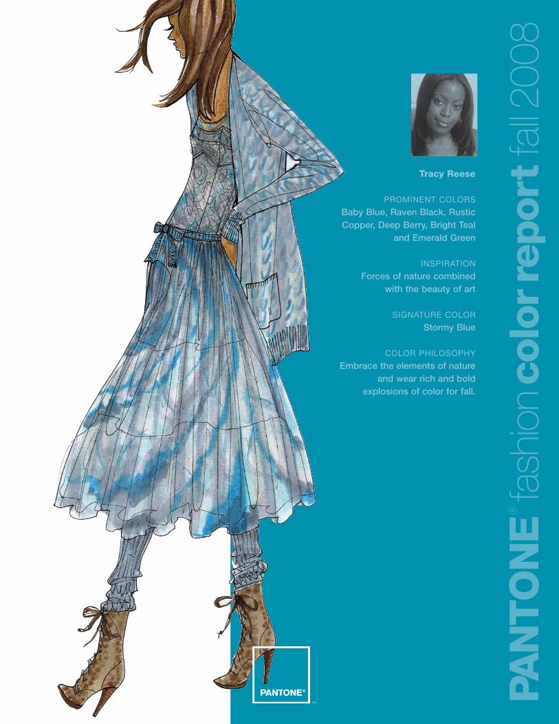
Tracy Reese
PROMINENT COLORS
Baby Blue, Raven Black, RusticCopper, Deep Berry, Bright Teal
and Emerald Green
INSPIRATION
Forces of nature combined with the beauty of art
SIGNATURE COLOR
Stormy Blue
COLOR PHILOSOPHY
Embrace the elements of natureand wear rich and bold
explosions of color for fall.
PAN
TO
NE
®
fash
ion
colo
rrep
ort
fall2
008
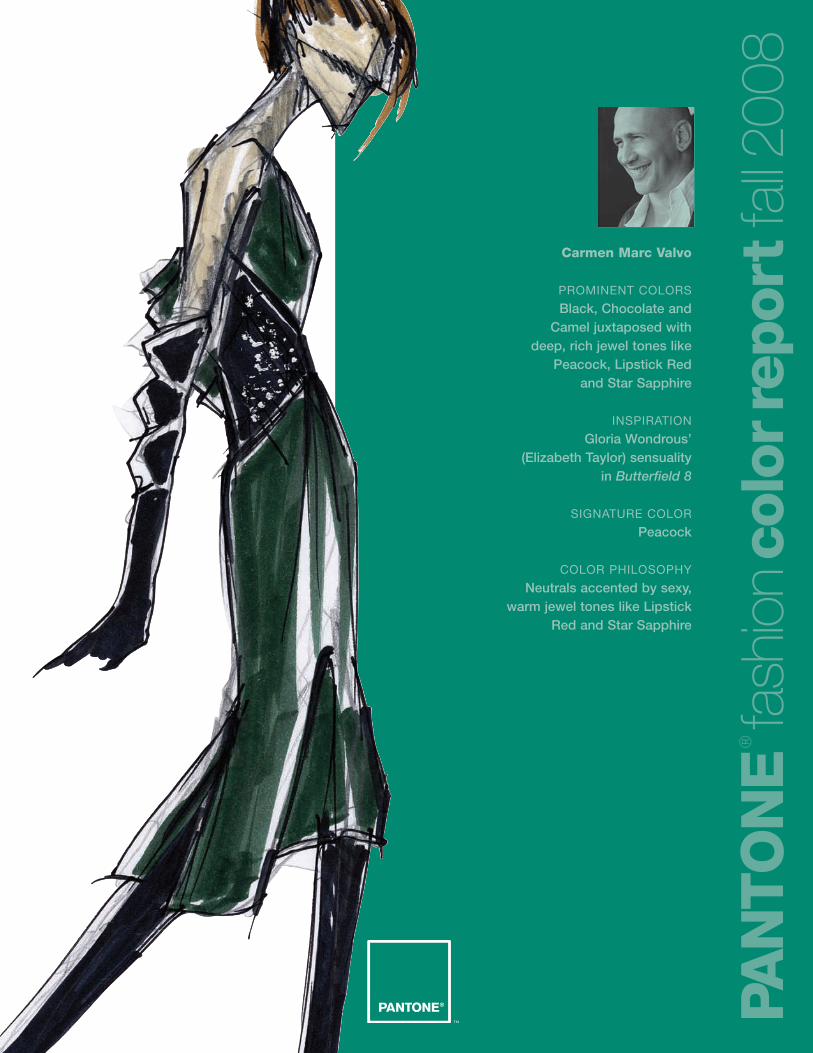
Carmen Marc Valvo
PROMINENT COLORS
Black, Chocolate and Camel juxtaposed with
deep, rich jewel tones likePeacock, Lipstick Red
and Star Sapphire
INSPIRATION
Gloria Wondrous’ (Elizabeth Taylor) sensuality
in Butterfield 8
SIGNATURE COLOR
Peacock
COLOR PHILOSOPHY
Neutrals accented by sexy, warm jewel tones like Lipstick
Red and Star Sapphire
PAN
TO
NE
®
fash
ion
colo
rrep
ort
fall2
008
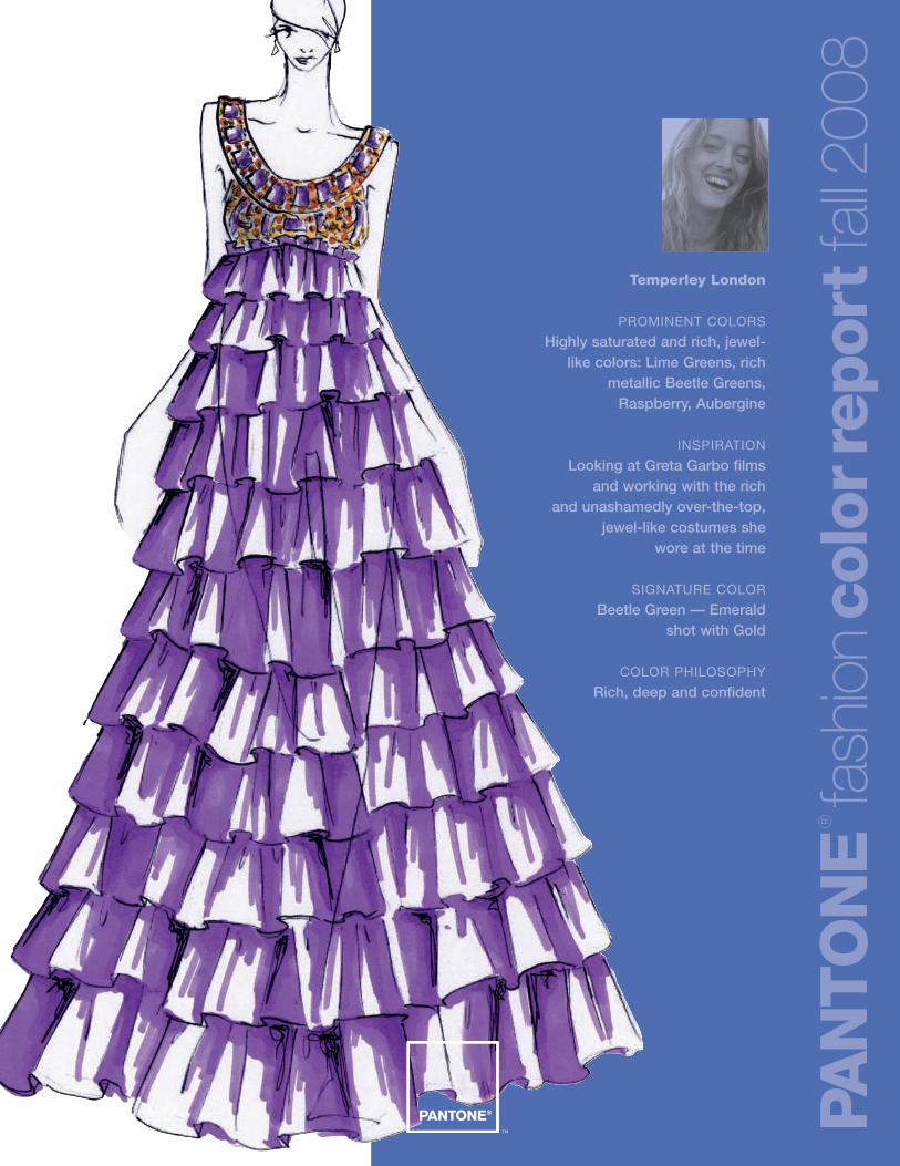
Temperley London
PROMINENT COLORS
Highly saturated and rich, jewel-like colors: Lime Greens, rich
metallic Beetle Greens,Raspberry, Aubergine
INSPIRATION
Looking at Greta Garbo films and working with the rich
and unashamedly over-the-top,jewel-like costumes she
wore at the time
SIGNATURE COLOR
Beetle Green — Emerald shot with Gold
COLOR PHILOSOPHY
Rich, deep and confident
PAN
TO
NE
®
fash
ion
colo
rrep
ort
fall2
008
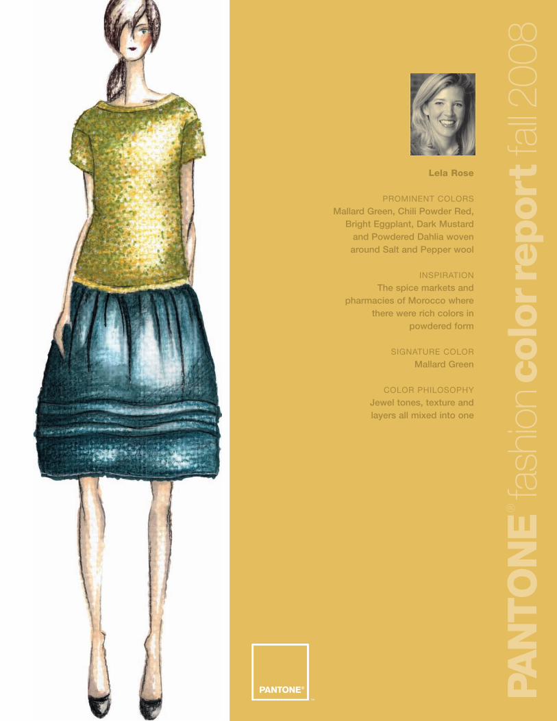
Lela Rose
PROMINENT COLORS
Mallard Green, Chili Powder Red,Bright Eggplant, Dark Mustard
and Powdered Dahlia wovenaround Salt and Pepper wool
INSPIRATION
The spice markets andpharmacies of Morocco where
there were rich colors inpowdered form
SIGNATURE COLOR
Mallard Green
COLOR PHILOSOPHY
Jewel tones, texture and layers all mixed into one
PAN
TO
NE
®
fash
ion
colo
rrep
ort
fall2
008
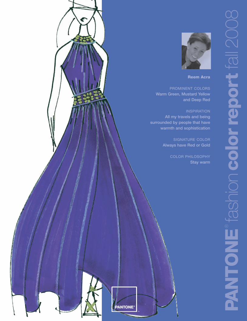
Reem Acra
PROMINENT COLORS
Warm Green, Mustard Yellow and Deep Red
INSPIRATION
All my travels and beingsurrounded by people that have
warmth and sophistication
SIGNATURE COLOR
Always have Red or Gold
COLOR PHILOSOPHY
Stay warm
PAN
TO
NE
®
fash
ion
colo
rrep
ort
fall2
008
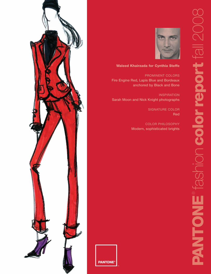
Waleed Khairzada for Cynthia Steffe
PROMINENT COLORS
Fire Engine Red, Lapis Blue and Bordeauxanchored by Black and Bone
INSPIRATION
Sarah Moon and Nick Knight photographs
SIGNATURE COLOR
Red
COLOR PHILOSOPHY
Modern, sophisticated brights
PAN
TO
NE
®
fash
ion
colo
rrep
ort
fall2
008
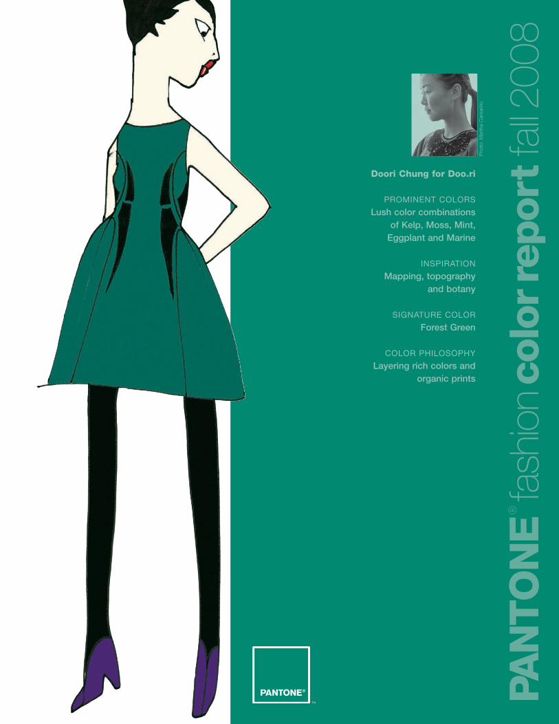
Doori Chung for Doo.ri
PROMINENT COLORS
Lush color combinations of Kelp, Moss, Mint,
Eggplant and Marine
INSPIRATION
Mapping, topography and botany
SIGNATURE COLOR
Forest Green
COLOR PHILOSOPHY
Layering rich colors and organic prints
PAN
TO
NE
®
fash
ion
colo
rrep
ort
fall2
008
Pho
to:
Mar
tha
Cam
arill
o
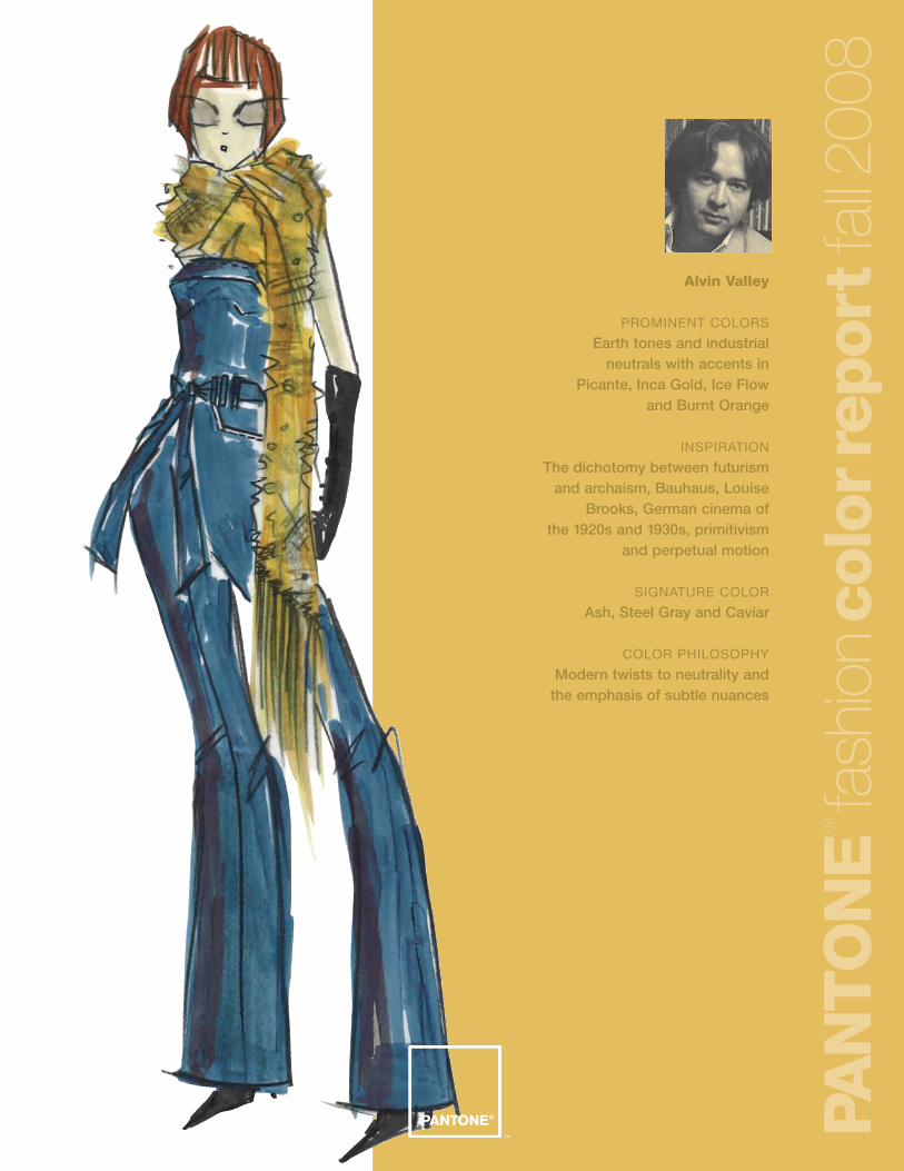
Alvin Valley
PROMINENT COLORS
Earth tones and industrialneutrals with accents in
Picante, Inca Gold, Ice Flow and Burnt Orange
INSPIRATION
The dichotomy between futurismand archaism, Bauhaus, Louise
Brooks, German cinema of the 1920s and 1930s, primitivism
and perpetual motion
SIGNATURE COLOR
Ash, Steel Gray and Caviar
COLOR PHILOSOPHY
Modern twists to neutrality andthe emphasis of subtle nuances
PAN
TO
NE
®
fash
ion
colo
rrep
ort
fall2
008
Tia Cibani for Ports 1961
PROMINENT COLORS
Limerick (Mossy Green), Sycamore(Warm Tan), Dulse (Malt Brown)
and Coll (Ochre) are accented with pops of Loch (Indigo) and
Rowan (Red-Orange) to stimulate the subconscious mind.
INSPIRATION
The beauty of the naturallandscape mixed with the fantasy
of Gaelic mythology — I felt it wasimportant to explore the more
bold colors of Loch (Indigo), Ross(Forest Green) and Rowan (Warm
Bright Red) as a tribute to thechildish wonder we all possess
SIGNATURE COLOR
Loch (Indigo)
COLOR PHILOSOPHY
Practicality blended with theexcitement of fantasy
PAN
TO
NE
®
fash
ion
colo
rrep
ort
fall2
008
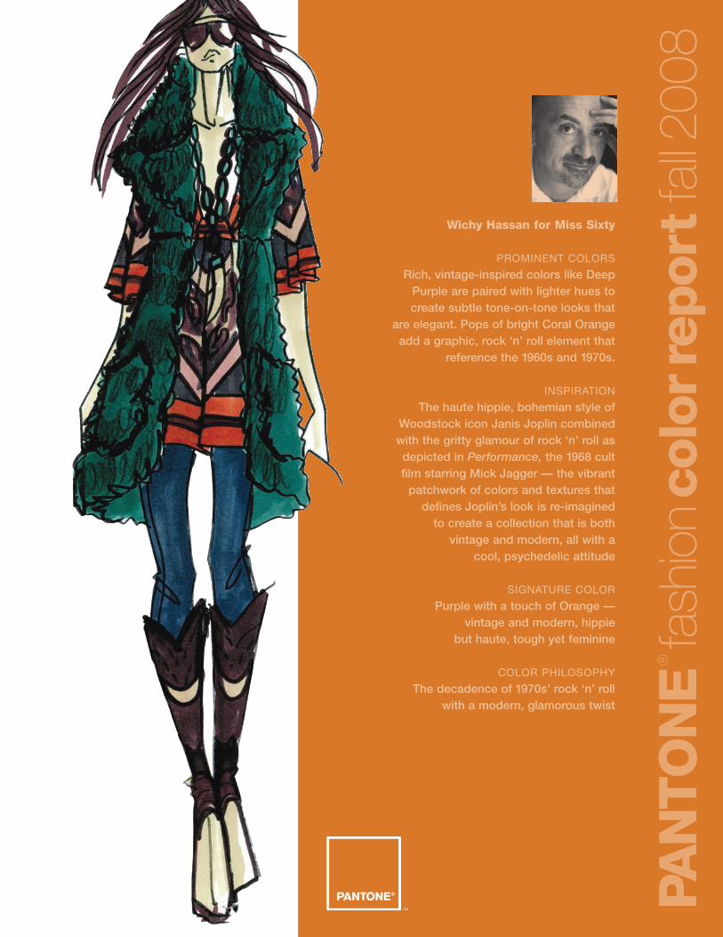
Wichy Hassan for Miss Sixty
PROMINENT COLORS
Rich, vintage-inspired colors like DeepPurple are paired with lighter hues tocreate subtle tone-on-tone looks that
are elegant. Pops of bright Coral Orangeadd a graphic, rock ‘n’ roll element that
reference the 1960s and 1970s.
INSPIRATION
The haute hippie, bohemian style ofWoodstock icon Janis Joplin combinedwith the gritty glamour of rock ‘n’ roll asdepicted in Performance, the 1968 cult film starring Mick Jagger — the vibrant
patchwork of colors and textures thatdefines Joplin’s look is re-imagined
to create a collection that is both vintage and modern, all with a
cool, psychedelic attitude
SIGNATURE COLOR
Purple with a touch of Orange — vintage and modern, hippie
but haute, tough yet feminine
COLOR PHILOSOPHY
The decadence of 1970s’ rock ‘n’ roll with a modern, glamorous twist
PAN
TO
NE
®
fash
ion
colo
rrep
ort
fall2
008
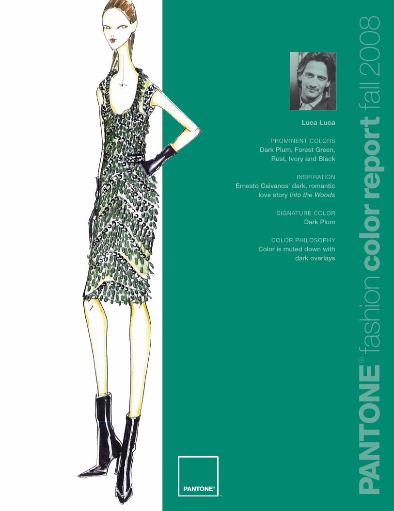
Luca Luca
PROMINENT COLORS
Dark Plum, Forest Green, Rust, Ivory and Black
INSPIRATION
Ernesto Caivanos’ dark, romanticlove story Into the Woods
SIGNATURE COLOR
Dark Plum
COLOR PHILOSOPHY
Color is muted down with dark overlays
PAN
TO
NE
®
fash
ion
colo
rrep
ort
fall2
008
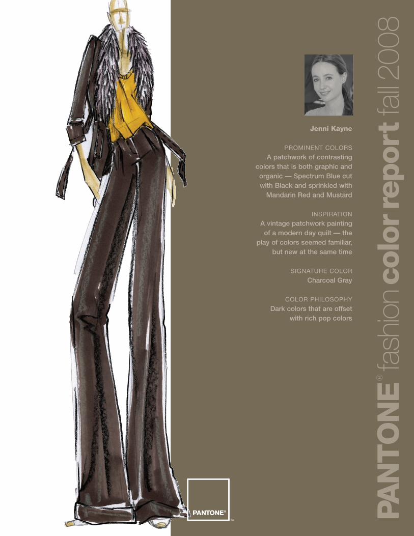
Jenni Kayne
PROMINENT COLORS
A patchwork of contrasting colors that is both graphic andorganic — Spectrum Blue cut with Black and sprinkled with
Mandarin Red and Mustard
INSPIRATION
A vintage patchwork painting of a modern day quilt — the
play of colors seemed familiar, but new at the same time
SIGNATURE COLOR
Charcoal Gray
COLOR PHILOSOPHY
Dark colors that are offset with rich pop colors
PAN
TO
NE
®
fash
ion
colo
rrep
ort
fall2
008
Dennis Basso
PROMINENT COLORS
Warm, ombré and tone-on-tonecolors from Creamy Beige to
deep Charcoal tones
INSPIRATION
A feeling of warmth and luxury in the cold weather seasons
SIGNATURE COLOR
Tones of Cocoa Brown through to Deep Charcoal
COLOR PHILOSOPHY
Use color as the backdrop to show off the design
elements of the garment.
PAN
TO
NE
®
fash
ion
colo
rrep
ort
fall2
008
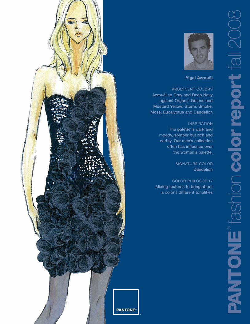
Yigal Azrouël
PROMINENT COLORS
Azrouëlian Gray and Deep Navyagainst Organic Greens and
Mustard Yellow; Storm, Smoke,Moss, Eucalyptus and Dandelion
INSPIRATION
The palette is dark and moody, somber but rich andearthy. Our men’s collection
often has influence over the women’s palette.
SIGNATURE COLOR
Dandelion
COLOR PHILOSOPHY
Mixing textures to bring about a color’s different tonalities
PAN
TO
NE
®
fash
ion
colo
rrep
ort
fall2
008
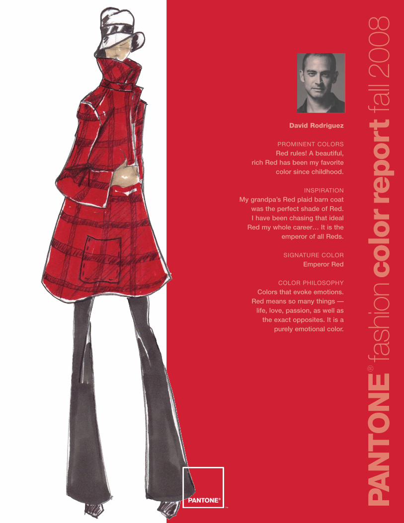
David Rodriguez
PROMINENT COLORS
Red rules! A beautiful, rich Red has been my favorite
color since childhood.
INSPIRATION
My grandpa’s Red plaid barn coatwas the perfect shade of Red. I have been chasing that ideal
Red my whole career… It is theemperor of all Reds.
SIGNATURE COLOR
Emperor Red
COLOR PHILOSOPHY
Colors that evoke emotions. Red means so many things —
life, love, passion, as well as the exact opposites. It is a
purely emotional color.
PAN
TO
NE
®
fash
ion
colo
rrep
ort
fall2
008
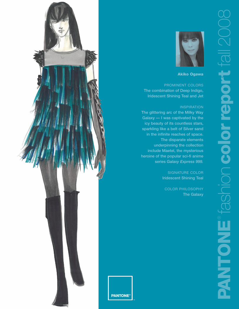
Akiko Ogawa
PROMINENT COLORS
The combination of Deep Indigo,Iridescent Shining Teal and Jet
INSPIRATION
The glittering arc of the Milky Way Galaxy — I was captivated by the
icy beauty of its countless stars, sparkling like a belt of Silver sand
in the infinite reaches of space. The disparate elements
underpinning the collection include Maetel, the mysterious
heroine of the popular sci-fi anime series Galaxy Express 999.
SIGNATURE COLOR
Iridescent Shining Teal
COLOR PHILOSOPHY
The Galaxy
PAN
TO
NE
®
fash
ion
colo
rrep
ort
fall2
008
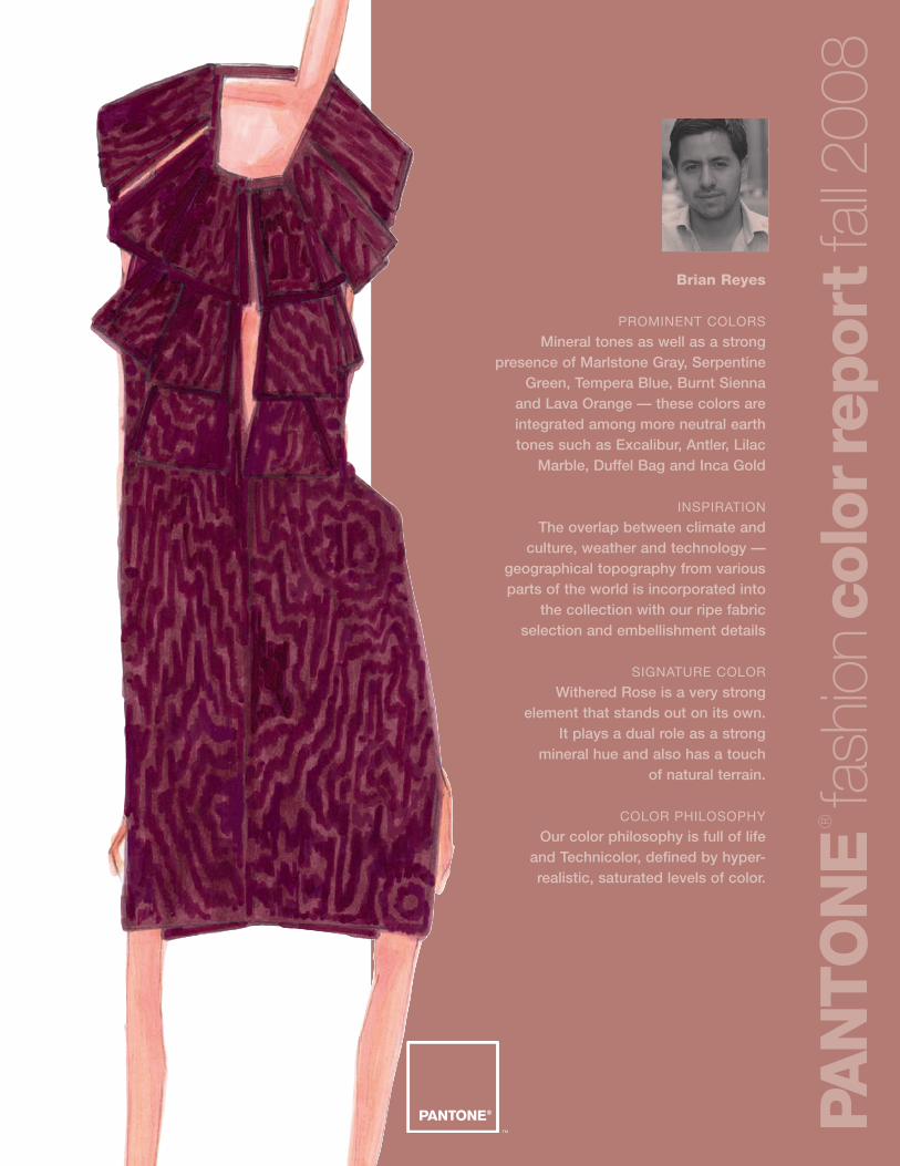
Brian Reyes
PROMINENT COLORS
Mineral tones as well as a strongpresence of Marlstone Gray, Serpentine
Green, Tempera Blue, Burnt Sienna and Lava Orange — these colors areintegrated among more neutral earthtones such as Excalibur, Antler, Lilac
Marble, Duffel Bag and Inca Gold
INSPIRATION
The overlap between climate and culture, weather and technology —
geographical topography from variousparts of the world is incorporated into
the collection with our ripe fabricselection and embellishment details
SIGNATURE COLOR
Withered Rose is a very strong element that stands out on its own.
It plays a dual role as a strong mineral hue and also has a touch
of natural terrain.
COLOR PHILOSOPHY
Our color philosophy is full of life and Technicolor, defined by hyper-realistic, saturated levels of color.
PAN
TO
NE
®
fash
ion
colo
rrep
ort
fall2
008
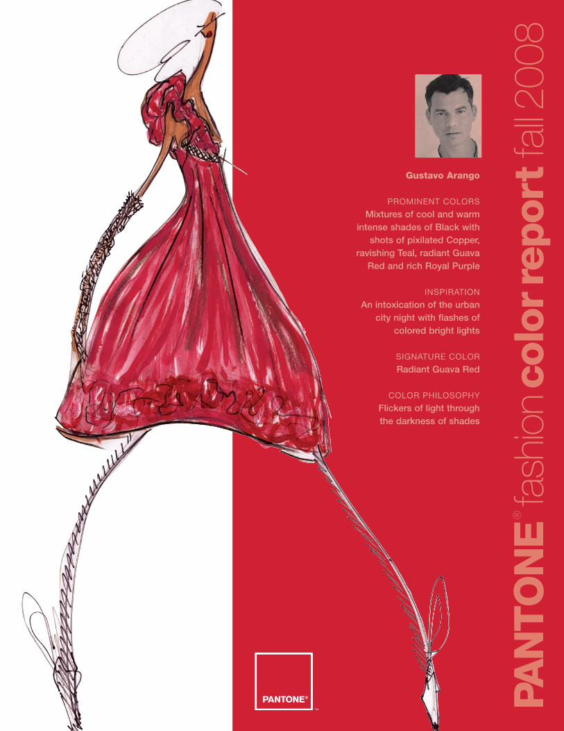
Gustavo Arango
PROMINENT COLORS
Mixtures of cool and warmintense shades of Black with
shots of pixilated Copper,ravishing Teal, radiant Guava
Red and rich Royal Purple
INSPIRATION
An intoxication of the urban city night with flashes of
colored bright lights
SIGNATURE COLOR
Radiant Guava Red
COLOR PHILOSOPHY
Flickers of light through the darkness of shades
PAN
TO
NE
®
fash
ion
colo
rrep
ort
fall2
008
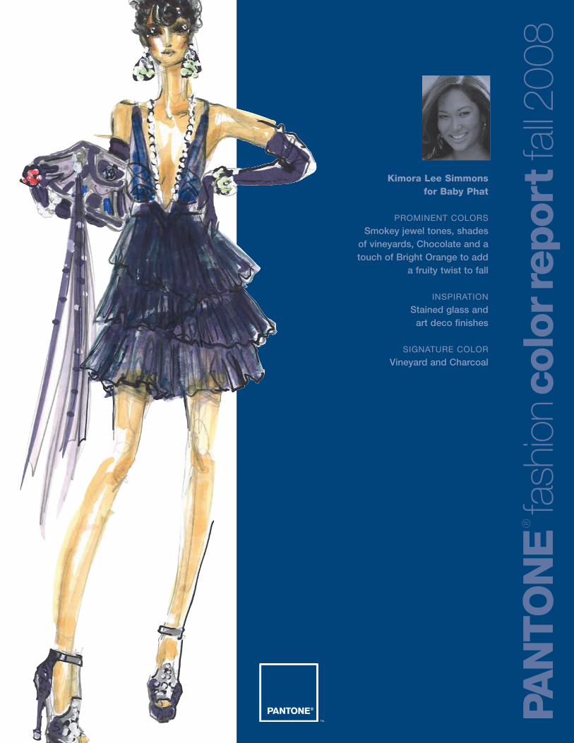
Kimora Lee Simmons for Baby Phat
PROMINENT COLORS
Smokey jewel tones, shades of vineyards, Chocolate and a touch of Bright Orange to add
a fruity twist to fall
INSPIRATION
Stained glass and art deco finishes
SIGNATURE COLOR
Vineyard and Charcoal
PAN
TO
NE
®
fash
ion
colo
rrep
ort
fall2
008
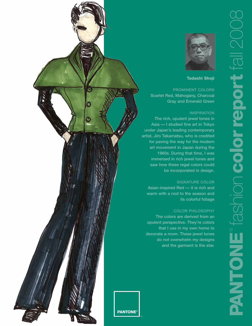
Tadashi Shoji
PROMINENT COLORS
Scarlet Red, Mahogany, CharcoalGray and Emerald Green
INSPIRATION
The rich, opulent jewel tones in Asia — I studied fine art in Tokyo
under Japan’s leading contemporaryartist, Jiro Takamatsu, who is credited
for paving the way for the modernart movement in Japan during the
1960s. During that time, I wasimmersed in rich jewel tones and saw how these regal colors could
be incorporated in design.
SIGNATURE COLOR
Asian-inspired Red — it is rich andwarm with a nod to the season and
its colorful foliage
COLOR PHILOSOPHY
The colors are derived from anopulent perspective. They’re colors
that I use in my own home todecorate a room. These jewel tones
do not overwhelm my designs and the garment is the star.
PAN
TO
NE
®
fash
ion
colo
rrep
ort
fall2
008
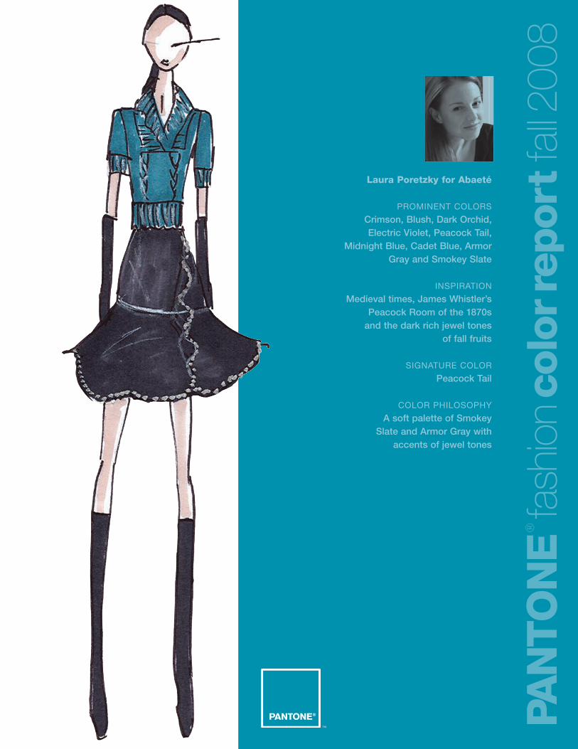
Laura Poretzky for Abaeté
PROMINENT COLORS
Crimson, Blush, Dark Orchid,Electric Violet, Peacock Tail,
Midnight Blue, Cadet Blue, ArmorGray and Smokey Slate
INSPIRATION
Medieval times, James Whistler’sPeacock Room of the 1870s
and the dark rich jewel tonesof fall fruits
SIGNATURE COLOR
Peacock Tail
COLOR PHILOSOPHY
A soft palette of Smokey Slate and Armor Gray with
accents of jewel tones
PAN
TO
NE
®
fash
ion
colo
rrep
ort
fall2
008
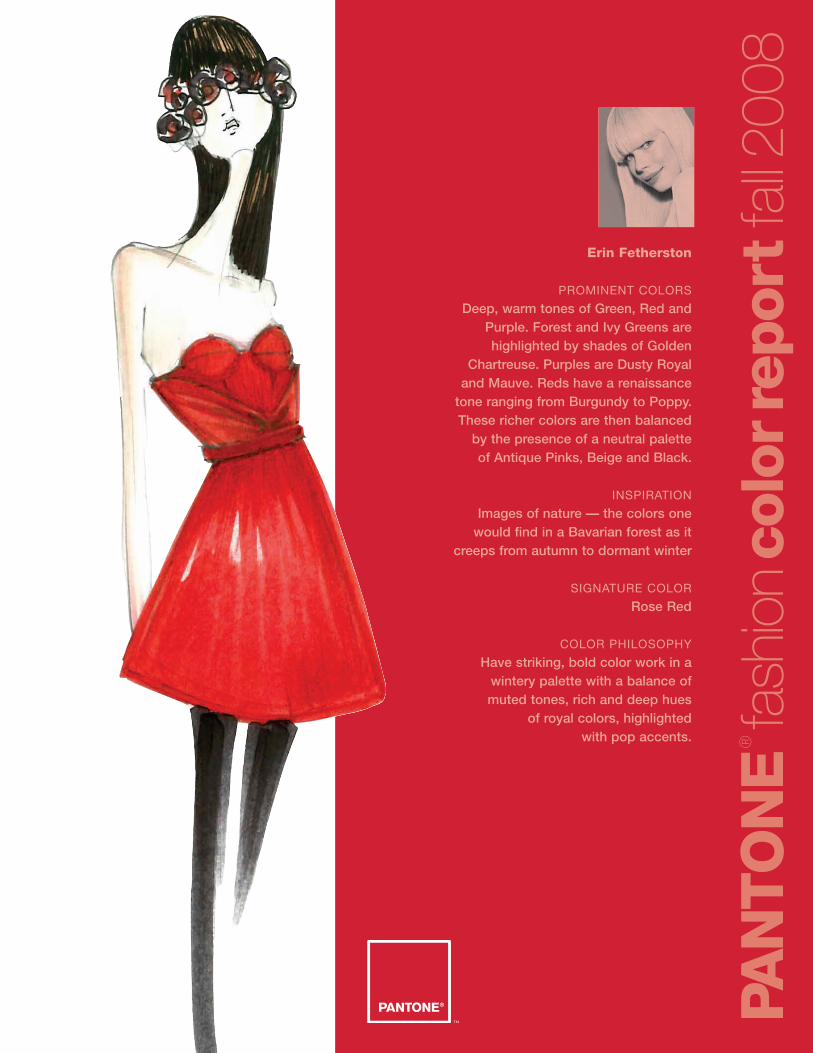
Erin Fetherston
PROMINENT COLORS
Deep, warm tones of Green, Red andPurple. Forest and Ivy Greens arehighlighted by shades of Golden
Chartreuse. Purples are Dusty Royal and Mauve. Reds have a renaissance
tone ranging from Burgundy to Poppy.These richer colors are then balanced
by the presence of a neutral palette of Antique Pinks, Beige and Black.
INSPIRATION
Images of nature — the colors one would find in a Bavarian forest as it
creeps from autumn to dormant winter
SIGNATURE COLOR
Rose Red
COLOR PHILOSOPHY
Have striking, bold color work in awintery palette with a balance of muted tones, rich and deep hues
of royal colors, highlighted with pop accents.
PAN
TO
NE
®
fash
ion
colo
rrep
ort
fall2
008
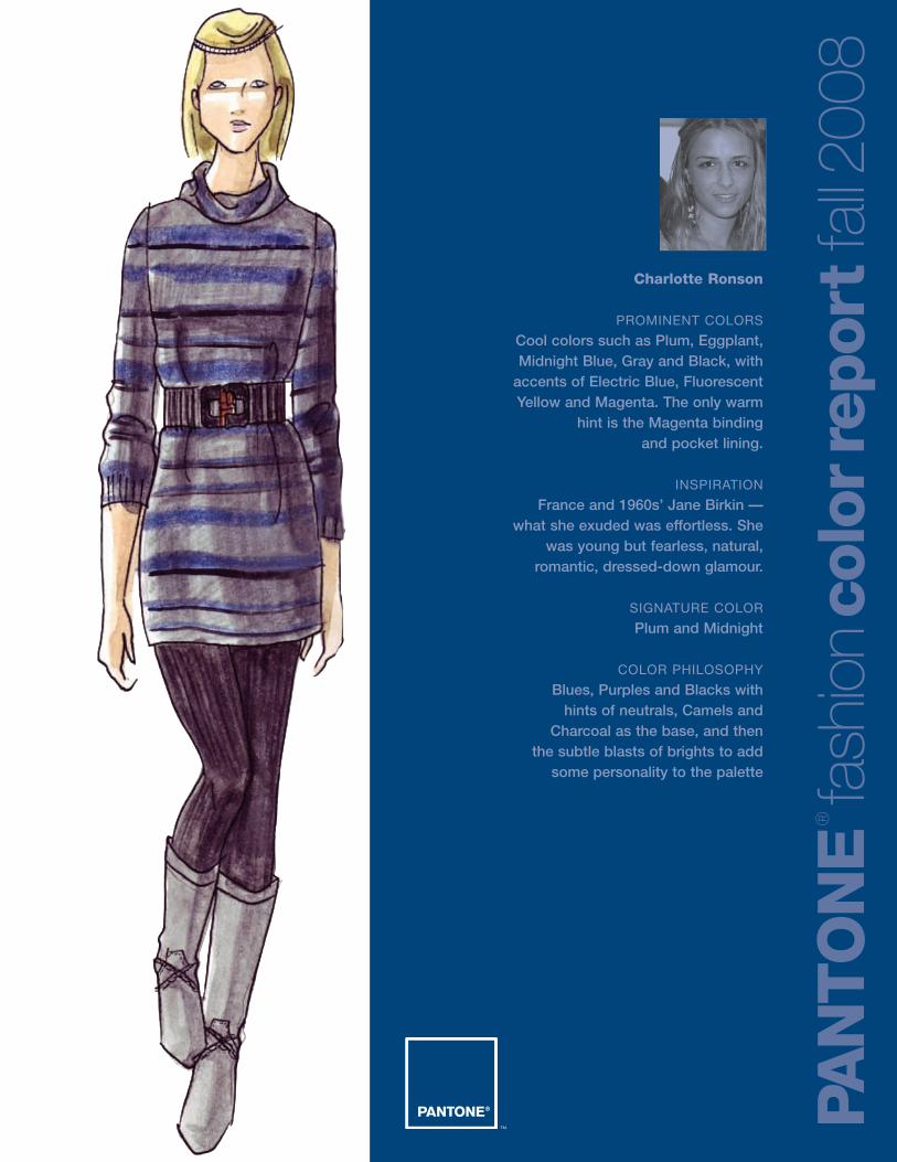
Charlotte Ronson
PROMINENT COLORS
Cool colors such as Plum, Eggplant,Midnight Blue, Gray and Black, with
accents of Electric Blue, FluorescentYellow and Magenta. The only warm
hint is the Magenta binding and pocket lining.
INSPIRATION
France and 1960s’ Jane Birkin — what she exuded was effortless. She
was young but fearless, natural,romantic, dressed-down glamour.
SIGNATURE COLOR
Plum and Midnight
COLOR PHILOSOPHY
Blues, Purples and Blacks with hints of neutrals, Camels and
Charcoal as the base, and then the subtle blasts of brights to add
some personality to the palette
PAN
TO
NE
®
fash
ion
colo
rrep
ort
fall2
008
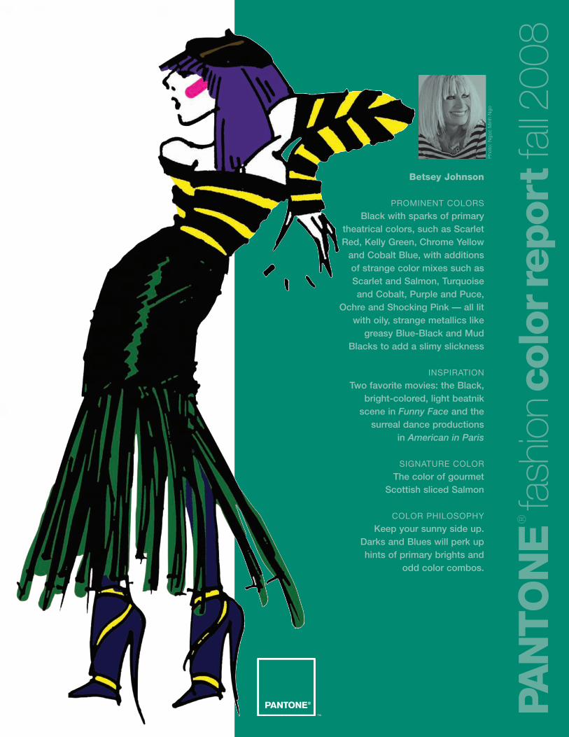
Betsey Johnson
PROMINENT COLORS
Black with sparks of primarytheatrical colors, such as ScarletRed, Kelly Green, Chrome Yellow
and Cobalt Blue, with additions of strange color mixes such asScarlet and Salmon, Turquoiseand Cobalt, Purple and Puce,
Ochre and Shocking Pink — all litwith oily, strange metallics like
greasy Blue-Black and MudBlacks to add a slimy slickness
INSPIRATION
Two favorite movies: the Black,bright-colored, light beatnik
scene in Funny Face and thesurreal dance productions
in American in Paris
SIGNATURE COLOR
The color of gourmet Scottish sliced Salmon
COLOR PHILOSOPHY
Keep your sunny side up. Darks and Blues will perk up hints of primary brights and
odd color combos.
PAN
TO
NE
®
fash
ion
colo
rrep
ort
fall2
008
Pho
to:
Ngo
cM
inh
Ngo
PAN
TO
NE
®
fash
ion
colo
rrep
ort
fall2
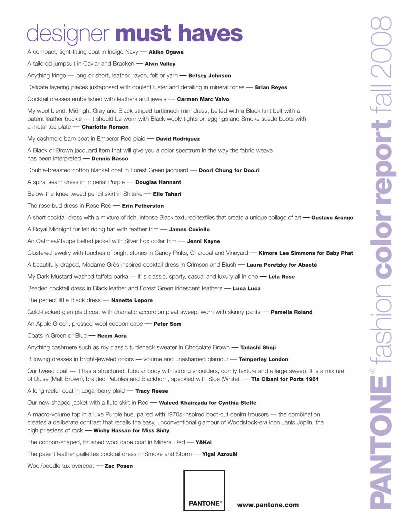
008designer must haves
A compact, tight-fitting coat in Indigo Navy — Akiko Ogawa
A tailored jumpsuit in Caviar and Bracken — Alvin Valley
Anything fringe — long or short, leather, rayon, felt or yarn — Betsey Johnson
Delicate layering pieces juxtaposed with opulent luster and detailing in mineral tones — Brian Reyes
Cocktail dresses embellished with feathers and jewels — Carmen Marc Valvo
My wool blend, Midnight Gray and Black striped turtleneck mini dress, belted with a Black knit belt with a patent leather buckle — it should be worn with Black wooly tights or leggings and Smoke suede boots with a metal toe plate — Charlotte Ronson
My cashmere barn coat in Emperor Red plaid — David Rodriguez
A Black or Brown jacquard item that will give you a color spectrum in the way the fabric weave has been interpreted — Dennis Basso
Double-breasted cotton blanket coat in Forest Green jacquard — Doori Chung for Doo.ri
A spiral seam dress in Imperial Purple — Douglas Hannant
Below-the-knee tweed pencil skirt in Shitake — Elie Tahari
The rose bud dress in Rose Red — Erin Fetherston
A short cocktail dress with a mixture of rich, intense Black textured textiles that create a unique collage of art — Gustavo Arango
A Royal Midnight fur felt riding hat with feather trim — James Coviello
An Oatmeal/Taupe belted jacket with Silver Fox collar trim — Jenni Kayne
Clustered jewelry with touches of bright stones in Candy Pinks, Charcoal and Vineyard — Kimora Lee Simmons for Baby Phat
A beautifully draped, Madame Grès-inspired cocktail dress in Crimson and Blush — Laura Poretzky for Abaeté
My Dark Mustard washed taffeta parka — it is classic, sporty, casual and luxury all in one — Lela Rose
Beaded cocktail dress in Black leather and Forest Green iridescent feathers — Luca Luca
The perfect little Black dress — Nanette Lepore
Gold-flecked glen plaid coat with dramatic accordion pleat sweep, worn with skinny pants — Pamella Roland
An Apple Green, pressed-wool cocoon cape — Peter Som
Coats in Green or Blue — Reem Acra
Anything cashmere such as my classic turtleneck sweater in Chocolate Brown — Tadashi Shoji
Billowing dresses in bright-jeweled colors — volume and unashamed glamour — Temperley London
Our tweed coat — it has a structured, tubular body with strong shoulders, comfy texture and a large sweep. It is a mixture of Dulse (Malt Brown), braided Pebbles and Blackhorn, speckled with Sloe (White). — Tia Cibani for Ports 1961
A long reefer coat in Loganberry plaid — Tracy Reese
Our new shaped jacket with a flute skirt in Red — Waleed Khairzada for Cynthia Steffe
A macro-volume top in a luxe Purple hue, paired with 1970s-inspired boot-cut denim trousers — the combination creates a deliberate contrast that recalls the easy, unconventional glamour of Woodstock-era icon Janis Joplin, the high priestess of rock — Wichy Hassan for Miss Sixty
The cocoon-shaped, brushed wool cape coat in Mineral Red — Y&Kei
The patent leather paillettes cocktail dress in Smoke and Storm — Yigal Azrouël
Wool/poodle tux overcoat — Zac Posen
www.pantone.com
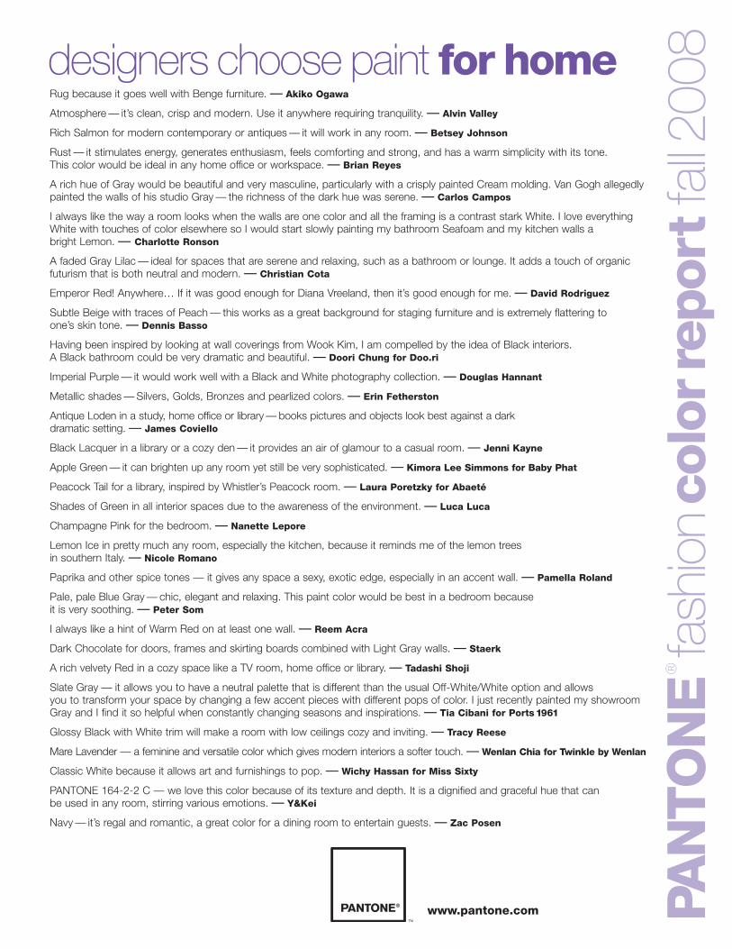
Rug because it goes well with Benge furniture. — Akiko Ogawa
Atmosphere — it’s clean, crisp and modern. Use it anywhere requiring tranquility. — Alvin Valley
Rich Salmon for modern contemporary or antiques — it will work in any room. — Betsey Johnson
Rust — it stimulates energy, generates enthusiasm, feels comforting and strong, and has a warm simplicity with its tone. This color would be ideal in any home office or workspace. — Brian Reyes
A rich hue of Gray would be beautiful and very masculine, particularly with a crisply painted Cream molding. Van Gogh allegedlypainted the walls of his studio Gray — the richness of the dark hue was serene. — Carlos Campos
I always like the way a room looks when the walls are one color and all the framing is a contrast stark White. I love everything White with touches of color elsewhere so I would start slowly painting my bathroom Seafoam and my kitchen walls a bright Lemon. — Charlotte Ronson
A faded Gray Lilac — ideal for spaces that are serene and relaxing, such as a bathroom or lounge. It adds a touch of organicfuturism that is both neutral and modern. — Christian Cota
Emperor Red! Anywhere… If it was good enough for Diana Vreeland, then it’s good enough for me. — David Rodriguez
Subtle Beige with traces of Peach — this works as a great background for staging furniture and is extremely flattering to one’s skin tone. — Dennis Basso
Having been inspired by looking at wall coverings from Wook Kim, I am compelled by the idea of Black interiors. A Black bathroom could be very dramatic and beautiful. — Doori Chung for Doo.ri
Imperial Purple — it would work well with a Black and White photography collection. — Douglas Hannant
Metallic shades — Silvers, Golds, Bronzes and pearlized colors. — Erin Fetherston
Antique Loden in a study, home office or library — books pictures and objects look best against a dark dramatic setting. — James Coviello
Black Lacquer in a library or a cozy den — it provides an air of glamour to a casual room. — Jenni Kayne
Apple Green — it can brighten up any room yet still be very sophisticated. — Kimora Lee Simmons for Baby Phat
Peacock Tail for a library, inspired by Whistler’s Peacock room. — Laura Poretzky for Abaeté
Shades of Green in all interior spaces due to the awareness of the environment. — Luca Luca
Champagne Pink for the bedroom. — Nanette Lepore
Lemon Ice in pretty much any room, especially the kitchen, because it reminds me of the lemon trees in southern Italy. — Nicole Romano
Paprika and other spice tones — it gives any space a sexy, exotic edge, especially in an accent wall. — Pamella Roland
Pale, pale Blue Gray — chic, elegant and relaxing. This paint color would be best in a bedroom because it is very soothing. — Peter Som
I always like a hint of Warm Red on at least one wall. — Reem Acra
Dark Chocolate for doors, frames and skirting boards combined with Light Gray walls. — Staerk
A rich velvety Red in a cozy space like a TV room, home office or library. — Tadashi Shoji
Slate Gray — it allows you to have a neutral palette that is different than the usual Off-White/White option and allows you to transform your space by changing a few accent pieces with different pops of color. I just recently painted my showroomGray and I find it so helpful when constantly changing seasons and inspirations. — Tia Cibani for Ports 1961
Glossy Black with White trim will make a room with low ceilings cozy and inviting. — Tracy Reese
Mare Lavender — a feminine and versatile color which gives modern interiors a softer touch. — Wenlan Chia for Twinkle by Wenlan
Classic White because it allows art and furnishings to pop. — Wichy Hassan for Miss Sixty
PANTONE 164-2-2 C — we love this color because of its texture and depth. It is a dignified and graceful hue that can be used in any room, stirring various emotions. — Y&Kei
Navy — it’s regal and romantic, a great color for a dining room to entertain guests. — Zac Posen
PAN
TO
NE
®
fash
ion
colo
rrep
ort
fall2
008designers choose paint for home
www.pantone.com
PANTONE FASHION+HOME SMART Color SystemPantone is the only globally available, off-the-shelf
color system that fashion designers and their vendors
can trust for unsurpassed color accuracy. Technical
advancements in today’s marketplace inspired Pantone
to redesign the PANTONE FASHION + HOME Color
System, making the System SMART to meet speed-
to-market needs, lower color management costs
and provide higher color quality at point of sale—
requirements necessary in today’s global market.
Using the new PANTONE FASHION+HOME Color
System, designers can reduce color development
cycles by 50 percent or more.
The PANTONE Goe System™
The PANTONE Goe System is a completely new
color inspiration and specification system for the
graphic arts industry including 2,058 new PANTONE
Colors, plus modern tools and interactive software
for multimedia color reproduction. Created to answer
the color needs of graphic designers— from concept
to execution—the new PANTONE Goe System offers
total creative flexibility. It provides a comprehensive
range of colors that are easy to locate and specify
in analog and digital formats. And, using printed or
digital palette cards, experimenting, finalizing and
sharing color palettes in numerous ways is easy.
PANTONE Fashion Color Report, Volume 29, February 2008
Pantone, Inc., 590 Commerce Blvd., Carlstadt, NJ 07072-3098
Tel: 201.935.5500. PANTONE Colors displayed here may not match
PANTONE-identified standards. Consult current PANTONE FASHION+
HOME Color System publications for accurate color. PANTONE® and
other Pantone, Inc. trademarks are the property of Pantone, Inc.
Pantone, Inc. is a wholly-owned subsidiary of X-Rite, Incorporated.
All other trademarks are the property of their respective owners.
© Pantone, Inc., 2008. All rights reserved.
Design by John De Francesco
PAN
TO
NE
®
fash
ion
colo
rrep
ort
fall2
008Blue Iris PANTONE® 18-3943
CMYK 75 58 2 0GOE 59-1-4
Royal Lilac PANTONE 18-3531CMYK 66 77 0 0
GOE 46-1-7
Shady Glade PANTONE 18-5624CMYK 98 19 68 7
GOE 105-3-6
Caribbean Sea PANTONE 18-4525CMYK 100 17 26 3
GOE 93-1-5
Aurora Red PANTONE 18-1550CMYK 13 100 88 2
GOE 21-2-5
Shitake PANTONE 18-1015CMYK 52 50 67 17
GOE 155-1- 4
Withered Rose PANTONE 18-1435CMYK 30 57 50 2
GOE 16-4-3
Twilight Blue PANTONE 19-3938CMYK 100 72 12 24
GOE 62-1-7
Burnt Orange PANTONE 16-1448CMYK 13 63 100 0
GOE 13-2-7
Ochre PANTONE 14-1036CMYK 11 24 74 0
GOE 142-1-1 www.pantone.com