project SALOP
24
project SALOP
-
Upload
david-payne -
Category
Documents
-
view
217 -
download
4
description
project SALOP is a brand refresh of Shrewsbury Town FC moving the club forward into the modern age of football.
Transcript of project SALOP
project SALOP


project SALOP is a brand refresh of Shrewsbury Town FC moving the club forward into the modern age of football.
A strong and recognisable identity is an important aspect of every football club; it represents who you are and where
you’re from. The project takes into consideration the club’s proud history and the equally important opinions of
the supporters.
project SALOP aims to bring Shrewsbury Town FC a fresh visual identity the club can be proud of.
designed by DP|vcwww.dp-vc.uk
1
2
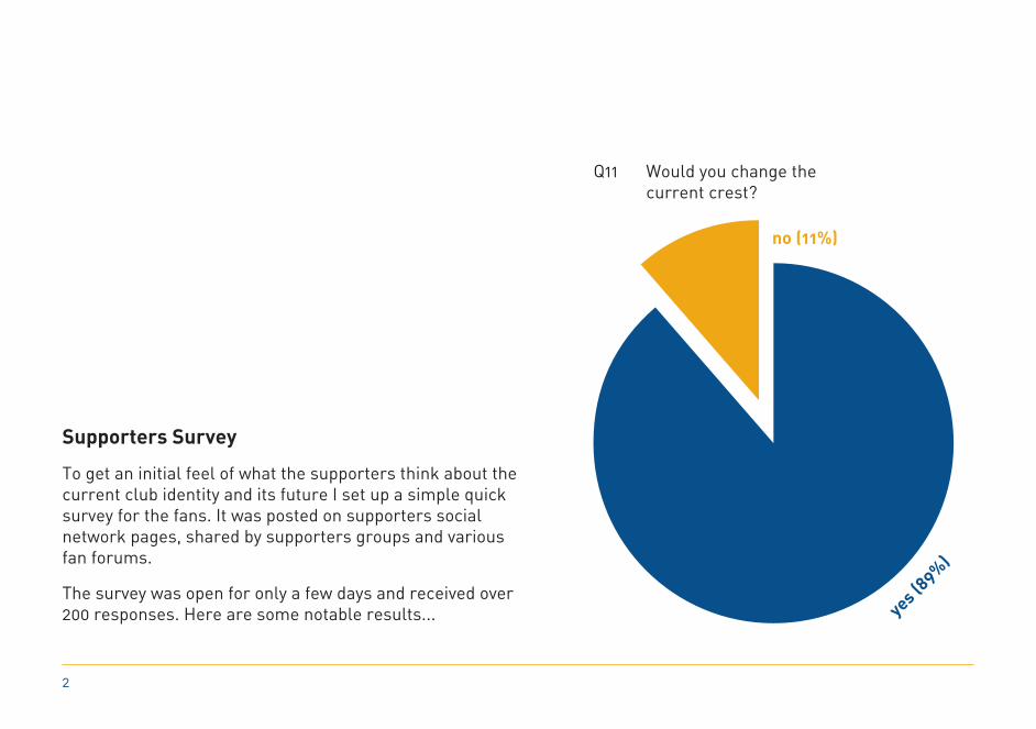
Supporters Survey
To get an initial feel of what the supporters think about the current club identity and its future I set up a simple quick survey for the fans. It was posted on supporters social network pages, shared by supporters groups and various fan forums.
The survey was open for only a few days and received over 200 responses. Here are some notable results...
no (11%)
yes (89%)
Q11 Would you change the current crest?

3
90%10%
of fans said that ‘visual design’, in football, is either very important or important to them.
of fans said it wasn’t important or they weren’t bothered.
Q6 Is ‘visual design’ in football important to you?
Q12 What images would you include in a new crest?
other suggestions included the River Severn loop, Shrewsbury Castle & the English Bridge; all looking at bringing a part of Shrewsbury to the identity of Shrewsbury Town FC.
Q9 What statement best describes what you think of the ‘historical visuals’ around the ground?
61 % “I like them but they could be improved.” 17 % “Don’t like them but I like the concept.” 11 % “I think they’re great and wouldn’t change them.” 8 % “Not bother and no opinion.” 2 % “I don’t like them and don’t like the concept.”

4
Loggerheads Research
Loggerhead; the heraldry name for a leopard’s head.
The Loggerheads have long been associated with Shrewsbury and Shropshire. Whether it’s a plaque on a building, carved into stone or cast in metal, you won’t be far from the Loggerheads anywhere in Shrewsbury.
The Loggerheads are recognisably associated with Shrewsbury Town FC, because over time they have represented the club for over 75% of seasons when crests have been in place.

5
Typographic Research
Looking through old Shrewsbury Town FC posters and programmes as resource material for inspiration towards an identity true to it’s history.

6
1. 2. 3.
1. Full Colour ‘Total’ Crest used whenever full colour is available but only on a blue background2. Full Colour ‘Match’ Crest abbreviated crest only to be embroidered on replica shirts3. White ‘Total’ Crest white version for use on blue, any colour and photographic backgrounds

7
4.
4. White ‘Total’ Crest white version for use on any dark colour and photographic backgrounds5. White Corporate Logo used only for corporate purposes with full name on any darker colour or photographic backgrounds6. White Sport Logo used for any purpose as a logo where crests are not suited
5.
6.

8
1. Blue ‘Total’ Crest used only on amber and white backgrounds2. Blue ‘Match’ Crest abbreviated crest only to be embroidered on amber and white replica shirts
1. 2.

9
3. Black ‘Total’ Crest black version for use on any light colour backgrounds4. Black Corporate Logo used only for corporate purposes with full name on any light colour backgrounds5. Black Sport Logo used for any purpose as a logo where crests are not suited
1. 3.
4. 5.
2.

Example home shirts produced using miadidas
10

Example away shirts produced using miadidas
11

Floreat Salopia
“Let Shropshire Flourish”; Shrewsbury’s motto has disappeared from Shrewsbury Town but is still at the heart of its supporters. A staggering 177 of 205 supporters said they would include “Floreat Salopia” in a new crest; but incorporating the motto over complicates the crest and takes away it’s bold impact.
As this is obviously important to the supporters and the clubs heritage the motto will be embroidered on the back of the neck on all shirts.
12

13

14
BLU
EA
MB
ERW
HIT
EG
REY
BLU
EO
FF B
LACK
C: 99 R: 14M: 75 G: 62Y: 18 B: 122K: 5
C: 0 R: 230M: 35 G: 149Y: 100 B: 0K: 5
C: 0 R: 255M: 0 G: 255Y: 0 B: 255K: 0
C: 70 R: 61M: 55 G: 73Y: 30 B: 98K: 25
C: 0 R: 30M: 0 G: 30Y: 0 B: 31K: 95
Colour
Originally Shrewsbury Town FC played in blue and white for many years, adopted from the founding members who previously played for Shrewsbury Castle Blues.
The famous blue and amber combination was first introduced in 1935, but only for a few years. It was later reintroduced in the 60’s and is recognisable as Shrewsbury Town’s colours.
Blue has always featured in the club’s colours and will be the dominant colour throughout the identity.

15
DIN Alternate BoldDIN Alternate Regular
DIN Alternate Bold (size 14pt) - black used for sub headings in body text
DIN Alternate Regular (size 12pt) - black used for main body text
Typefaces
To build a recognisable and consistent identity at Shrewsbury Town typeface choice is just as important as colour choice.
The crest and logo typeface is Adelon Serial Bold; chosen from a programme heading type used throughout part of the 50’s and 60’s. Its classic but works in a modern updated crest.
For all other text DIN Alternate is to be used, either bold or regular weight, it’s clean, legible & modern.

16
Environmental Graphics
Underneath the terraces the current plain walls could become a canvas for environmental graphics celebrating Shrewsbury Town’s rich history.
Something with more impact than the current framed photos; super graphics painted directly onto the walls, sided with information printed onto acrylic panels.
Here are some initial examples of these graphics that can become the talking point for home and away fans.
Floreat Salopia
“Let Shropshire Flourish”; Shrewsbury’s motto has disappeared from Shrewsbury Town but is still at the heart of it’s supporters. A staggering 177 of 205 supporters said they would include “Floreat Salopia” in a new crest; but incorporating the motto over complicates the crest and takes away it’s bold impact.
As this is obviously important to the supporters and the clubs heritage the motto will be embroidered on the back of the neck on all shirts and will appear in various forms around the ground. For example this typographic super graphic using different fonts to represent different eras; from a 1930’s letterpress poster to a 1980’s programme font.

17
Arthur Rowley
The all time leading goalscorer in English League football with 434 goals. Arthur arrived from Leicester in June 1958, and became Shrewsbury’s longest serving, and arguably most successful manager. On arrival he promised goals, and he broke the Club record in his first season, whilst his promoted side scored 101 in the league.^

18
The Welsh Cup
Shrewsbury Town are the most successful English club to compete in the Welsh Cup, winning it a total of 6 times and runners up 3 times. They will always be the most successful English club in the cup’s history; as of 1995 no English League clubs are allowed to enter.
The environmental graphic represents how many times and when Shrewsbury Town won the welsh cup. It also shows the clubs colours at the time when they won through the coloured ribbons. The graphic would look great along a ‘drinks ledge’ acting like a shelf.

19
The Coracle Man
For many years until 1979, Shrewsbury coracle maker Fred Davies achieved some notability amongst football fans; he would sit in his coracle during Shrewsbury Town FC home matches at Gay Meadow, and retrieve stray balls from the River Severn. Although Davies died in 1994, his legend is still associated with the club.^
Something completely unique to Shrewsbury Town FC that should be celebrated; the graphics shows a life size representation of the coracle and oar.

20
This is just the starting point for project SALOP...
designed by DP|vcwww.dp-vc.uk
Bibliography
pages 2 - 3 Survey conducted by David Payne via PollDaddy.com
page 4 Previous Shrewsbury Town crests from historicalkits.co.uk
page 4 Shrewsbury Town Football Club crest from book cover: Breathe on ‘em Salop by Mike Jones
page 13 Arthur Rowley image illustrated from original image owned by PAphotos.co.uk
page 13 ^Arthur Rowley text adapted from book: Meadow Maestros and Misfits by Mike Jones
page 15 Fred Davies image illustrated from original image in book: Breathe on ‘em Salop by Mike Jones
page 15 ^Fred Davies text from book: Gentleman of the River by Phyllis Blakemore


designed by DP|vc www.dp-vc.uk