Project book wk1
47
Table of Contents
-
Upload
shanna-reid -
Category
Documents
-
view
221 -
download
1
description
the first draft of project book
Transcript of Project book wk1

Table of Contents
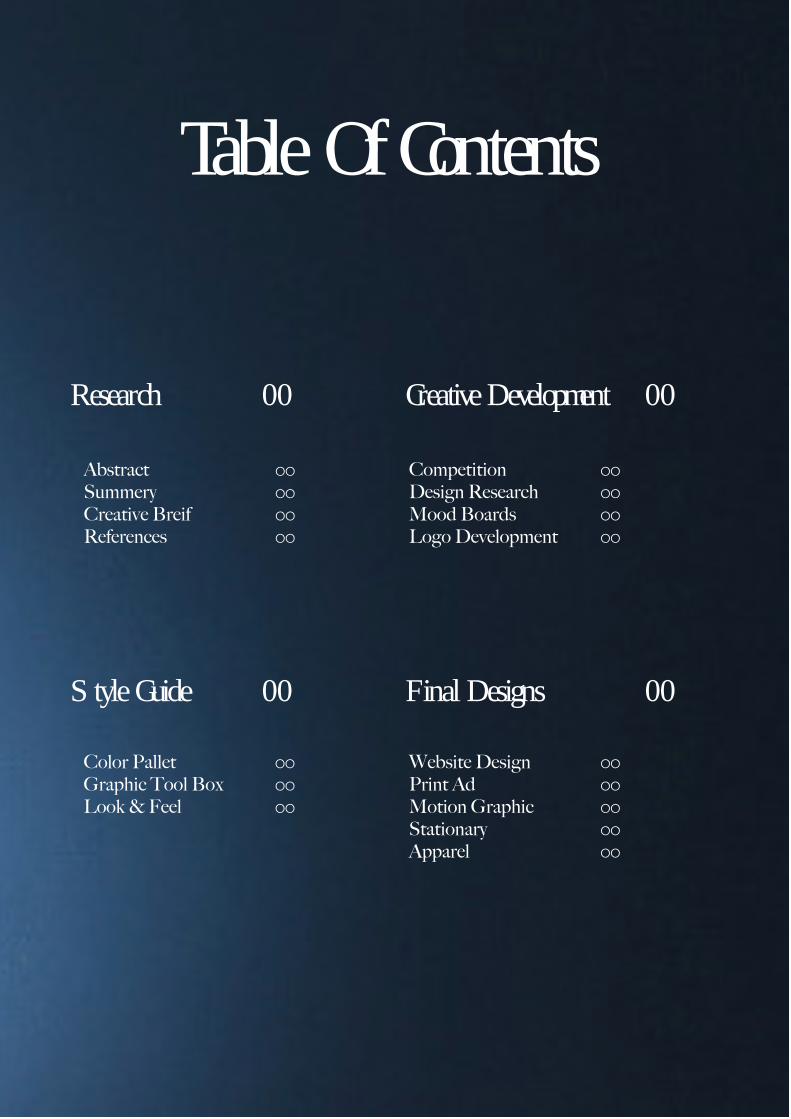
Table of ContentsTable Of Contents
Research 00 Creative Development 00
Style Guide 00 Final Designs 00
Abstract 00Summery 00Creative Breif 00References 00
Competition 00Design Research 00Mood Boards 00Logo Development 00
Color Pallet 00Graphic Tool Box 00Look & Feel 00
Website Design 00Print Ad 00Motion Graphic 00Stationary 00Apparel 00

resarch Page Devider

resarch Page Devider

Abstract

Abstract

Summery

Summery

Creative Breif

Creative Breif

References

References

Creative Development

Creative Development

Competition

Competition
Design Research

Design Research

Mood Boards

Mood Boards

Logo Development

Logo Development


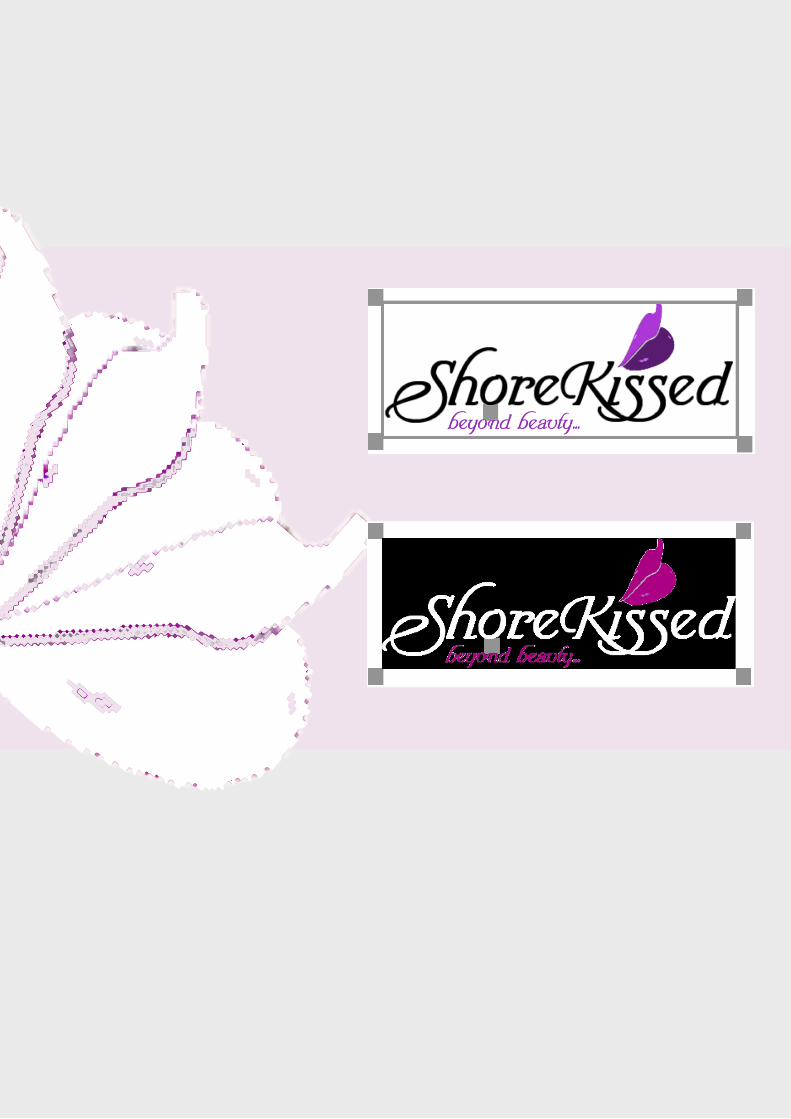
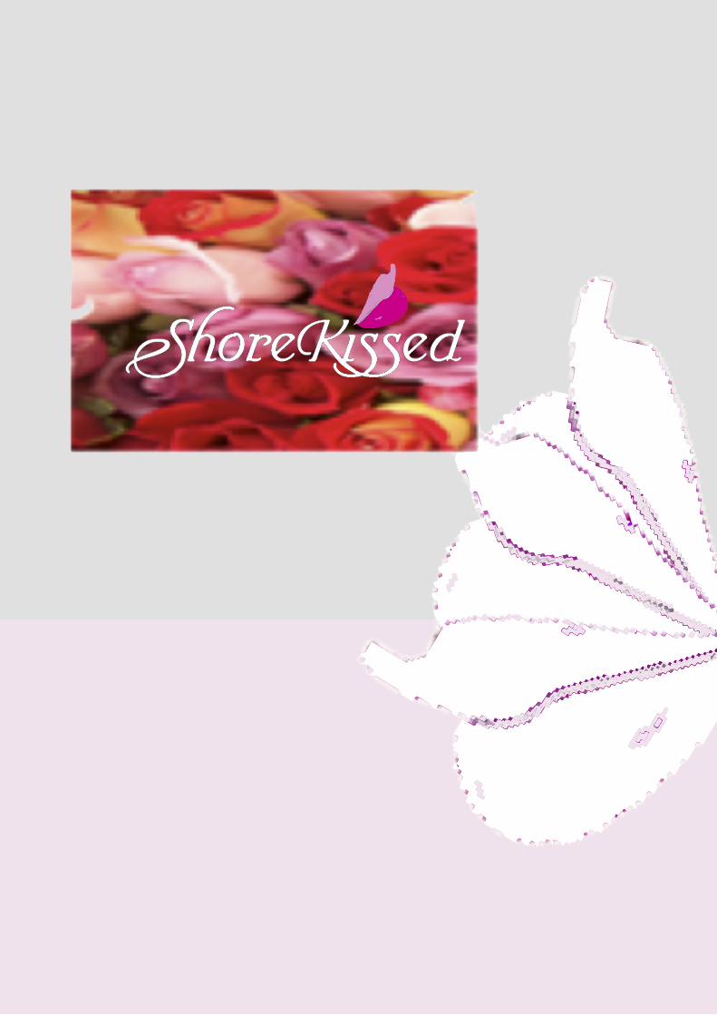
The Logo was created with the font Turbayne Running Hand. There are two main versions of the logo. The black and white version and the colored version with the two tone lips.
The lips and tagline color can be changed as long as it is one of the pink or purple within the given palette. The tagline and the top lip must be the same color and the word ShoreKissed must be ei-ther black or white.
The Logo


Logo and Tagline Relationship
The only acceptable tagline is “beyond beauty...” This should be used with the Logo most of the time. When the tagline appears, it should be the same color as the upper lip of the Logo emblem.
When the tagline is not in use it is important that all the ele-ments remain the same. This should be used only whe the tagline is imractical because of readability issues.

Acceptable Logo Treatments
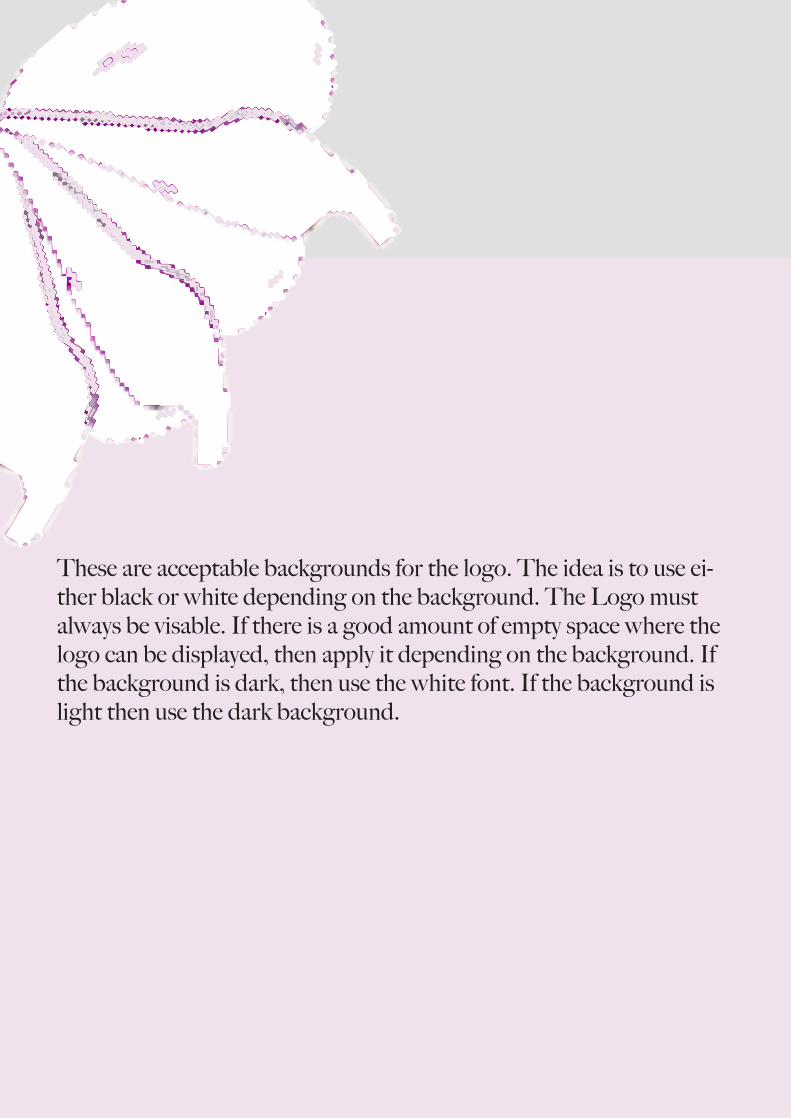
These are acceptable backgrounds for the logo. The idea is to use ei-ther black or white depending on the background. The Logo must always be visable. If there is a good amount of empty space where the logo can be displayed, then apply it depending on the background. If the background is dark, then use the white font. If the background is light then use the dark background.


Font Treatment

Stationary
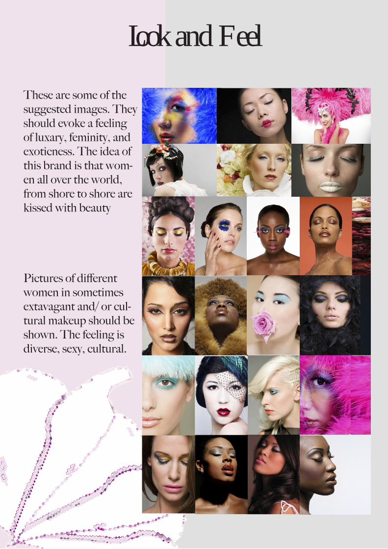
Look and Feel
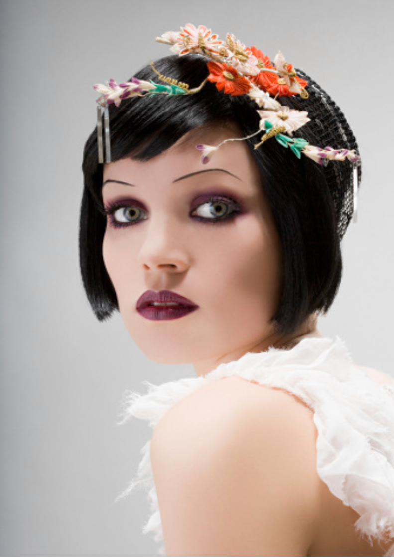
These are some of the suggested images. They should evoke a feeling of luxary, feminity, and exoticness. The idea of this brand is that wom-en all over the world, from shore to shore are kissed with beauty
Pictures of different women in sometimes extavagant and/ or cul-tural makeup should be shown. The feeling is diverse, sexy, cultural.

Final Designs

Final Designs
Website Design

Website Design
Print Ad

Print Ad

Motion Graphic

Motion Graphic

Stationary

Stationary

Back Cover