PRODUCT FACTS -...
62
MOBILE & WEB REDESIGN Kaela Burns | Matt Dixoncarter | Juyeon Lee | PRODUCT FACTS
Transcript of PRODUCT FACTS -...
MOBILE & WEB REDESIGN
Kaela Burns | Matt Dixoncarter | Juyeon Lee
|PRODUCTFACTS

THE MISSION
PROBLEMCoca-Cola’s product facts site is problematic in both function and design. Users experienced both frustration and confusion when trying to explore the information and pages. SOLUTION Redesign the mobile and web sites for simpler navigation and with user needs in mind, featuring more filter options and compact modular displays.
|

|EXPLORE

Comparative Analysis
Taco BellP & G
Layout
McDonald’s
Clean and legible Clean and legible Animation andtext heavy
Info Delivery
Cluttered
Images and nutrition info
Images and detail description
Allergen info / nutrition info
Recommended Alternatives
N N N N
Info by serving size Y Y
Tone General General Fun / whimsical / sarcastic Scientific terms
None
# of clicksto info 3 4 4 2
Coca-ColaProduct Facts
Y
Ingredient / nutrition info
COOl IDEAS

Showing warning symbolit is easy to get an sense of the meaning at glance
TAKEAWAYS
• Non-threatening health alert
• Nutrition facts by size

NestleDr. PepperCoca-Cola
Product Facts
Clarity of navigation
Pepsi
Mobile Site
# of clicksto info
Clarity of info
Nutrition Info Search
• Left aligned navigation
• Icons fun and easy to read.
• ‘Dropdown’ or extended
nav is confusing.
• Not mobile first design.
N Y Y Y
2 2 ? 2
• Scrolling
overwhelming
• Hamburger button
simple and directN/A
• Misleading
hamburger menu
• Scrolling jumpy and
jarring
• Hard to browse
by category
• Clear nutritional information
with infographics
• Designed for web and not
mobile
• Provides clear
nutritional information
• Easy to read
• Restriction of
information
Difficult finding info
Y To product page
N Y
THE COMPETITION

TAKEAWAYS
• Nutrition info by size
• Infographics to aidFAQ text
• Clean facts layout

User Types on Data Analysis
Quick Hit Researcher
Organic
Research
Only comes for
one thing
FAQ Landing Page
Lower Bounce
3+ pages
/session
Specific
Search
Clean
Layout
Easy
Navigation
No
Wasting
Time
TWO MAIN USER TYPES


CURRENT HOME
• Redundant Menus • Jumpy Transitions • Text Heavy Menu
"That jumping is REALLY weird and the scrolling too,
it made me miss the navigation elements."
-Tracy
• False Hamburger Menu • Ambiguous selection
indicator • Time consuming carousels

CURRENT PRODUCTS• Unclear sorting • Redundant “All” option • Too many products on
page - excessive mobile scrolling

CURRENT INGREDIENTS
• Poor eye tracking
• Doesn’t snap to desired ingredient
Ingredient main page
• Too much scrolling

CURRENT PRODUCT PAGE
• Redundant product naming
• Flavors - links other pages
• Loading result pages inconsistent
• Unclear purpose of sharing and numbers
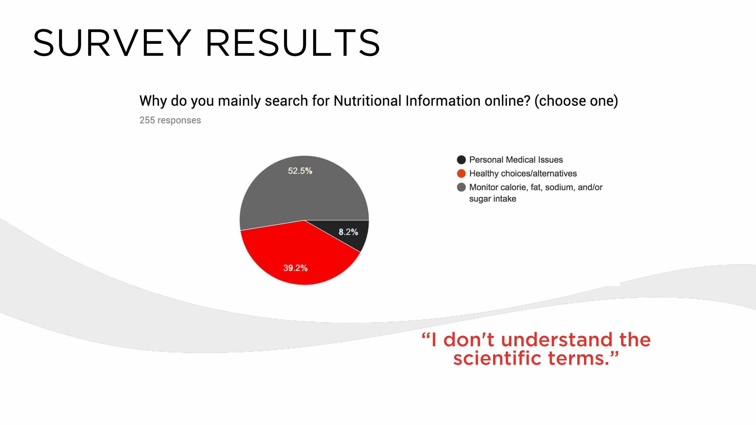
SURVEY RESULTS
“I don't understand the scientific terms.”

“I drink a LOT of Coke Zero, which I love, but the issue in it that most worries me is the aspartame and its potential
long-term health issues.”
SURVEY RESULTS

“Who's to tell how accurate they are?”
SURVEY RESULTS
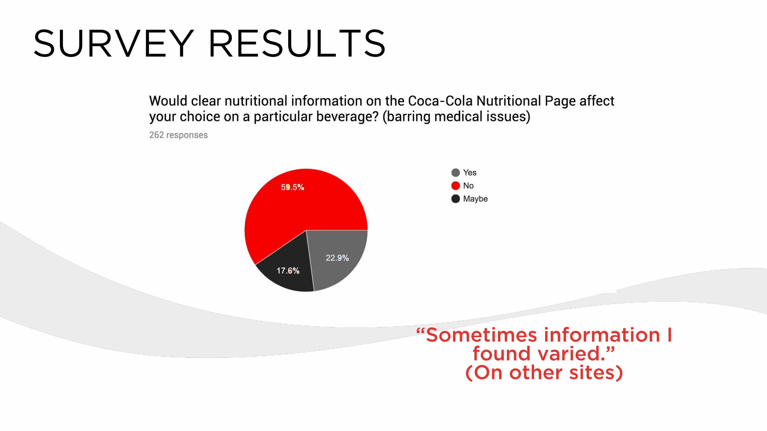
“Sometimes information I found varied.”
(On other sites)
SURVEY RESULTS
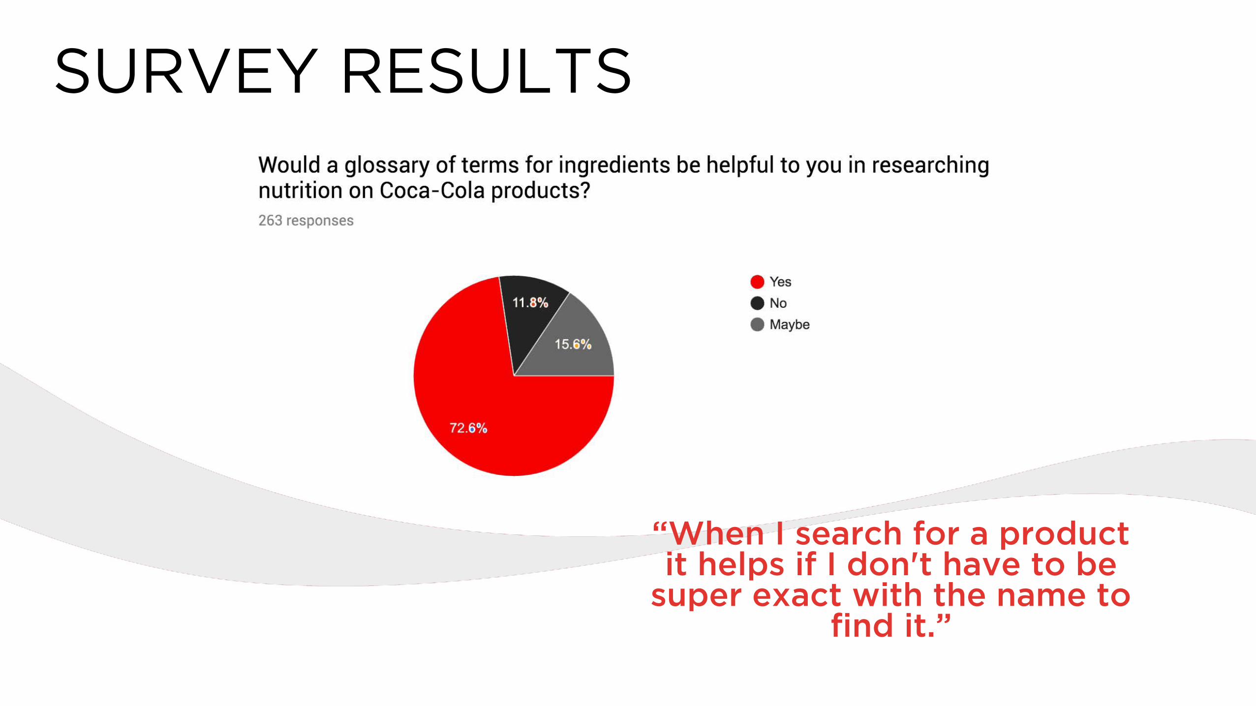
“When I search for a product it helps if I don't have to be
super exact with the name to find it.”
SURVEY RESULTS
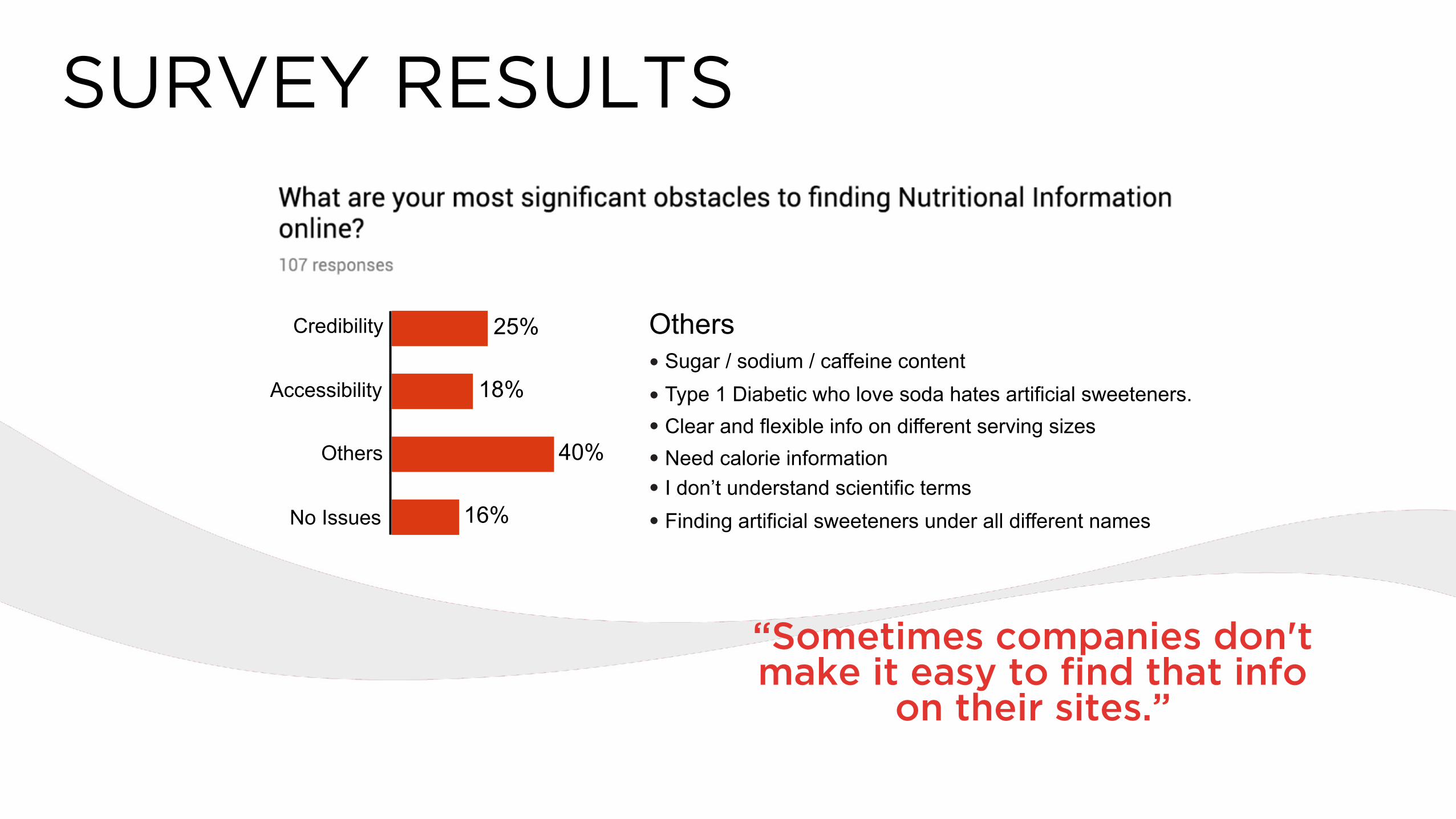
“Sometimes companies don't make it easy to find that info
on their sites.”
SURVEY RESULTS
Credibility
Accessibility
Others
No Issues
25%
18%
16%
40%
Others
Sugar / sodium / caffeine content•
Type 1 Diabetic who love soda hates artificial sweeteners.•
Clear and flexible info on different serving sizes•
Need calorie information•
I don’t understand scientific terms•
Finding artificial sweeteners under all different names•
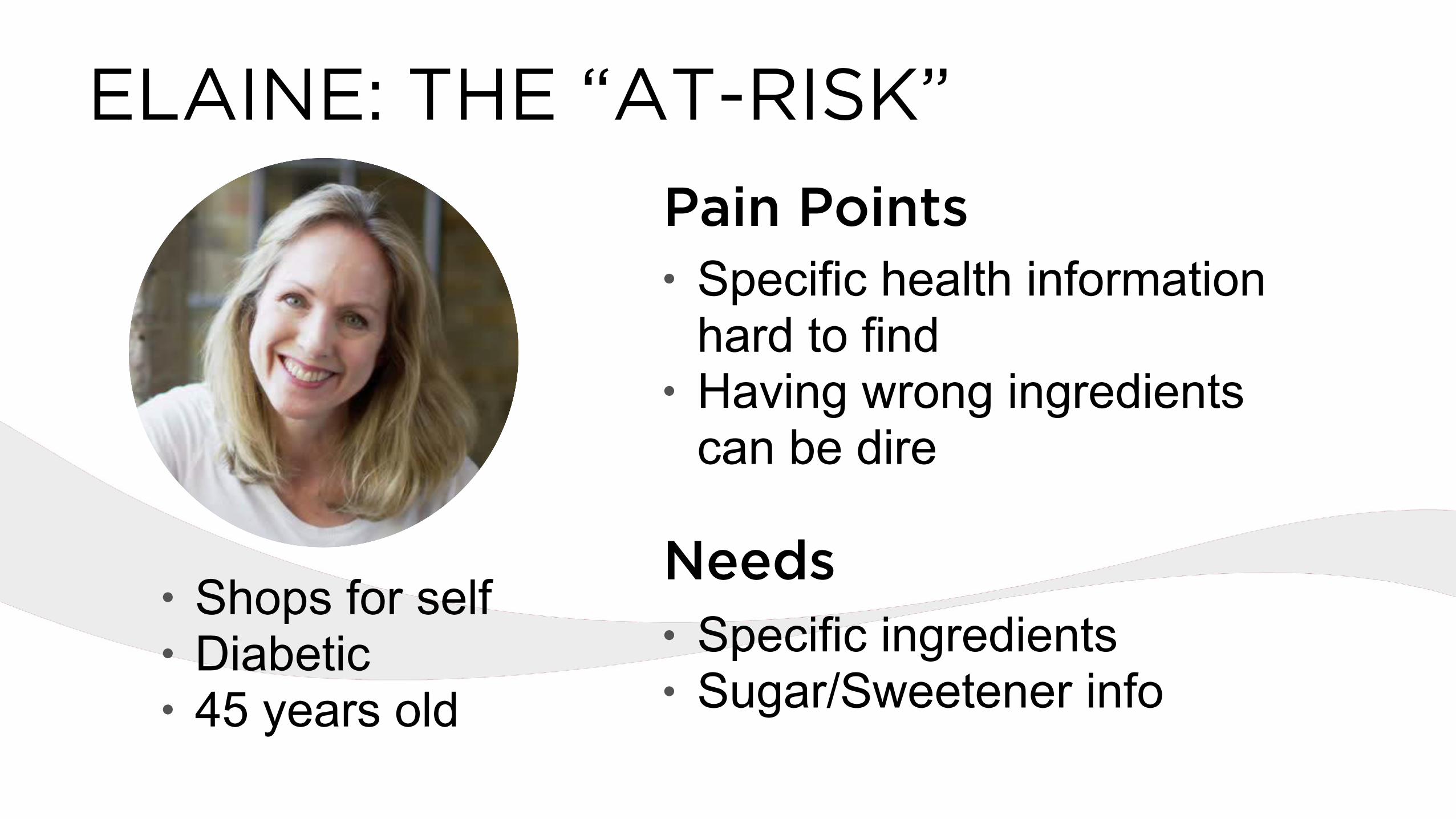
ELAINE: THE “AT-RISK”
• Shops for self • Diabetic • 45 years old
• Specific health information hard to find
• Having wrong ingredients can be dire
• Specific ingredients • Sugar/Sweetener info
Pain Points
Needs

• Shops for family • Tries to be healthy
but not priority • 32 years old
• Scrutinizes nutrition facts
• Prefers organic products
• 24 years old
• Unclear information for products & ingredients
• Finding kid-friendly health options
• Nutrition balance • Knowledge on
more options
• Unaware of healthy brands and options
• Healthy choices • Find out healthier
brands and options • Search products /
ingredients
NeedsPain Points Pain Points Needs
BETTY: THE “SHOPPER MOM” LEVI: THE “MILLENIAL”

SITE MAP

USER FLOW

|CREATE

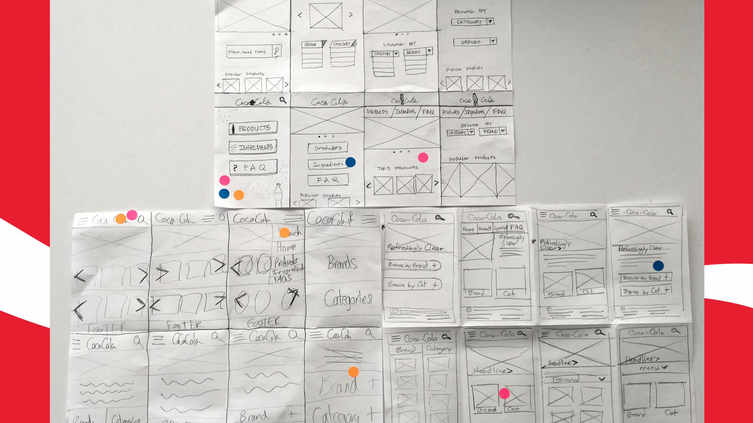

MOBILE SKETCHES

MOBILE SKETCHES

WEB SKETCHES

WEB SKETCHES

PAPER PROTOTYPING
"I understand two search bar options. One is for entire web search, other one is specific
search option."
"I like tapping because I can switch info easily."

92% 8%
• Less clicks
• Clear navigation
• Clean appearance
• More clicks
• Lower discoverability
• Inefficient
A/B TESTING

100% 0%
A/B TESTING
• Fun interaction • Easier to
select letter • Clean layout
• Harder to select letter
• Unattractive appearance
100% 0%

USER FEEDBACK
• More products feature • Letter carousel on glossary • FAQ Infographics • More filter options (caffeine, sugar,
and calories)
• Ambiguous symbol - I don’t know
what it means

|BUILD

1
2
3
4
5
Home Page
1 Global Masthead - contains Coca-Cola Product Facts logo and Search button.
2 Global Navigation - anchored at the top of the page under the masthead. Red indicates thecurrent page.
3 Brand Messaging spots - includes Hero Image with headline overlaid, text and ‘more’ button for cases where linking to a supporting article is needed.
4 Top FAQs section - 3 buttons, each containing one of the top FAQs. Buttons link to related article page.
5 Browse Products Button - links to the Product Listings page.
6
6 Global Footer - contains copyright info. Links to Terms, Privacy Policy, Contact, Coca-Cola Journey, My Coke Rewards, About Our Ads.
1 2
3
4
5
6

7
8
10
9
Product Listings
7 Back Button - added to the Global Masthead on every page but the Home Page.
8 Filter Search Button - opens up Filter Search screen.
9 Product Grid - 2 column, 6 row grid (12 products per page). Product represented by an image and name, both link to the Product Information Page.
10 Page Selection - numbers click to another page of products.
9
10
8

21
22
25
Filtered Search
21 Brand dropdown - select from brand options.
22 Caffeine dropdown - select from None, High to Low, Low to High
23 Sweetener - select from None, High to Low, Low to High
24 Calories - select from None, High to Low, Low to High
25 Apply Filter - pulls up products relevant to selected filters on Product Listings page
24
23

11
12
15
16
17
Product Page
11 Product - includes image, product name, product description.
12 Nutrition/Ingredients section - Nutrition and Ingredient info are selectable by tab. White tab is the current selection. Nutrition is the default.
13 Size drop down - drop down menu to select from available sizes. Nutritional information and product image (above) change based on selection.
14 Flavor drop down - drop down menu to select from flavors associated with the product. Nutritional information and product image (above) change based on selection.
15 Nutritional Information - information is laid out in a similar style to how it is presented on the product.
17
16 More Products - products similar to the product featured.
13 14
Brand Site button - links to the brand site in a new window.
11
12
13 14
15
16
17

18
19
20 Product Page
18 Health Condition Alert - Clickable alert icon and text. Opens up modal.
19 Information Modal - describes pertinent information related to health conditions like allergies, diabetes, known sensitivities to chemicals. Includes close button.
20 Ingredients - listed product ingredients. Each ingredient is clickable and opens a modal with summary information, a link to the ingredient article page and a close button
18
19
20

27
26
28
Ingredients Page
26 Ingredient Message - section for messaging regarding Coca-Cola’s ingredient information. Includes link to Article Page for more information.
27 Ingredients Search - searches within ingredients listings. Uses auto-suggest to offer potential options as you type.
28 Alphabet carousel - slide with finger to select a letter. Slide desired letter into center box and tap to generate list of ingredients starting with that letter.
29
29 Search Results section - generates results based on Search or Alphabetical selection. Search listing displays Ingredient Name, summary text, ‘more’ button linking to the ingredient’s article page.
26
27
29

30
31
FAQ Category Page
30 FAQ Search - searches within FAQs for relevant results. Results displayed on FAQ Results Page. Uses auto-suggest to offer potential options as you type.
31 FAQ Categories - takes the user to the FAQ Results Page with results that occur within that category.
32 Contact Section - generates an email to Coca-Cola.
32
30
31
32

33
FAQ Results Page
33 Questions section - listing of questions relevant to either search or selected category. Answer button links to article page.
33

34
Article Page
34 Article Page - multi-use page layout. Used for pages for specific ingredients, answers to FAQs, or any other situation an article is needed. The layout include a hero image, title, subheads, body text, supporting images and/or info graphics.
35 Sources Section - Links to external source articles
35
35
34

36
Search Results
36 Search Results - relevant results to global search. Results include title, summary text (2 lines), and ‘more’ button linking to associated article page.
37
38
37 More Products - products relevant to global search.
38 Related FAQs - FAQ buttons relevant to global search. Links to article page.
36
37
38

MOBILE USABILITY TESTING
"That health balloon is useful, I know people that could use that."
"It does not link other page which is good for mobile
version."

WEB USABILITY TESTING
"I can trust info now. It is more rigid and
less biased."

USER FEEDBACK
• Pop up information instead of
redirecting to another page • External sources - Credibility • Specified search bars • Alert message • Search box drop
• Confused by mobile toggle • Confused by swipe interaction • Needed X button on pop-up box

|REFINE


|NEXTSTEPS