Process Book
26
Design
-
Upload
terren-spencer -
Category
Documents
-
view
212 -
download
0
description
Â
Transcript of Process Book
Design


This course kicked my butt. I came into this class thinking it was going to be something different than it actually was. I came into the first day of class hoping I was going to learn how to play t-ball but instead I was put on the little league team as starting pitcher. If that metaphor was effective at all then I am more proud of it than anything that I came up with in this course. To be honest, I was very excited to take this course but that excitement diminished as the semester went on. But, in retrospect I know I learned a lot about what it takes to be a graphic designer and that’s the point right? rse but that excitement diminished as the semester went on. urse. To be honest, I was very excited to take this course but that excitement diminished as the semester went

The objective of the D* school crash course was to start thinking like a designer by creating an abundance of ideas and then condensing them down to the most important. I enjoyed how it forced a structure to the design process. I enjoyed this crash course because it gave me a taste of what a design process is like. I came into this class expecting to learn how to think like a designer.
To generate work like a designer and this crash course was a great “get your feet wet” activity for what is to come.I struggled with the aspect of generating ideas through pictures and not being able to write words. I didn’t understand why I couldn’t be able to explain my designs. But I realized that a good design should be able to explain itself.

Te objective of the dot/ line process was to communicate meaning through abstraction. Using elements of value, scale, and visual hierarchy we were instructed to convey meaning to four words using only dots and lines. The four words I chosen to tackle were: Stability, Rejection, Scarcity, Abundance. Further criteria include only using combinations of: 1 dot + 1 line, 1 dot + 2 lines, 2 dots + 2 lines, All dots, etc...
This project proved difficult for me because I didn’t understand that what might convey scarcity to me (for instance) may not always convey scarcity to someone else. It wasn’t until after the critique of this project did I understand the importance of it. I realized that this simple dot/line practice is representative of what graphic design tries to convey; that is, meaning without explicit illustration.


These are are my final Dot/line iterations. Notice the unstraight edges of the white paper and the leftover glue residue on the black border. I didnt pay too much attention to detail obviously and my art suffered because of it. While my craft is subpar to say the least, my ideas for these inspirations were thought out for awhile. It took me along time to decide to use these 4 iterations.
I noticed that my iterations probably only make sense to me which was the opposite of the purpose of this project. Therefore, I took this project as a lesson to keep in mind for the future while doing my other projects. *Graphic Design isn’t effective if it doesn’t communicate well.


I made numerous iterations before settling on my 4 final iterations. These are some of the iterations I made before I narrowed them down. I was instructed to work abundantly and try many different ways to evoke the meaning of the word I had chosen.

For our designer presentations, we had to research a designer and come up with a power point presentation about them to present to the class. I chose to do my presentation on Paula Scher. She has been a graphic design king pin for a couple decades now. I chose to do my presentation on her because she has done phenomenal work with map art and environmental art.
She was very fun to research because there are numerous videos on YouTube of her giving talks and they are all very fascinating. She is just a very smart designer. She was definitely my favorite designer out of all of the designers that were presented in class.
Designer Presentation

The Objective of the word iteration project was to get us designing abudantly and to think about words abstracly. The word I chose to tackle was flow. I thought about the different meanings of the word by making a word map. This assisted me in designing iterations of the word
I filled a two page spread with different iterations for flow. Yet none of them really stood out to me as being strong enough. So I came up with all new ideas for my final iterations.


The toughest media for me to utilize was the master artist renditions because I could not think of what I artist’s style I could replicate. Luckily, the bright idea of using American Gothic as the style came to me and I rolled with that. It turned out pretty goofy but it was my favorite iteration that I made. If I had to continue with this object iteration project for a year I think I could come up with a pretty cool logo as well as some t-shirt designs and a penguin car decal. If you are interested in this, hit me up! Just kidding.
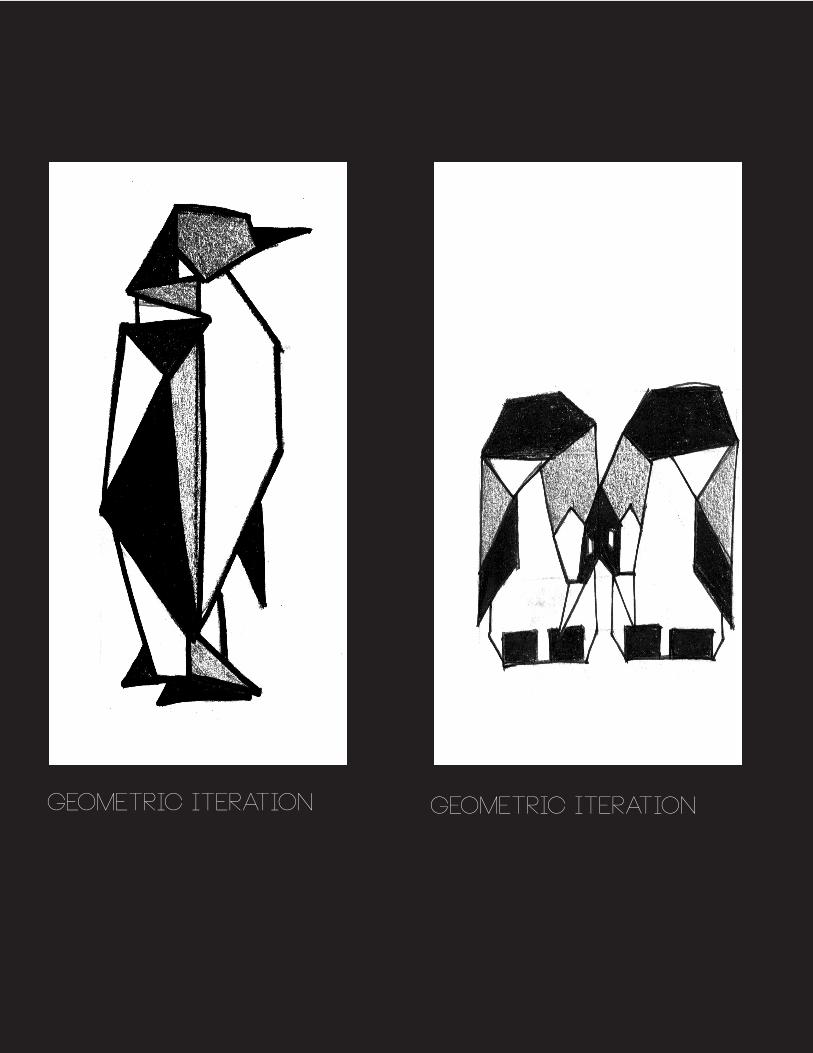
The purpose of the object iteration was to think about ordinary objects in a different light. We were to really study the most distinctive aspects of our objects in order to portray them more a bstractly. We had to portray our objects through collages, text collages, master artist renditions, geometric iterations, and continuous line iterations. I chose to focus on a penguin for my object iteration. This project was a learning experience because it made you stretch your imagination as far as it could. Once you your brain is thoroughly fatigued from all the stretching of your imagination, that is when you have successfully generated quality object iterations.


The objective of the instructional was to effectively communicate a step-by-step tutorial of a task through a poster. I chose to illustrate how to string a guitar. I wrote the tutorial before I thought about the design of the poster. I wrote the tutorial very nonchalantly and my target audience was sarcastic teenagers. So, I thought about how I could communicate to this audience through the illustration of the poster. I came up with a very unorderly but organized use of text, a neutral color pallet, and a grungy guitar head as the main illustration. This is what I thought would most effectively communicate to my audience.


The children’s book project was a project that got us acquainted with working with a client. We were paired up with students in an education class to illustrate their children’s stories. Together, we got to produce a children’s book. The story I was given to illustrate was about a princess trying to find her talent. She finds out at the end that her real talent was helping her sisters out. Not the greatest talent in the world in my opinion but it’s a talent nonetheless I guess. My partners were very easy to work with and they gave me a lot of control on how the book was going to be illustrated. This was a good thing because I am not the most talented artist. So, I was very minimalistic when it came to the illustrations.
When approaching the character designs, I drew them in resemblance of their ‘talent’. They are very minimally designed and drawn. I used watercolor to put color into them. If I had to do this again I might discard the minimalist style that I utilized and I would try to take a more detailed approach to the project. Maybe, add some background? Expand the color pallet? When I become a children’s book illustrator I will try to incorporate these ideas.