PROCESS
34
-
Upload
niki-macrae -
Category
Documents
-
view
214 -
download
0
description
A book documenting the process involved in Beauty, a collaborative moving image piece i made with Maximillian Malone.
Transcript of PROCESS


Over the past two months a wide variety of processes and techniques
have been required to carry out the Words in Motion brief. The journey has involved processes from tracing to laser cutting as well a variety of software pro-grams to bring the project together.
Through trial and error obstacles have been overcome and valuable lessons have been learnt; from the DIY camera tracks that we assembled, to the importance of understanding software. Planning and time management along with detailed storyboarding are all aspects that we have learnt cannot be overlooked.
Filming before sunrise and editing into the night were how we finished the 90-second motion piece along with this publication. The time and patience to get to the final result has been very rewarding and this process book here gives a brief insight into the efforts and processes that were involved with the motion picture.
◆
Maximillian Malone & Niki Z Macrae

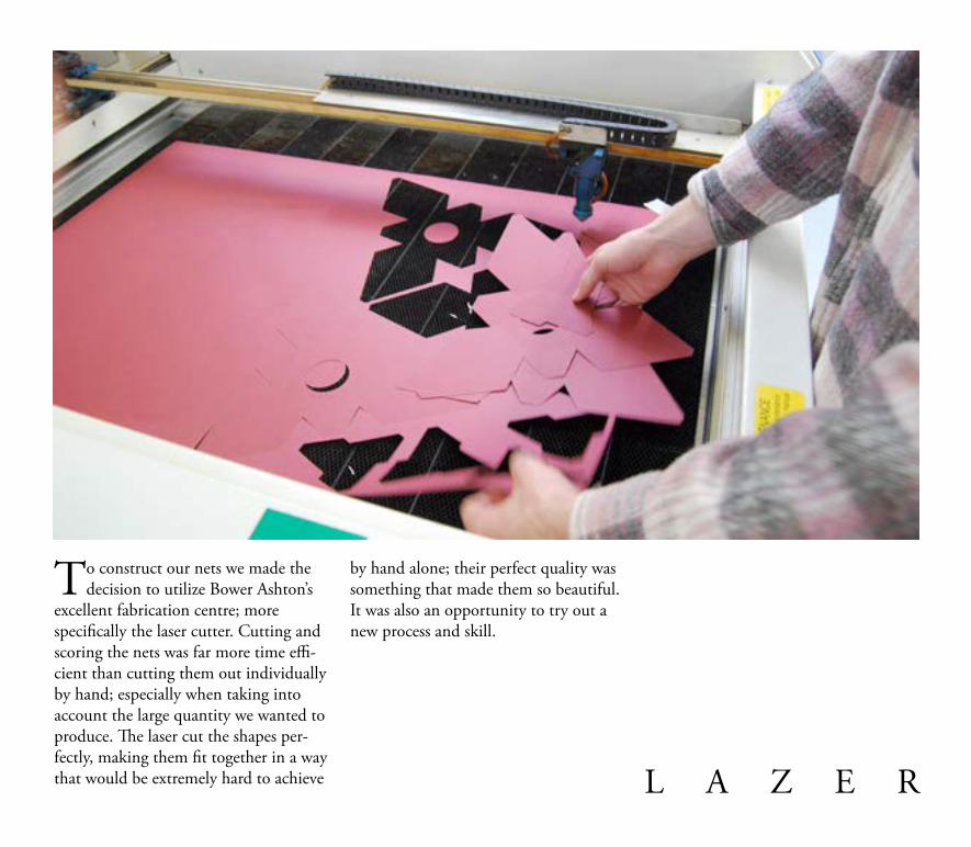
To construct our nets we made the decision to utilize Bower Ashton’s
excellent fabrication centre; more specifically the laser cutter. Cutting and scoring the nets was far more time effi-cient than cutting them out individually by hand; especially when taking into account the large quantity we wanted to produce. The laser cut the shapes per-fectly, making them fit together in a way that would be extremely hard to achieve
by hand alone; their perfect quality was something that made them so beautiful. It was also an opportunity to try out a new process and skill.
L A Z E R

Playing with lasers is fun

Constructing the nets was a straight for-ward task yet time consuming as Niki can not use double sided tape.
Once stuck together we got our first sense of whether the shapes could illus-trate the poem. The isometric triangles could be arranged and pieced together in many formations and when arranged into different forms and clusters they started to resemble the visual language
of the poem. The objects when docu-mented together on flat paper back-grounds were not helping to compli-ment our desired atmosphere, further experimenting then took place to put the objects into the natural environ-ments as they would contrast to the form as well as continue Owens lan-guage choices of nature and beauty.

Early experiments into different formations


W O R D s

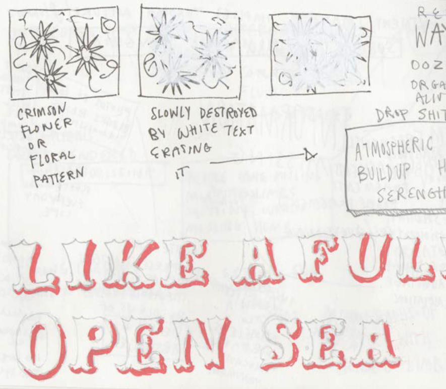
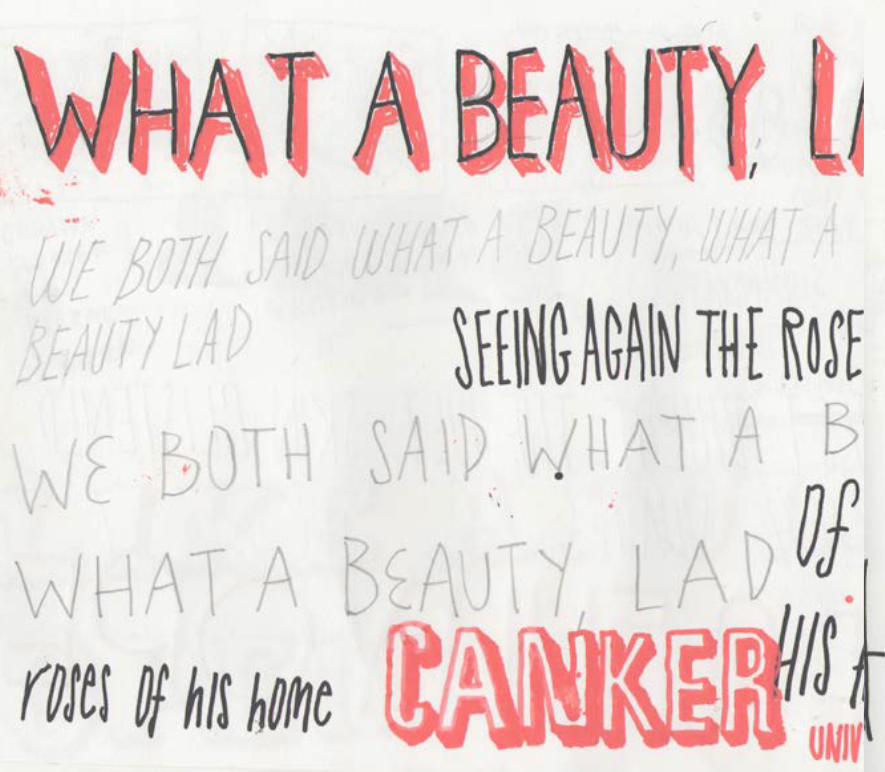
When we thought about lettering we decided there were two main
tones in the poem, one louder, more aggressive and punchy, the other much quieter and sad. With this in mind, we started looking through early 20th century type design books for inspira-tion. We made the decision to hand render the lettering, as it was more in keeping with our tactile sculptures, and felt more human. After a bit of experi-
mentation we decided on Buxom, for its bold, and aggressive feel. It also seemed to echo the kind of industrial type you might find painted on the side of an army vehicle. One thing that interested me about it was the drop shadow, with big areas of blank space that the video could also be seen through the text. The secondary type is just my thin, upper-case handwriting, its quite subtle and a nice contrast to the loud display type.
At first we were going to draw up the display type free hand, to give it a more handmade look, but this was prag-matically unfeasible and so to give it the hand rendered look we instead traced it by hand.

An early type and collage experiment involving a similar feeling typeface to Buxom, it looks very digital, stark and cold in contrast to our tactile sculptures.

After tracing Buxom we played with dif-ferent ways of filling the type. This idea was scrapped as it was too distracting from the message and visuals.
For the smaller, understated hand writ-ing type, a tablet was used to input it direct to illustrator. In the end the dis-jointed way a tablet works defeated us, and so we settled for good old fashioned pen and paper.


One concept was to animate the words using traditional stop-motion tech-niques; cutting the letters individually and placing them onto a lightbox with handmade paper over the top. This gave a warm hue and glow to the word which dulled the font making it softer yet still legible.

s H O O T I N G
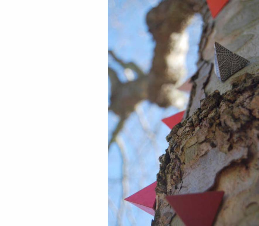

The ideal location was discovered on a weekend cycle trip. Bedminster’s
Victoria Park has a collection of old, chopped down trees that provided the ideal backdrop for our paper sculptures. The flowing contours in the wood, the sharp and vicious cankers and all the colours of the natural environment pro-vided a great contrast to our isometric paper constructions.
Documenting all perspectives and angles as stills started to help with the story-board process as we could see viewpoints that would compliment the words of the poem.
Careful consideration was taken to angle shots and this began to build our own environment within the park. The most successful photos from our collection were ones that focused on small details, fully cropping only a tree into the frame.
The phrase “Tree Wall” was used to describe a shot that had only tree in the frame and no sky, grass or park in shot; this helped to create our own environ-ment that became more unfamiliar and more intriguing.


BACK COVER????!!!!!