Pringles stix mke_proposal_v1
10
Project Proposal: Pringles Stix Package Redesign Michael Lau
Transcript of Pringles stix mke_proposal_v1
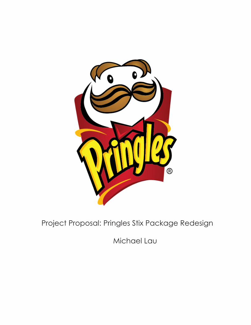
Project Proposal: Pringles Stix Package Redesign Michael Lau
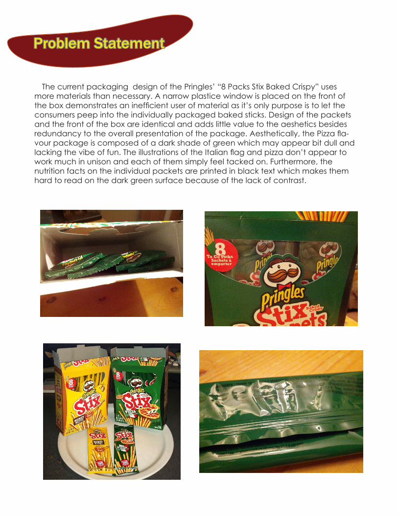
Problem Statement
The current packaging design of the Pringles’ “8 Packs Stix Baked Crispy” uses more materials than necessary. A narrow plastice window is placed on the front of the box demonstrates an inefficient user of material as it’s only purpose is to let the consumers peep into the individually packaged baked sticks. Design of the packets and the front of the box are identical and adds little value to the aeshetics besides redundancy to the overall presentation of the package. Aesthetically, the Pizza fla-vour package is composed of a dark shade of green which may appear bit dull and lacking the vibe of fun. The illustrations of the Italian flag and pizza don’t appear to work much in unison and each of them simply feel tacked on. Furthermore, the nutrition facts on the individual packets are printed in black text which makes them hard to read on the dark green surface because of the lack of contrast.
Problem Statement Users and Values
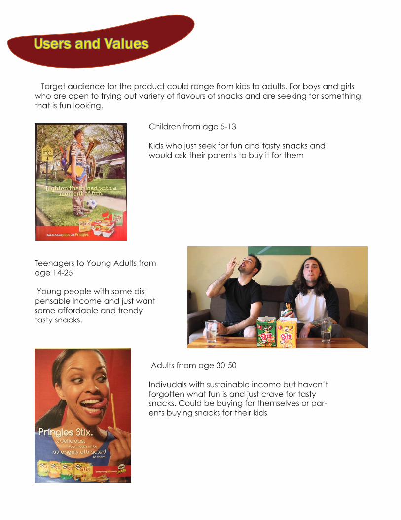
Target audience for the product could range from kids to adults. For boys and girls who are open to trying out variety of flavours of snacks and are seeking for something that is fun looking.
Children from age 5-13 Kids who just seek for fun and tasty snacks and would ask their parents to buy it for them
Teenagers to Young Adults from age 14-25 Young people with some dis-pensable income and just want some affordable and trendy tasty snacks.
Adults frrom age 30-50 Indivudals with sustainable income but haven’t forgotten what fun is and just crave for tasty snacks. Could be buying for themselves or par-ents buying snacks for their kids
Context
Staying true to the current Pringles slogan “You Don’t Just Eat’em”, the Pringles Stix are also suppose to fun and tasty snacks that can easily be shared with friends and family.
Individual packets makes it easy to carry around and eat on the go
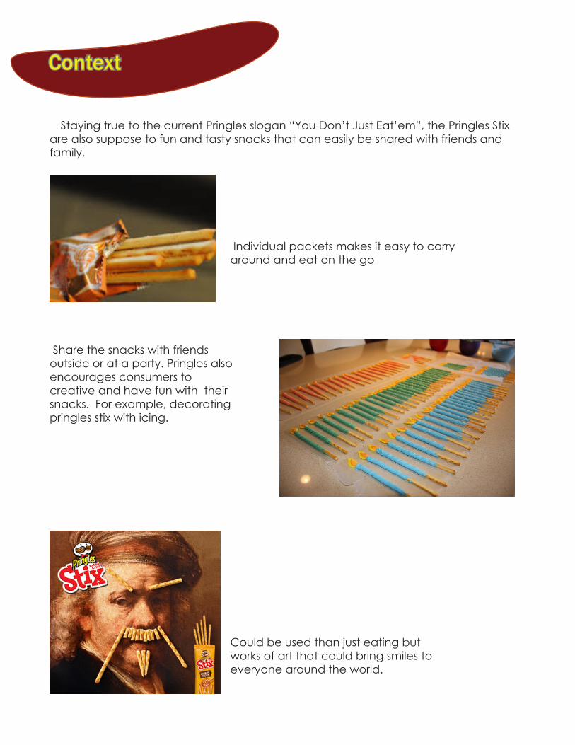
Share the snacks with friends outside or at a party. Pringles also encourages consumers to creative and have fun with their snacks. For example, decorating pringles stix with icing.
Could be used than just eating but works of art that could bring smiles to everyone around the world.
Context Market Research and Analysis
Category Analysis The Pringles Stix is a relatively new product that was launched under the Pringles brand in 2013. Unlike, Pringles potato chips, Pringles Stix are seasoned cracker sticks that comes in flavours of pizza, honey, cheese and sugar honey. Besides being sold in 8 packs, the Pringles Stix also come in a large pack of 70 sticks.
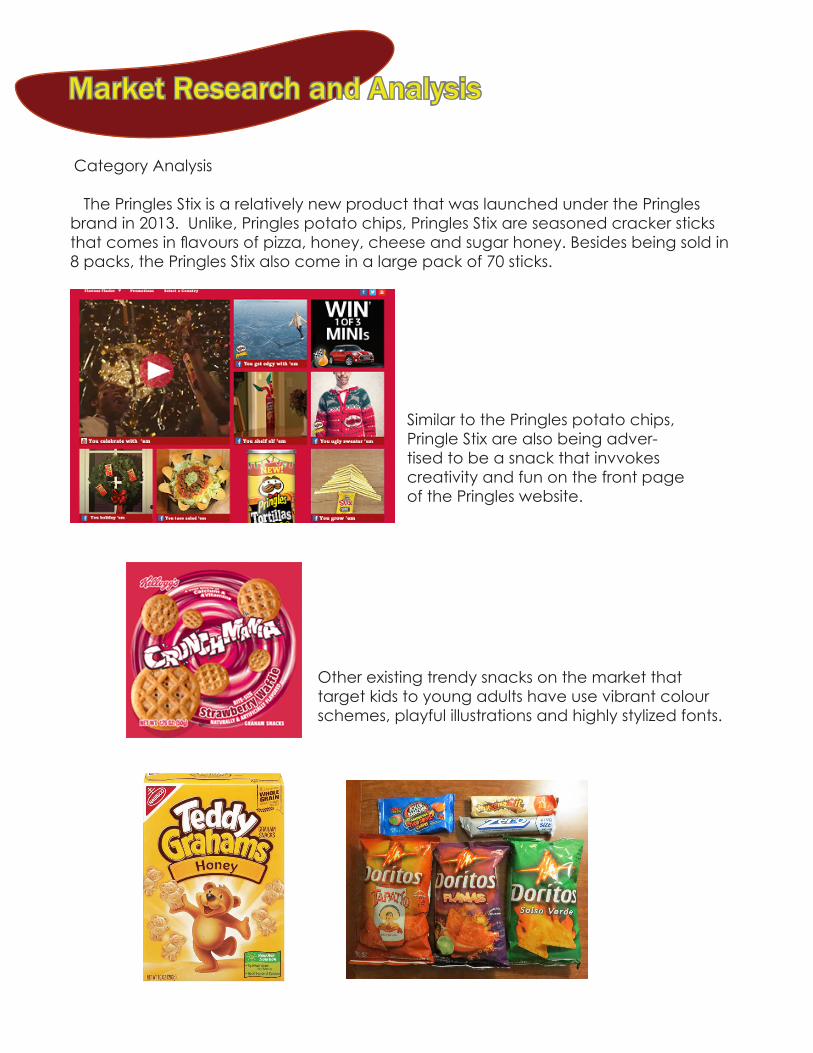
Similar to the Pringles potato chips, Pringle Stix are also being adver-tised to be a snack that invvokes creativity and fun on the front page of the Pringles website.
Other existing trendy snacks on the market that target kids to young adults have use vibrant colour schemes, playful illustrations and highly stylized fonts.

Market Research and Analysis
Competitive Analysis Currently, Pringles Six does not seem to have western competitors with the similar products, but simliar products have existed for a long time in Asia. Primarily Glicco’s Pocky and Pretz from Japan are the most popular brands for the stick biscuit snacks with countless look-a-like brands in Asia.
On the left: Pretz are salted biscuit sticks that often come in flavours like butter, salad, pizza, wasabi and etc. Right: Pocky stick flavours revolve more around dessert types like strawberry, chocolate, or co-conut coated in sugary icing
Some Pretz or Pocky boxes can’t be closed or resealed back properly once opened. The tighltly packed packets will sometimes make the bis-cuit sticks a bit of a struggle to pull out and sticks could break if pulled out incorrectly.
Consumers could be overwhelmed by the wide variety of Pretz and Pocky packages as they come in a variety of shapes and sizes.
Market Research and Analysis Market Research and Analysis
Positively, Pretz and Pocky packaging are bright and playful. The logos are printed big bold letters that consumers can instantly recognize. The flavours and image of the sticks are also emphasized by taking a significant portion of the package. One would quickly be attracted by the high contrast packages and recognize what flavour the products are quickly.
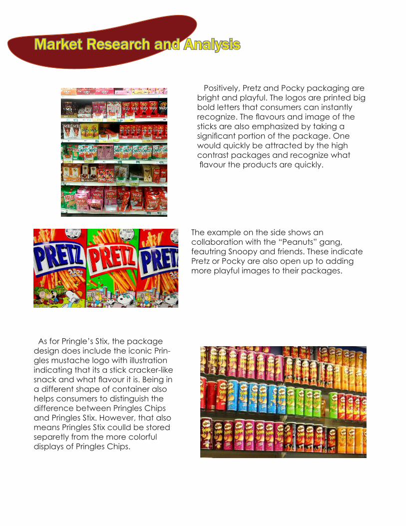
As for Pringle’s Stix, the package design does include the iconic Prin-gles mustache logo with illustration indicating that its a stick cracker-like snack and what flavour it is. Being in a different shape of container also helps consumers to distinguish the difference between Pringles Chips and Pringles Stix. However, that also means Pringles Stix coulld be stored separetly from the more colorful displays of Pringles Chips.
The example on the side shows an collaboration with the “Peanuts” gang, feautring Snoopy and friends. These indicate Pretz or Pocky are also open up to adding more playful images to their packages.

Market Research and Analysis
Pringle Stix come in a box of 8 packs, 10 packs and a pack of 70 sticks. The 8 packs and 10 packs are still stored in a box, but they both have different style of illustrations on the package which creates some brand incon-sistency. Meanwhile, the 70 sticks large pack uses a re-seable foil bag because the sticks are not organized in individual packets. The difference of 2 packs make either the 8 packs or 10 packs seem unnecessary. Adding to the inconsistency in the illustration of the 10 packs packaging design it would like seem a logical choice to be remove from the lineup.
As mentioned beefore the window on the 8 packs box is unnecessary as taking a glimpse of the side of the packets don’t add any significant appeal to the package. Instead, more space could be used to put more emphasis on the illustrations on the box instead.
Brand Positionin Objections The pringles brand is famours for it’s potato chips stored into a tuble shape container. An emphasis on popping the can and having fun with the chips is a belief that has sticked with brand for a long time. Yet the design on Pringles Stix packages are just box or bag with unerhwelming illustrations that do not really speak out the vibe of fun.
Market Research and Analysis Market Research and Analysis
Atrributes and Communication Priorities Pringles logo, image of the snack, flavour, and slogan are important for identifying the product in the store. The Pringles logo is important because it repsents the mot-to of what the brand is about. Upon looking at the iconic Pringles Logo, consumers should be perceiving the product as affordable, good and fun snacks.
Plan of Action First idea is to take out the plastic window as it’s an inefficient use of material. Secondly, is to come up with a more playful and appealing illustrated design for the package, The current design is not playful and inspiring as one just involves a small slice of cheese at the bottom of the box paired with the image of the snacks. The illustrations themselves don’t have much unison with eachother. The size of the illustrations could be expanded upon or actually include some more playful illustrations like a cartoon character. Lastly. the shape of the container is a retangular box meanwhile, the Pringles potato chips are stored in cans which are more iconic to the consumers. Perhaps changing the shape of the Pringles Stix container to also cyclinder object would make it more recognizable as a Pringles brand product.
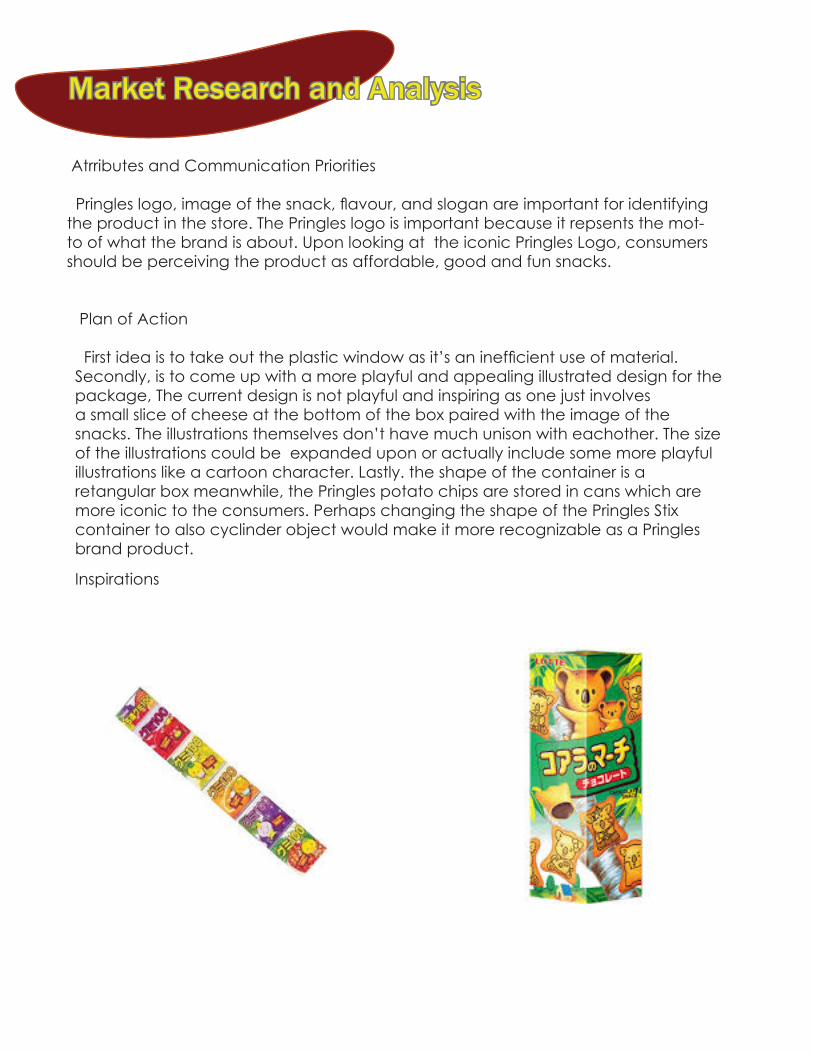
Inspirations
Market Research and Analysis
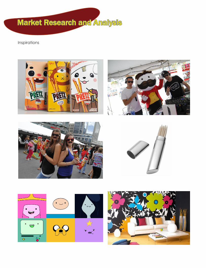
Inspirations