Pride in NSW Brand Guidelines
15
Pride in NSW Brand Guidelines March 2021 Version 1
Transcript of Pride in NSW Brand Guidelines

Pride in NSW Brand GuidelinesMarch 2021
Version 1

ContentsPurpose ..............................................................................................................................3
Rainbow Waratah usage ............................................................................................4
Allowed .......................................................................................................................4
Disallowed ..................................................................................................................4
Requests to use ..............................................................................................................5
How to use ......................................................................................................................5
Logo spacing.............................................................................................................5
Colour requirements ...................................................................................................6
Typography ................................................................................................................6
Colour palette ...........................................................................................................6
Primary logo ....................................................................................................................7
Stacked orientation with blue text ..................................................................7
Stacked orientation with white text ...............................................................7
Acceptable use of the logo ................................................................................8
Unacceptable use of the logo ...........................................................................9
Examples of use ............................................................................................................ 11
Further information .................................................................................................... 15
Pride in NSW Brand Guidelines 3
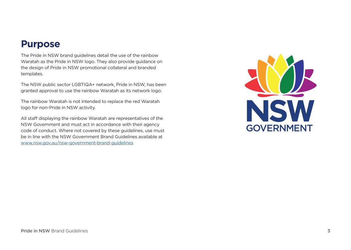
PurposeThe Pride in NSW brand guidelines detail the use of the rainbow
Waratah as the Pride in NSW logo. They also provide guidance on
the design of Pride in NSW promotional collateral and branded
templates.
The NSW public sector LGBTIQA+ network, Pride in NSW, has been
granted approval to use the rainbow Waratah as its network logo.
The rainbow Waratah is not intended to replace the red Waratah
logo for non-Pride in NSW activity.
All staff displaying the rainbow Waratah are representatives of the
NSW Government and must act in accordance with their agency
code of conduct. Where not covered by these guidelines, use must
be in line with the NSW Government Brand Guidelines available at
www.nsw.gov.au/nsw-government-brand-guidelines

Pride in NSW Brand Guidelines 4
Rainbow Waratah usage
Allowed
i. The rainbow Waratah can be used
in conjunction (but not directly next
to) the words ‘Pride in NSW'. Where
there is limited space, the design
should accommodate for appropriate
distance between the rainbow
Waratah and ‘Pride in NSW' words.
ii. The rainbow Waratah can be used
for events, communication and
merchandise by Pride in NSW.
iii. The rainbow Waratah can be used
in conjunction with other internal
government logos for cluster
LGBTIQA+ groups when endorsement
has been granted by Pride in NSW.
A text statement acknowledging
Pride in NSW should be used near the
rainbow Waratah logo for this type of
use. (See Examples of use section)
Disallowed
i. Any use of the rainbow Waratah not
by Pride in NSW must be endorsed by
Pride in NSW.
ii. The rainbow Waratah must not be
used alongside the red Waratah logo.
iii. The rainbow Waratah must not be
used on social media profile pictures
and professional networking profiles
of individual staff members.
iv. The rainbow Waratah must not be
used for any item or event that is
not supportive of the LGBTIQA+
community.
Pride in NSW Brand Guidelines 5
Requests to useTo request to use the rainbow Waratah for Pride in NSW branding on
your communications (to promote relevant programs, networks and
events throughout NSW Government), complete the Pride in NSW
request form.
Please discuss your request with your cluster branding representative
before submitting. See full list of cluster contacts.
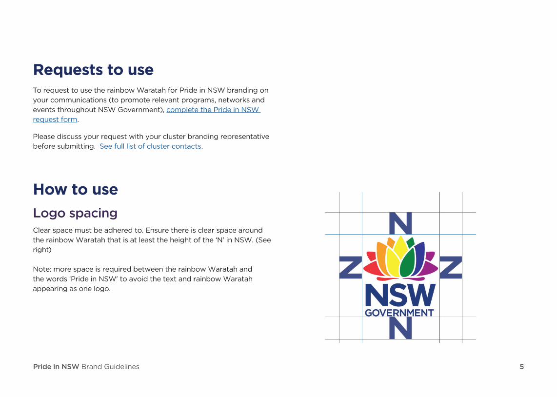
How to use
Logo spacingClear space must be adhered to. Ensure there is clear space around
the rainbow Waratah that is at least the height of the ‘N' in NSW. (See
right)
Note: more space is required between the rainbow Waratah and
the words ‘Pride in NSW' to avoid the text and rainbow Waratah
appearing as one logo.
Pride in NSW Brand Guidelines 6
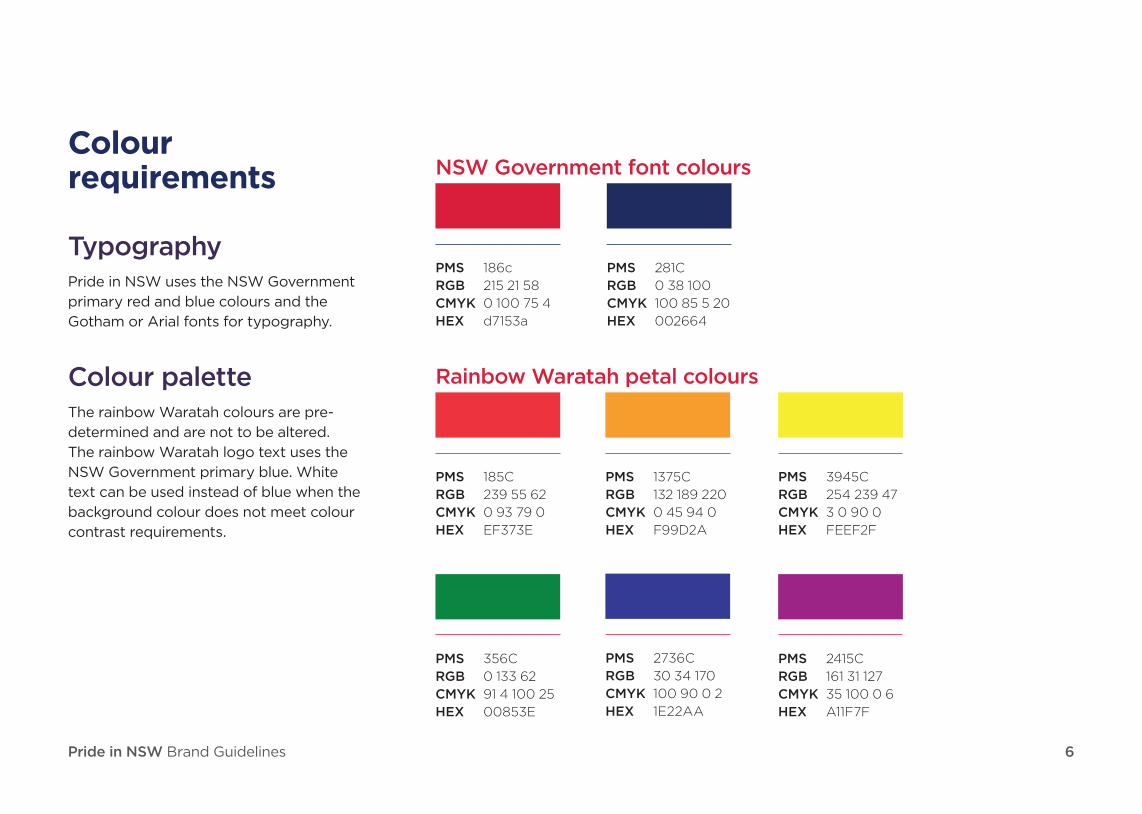
Colour requirements
TypographyPride in NSW uses the NSW Government
primary red and blue colours and the
Gotham or Arial fonts for typography.
Colour paletteThe rainbow Waratah colours are pre-
determined and are not to be altered.
The rainbow Waratah logo text uses the
NSW Government primary blue. White
text can be used instead of blue when the
background colour does not meet colour
contrast requirements.
NSW Government font colours
PMS 186c
RGB 215 21 58
CMYK 0 100 75 4
HEX d7153a
PMS 281C
RGB 0 38 100
CMYK 100 85 5 20
HEX 002664
Rainbow Waratah petal colours
PMS 185C
RGB 239 55 62
CMYK 0 93 79 0
HEX EF373E
PMS 1375C
RGB 132 189 220
CMYK 0 45 94 0
HEX F99D2A
PMS 3945C
RGB 254 239 47
CMYK 3 0 90 0
HEX FEEF2F
PMS 356C
RGB 0 133 62
CMYK 91 4 100 25
HEX 00853E
PMS 2736C
RGB 30 34 170
CMYK 100 90 0 2
HEX 1E22AA
PMS 2415C
RGB 161 31 127
CMYK 35 100 0 6
HEX A11F7F

Pride in NSW Brand Guidelines 7
Primary logoOrientation: the primary logo uses a stacked orientation
Stacked orientation with blue textThis is the primary rainbow Waratah logo. Use this orientation
wherever possible and across all formats and sizes unless
outlined within this document. Designs should take into
consideration use of this version.
Stacked orientation with white textThe mono reverse version is only to be used on dark
backgrounds when blue text is not legible or does not meet
colour WCAG 2.0 Level AA contrast requirements.

Pride in NSW Brand Guidelines 8
Acceptable use of the logo
Primary logo — stacked orientation with blue text
Primary logo — stacked orientation with white text

Pride in NSW Brand Guidelines 9
Unacceptable use of the logo
Primary logo — stacked orientation with blue text
Insufficient contrast — use mono reverse (white text) logo.

Pride in NSW Brand Guidelines 10
Government tag removed
Stacked with blue text
To be used in extreme small-scale applications, for example social media and
community network profiles.
Stacked orientation with white text
The mono reverse version is only to be used on dark backgrounds when blue text is
not legible or does not meet colour WCAG 2.0 Level AA contrast requirements.
Horizontal with blue text
To be used in extreme small-scale applications, for example social media and
community network profiles. Use of this version requires approval by the NSW
Government Brand team [email protected]
Horizontal with white text
The mono reverse version is only to be used on dark backgrounds when blue text is
not legible or does not meet colour WCAG 2.0 Level AA contrast requirements.
To be used in extreme small-scale applications, for example social media and
community network profiles. Use of this version requires approval by the NSW
Government Brand team [email protected]

Pride in NSW Brand Guidelines 11
Examples of use
Communications Microsoft Teams background
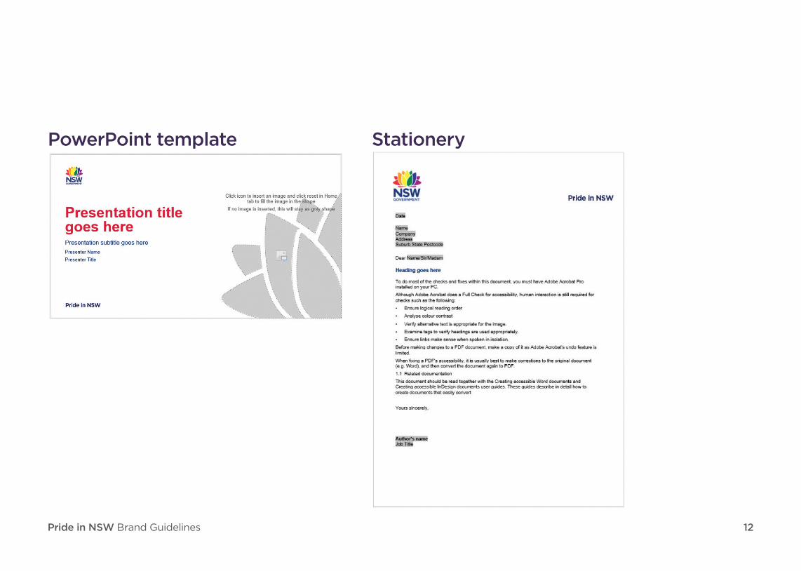
Pride in NSW Brand Guidelines 12
PowerPoint template Stationery

Pride in NSW Brand Guidelines 13
MerchandiseIf there's an option for a white t shirt or
black t shirt, preference is given to white
(to reduce the number of colours on the
design and to use blue text logo as much as
possible).

Pride in NSW Brand Guidelines 14
Pride in NSW endorsement
DCS Pride event communications
Pride in NSW Brand Guidelines 15
Further informationFor more information on Pride in NSW please contact the team
For further information on using these guidelines or to propose
changes to the items in these guidelines, contact the Public Service
Commission [email protected]
Any changes must be approved by the NSW Government Brand
Team [email protected]