Presented By Dr. Vivek B. Sathe
49
Presented By Dr. Vivek B. Sathe
Transcript of Presented By Dr. Vivek B. Sathe

Presented By Dr. Vivek B. Sathe

Spread sheet consists of rows and column, in which any data can be entered. An Electronic spread sheet is an application software package that lets one enter data values, calculate, manipulate and analyze set of data. It helps in organizing, calculating, analyzing it and producing the desired result. VisiCalc, was the first computer spread sheet program released in 1979 for Apple II computers developed by Dan Bricklin and Bob Frankston. Collection of rows and column are known as worksheet and collection of worksheet are know as workbook. By default a workbook consists three worksheets named sheet1, sheet2 and sheet3. each sheet contains 256 columns and 65536 rows in MS-Excel 2003 and previous versions. In MS-Excel 2007 the number of columns are 16384 and more than 1 million rows.
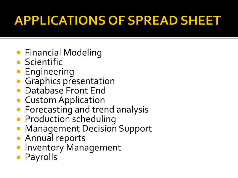
Financial Modeling Scientific Engineering Graphics presentation Database Front End Custom Application Forecasting and trend analysis Production scheduling Management Decision Support Annual reports Inventory Management Payrolls

MS-Excel for Windows Number in Apple Mariner Calc for MAC Ispread for ipad and Iphone Calligra (KCalc) sheets for Calligra office suite Zcubes for webbased Kingsoft Office is an office suite for MS-
windows, Linux and Andriod Accel Spread sheet for All Windows

MS-EXCEL 2003
Menu Driven Standard tool bar Formatting tool bar Formula bar Drawing tool bar
MS-EXCEL 2007
Ribbon Driven Quick access tool bar Office button Tab Group Dialog box launcher Formula bar
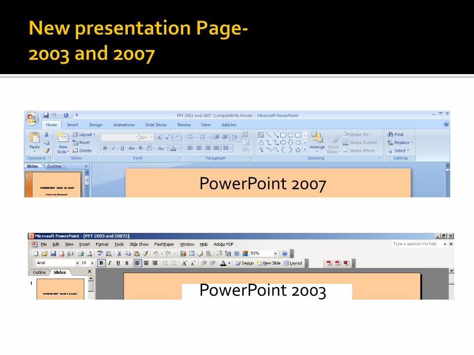
PowerPoint 2007
PowerPoint 2003

Ribbon: It replaces the previous versions menu bar and drop down menus, user interface is based on the ribbon it shows all the commonly used options needed to perform a particular task.
Office button: It replaces the file menu option i.e., from this button we can open, save, print and exit as well as the Excel options button that enables us to change Excel’s default settings.
Quick Access Toolbar: It is a small toolbar next to the office button contain shortcuts for some of the most common commands such as save, Undo and Redo buttons.

The MS Office Button is a New Feature of PowerPoint 2007. It replaces the File Menu
It is the access point to:
Create New PowerPoint presentations
Open
Save
Close

The MS Office Button also houses Recently Opened presentations Convert converts PowerPoint
files into the 2007 Format Prepare to finalize presentations
for distribution Send which distributes
presentations through facsimile or email
Publish to distribute a presentation to a server, blog, or shared workspace
PowerPoint Options (previously located under the Tools Menu)

Located next to the MS Office Button, the Quick Access Toolbar offers one-click access to the most widely used office functions.
By default, there are 3 buttons Save, Undo, and Redo.
Click on the arrow next to the toolbar, to open the customize Menu
Click the checkbox next to each feature to add and more options to the toolbar
This is a New Feature
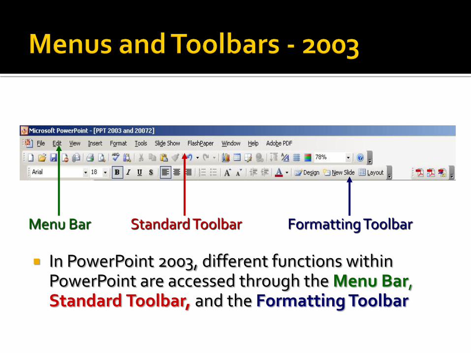
In PowerPoint 2003, different functions within PowerPoint are accessed through the Menu Bar, Standard Toolbar, and the Formatting Toolbar
Menu Bar Formatting Toolbar Standard Toolbar
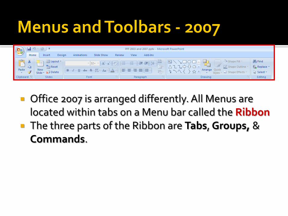
Office 2007 is arranged differently. All Menus are located within tabs on a Menu bar called the Ribbon
The three parts of the Ribbon are Tabs, Groups, & Commands.

Commands: Buttons, boxes or Menus relating to specific functions within PowerPoint
Tabs: 8 tabs representing common related activities
Groups: Sections containing Related items or tasks

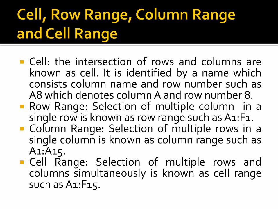
Cell: the intersection of rows and columns are known as cell. It is identified by a name which consists column name and row number such as A8 which denotes column A and row number 8.
Row Range: Selection of multiple column in a single row is known as row range such as A1:F1.
Column Range: Selection of multiple rows in a single column is known as column range such as A1:A15.
Cell Range: Selection of multiple rows and columns simultaneously is known as cell range such as A1:F15.

Formula: Formulas is a collection of operators and operands, which is defined by users. A formula is always start with equal to (=) sign in a specific cell where we want the resultant value.
Example: If we want to calculate the percentage of Obtained marks then we can define a formula in a specific cell such as :
=Obtained marks/Total Marks *100 we can also give the reference of cell instead values of cell in
formula, Such as : = C1/d1*100
When the value of referenced cell change, it will also affect the cell value of where formula is used. This is called WHATIF analysis.

Function: Functions are prewritten formulas that operates on one or more values and returns desired results. Each function is identified by a name followed by a set of arguments. It is differ from regular formulas in that we supply the value but not the operators. MS-Excel has more than 300 built-in functions divided into various categories, including; Financial Logical Math and Trigonometry Statistical Engineering Cube Square Root Information Database Lookup and Reference

Fill Series: Through this feature we can easily fill the numbers, roll numbers, any series with any format through dragging with selection of specified cell. Example: if we want to fill a column with s.no. then we use fill series option and specify the series starting and ending point.
Sorting: Through his feature we can arrange our records or data in ascending or descending order with specified column. By default order of sorting is numbers first, Capital letters, Small letters and then alphanumeric.
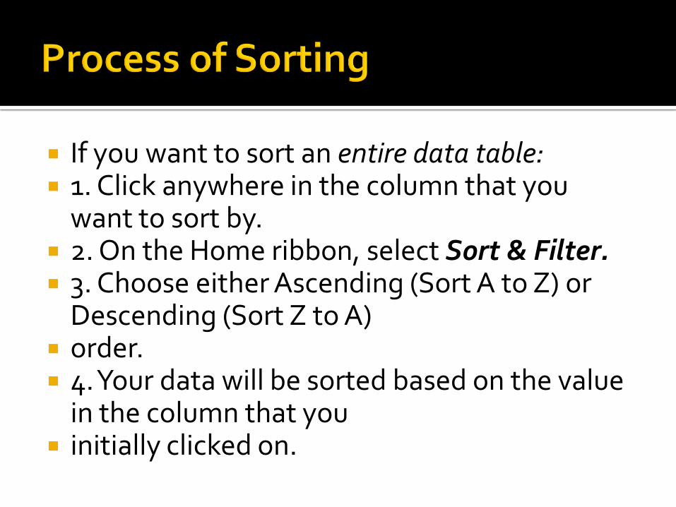
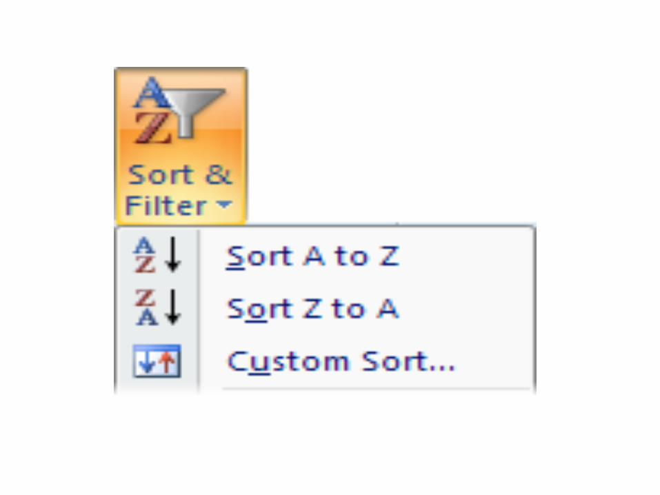
If you want to sort an entire data table: 1. Click anywhere in the column that you
want to sort by. 2. On the Home ribbon, select Sort & Filter. 3. Choose either Ascending (Sort A to Z) or
Descending (Sort Z to A) order. 4. Your data will be sorted based on the value
in the column that you initially clicked on.

If you want to sort on two or more criteria (columns), or if you want to sort a range of cells,
then you need to do a custom sort: 1. Click in the data table, or select the cells to
be sorted. 2. On the Home ribbon, select Sort & Filter,
and choose Custom Sort. The Sort Window will open.


3. In the Sort By field, use the drop-down arrows to select the column that you want to
sort by and the order (ascending or descending) to be used.
4. If you want to add another sort criterion, then click the Add Level button, and a
second details row will appear in the window. Again, choose the sort column and sort
order. 5. Add more levels (or delete levels) as required. 6. When you click the OK button at the bottom
of the window, your data will be sorted.
Filter: This feature enable us to select specific records from a group of records, that is, we can select the data or records according to the specified heading of columns.
Example: If we want to see the list of students who participated in cricket then we can put the filter on the column which have heading game. It shows a pull down menu which has multiple option according to games then select cricket from available options, it will display the name of only those student who partcipated in cricket.

The filter function lets you view just the records that you want to see!
The other records in your data table will still be there, but hidden.
To use this amazing function: 1. On the Home ribbon, select Sort & Filter, and
select the Filter option. In the first row of your data table, a drop-down arrow
will appear on the right of each column heading. When you click on a drop-down arrow, you’ll see a list
of all the values occurring in that column. Press [ESC] to close the filter list.


If you want to view records with a particular value only, click to uncheck the Select All
option, and then check one or more values that you want to view. Click the OK
button. (The example above has already been filtered on Product, Delivery month
and Customer Type, and is about to be filtered on Discount as well.)

All rows that do not contain the value(s) you checked, will be hidden from view. A
column that has been filtered will show a funnel icon next to the drop-down arrow on
the heading. 5. Repeat the filtering process for as many
columns as you need. You can remove a column filter by checking its Select All
option.
To clear your previous filter settings, select Sort & Filter, and then Clear.
To turn off filtering, select Sort & Filter, and then Filter (the same option that you originally
used to turn it on). Note that the Sort function is also available
from the Data ribbon.

Charts or Graphs: It is a visual representation of numeric values. Displaying data in a well-conceived chart can make our numeric data more understandable. To create a chart we must have some number in cells in an Excel worksheet.
Types of Charts:
Column
Line
Pie
Bar
Area
Scatter
Stock
Surface
Radar
Every chart type has category of subtypes we have to choose one of them form available lists.

A picture is worth a thousand words! Often it’s much easier to understand data when it’s
presented graphically, and Excel provides the perfect tools to do this!
It’s worth starting with a quick outline of different data types and charts:
Categorical data items belong to separate conceptual categories such as knives, forks and
spoons; or males and females. They don’t have inherent numerical values, and it doesn’t
make sense to do calculations such as finding an average category. A pie chart or column
chart is most suitable for categorical data.

It’s very easy to create a basic chart in Excel: 1. Select the data that you want to include in
the chart (together with column headings if you have them).
2. Find the Charts category on the Insert ribbon, and select your preferred chart type.

That’s it! The chart appears in the current window. Move the cursor over the Chart Area to drag it to a new position.

Modifying a chart When you click on a chart, a Chart Tools section appears on your Ribbon, with Design, Layout and Format tabs. Use the Design tab to quickly change the chart type, or to swap data rows and columns.

In this example, I’ve changed the previous chart type to Column, and swapped rows and columns. All it took was two mouse clicks!
Use the Layout tab to add a title, and to provide axis and data labels. Use the Format tab to add border and fill effects.

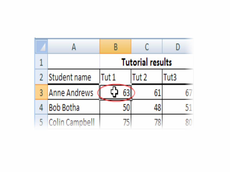
Freeze Panes: It enable us to freeze the required rows or columns in a worksheet. If we have more than 100 records with multiple column, then we can freeze the row where we define the headings in columns, which holds the heading row and hide records which can be seen by scroll bars.
If you scroll through a lot of data in a worksheet, you’ll probably lose sight of the column
headings as they disappear off the top of your “page”. This can make life really difficult –
imagine trying to check a student’s result for tutorial 8 in row 183 of the worksheet! And it’s
even more difficult if the student’s name in column A has scrolled off the left edge of the
window.

The Freeze Panes feature allows you to specify particular rows and columns that will always
remain visible as you scroll through the worksheet. And it’s easy to do!
Select a cell immediately below the rows that you want to remain visible, and immediately to
the right of the columns that you want to remain visible. For example, if you want to be able to
see Rows 1 and 2, and column A, then you would click on cell B3.

On the View tab, click Freeze Panes, and select the first option.
If Freeze Panes has already been applied, then the ribbon option automatically changes to Unfreeze Panes.

Pivot table reports, or pivot tables as they are often called, can help you answer questions about your spreadsheet by analyzing the numerical information in various ways. If you work with spreadsheets with a lot of data, pivot tables can be an extremely useful tool. Pivot table reports give you power because you can quickly find the answer to many different questions and can manipulate your data in many different ways.
Why are They Named Pivot Tables? You may be wondering why it is called a pivot table.
Basically, pivot tables allow you to pivot, or move, data so that you can produce answers to questions. Once you create a pivot table, you can very easily see what effect pivoting the data has on the spreadsheet information.
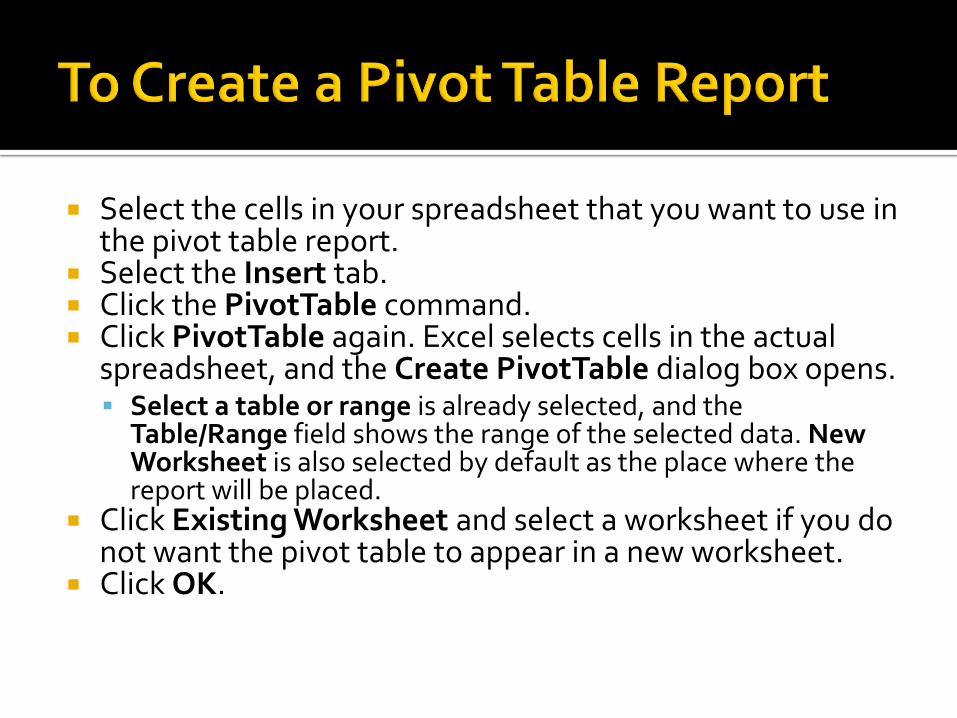
Select the cells in your spreadsheet that you want to use in the pivot table report.
Select the Insert tab. Click the PivotTable command. Click PivotTable again. Excel selects cells in the actual
spreadsheet, and the Create PivotTable dialog box opens. Select a table or range is already selected, and the
Table/Range field shows the range of the selected data. New Worksheet is also selected by default as the place where the report will be placed.
Click Existing Worksheet and select a worksheet if you do not want the pivot table to appear in a new worksheet.
Click OK.


Creating a Pivot Table Report If you use the sample spreadsheet to create a
pivot table, you can see that the column headings are salesperson, region, account, order amount, and month. When you create a pivot table, each column label in your data becomes a field that can be used in the report. The Field List appears on the right side of the report, while the layout area appears on the left.

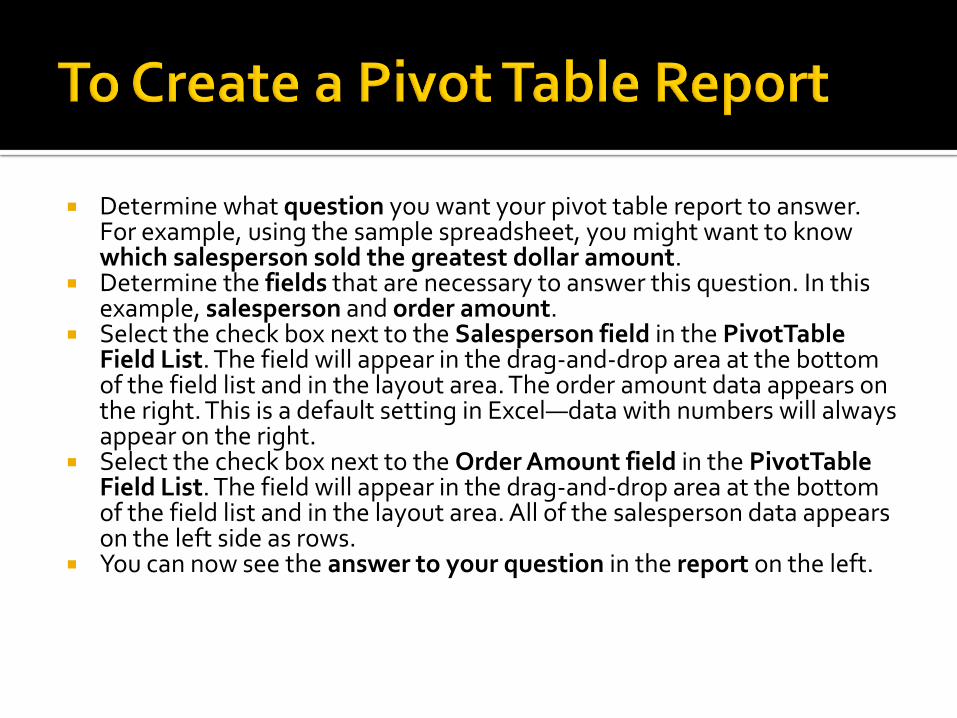
Determine what question you want your pivot table report to answer. For example, using the sample spreadsheet, you might want to know which salesperson sold the greatest dollar amount.
Determine the fields that are necessary to answer this question. In this example, salesperson and order amount.
Select the check box next to the Salesperson field in the PivotTable Field List. The field will appear in the drag-and-drop area at the bottom of the field list and in the layout area. The order amount data appears on the right. This is a default setting in Excel—data with numbers will always appear on the right.
Select the check box next to the Order Amount field in the PivotTable Field List. The field will appear in the drag-and-drop area at the bottom of the field list and in the layout area. All of the salesperson data appears on the left side as rows.
You can now see the answer to your question in the report on the left.


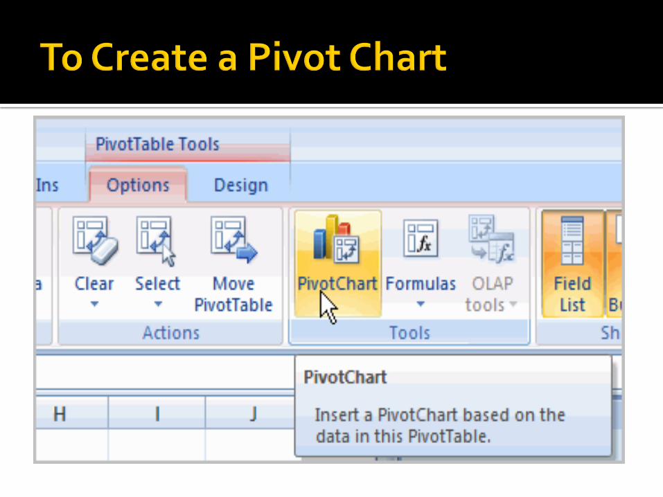
To Create a PivotChart Select the Pivot Chart command from the
Options tab. The Insert Chart dialog box appears.
Select the chart you’d like to insert. Click OK. The chart will now appear on the
same sheet as the Pivot Table. The information in the chart includes the
information in the pivot table, rather than all the original source data.