Presentation Secrets
38
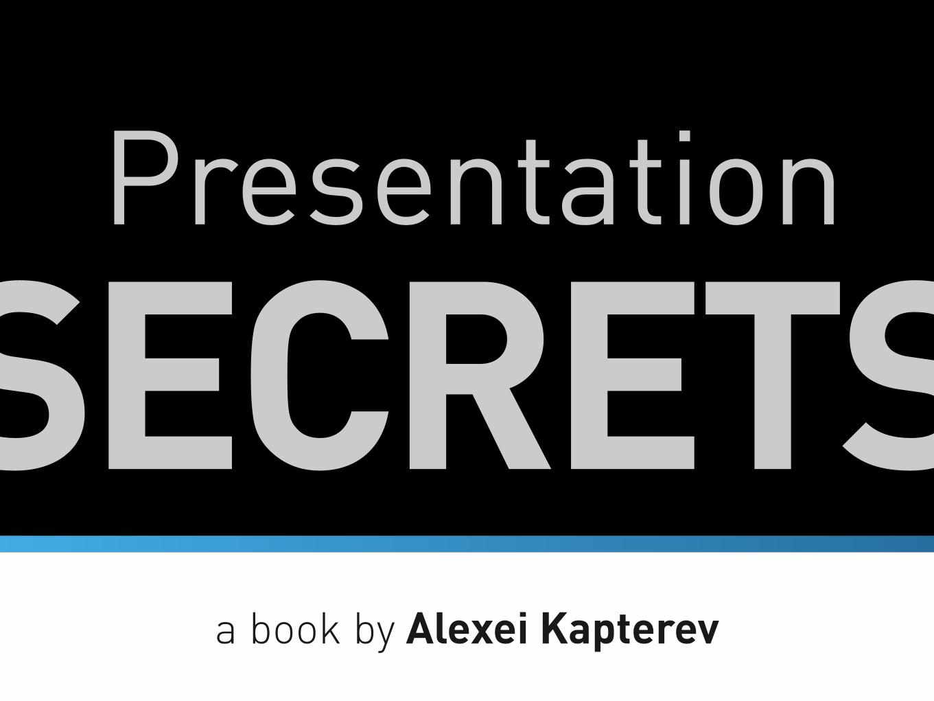
SECRETS Presentation a book by Alexei Kapterev
-
Upload
alexei-kapterev -
Category
Education
-
view
393.967 -
download
0
Transcript of Presentation Secrets
SECRETSPresentation
a book by Alexei Kapterev
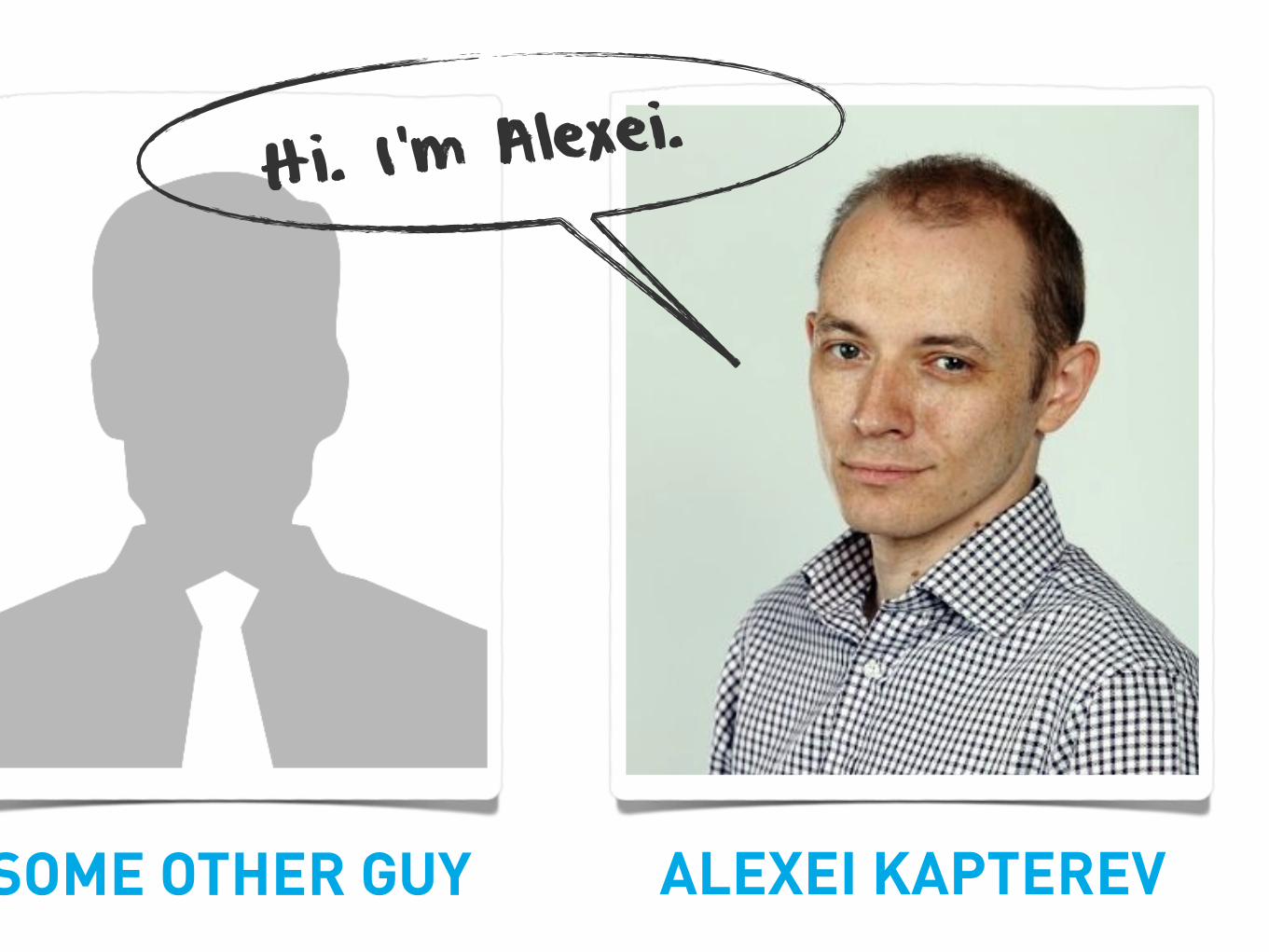
Hi. I’m Alexei.
ALEXEI KAPTEREVSOME OTHER GUY
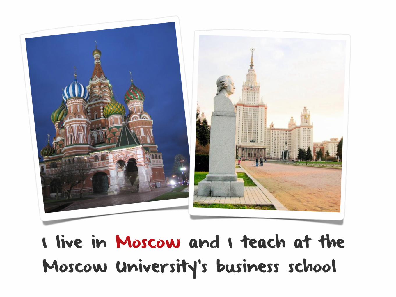
I live in Moscow and I teach at the Moscow University’s business school
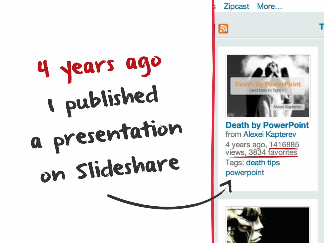
4 years ago
I published
a presentation
on Slideshare
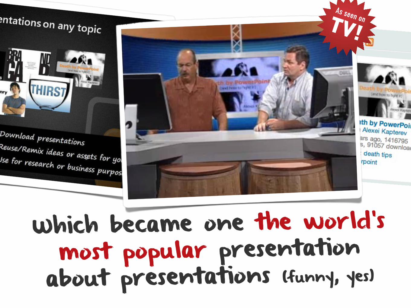
As seen on TV!
Which became one the world’s most popular presentation
about presentations (funny, yes)

But let
a small confession...me make

Back then I wasn’t really much of a guru myself
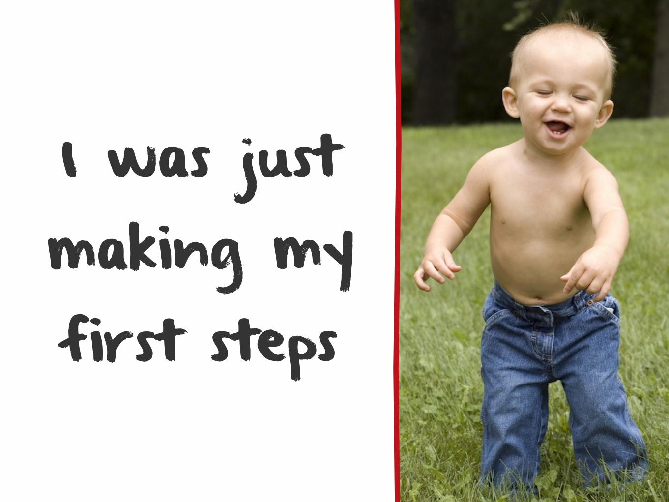
I was just making my first steps
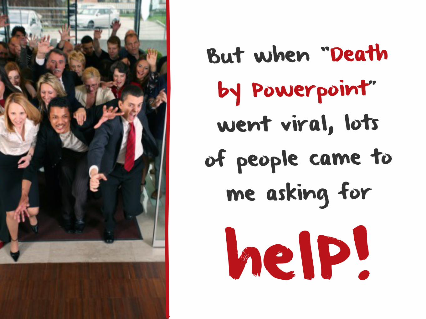
But when “Death by Powerpoint” went viral, lots
of people came to me asking for
helP!

I had no choice but to become an expert
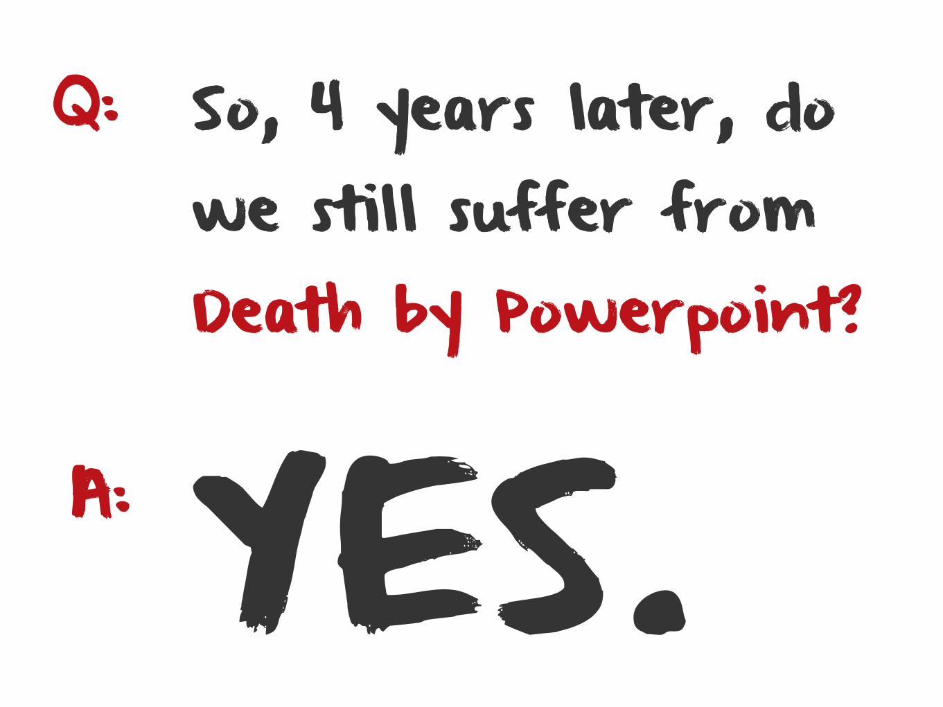
Q:
YES.A:
So, 4 years later, do we still suffer from Death by Powerpoint?
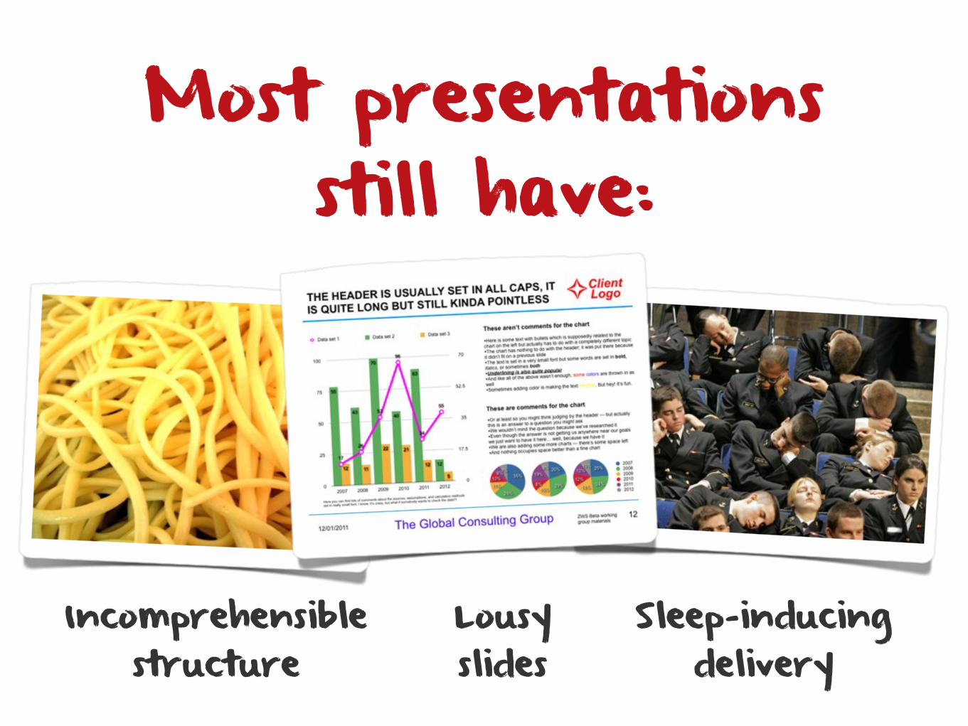
Incomprehensible structure
Lousy slides
Sleep-inducing delivery
Most presentations still have:
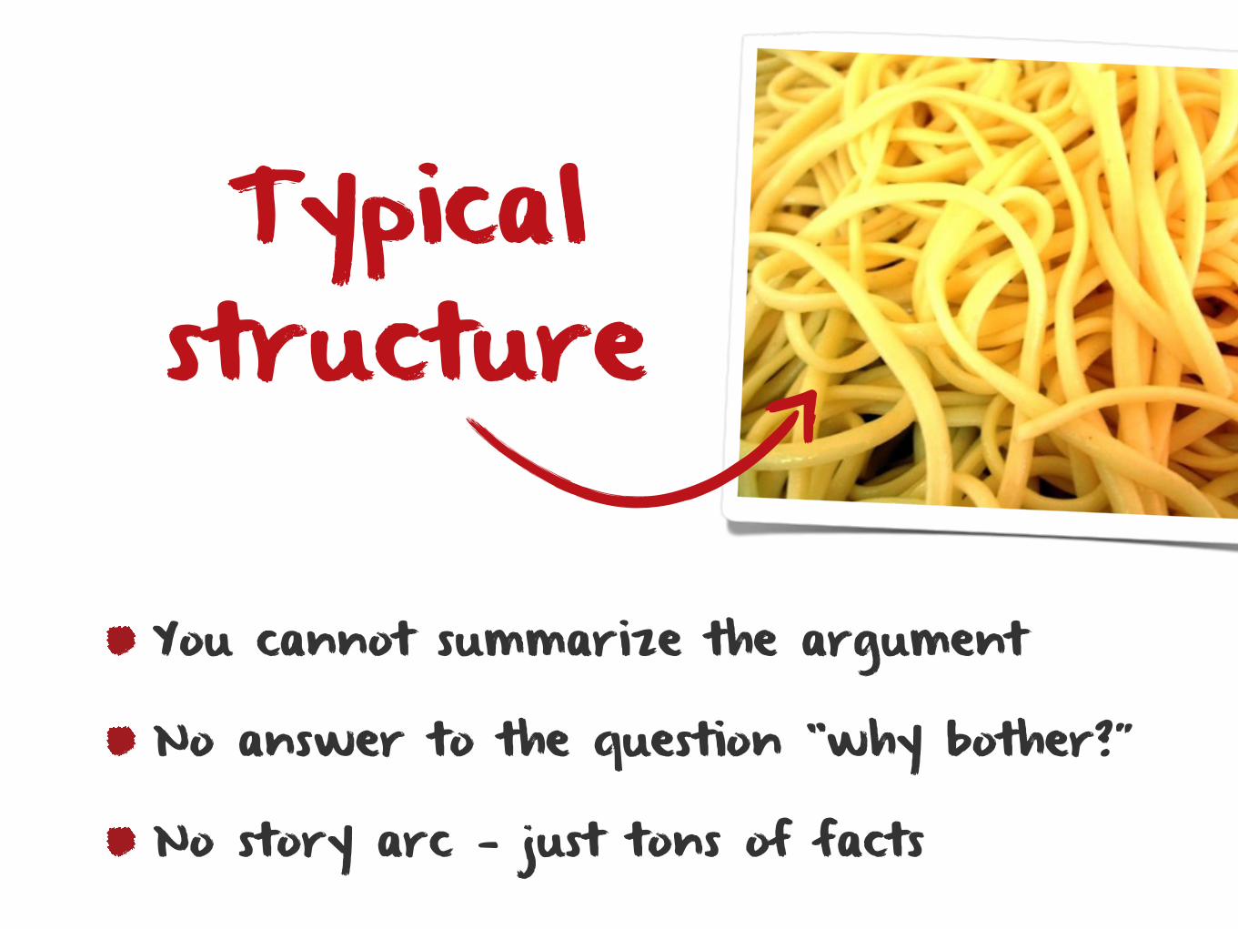
You cannot summarize the argument
No answer to the question “why bother?”
No story arc — just tons of facts
Typical structure
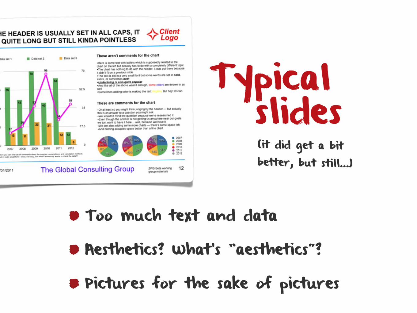
Typical
Too much text and data
Aesthetics? What’s “aesthetics”?
Pictures for the sake of pictures
(it did get a bit better, but still…)
slides
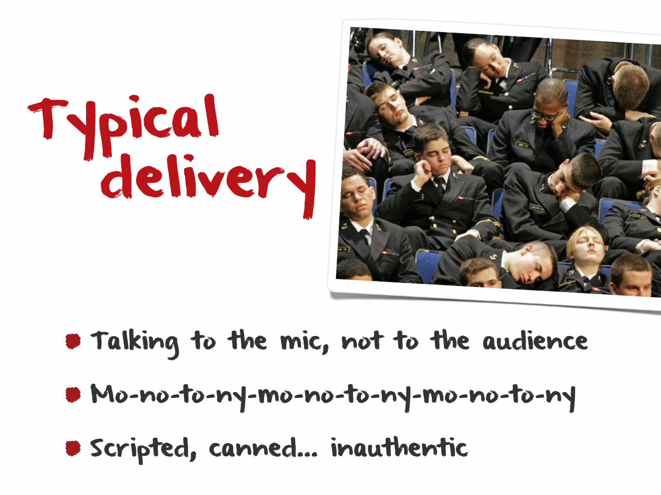
Typical
Talking to the mic, not to the audience
Mo-no-to-ny-mo-no-to-ny-mo-no-to-ny
Scripted, canned… inauthentic
delivery

What is still wrong?
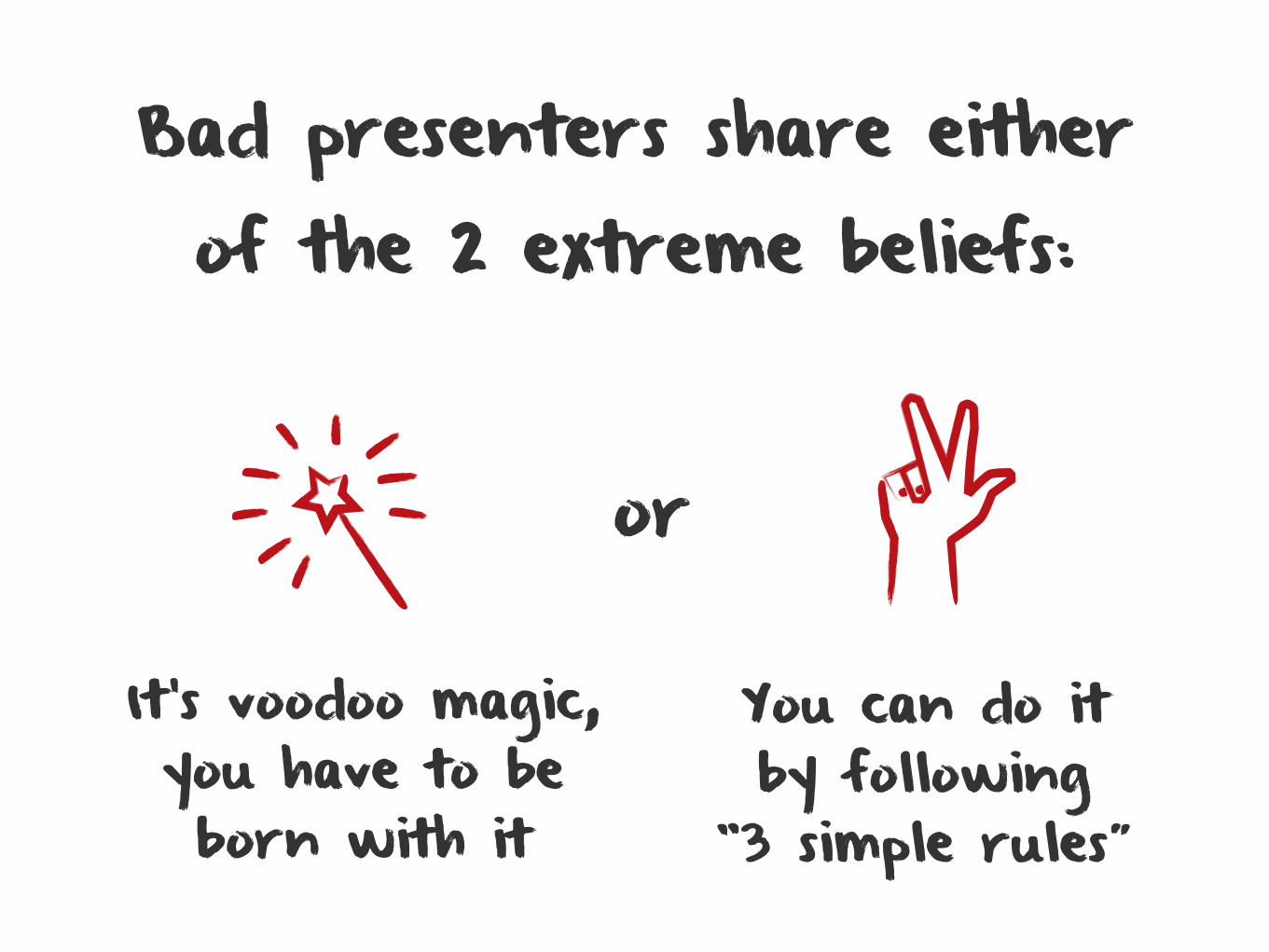
You can do it by following
“3 simple rules”
It’s voodoo magic, you have to be born with it
Bad presenters share either of the 2 extreme beliefs:
or
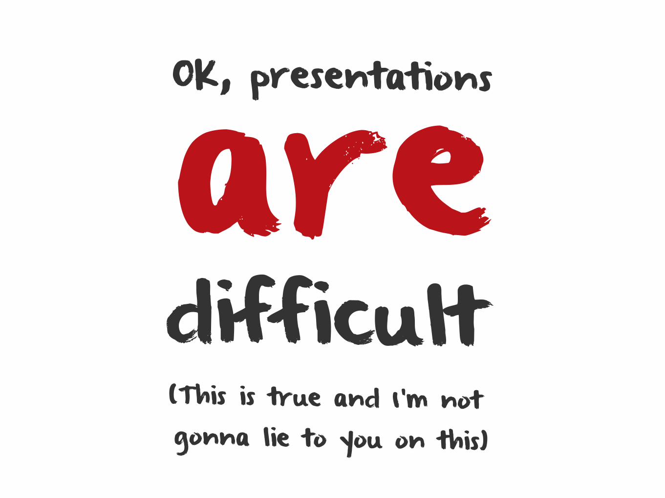
OK, presentations
difficult(This is true and I’m not gonna lie to you on this)
are
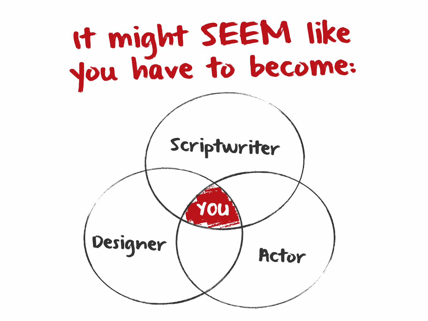
It might SEEM like you have to become:
Scriptwriter
Designer Actor
YOU
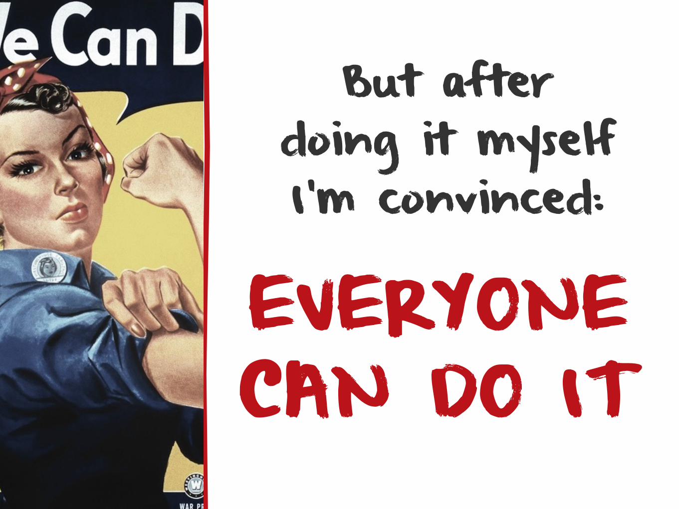
But after doing it myself I’m convinced:
EVERYONECAN DO IT
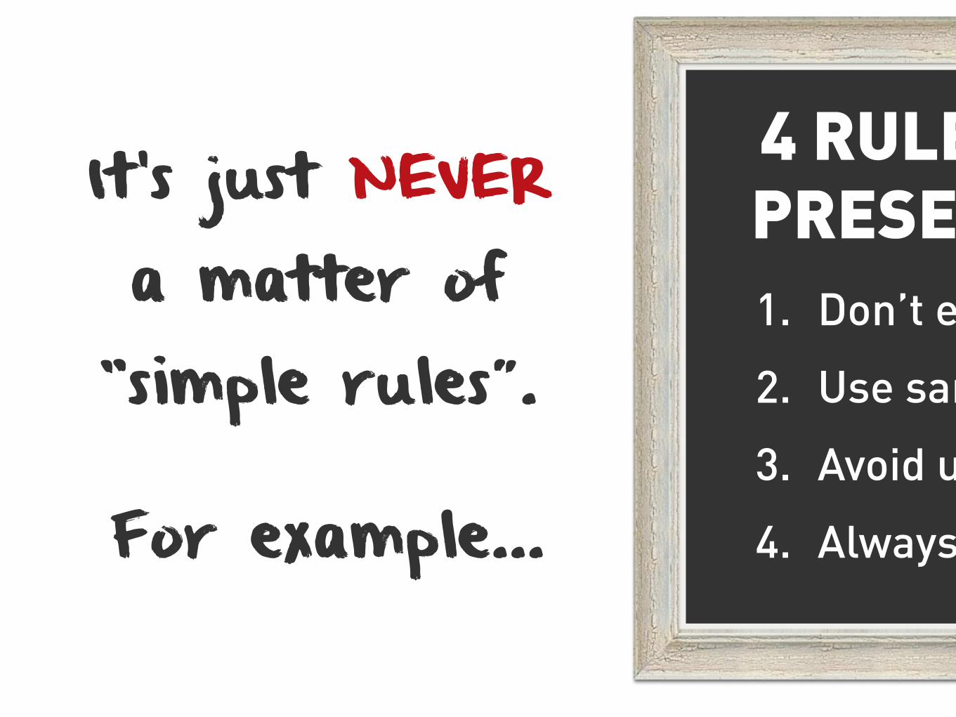
It’s just NEVER a matter of “simple rules”.
For example…
4 RULES FOR PRESENTERS1. Don’t ev
2. Use san
3. Avoid u
4. Always
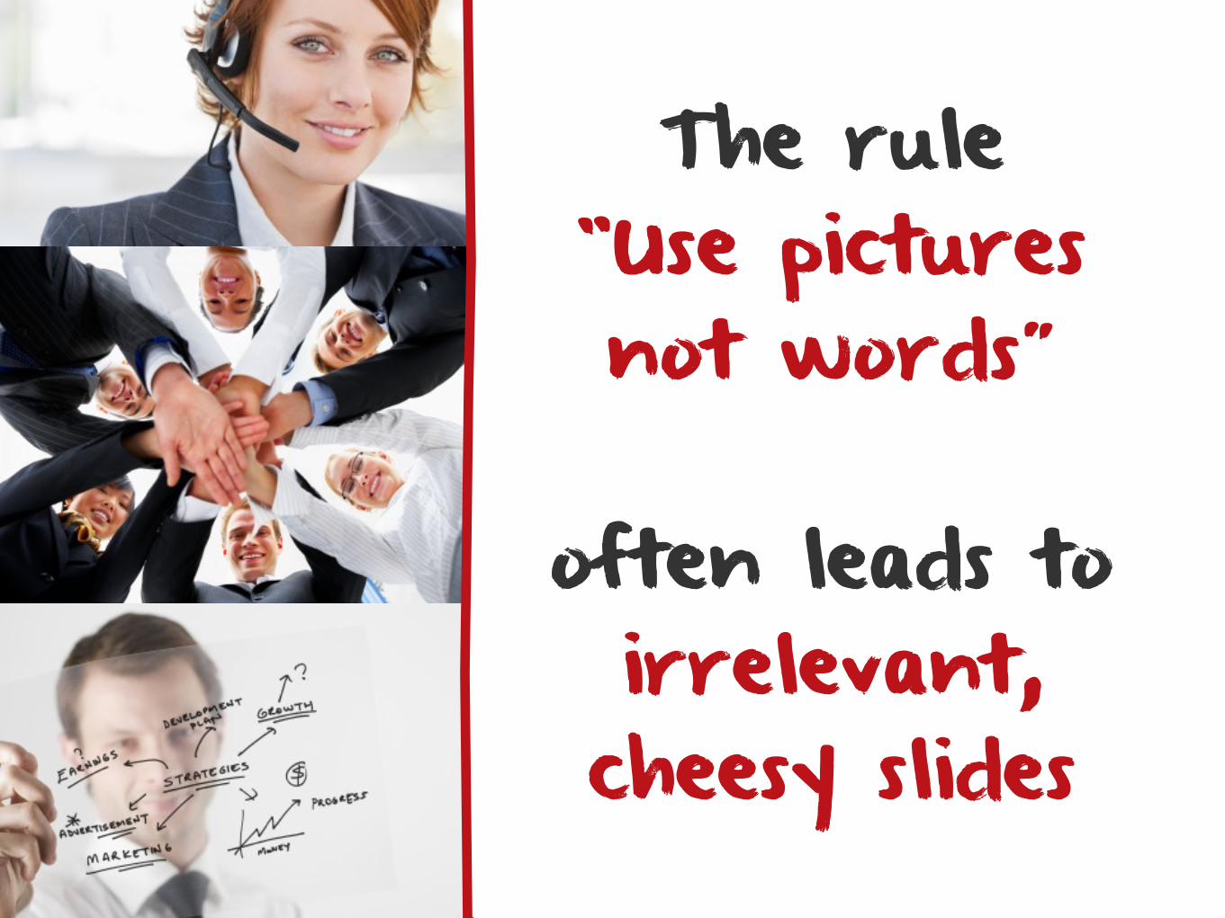
The rule “Use pictures not words”
often leads toirrelevant, cheesy slides
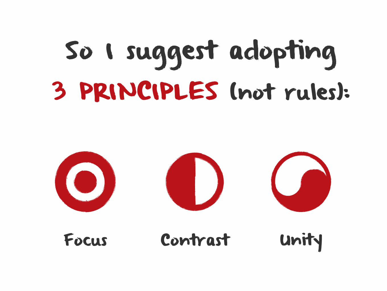
So I suggest adopting3 PRINCIPLES (not rules):
Focus Contrast Unity
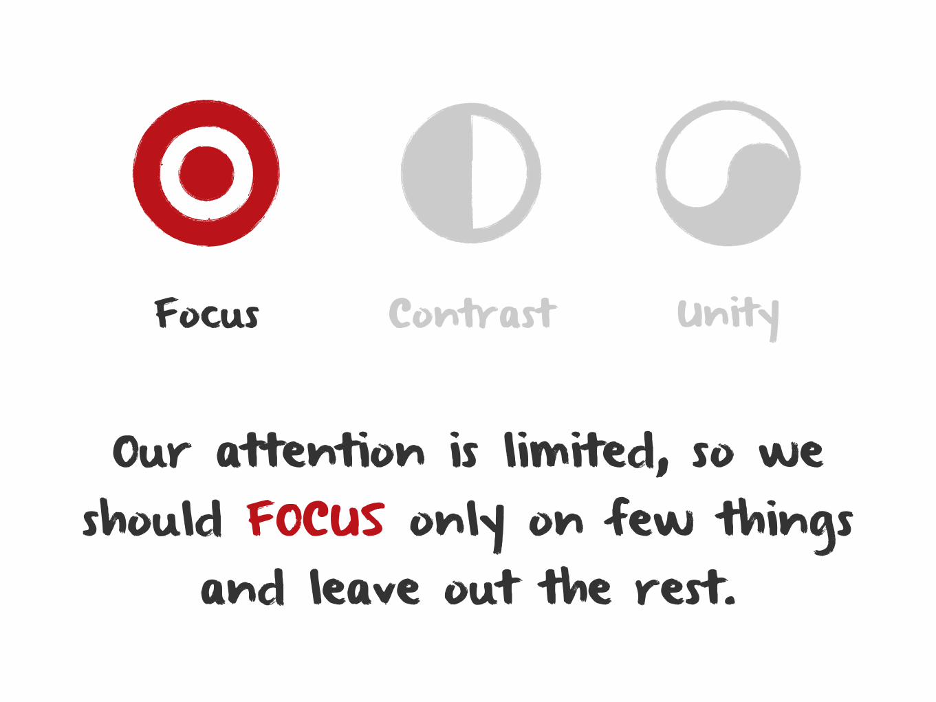
Our attention is limited, so we should FOCUS only on few things
and leave out the rest.
Focus Contrast Unity
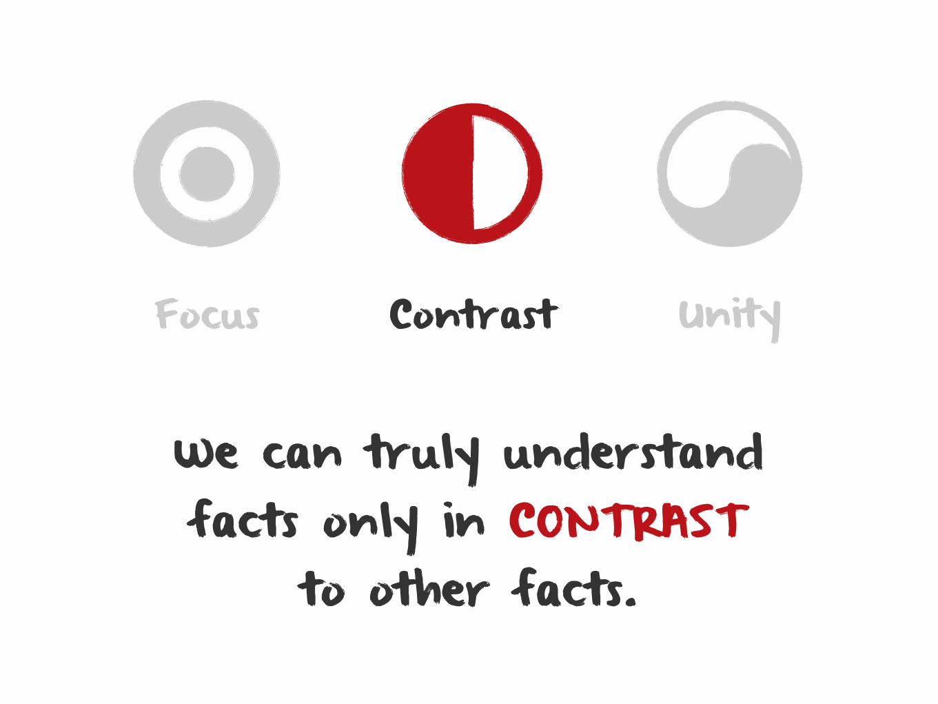
We can truly understand facts only in CONTRAST
to other facts.
Focus Contrast Unity
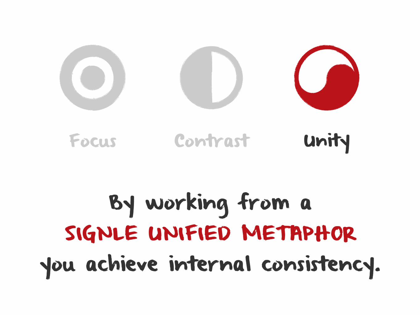
By working from a SIGNLE UNIFIED METAPHOR
you achieve internal consistency.
Focus Contrast Unity
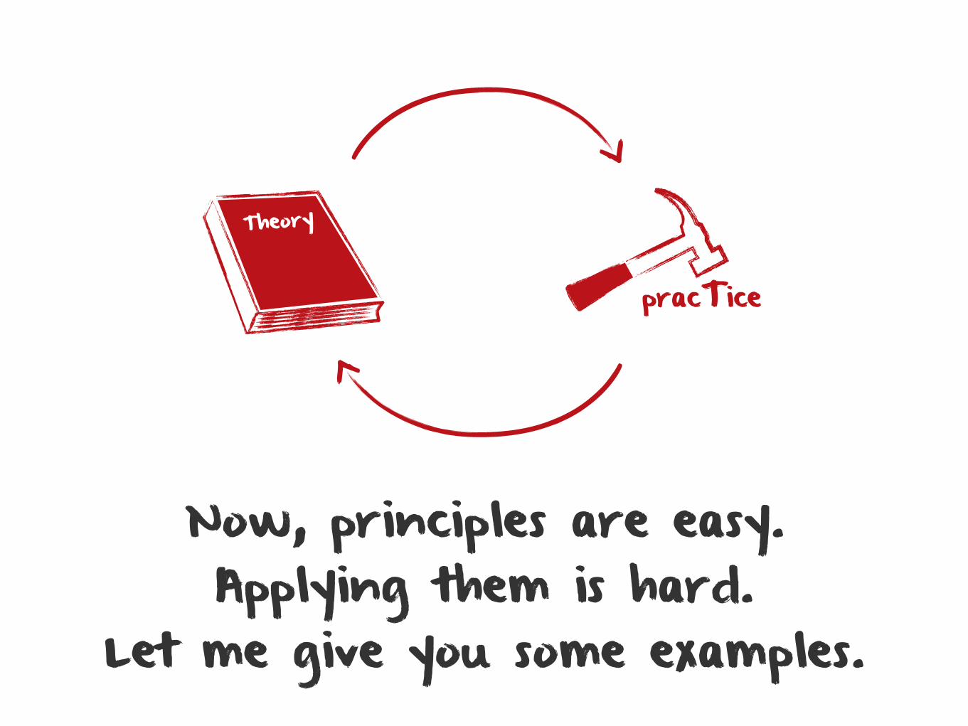
Now, principles are easy.Applying them is hard.
Let me give you some examples.
Theory
pracTice
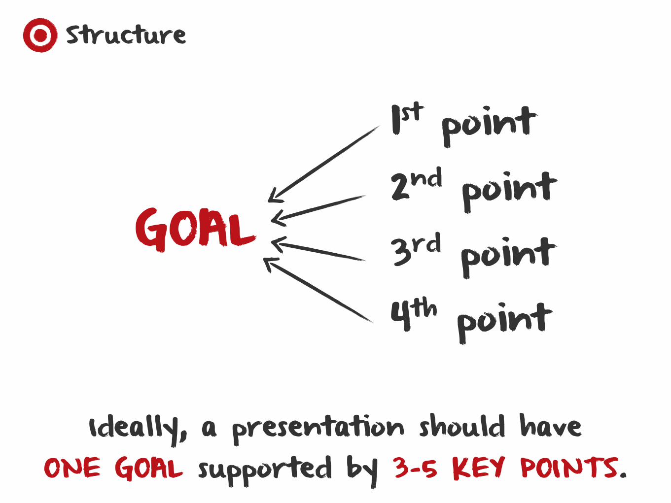
Structure
Ideally, a presentation should have ONE GOAL supported by 3-5 KEY POINTS.
1st point2nd point3rd point4th point
GOAL
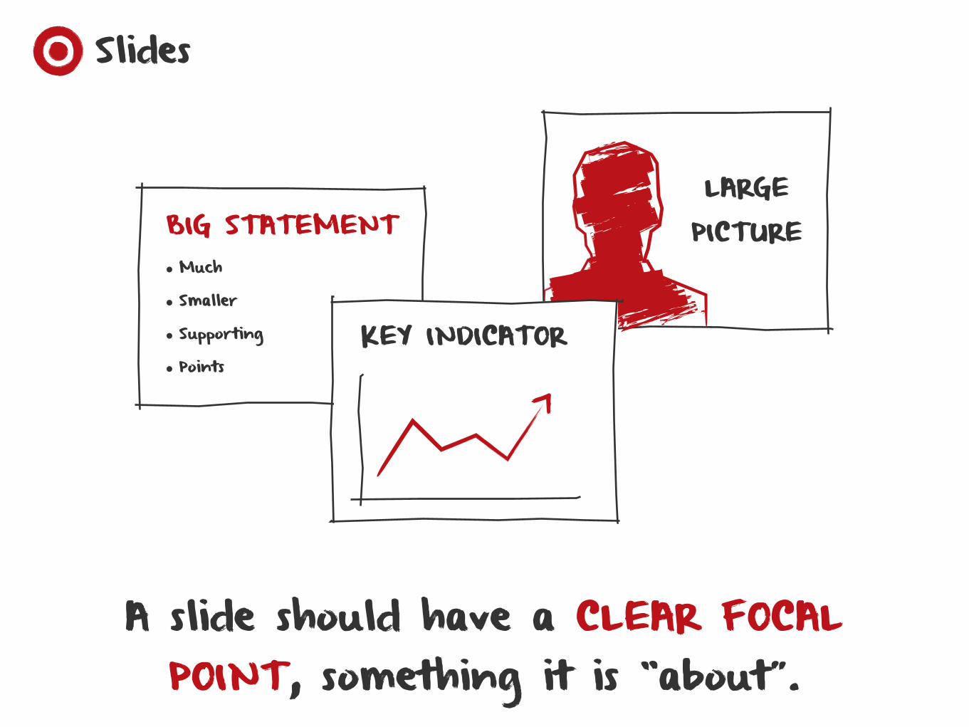
BIG STATEMENT• Much
• Smaller
• Supporting
• Points
LARGE PICTURE
KEY INDICATOR
A slide should have a CLEAR FOCAL POINT, something it is “about”.
Slides
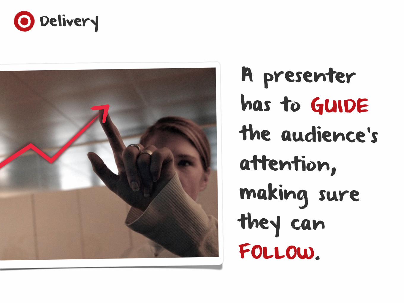
A presenter has to GUIDE the audience’s attention, making sure they can FOLLOW.
Delivery
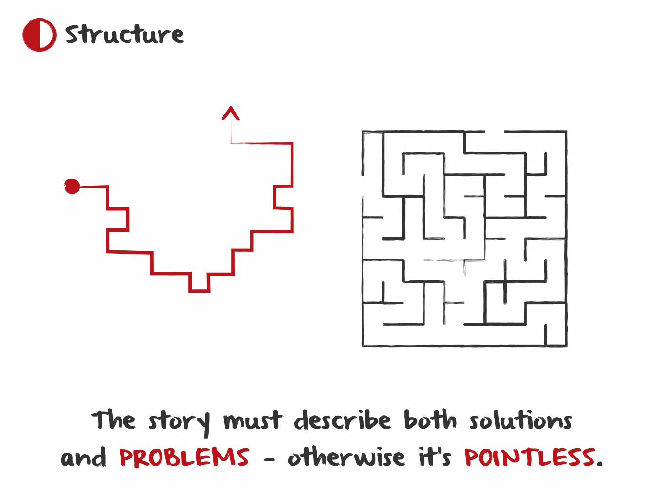
The story must describe both solutions and PROBLEMS — otherwise it’s POINTLESS.
Structure
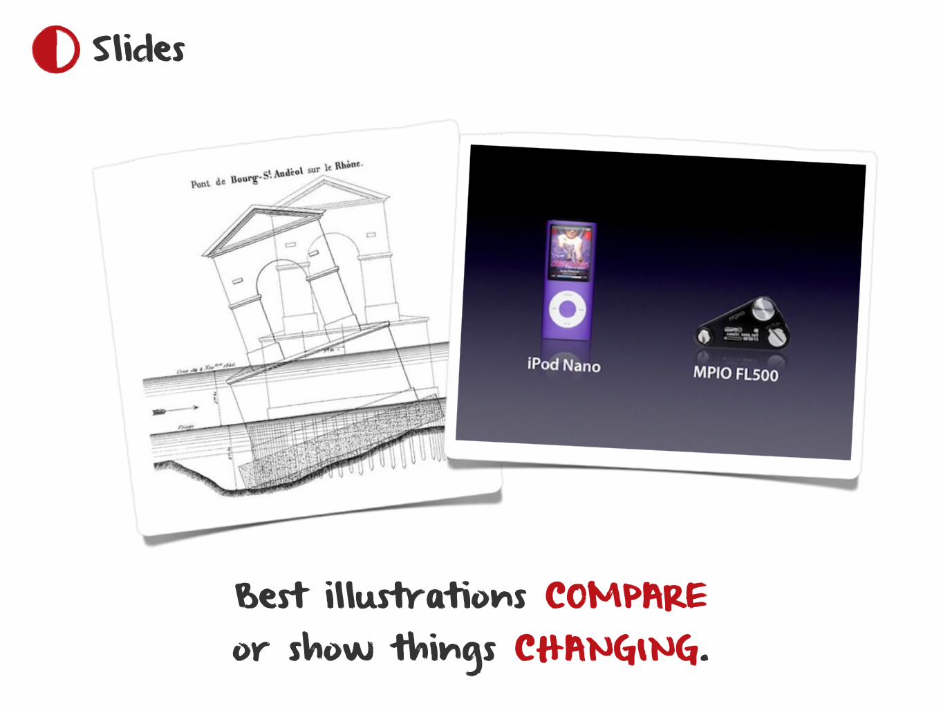
Best illustrations COMPARE or show things CHANGING.
Slides
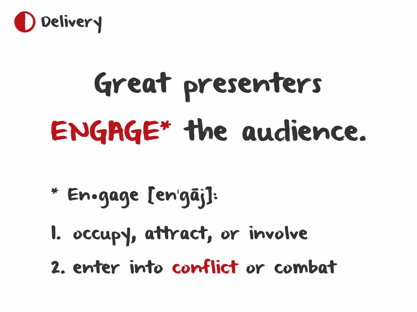
Great presentersENGAGE* the audience.
* En•gage [enˈgāj]:
1. occupy, attract, or involve
2. enter into conflict or combat
Delivery
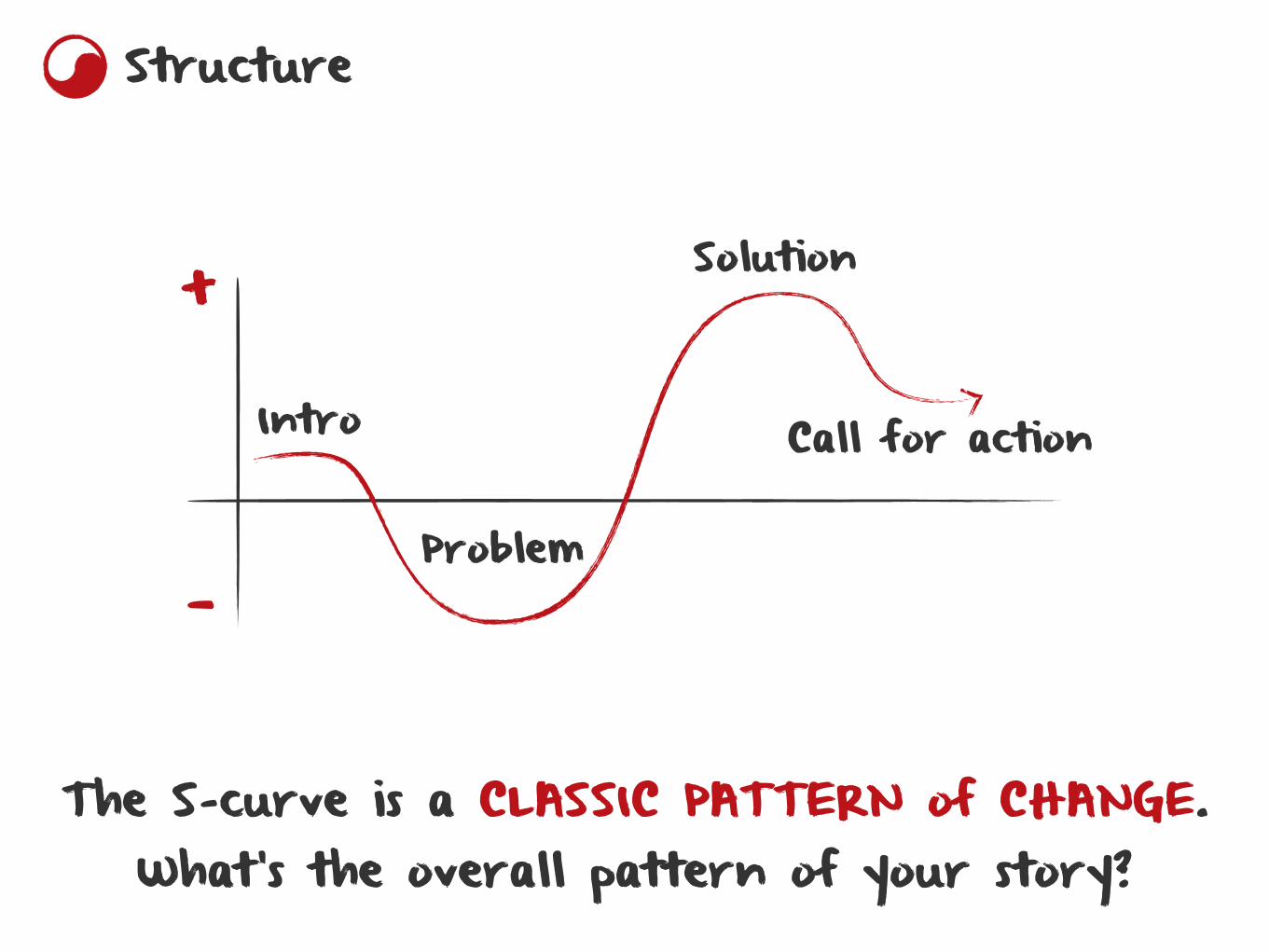
+
—
Intro
Problem
Solution
Call for action
The S-curve is a CLASSIC PATTERN of CHANGE. What’s the overall pattern of your story?
Structure
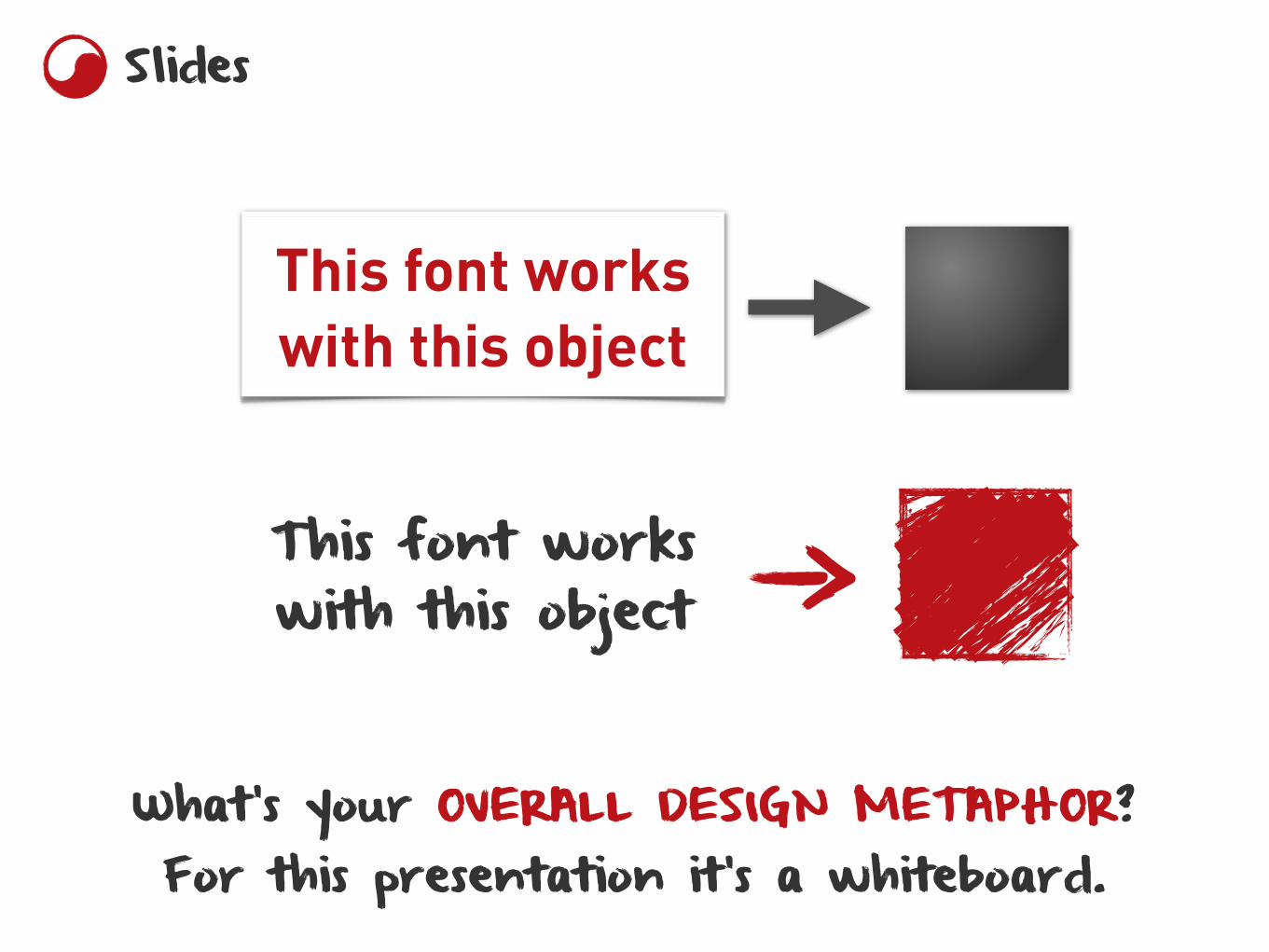
What’s your OVERALL DESIGN METAPHOR? For this presentation it’s a whiteboard.
This font works with this object
This font works with this object
Slides
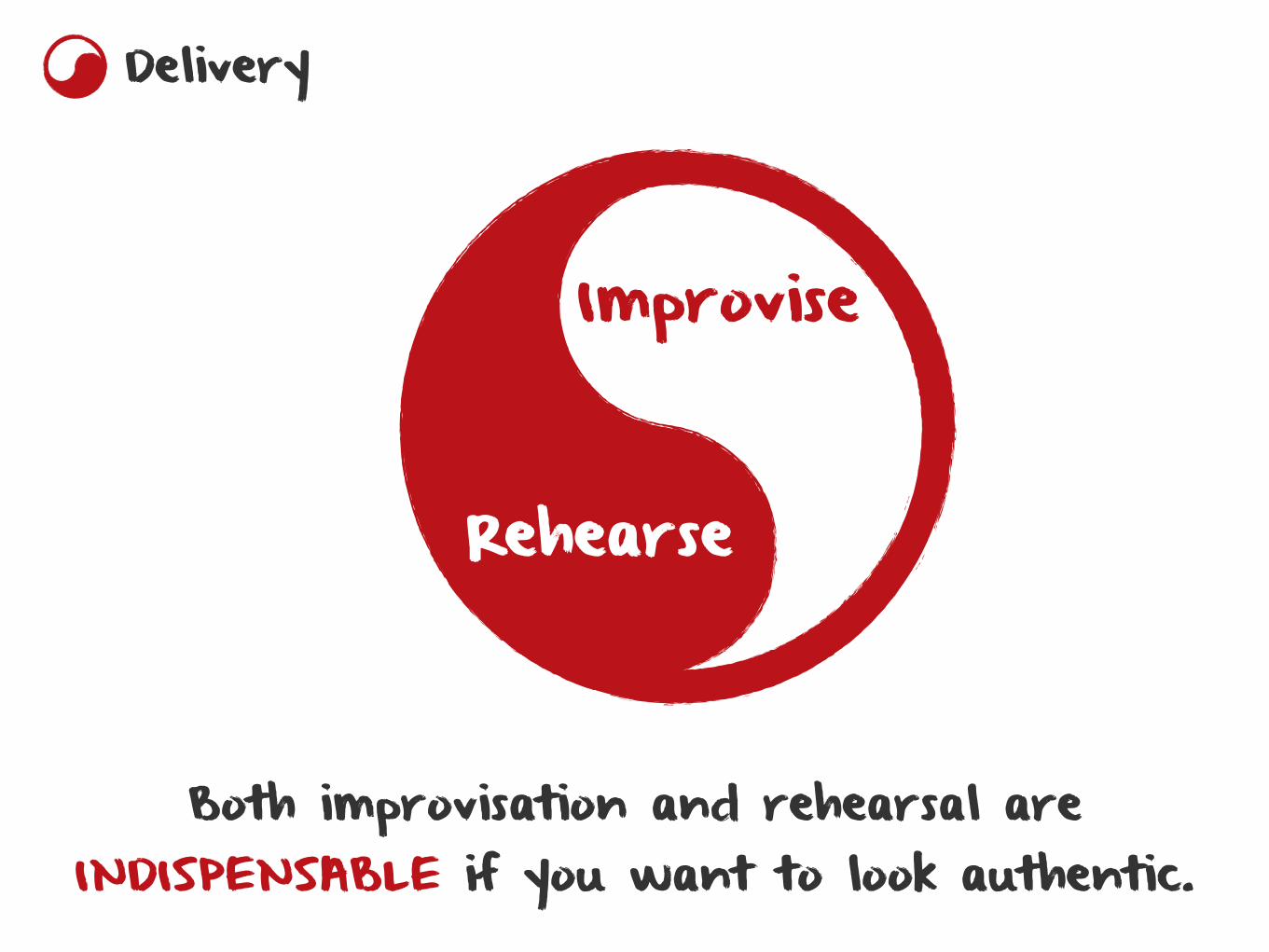
Both improvisation and rehearsal are INDISPENSABLE if you want to look authentic.
Rehearse
Improvise
Delivery
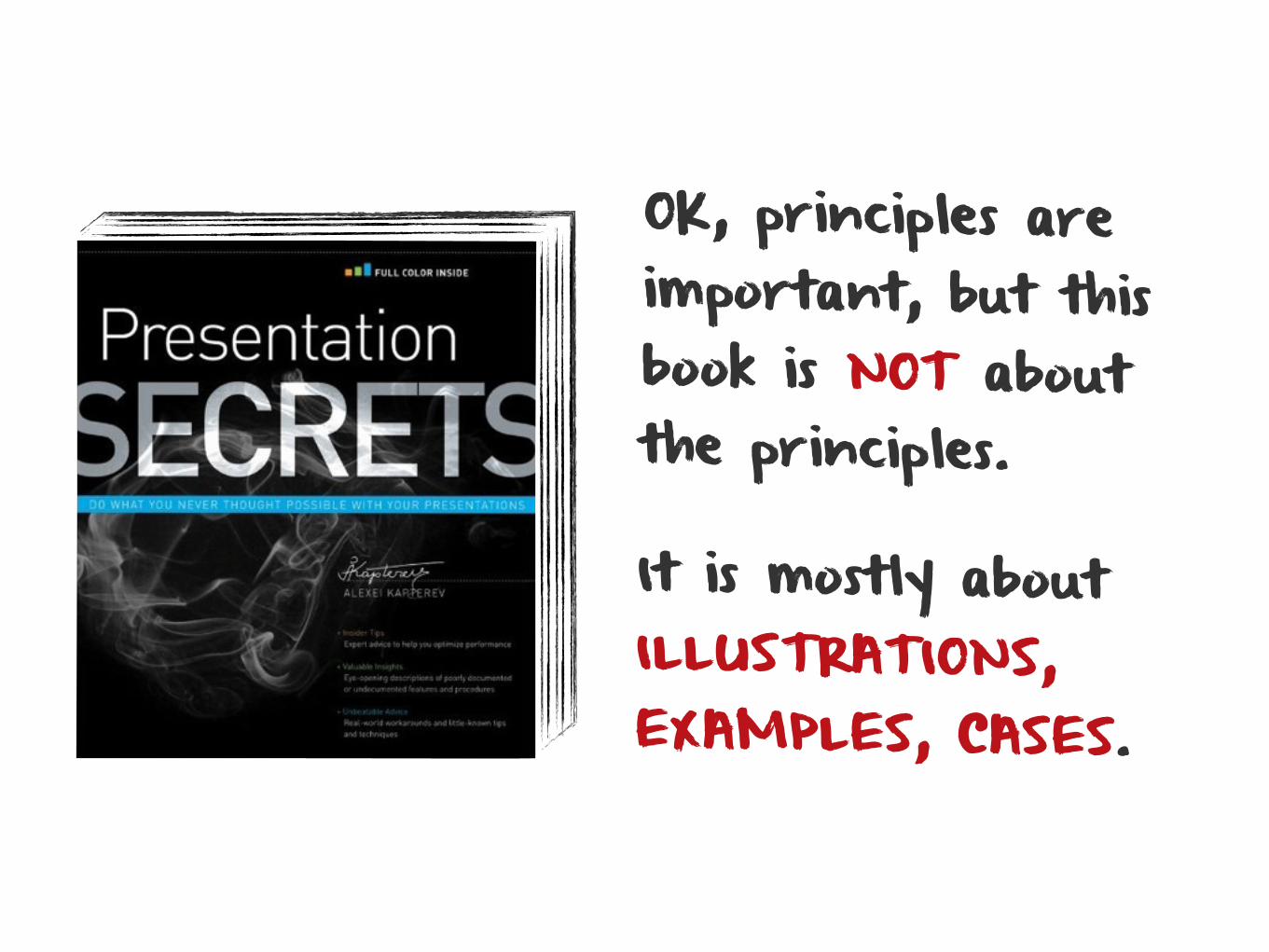
OK, principles are important, but this book is NOT about the principles.
It is mostly about ILLUSTRATIONS, EXAMPLES, CASES.

ALEXEI KAPTEREV
I believe that by studying examples you learn to APPLY those principles CREATIVELY — and this is the secret of GREAT presentations.
Get your copy of Presentation Secrets on WILEY.com. www.kapterev.com