Presentation CRAFT* Magazine
39
PRESENTATION CRAFT * Magazine
description
CRAFT * is a magazine that talks about economy in arts, made in the discipline of publishing projects of structure, integrated in the Postgraduate Diploma in Graphic Design and Publishing Projects, in Escola Superior de Disseny i Enginyeria de Barcelona.
Transcript of Presentation CRAFT* Magazine

PRESENTATION
CRAFT* Magazine

CRAFT*Economy In Arts Magazine
Elisava – Postgrado de Proyectos Editoriales
Deseño Editorialde Estructura – Prensa
Rita Hart
CRAFT*ECONOMY IN ARTS MAGAZINE

BETwEEN ThE COuldSMasao Yamamoto
Elisava – Postgrado de Proyectos Editoriales
Deseño Editorialde Estructura – Prensa
Rita Hart
01
NAMING
CRAFTExperiencia, Habilidad, Arte, Competencia, Destreza, Técnica
Arts&Crafts - Fue un movimiento estético que surgió en Inglaterra en la segunda mitad del siglo XIX. Defendió la artesanía creativa como una alternativa a la producción de la mecanización en masa, da un gran valor la creación artística.

BETwEEN ThE COuldSMasao Yamamoto
Elisava – Postgrado de Proyectos Editoriales
Deseño Editorialde Estructura – Prensa
Rita Hart
02
CONCEPTO
CRAFT*Es una revista que habla sobre la economía en el mundo de las artes.La economía actual no se lee solamente en números, también en conceptos y emociones – Arte (arte, design, arquitectura etc.).Es una revista de asimilación de conceptos a través de una presentación más actual y atractiva, concisa y clara.
Revista en un solo idioma, Inglés.

BETwEEN ThE COuldSMasao Yamamoto
Elisava – Postgrado de Proyectos Editoriales
Deseño Editorialde Estructura – Prensa
Rita Hart
03
CONCEPTO - Secciones
CRAFT*Checking in… – Habla de artículos de economia relacionados con el arte.
CHEKING IN...
P. 08 19
ART IN THE NEW ECONOMY
BY ALAN BAMBERGER
WHY SHOULD PEOPLE BUY AND OWN ART?
BY PATRICIA JAMES
BAD ECONOMY MAKESGOOD ART
BY LAUREN COLLINS
SEED OF CHANGE
BY PETER ASPEN
ANISH KAPOOR DEDICATES ART TO AI WEIWEI
BY PETER ASPEN

BETwEEN ThE COuldSMasao Yamamoto
Elisava – Postgrado de Proyectos Editoriales
Deseño Editorialde Estructura – Prensa
Rita Hart
04
CONCEPTO - Secciones
CRAFT*Checking in…
T he Whitney Museum and the Museum of Modern Art opened their doors during America's Great Depression.
Photographer Dorothea Lange's image “The Migrant Mother” (seen above) is the essence of the economic hardship.
When times are tough, art can often capti-vate and inspire the public. Economic crises challenge an established order and art seems to provide answers.
David Philips' seascapes rendered in shre-dded beer cans are a modern example of art that inspires people to look beyond the day-to-day hardships.Philips began creating the seascapes after an epiphany when he was enjoying a beer on the beach gazing at the sea.
In a February 2009 article, which exami-ned artistic success in hard times, The New York Times reported the museum's first acquisi-tion was Edward Hopper's “House by the Railroad”. The painting was part of their second exhibit, “Paintings by 19 American Artists.” The Times reported that the exhibit had no admission fee. Hopper's painting of a 19th-Century Second Empire-style home is from a viewpoint where railroad tracks and the land elevating them obscure the bottom quarter of the home.
American Poet Edward Hirsch describes the loneliness that Hopper's painting con-veys in his poem “Edward Hopper and the House by the Railroad”. A large home abandoned might evoke the emptiness of material things.
BAD ECONOMY MAKES GOOD ARTThe global economic recession has caused the Getty Museum, the world's weal-thiest arts centre, to slash its budget up to 25%, and there is no objection that economic hardship has also been productive for art.
Exposing the vulnerability of the material world resonated with people at the Museum of Modern Art's second exhibit.
Dorothea Lange is probably best known for her image “Migrant Mother,” a photograph made while she shot for the Farm Security Administration (FSA). wThe FSA was part of the New Deal under President Franklin D.Roosevelt.
Unemployment had reached almost 25 per-cent when Roosevelt began his presidency.
FSA photographers wanted to show the effects of the Great Depression and chang-es that mechanization was bringing to America's farms.
While the story behind the picture is subject to differing accounts, Lange's image became the human face staring out at the crisis. The image's publication influenced the government and the public to do more for America's agricultural workers.
A beer and the ocean were all Dave Philips needed to inspire his artwork. “I had a can of beer in my hand and I was staring out to sea, and then it hit me –
I could combine the two,” Philips told the Metro. Also, the current recession struck his work as a proper-ty developer which probably ad-ded some motivation to create.
An article in What's On reported that Mike Hocking, who runs Masa Fine Art gallery at the Royal William Yard, valued Philips' work at £4,000 per piece.
Both the Metro and What's On Southwest reported that Philips' work is unique in that he is believed to be the only artist using shredded beer cans to create textures in his paintings.
Perhaps the world can look forward to more artistic innovations as the economy continues to flounder. The Associated Press has outlined the economic activity worldwide as a story which includes growth revised downwards.
These are great conditions for history to repeat itself and for art to flourish.
While the story behind the picture is sub-ject to differing accounts, Lange's image became the human face staring out at the crisis. The image's publication influenced the government and the public to do more for America's agricultural workers. While the story behind the picture is subject to differing accounts, Lange's image became the human face staring out at the crisis. The image's publication influenced the govern-ment and the public.
BY ANDREW OTTO
Museum of Modern Art Empathy with art consumers
probably guided the Museum of Modern Art
in its early days.
CRAFT* CH E C K ING IN... 0607
PHOTOGRAPH BY DOROTHEA LANGE’S IMAGE “THE MIGRANT MOTHER”

BETwEEN ThE COuldSMasao Yamamoto
Elisava – Postgrado de Proyectos Editoriales
Deseño Editorialde Estructura – Prensa
Rita Hart
05
CONCEPTO - Secciones
CRAFT*Report – Una reportage de un pais.
REPORT
P. 20 31
BERLIM(AGENCY)
HORT DESIGN
(ARTIST) THOMAS DEMAND
BY KATY ATYLEVICH

BETwEEN ThE COuldSMasao Yamamoto
Elisava – Postgrado de Proyectos Editoriales
Deseño Editorialde Estructura – Prensa
Rita Hart
06
CONCEPTO - Secciones
CRAFT*Report
BERLIMON FIRE
CRAFT*
BY KATY ATYLEVICHPHOTOS BY JOÃO GUIMARÃES
23REPORT 22

BETwEEN ThE COuldSMasao Yamamoto
Elisava – Postgrado de Proyectos Editoriales
Deseño Editorialde Estructura – Prensa
Rita Hart
07
CONCEPTO - Secciones
CRAFT*Art – Está sub-seccionado por cuatro temas (Arquitectura, Arte, Design, Fotografia).
ARTS
P. 34 87
(ARCHITECTURE)
ROBERT STONE
BY KATYA TYLEVICH
(DESIGN)
ELIZA STROZYK
BY KAREN DAY
(ART)
BANKSY
BY LAUREN COLLINS
(PHOTOGRAPHY)
STEVEN MCCURRY
BY JOHN HARRYS

BETwEEN ThE COuldSMasao Yamamoto
Elisava – Postgrado de Proyectos Editoriales
Deseño Editorialde Estructura – Prensa
Rita Hart
08
CONCEPTO - Secciones
CRAFT*Art
CRAFT*
04 The house can be rented for short stays or public gatherings.
“In America, every communitythat’s worth a damn has an
abandoned house that all thekids know about.”
43ART – Architecture 42
forward into a new context. Most architec-ture, by its very conception, goes straight after timelessness and abstraction and avoids any connection to the living cultural context. Rosa Muerta dives into the here and now, denies nothing, and goes with the flow. It means something now. It will mean something different years from now. But, it will never be meaningless.
If you look back at previous projects, this house develops around the same issues as the Altered Parking Blocks, the Strap-on Subwoofer, the Smoking Tables and the Vacancy Motel. . . creating a kind of arma-ture for social activity, extending minimal-ist subject/object experiments into a more complicated cultural dimension, exploring the dialectic between the familiar and un-familiar., and carefully reinvesting the ba-sic body/object relationship with an open but self-concious physicality. I have been developing this aesthetic vocabulary and conceptual approach for nearly 20 years. Rosa Muerta was my first built example as architecture.
Without a client or a budget, I built this house literally by myself because I wanted
to assert architecture as an individual and di-rect art form that can exist on underground support alone. I wanted to make architecture directly for the very people who would be cool enough to come out, share it, and sup-port it. So far, there have been hundreds of people that have vacationed there and brought the house to life in as many dif-ferent ways.
Architect Robert Stone and I are planning my visit to Rosa Muerta, a textured and re-flective black mirage, which materializes just east of Joshua Tree in Southern California. In our initial e-mail correspondence, Stone tries to illustrate what I’m in for: ‘The house sits out in the middle of the open desert, overgrown with weeds and grasses like an exquisite burnedout Barcelona Pavilion from another, much sexier universe.’ S everal days later, my car thermometer climbs 17° in under three hours, ultimately perching at 40°C. Congested Los Angeles freeways give way to dirt roads, steep grades and stretches of dry, uninhabited land. The setting is ex-traterrestrial, to be sure. And when I finally cross the integrated threshold from scorched sand to smooth black concrete, indeed I
feel I’ve stepped through the looking glass in Barcelona and into Stone’s iridescent, heat-bent and handcrafted galaxy (where I experience an instant drop in temperature under the dramatic overhang). Reflections of Mies van der Rohe bounce, distorted, from the structure’s chrome columns. They rep-licate again in the (outdoor) living room’s low, mirrored canopy, which reflects back at the reflecting pool (also a spa) and makes the desert floor a ceiling. But with a nod to the columns, Stone urges me to consider the chrome details of a Mongoose BMX bike as well. Later, the architect alludes to leg-warmers (yes, the ’80s fashion staple) as he explains how the black rope around each column visually disconnects the straight line of the supporting structure, ‘to make it float a little more’. Clearly, I understand what it means to take a chrome column, and it’s the Barcelona Pavilion – but it’s coming out of the dirt,’ Stone says. ‘It’s not sitting on a plinth; it’s in the desert. I know what the high references are for these things, but there are also ones that are just close to my heart. ’In this way, Rosa Muerta is welded of dichotomous orientation points.
05 The opening through the centre of the house is aligned with a distant Joshua tree.

BETwEEN ThE COuldSMasao Yamamoto
Elisava – Postgrado de Proyectos Editoriales
Deseño Editorialde Estructura – Prensa
Rita Hart
09
CONCEPTO - Secciones
CRAFT*Future – Es una seccione de artículos de economia ligados al futuro y a la tecnologia.
FUTURE
P. 66 75
WORDS WINDOWS AND CHAOS
BY JOSHUA KOOMEN
COLLECTIVE INTELLIGENCE:A CIVILISATION
BY PIERRE LÉVI
WHEN TECNOLOGY IMITATES ART
BY JOSHUA TOMPKINS
THE DREAMS OF AN ACCELERATED CULTURE
BY MAADS HAAHR

BETwEEN ThE COuldSMasao Yamamoto
Elisava – Postgrado de Proyectos Editoriales
Deseño Editorialde Estructura – Prensa
Rita Hart
10
CONCEPTO - Secciones
CRAFT*Future
WHEN TECHNOLOGYIMITATES ART
CRAFT*
A few weeks ago, a sculptor in France contacted Studio Roc, a new stone milling company in North Hollywood,
Calif., with the type of challenge the company was seeking. He had a 19th-cen-tury limestone lion’s face that he wanted to reproduce for a line of fountains. But carving each face by hand was a tedious chore for which he no longer had the time or resources.
Instead, he shipped the original work to Studio Roc, where technicians mapped it in three dimensions with a laser scanner. Then they placed a limestone blank in a computer-controlled milling machine and used the scan data to carve a duplicate lion face at the touch of a button.
The result required some hand detail-ing, but that was exactly what the sculptor wanted. In about six hours, the machine had done the busywork that would have taken him much longer with a hammer and chisel.
‘’What energy does he have left after slav-ing for a week over one piece?’’ said Studio
Roc’s chief executive, Kenneth Kai Chang. ‘’Now he can really get toward the back end, the finished look, much faster than he could before.’’
The limestone lion is an example of how technology is transforming the way sculp-ture, architectural elements and many other once-hand-carved items can be created or cloned. Scanners, computer-aided design software and automated milling devices are assisting sculptors and in some cases replac-ing them, creating detailed pieces from slabs of marble and reverse-engineering complex .
The result is the seemingly oxymoronic concept of mass customization, in which infinite copies of infinite variations are pos-sible as long as there is stone to quarry.
But the harnessing of these granite-grind-ing Xerox machines, able to duplicate just about any sculpture, may also blur the line between what is authentic and what is not. may also blur the line between what is au-thentic and what is not. Is such a sculpture art, or merely a computer-aided copy?
In March, for example, using data gene- rated during a monthlong scan of Miche-langelo’s David by researchers from Stanford University and the University of Washington, Gentle Giant Studios, a special-effects firm in Burbank, Calif., turned out a small replica of the 17-foot tall statue.
While reasonably faithful copies of David have been created using plaster casts, the 15-inch replica is the most perfect scale model ever created of the masterpiece. Made with permission from Italian officials, it could potentially seed an army of near-identical twins. (A Stanford University Web site says the researchers will indeed sell copies of the model eventually, although Marc Levoy, a computer science professor who oversaw the scanning project, said there were no plans to do so.)
Studio Roc’s goal is not to upset the art world, but to attract architects and con-tractors who want custom-carved fixtures turned out faster, at a lower price and with more precision than if they were done by an
The result is the seemingly oxymoronic concept of mass customization, in which infinite copies of infinite variations are possible as long as there is stone to quarry.
71TECHNOLOGY 70
W hile most of the offerings in the present issue of Crossings address the art/
technology interface in the experi-ence of musicians and their listening audience, the themes raised general-ise well beyond the musical domain. A particularly prominent theme that will be familiar to regular Crossings readers is collaboration in the creati-ve process. Many of the contributi-ons in the present issue explore the way that technological changes are prompting shifts in the distribution of roles in the creative processes.
In the context of music, it is pos-sible to map out four distinct creative processes: instrument (tool) making, composition, performance and lis-tening. In some cases, traditionally distinct roles, such as instrument maker, composer and performer are merging with unknown results for the status of musical production in the future, as Sile O’Modhráin obser-ves in her commentary. The merging of these roles constitutes a different type of interaction between the four creative processes: an intra-personal rather than in-ter-personal interac-tion. At the same time, incorporating multiple disciplines into one artistic practice requires either polymathic abilities or close communication bet- ween people of widely different tech- nical and artistic backgrounds, as Helen Mitchell outlines in her discus-sion of music education. Artists must either master a broader range of skills or collaborate with others in order to realise their vision.
Such challenges aside, technology also facilitates the expansion of crea-tive practice by allowing for collec-tive creation of artworks, thus blur-ring the roles of artist/performer and audience member. Dante Tanzi explores how online communicative processes (facilitated by new Internet-based tools for music exchan-
artisan. Mr. Chang, a former architect who describes his company as ‘’on the leading edge of the stone industry,’’ said, ‘’We just felt it was about time someone really put their head to it and pulled together the three or four or five technologies to make this area of construction up to date.’’
William Hablinski, a Los Angeles archi-tect who has designed residences for Gov. Arnold Schwarzenegger of California and Warren Beatty, predicts that computerized milling will become an integral part of upscale home construction, especially for moldings. ‘’You’re basically asking a robot to do what you would normally have to pay a master stone carver something on the order of between $70 and $180 per hour,’’ he said.
Mr. Hablinski said he would still hire an artist to create a unique fixture such as an ornate mantelpiece. ‘’We want to keep the craft alive,’’ he said. ‘’We don’t want the craft of stone carving to go away.’’
If the craft does fade, it will be because of equipment like that at Studio Roc, including a huge Italian-made Omag Mill5 five-axis milling machine. Equipped with a scanner and 30 interchangeable diamond-tipped bits and blades, the Mill5 can record nearly any object in minutes and carve a duplicate in any stone in a few hours.
The scanner and milling head are housed in a single armature that hangs from a mo-torized gantry and can deploy its tools at any angle, even aiming upward to trim a cor-nice detail or hollow out a gargoyle’s maw. Like the lion’s face, each finished product requires some hand work at the end, but the system can shoulder as much as 95 percent of the job, Mr. Chang said.
In March, for example, using data generated during a monthlong scan of Michelangelo’s David by researchers from Stanford University and the University of Washington, Gentle Giant Studios, a special-effects firm in Burbank, Calif., turned out a small replica of the 17-foot tall statue.
While reasonably faithful copies of David have been created using plaster casts, the 15-inch replica is the most perfect scale model ever created of the masterpiece. Made with permission from Italian officials, it could potentially seed an army of near-identical twins. A Stanford University Web site says the researchers will indeed sell copies of the model eventually, although Marc Levoy, a computer science professor who oversaw the scanning project, said there were no plans to do so. A computer science professor who oversaw the scanning project.
JOSHUA TOMPKINS
CREATIVITYIN PROCESS
ge and collaboration) affect practices of composition and reception. Tanzi takes his starting point in two recent technological developments: the digi-tisation of audio, and the ability to ex-change it over the Internet. He obser-ves that multiple forms of access to a huge body of material allow users to participate in the creation of musical content (and hence take on the roles of composer and performer) and also to improve their interpretative skills. However, there is also a risk of losing the context that would make such musical experiences meaningful.
Frank Pecquet focuses on changes in the creative process of music compo-sition using electronic tools. Pecquet shows how the availability of digitised music combined with the increased adoption and sophistication of such tools allow even highly complex sco-res under composition to be imme-diately performed (using electronic tools rather than human perform-ers), resulting in a more interactive process of composition than when the composer uses his or her ‘inner ear’ for the purposes of realisation.
Focuses on changes in the creative process of music composition using electronic tools. Pecquet shows how the availability of digitised music combined with the increased adop-tion and sophistication of such tools allow even highly complex sco-res under composition to be imme-diately performed (using electronic tools rather than human perform-ers), resulting in a more interactive process of composition than when the composer uses his or her ‘inner ear’ for the purposes of realisation.
Focuses on changes in the creative process of music composition using electronic tools. Pecquet shows how the availability of digitised music.
ELIZABETH DREW

BETwEEN ThE COuldSMasao Yamamoto
Elisava – Postgrado de Proyectos Editoriales
Deseño Editorialde Estructura – Prensa
Rita Hart
11
CONCEPTO - Secciones
CRAFT*Talks – Seccióne de entrevista a alguien.
TALKS
P. 76 87
(INTERVIEW)
JAMES NACHTWEY
BY JOHN PAUL

BETwEEN ThE COuldSMasao Yamamoto
Elisava – Postgrado de Proyectos Editoriales
Deseño Editorialde Estructura – Prensa
Rita Hart
12
CONCEPTO - Secciones
CRAFT*Talks
Nachtwey’s photographs “There sighs, lamenta-tions and loud wailings resounded through the starless air, so that from the beginning it made me weep.” Nachtwey’s photographs for “Time,” the “New York Times” Magazine, and other publications have won an unprecedented five Robert Kappa Gold Medals from the Overseas Press Clubs. Thank you for being with us.
JN: Thank you.
JPC: What brought you to do this book? These are not easy pictures to look at.
JN: “Inferno” is a record of crimes against humanity that occurred during the final dec-ade of the 20th century. I began in 1990, and followed stories as they evolved throughout the decade up to cost slow. -- Kosovo. It’s meant to be a kind of visual archive, so that this work will enter into our collective con-science and our collective memory.
JPC: Okay. Let’s start with a picture from Somalia. Tell us about this picture.
JN: This was a picture that was made in a small town in the town of Barbera in the intensive care tent that was set up by a hu-manitarian organization that had gone there to help relieve the victims of the famine. It’s a boy who is near death. His father is trying to comfort him, give him some water. And in the next frame, the boy dies. It’s a moment of tenderness and connection and love of a father for his son that is expressed in the direst circumstances. And it’s moments like these that I’ve seen own over and over again that give me faith in humanity.
JPC: : Tell us a little bit about this picture.JN: This is in one of the orphanages in
Romania just after the fall of the Ceausescu regime. As I traveled through Romania, I discovered a kind of gulag of dozens of these inhuman institutions, and it’s a stark, graph-ic representation of the kind of conditions that children and old people and especially anyone who was perceived to have a mental or physical handicap were being kept quite often throughout their entire life.
JPC: You said when you were taking these pictures of Romania, you just wanted to leave, but you didn’t leave. Why? What is the value? What is it you’re trying to do?
JN: If I cave in, if I fold up because of the emotional obstacles that are in front of me, I’m useless. There is no point in me being there in the first place. And I think if you go to places where people are experiencing these kinds of tragedies with a camera, you have a responsibility. The value of it is to make an appeal to the rest of the world, to
create an impetus where change is possible through public opinion. Public opinion is created through awareness. My job is to help create the awareness.
JPC: When did you start doing this? When did you know that you wanted to do this work?
JN: I became a photographer in order to be a war photographer, and a photographer involved in what I thought were critical so-cial issues. From the very beginning this was my goal.
JPC: Long ago, in the 70’s, right? You taught yourself to do it?
JN: Yes. I began after college, about 1972. I began to teach myself photography. I went to work for a local newspaper for four years as a kind of basic training. But this kind of work was always my goal.
JPC: And you do certainly shoot war... I mean, I think of this picture, for example, which is from Bosnia, right?
JN: That’s from the fighting in Mostar. I managed to get access through a group of Croatian militiamen in the very first days of the fighting as they were trying to ethni-cally cleanse the city of Mostar. They were fighting from house to house, from street to street, sometimes from apartment to apart-ment, pushing their own neighbors out of the city. What’s very poignant to me about this particular picture is that it’s a bedroom. It’s where life itself is conceived, where peo-ple share love and intimacy. And now it’s become a battlefield and a killing ground.
JPC: And you’ve written that you used to think of yourself as a war photographer, but now you think of yourself as an anti-war pho-tographer. Explain the distinction.
JN: At the very beginning, I think I was still interested in the dynamics of war it-self as a kind of fascinating study. And it evolved into more of a mission whereby I think to present pictures of situations that are unacceptable in human terms became a form of protest. So I found that my pictures were actually specifically trying to mitigate against the war itself.
JPC: You’ve written that you used to look for the moment of highest drama, a picture that would tell the whole story in one image, but in this book, here, for example, you’ve got consecu-tive pictures, almost like... it’s almost cinematic. Explain what you’re doing here.
JN: I became interested in portraying re-ality in a kind of cinematic way through a variety of moments and angles so that the
viewer could piece together a reality that was in a way beyond the presence of the photographer, that had a relentlessness and ongoing quality to it -- that became a reality beyond my own pictures.
JPC: And you’ve written that all your pictures are a combination of what is inside of you and what is in front of you. Explain that, too.
JN: It’s a confluence. I don’t believe there’s any such thing as objective reality. It’s only reality as we experience it. And whatever emotions I’m feeling, for whatever reason I’m feeling them, get channeled into my work. If I’m feeling outraged, grief, disbelief, frustration, sympathy, that gets channeled through me and into my pictures and hope-fully transmitted to the viewer.
JPC: And you do certainly shoot war... I mean, I think of this picture, for example, which is from Bosnia, right?
JN: That’s from the fighting in Mostar. I managed to get access through a group of Croatian militiamen in the very first days of the fighting as they were trying to ethni-cally cleanse the city of Mostar. They were fighting from house to house, from street to street, sometimes from apartment to apart-ment, pushing their own neighbors out of the city. What’s very poignant to me about this particular picture is that it’s a bedroom. It’s where life itself is conceived, where peo-ple share love and intimacy. And now it’s become a battlefield and a killing ground.
JPC: And what do you specifically hope that people are do after they see these pictures? Let’s take just this one, for example, this is Rwanda.
JN: This is a picture of a man who had just been liberated from a Hutu death camp where mainly members of the Tutsi tribe were being incarcerated, being starved, beat-en, abused and systematically killed. This man happened to be a Hutu himself, but because he didn’t support the genocide, he was subjected to the same treatment. On the most basic level, I hope that people when they look at this work will engage them-selves with it and not shut down, not turn away from it, but realize that their opinion counts for something, that they become part of a constituency, and people who have the power to make decisions that affect the lives of thousands of people know that there’s a constituency forming out there, and they have to do something about it.
JPC: Well, James Nachtwey, thank you very much for being with us.
JN: You’re welcome.
87TALKS 86

BETwEEN ThE COuldSMasao Yamamoto
Elisava – Postgrado de Proyectos Editoriales
Deseño Editorialde Estructura – Prensa
Rita Hart
13
CONCEPTO - Secciones
CRAFT**Things – Parte de bazar y moda.
*THINGS
P. 88 128
(BAZAR)
BLUE THINGS
BLACK THINGS
MORE THINGS

BETwEEN ThE COuldSMasao Yamamoto
Elisava – Postgrado de Proyectos Editoriales
Deseño Editorialde Estructura – Prensa
Rita Hart
14
CONCEPTO - Secciones
CRAFT**Things
CRAFT*
MORETHINGS
THE MATTSON2 Feeling HandsCD 2011
www.mattson2.com/blog/www.galaxiarecords.com/
RYOJI IKEDA The TransfinitePERFORNANCE
Park Avenue Armory New York
May 20 — June 11, 2011www.armoryonpark.org/
“…an extreme and elaborate visual and sonic environment.”
- New York Magazine
YOHJI YAMAMOTORetrospective
FASHION EXHIBITION
Victoria and Albert MuseumLondon
March 12 – July 10, 2011www.vam.ac.uk/
95 *THINGS 94
YAYOI KUSAMAThe Passing Winter EXHIBITION
TATE ModernLondonFebruary 8 — May 20, 2012www.tate.org.uk/
“…This is a varied, spectacularexhibition of a truly unique artist.”- TATE Modern curator
ISABELLA BLOW by Stefan Brüggemann
BOOK 2011
www.triangulobooks.com

BETwEEN ThE COuldSMasao Yamamoto
Elisava – Postgrado de Proyectos Editoriales
Deseño Editorialde Estructura – Prensa
Rita Hart
15
CONCEPTO
TARGET Gente joven, entre 25 y 45 años, con alta formación académica y intereses más allá de la economía — como el Arte (arte, design, arqitectura etc..)
PERIOCIdAdMensual
¿dONdE?Se vende en quioscos y librerías.

BETwEEN ThE COuldSMasao Yamamoto
Elisava – Postgrado de Proyectos Editoriales
Deseño Editorialde Estructura – Prensa
Rita Hart
16
CONCEPTO
FORMATO20 X 27 cm.Tamanho más o menos estándar (entre la revista Elephant y Monocle).Fácil manejo, para leer en cualquier lugar.
PÁGINAS128 Páginas4 cadernos6 secciones
ENCuAdERNACIÓNRústica cozida
IMPRESIÓNOffset - 4 colores
BETwEEN ThE COuldSMasao Yamamoto
Elisava – Postgrado de Proyectos Editoriales
Deseño Editorialde Estructura – Prensa
Rita Hart
17
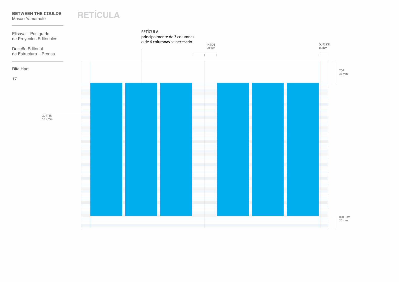
RETÍCulA
RETÍCULAprincipalmente de 3 columnas o de 6 columnas se necesario
GUTTERde 5 mm
TOP35 mm
OUTSIDE15 mm
INSIDE20 mm
BOTTOM20 mm

BETwEEN ThE COuldSMasao Yamamoto
Elisava – Postgrado de Proyectos Editoriales
Deseño Editorialde Estructura – Prensa
Rita Hart
18
RETÍCulA
Textos
Imagénes

BETwEEN ThE COuldSMasao Yamamoto
Elisava – Postgrado de Proyectos Editoriales
Deseño Editorialde Estructura – Prensa
Rita Hart
19
RETÍCulA
Textos
Imagénes

BETwEEN ThE COuldSMasao Yamamoto
Elisava – Postgrado de Proyectos Editoriales
Deseño Editorialde Estructura – Prensa
Rita Hart
20
RETÍCulA
Textos
Imagénes

S o in the interest of minimizing the pain and suffering of selling your art – and of encouraging more people
everywhere to own more art – please feel free to incorporate any or all of the following helpful hints about why art is worth own- ing into as many of your sales presenta- tions as necessary:
Art is a powerful form of expression not only for the artists who create it, but also for those who own it. Art allows people to express their individuality, and to represent deeply held beliefs, feelings, convictions.
Art encourages people to ask questions, to take brief moments out of our busy lives to reflect on ideas other than how to make more money faster or how to get over on the competition.
Art improves quality of life. All you have to do is think about the differen-ce between a room with bare walls and one with walls full of art.
Art inspires people to think about and even visualize ways that life might one day be better than it is now.
Art stimulates the expression and inter-change of thoughts, feelings, and ideas among strangers who might never otherwise say a single word.
Children are fascinated with art. Art makes children ask questions, encourages them to fantasize and imagine, and expends their perceptions of reality. Art teaches children how to be creative.
Art is environmentally friendly, energy efficient, and easy to maintain. It does not increase global warming, use fossil fuels, or need to be serviced on a regular basis, and it’s certainly not just another expendable.
Art transforms and personalizes the places where we live and work. Art can evolve lifeless interiors, into uni- que, beautiful and engaging local.
An original work of art is not only visually appealing, but it also commu- nicates the personality, abilities, creativity, inspiration, attitudes, and at best, the brilliance and genius.
Art makes people proud to live, work, and play where they do. They point to their museums, public monu-ments, and cultural institutions with pride. For those of you buyers who like to profit from your art, people decide where to spend their time (and money) based on the types or amounts of art.
For those so inclined, art can be used to signify wealth, success or power, and can even be used to intimidate. Anyone who sits and meets with this individual must also contend with his art.
Selling art can be just as hard, if not harder, than making art. This sentiment has been and will continue to be echoed by fine artists everywhere for as long as artists make art. The instant a work of art is finished and ready to leave an artist’s studio, that artist is now confronted with the seemingly insurmountable task of having to convince someone somewhere that not only is the art worth experiencing, enjoying and appreciating.
PATRICIA JAMES
WHY SHOULDPEOPLE BUY AND OWN ART?
01
02
03
04
05
06
09
10
1107
08
15CHECKING IN... 14
PHOTO BY WILLIAM POWHIDA
CRAFT*
BETwEEN ThE COuldSMasao Yamamoto
Elisava – Postgrado de Proyectos Editoriales
Deseño Editorialde Estructura – Prensa
Rita Hart
21
RETÍCulA
Textos
Imagénes

S o in the interest of minimizing the pain and suffering of selling your art – and of encouraging more people
everywhere to own more art – please feel free to incorporate any or all of the following helpful hints about why art is worth own- ing into as many of your sales presenta- tions as necessary:
Art is a powerful form of expression not only for the artists who create it, but also for those who own it. Art allows people to express their individuality, and to represent deeply held beliefs, feelings, convictions.
Art encourages people to ask questions, to take brief moments out of our busy lives to reflect on ideas other than how to make more money faster or how to get over on the competition.
Art improves quality of life. All you have to do is think about the differen-ce between a room with bare walls and one with walls full of art.
Art inspires people to think about and even visualize ways that life might one day be better than it is now.
Art stimulates the expression and inter-change of thoughts, feelings, and ideas among strangers who might never otherwise say a single word.
Children are fascinated with art. Art makes children ask questions, encourages them to fantasize and imagine, and expends their perceptions of reality. Art teaches children how to be creative.
Art is environmentally friendly, energy efficient, and easy to maintain. It does not increase global warming, use fossil fuels, or need to be serviced on a regular basis, and it’s certainly not just another expendable.
Art transforms and personalizes the places where we live and work. Art can evolve lifeless interiors, into uni- que, beautiful and engaging local.
An original work of art is not only visually appealing, but it also commu- nicates the personality, abilities, creativity, inspiration, attitudes, and at best, the brilliance and genius.
Art makes people proud to live, work, and play where they do. They point to their museums, public monu-ments, and cultural institutions with pride. For those of you buyers who like to profit from your art, people decide where to spend their time (and money) based on the types or amounts of art.
For those so inclined, art can be used to signify wealth, success or power, and can even be used to intimidate. Anyone who sits and meets with this individual must also contend with his art.
Selling art can be just as hard, if not harder, than making art. This sentiment has been and will continue to be echoed by fine artists everywhere for as long as artists make art. The instant a work of art is finished and ready to leave an artist’s studio, that artist is now confronted with the seemingly insurmountable task of having to convince someone somewhere that not only is the art worth experiencing, enjoying and appreciating.
PATRICIA JAMES
WHY SHOULDPEOPLE BUY AND OWN ART?
01
02
03
04
05
06
09
10
1107
08
15CHECKING IN... 14
PHOTO BY WILLIAM POWHIDA
CRAFT*
BETwEEN ThE COuldSMasao Yamamoto
Elisava – Postgrado de Proyectos Editoriales
Deseño Editorialde Estructura – Prensa
Rita Hart
22
RETÍCulA

BETwEEN ThE COuldSMasao Yamamoto
Elisava – Postgrado de Proyectos Editoriales
Deseño Editorialde Estructura – Prensa
Rita Hart
23
MATERIAIS
PAPEl
Papel CubiertaPapel Biblos Guarros – es un papel couchet blanco texturado.- Tiene una textura como de una tela de un quadro.
Papel Gris (1º y 2º caderno)Papel Popset perla para seccionés más ligadas a economía – Checking in..., Report, Future y *Things- Mucho carácter y con una contextualización muy clara.
Papel Offset blanco (3º caderno)Papel blanco para hacer diferencia con las otras secciones – seccione de arte- Gran calidez al tacto, mucha absorción de tinta en la impressión. Excelente para la lectura.
Papel Estucado Brillante (4º caderno)Papel con textura diferente – para secção de editoriais de moda, que es una seccione á parte.- Gran calidade de impresión. Buen resultado en texto y principalmente fotografia.
BETwEEN ThE COuldSMasao Yamamoto
Elisava – Postgrado de Proyectos Editoriales
Deseño Editorialde Estructura – Prensa
Rita Hart
24
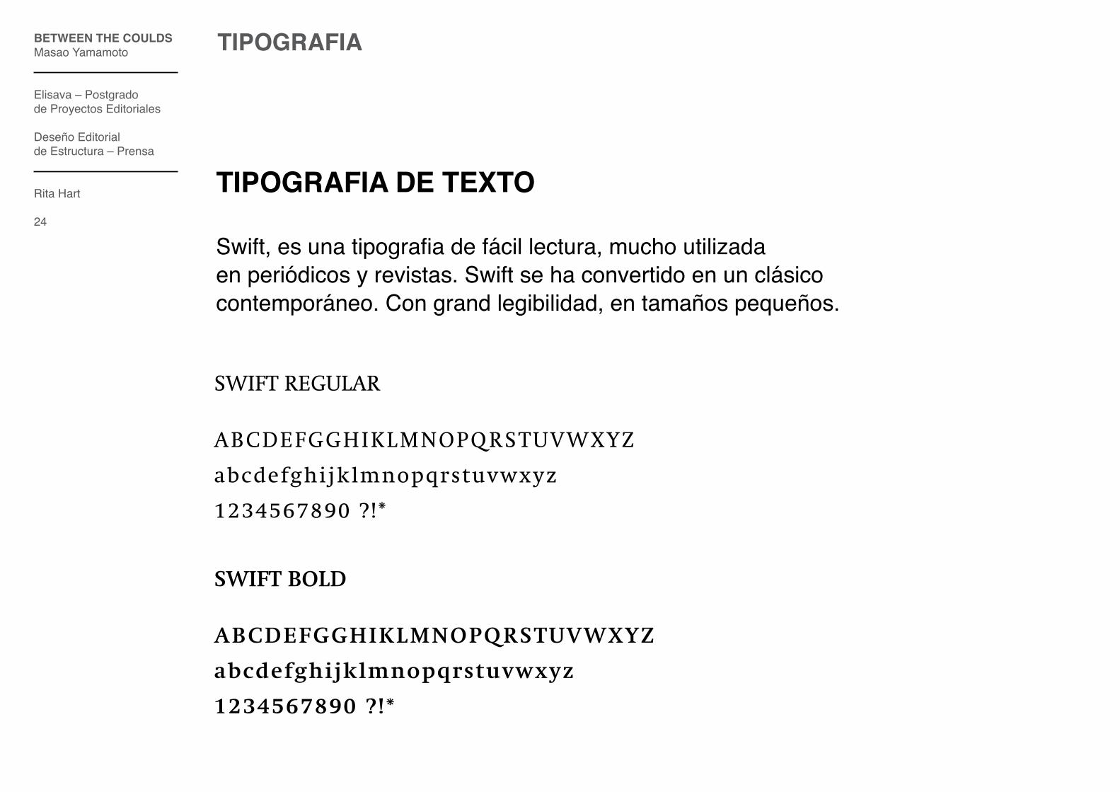
TIPOGRAFIA
TIPOGRAFIA dE TEXTO
Swift, es una tipografia de fácil lectura, mucho utilizada en periódicos y revistas. Swift se ha convertido en un clásico contemporáneo. Con grand legibilidad, en tamaños pequeños.
SWIFT REGULAR
ABCDEFGGHIKLMNOPQRSTUVWXYZ
abcdefghijklmnopqrstuvwxyz
1234567890 ?!*
SWIFT BOLD
ABCDEFGGHIKLMNOPQRSTUVWXYZ
abcdefghijklmnopqrstuvwxyz
1234567890 ?!*

BETwEEN ThE COuldSMasao Yamamoto
Elisava – Postgrado de Proyectos Editoriales
Deseño Editorialde Estructura – Prensa
Rita Hart
25
TIPOGRAFIA
TIPOGRAFIA dE BASE (como paginación)
ITC Officina Sans es una tipografia de la miesma familiade la ITC Officina Serif.Es utilizada en los pormenores de la revista.
ITC OFFICINA SANS BOOK
ABCDEFGGHIKLMNOPQRSTUVWXYZ
abcdefghi jk lmnopqrstuvwxyz
1234567890 ?!*
ITC OFFICINA SANS BOLD
ABCDEFGGHIKLMNOPQRSTUVWXYZ
abcdefghijklmnopqrstuvwxyz
1234567890 ?!*

BETwEEN ThE COuldSMasao Yamamoto
Elisava – Postgrado de Proyectos Editoriales
Deseño Editorialde Estructura – Prensa
Rita Hart
26
TIPOGRAFIA
TIPOGRAFIA dE dIVISIÓN dE SECCIÓN
Umbra es utilizada para como tipografia de identidad corporativae tambien como en las divisiones de sección.Es una fuente con gran personalidad e fuerza.
ITC OFFICINA SERIF BOOK
ABCDEFGGHIKLMNOPQRSTUVWXYZ
abcdefghijklmnopqrstuvwxyz
1234567890 ?!*

BETwEEN ThE COuldSMasao Yamamoto
Elisava – Postgrado de Proyectos Editoriales
Deseño Editorialde Estructura – Prensa
Rita Hart
27
TIPOGRAFIA
TIPOGRAFIA dE TITulARES/ SuBTITulARES/ dESTACAdOS
ITC Officina serif es una tipografia con gran personalidade, fuerza y carisma. Es bastante utilizada en periodicos y revistasde economia.
ITC OFFICINA SERIF BOOK
ABCDEFGGHIKLMNOPQRSTUVWXYZ
abcdefghijklmnopqrstuvwxyz
1234567890 ?!*
ITC OFFICINA SERIF BOLD
ABCDEFGGHIKLMNOPQRSTUVWXYZ
abcdefghijklmnopqrstuvwxyz
1234567890 ?!*
BETwEEN ThE COuldSMasao Yamamoto
Elisava – Postgrado de Proyectos Editoriales
Deseño Editorialde Estructura – Prensa
Rita Hart
28
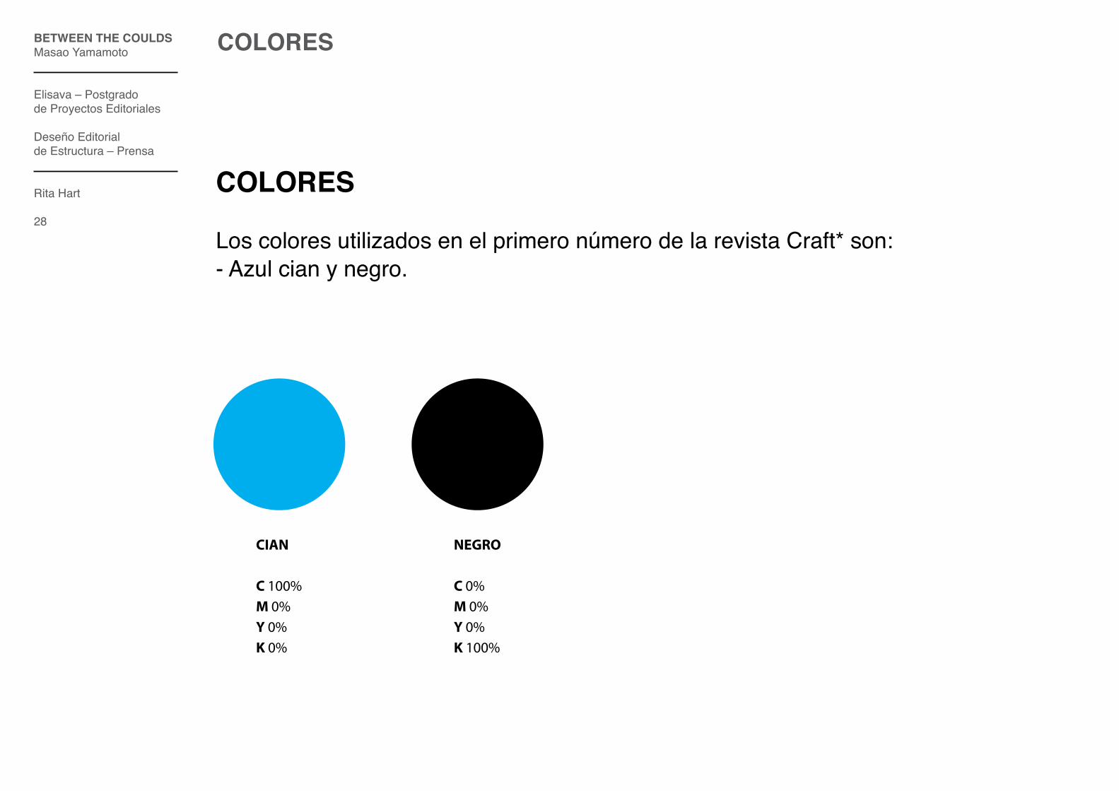
COlORES
COlORES Los colores utilizados en el primero número de la revista Craft* son:- Azul cian y negro.
CIAN
C 100%M 0%Y 0%K 0%
NEGRO
C 0%M 0%Y 0%K 100%

BETwEEN ThE COuldSMasao Yamamoto
Elisava – Postgrado de Proyectos Editoriales
Deseño Editorialde Estructura – Prensa
Rita Hart
29
COlORES
COlORES OTROS NÚMEROS
En cada número de la revista hay un color que se destaca.Estas seriam las colores de los números seguientes:
GRIS
C 0%M 0%Y 0%K 40%
VERDE
C 100%M 0%Y 50%K 0%
ROJO
C 0%M 100%Y 100%K 0%
ROSA
C 0%M100%Y 0%K 0%
AMARILLO
C 0%M 15%Y 100%K 6%
GRANTE
C 24%M100%Y 100%K 22%

BETwEEN ThE COuldSMasao Yamamoto
Elisava – Postgrado de Proyectos Editoriales
Deseño Editorialde Estructura – Prensa
Rita Hart
30
REVISTA – CABECERA
Craft*
01
E C O N O M Y I N A R T S M A G A Z I N E
CABECERA
En cada número de la revista hay un color que se destaca, y este cambia tambiénen la cabecera.

BETwEEN ThE COuldSMasao Yamamoto
Elisava – Postgrado de Proyectos Editoriales
Deseño Editorialde Estructura – Prensa
Rita Hart
31
REVISTA – Portada

BETwEEN ThE COuldSMasao Yamamoto
Elisava – Postgrado de Proyectos Editoriales
Deseño Editorialde Estructura – Prensa
Rita Hart
32
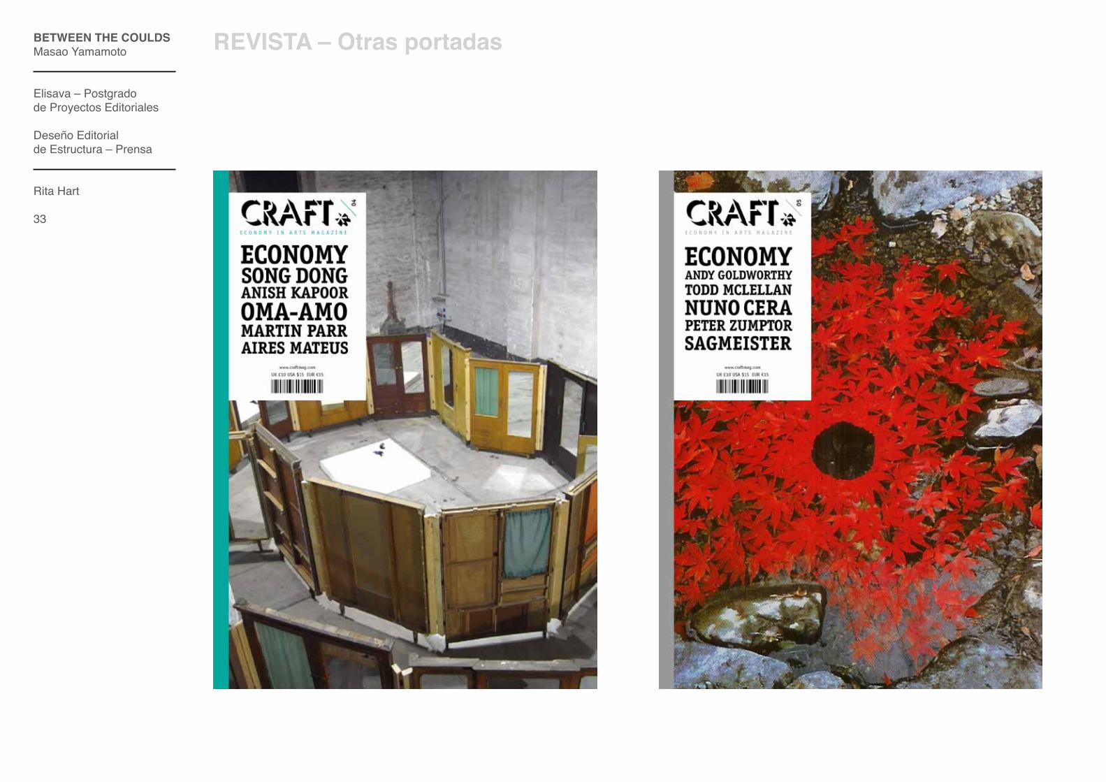
REVISTA – Otras portadas
BETwEEN ThE COuldSMasao Yamamoto
Elisava – Postgrado de Proyectos Editoriales
Deseño Editorialde Estructura – Prensa
Rita Hart
33
REVISTA – Otras portadas

BETwEEN ThE COuldSMasao Yamamoto
Elisava – Postgrado de Proyectos Editoriales
Deseño Editorialde Estructura – Prensa
Rita Hart
34
REVISTA – Otras portadas

BETwEEN ThE COuldSMasao Yamamoto
Elisava – Postgrado de Proyectos Editoriales
Deseño Editorialde Estructura – Prensa
Rita Hart
35
REVISTA – Otras portadas

REVISTA COMPlETA
BETwEEN ThE COuldSMasao Yamamoto
Elisava – Postgrado de Proyectos Editoriales
Deseño Editorialde Estructura
Rita Hart
36

BETwEEN ThE COuldSMasao Yamamoto
Elisava – Postgrado de Proyectos Editoriales
Deseño Editorialde Estructura
Rita Hart
GRACIAS