

Pragmatic Responsive Web Design
34
Pragmatic Responsive Web Design From / John Tsevdos @tsevdos
-
Upload
john-tsevdos -
Category
Technology
-
view
358 -
download
1
description
Presentation I gave at the 1st UpNorth conference (1/12/2012). http://www.upnorthconf.gr
Transcript of Pragmatic Responsive Web Design
PragmaticResponsiveWeb Design
From / John Tsevdos @tsevdos
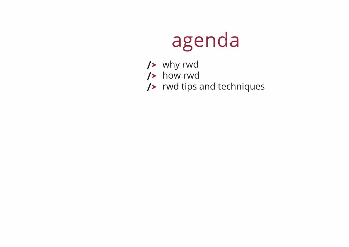
agendawhy rwdhow rwdrwd tips and techniques
why responsive?and not nativeand not mobile site
because with aresponsive web site we
provide supportfor all devices, including tablets, phones and tvsfor all screen sizesfor all (modern?) browsersand because we love the "one site to rule themall" attitude
responsive web designprinciples
flexible layout (grid)media queriesflexible media (images, videos, etc.)

that's all bye, bye...
...but I promisepragmatic responsive
web design!

being pragmaticthink differentsupport as many devices/browsers your budgetallowssolve problems with simple solutions
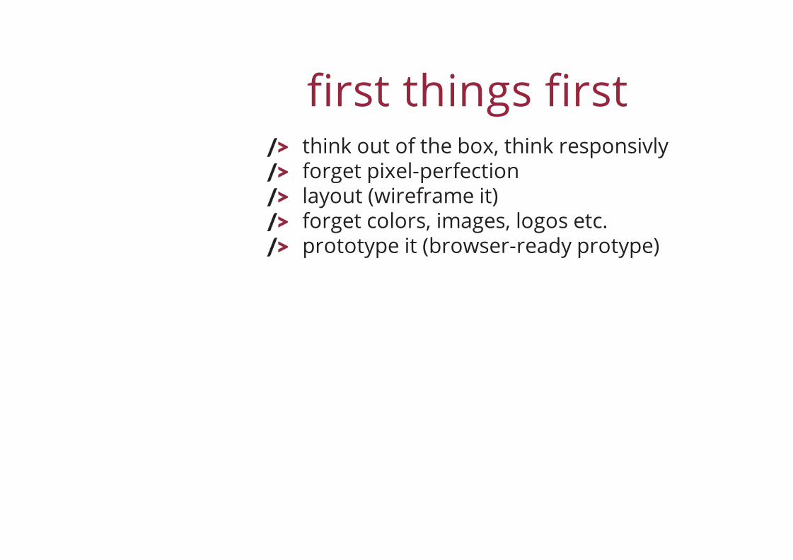
first things firstthink out of the box, think responsivlyforget pixel-perfectionlayout (wireframe it)forget colors, images, logos etc.prototype it (browser-ready protype)
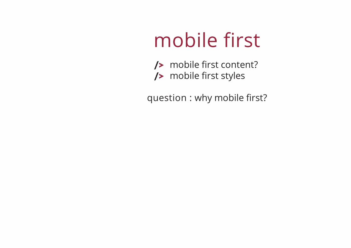
mobile firstmobile first content?mobile first styles
question : why mobile first?
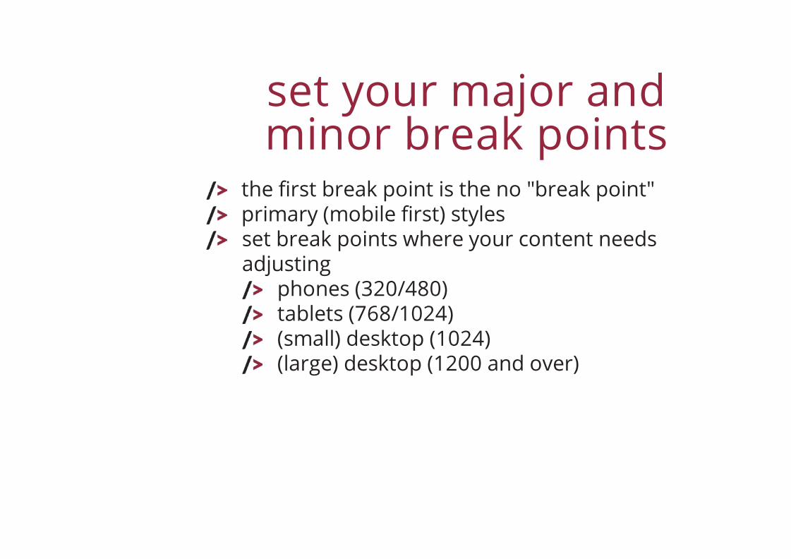
set your major andminor break points
the first break point is the no "break point"primary (mobile first) stylesset break points where your content needsadjusting
phones (320/480)tablets (768/1024)(small) desktop (1024)(large) desktop (1200 and over)
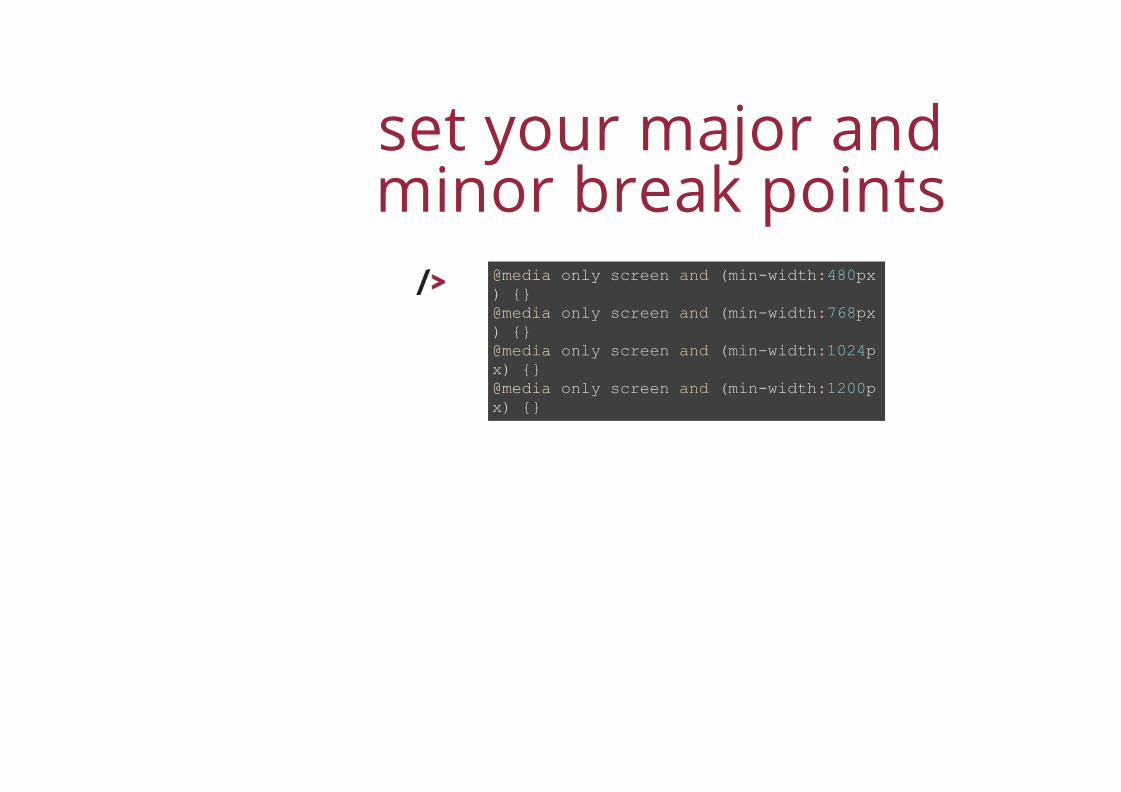
set your major andminor break points
@media only screen and (min-width:480px) {}@media only screen and (min-width:768px) {}@media only screen and (min-width:1024px) {}@media only screen and (min-width:1200px) {}
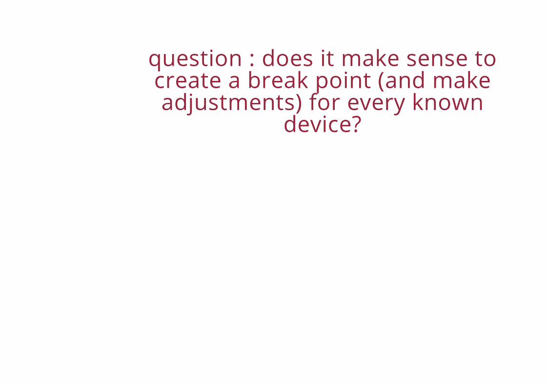
question : does it make sense tocreate a break point (and makeadjustments) for every known
device?
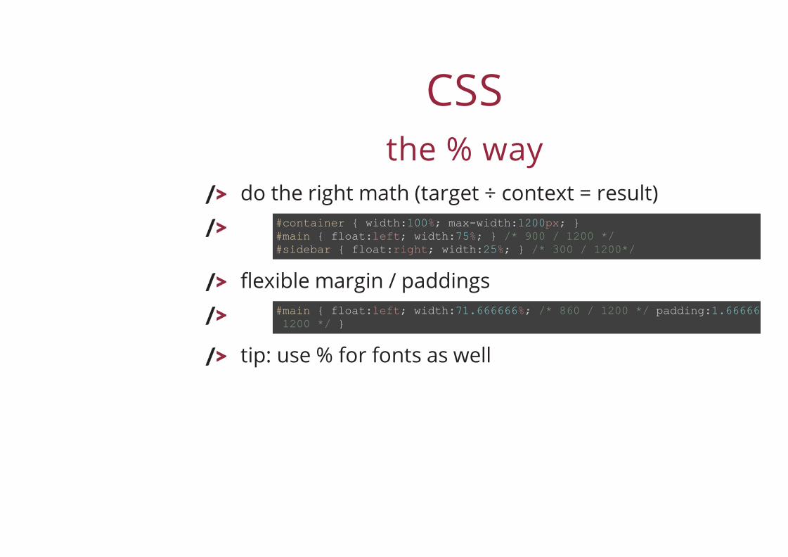
CSSthe % way
do the right math (target ÷ context = result)
flexible margin / paddings
tip: use % for fonts as well
#container { width:100%; max-width:1200px; }#main { float:left; width:75%; } /* 900 / 1200 */#sidebar { float:right; width:25%; } /* 300 / 1200*/
#main { float:left; width:71.666666%; /* 860 / 1200 */ padding:1.666666 1200 */ }
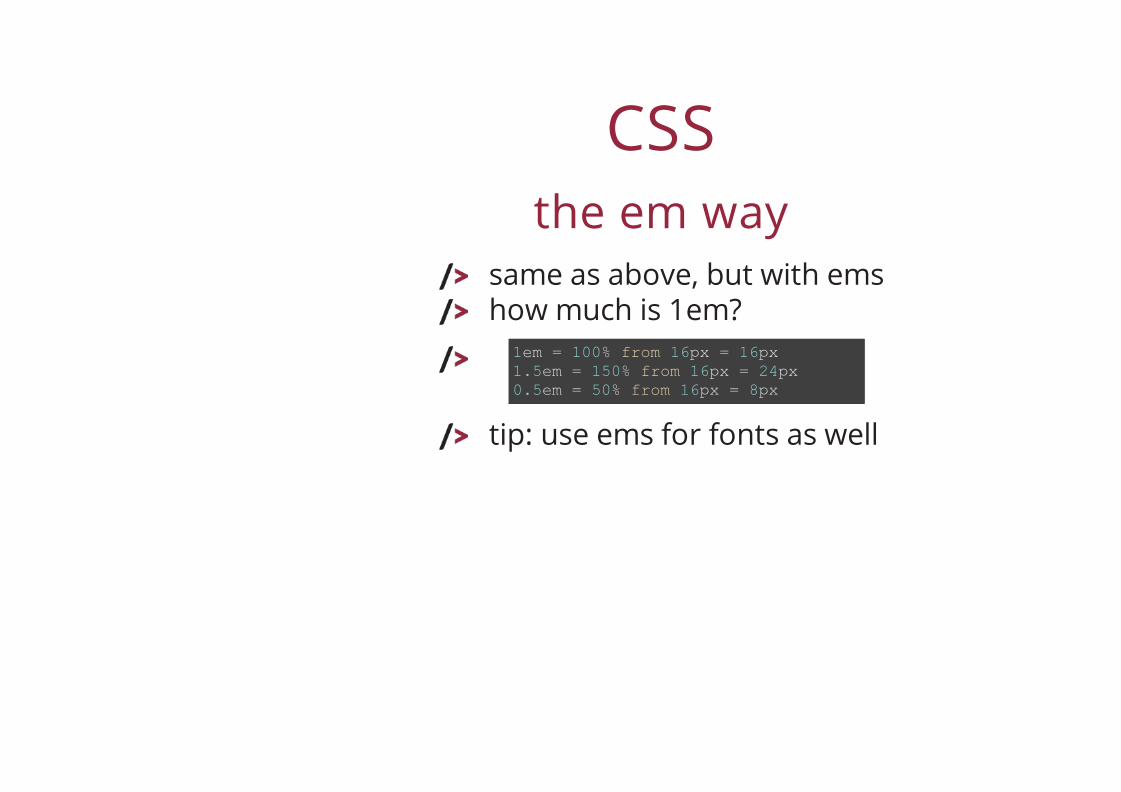
CSSthe em way
same as above, but with emshow much is 1em?
tip: use ems for fonts as well
1em = 100% from 16px = 16px1.5em = 150% from 16px = 24px0.5em = 50% from 16px = 8px
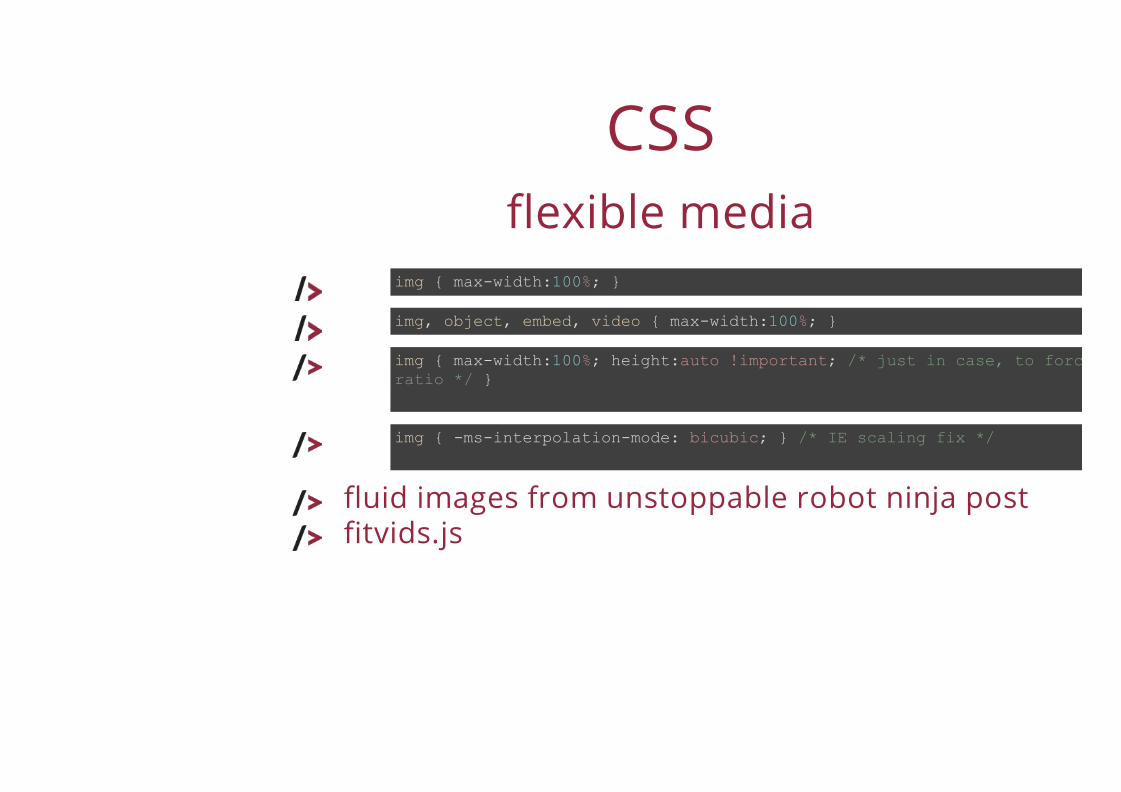
CSSflexible media
img { max-width:100%; }
img, object, embed, video { max-width:100%; }
img { max-width:100%; height:auto !important; /* just in case, to force correct aspet ratio */ }
img { -ms-interpolation-mode: bicubic; } /* IE scaling fix */
fluid images from unstoppable robot ninja postfitvids.js
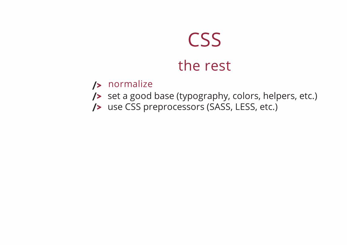
CSSthe rest
set a good base (typography, colors, helpers, etc.)use CSS preprocessors (SASS, LESS, etc.)
normalize
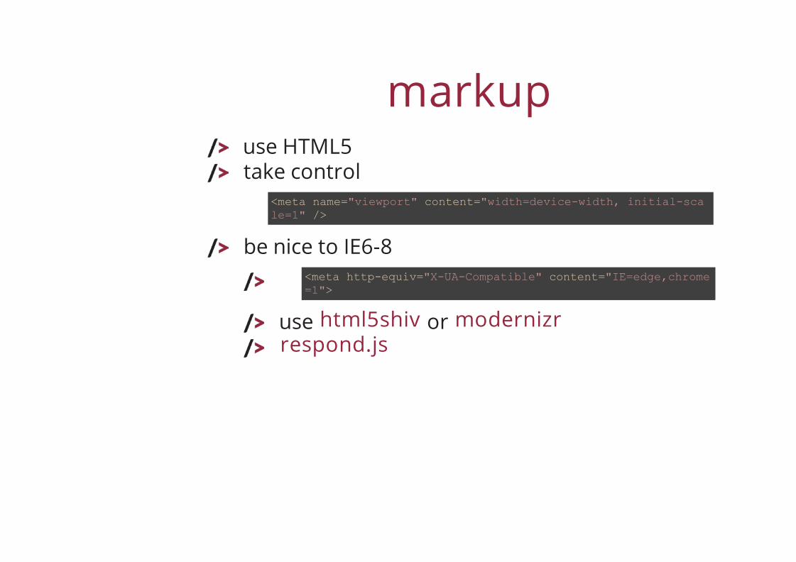
markupuse HTML5take control
be nice to IE6-8
use or
<meta name="viewport" content="width=device-width, initial-scale=1" />
<meta http-equiv="X-UA-Compatible" content="IE=edge,chrome=1">
html5shiv modernizrrespond.js
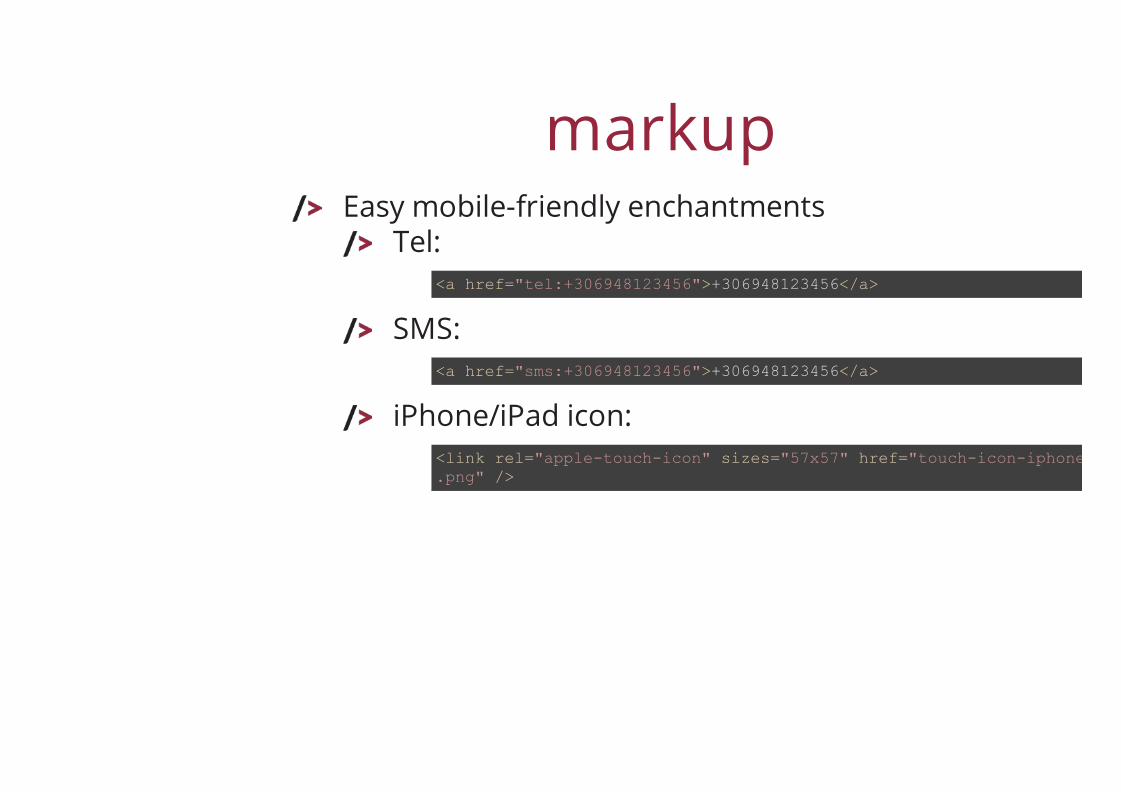
markupEasy mobile-friendly enchantments
Tel:
SMS:
iPhone/iPad icon:
<a href="tel:+306948123456">+306948123456</a>
<a href="sms:+306948123456">+306948123456</a>
<link rel="apple-touch-icon" sizes="57x57" href="touch-icon-iphone-114.png" />
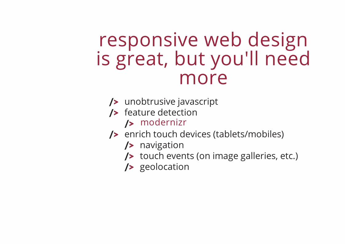
responsive web designis great, but you'll need
moreunobtrusive javascriptfeature detection
enrich touch devices (tablets/mobiles)navigationtouch events (on image galleries, etc.)geolocation
modernizr
hand-code orframeworks
that's a tough one, it dependsbudgettimeproject scale
responsive web designframeworks
BootstrapFoundation
responsive web designpatterns
(all images arefrom the post)
Multi-Device Layout Patterns
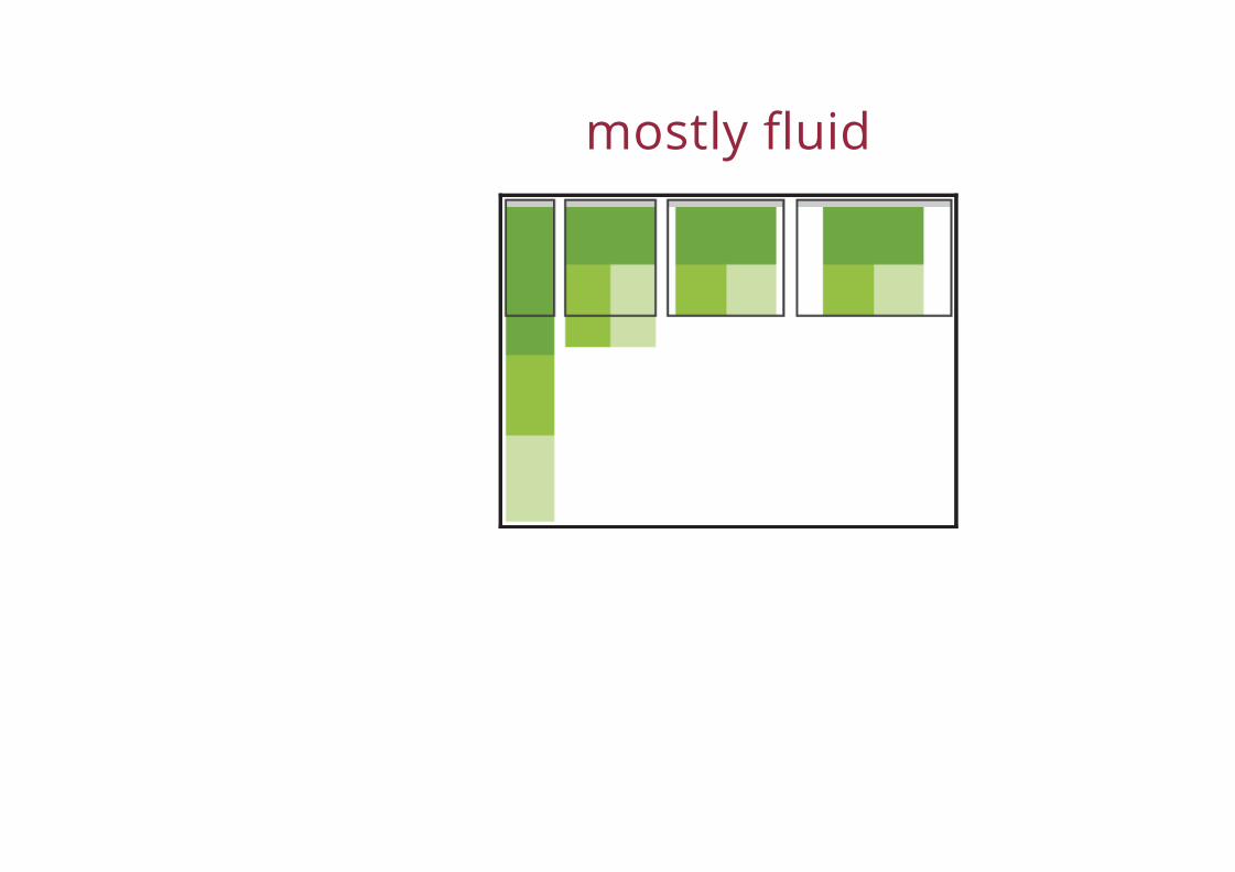
mostly fluid
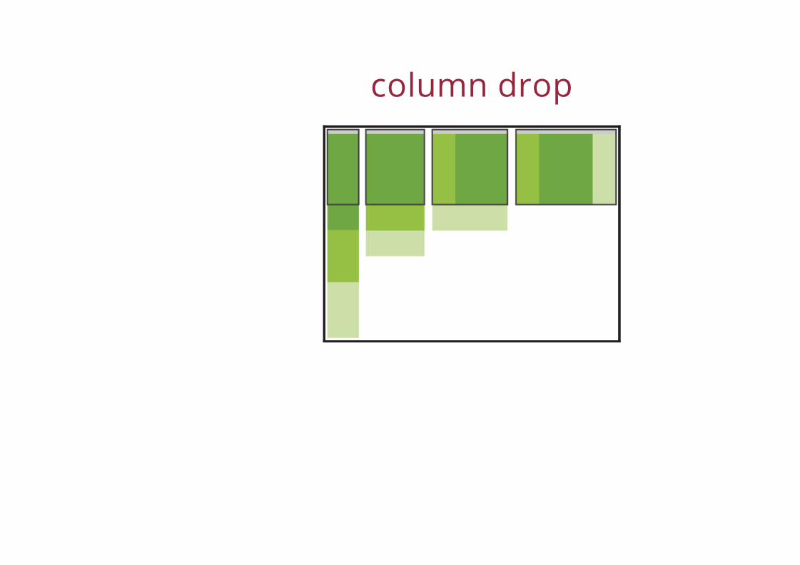
column drop
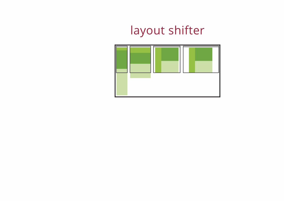
layout shifter

tiny tweaks

off canvas
responsive web designpatternsResponsive Patterns
toolboxtext editor / IDEChrome / FirefoxiPadiPhoneAdobe Edge Inspect
testingdon't rely on emulators and other desktop toolstry to test to as many devices / browsers / OS youcanyou're not magician, it may not work on yourmum's mobile...

thank you
questions ?


![Responsive Design Fundamentals [Read-Only] - … Design Fundame… · Responsive Design Fundamentals Carolyn Yon, PMI-ACP Development Manager ... Responsive Design • web design](https://static.fdocuments.us/doc/165x107/5b7c060b7f8b9adb4c8df8c4/responsive-design-fundamentals-read-only-design-fundame-responsive-design.jpg)