Potentially Preventable Deaths Among the Five Leading ... · (ICD-10) codes. † The five leading...
40
Continuing Education examination available at http://www.cdc.gov/mmwr/cme/conted_info.html#weekly. U.S. Department of Health and Human Services Centers for Disease Control and Prevention Morbidity and Mortality Weekly Report Weekly / Vol. 65 / No. 45 November 18, 2016 INSIDE 1256 Trends in Obesity Among Participants Aged 2–4 Years in the Special Supplemental Nutrition Program for Women, Infants, and Children — United States, 2000–2014 1261 CDC Grand Rounds: A Public Health Approach to Detect and Control Hypertension 1265 Disparities in the Prevalence of Diagnosed Diabetes — United States, 1999–2002 and 2011–2014 1270 Global Routine Vaccination Coverage, 2015 1274 Notes from the Field: Fungal Bloodstream Infections Associated with a Compounded Intravenous Medication at an Outpatient Oncology Clinic — New York City, 2016 1276 Notes from the Field: Cardiac Dysrhythmias After Loperamide Abuse — New York, 2008–2016 1278 Announcements 1281 QuickStats Death rates by specific causes vary across the 50 states and the District of Columbia.* Information on differences in rates for the leading causes of death among states might help state health officials determine prevention goals, priorities, and strategies. CDC analyzed National Vital Statistics System data to provide national and state-specific estimates of potentially preventable deaths among the five leading causes of death in 2014 and compared these estimates with estimates previously published for 2010. Compared with 2010, the estimated number of potentially preventable deaths changed (supple- mental material at https://stacks.cdc.gov/view/cdc/42472); cancer deaths decreased 25% (from 84,443 to 63,209), stroke deaths decreased 11% (from 16,973 to 15,175), heart disease deaths decreased 4% (from 91,757 to 87,950), chronic lower respiratory disease (CLRD) (e.g., asthma, bronchitis, and emphysema) deaths increased 1% (from 28,831 to 29,232), and deaths from unintentional injuries increased 23% (from 36,836 to 45,331). A better understanding of progress made in reducing potentially preventable deaths in the United States might inform state and regional efforts targeting the preven- tion of premature deaths from the five leading causes in the United States. To determine significant changes in the number of potentially preventable deaths for the five leading causes of death in the United States, CDC analyzed National Vital Statistics System mortality data from 2014 (1) using the same analytic model presented in the original report that used 2010 data as benchmarks ( 2). The number of potentially preventable deaths per year per state in persons aged <80 years was determined by comparing the number of expected deaths (based on the cause-specific average death rate of the three states with the lowest 2008–2010 average rate by age groups) with the number of observed deaths in 2010 and 2014. Further detail on age-adjusted rates by state and cause can be found in yearly publications on final death data ( 1). Population estimates for 2010 and 2014 were produced by the U.S. Census Bureau. The calculations of potentially pre- ventable deaths were restricted to U.S. residents and deaths in persons aged <80 years. Premature death was defined as a death that occurred in a person aged <80 years, based on the average life expectancy for the total U.S. population, which was nearly Potentially Preventable Deaths Among the Five Leading Causes of Death — United States, 2010 and 2014 Macarena C. García, DrPH 1 ; Brigham Bastian 2 ; Lauren M. Rossen, PhD 2 ; Robert Anderson, PhD 2 ; Arialdi Miniño, MPH 2 ; Paula W. Yoon, ScD 1 ; Mark Faul, PhD 3 ; Greta Massetti, PhD 4 ; Cheryll C. Thomas, MSPH 4 ; Yuling Hong, MD 4 ; Michael F. Iademarco, MD 1 * http://www.cdc.gov/nchs/data/nvsr/nvsr61/nvsr61_04.pdf.
Transcript of Potentially Preventable Deaths Among the Five Leading ... · (ICD-10) codes. † The five leading...

Continuing Education examination available at http://www.cdc.gov/mmwr/cme/conted_info.html#weekly.
U.S. Department of Health and Human ServicesCenters for Disease Control and Prevention
Morbidity and Mortality Weekly ReportWeekly / Vol. 65 / No. 45 November 18, 2016
INSIDE1256 Trends in Obesity Among Participants Aged
2–4 Years in the Special Supplemental Nutrition Program for Women, Infants, and Children — United States, 2000–2014
1261 CDC Grand Rounds: A Public Health Approach to Detect and Control Hypertension
1265 Disparities in the Prevalence of Diagnosed Diabetes — United States, 1999–2002 and 2011–2014
1270 Global Routine Vaccination Coverage, 20151274 Notes from the Field: Fungal Bloodstream
Infections Associated with a Compounded Intravenous Medication at an Outpatient Oncology Clinic — New York City, 2016
1276 Notes from the Field: Cardiac Dysrhythmias After Loperamide Abuse — New York, 2008–2016
1278 Announcements1281 QuickStats
Death rates by specific causes vary across the 50 states and the District of Columbia.* Information on differences in rates for the leading causes of death among states might help state health officials determine prevention goals, priorities, and strategies. CDC analyzed National Vital Statistics System data to provide national and state-specific estimates of potentially preventable deaths among the five leading causes of death in 2014 and compared these estimates with estimates previously published for 2010. Compared with 2010, the estimated number of potentially preventable deaths changed (supple-mental material at https://stacks.cdc.gov/view/cdc/42472); cancer deaths decreased 25% (from 84,443 to 63,209), stroke deaths decreased 11% (from 16,973 to 15,175), heart disease deaths decreased 4% (from 91,757 to 87,950), chronic lower respiratory disease (CLRD) (e.g., asthma, bronchitis, and emphysema) deaths increased 1% (from 28,831 to 29,232), and deaths from unintentional injuries increased 23% (from 36,836 to 45,331). A better understanding of progress made in reducing potentially preventable deaths in the United States might inform state and regional efforts targeting the preven-tion of premature deaths from the five leading causes in the United States.
To determine significant changes in the number of potentially preventable deaths for the five leading causes of death in the United States, CDC analyzed National Vital Statistics System mortality data from 2014 (1) using the same analytic model presented in the original report that used 2010 data as benchmarks (2). The number of potentially preventable deaths per year per state in persons aged <80 years was determined by comparing the number of expected deaths (based on the cause-specific average death rate of the three states with the lowest 2008–2010
average rate by age groups) with the number of observed deaths in 2010 and 2014. Further detail on age-adjusted rates by state and cause can be found in yearly publications on final death data (1).
Population estimates for 2010 and 2014 were produced by the U.S. Census Bureau. The calculations of potentially pre-ventable deaths were restricted to U.S. residents and deaths in persons aged <80 years. Premature death was defined as a death that occurred in a person aged <80 years, based on the average life expectancy for the total U.S. population, which was nearly
Potentially Preventable Deaths Among the Five Leading Causes of Death — United States, 2010 and 2014
Macarena C. García, DrPH1; Brigham Bastian2; Lauren M. Rossen, PhD2; Robert Anderson, PhD2; Arialdi Miniño, MPH2; Paula W. Yoon, ScD1; Mark Faul, PhD3; Greta Massetti, PhD4; Cheryll C. Thomas, MSPH4; Yuling Hong, MD4; Michael F. Iademarco, MD1
* http://www.cdc.gov/nchs/data/nvsr/nvsr61/nvsr61_04.pdf.

Morbidity and Mortality Weekly Report
1246 MMWR / November 18, 2016 / Vol. 65 / No. 45 US Department of Health and Human Services/Centers for Disease Control and Prevention
The MMWR series of publications is published by the Center for Surveillance, Epidemiology, and Laboratory Services, Centers for Disease Control and Prevention (CDC), U.S. Department of Health and Human Services, Atlanta, GA 30329-4027.Suggested citation: [Author names; first three, then et al., if more than six.] [Report title]. MMWR Morb Mortal Wkly Rep 2016;65:[inclusive page numbers].
Centers for Disease Control and PreventionThomas R. Frieden, MD, MPH, Director
Harold W. Jaffe, MD, MA, Associate Director for Science Joanne Cono, MD, ScM, Director, Office of Science Quality
Chesley L. Richards, MD, MPH, Deputy Director for Public Health Scientific ServicesMichael F. Iademarco, MD, MPH, Director, Center for Surveillance, Epidemiology, and Laboratory Services
MMWR Editorial and Production Staff (Weekly)Sonja A. Rasmussen, MD, MS, Editor-in-Chief
Charlotte K. Kent, PhD, MPH, Executive Editor Jacqueline Gindler, MD, Editor
Teresa F. Rutledge, Managing Editor Douglas W. Weatherwax, Lead Technical Writer-Editor
Stacy A. Benton, Soumya Dunworth, PhD, Teresa M. Hood, MS, Technical Writer-Editors
Martha F. Boyd, Lead Visual Information SpecialistMaureen A. Leahy, Julia C. Martinroe,
Stephen R. Spriggs, Moua Yang, Tong Yang,Visual Information Specialists
Quang M. Doan, MBA, Phyllis H. King, Terraye M. Starr,Information Technology Specialists
MMWR Editorial BoardTimothy F. Jones, MD, ChairmanMatthew L. Boulton, MD, MPH
Virginia A. Caine, MD Katherine Lyon Daniel, PhD
Jonathan E. Fielding, MD, MPH, MBADavid W. Fleming, MD
William E. Halperin, MD, DrPH, MPHKing K. Holmes, MD, PhD
Robin Ikeda, MD, MPH Rima F. Khabbaz, MD
Phyllis Meadows, PhD, MSN, RNJewel Mullen, MD, MPH, MPA
Jeff Niederdeppe, PhDPatricia Quinlisk, MD, MPH
Patrick L. Remington, MD, MPH Carlos Roig, MS, MA
William L. Roper, MD, MPH William Schaffner, MD
79 years in 2010 (2). Analysis was restricted to deaths with an underlying cause of death among the five leading causes, based on International Classification of Diseases, 10th Revision (ICD-10) codes.† The five leading causes of death represented 63% of all deaths in 2014, a decrease of 2.3% compared with 2010. In 2014 the next five most frequent causes accounted for approximately 12% of deaths (3).
The number of potentially preventable deaths for each of the five leading causes of death by state in 2014 was calculated in four steps. The first step was to calculate and rank state disease-specific death rates by age group. Using 2008–2010 data, the three states with the lowest observed death rates for each age group and specific cause of death category were selected and their death rates averaged across the three states to calculate a lowest average age-specific death rate for each cause of death. For example, during 2008–10, among persons aged 40–49 years, the three states with the lowest rate of death from unintentional injuries were Maryland, New Jersey, and New York, and the benchmark average was 25.2 (supplemental material at https://stacks.cdc.gov/view/cdc/42342).
The average of the lowest three states was chosen to minimize the effect of any extreme outlier and to represent the low end of the distribution of death rates among the states. The second
step was to calculate expected deaths for each age group and state by multiplying the age-specific state populations for 2010 by the 2010 benchmark death rates (i.e., the lowest three-state average age-specific death rates for each cause). Total expected deaths for each cause and state were calculated by summing expected deaths over all age groups aged <80 years, effectively taking into account differences in mortality across age groups. These state-specific and cause-specific expected death counts represent the number of deaths expected if all states were to achieve the 2010 death rate benchmarks (2). Third, the 2010 potentially preventable deaths were calculated by subtract-ing expected deaths from 2010 observed deaths. Finally, the same 2010 benchmark death rates for each cause were used to calculate 2014 potentially preventable deaths by repeating the third and fourth steps with 2014 population and mortal-ity data. Specifically, the number of expected deaths in 2014 was calculated by multiplying the 2010 benchmark death rates by the 2014 age-specific populations; these expected counts were then subtracted from 2014 observed deaths. The numbers of potentially preventable deaths for each cause were assumed to follow a Poisson distribution, and standard errors were calculated, taking into account stochastic variation, consistent with methods described previously (2), in both the expected and observed number of deaths§ for each cause and year. Statistically significant changes from 2010–2014 were
† Diseases of the heart codes I00-I09, I11, I13, I20-I51; cancer C00-C97; CLRD J40-J47; cerebrovascular diseases (stroke) I60-I69; and unintentional injuries V01-X59, Y85-Y86.
§ Standard error = the square root of [expected number + observed number of deaths].

Morbidity and Mortality Weekly Report
MMWR / November 18, 2016 / Vol. 65 / No. 45 1247US Department of Health and Human Services/Centers for Disease Control and Prevention
assessed using a two-sided z-test (p<0.01). Results are presented for the United States as a whole, by state, and by the 10 U.S. Department of Health and Human Services regions.¶
The five leading causes of death for persons aged <80 years in 2014 (diseases of the heart, malignancies [cancer], cerebro-vascular diseases [stroke], chronic lower respiratory diseases [CLRD], and unintentional injuries [accidents]) represent 63% of deaths from all causes. The estimated number of potentially preventable deaths and the proportion preventable among the five leading causes of death in persons aged <80 years were 87,950 for diseases of the heart (30% preventable); 63,209 for cancer (15% preventable); 45,331 for unintentional injuries
(43% preventable); 29,232 for CLRD (36% preventable); and 15,175 for stroke (28% preventable) (Figure).
Potentially preventable deaths from cancer declined 25% from 2010 to 2014 (the increase in the expected number of deaths was greater than the increase in the observed num-ber). This decline appears to be driven by a 12% decrease in the age-adjusted death rate from lung cancer from 2010 and 2014. Decreases in age-adjusted death rates from cancer were observed across all U.S. states, except the District of Columbia (supplemental material at https://stacks.cdc.gov/view/cdc/42343). The expected number of deaths was based on benchmark death rates from 2010; however, cancer-related death rates declined during 2010–2014. In both 2010 and 2014 the Southeast (Region 4) had the highest number of potentially preventable deaths for each of the five leading causes of death (Table 1). In 2014, the Northwest (Region 10) had the lowest number of potentially preventable deaths for each of the five leading causes of death except deaths from CLRD and unintentional injuries, where the lowest number occurred in New York and New Jersey (Region 2) (Table 2).
Consistent with increases in population since 2010, particu-larly among older age groups, the number of observed deaths
0
10,000
20,000
30,000
40,000
50,000
60,000
70,000
80,000
90,000
100,000
Diseases of the heart Cancer Chronic lowerrespiratory disease
Cerebrovascular diseases(stroke)
Unintentional injuries
20102014
Num
ber o
f pot
entia
lly p
reve
ntab
le d
eath
s
Cause of death
FIGURE. Number of potentially preventable deaths among the five leading causes of death, for persons aged <80 years — United States, 2010 and 2014
¶ Region 1: Connecticut, Maine, Massachusetts, New Hampshire, Rhode Island, and Vermont. Region 2: New Jersey, New York, Puerto Rico, and the U.S. Virgin Islands. Region 3: Delaware, the District of Columbia, Maryland, Pennsylvania, Virginia, and West Virginia. Region 4: Alabama, Florida, Georgia, Kentucky, Mississippi, North Carolina, South Carolina, and Tennessee. Region 5: Illinois, Indiana, Michigan, Minnesota, Ohio, and Wisconsin. Region 6: Arkansas, Louisiana, New Mexico, Oklahoma, and Texas. Region 7: Iowa, Kansas, Missouri, and Nebraska. Region 8: Colorado, Montana, North Dakota, South Dakota, Utah, and Wyoming. Region 9: Arizona, California, Hawaii, Nevada, American Samoa, Commonwealth of the Northern Mariana Islands, Federated States of Micronesia, Guam, Marshall Islands, and Republic of Palau. Region 10: Alaska, Idaho, Oregon, and Washington.

Morbidity and Mortality Weekly Report
1248 MMWR / November 18, 2016 / Vol. 65 / No. 45 US Department of Health and Human Services/Centers for Disease Control and Prevention
TABLE 1. Number of expected, observed, and potentially preventable deaths among the five leading causes of death and significant changes in potentially preventable deaths, for persons aged <80 years, by U.S. Department of Health and Human Services (HHS) region — United States, 2010 and 2014
HHS region
2010 2014
Z-test significanceExpected Observed
Potentially preventable Expected Observed
Potentially preventable
Diseases of the heart1 8,904 10,286 1,382 9,798 10,468 670 *2 16,765 24,477 7,712 18,170 24,272 6,102 *3 18,327 28,563 10,236 20,099 29,185 9,086 *4 38,367 65,198 26,831 43,235 69,897 26,6625 30,726 47,280 16,554 33,618 50,437 16,8196 20,656 35,898 15,242 23,245 39,907 16,662 *7 8,281 12,769 4,488 8,958 13,425 4,4678 5,782 6,464 682 6,616 7,325 7099 26,030 33,352 7,322 29,622 35,133 5,511 *10 7,422 8,401 979 8,539 9,216 677Malignant neoplasms (cancers)1 15,587 19,061 3,474 17,216 18,995 1,779 *2 29,259 34,735 5,476 31,827 34,826 2,999 *3 32,039 42,003 9,964 35,241 43,236 7,995 *4 66,962 90,439 23,477 75,522 95,461 19,939 *5 53,686 71,553 17,867 58,975 73,529 14,554 *6 36,074 46,950 10,876 40,693 49,216 8,523 *7 14,443 19,028 4,585 15,692 19,653 3,9618 10,123 10,708 585 11,625 11,387 -238† *9 45,439 50,611 5,172 51,835 53,179 1,344 *10 13,041 15,861 2,820 15,018 16,700 1,682 *Cerebrovascular diseases (stroke)1 1,722 1,863 141 1,914 1,781 -133 *2 3,261 3,742 481 3,556 3,716 160 *3 3,568 5,239 1,671 3,947 5,511 1,5644 7,538 12,960 5,422 8,567 13,934 5,3675 5,988 8,832 2,844 6,603 9,143 2,5406 4,040 7,174 3,134 4,575 7,749 3,1747 1,628 2,405 777 1,773 2,490 7178 1,128 1,374 246 1,302 1,440 1389 5,078 6,904 1,826 5,822 6,952 1,130 *10 1,439 1,867 428 1,679 1,991 312Chronic lower respiratory diseases (CLRD)1 2,234 2,774 540 2,505 3,068 5632 4,218 4,794 576 4,634 4,697 63 *3 4,630 6,951 2,321 5,166 7,234 2,0684 9,820 18,612 8,792 11,254 21,025 9,771 *5 7,740 13,494 5,754 8,623 14,669 6,0466 5,174 9,539 4,365 5,911 10,547 4,6367 2,111 4,318 2,207 2,317 4,644 2,3278 1,442 2,447 1,005 1,686 2,681 9959 6,514 8,447 1,933 7,550 8,977 1,427 *10 1,857 3,082 1,225 2,195 3,357 1,162Unintentional injuries (accidents)1 2,771 3,703 932 2,866 4,817 1,951 *2 5,357 5,692 335 5,531 6,824 1,293 *3 5,703 8,769 3,066 5,916 10,261 4,345 *4 11,650 23,804 12,154 12,338 24,789 12,4515 9,724 15,104 5,380 9,984 17,898 7,914 *6 7,040 13,487 6,447 7,530 14,598 7,068 *7 2,566 4,720 2,154 2,639 4,901 2,2628 1,985 3,479 1,494 2,136 4,046 1,910 *9 8,845 12,264 3,419 9,420 13,768 4,348 *10 2,414 3,840 1,426 2,569 4,358 1,789 *
* Significant change from 2010 to 2014, p<0.01.† Negative potentially preventable deaths occurred when an HHS region included one or more of the states with the lowest three death rates (the lowest three death
rates were averaged to create the benchmark death rates) for at least a few age groups. Negative potentially preventable deaths are preserved in this table to test changes from 2010 to 2014.

Morbidity and Mortality Weekly Report
MMWR / November 18, 2016 / Vol. 65 / No. 45 1249US Department of Health and Human Services/Centers for Disease Control and Prevention
TABLE 2. Number of expected, observed, and potentially preventable deaths among the five leading causes of death and significant changes in potentially preventable deaths, for persons aged <80 years, by state — United States, 2010 and 2014
State
2010 2014Z-test
significanceExpected Observed Potentially preventable (95% CI) Expected Observed Potentially preventable (95% CI)
Diseases of the heartAlabama 2,993 6,604 3,611 (3,419–3,803) 3,266 6,933 3,667 (3,469–3,865)Alaska 331 463 132 (77–187) 377 497 120 (62–178)Arizona 3,885 4,735 850 (668–1,032) 4,512 5,061 549 (357–741)Arkansas 1,845 3,808 1,963 (1,816–2,110) 1,998 4,258 2,260 (2,105–2,415) *California 19,742 24,707 4,965 (4,552–5,378) 22,358 25,338 2,980 (2,552–3,408) *Colorado 2,707 2,815 108 (-38–254) 3,153 3,246 93 (-64–250)Connecticut 2,176 2,569 393 (258–528) 2,362 2,552 190 (53–327)Delaware 575 857 282 (208–356) 658 929 271 (193–349)District of Columbia 310 729 419 (356–482) 337 733 396 (332–460)Florida 13,352 17,586 4,234 (3,889–4,579) 15,121 19,121 4,000 (3,637–4,363)Georgia 5,120 9,103 3,983 (3,749–4,217) 5,890 9,911 4,021 (3,775–4,267)Hawaii 836 1,007 171 (87–255) 920 1,217 297 (206–388)Idaho 883 1,080 197 (110–284) 1,025 1,240 215 (122–308)Illinois 7,249 11,424 4,175 (3,907–4,443) 7,898 11,839 3,941 (3,666–4,216)Indiana 3,783 6,421 2,638 (2,440–2,836) 4,145 6,779 2,634 (2,429–2,839)Iowa 1,892 2,716 824 (691–957) 2,032 2,622 590 (456–724)Kansas 1,636 2,248 612 (490–734) 1,766 2,402 636 (509–763)Kentucky 2,662 5,332 2,670 (2,495–2,845) 2,912 5,798 2,886 (2,703–3,069)Louisiana 2,609 5,784 3,175 (2,995–3,355) 2,861 6,149 3,288 (3,102–3,474)Maine 928 1,083 155 (67–243) 1,026 1,167 141 (49–233)Maryland 3,303 5,321 2,018 (1,836–2,200) 3,701 5,476 1,775 (1,587–1,963)Massachusetts 3,926 4,416 490 (311–669) 4,333 4,382 49 (-134–232) *Michigan 6,056 10,327 4,271 (4,020–4,522) 6,646 11,461 4,815 (4,551–5,079) *Minnesota 3,050 2,720 -330† (-479 to -181) 3,414 2,951 -463 (-619 to -307)Mississippi 1,750 4,183 2,433 (2,282–2,584) 1,903 4,428 2,525 (2,369–2,681)Missouri 3,691 6,553 2,862 (2,664–3,060) 4,011 7,113 3,102 (2,895–3,309)Montana 650 826 176 (101–251) 733 910 177 (98–256)Nebraska 1,063 1,252 189 (95–283) 1,149 1,288 139 (42–236)Nevada 1,566 2,903 1,337 (1,206–1,468) 1,832 3,517 1,685 (1,542–1,828) *New Hampshire 828 916 88 (6–170) 931 976 45 (-41–131)New Jersey 5,243 7,106 1,863 (1,645–2,081) 5,703 7,145 1,442 (1,220–1,664) *New Mexico 1,253 1,510 257 (154–360) 1,382 1,642 260 (152–368)New York 11,522 17,371 5,849 (5,516–6,182) 12,467 17,127 4,660 (4,323–4,997) *North Carolina 5,679 9,021 3,342 (3,104–3,580) 6,456 9,223 2,767 (2,522–3,012) *North Dakota 406 512 106 (47–165) 437 542 105 (44–166)Ohio 7,164 11,875 4,711 (4,441–4,981) 7,736 12,697 4,961 (4,681–5,241)Oklahoma 2,267 4,857 2,590 (2,425–2,755) 2,456 5,300 2,844 (2,671–3,017)Oregon 2,364 2,421 58 (-79–193) 2,714 2,622 -92 (-235–51)Pennsylvania 8,221 12,668 4,447 (4,164–4,730) 8,824 12,689 3,865 (3,578–4,152) *Rhode Island 636 820 184 (109–259) 689 855 166 (89–243)South Carolina 2,896 5,413 2,517 (2,338–2,696) 3,335 5,742 2,407 (2,220–2,594)South Dakota 491 590 99 (35–163) 541 741 200 (130–270)Tennessee 3,916 7,956 4,040 (3,826–4,254) 4,353 8,741 4,388 (4,164–4,612)Texas 12,683 19,939 7,256 (6,902–7,610) 14,549 22,558 8,009 (7,631–8,387) *Utah 1,194 1,229 35 (-61–131) 1,383 1,349 -34 (-136–68)Vermont 411 482 71 (12–130) 457 536 79 (17–141)Virginia 4,609 6,588 1,979 (1,772–2,186) 5,185 6,978 1,793 (1,577–2,009)Washington 3,844 4,437 593 (415–771) 4,424 4,857 433 (244–622)West Virginia 1,308 2,400 1,092 (973–1,211) 1,395 2,380 985 (865–1,105)Wisconsin 3,424 4,513 1,089 (914–1,264) 3,779 4,710 931 (750–1,112)Wyoming 333 492 159 (103–215) 369 537 168 (109–227)United States 181,261 272,688 91,757 (90,436–93,078) 201,902 289,265 87,950 (86,576–89,324) *
Malignant neoplasms (cancers)Alabama 5,227 7,595 2,368 (2,146–2,590) 5,714 7,796 2,082 (1,854–2,310)Alaska 588 703 115 (45–185) 670 782 112 (37–187)Arizona 6,775 7,460 685 (451–919) 7,857 8,085 228 (-19–475) *Arkansas 3,219 4,720 1,501 (1,326–1,676) 3,487 4,897 1,410 (1,231–1,589)California 34,454 38,226 3,772 (3,244–4,300) 39,157 39,678 521 (-29–1071) *Colorado 4,752 4,944 192 (-1–385) 5,553 5,188 -365 (-568 to -162) *Connecticut 3,805 4,367 562 (385–739) 4,144 4,219 75 (-104–254) *Delaware 1,006 1,352 346 (251–441) 1,151 1,426 275 (176–374)See table footnotes on page 1253.

Morbidity and Mortality Weekly Report
1250 MMWR / November 18, 2016 / Vol. 65 / No. 45 US Department of Health and Human Services/Centers for Disease Control and Prevention
TABLE 2. (Continued) Number of expected, observed, and potentially preventable deaths among the five leading causes of death and significant changes in potentially preventable deaths, for persons aged <80 years, by state — United States, 2010 and 2014
State
2010 2014Z-test
significanceExpected Observed Potentially preventable (95% CI) Expected Observed Potentially preventable (95% CI)
District of Columbia 543 742 199 (129–269) 592 837 245 (171–319)Florida 23,195 28,249 5,054 (4,609–5,499) 26,279 29,519 3,240 (2,777–3,703) *Georgia 8,967 11,820 2,853 (2,570–3,136) 10,323 12,738 2,415 (2,117–2,713)Hawaii 1,467 1,555 88 (-20–196) 1,616 1,693 77 (-36–190)Idaho 1,546 1,753 207 (94–320) 1,796 1,995 199 (78–320)Illinois 12,654 16,558 3,904 (3,569–4,239) 13,840 16,862 3,022 (2,679–3,365) *Indiana 6,612 9,385 2,773 (2,525–3,021) 7,268 9,821 2,553 (2,297–2,809)Iowa 3,295 4,127 832 (663–1,001) 3,559 4,258 699 (526–872)Kansas 2,854 3,624 770 (612–928) 3,098 3,758 660 (498–822)Kentucky 4,655 7,499 2,844 (2,628–3,060) 5,104 7,815 2,711 (2,488–2,934)Louisiana 4,562 6,909 2,347 (2,137–2,557) 5,021 7,137 2,116 (1,900–2,332)Maine 1,627 2,259 632 (510–754) 1,805 2,186 381 (257–505) *Maryland 5,788 7,218 1,430 (1,206–1,654) 6,499 7,616 1,117 (884–1,350)Massachusetts 6,865 8,319 1,454 (1,212–1,696) 7,609 8,341 732 (484–980) *Michigan 10,600 14,394 3,794 (3,484–4,104) 11,671 14,884 3,213 (2,894–3,532)Minnesota 5,328 6,273 945 (734–1,156) 5,992 6,267 275 (58–492) *Mississippi 3,055 4,731 1,676 (1,503–1,849) 3,330 5,019 1,689 (1,510–1,868)Missouri 6,442 9,023 2,581 (2,337–2,825) 7,020 9,345 2,325 (2,074–2,576)Montana 1,143 1,304 161 (64–258) 1,291 1,445 154 (51–257)Nebraska 1,852 2,254 402 (276–528) 2,014 2,292 278 (149–407)Nevada 2,743 3,370 627 (474–780) 3,205 3,723 518 (355–681)New Hampshire 1,455 1,772 317 (206–428) 1,642 1,846 204 (88–320)New Jersey 9,147 10,948 1,801 (1,523–2,079) 9,986 10,965 979 (695–1,263) *New Mexico 2,194 2,393 199 (66–332) 2,423 2,451 28 (-109–165)New York 20,112 23,787 3,675 (3,264–4,086) 21,842 23,861 2,019 (1,600–2,438) *North Carolina 9,931 13,297 3,366 (3,067–3,665) 11,304 14,393 3,089 (2,775–3,403)North Dakota 708 780 72 (-4–148) 767 852 85 (6–164)Ohio 12,514 17,413 4,899 (4,560–5,238) 13,570 18,043 4,473 (4,125–4,821)Oklahoma 3,957 5,787 1,830 (1,637–2,023) 4,293 5,896 1,603 (1,405–1,801)Oregon 4,153 5,212 1,059 (869–1,249) 4,771 5,496 725 (526–924)Pennsylvania 14,340 19,114 4,774 (4416–5,132) 15,463 19,064 3,601 (3,237–3,965) *Rhode Island 1,112 1,423 311 (212–410) 1,210 1,442 232 (131–333)South Carolina 5,079 7,063 1,984 (1,768–2,200) 5,846 7,487 1,641 (1,415–1,867)South Dakota 856 1,054 198 (112–284) 950 1,115 165 (76–254)Tennessee 6,853 10,185 3,332 (3,076–3,588) 7,622 10,694 3,072 (2,807–3,337)Texas 22,143 27,141 4,998 (4,563–5,433) 25,469 28,835 3,366 (2,909–3,823) *Utah 2,080 1,931 -149 (-273 to -25) 2,413 2,105 -308 (-440 to -176)Vermont 723 921 198 (119–277) 807 961 154 (72–236)Virginia 8,073 10,162 2,089 (1,824–2,354) 9,090 10,651 1,561 (1,286–1,836) *Washington 6,754 8,193 1,439 (1,199–1,679) 7,781 8,427 646 (396–896) *West Virginia 2,289 3,415 1,126 (978–1,274) 2,446 3,642 1,196 (1,043–1,349)Wisconsin 5,978 7,530 1,552 (1,324–1,780) 6,635 7,652 1,017 (783–1251) *Wyoming 585 695 110 (40–180) 651 682 31 (-41–103)United States 316,652 400,949 84,443 (82,783–86,103) 353,645 416,182 63,209 (61,489–64,929) *
Cerebrovascular diseases (stroke)Alabama 588 1,277 689 (604–774) 646 1,335 689 (602–776)Alaska 62 91 29 (5–53) 72 87 15 (-10–40)Arizona 771 848 77 (-2–156) 905 912 7 (-77–91)Arkansas 365 718 353 (289–417) 398 738 340 (274–406)California 3,839 5,366 1,527 (1,339–1,715) 4,374 5,324 950 (757–1,143) *Colorado 520 604 84 (18–150) 614 633 19 (-50–88)Connecticut 420 425 5 (-52–62) 460 405 -55 (-113–3)Delaware 113 170 57 (24–90) 130 172 42 (8–76)District of Columbia 61 107 46 (21–71) 66 88 22 (-2–46)Florida 2,655 3,481 826 (672–980) 3,030 3,812 782 (620–944)Georgia 989 1,965 976 (869–1,083) 1,150 2,060 910 (799–1,021)Hawaii 163 244 81 (41–121) 182 234 52 (12–92)Idaho 174 234 60 (20–100) 204 268 64 (21–107)Illinois 1,412 2,047 635 (520–750) 1,547 2,175 628 (508–748)Indiana 739 1,240 501 (414–588) 816 1,289 473 (383–563)Iowa 373 462 89 (32–146) 403 465 62 (4–120)Kansas 321 485 164 (108–220) 349 489 140 (83–197)See table footnotes on page 1253.

Morbidity and Mortality Weekly Report
MMWR / November 18, 2016 / Vol. 65 / No. 45 1251US Department of Health and Human Services/Centers for Disease Control and Prevention
TABLE 2. (Continued) Number of expected, observed, and potentially preventable deaths among the five leading causes of death and significant changes in potentially preventable deaths, for persons aged <80 years, by state — United States, 2010 and 2014
State
2010 2014Z-test
significanceExpected Observed Potentially preventable (95% CI) Expected Observed Potentially preventable (95% CI)
Kentucky 520 934 414 (339–489) 573 948 375 (299–451)Louisiana 510 1,003 493 (417–569) 564 1,176 612 (530–694)Maine 180 229 49 (9–89) 202 222 20 (-20–60)Maryland 636 935 299 (221–377) 720 1,025 305 (223–387)Massachusetts 761 807 46 (-32–124) 846 784 -62 (-141–17)Michigan 1,178 1,743 565 (459–671) 1,306 1,792 486 (377–595)Minnesota 592 662 70 (1–139) 669 705 36 (-37–109)Mississippi 344 827 483 (416–550) 377 858 481 (412–550)Missouri 724 1,164 440 (355–525) 793 1,263 470 (381–559)Montana 127 162 35 (2–68) 146 182 36 (1–71)Nebraska 209 294 85 (41–129) 227 273 46 (2–90)Nevada 305 446 141 (87–195) 361 482 121 (64–178)New Hampshire 158 163 5 (-30–40) 181 174 -7 (-44–30)New Jersey 1,015 1,319 304 (209–399) 1,111 1,322 211 (114–308)New Mexico 246 310 64 (18–110) 275 321 46 (-2–94)New York 2,246 2,423 177 (43–311) 2,445 2,394 -51 (-187–85)North Carolina 1,108 1,894 786 (679–893) 1,271 2,110 839 (725–953)North Dakota 80 127 47 (19–75) 87 120 33 (5–61)Ohio 1,400 2,271 871 (752–990) 1,523 2,328 805 (683–927)Oklahoma 448 889 441 (369–513) 488 894 406 (333–479)Oregon 461 635 174 (109–239) 536 699 163 (94–232)Pennsylvania 1,611 2,194 583 (462–704) 1,740 2,388 648 (522–774)Rhode Island 123 148 25 (-7–57) 135 114 -21 (-52–10)South Carolina 567 1,119 552 (472–632) 661 1,185 524 (440–608)South Dakota 97 126 29 (0–58) 107 108 1 (-28–30)Tennessee 765 1,463 698 (605–791) 859 1,626 767 (669–865)Texas 2,471 4,254 1,783 (1,622–1,944) 2,850 4,620 1,770 (1,601–1,939)Utah 238 282 44 (-1–89) 276 325 49 (1–97)Vermont 79 91 12 (-14–38) 90 82 -8 (-34–18)Virginia 891 1,369 478 (385–571) 1,014 1,354 340 (245–435)Washington 743 907 164 (84–244) 867 937 70 (-13–153)West Virginia 257 464 207 (154–260) 276 484 208 (154–262)Wisconsin 667 869 202 (125–279) 742 854 112 (34–190)Wyoming 65 73 8 (-15–31) 73 72 -1 (-25–23)United States 35,390 52,360 16,973 (16,392–17,554) 39,737 54,707 15,175 (14,573–15,777) *
Chronic lower respiratory diseasesAlabama 765 1,778 1,013 (914–1,112) 848 1,897 1,049 (946–1,152)Alaska 77 112 35 (8–62) 92 116 24 (-4–52)Arizona 1,004 1,558 554 (455–653) 1,189 1,870 681 (573–789)Arkansas 476 1,101 625 (547–703) 523 1,339 816 (731–901) *California 4,904 6,047 1,143 (938–1,348) 5,650 6,073 423 (211–635) *Colorado 665 1,141 476 (393–559) 795 1,301 506 (416–596)Connecticut 544 509 -35 (-99–29) 601 586 -15 (-83–53)Delaware 147 224 77 (39–115) 172 231 59 (20–98)District of Columbia 78 73 -5 (-29–19) 85 73 -12 (-37–13)Florida 3,501 5,327 1,826 (1,642–2,010) 4,018 5,855 1,837 (1,642–2,032)Georgia 1,263 2,413 1,150 (1,031–1,269) 1,486 2,729 1,243 (1,116–1,370)Hawaii 212 141 -71 (-108 to -34) 239 151 -88 (-127 to -49)Idaho 224 409 185 (136–234) 267 485 218 (164–272)Illinois 1,815 2,740 925 (793–1,057) 2,010 2,891 881 (744–1,018)Indiana 954 2,154 1,200 (1,091–1,309) 1,063 2,389 1,326 (1,211–1,441)Iowa 485 859 374 (302–446) 528 968 440 (364–516)Kansas 414 826 412 (343–481) 455 938 483 (410–556)Kentucky 675 1,792 1,117 (1,020–1,214) 750 2,078 1,328 (1,224–1,432) *Louisiana 658 1,106 448 (366–530) 733 1,360 627 (537–717) *Maine 237 443 206 (155–257) 268 494 226 (172–280)Maryland 818 1,035 217 (133–301) 936 998 62 (-24–148)Massachusetts 984 1,115 131 (41–221) 1,105 1,205 100 (6–194)Michigan 1,527 2,721 1,194 (1,066–1,322) 1,712 2,939 1,227 (1,093–1,361)Minnesota 762 960 198 (117–279) 871 1,153 282 (194–370)Mississippi 446 1,016 570 (495–645) 492 1,129 637 (558–716)Missouri 941 2,090 1,149 (1,041–1,257) 1,039 2,175 1,136 (1025–1,247)See table footnotes on page 1253.

Morbidity and Mortality Weekly Report
1252 MMWR / November 18, 2016 / Vol. 65 / No. 45 US Department of Health and Human Services/Centers for Disease Control and Prevention
TABLE 2. (Continued) Number of expected, observed, and potentially preventable deaths among the five leading causes of death and significant changes in potentially preventable deaths, for persons aged <80 years, by state — United States, 2010 and 2014
State
2010 2014Z-test
significanceExpected Observed Potentially preventable (95% CI) Expected Observed Potentially preventable (95% CI)
Montana 166 341 175 (131–219) 192 380 188 (141–235)Nebraska 270 543 273 (217–329) 296 563 267 (210–324)Nevada 395 701 306 (241–371) 472 883 411 (339–483)New Hampshire 206 315 109 (64–154) 237 352 115 (67–163)New Jersey 1,312 1,436 124 (21–227) 1,447 1,391 -56 (-160–48)New Mexico 320 535 215 (158–272) 361 605 244 (183–305)New York 2,906 3,358 452 (297–607) 3,186 3,306 120 (-38–278) *North Carolina 1,436 2,698 1,262 (1,136–1,388) 1,663 3,077 1,414 (1,279–1,549)North Dakota 104 170 66 (34–98) 113 162 49 (17–81)Ohio 1,818 3,729 1,911 (1,765–2,057) 1,996 3,922 1,926 (1,775–2,077)Oklahoma 581 1,736 1,155 (1,061–1,249) 638 1,787 1,149 (1,052–1,246)Oregon 599 1,110 511 (430–592) 706 1,153 447 (363–531)Pennsylvania 2,101 3,051 950 (809–1,091) 2,287 3,223 936 (791–1,081)Rhode Island 160 225 65 (27–103) 176 242 66 (26–106)South Carolina 740 1,391 651 (561–741) 870 1,693 823 (724–922)South Dakota 126 226 100 (63–137) 140 202 62 (26–98)Tennessee 995 2,197 1,202 (1,091–1,313) 1,125 2,567 1,442 (1,323–1,561) *Texas 3,139 5,061 1,922 (1,745–2,099) 3,656 5,456 1,800 (1,613–1,987)Utah 298 383 85 (34–136) 350 451 101 (46–156)Vermont 103 167 64 (32–96) 118 189 71 (37–105)Virginia 1,148 1,647 499 (395–603) 1,320 1,714 394 (286–502)Washington 956 1,451 495 (399–591) 1,130 1,603 473 (371–575)West Virginia 338 921 583 (513–653) 367 995 628 (556–700)Wisconsin 862 1,190 328 (239–417) 970 1,375 405 (310–500)Wyoming 83 186 103 (71–135) 95 185 90 (57–123)United States 45,738 74,458 28,831 (28,151–29,511) 51,840 80,899 29,232 (28,518–29,946)
Unintentional injuries (accidents)Alabama 910 2,036 1,126 (1,020–1,232) 939 2,104 1,165 (1,057–1,273)Alaska 131 331 200 (158–242) 137 348 211 (168–254)Arizona 1,191 2,341 1,150 (1,034–1,266) 1,284 2,562 1,278 (1,156–1,400)Arkansas 551 1,221 670 (587–753) 568 1,172 604 (522–686)California 6,886 8,627 1,741 (1,497–1,985) 7,315 9,818 2,503 (2,246–2,760) *Colorado 940 1,525 585 (488–682) 1,018 1,833 815 (710–920) *Connecticut 679 905 226 (148–304) 696 1,142 446 (362–530) *Delaware 172 296 124 (82–166) 183 350 167 (122–212)District of Columbia 117 169 52 (19–85) 128 177 49 (15–83)Florida 3,675 6,927 3,252 (3,050–3,454) 3,951 6,997 3,046 (2,841–3,251)Georgia 1,791 3,133 1,342 (1,204–1,480) 1,905 3,342 1,437 (1,295–1,579)Hawaii 259 344 85 (37–133) 272 356 84 (35–133)Idaho 285 516 231 (176–286) 304 575 271 (213–329)Illinois 2,395 3,093 698 (553–843) 2,449 3,642 1,193 (1,040–1,346) *Indiana 1,209 2,064 855 (743–967) 1,250 2,425 1,175 (1,056–1,294) *Iowa 571 892 321 (246–396) 587 948 361 (284–438)Kansas 525 1,010 485 (408–562) 539 1,004 465 (388–542)Kentucky 826 2,240 1,414 (1,305–1,523) 852 2,225 1,373 (1,264–1,482)Louisiana 850 1,771 921 (821–1,021) 882 2,074 1,192 (1,085–1,299) *Maine 262 390 128 (78–178) 267 487 220 (166–274)Maryland 1,093 1,065 -28 (-119–63) 1,147 1,217 70 (-25–165)Massachusetts 1,252 1,507 255 (152–358) 1,310 2,085 775 (661–889) *Michigan 1,869 2,923 1,054 (918–1,190) 1,916 3,455 1,539 (1,395–1,683) *Minnesota 993 1,342 349 (254–444) 1,034 1,440 406 (309–503)Mississippi 553 1,395 842 (756–928) 567 1,438 871 (783–959)Missouri 1,133 2,328 1,195 (1,080–1,310) 1,164 2,414 1,250 (1,133–1,367)Montana 190 416 226 (178–274) 199 418 219 (170–268)Nebraska 337 490 153 (97–209) 349 535 186 (128–244)Nevada 510 952 442 (367–517) 549 1,032 483 (405–561)New Hampshire 255 381 126 (77–175) 263 507 244 (190–298) *New Jersey 1,665 1,888 223 (106–340) 1,718 2,309 591 (467–715) *New Mexico 386 1,013 627 (554–700) 397 1,249 852 (772–932) *New York 3,692 3,804 112 (-58–282) 3,813 4,515 702 (523–881) *North Carolina 1,802 3,268 1,466 (1,326–1,606) 1,915 3,592 1,677 (1,532–1,822)North Dakota 127 193 66 (31–101) 138 233 95 (57–133)See table footnotes on the next page.

Morbidity and Mortality Weekly Report
MMWR / November 18, 2016 / Vol. 65 / No. 45 1253US Department of Health and Human Services/Centers for Disease Control and Prevention
increased for each of the five leading causes of deaths in 2014, and age-adjusted death rates declined during 2010–2014 for each category except unintentional injuries. Specifically, from 2010 to 2014, age-adjusted death rates per 100,000 popula-tion for heart disease declined 6.8% from 179.1 to 167.0; for cancer, from 172.8 to 161.2 (6.7% decrease); for stroke, from 39.1 to 36.5 (6.6% decrease); and for CLRD, from 42.2 to 40.5 (4.0% decrease). For unintentional injuries, age-adjusted death rates increased 6.6%, from 38.0 to 40.5 (supplemental material at https://stacks.cdc.gov/view/cdc/42341) (1). Among subcategories of unintentional injury deaths for all ages, age-adjusted death rates for poisonings increased 25%, and falls increased by 12% (supplemental material at https://stacks.cdc.gov/view/cdc/42344). Prescription drug and illicit drug overdose was a major contributor to the increase in poisonings during 2010–2014 (4).
Discussion
The results of this analysis show that the number of observed deaths increased for each of the leading five causes of death, consistent with increases in population size in 2014, compared with 2010. Age-adjusted death rates declined overall for all causes of death combined in 2014 compared with 2010. Potentially preventable deaths declined during 2010–2014 for three of the five leading causes of death: diseases of the heart, cancer, and stroke. No change was observed for potentially preventable deaths from CLRD. Potentially preventable deaths from unin-tentional injuries increased from 2010 compared with 2014.
States in the Southeast continued to have the highest number of potentially preventable deaths from all five causes in 2014.
Although substantial progress was made in combatting infectious diseases during the early part of the 20th century, additional focus has shifted toward prevention of noncommu-nicable diseases, including chronic diseases, and unintentional injuries (5,6). The decrease in cancer deaths can be attributed, in part, to progress in prevention, early detection, and treat-ment (7). Improvement of quality of care and reduction in risk factors, including increased number of persons with hyperten-sion under control, have contributed to the decline in death rates for heart disease and stroke.** Tobacco use is a risk factor for some of the deaths included in this report, such as heart dis-ease, cancer, CLRD, and cerebrovascular diseases.†† Mortality from tobacco-related causes has decreased in conjunction with national decreases in tobacco use across the United States, but an estimated 40 million adults (16.8%) smoked in 2014 (8). Implementation of evidence-based tobacco control interven-tions, including increased tobacco product prices, implementa-tion and enforcement of comprehensive smoke-free laws, media campaigns, and access to proven resources (e.g., quit lines) to help persons quit tobacco use§§ varies among states. In addition to tobacco use, other health behaviors contribute to premature deaths and create opportunities for prevention. For example,
** http://www.cdc.gov/nchs/data/databriefs/db220.pdf. †† http://www.surgeongeneral.gov/library/reports/50-years-of-progress/. §§ http://www.cdc.gov/tobacco/stateandcommunity/best_practices/index.htm.
TABLE 2. (Continued) Number of expected, observed, and potentially preventable deaths among the five leading causes of death and significant changes in potentially preventable deaths, for persons aged <80 years, by state — United States, 2010 and 2014
State
2010 2014Z-test
significanceExpected Observed Potentially preventable (95% CI) Expected Observed Potentially preventable (95% CI)
Ohio 2,184 4,016 1,832 (1,678–1,986) 2,230 4,928 2,698 (2,532–2,864) *Oklahoma 703 1,870 1,167 (1,068–1,266) 732 1,944 1,212 (1,111–1,313)Oregon 730 1,068 338 (255–421) 773 1,254 481 (393–569)Pennsylvania 2,435 4,319 1,884 (1,723–2,045) 2,486 4,993 2,507 (2,337–2,677) *Rhode Island 200 339 139 (93–185) 205 408 203 (154–252)South Carolina 883 1,910 1,027 (923–1,131) 942 2,032 1,090 (983–1,197)South Dakota 151 284 133 (92–174) 159 320 161 (118–204)Tennessee 1,209 2,895 1,686 (1,560–1,812) 1,268 3,059 1,791 (1,662–1,920)Texas 4,551 7,612 3,061 (2,845–3,277) 4,951 8,159 3,208 (2,984–3,432)Utah 470 765 295 (226–364) 510 927 417 (343–491)Vermont 122 181 59 (25–93) 125 188 63 (28–98)Virginia 1,521 1,889 368 (254–482) 1,604 2,390 786 (662–910) *Washington 1,269 1,925 656 (545–767) 1,355 2,181 826 (709–943)West Virginia 364 1,031 667 (594–740) 368 1,134 766 (690–842)Wisconsin 1,074 1,666 592 (489–695) 1,105 2,008 903 (794–1,012) *Wyoming 106 296 190 (151–229) 111 315 204 (164–244)United States 58,055 94,862 36,836 (36,070–37,602) 60,929 106,260 45,331 (44,530–46,132) *
Abbreviation: CI = confidence interval.* Significant change from 2010 to 2014, p<0.01.† Negative potentially preventable deaths occurred when a U.S. Department of Health and Human Services region included one or more of the states with the lowest
three death rates (the lowest three death rates were averaged to create the benchmark death rates) for at least a few age groups. Negative potentially preventable deaths were preserved in this table to test changes from 2010 to 2014, but were truncated to zero and not included in the totals for the United States in the table and text.

Morbidity and Mortality Weekly Report
1254 MMWR / November 18, 2016 / Vol. 65 / No. 45 US Department of Health and Human Services/Centers for Disease Control and Prevention
obesity increases the risk for CLRD, diseases of the heart, and cerebrovascular disease, in addition to some cancers.¶¶
Although the number of potentially preventable deaths declined during 2010–2014 for heart disease, cancer, and stroke, observed deaths increased overall for these causes. Based on the methodology used for this analysis, when the pace of the increase in observed deaths is slower than the growth in population, potentially preventable deaths will decrease. Observed deaths increased 6% for heart disease, 4% for cancer, 4% for stroke, and 8% for CLRD. These increases were smaller than would be expected to result from population growth, particularly growth in population size among older age groups during this period.
In contrast, both observed and potentially preventable deaths from unintentional injuries increased during 2010–2014. Examples of state actions to reduce drug overdose include developing or enhancing prescription drug monitoring pro-grams, adopting clinical prescribing guidelines, and increasing access to medication-assisted treatment for opioid use disorder and naloxone to reverse opioid-related poisoning (9). As the U.S. population aged, falls among older adults increased. Tools such as STEADI, designed to assist clinicians in assessing fall risk, educating patients, and selecting interventions, are avail-able from CDC.***
The findings in this report are subject to at least five limita-tions. First, the same method used in a previous report was applied to set a benchmark for potentially preventable deaths (2). These benchmarks are based on data from the states with the lowest death rates for each condition during 2008–2010 alone. The benchmarks might need to be reevaluated over time, especially given shifts in cause-specific death rates observed using provisional mortality data from 2015–2016.††† For example, death rates from unintentional injury were increasing before 2008–2010, resulting in benchmarks that might not be comparable to historical lows or international points of reference. Second, alternative ways of defining and measuring potentially preventable or premature avoidable mortality have been used in other studies and no gold standard exists (10). Third, a lowest average rate was calculated based on individual states. The sum of the individual potentially preventable deaths by state is qualitatively different from estimating the number of potentially preventable deaths for the United States as a whole. Fourth, changes in the number of potentially preventable deaths by cause are not necessarily independent. For example, whereas some cancer deaths might be prevented entirely, some might be shifted into another cause grouping, such as heart
disease. Finally, defining potentially preventable deaths across the five leading causes does not take into consideration the fact that these are complex and diverse causes of death. Not all deaths are equivalently preventable across the leading causes or within each leading cause. For example, certain types of cancer might be considered more or less preventable than other types, and some specific mechanisms of injury deaths (e.g., drug poi-soning) might be considered completely preventable and other mechanisms less preventable. In addition, the majority of risk factors do not occur randomly in populations; they are closely related to the social, demographic, environmental, economic, and geographic attributes of the neighborhoods in which per-sons live and work.§§§ However, from a health equity perspec-tive, every state can be compared with the same benchmark rates regardless of demographic differences. If health disparities were eliminated, as is called for by Healthy People 2020,¶¶¶ all
SummaryWhat is already known about this topic?
Deaths from heart disease, cancer, chronic lower respiratory disease, cerebrovascular diseases (stroke), and unintentional injuries account for the five leading causes of death in the United States. Death rates for these diseases vary widely across states, related to variation in the distribution of social determinants of health, access and use of health services, and public health efforts.
What is added by this report?
There has been a significant decrease in the number of potentially preventable deaths among three of the five leading causes of death (diseases of the heart, cancer, and stroke) during 2010–2014. However, the number of potentially preventable deaths from unintentional injuries increased significantly during the same period. This is mostly attributed to an increase in drug poisoning (overdose from prescription and illicit drugs) and falls. No significant change was observed in potentially preventable deaths from chronic lower respiratory disease (e.g., asthma, bronchitis, and emphysema).
What are the implications for public health practice?
Public health officials can use the decreases observed as benchmarks for improving population health, while using observed increases to direct targeted efforts to reduce the number of potentially preventable deaths. A joint effort of public health and health care organizations can support analysis and action to reduce the number of potentially preventable deaths from the five leading causes of death. Specifically, given the reported increase in potentially preventable deaths from unintentional injuries, these findings might inform the selection and implementation of evidence-based interventions to prevent deaths from injuries such as falls and drug overdoses, based on epidemiologic burden.
¶¶ http://www.nhlbi.nih.gov/sites/www.nhlbi.nih.gov/files/obesity-evidence-review.pdf.
*** http://www.cdc.gov/steadi/pdf/stay_independent_brochure-a.pdf. ††† http://www.cdc.gov/nchs/products/vsrr/mortality-dashboard.htm.
§§§ http://www.cdc.gov/mmwr/preview/ind2013_su.html. ¶¶¶ https://www.healthypeople.gov/.

Morbidity and Mortality Weekly Report
MMWR / November 18, 2016 / Vol. 65 / No. 45 1255US Department of Health and Human Services/Centers for Disease Control and Prevention
states could be closer to achieving the lowest possible death rates for the five leading causes of death.
Further analysis of state and regional differences in death rates for the five leading causes of death could assist state and federal health officials in establishing prevention goals, pri-orities, and strategies. Clinical preventive services, including physician tobacco cessation counseling, as recommended by the U.S. Preventive Services Task Force**** for heart disease, stroke, cancer, and CLRD also provide opportunities for addressing preventable deaths.††††
Acknowledgments
Chad Heilig, PhD, Paul Z. Siegel, MD, Center for Surveillance, Epidemiology, and Laboratory Services, CDC; Peter Briss, MD, National Center for Chronic Disease Prevention and Health Promotion, CDC.
1Center for Surveillance, Epidemiology, and Laboratory Services, CDC; 2National Center for Health Statistics, CDC; 3National Center for Injury Prevention and Control, CDC; 4National Center for Chronic Disease Prevention and Health Promotion, CDC.
Corresponding author: Macarena C. García, [email protected], 404-539-4410.
References 1. Kochanek KD, Murphy SL, Xu J, Tejada-Vera B. Deaths: final data for
2014. Natl Vital Stat Rep 2016;65(4):1–122. 2. Yoon PW, Bastian B, Anderson RN, Collins JL, Jaffe HW. Potentially
preventable deaths from the five leading causes of death—United States, 2008–2010. MMWR Morb Mortal Wkly Rep 2014;63:369–74.
3. Heron M. Deaths: leading causes for 2014. Natl Vital Stat Rep 2016;65(5):1–96.
4. Rudd RA, Aleshire N, Zibbell JE, Gladden RM. Increases in drug and opioid overdose deaths—United States, 2000–2014. MMWR Morb Mortal Wkly Rep 2016;64:1378–82. http://dx.doi.org/10.15585/mmwr.mm6450a3
5. Epidemiology Program Office, Office of the Director, CDC. Achievements in public health, 1900–1999: changes in the public health system. MMWR Morb Mortal Wkly Rep 1999;48:1141–7.
6. Bauer UE, Briss PA, Goodman RA, Bowman BA. Prevention of chronic disease in the 21st century: elimination of the leading preventable causes of premature death and disability in the USA. Lancet 2014;384:45–52. http://dx.doi.org/10.1016/S0140-6736(14)60648-6
7. Ryerson AB, Eheman CR, Altekruse SF, et al. Annual report to the nation on the status of cancer, 1975–2012, featuring the increasing incidence of liver cancer. Cancer 2016;122:1312–37. http://dx.doi.org/10.1002/cncr.29936
8. Jamal A, Homa DM, O’Connor E, et al. Current cigarette smoking among adults—United States, 2005–2014. MMWR Morb Mortal Wkly Rep 2015;64:1233–40. http://dx.doi.org/10.15585/mmwr.mm6444a2
9. Haegerich TM, Paulozzi LJ, Manns BJ, Jones CM. What we know, and don’t know, about the impact of state policy and systems-level interventions on prescription drug overdose. Drug Alcohol Depend 2014;145:34–47. http://dx.doi.org/10.1016/j.drugalcdep.2014.10.001
10. Schieb LJ, Greer SA, Ritchey MD, George MG, Casper ML. Vital signs: avoidable deaths from heart disease, stroke, and hypertensive disease—United States, 2001–2010. MMWR Morb Mortal Wkly Rep 2013;62:721–7.
**** https : / /www.usprevent iveserv ices taskforce .org/Page/Name/uspstf-a-and-b-recommendations/.
†††† https : / /www.usprevent iveserv ices taskforce .org/Page/Name/tools-and-resources-for-better-preventive-care.

Morbidity and Mortality Weekly Report
1256 MMWR / November 18, 2016 / Vol. 65 / No. 45 US Department of Health and Human Services/Centers for Disease Control and Prevention
Childhood obesity is associated with negative health con-sequences in childhood (1) that continue into adulthood (2), putting adults at risk for type 2 diabetes, cardiovascular disease, and certain cancers (1). Obesity disproportionately affects chil-dren from low-income families (3). Through a collaboration with the United States Department of Agriculture (USDA), CDC has begun to use data from the Special Supplemental Nutrition Program for Women, Infants, and Children (WIC) Participants and Program Characteristics (WIC PC) to replace the Pediatric Nutrition Surveillance System (PedNSS) (4,5) for obesity surveillance among young children from low-income families. CDC examined trends in obesity prevalence during 2000–2014 among WIC participants aged 2–4 years using WIC PC data. Overall obesity prevalence increased from 14.0% in 2000 to 15.5% in 2004 and 15.9% in 2010, and then decreased to 14.5% in 2014. During 2010–2014, the preva-lence of obesity decreased significantly overall, among non-Hispanic whites, non-Hispanic blacks, Hispanics, American Indian/Alaska Natives and Asians/Pacific Islanders, and among 34 (61%) of the 56 WIC state agencies in states, the District of Columbia, and U.S. territories. Despite these declines, the obesity prevalence among children aged 2–4 years in WIC remains high compared with the national prevalence of 8.9% among children aged 2–5 years in 2011–2014. Continued initiatives to work with parents and other stakeholders to promote healthy pregnancies, breastfeeding, quality nutrition, and physical activity for young children in multiple settings are needed to ensure healthy child development.
To improve maternal and child health among women and children at risk for poor nutrition, WIC provides supple-mental foods, nutrition education, and health care referral for low-income women who are pregnant, postpartum, or breastfeeding, and infants and children aged up to 5 years. WIC is administered in each state or territory by state health departments or Indian tribal organizations. WIC PC is a bien-nial census conducted by the USDA in even years that includes participants certified to receive WIC benefits in April of the reporting year. To be eligible for WIC, women, infants, and children have to meet residential, income (gross household income ≤185% of the U.S. Poverty Level or adjunctively eli-gible for other child nutrition programs), and nutrition risk
requirements.* Children’s weight and height were measured by clinic-trained staff members according to a standard protocol†; children’s weight and height records during the most recent certification or recertification were included. Obesity was defined as sex-specific body mass index (BMI)-for-age ≥95th percentile on the 2000 CDC growth charts.
JoinPoint regression was used to identify the inflection years when changes in the overall trend occurred. Log binomial regression adjusted for age, sex, and race/ethnicity was used to estimate prevalence ratios that represent relative changes in prevalence between two inflection years. Differences in adjusted prevalence were then calculated ([prevalence at begin-ning of period] x [adjusted prevalence ratio] – [prevalence at beginning of period]). Changes in obesity prevalence were con-sidered statistically significant if the 95% confidence intervals for differences in adjusted prevalence did not include zero.
Data from the WIC state agencies in 50 states, the District of Columbia, and five U.S. territories are included in the analyses. Approximately 90% of participants lived in households with gross incomes ≤185% of the U.S. Poverty Level. Approximately 75% of the anthropometric data were collected within 6 months before April of the reporting year. Data on 24,472 (0.11%) children from Hawaii in 2002 and 2004 were excluded because these prevalence estimates differed by >10 percentage points from the values predicted by a robust regression model, as were children whose weight and height were measured >1 year before the reporting year (n = 1,062 [0.005%]) or whose sex, weight, height, or BMI were missing or biologically implausible (194,526 [0.85%]) (6). The final analytic sample included 22,553,518 children aged 2–4 years from 56 WIC state agencies.
During 2000–2010, overall obesity prevalence increased significantly from 14.0% (2000) to 15.5% (2004) and 15.9% (2010); during 2010–2014, obesity prevalence decreased sig-nificantly to 14.5% (2014) (Figure) (Table). In a sensitivity analysis to assess the impact on the effect from Hawaii and the Northern Mariana Islands, which did not have consistent, reli-able data during 2000–2014, the overall prevalence remained the same during 2000, 2004, and 2010 and increased slightly
Trends in Obesity Among Participants Aged 2–4 Years in the Special Supplemental Nutrition Program for Women, Infants, and Children —
United States, 2000–2014Liping Pan, MD1; David S Freedman, PhD1; Andrea J Sharma, PhD1; Karen Castellanos-Brown, PhD2; Sohyun Park, PhD1;
Ray B Smith, MS1; Heidi M Blanck, PhD1
* www.fns.usda.gov/wic/wic-eligibility-requirements.† https://wicworks.fns.usda.gov/wicworks/Sharing_Center/PA/Anthro/lib/pdf/
Anthropometric_Training_Manual.pdf.

Morbidity and Mortality Weekly Report
MMWR / November 18, 2016 / Vol. 65 / No. 45 1257US Department of Health and Human Services/Centers for Disease Control and Prevention
from 14.5% to 14.6% in 2014, when data from Hawaii and the Northern Mariana Islands were excluded. Patterns in overall obesity trends remained the same.
Obesity prevalence in all years was highest among American Indians/Alaska Natives and Hispanics. Among non-Hispanic whites, non-Hispanic blacks, Hispanics, and American Indians/Alaska Natives, prevalence increased significantly during 2000–2004, then decreased significantly during 2010–2014. Among Asians/Pacific Islanders, prevalence decreased significantly throughout the study period (Figure). Patterns in obesity trends remained the same for all racial/ethnic groups if Hawaii and the Northern Mariana Islands were excluded.
The JoinPoint analysis identified 2004 and 2010 as the inflec-tion years for overall obesity trend. Obesity prevalences by WIC state agency are observed at four time points (2000, 2004, 2010, and 2014), with comparisons in adjusted prevalence during 2004 and 2000, 2010 and 2004, and 2014 and 2010 (Table). Among the 54 state agencies with data for 2000 and 2004, an increase in obesity prevalence was observed in 48 (89%); among these, 38 (70%) were statistically significant; the largest increase occurred in
Kansas (from 11.8% to 16.7%). Obesity prevalence decreased for four (7%) WIC state agencies; Puerto Rico was the only WIC state agency with a significant decrease (from 22.1% to 21.3%) (Table).
Among the 54 WIC state agen_cies with data for 2004 and 2010, an increase in prevalence occurred in 26 (48%), including 17 (31%) that were statistically significant; a decrease occurred in 27 (50%) WIC state agencies, including 20 (37%) that were statistically significant. The largest increase in obesity prevalence occurred in New Mexico (from 11.0% to 15.7%) and the largest decrease occurred in Illinois (from 20.3% to 15.7%) (Table).
Among the 56 WIC state agencies with data for 2010 and 2014, only nine (16%) experienced an increase in obesity prevalence, including four (7%) in which the increase was statistically significant. The largest significant increase occurred in Nebraska (from 14.4% to 16.9%). In contrast, a decrease in obesity prevalence occurred in 45 (80%) WIC state agencies, including 34 (61%) in which the difference was statistically significant. The adjusted prevalence decreased by more than 3 percentage points in six WIC state agencies; the largest sig-nificant decrease was in Puerto Rico (from 20.3% to 13.9%).
FIGURE. Prevalence of obesity* among WIC participants aged 2–4 years, overall and by race/ethnicity — United States,† 2000–2014
Abbreviation: WIC = Special Supplemental Nutrition Program for Women, Infants, and Children.* Defined as sex-specific body mass index-for-age ≥95th percentile based on 2000 CDC growth charts.† Includes data from all the WIC state agencies in 50 states (except for Hawaii data in 2002 and 2004), the District of Columbia, and five U.S. territories.
10
0
12
14
16
18
20
22
24
100
2000 2002 2004 2006 2008 2010 2012 2014
Perc
enta
ge o
f chi
ldre
n w
ith o
besi
ty
Year
Overall
Hispanic
Black, non-Hispanic
American Indian/Alaska Native
White, non-Hispanic
Asian/Paci�c Islander

Morbidity and Mortality Weekly Report
1258 MMWR / November 18, 2016 / Vol. 65 / No. 45 US Department of Health and Human Services/Centers for Disease Control and Prevention
TABLE. Prevalence of obesity* among WIC participants aged 2–4 years, by WIC state agency and year — United States, the District of Columbia (DC), and five U.S. territories, 2000–2014
WIC state agency
No. WIC participants aged 2–4 years Obesity prevalence (%)†
Difference in adjusted obesity prevalence
2004 vs 2000 2010 vs 2004 2014 vs 2010
2000 2004 2010 2014 2000 2004 2010 2014% Difference§
(95% CI)% Difference§
(95% CI)% Difference§
(95% CI)
Overall¶ 2,352,648 2,648,564 3,307,442 3,016,487 14.0 15.5 15.9 14.5 1.2** (1.2 to 1.3) 0.1** (0.1 to 0.2) -1.3†† (-1.4 to -1.3)Alabama 28,680 39,859 45,743 43,509 13.2 14.1 15.8 16.3 0.5 (0.0 to 1.0) 0.7** (0.2 to 1.2) 0.3 (-0.2 to 0.8)Alaska 7,879 9,297 10,108 5,552 18.8 20.6 21.2 19.1 1.9** (0.7 to 3.2) 0.1 (-1.0 to 1.2) -1.7†† (-2.9 to -0.4)Arizona 37,898 50,484 72,933 53,044 11.3 12.1 15.0 13.3 0.7** (0.3 to 1.2) 2.7** (2.3 to 3.1) -1.7†† (-2.1 to -1.3)Arkansas 22,085 24,713 31,245 28,543 11.0 12.5 14.8 14.4 1.2** (0.6 to 1.8) 1.8** (1.2 to 2.4) -0.4 (-1.0 to 0.1)California 449,965 482,239 583,008 551,510 16.4 16.4 18.4 16.6 0.0 (-0.2 to 0.1) 1.7** (1.6 to 1.9) -1.7†† (-1.8 to -1.6)Colorado 20,972 25,835 39,612 33,057 8.4 9.8 9.6 8.5 0.9** (0.4 to 1.4) -0.7†† (-1.1 to -0.2) -1.0†† (-1.4 to -0.6)Connecticut 17,973 18,421 22,988 19,839 16.9 17.8 17.1 15.3 0.7 (-0.1 to 1.5) -1.0†† (-1.7 to -0.3) -1.7†† (-2.4 to -1.1)Delaware 4,475 5,993 7,650 7,251 14.9 15.5 18.4 17.2 -0.3 (-1.6 to 1.1) 1.6** (0.4 to 3.0) -0.3 (-1.5 to 1.0)DC 4,806 5,165 5,182 4,608 13.4 14.0 14.4 13.0 0.0 (-1.3 to 1.3) -0.6 (-1.8 to 0.7) -1.4 (-2.6 to 0.0)Florida 96,465 127,203 194,924 182,567 13.2 14.5 14.6 12.7 0.8** (0.5 to 1.1) -0.5†† (-0.7 to -0.2) -1.7†† (-1.9 to -1.5)Georgia 58,132 78,835 104,959 93,386 11.5 13.3 14.4 13.0 1.0** (0.6 to 1.4) 0.7** (0.4 to 1.0) -1.3†† (-1.6 to -1.1)Hawaii 12,377 NA 14,504 12,987 11.7 NA 9.7 10.3 NA NA 0.6 (-0.1 to 1.3)Idaho 11,729 12,563 18,704 15,087 10.8 12.3 11.9 11.6 1.4** (0.6 to 2.3) -0.9†† (-1.5 to -0.2) -0.5 (-1.1 to 0.2)Illinois 76,596 78,564 108,762 96,060 16.2 20.3 15.7 15.2 3.3** (2.9 to 3.8) -5.3†† (-5.6 to -5.0) -0.1 (-0.4 to 0.3)Indiana 37,253 40,746 63,220 54,717 12.5 14.6 15.1 14.3 1.4** (0.9 to 1.9) 0.3 (-0.2 to 0.7) -0.8†† (-1.1 to -0.4)Iowa 20,622 19,016 29,481 24,835 12.7 15.0 15.6 14.7 2.0** (1.3 to 2.7) -0.2 (-0.8 to 0.5) -0.7†† (-1.3 to -0.1)Kansas 17,750 24,336 30,458 25,532 11.8 16.7 13.7 12.8 4.5** (3.7 to 5.3) -3.3†† (-3.9 to -2.8) -1.1†† (-1.6 to -0.5)Kentucky 37,609 41,122 45,761 44,355 14.6 16.7 18.2 13.3 2.0** (1.4 to 2.5) 1.2** (0.7 to 1.8) -5.0†† (-5.4 to -4.6)Louisiana 28,800 35,556 48,145 39,507 12.4 14.8 13.8 13.2 2.4** (1.8 to 3.0) -1.4†† (-1.8 to -0.9) -0.8†† (-1.2 to -0.4)Maine 7,325 7,722 10,410 9,034 14.1 16.7 15.2 15.1 2.5** (1.3 to 3.8) -1.6†† (-2.6 to -0.5) -0.2 (-1.1 to 0.9)Maryland 26,943 34,104 51,280 49,008 13.3 14.9 17.1 16.5 0.8** (0.3 to 1.4) 0.6** (0.1 to 1.1) -0.6†† (-1.1 to -0.2)Massachusetts 43,334 42,986 49,178 44,350 16.3 18.1 17.1 16.6 1.5** (1.0 to 2.1) -1.0†† (-1.5 to -0.5) -0.7†† (-1.2 to -0.2)Michigan 76,127 79,619 85,293 86,139 12.3 13.9 14.4 13.4 1.3** (0.9 to 1.6) 0.2 (-0.1 to 0.6) -0.7†† (-1.0 to -0.3)Minnesota 28,340 41,316 57,529 47,773 12.6 13.9 12.7 12.3 1.3** (0.8 to 1.9) -1.8†† (-2.2 to -1.4) -0.6†† (-1.0 to -0.2)Mississippi 20,068 28,505 36,519 26,007 13.2 16.4 14.9 14.5 3.3** (2.6 to 4.1) -1.8†† (-2.3 to -1.2) -0.5 (-1.1 to 0.0)Missouri 42,380 44,784 50,575 43,895 12.0 14.6 14.4 13.0 2.3** (1.8 to 2.8) -0.2 (-0.6 to 0.2) -1.5†† (-1.9 to -1.1)Montana 7,435 7,509 7,194 7,288 10.5 12.2 13.4 12.5 1.5** (0.5 to 2.6) 0.9 (-0.1 to 2.1) -0.9 (-1.9 to 0.1)Nebraska 10,444 13,859 15,622 13,726 13.2 14.2 14.4 16.9 0.1 (-0.7 to 1.0) -0.4 (-1.1 to 0.4) 2.5** (1.6 to 3.4)Nevada 14,955 13,801 25,855 26,884 11.8 15.7 15.0 12.0 3.4** (2.6 to 4.3) -0.9†† (-1.6 to -0.2) -2.8†† (-3.3 to -2.2)New Hampshire 5,667 5,707 7,263 5,551 14.2 14.8 15.0 15.1 0.4 (-0.9 to 1.7) 0.1 (-1.1 to 1.4) 0.0 (-1.2 to 1.3)New Jersey 37,374 43,686 59,000 56,815 18.6 18.7 18.9 15.3 -0.3 (-0.8 to 0.2) -0.5†† (-1.0 to -0.1) -3.4†† (-3.8 to -3.0)New Mexico 19,951 19,047 21,968 20,515 8.2 11.0 15.7 12.5 2.8** (2.1 to 3.5) 4.4** (3.7 to 5.2) -3.3†† (-3.9 to -2.7)
See table footnotes on the next page.
Discussion
The prevalence of obesity among young children from low-income families participating in WIC in U.S. states and territories was 14.5% in 2014. This estimate was higher than the national estimate (8.9%) among all U.S. children in a slightly different age group (2–5 years) based on data from the 2011–2014 National Health and Nutrition Examination Survey (7). Since 2010, statistically significant downward trends in obesity prevalence among WIC young children have been observed overall, in all five racial/ethnic groups, and in 34 of the 56 WIC state agencies, suggesting that prevention initiatives are making progress, potentially by impacting the estimated excess of calories eaten versus energy expended for this vulnerable group (8).
Nutrition during pregnancy and early childhood is critical for healthy child growth and development. A recent review of factors contributing to childhood obesity identified risk factors present during pregnancy and the first 2 years of life,
including high maternal prepregnancy BMI, excess maternal gestational weight gain, gestational diabetes, high infant birth weight, and rapid infant weight gain that can influence the risk for obesity in later childhood (9). The USDA WIC program reaches low-income mothers and children with nutritional risk during this critical developmental period. WIC promotes healthy eating and provides nutrition educa-tion that emphasizes the nutritional needs of women who are pregnant, postpartum, or breastfeeding, and children aged up to 5 years. In 2009, the WIC food packages were revised§ to align with the Dietary Guidelines for Americans and the infant feeding practice guidelines of the American Academy of Pediatrics. The revisions promote and support breastfeeding, provide WIC participants with a wider variety of healthy food options, and improve availability of and access to healthy foods in communities (10).
§ http://www.fns.usda.gov/wic/final-rule-revisions-wic-food-packages.

Morbidity and Mortality Weekly Report
MMWR / November 18, 2016 / Vol. 65 / No. 45 1259US Department of Health and Human Services/Centers for Disease Control and Prevention
Other factors also might be contributing to the modest declines in obesity among WIC young children. Local, state, and national obesity initiatives and reports such as Let’s Move,¶ the White House Childhood Obesity Task Force report,** and the Institute of Medicine recommendations†† have raised awareness and drawn the attention of stakeholders, including parents, early care and education (ECE) providers, commu-nity and business leaders, industry, health care providers, and public health officials. A number of federal initiatives have provided support to states and localities to assist ECE programs to improve nutrition, breastfeeding support, physical activ-ity, and screen time standards. For example, CDC supports states in embedding these standards in their ECE systems
¶ http://www.letsmove.gov. ** http://www.letsmove.gov/sites/letsmove.gov/files/TaskForce_on_Childhood_
Obesity_May2010_FullReport.pdf. †† https://www.nap.edu/read/13275/chapter/1.
TABLE. (Continued) Prevalence of obesity* among WIC participants aged 2–4 years, by WIC state agency and year — United States, the District of Columbia (DC), and five U.S. territories, 2000–2014
WIC state agency
No. WIC participants aged 2–4 years Obesity prevalence (%)†
Difference in adjusted obesity prevalence
2004 vs 2000 2010 vs 2004 2014 vs 2010
2000 2004 2010 2014 2000 2004 2010 2014% Difference§
(95% CI)% Difference§
(95% CI)% Difference§
(95% CI)
New York 151,124 161,904 186,760 195,413 16.5 17.4 16.1 14.3 0.7** (0.4 to 1.0) -1.5†† (-1.7 to -1.3) -1.7†† (-1.9 to -1.5)North Carolina 52,651 62,956 89,798 92,407 11.6 13.6 13.9 15.0 1.3** (0.9 to 1.7) -0.4†† (-0.7 to -0.03) 1.3** (1.0 to 1.6)North Dakota 5,049 4,848 5,484 4,586 10.8 12.7 14.5 14.4 1.5** (0.2 to 2.9) 1.2 (-0.1 to 2.6) 0.0 (-1.3 to 1.4)Ohio 78,769 88,873 102,803 81,440 11.6 12.1 12.6 13.1 0.3 (0.0 to 0.6) 0.4** (0.1 to 0.7) 0.3** (0.03 to 0.6)Oklahoma 28,650 27,244 37,849 32,754 11.1 13.7 15.4 13.8 2.0** (1.4 to 2.6) 1.2** (0.6 to 1.8) -1.7†† (-2.2 to -1.2)Oregon 23,948 33,521 43,209 38,378 14.7 14.8 15.8 15.0 -0.4 (-1.0 to 0.2) 0.5** (0.03 to 1.0) -0.7†† (-1.2 to -0.2)Pennsylvania 77,518 81,491 96,762 84,996 12.1 12.6 12.8 12.9 0.2 (-0.1 to 0.5) 0.0 (-0.3 to 0.3) 0.1 (-0.2 to 0.4)Rhode Island 7,005 7,498 10,783 8,853 17.3 18.3 16.4 16.3 0.8 (-0.4 to 2.1) -1.9†† (-2.9 to -0.8) -0.3 (-1.3 to 0.8)South Carolina 27,083 28,169 39,785 32,346 12.3 15.6 13.3 12.0 2.8** (2.2 to 3.4) -2.8†† (-3.2 to -2.3) -1.4†† (-1.8 to -0.9)South Dakota 6,274 6,697 7,884 5,179 12.0 14.9 17.3 17.1 3.1** (1.8 to 4.5) 1.5** (0.3 to 2.8) -0.5 (-1.7 to 0.9)Tennessee 43,309 48,114 57,153 54,429 11.8 13.5 16.0 14.9 1.2** (0.7 to 1.6) 1.7** (1.3 to 2.2) -1.0†† (-1.4 to -0.6)Texas 255,124 306,999 361,823 307,498 12.5 15.9 16.9 14.9 3.3** (3.1 to 3.5) 0.7** (0.5 to 0.8) -1.6†† (-1.8 to -1.5)Utah 19,555 21,345 26,045 22,919 10.3 12.3 12.5 8.2 2.0** (1.3 to 2.7) -0.7†† (-1.2 to -0.1) -4.3†† (-4.7 to -3.8)Vermont 5,848 6,308 6,964 5,574 12.5 14.6 13.8 14.1 2.0** (0.7 to 3.3) -0.7 (-1.8 to 0.6) 0.1 (-1.1 to 1.4)Virginia 45,135 42,233 48,920 57,983 14.0 18.3 21.5 20.0 3.8** (3.2 to 4.3) 1.7** (1.2 to 2.2) -1.5†† (-2.0 to -1.1)Washington 56,173 63,851 78,336 76,564 13.4 14.5 14.9 13.6 0.7** (0.3 to 1.1) -0.3 (-0.7 to 0.1) -1.4†† (-1.7 to -1.1)West Virginia 15,654 17,687 17,669 14,902 11.9 13.7 14.4 16.4 1.6** (0.9 to 2.4) 0.8** (0.1 to 1.6) 1.9** (1.1 to 2.8)Wisconsin 35,780 39,710 48,511 39,965 11.6 14.4 15.2 14.7 2.5** (2.0 to 3.0) 0.2 (-0.2 to 0.7) -0.6†† (-1.1 to -0.2)Wyoming 3,596 3,658 4,413 3,731 8.1 10.0 11.8 9.9 2.1** (0.7 to 3.7) 1.0 (-0.3 to 2.5) -2.1†† (-3.2 to -0.8)TerritoryAmerican Samoa 2,028 3,157 3,221 3,160 16.5 16.8 14.6 16.3 0.4 (-1.6 to 2.7) -2.3†† (-3.9 to -0.6) 1.6 (-0.1 to 3.6)Guam 1,415 1,842 3,248 2,737 10.7 11.6 11.4 8.7 0.7 (-1.3 to 3.2) -0.1 (-1.8 to 1.9) -2.8†† (-4.1 to -1.4)Northern
Mariana IslandsNA NA 2,157 1,808 NA NA 14.1 9.0 NA NA -5.3†† (-6.7 to -3.5)
Puerto Rico 75,865 85,711 70,699 74,118 22.1 21.3 20.3 13.9 -1.0†† (-1.4 to -0.6) -1.1†† (-1.4 to -0.7) -6.4†† (-6.7 to -6.1)Virgin Islands 2,686 2,156 2,093 1,816 11.4 12.0 12.4 11.9 0.5 (-1.2 to 2.5) 0.4 (-1.5 to 2.5) -0.5 (-2.4 to 1.7)
Abbreviation: NA = No data collected, or data were considered unreliable if sample size was <50 or prevalence changed by >10 percentage points from previous year. * Defined as sex-specific body mass index-for-age ≥the 95th percentile on the CDC growth charts. † Crude prevalence of obesity. § Calculated as [prevalence at beginning of period] x [adjusted prevalence ratio] – [prevalence at beginning of period]. The adjusted prevalence ratios that represent
relative changes in obesity prevalence between two inflection years were calculated from log binomial regression models adjusted for age, sex, and race/ethnicity. ¶ Includes data from all the WIC state agencies in 50 states, DC, and five U.S. territories, except for Hawaii data in 2002 and 2004. ** Statistically significant increase based on log binomial regression model adjusted for age, sex, and race/ethnicity. †† Statistically significant decrease based on log binomial regression model adjusted for age, sex, and race/ethnicity.
through various mechanisms, including the State Public Health Actions§§ and the ECE Obesity Prevention coopera-tive agreements.
The findings in this report are subject to at least two limitations. First, findings might not be generalizable to all young children from low-income families, because the study includes only young children who participated in WIC and only about 50% of WIC eligible young children were enrolled in the program.¶¶ Second, findings of this study are not directly comparable to those based on the older PedNSS data, which also included WIC participants (4,5). Data collected by PedNSS in January–December calendar years included participants from some other child nutrition pro-grams (<20%), in addition to WIC, but did not have consistent data for all WIC state agencies over time.
§§ https://www.cdc.gov/chronicdisease/about/state-public-health-actions.htm. ¶¶ http://www.fns.usda.gov/sites/default/files/WICEligibles2000-2009Vol2_0.pdf.

Morbidity and Mortality Weekly Report
1260 MMWR / November 18, 2016 / Vol. 65 / No. 45 US Department of Health and Human Services/Centers for Disease Control and Prevention
Despite the recent declining trends, the obesity prevalence for young, low-income children in WIC remains high at 14.5% in 2014. To reduce the high prevalence of early childhood obesity among low-income families, new and continued implementa-tion of evidence-based measures are needed to support and educate pregnant women, ensure parents and families have the appropriate information about healthy behaviors, and encourage stakeholders across various settings and sectors to create supportive nutrition and physical activity environments.
SummaryWhat is already known about this topic?
Previous analyses using Pediatric Nutrition Surveillance System (PedNSS) data found that during 2008–2011, obesity prevalence among children aged 2–4 years who participated in the Special Supplemental Nutrition Program for Women, Infants, and Children (WIC) and other nutrition and health programs declined slightly overall, among non-Hispanic whites, non-Hispanic blacks, Hispanics, and Asians/Pacific Islanders, and in 19 of 43 states and U.S. territories.
What is added by this report?
The WIC Participants and Program Characteristics (WIC PC) census data replaces the PedNSS system to report obesity prevalence among low-income young children from more jurisdictions consistently. This is the first study to use WIC PC data to examine early childhood obesity among low-income WIC young children. Modest declines in obesity prevalence from 2010 to 2014 were observed overall and in all five racial/ethnic groups. Among the 56 WIC state agencies in states, the District of Columbia, and U.S. territories, 34 had statistically significant declines. Despite the recent downward trends, the overall obesity prevalence among WIC children aged 2–4 years remains high at 14.5% in 2014.
What are the implications for public health practice?
Continued obesity prevention initiatives at the national, state, and local levels are needed. Policy and practice changes in key settings (community, early care and education, and health care), and initiatives that support pregnant women, parents, and key care providers to promote healthy pregnancies, breastfeeding, quality nutrition, and physical activity for young children are needed to further reduce the prevalence of early childhood obesity.
Acknowledgments
Lisa McGuire, Patricia Brindley, Meredith Reynolds, CDC; Jinee Burdg, U.S. Department of Agriculture.
1Division of Nutrition, Physical Activity, and Obesity, CDC; 2Special Nutrition Research and Analysis Division, Food and Nutrition Service, U.S. Department of Agriculture.
Corresponding author: Liping Pan, [email protected], 770-488-8001.
References 1. CDC. Overweight and obesity. Atlanta, GA: US Department of Health
and Human Services, CDC; 2015. http://www.cdc.gov/obesity/ 2. Simmonds M, Llewellyn A, Owen CG, Woolacott N. Predicting adult
obesity from childhood obesity: a systematic review and meta-analysis. Obes Rev 2016;17:95–107. http://dx.doi.org/10.1111/obr.12334
3. Freedman D. Obesity—United States, 1988–2008. In: CDC. CDC Health Disparities and Inequalities Report—United States, 2011. MMWR Suppl 2011;60(No. Suppl 1).
4. CDC. Vital signs: obesity among low-income, preschool-aged children—United States, 2008–2011. MMWR Morb Mortal Wkly Rep 2013;62:629–34.
5. Pan L, McGuire LC, Blanck HM, May-Murriel AL, Grummer-Strawn LM. Racial/ethnic differences in obesity trends among young low-income children. Am J Prev Med 2015;48:570–4. http://dx.doi.org/10.1016/j.amepre.2014.11.009
6. CDC. A SAS program for the 2000 CDC Growth Charts (ages 0 to <20 years). Atlanta, GA: US Department of Health and Human Services, CDC; 2016. http://www.cdc.gov/nccdphp/dnpao/growthcharts/resources/sas.htm
7. Ogden CL, Carroll MD, Fryar CD, Flegal KM. Prevalence of obesity among adults and youth: United States, 2011–2014. NCHS Data Brief 2015;219:1–8.
8. Wang YC, Hsiao A, Orleans CT, Gortmaker SL. The caloric calculator: average caloric impact of childhood obesity interventions. Am J Prev Med 2013;45:e3–13. http://dx.doi.org/10.1016/j.amepre.2013.03.012
9. Woo Baidal JA, Locks LM, Cheng ER, Blake-Lamb TL, Perkins ME, Taveras EM. Risk factors for childhood obesity in the first 1,000 days: a systematic review. Am J Prev Med 2016;50:761–79. http://dx.doi.org/10.1016/j.amepre.2015.11.012
10. Lu W, McKyer EL, Dowdy D, et al. Evaluating the influence of the revised Special Supplemental Nutrition Program for Women, Infants, and Children (WIC) Food Allocation Package on healthy food availability, accessibility, and affordability in Texas. J Acad Nutr Diet 2016;116:292–301. http://dx.doi.org/10.1016/j.jand.2015.10.021

Morbidity and Mortality Weekly Report
MMWR / November 18, 2016 / Vol. 65 / No. 45 1261US Department of Health and Human Services/Centers for Disease Control and Prevention
Hypertension is generally defined as systolic blood pressure ≥140 mmHg, or diastolic blood pressure ≥90 mmHg. A person who currently uses blood pressure-lowering medication is also defined as having hypertension. Hypertension is a leading risk factor for cardiovascular disease and stroke (1,2). Hypertension affects nearly one third of U.S. residents aged ≥18 years (approximately 75 million persons), and in approximately one half of adults with hypertension (nearly 35 million persons), it is uncontrolled (2). Among these 35 million U.S. residents with uncontrolled hypertension, 33% (11.5 million persons) are not aware of their hypertension, 20% (7 million persons) are aware of their hypertension, but are not being treated for it, and approximately 47% (16.1 million persons) are aware of their hypertension and being treated for it, but treatment (by medication and/or lifestyle modification) is not adequately controlling their blood pressure (Figure) (2).
Uncontrolled hypertension is associated with increased cardiovascular morbidity and mortality and an increased use of health care resources (3), with approximately $49 billion spent annually in direct and indirect medical expenses (4). Seventy-seven percent of persons who have a first stroke have hypertension (4). Of the 35 million U.S. residents who have uncontrolled hypertension, 81% (30 million) have health insurance, 83% (31 million) have a usual source of care, and 79% (30 million) received medical care in the previous year (Table). These data point to gaps and barriers in the current system that, if addressed, could lead to improved control of hypertension in the U.S. population, and considerable reduc-tion in hypertension-associated morbidity and mortality.
Accurate diagnosis and appropriate management of hyper-tension require multiple reliable blood pressure readings over time. Missed opportunities to detect and control hypertension can arise at the individual level, the care provider level, and at the health care system level. Persons might not recognize that hypertension is uncontrolled because they do not experience symptoms. Many persons find it challenging to follow proper medication regimens, or make appropriate lifestyle changes such as eating a healthy, low-sodium diet and quitting smoking (5). During office visits, providers often must address other pressing issues, and might miss opportunities to reinforce the importance of, and strategies for, effective blood pressure control. At the health care system level, lack of access to blood pressure readings done elsewhere within a health care system, or concern over the reliability of those readings can lead to missed
opportunities to diagnose and treat hypertension (6). These varied reasons for lack of hypertension control underscore the need for multiple approaches and a more coordinated effort to reduce the prevalence of hypertension and its associated morbidity and mortality.
The Million Hearts Initiative (Million Hearts) is a U.S. Department of Health and Human Services initiative, that focuses on efforts of federal agencies, state and local govern-ments, health care providers and systems, community-based organizations, employers, and persons, with the overall goal of preventing one million heart attacks and strokes by 2017 (7). Hypertension is a major modifiable risk factor for heart attacks and strokes; thus, one major Million Hearts objective is to increase by 10 million the number of persons in the United States whose hypertension is under control (7). To achieve this, Million Hearts aims to enhance detection and control of hypertension by facilitating more accurate blood pressure measurement and monitoring, improving blood pressure treat-ment, and increasing awareness of hypertension in populations considered at increased risk. This report summarizes specific efforts to achieve these aims in two health care systems and a public health department.
NorthShore University Health System. NorthShore University Health System, in Illinois, is a health care delivery system that includes >800 physicians, four community hos-pitals, and a research institute; NorthShore uses an integrated and unified electronic health record (EHR) that stores data and makes data accessible across the entire health system. The NorthShore Undiagnosed Hypertension Quality Improvement Project was established to improve screening to identify patients with elevated blood pressure; ensure accuracy and reliability of office blood pressure measurement; recognize patients at risk at the point of care; and provide clinical decision support tools to facilitate appropriate treatment. NorthShore’s Ambulatory Primary Care Innovations Group and clinical informatics team developed an enterprise-wide hypertension surveillance system within the EHR, which included point-of-care alerts for both clinic staff and physicians. Data were queried from the EHR using several unique algorithms to identify patients meeting the criteria for elevated blood pressure, and who might have hypertension (8). These algorithms, called NorthShore hypertension criteria, were derived from accepted clinical practices, guidelines, and research literature. Patients satisfy-ing at least one of the hypertension criteria were notified that
CDC Grand Rounds: A Public Health Approach to Detect and Control Hypertension
Rikita Merai, MPH1,2; Claudia Siegel, MPA3; Michael Rakotz, MD4; Peter Basch, MD5; Janet Wright, MD1; Betty Wong, DHSc6; Phoebe Thorpe, MD6

Morbidity and Mortality Weekly Report
1262 MMWR / November 18, 2016 / Vol. 65 / No. 45 US Department of Health and Human Services/Centers for Disease Control and Prevention
they might be at risk for hypertension, and urged to schedule an automated office blood pressure (AOBP) visit. At AOBP visits, a consistent protocol for measuring blood pressure was followed to verify whether patients had hypertension. Among patients who satisfied the NorthShore hypertension criteria, but chose not to come in for an AOBP visit, electronic “best practice advisories” alerted clinic staff and physicians each time the patient came for an office visit that the patient remained at risk for hypertension. These alerts continued until either an AOBP was performed, or a blood pressure-related diagnosis was placed in the EHR.
During the first 8 months of the project, 435 (52%) of 836 patients with previously undiagnosed and untreated hyperten-sion received a hypertension diagnosis using the algorithm alerts and confirmatory AOBP readings across the system’s 23 primary care clinics. For patients meeting the NorthShore hypertension criteria, triggering recall to the office, 97% now have a diagnosis of hypertension in their EHR, and 94% of persons with newly diagnosed hypertension were prescribed medication within 90 days of diagnosis. Screening for patients with undiagnosed hypertension using EHR data, combined with electronic alerts at the point of care was effective in this
health care setting and reduced the number of undiagnosed hypertensive patients.
MedStar Health. MedStar Health is the largest healthcare system in the Maryland and Washington, D.C. area with 10 hospitals, ambulatory care and urgent care centers, approxi-mately 100 community locations, and during 2012, >160,000 hospital admissions and 1.5 million outpatient visits. MedStar typically records a patient’s blood pressure at every visit. To improve hypertension control, MedStar implemented a system-wide EHR prompt with suggested guidelines recommending default blood pressure goals, which took into account comorbid conditions, (e.g., diabetes, prior stroke, or acute myocardial infarction). If the provider did not further personalize the recommended blood pressure goal, the default blood pressure goal would autoinsert into the EHR. Once a guideline recom-mended blood pressure goal was inserted into a patient’s record, every subsequent visit to any primary care doctor within the MedStar system presented an opportunity to verify that the patient’s blood pressure was at the specified goal. Through the use of additional prompts, alerts, and patient handouts that were automatically generated, providers and patients were made aware that a patient’s blood pressure did or did not meet the
Percentage of adults with hypertension, 2013–2014
Percentage of adults with uncontrolled hypertension, by awareness and treatment,
2013–2014
16.1M
46.6%
11.5M
33.1%
40.6M
54%
34.6M
46%
Aware, treated but uncontrolled
Aware but untreatedUnaware
Controlled
Uncontrolled
7M
20.3%
FIGURE. Number and percentage of adults with hypertension and uncontrolled hypertension, by awareness and treatment — National Health and Nutrition Examination Survey, United States, 2013–2014
Abbreviation: M = million.

Morbidity and Mortality Weekly Report
MMWR / November 18, 2016 / Vol. 65 / No. 45 1263US Department of Health and Human Services/Centers for Disease Control and Prevention
recommended goal, and patients were informed if additional consultations or treatments should be considered.
One year into MedStar’s program to improve hypertension control, the percentage of patients with hypertension and a documented evidence-based blood pressure goal increased from 5% to 92%. The percentage of patients with uncontrolled hypertension declined during this same period, from 32% to 28%. Although these preliminary results represent a modest improvement in hypertension control, MedStar has begun evaluating best practices from high-performing providers and assessing the characteristics of patients with uncontrolled hypertension to identify potential next steps to further reduce uncontrolled hypertension.
Philadelphia Department of Public Health. Philadelphia has one of the highest hypertension prevalence rates in the nation, (44.7% of adult males and 47.6% of adult females have hypertension) and has one of the highest rates of uncon-trolled hypertension (18.9% of adult males and 21.4% of adult females) in the United States (9).
In 2010, the Philadelphia Department of Public Health (PDPH), through a CDC cooperative agreement, sought to improve public health data infrastructure to gather, store, analyze, and share more and higher quality data for the entire Philadelphia jurisdiction; the agreement focused on hyperten-sion, adult immunization, and cancer screening. The Office of Health Information and Improvement was established within the Health Commissioner’s Office, and the PDPH assembled a work group to secure hypertension data. The workgroup included state agencies, academic health systems, the prison system, the county medical society, the federation represent-ing a majority of the Federally Qualified Health Centers, a community health service not-for-profit organization, and the regional hospital association. The Office of Health Information and Improvement asked this work group to share deidenti-fied, aggregated data for their total patient population. The
requested data elements included age, sex, race/ethnicity, and insurance type (if known); the number of persons within the patient population aged ≥18 years who could be identified as hypertensive (using International Classification of Diseases, 9th Revision, Clinical Modification [ICD-9-CM] codes); and the number of patients who had their blood pressure under control (≤140/90 mmHg). In response, partners provided prevalence data from EHRs, or administrative databases, along with exist-ing reports, such as the Uniform Data System.
Data were also received from insurers covering 585,922 of Philadelphia’s population aged ≥18 years (just under 50% of that age cohort). Overall, hypertension prevalence was 24.2%, which was lower than national survey data; however, this might be related to the age distribution of the insured population; 56.1% of the insured patients were aged <44 years. The per-centage of the hypertensive population with adequately con-trolled hypertension among payer groups ranged from 35.4% to 62.5%, possibly because of the variety of proxy measures used (e.g., medication adherence data). Among the payer groups, the population with Medicare had the highest preva-lence of hypertension (79.5%) and the highest prevalence of hypertension control (62.5%). Provider data covered 355,057 adults aged ≥18 years, with an average hypertension prevalence of 17.1% and control ranging from 42.1% to 65.7%.
This data exchange enabled PDPH to have a better under-standing of the variations in hypertension prevalence and control, identified considerable gaps in control, and provided an impetus to improve. By looking beyond the realm of tra-ditional public health, PDPH and its partners are working to expand dialogue, data exchange, and collaborations to improve overall system performance in detecting and controlling high blood pressure in this high-need population.
Reaching the Million Hearts hypertension goal of 10 million more persons in the United States whose hypertension is under control will require more of these innovative efforts in health systems and communities. Collaborative and coordinated efforts are required to leverage the strengths and resources of both public health and health care systems. The NorthShore and MedStar Health examples demonstrate how health infor-mation technology tools can be used to help busy health care providers and their patients more effectively detect and control high blood pressure. PDPH demonstrates how public health can engage stakeholders (e.g., insurers, healthcare systems) to work together across systems to address this problem. 1Division for Heart Disease and Stroke Prevention, National Center for Chronic
Disease Prevention and Health Promotion, CDC; 2IHRC, Inc. Atlanta, Georgia; 3Philadelphia Department of Public Health; 4Northwestern Memorial Physicians Group, Chicago, Illinois; 5MedStar Health, Columbia, Maryland; 6Office of the Associate Director for Science, CDC.
Corresponding author: Janet Wright, [email protected], 202-834-7901.
TABLE. Access to health care among 35 million persons with uncontrolled hypertension — National Health and Nutrition Examination Survey, United States, 2011–2014
Characteristic No. (millions)
Have health insuranceYes 29.9No 4.7Have usual source of health careYes 30.8No 3.9No. of health care visits during past year≥2 25.31 4.70 4.7
Source: CDC. National Health and Nutrition Examination Survey Data 2011–2014 (http://www.cdc.gov/nchs/nhanes.htm).

Morbidity and Mortality Weekly Report
1264 MMWR / November 18, 2016 / Vol. 65 / No. 45 US Department of Health and Human Services/Centers for Disease Control and Prevention
Acknowledgment
Cathleen Gillespie, Division for Heart Disease and Stroke Prevention, National Center for Chronic Disease Prevention and Health Promotion, CDC.
References1. Roger VL, Go AS, Lloyd-Jones DM, et al.; American Heart Association
Statistics Committee and Stroke Statistics Subcommittee. Heart disease and stroke statistics—2012 update: a report from the American Heart Association. Circulation 2012;125:e2–220. http://dx.doi.org/10.1161/CIR.0b013e31823ac046
2. Yoon SS, Fryar C, Carrol M. Hypertension prevalence and control among adults: United States, 2011–2014. National Center for Health Statistics data brief, November 2015;(220):1–8.
3. Chobanian AV, Bakris GL, Black HR, et al.; National High Blood Pressure Education Program Coordinating Committee. Seventh report of the Joint National Committee on Prevention, Detection, Evaluation, and Treatment of High Blood Pressure. Hypertension 2003;42:1206–52. http://dx.doi.org/10.1161/01.HYP.0000107251.49515.c2
4. Mozaffarian D, Benjamin EJ, Go AS, et al.; Writing Group Members; American Heart Association Statistics Committee; Stroke Statistics Subcommittee. Heart disease and stroke statistics—2016 update: a report from the American Heart Association. Circulation 2016;133:e38–360. http://dx.doi.org/10.1161/CIR.0000000000000350
5. CDC. 2010 Surgeon General’s Report—how tobacco smoke causes disease: the biology and behavioral basis for smoking-attributable disease. Atlanta, GA: U.S. Department of Health and Human Services, CDC; 2016.
6. Wofford MR, Minor DS. Hypertension: issues in control and resistance. Curr Hypertens Rep 2009;11:323–8. http://dx.doi.org/10.1007/s11906-009-0055-0
7. Frieden TR, Berwick DM. The “Million Hearts” initiative—preventing heart attacks and strokes. N Engl J Med 2011;365:e27. http://dx.doi.org/10.1056/NEJMp1110421
8. Rakotz MK, Ewigman BG, Sarav M, et al. A technology-based quality innovation to identify undiagnosed hypertension among active primary care patients. Ann Fam Med 2014;12:352–8. http://dx.doi.org/10.1370/afm.1665
9. Olives C, Myerson R, Mokdad A, Murray C, Lim S. Prevalence, awareness, treatment and control of hypertension in United States counties, 2001–2009. PLoS One 2013;8(4)e60308. Epub April 5, 2013. http://dx.doi.org/10.1371/journal.pone.0060308

Morbidity and Mortality Weekly Report
MMWR / November 18, 2016 / Vol. 65 / No. 45 1265US Department of Health and Human Services/Centers for Disease Control and Prevention
The prevalence of diabetes mellitus has increased rapidly in the United States since the mid-1990s. By 2014, an esti-mated 29.1 million persons, or 9.3% of the total population, had received a diagnosis of diabetes (1). Recent evidence indicates that the prevalence of diagnosed diabetes among non-Hispanic black (black), Hispanic, and poorly educated adults continues to increase but has leveled off among non-Hispanic whites (whites) and persons with higher education (2). During 2004–2010, CDC reported marked racial/ethnic and socioeconomic position disparities in diabetes prevalence and increases in the magnitude of these disparities over time (3). However, the magnitude and extent of temporal change in socioeconomic position disparities in diagnosed diabetes among racial/ethnic populations are unknown. CDC used data from the National Health Interview Survey (NHIS) for the periods 1999–2002 and 2011–2014 to assess the magnitude of and change in socioeconomic position disparities in the age-standardized prevalence of diagnosed diabetes in the overall population and among blacks, whites, and Hispanics. During each period, significant socioeconomic position disparities existed in the overall population and among the assessed racial/ethnic populations. Disparities in prevalence increased with increasing socioeconomic disadvantage and widened over time among Hispanics and whites but not among blacks. The persis-tent widening of the socioeconomic position gap in prevalence suggests that interventions to reduce the risk for diabetes might have a different impact according to socioeconomic position.
To assess progress toward eliminating socioeconomic posi-tion disparities in diabetes prevalence, CDC used NHIS data for the periods 1999–2002 and 2011–2014 (4). These survey periods were selected to allow for prevalence estimates that were relatively similar within each period and distinct between the comparison periods (5). NHIS is an ongoing, cross-sectional, household interview survey of a representative sample of the civilian, noninstitutionalized, U.S. population. A randomly selected adult (aged ≥18 years) in each family was asked whether they had ever been told by a health care professional that they had diabetes; women who were told only during pregnancy were considered not to have diabetes. Prevalence was calculated for adults aged ≥18 years. Statistical software was used to account for the complex sampling design. Data were weighted to provide representative population estimates.
Estimates were age-standardized by the direct method to the 2000 U.S. Census population.
Socioeconomic position disparities for the periods 1999–2002 and 2011–2014 and the change in the magnitude of these disparities between the two periods were measured in the overall population and within the three largest U.S. racial/eth-nic populations (white, black, and Hispanic). Socioeconomic position was defined by educational attainment (less than high school, high school diploma/General Education Diploma, some college, and college degree or higher) and the income-to-poverty ratio (IPR) (poor <100% federal poverty level [FPL]; near poor 100%–199% FPL; middle-income 200%–399% FPL; and high-income ≥400% FPL) (6). The category of each socioeconomic position indicator with the lowest prevalence was designated as the referent category. The magnitudes of the disparities in each period were calculated by pairwise compari-son to estimate the absolute difference (i.e., percentage-point difference) between the values in each educational attainment or IPR subgroup and the respective referent group (3,7). The relative difference (i.e., percentage difference) was calculated by dividing the absolute difference by the referent value.
Marked changes in the distributions of the socioeconomic position indicators occurred in the U.S. population between the periods studied. For example, in the 2011–2014 NHIS sample, the proportion of persons reporting less than a high school education declined by 3.6 percentage points (ppt) overall, with the greatest declines occurring among Hispanics (-9.3 ppt) and blacks (-7.4 ppt). To account for these changes when assessing the population impact of the health disparities, weighted least squares regression was used to estimate summary measures of percentage and percentage-point differences in socioeconomic position (7). The magnitude and direction of changes over time were assessed as the simple differences between the periods, expressed as a percentage. Using the z-score and a two-tailed t-test, differences were considered significant at p<0.05.
Overall and within each racial/ethnic population, significant socioeconomic position disparities in the age-standardized preva-lence of self-reported physician-diagnosed diabetes that increased in magnitude with decreasing socioeconomic advantage were identified (Table 1). During 1999–2002, the absolute disparities between the least and most educated groups and between the low-est and highest IPR groups were 4.2 ppt and 3.7 ppt, respectively.
Disparities in the Prevalence of Diagnosed Diabetes — United States, 1999–2002 and 2011–2014
Gloria L. Beckles, MD1, Chiu-Fang Chou, DrPH1

Morbidity and Mortality Weekly Report
1266 MMWR / November 18, 2016 / Vol. 65 / No. 45 US Department of Health and Human Services/Centers for Disease Control and Prevention
During 2011–2014, these absolute disparities had widened to 6.0 ppt and 5.5 ppt. Similar patterns in socioeconomic position disparities in the age-standardized prevalence of diagnosed diabetes were observed for each racial/ethnic population (Table 1).
The regression-based summary measure of absolute differ-ences indicated that the socioeconomic position disparities in prevalence were not limited to the extremes of the distributions of each socioeconomic position indicator, but were present across all socioeconomic subgroups in the entire population
(Table 2). During 1999–2002, both the average difference in prevalence from the lowest to the highest education group and the average difference across the IPR groups were -4.7 ppt. During 2011–2014, the magnitude of the absolute prevalence differences for educational attainment (-6.7 ppt) and IPR (-7.1 ppt) were significantly larger than during 1999–2002, indicating that socioeconomic position disparities in the prevalence of age-standardized diagnosed diabetes widened over time in the overall population.
TABLE 1. Socioeconomic position disparities in age-standardized prevalence of physician-diagnosed diabetes among adults aged ≥18 years, overall and by three racial/ethnic populations — National Health Interview Survey, United States, 1999–2002 and 2011–2014
Socioeconomic position indicator
1999–2002 2011–2014
No. in sample
Age-standardized % (95% CI)
Absolute (percentage-point)
differenceRelative (%) difference
No. in sample
Age-standardized % (95% CI)
Absolute (percentage-point)
differenceRelative (%) difference
Educational attainmentAll racial/ethnic populations combined<High school 25,776 7.8 (7.5–8.2) 4.2* 116.0* 21,740 11.0 (10.6–11.5) 6.0* 120.4*High school/GED 36,599 5.7 (5.5–6.0) 2.1* 57.0* 35,781 8.3 ( 8.0–8.6) 3.3* 65.6*Some college 35,509 5.0 (4.7–5.3) 1.4* 37.5* 42,286 7.5 ( 7.2–7.8) 2.5* 49.4*College or higher 28,199 3.6 (3.4–3.9 ref ref 38,241 5.0 ( 4.8–5.3) ref refWhite, non-Hispanic<High school 11,162 7.2 (6.7–7.8) 4.0* 123.5* 8,059 10.0 (9.2–10.8) 5.6* 126.3*High school/GED 25,580 5.2 (4.0–5.5) 1.9* 59.8* 21,791 7.6 (7.2–8.1) 3.2* 73.0*Some college 24,726 4.5 (4.3–4.8) 1.3* 40.2* 27,284 6.7 (6.3–7.0) 2.3* 51.2*College or higher 21,942 3.2 (3.0–3.5) ref ref 27,004 4.4 (4.1–4.7) ref refBlack, non-Hispanic<High school 4,353 9.9 (9.0–10.8) 2.7* 37.3* 3,840 13.3 (12.2–14.4) 4.7* 55.6*High school/GED 5,178 9.5 8.6–10.5) 2.3* 32.3* 6,058 11.3 (10.4–12.2) 2.8* 32.3*Some college 5,212 7.8 (6.8–8.9) 0.6 8.2 6,680 11.8 (10.9–12.8) 3.3* 38.4*College or higher 2,556 7.2 (6.0–8.6) ref ref 3,787 8.5 (7.5–9.6) ref refHispanic<High school 9,653 8.9 (8.2–9.6) 2.8* 47.0* 8,705 12.6 (11.8–13.3) 5.7* 83.4*High school/GED 4,955 7.0 (6.0–8.0 0.9 15.1 6,040 10.5 (9.5–11.5) 3.6* 52.6*Some college 4,396 7.4 (6.1–8.9) 1.3 22.0 5,854 9.6 (8.5–10.8) 2.7* 39.6*College or higher 1,909 6.0 (4.3–8.4) ref ref 2,901 6.9 (5.8–8.1) ref refIncome-to-poverty ratio†
All racial/ethnic populations combinedPoor 19,453 7.9 (7.4–8.3) 3.7* 88.1* 25,056 10.9 (10.5–11.4) 5.5* 100.4*Near poor 25,596 7.0 (6.7–7.4) 2.8* 66.7* 29,389 9. 5 ( 9.1–9.9) 4.0* 74.1*Middle income 39,745 5.6 (5.3–5.8) 1.4* 33.3* 40,462 7.6 ( 7.4–7.9) 2.2* 40.0*High income 42,629 4.2 (3.9–4.4) ref ref 43,791 5.5 ( 5.2–5.7) ref refWhite, non-HispanicPoor 8,271 6.8 (6.2–7.5) 3.0* 78.7* 10,292 9.7 (9.5–10.4) 4.9* 101.7*Near poor 14,383 6.2 (5.8–6.7) 2.4* 62.5* 15,184 8.7 (9.1–9.2) 3.8* 79.5*Middle income 27,639 5.1 (4.9–5.4) 1.3* 34.9* 26,133 7.0 (6.6–7.3) 2.1* 44.4*High income 33,849 3.8 (3.6–4.1) ref ref 32,768 4.8 (4.6–5.1) ref refBlack, non-HispanicPoor 4,501 9.7 (8.7–10.7) 2.4* 31.9* 5,929 12.8 (11.8–13.8) 3.4* 36.9*Near poor 4,235 10.2 (9.2–11.3) 2.9* 39.2* 5,203 12.0 (11.1–13.0) 2.7* 29.2*Middle income 5,053 8.3 (7.4–9.2) 1.0 12.8 5,468 11.1 (10.2–12.1) 1.8* 19.5*High income 3,730 7.3 (6.1–8.8) ref ref 3,897 9.3 ( 8.2–10.5) ref refHispanicPoor 5,899 9.3 (8.3–10.3) 2.5* 36.4* 6,190 12.8 (11.9–13.8) 3.8* 42.3*Near poor 6,160 8.8 (7.9–9.8) 2.0* 29.6* 7,084 11.0 (10.2–11.9) 2.0* 22.2*Middle income 5,832 6.8 (5.9–7.8) -0.02 -0.3 6,215 9.7 (8.9–10.7) 0.7 8.2High income 3,346 6.8 (5.4–8.5) ref ref 3,499 9.0 (7.8–10.3) ref ref
Abbreviations: CI = confidence interval; GED = General Education Diploma; ref = referent.* Difference between the group estimate and the reference category significant at p<0.05.† Based on the federal poverty level (FPL): poor, <100% FPL; near poor, 100–199% FPL; middle income, 200–399% FPL; high income, ≥400% FPL.

Morbidity and Mortality Weekly Report
MMWR / November 18, 2016 / Vol. 65 / No. 45 1267US Department of Health and Human Services/Centers for Disease Control and Prevention
During 1999–2002, the summary measure of educational disparities in diabetes prevalence showed no significant racial/ethnic differences (whites [-4.1 ppt], blacks [-3.7 ppt], and Hispanics [-3.4 ppt]) (Table 2). By 2011–2014, the summary measure of absolute differences for education and IPR disparities in prevalence had widened between whites (-6.0 ppt [education] and -6.4 ppt [IPR]) and Hispanics (-6.4 ppt [education] and -4.9 ppt [IPR]). Among blacks, the magnitudes of absolute differences (-4.3 ppt and -4.4 ppt) were similar to those in the earlier period (-3.7 ppt and -3.6 ppt). The patterns of relative socioeconomic position disparities in the age-standardized prevalence were similar in each racial/ethnic group.
Changes in socioeconomic position disparities in the age-standardized prevalence of diagnosed diabetes over time were observed (Table 2). The regression-based summary measure of absolute socioeconomic position disparity was significantly higher during 2011–2014 than during 1999–2002, indicat-ing that the gap in prevalence between the referent and lower socioeconomic position groups widened. The average absolute educational and IPR disparities in diabetes prevalence increased by at least 40% in the overall population (41.5% [education], 49.4% [IPR]) and among whites (44.2% [education], 66.9% [IPR]), but showed no significant change over time among blacks (16.4% [education], 22.1% [IPR]) (Table 2). Although
the average absolute educational disparities in diabetes preva-lence among Hispanics increased over time, there were no sta-tistical differences in the IPR-related prevalence disparities. As expected, the changes in the regression-based summary measure of relative differences were smaller; only the increasing relative IPR disparity among whites was statistically significant, but most were in the same direction as the absolute differences.
Discussion
During 1999–2002 and 2011–2014, significant socioeco-nomic position disparities in the age-standardized prevalence of self-reported physician-diagnosed diabetes existed among U.S. adults in the overall population and among blacks, whites, and Hispanics. During each period, socioeconomic position disparities were present from the lowest to the highest socio-economic position group and increased with socioeconomic disadvantage. Socioeconomic position disparities in prevalence among whites widened over time, whereas no significant tem-poral change was observed among blacks. Among Hispanics, educational disparities in prevalence widened over time, but IPR disparities did not.
The findings in this report are consistent with an earlier report describing the presence of and temporal increase in socioeconomic position disparities in diabetes prevalence in
TABLE 2. Regression-based summary measures of absolute* and relative† educational attainment and income-to-poverty ratio disparities in age-standardized prevalence of physician diagnosed diabetes and change in disparities over time among adults aged ≥18 years, overall and by three racial/ethnic populations — National Health Interview Survey, United States, 1999–2002 and 2011–2014
Socioeconomic position indicator
Absolute (percentage-point) difference (95% CI) Relative (%) difference (95% CI)
1999–2002 2011–2014% change, 1999–2002
to 2011–2014 1999–2002 2011–2014% change, 1999–2002
to 2011–2014
Educational attainmentAll racial/ethnic populations combined
-4.7 (-5.4 to -4.2) -6.7 (-7.2 to -6.1) -41.5§ -0.9 (-1.0 to -0.8) -0.9 (-1.0 to -0.8) -2.0
White, non-Hispanic -4.1 (-5.4 to -3.7) -6.0 (-6.7 to -5.3) -44.2§ -0.9 (-1.0 to -0.8) -0.9 (-1.0 to -0.8) -5.3Black, non-Hispanic -3.7 (-5.4 to -2.0) -4.3 (-6.0 to -2.6) -16.4 -0.4 (-0.6 to -0.2) -0.4 (-0.5 to -0.2) 9.5Hispanic -3.4 (-5.4 to -1.4) -6.4 (-8.1 to -4.7) -89.1¶ -0.4 (-0.7 to -0.2) -0.6 (-0.8 to -0.4) -40.5Income-to-poverty ratio**All racial/ethnic populations combined
-4.7 (-5.3 to -4.2) -7.1 (-7.6 to -6.5) -49.4§ -0.9 (-1.0 to -0.8) -0.9 (-1.0 to -0.9) -8.7
White, non-Hispanic -3.8 (-4.5 to -3.2) -6.4 (-7.1 to -5.7) -66.9§ -0.8 (-0.9 to -0.7) -1.0 (-1.1 to -0.9) -23.6¶
Black, non-Hispanic -3.6 (-5.6 to -1.6) -4.4 (-6.2 to -2.6) -22.1 -0.4 (-0.6 to -0.2) -0.4 (-0.6 to -0.2) 5.4Hispanic -3.8 (-5.8 to -1.7) -4.9 (-6.6 to -3.1) -28.5 -0.5 (-0.7 to -0.2) -0.5 (-0.6 to -0.3) 5.1
Abbreviation: CI = confidence interval. * The socioeconomic position domain consists of groups ordered from the lowest to the highest levels of educational attainment and income-to-poverty ratio (IPR).
The summary measure of absolute difference was obtained by using regression to fit a straight line to the prevalence estimates ordered from the lowest to the highest levels of educational attainment or IPR. The slope of the regression line is interpreted as the average absolute change in the age-standardized prevalence of diagnosed diabetes from the lowest to the highest level of each socioeconomic position indicator. The regression-based summary measure of absolute difference, also known as the Slope Index of Inequality, is expressed in percentage points. Source: Keppel K, Pamuk E, Lynch J, et al. Methodological issues in measuring health disparities. Vital Health Stat 2 2005;141:1–16.
† The summary measure of relative difference was obtained by dividing the absolute difference by the prevalence of age-standardized diagnosed diabetes in the total population. It is interpreted as the average percentage change in the age-standardized prevalence of diagnosed diabetes from the lowest to the highest level of each socioeconomic position indicator. The regression-based summary relative difference, also known as the Relative Index of Inequality, is expressed as a percentage.
§ Difference between the absolute differences during 1999–2002 and 2011–2014 significant at p<0.01. ¶ Difference significant at p<0.05. ** Based on the federal poverty level.

Morbidity and Mortality Weekly Report
1268 MMWR / November 18, 2016 / Vol. 65 / No. 45 US Department of Health and Human Services/Centers for Disease Control and Prevention
1Division of Diabetes Translation, National Center for Chronic Disease Prevention and Health Promotion, CDC.
Corresponding author: Gloria L. Beckles, [email protected], 770-488-1272.
References 1. CDC. National Diabetes Surveillance System. National diabetes statistics
report, 2014. Atlanta, GA: US Department of Health and Human Services, CDC; 2014. http://www.cdc.gov/diabetes/pubs/statsreport14/national-diabetes-report-web.pdf
2. Geiss LS, Wang J, Cheng YJ, et al. Prevalence and incidence trends for diagnosed diabetes among adults aged 20 to 79 years, United States, 1980–2012. JAMA 2014;312:1218–26. http://dx.doi.org/10.1001/jama.2014.11494
3. Beckles GL, Chou CF. Diabetes—United States, 2006 and 2010. MMWR Suppl 2013;62(03):99–104.
4. National Center for Health Statistics. 2014 National Health Interview Survey (NHIS). Survey Description. Hyattsville, MD: US Department of Health and Human Services, CDC, National Center for Health Statistics; 2015. http://ftp.cdc.gov/pub/Health_Statistics/NCHS/Dataset_Documentation/NHIS/2014/srvydesc.pdf
SummaryWhat is already known about this topic?
During the first decade of the 2000s, marked socioeconomic position disparities in the age-standardized prevalence of physician-diagnosed diabetes were found among the U.S. adult population. These disparities widened over time.
What is added by this report?
This report confirmed the presence of substantial socioeco-nomic position disparities in the overall population. In 1992–2002, the absolute differences in education and income-to-poverty ratio (IPR) were both 4.7 percentage points (ppt). In 2011–2014, the differences were 6.1 ppt for education and 7.1 for IPR. Similar patterns were observed among non-Hispanic blacks, non-Hispanic whites, and Hispanics. The report also provides evidence that socioeconomic position disparities widened over time.
What are the implications for public health practice?
Eliminating disparities and achieving health equity are impor-tant U.S. public health goals. Interventions designed to achieve health equity target lifestyle factors such as obesity, physical inactivity and poor dietary habits that are most common among persons and in places associated with low socioeco-nomic circumstances. The widening socioeconomic position disparities in diagnosed diabetes in the interval between 1999–2002 and 2011–2014 suggests that efforts at diabetes risk reduction might have had differential impact by socioeconomic position. Evaluation of the effectiveness of interventions across socioeconomic groups might be crucial to understanding the extent to which national goals are achieved.
the overall U.S. population (3). However, these findings are not strictly comparable with that report. First, this study exam-ined a longer interval than the 5-year intervals studied earlier; the disparities observed over the longer interval might reflect more closely the population response to diabetes risk-reduction efforts. In addition, the summary measures indicated that the socioeconomic position disparities were present across the entire distribution of each socioeconomic position indicator rather than just at the extremes, and differed by racial/ethnic population. The racial/ethnic analyses revealed that the socioeconomic position disparities in prevalence increased over time, even among whites, the group with the lowest diabetes prevalence.
The findings in this report are subject to at least two limi-tations. First, all data are self-reported and therefore subject to recall and social desirability bias. However, self-reported diagnosed diabetes has been shown to have high reliability (2). To avoid bias related to the high nonresponse to survey questions on income, NHIS datasets with imputed income were used. Second, these findings do not reflect disparities in the prevalence of all diabetes (diagnosed plus undiagnosed); approximately 28% of all diabetes is undiagnosed (2) and might vary by socioeconomic position and race/ethnicity. However, the socioeconomic patterning of disparities in prevalence of diagnosed diabetes is consistent with reports on diabetes risk in the U.S. adult population (2).
One of the overarching goals of Healthy People 2020 is to achieve health equity, eliminate disparities, and improve the health of all groups.* Evidence-based public health interven-tions that are designed to delay or prevent diabetes target diabetes-related lifestyle factors such as obesity, physical inac-tivity, and poor dietary habits, which increase with decreasing socioeconomic circumstances among persons and the places where they live (8). The persistent widening of the socioeco-nomic position gap in the prevalence of physician-diagnosed diabetes observed in this study is consistent with an increasing body of evidence that suggests that interventions to reduce dia-betes or its risk factors can have different impacts according to socioeconomic position (9,10). Evaluation of the effectiveness of such interventions across socioeconomic groups might be critical to understanding whether risk reduction efforts achieve the national health equity goal.
* https://www.healthypeople.gov/sites/default/files/HP2020_brochure_with_LHI_508_FNL.pdf.

Morbidity and Mortality Weekly Report
MMWR / November 18, 2016 / Vol. 65 / No. 45 1269US Department of Health and Human Services/Centers for Disease Control and Prevention
5. National Center for Health Statistics. Health, United States, 2015: with special feature on racial and ethnic health disparities. Hyattsville, MD: US Department of Health and Human Services, CDC, National Center for Health Statistics; 2016. http://www.cdc.gov/nchs/data/husis.pdf#o40
6. Krieger N, Williams DR, Moss NE. Measuring social class in US public health research: concepts, methodologies, and guidelines. Annu Rev Public Health 1997;18:341–78. http://dx.doi.org/10.1146/annurev.publhealth.18.1.341
7. Keppel K, Pamuk E, Lynch J, et al. Methodological issues in measuring health disparities. Vital Health Stat 2 2005;141:1–16.
8. CDC. National Diabetes Prevention Program. Atlanta, GA: US Department of Health and Human Services, CDC; 2016. http://www.cdc.gov/diabetes/prevention/index.html
9. Beauchamp A, Backholer K, Magliano D, Peeters A. The effect of obesity prevention interventions according to socioeconomic position: a systematic review. Obes Rev 2014;15:541–54. http://dx.doi.org/10.1111/obr.12161
10. McGill R, Anwar E, Orton L, et al. Are interventions to promote healthy eating equally effective for all? Systematic review of socioeconomic inequalities in impact. BMC Public Health 2015;15:457. http://dx.doi.org/10.1186/s12889-015-1781-7

Morbidity and Mortality Weekly Report
1270 MMWR / November 18, 2016 / Vol. 65 / No. 45 US Department of Health and Human Services/Centers for Disease Control and Prevention
In 1974, the World Health Organization (WHO) established the Expanded Program on Immunization* to provide protection against six vaccine-preventable diseases through routine infant immunization (1). Based on 2015 WHO and United Nations Children’s Fund (UNICEF) estimates, global coverage with the third dose of diphtheria-tetanus-pertussis vaccine (DTP3), the first dose of measles-containing vaccine (MCV1) and the third dose of polio vaccine (Pol3) has remained stable (84%–86%) since 2010. From 2014 to 2015, estimated global coverage with the second MCV dose (MCV2) increased from 39% to 43% by the end of the second year of life and from 58% to 61% when older age groups were included. Global coverage was higher in 2015 than 2010 for newer or underused vaccines, including rota-virus vaccine, pneumococcal conjugate vaccine (PCV), rubella vaccine, Haemophilus influenzae type b (Hib) vaccine, and 3 doses of hepatitis B (HepB3) vaccine. Coverage estimates varied widely by WHO Region, country, and district; in addition, for the vaccines evaluated (MCV, DTP3, Pol3, HepB3, Hib3), wide disparities were found in coverage by country income classification. Improvements in equity of access are necessary to reach and sustain higher coverage and increase protection from vaccine-preventable diseases for all persons.
WHO and UNICEF derive national coverage estimates through an annual country-by-country review of all available data, including administrative† and survey-based§ reviews (2,3). To analyze equity of vaccination coverage, countries were categorized by World Bank income classification (low, lower-middle, upper-middle, high) based on 2015 per capita gross national income (GNI) (4) and eligibility for financial support from Gavi, the Vaccine Alliance (Gavi), for new vac-cine introduction at any time since 2005¶ (5). Eligibility for Gavi support is typically based on a country’s GNI per capita; the threshold for support started at US$1,000 per capita in 2000 and increased to US$1,580 by 2016.
Endorsed by the World Health Assembly in 2012, the Global Vaccine Action Plan 2011–2020 (6) calls on all coun-tries to reach ≥90% national coverage and ≥80% coverage in every district or equivalent administrative unit for all vaccines in the country’s national immunization schedule by 2020. DTP3 coverage by age 12 months is an indicator of immunization program performance (2). During 2015, a total of 116 million children received DTP3; DTP3 coverage ranged from 76% in the WHO African Region to 94% in the Western Pacific Region (Table 1). National DTP3 coverage estimates ranged from 16% to 99% and the national DTP1 (first dose of DTP) to DTP3 dropout rates (the proportion of children who received DTP1 but did not receive DTP3) ranged from 0% to 61%. Overall, 124 (65%) countries achieved ≥90% national DTP3 coverage (Table 2). National DTP3 coverage was 80%–89% in 34 countries, 70%–79% in 12 countries, and <70% in 22 countries. Among the 19.4 million children worldwide who did not receive 3 DTP doses during the first year of life, 11.7 million (60%) lived in 10 countries (Figure). Among all children who did not complete the 3-dose DTP series, 12.8 million (66%) never received the first DTP dose, and 6.6 million (34%) started, but did not complete the series.
DTP3 coverage estimates in low-income countries were lower than in higher-income countries (Table 2). On average, DTP3 coverage was 11% lower in countries eligible for 2016 Gavi support (see supplemental figure at https://stacks.cdc.gov/view/cdc/42377). More than half of the 10 countries with the lowest 2015 DTP3 coverage estimates (Equatorial Guinea [16%]; Ukraine [23%]; South Sudan [31%]; Syrian Arab Republic [41%]; Somalia [42%]; Central African Republic [47%]; Guinea [51%]; Liberia [52%]; Chad [55%]; and Nigeria [56%]) are currently experiencing civil unrest or eco-nomic turmoil, which can lead to disruption of vaccination services (7). Complete subnational coverage data, based on country-reported administrative sources, were available for 158 countries in 2015; among these, 54 (34%) reported achieving ≥80% DTP3 coverage in every district, and 21 (13%) reported that ≥10% of districts had DTP3 coverage <50%.
MCV1 coverage in 2015 ranged from 74% in the African Region to 96% in the Western Pacific Region (Table 1) and from 20% to 99% by country; MCV2 coverage var-ied from 18% to 93% by region and from 8% to 99% by country. Globally, 119 (61%) countries achieved the ≥90%
Global Routine Vaccination Coverage, 2015Rebecca M. Casey, MBBS1,2; Laure Dumolard, PhD3; M. Carolina Danovaro-Holliday, MD3; Marta Gacic-Dobo, MSc3; Mamadou S. Diallo, PhD4;
Lee M. Hampton, MD2; Aaron S. Wallace, MPH2
* The original EPI vaccines were Bacille Calmette-Guérin vaccine (BCG) (to protect against tuberculosis), polio vaccine (Pol), measles-containing vaccine (MCV), and diphtheria-tetanus-pertussis vaccine (DTP).
† Administrative coverage is calculated as the number of vaccine doses administered to persons in a specified target group divided by the estimated target population.
§ During vaccination coverage surveys, a representative sample of households are visited and caregivers of children in a specified target group (aged 12–23 months) are interviewed. Dates of vaccination are transcribed from the child’s home-based record or are recorded based on caregiver recall or from health facility records. Coverage is calculated as the proportion of persons in a target age group who received a vaccine dose.
¶ Gavi Phase 2 classification (73 eligible countries).

Morbidity and Mortality Weekly Report
MMWR / November 18, 2016 / Vol. 65 / No. 45 1271US Department of Health and Human Services/Centers for Disease Control and Prevention
national MCV1 coverage target,** including 51 (91%) of 56 high-income countries and five (16%) of 31 low-income countries (Table 2).
During 2010–2015, global coverage increased for completed series of rotavirus (from 8% to 23%), PCV (11% to 37%), rubella (35% to 46%), Hib (42% to 64%) and HepB (74% to 84%) vaccines (Table 1)]. For the universally recommended vaccines that have been introduced globally into national schedules of most (>80%) countries, coverage estimates in low-income countries were lower than those in higher-income countries (Table 2). Among the 50 lower middle-income countries, a higher percentage of the 13 non-Gavi–eligible lower middle-income countries had achieved ≥90% national vaccination coverage than had the 37 Gavi-eligible lower middle-income countries for MCV1 (54% in non-Gavi eligible versus 38% in Gavi-eligible lower middle-income countries), MCV2 (31% versus 24%), DTP3 (46% versus 43%), Pol3 (54% versus 43%), HepB3 (46% versus 43%), and Hib3 (46% versus 43%).
Discussion
Commitment by country governments and the collabo-ration of multiple global immunization partners has led to a reduction in the number of incompletely vaccinated children to an all-time low of 19.4 million in 2015. Since 2000, approximately 70 low- and middle-income countries have benefitted from Gavi support to increase equitable use of vaccines by strengthening health systems and accelerating
the introduction and use of newer and underused vaccines such as PCV and rotavirus and rubella vaccines. However, despite substantial progress in increasing the number of children vaccinated worldwide, global DTP3, MCV1 and Pol3 coverage has remained at 84%–86% since 2010, with coverage improving in some countries and deteriorating in others; 68 (35%) countries have not yet met the Global Vaccine Action Plan 2011–2020 target of 90% national DTP3 coverage. Coverage varies widely among and within WHO Regions, countries, and communities. Even though vaccines are being introduced into low-income countries more rapidly than ever before (8), equity in coverage has not yet been achieved, and disparities exist, even for vac-cines with long-standing recommendations, such as DTP and MCV, with higher coverage in higher-income countries. Furthermore, in lower middle-income countries, vaccina-tion coverage in Gavi-eligible countries still lags behind coverage in non–Gavi-eligible countries despite Gavi sup-port, and nine of the 10 countries with the largest number of incompletely vaccinated children are current or former Gavi-eligible countries, indicating that continued Gavi sup-port for immunization system strengthening is necessary. Ensuring that eligible persons within each district are fully vaccinated according to the national schedule regardless of location, age, sex, ethnicity, educational level, and socio-economic level is a considerable challenge to the successful delivery of equitable immunization services.
WHO/UNICEF vaccination coverage estimates are sup-ported by or based on vaccination coverage surveys that disaggregate coverage data by demographic and other factors. The Demographic and Health Surveys and Multiple Indicator Cluster Surveys conducted during 2005–2013 indicate that DTP3 coverage is lower in children from poorer households
** The 2015 milestone in the Global Measles and Rubella Strategic Plan 2012–2020 was to achieve ≥90% coverage with the first routine dose of MCV (or measles-rubella-containing vaccine as appropriate) nationally and >80% vaccination coverage in every district or equivalent administrative unit. http://measlesrubellainitiative.org/wp-content/uploads/2013/06/Measles-Rubella-Strategic-Plan.pdf.
TABLE 1. Vaccination coverage, by vaccine and World Health Organization (WHO) region — worldwide, 2015
VaccineNo. countries
including vaccine*
WHO region (% coverage)†
Global African Americas Eastern Mediterranean European South-East Asia Western Pacific
BCG 158 88 80 95 87 89 87 96HepB BD 97 39 10 72 23 39 34 83HepB3 185 84 76 89 80 81 87 90DTP3 194 86 76 91 80 93 87 94Hib3 191 64 76 90 80 77 56 25Pol3 194 86 76 91 80 94 86 96Rota 84 23 41 76 21 18 0 1PCV3 129 37 59 85 48 48 5 11MCV1 194 85 74 94 76 94 85 96RCV1 147 46 12 94 45 94 14 89MCV2 160 61 18 53 68 89 71 93
Abbreviations: BCG = Bacille Calmette-Guérin vaccine; DTP3 = 3 doses of diphtheria-tetanus-pertussis vaccine; HepB BD = birth dose of hepatitis B vaccine; HepB3 = 3 doses of hepatitis B vaccine; Hib3 = 3 doses of Haemophilus influenzae type b vaccine; MCV1 = first dose of measles-containing vaccine (MCV); MCV2 = second dose of MCV; PCV3 = 3 doses of pneumococcal conjugate vaccine; Pol3 = 3 doses of polio vaccine; RCV1 = first dose of rubella-containing vaccine; Rota = final dose of rotavirus vaccine.* Number of countries that include the specified vaccine in the routine immunization schedule.† Weighted regional average. Coverage based on all countries listed in region or globally, including those that have not yet introduced a given vaccine.

Morbidity and Mortality Weekly Report
1272 MMWR / November 18, 2016 / Vol. 65 / No. 45 US Department of Health and Human Services/Centers for Disease Control and Prevention
and increases with higher economic status in most low- and middle-income countries (9). These surveys also indicate that coverage is generally higher in urban than rural areas and increases with level of mother’s education; no significant dif-ferences in coverage are observed by sex.
The findings in this report are subject to at least two limita-tions. First, inaccuracy in estimation of target population fig-ures might result in over- or under-estimation of administrative coverage. Second, parental recall bias could lead to inaccurate estimates of survey-based coverage (2,3).
TABLE 2. Number of countries reaching national 90% coverage with MCV1, MCV2, DTP3, Pol3, HepB3, and Hib3 vaccines, by World Bank income category — worldwide, 2015
Income category* (no. countries)
Vaccines with 90% coverage, no. (%) of countries
MCV1 MCV2 DTP3 Pol3 HepB3 Hib3
High (57) 52 (91) 34 (60) 56 (98) 54 (95) 43 (76) 55 (96)Upper-Middle (54) 40 (73) 27 (50) 38 (70) 35 (65) 39 (72) 30 (56)Lower-Middle (50) 21 (42) 13 (26) 22 (44) 23 (46) 22 (44) 22 (44)Low (31) 5 (16) 1 (3) 8 (26) 8 (26) 8 (26) 8 (26)All income categories (192) 117 (61) 75 (39) 124 (65) 120 (63) 113 (57) 115 (60)
Abbreviations: MCV1 = first dose of measles-containing vaccine (MCV); MCV2 = second dose of MCV; DTP3 = 3 doses of diphtheria-tetanus-pertussis vaccine; Pol3 = 3 doses of polio vaccine; HepB3 = 3 doses of hepatitis B vaccine; Hib3 = 3 doses of Haemophilus influenzae type b vaccine.* World Bank income category based on countries’ per capita gross national income (GNI) in 2015. Argentina was categorized based on 2014 GNI per capita. Cook
Islands and Niue are not included because of lack of recently available GNI estimates.
EthiopiaDR Congo
UkrainePhilippinesIndonesiaPakistanNigeriaIndia
OthersAngolaIraq
0
10
20
30
40
50
60
70
80
90
100
0
2
4
6
8
10
12
14
Low (n = 31) Lower-middle (n = 50) Upper-middle (n = 54) High (n = 57)
Percentage DTP3 coverageN
o. u
nvac
cina
ted
(mill
ions
)
Income classi�cation
DTP3 coverage
FIGURE. Average 3-dose diphtheria-tetanus-pertussis vaccine (DTP3) coverage and estimated number of incompletely vaccinated children, by country income category* — 10 countries† and worldwide, 2015
Abbreviation: DR Congo = Democratic Republic of the Congo.* Categories are 2016 World Bank income classifications, which are based on 2015 per capita gross national income and eligibility for financial support from Gavi, the
Vaccine Alliance for new vaccine introduction at any time since 2000. Argentina was categorized based on 2014 GNI per capita and Cook Islands and Niue are not included because of lack of World Bank estimate for country income category.
† The 10 countries specified are those with the largest number of incompletely vaccinated children. Others = all other countries within given country income category.

Morbidity and Mortality Weekly Report
MMWR / November 18, 2016 / Vol. 65 / No. 45 1273US Department of Health and Human Services/Centers for Disease Control and Prevention
Equitable access to immunization is a key goal of the Global Vaccine Action Plan 2011–2020 and is essential to reducing child mortality. Equity-oriented immunization programs that include effective community-centered activities to communi-cate the value and benefits of vaccination are required to reach marginalized populations and sustain high coverage. Because disease burden is often disproportionately higher in disadvan-taged populations, reaching these persons could also have a larger health impact and contribute to economic development (6). National commitment and ownership of initiatives to introduce new vaccines and achieve high vaccination coverage is essential to the success of such programs.
Although global commitment and Gavi support have improved introduction of new vaccines into low-income coun-tries (8), wide disparities in vaccination coverage by country income group exist, even for vaccines recommended since the
inception of the Expanded Program on Immunization. The proportion of lower middle-income countries reaching the Global Vaccine Action Plan 2011–2020 targets of 90% coverage could be improved for both Gavi-eligible and non-Gavi-eligible countries, reflecting that resources are still needed to provide adequate system strengthening even after vaccines have been introduced. Strengthening immunization services, especially in countries with the highest numbers of undervaccinated chil-dren, should be a priority to help achieve the United Nation’s third Sustainable Development Goal of ending preventable deaths of newborns and children aged <5 years by 2030 (10). 1Epidemic Intelligence Service, CDC; 2Global Immunization Division, CDC;
3Department of Immunization, Vaccines and Biologicals, World Health Organization; 4Division of Data, Research and Policy, United Nations Children’s Fund.
Corresponding author: Rebecca Casey, [email protected], 404-498-1474.
References 1. Subaiya S, Dumolard L, Lydon P, Gacic-Dobo M, Eggers R, Conklin L.
Global routine vaccination coverage, 2014. MMWR Morb Mortal Wkly Rep 2015;64:1252–5. http://dx.doi.org/10.15585/mmwr.mm6444a5
2. Burton A, Monasch R, Lautenbach B, et al. WHO and UNICEF estimates of national infant immunization coverage: methods and processes. Bull World Health Organ 2009;87:535–41. http://dx.doi.org/10.2471/BLT.08.053819
3. World Health Organization. Immunization, vaccines and biologicals—data, statistics and graphs. Geneva, Switzerland: World Health Organization; 2016. http://www.who.int/immunization/monitoring_surveillance/en
4. The World Bank. World Bank country and lending groups. New York, NY: The World Bank; 2016. https://datahelpdesk.worldbank.org/knowledgebase/articles/906519-world-bank-country-and-lending-groups
5. Gavi, the Vaccine Alliance. Countries eligible for support. Geneva, Switzerland: Gavi, the Vaccine Alliance; 2015. http://www.gavi.org/support/sustainability/countries-eligible-for-support/
6. World Health Organization. Global vaccine action plan 2011–2020. Geneva, Switzerland: World Health Organization; 2013. http://www.who.int/immunization/global_vaccine_action_plan/en/
7. Glatman-Freedman A, Nichols K. The effect of social determinants on immunization programs. Hum Vaccin Immunother 2012;8:293–301. http://dx.doi.org/10.4161/hv.19003
8. Loharikar A, Dumolard L, Chu S, Hyde T, Goodman T, Mantel C. Status of new vaccine introduction—worldwide, September 2016. MMWR Morb Mortal Wkly Rep 2016;65:1136–40. http://dx.doi.org/10.15585/mmwr.mm6541a3
9. World Health Organization. State of inequality: reproductive, maternal, neonatal and child health. Geneva, Switzerland: World Health Organization; 2015. http://www.who.int/gho/health_equity/report_2015/en/
10. United Nations. Transforming our world: the 2030 agenda for sustainable development. New York, NY: United Nations. https://sustainabledevelopment.un.org/content/documents/21252030%20Agenda%20for%20Sustainable%20Development%20web.pdf
SummaryWhat is already known about this topic?
In 1974, the World Health Organization (WHO) established the Expanded Program on Immunization to ensure that all children have access to routinely recommended vaccines. Since then, global coverage with vaccines to prevent tuberculosis, diphthe-ria, tetanus, pertussis, poliomyelitis, and measles has increased from <5% to ≥85%, and additional vaccines have been added to the recommended schedule. Coverage with the third dose of diphtheria-tetanus-pertussis vaccine (DTP3) by age 12 months is an indicator of immunization program performance.
What is added by this report?
Global DTP3 coverage has not increased above 85%–86% since 2010. Vaccination coverage varies widely across WHO Regions, countries, and districts, and between population groups and communities, with lower coverage and higher numbers of under-immunized children in lower-income countries and among children from poorer households.
What are the implications for public health practice?
Equitable access to immunization to achieve and sustain high coverage and reduce child mortality can be enhanced through continued financial and technical support for program strength-ening and vaccine introductions in lower-income settings; community engagement to increase vaccination acceptance and demand; the collection and use of high quality vaccination data; and government commitment to initiatives to improve immunization services.

Morbidity and Mortality Weekly Report
1274 MMWR / November 18, 2016 / Vol. 65 / No. 45 US Department of Health and Human Services/Centers for Disease Control and Prevention
Fungal Bloodstream Infections Associated with a Compounded Intravenous Medication at an Outpatient Oncology Clinic — New York City, 2016Amber M. Vasquez, MD1,2; Jason Lake, MD1,2; Stephanie Ngai, MPH3;
Megan Halbrook, MPH3; Snigdha Vallabhaneni, MD4; M. Shannon Keckler, PhD2,5; Heather Moulton-Meissner, PhD2; Shawn R. Lockhart, PhD4; Christopher T. Lee, MD1,3; Kiran Perkins, MD2; Joseph F. Perz, DrPH2; Mike Antwi, MD3; Miranda S. Moore, MPH3; Jane Greenko, MPH6; Eleanor Adams, MD6; Janet Haas, PhD7; Sandra Elkind, MS7;
Marjorie Berman, MS8; Dani Zavasky, MD7; Tom Chiller, MD4; Joel Ackelsberg, MD3
On May 24, 2016, the New York City Department of Health and Mental Hygiene notified CDC of two cases of Exophiala dermatitidis bloodstream infections among patients with malignancies who had received care from a single physician at an outpatient oncology facility (clinic A). Review of January 1–May 31, 2016 microbiology records identified E. dermatitidis bloodstream infections in two additional patients who also had received care at clinic A. All four patients had implanted vascular access ports and had received intravenous (IV) medica-tions, including a compounded IV flush solution containing saline, heparin, vancomycin, and ceftazidime, compounded and administered at clinic A.
E. dermatitidis (previously known as Wangiella dermatitidis) is a neurotropic, dark pigment–forming fungus that is found in the environment (1). Health care–associated infections have been reported and include catheter-associated fungemia (1) and an outbreak of E. dermatitidis meningitis associated with contaminated injectable steroids prepared by a compounding pharmacy (2).
A case was defined as any non-Candida species yeast or mold identified on culture of blood or central venous cath-eter (CVC) (implanted port or peripherally inserted central catheter) from a patient who received care at clinic A during January 1–May 31, 2016. Case finding included microbiology record review, medical record review, and requests for screening blood and CVC cultures for all patients who had received an IV medication at clinic A during this period.
During January 1–May 31, 2016, a total of 153 patients were seen at clinic A, 38 (25%) of whom received an IV medica-tion. Among these 38 patients, six were deceased before the investigation began with case status undetermined, and three declined to be evaluated, leaving 29 patients for analysis. Seventeen (59%) of the 29 patients met the case definition, including 13 whose cultures yielded E. dermatitidis, two with
Rhodotorula mucilaginosa, and two with both fungi. No cases were identified among patients who did not receive IV medi-cations. Five of the 17 cases were identified in symptomatic patients who sought medical care for infection or underlying medical conditions, and the remaining 12 were identified by screening blood or CVC culture. Two of the infected patients died at 10 days and 12 weeks after positive culture, respectively; it was unclear whether the deaths were related to the infections.
The 17 patients with a positive culture (by blood or CVC culture) did not share a common chemotherapeutic exposure or a common adjunctive IV therapy (e.g., dexamethasone or ondansetron). However, all patients with or without a positive culture were exposed to the compounded IV flush solution. Patients with a positive culture received a median of 12 flushes (range = 2–20) during the study period compared with a median of four flushes for those with a negative culture (range = 1–12) (p = 0.004, Kruskal-Wallis test).
Twenty-four of the 29 patients had a CVC, and five received IV medications through a peripheral line; all 17 patients with a positive culture had a CVC (attack rate of 71% compared with 0% among those with a peripheral line). After the screening blood culture was obtained, all patients with a CVC had their venous access removed and began 4–6 weeks of antifungal therapy. The five patients who received IV medications through a peripheral line had negative screening blood cultures, and antifungal treatment was not recommended.
Assessment of clinic A revealed failures to meet CDC infection control standards for outpatient oncology settings (3) as well as standards for sterile medication compound-ing and handling of hazardous drugs as outlined by U.S. Pharmacopeia chapters 797 and 800 (4,5) and the Food and Drug Administration (6). Investigators learned that IV flush bags containing saline, heparin, vancomycin, and ceftazidime had been compounded under substandard conditions, stored in a refrigerator, and accessed daily for multiple patients over approximately 4–8 weeks until the solution was depleted.
Upon issuance of an order by the commissioner of the New York City Department of Health and Mental Hygiene on May 31, 2016, the provider ceased treating patients at clinic A until it became compliant with medication preparation and infection prevention standards. This outbreak highlights the gaps in both awareness and enforcement of national and state pharmacy and infection control standards in outpatient set-tings that perform parenteral medication compounding and infusion services (3–6).
Notes from the Field

Morbidity and Mortality Weekly Report
MMWR / November 18, 2016 / Vol. 65 / No. 45 1275US Department of Health and Human Services/Centers for Disease Control and Prevention
Acknowledgments
Marcelle Layton, Don Weiss, New York City Department of Health and Mental Hygiene; Nadine Shehab, Melissa Schaeffer, Division of Healthcare Quality Promotion, National Center for Emerging and Zoonotic Infectious Diseases, CDC; Brendan R. Jackson, Colleen Lysen, Joyce Peterson, Division of Foodborne, Waterborne, and Enteric Diseases, National Center for Emerging and Zoonotic Infectious Diseases, CDC.
1Epidemic Intelligence Service, CDC; 2Division of Healthcare Quality Promotion, National Center for Emerging and Zoonotic Infectious Diseases, CDC; 3New York City Department of Health and Mental Hygiene; 4Division of Foodborne, Waterborne, and Enteric Diseases, National Center for Emerging and Zoonotic Infectious Diseases, CDC; 5Laboratory Leadership Service, CDC; 6New York State Department of Health; 7Lenox Hill Hospital, Northwell Health System, New York, New York; 8Northwell Health Laboratories, Northwell Health System.
Corresponding author: Amber M. Vasquez, [email protected], 404-718-1613.
References1. Nachman S, Alpan O, Malowitz R, Spitzer ED. Catheter-associated
fungemia due to Wangiella (Exophiala) dermatitidis. J Clin Microbiol 1996;34:1011–3.
2. CDC. Exophiala infection from contaminated injectable steroids prepared by a compounding pharmacy—United States, July–November 2002. MMWR Morb Mortal Wkly Rep 2002;51:1109–12.
3. CDC. Basic infection control and prevention plan for outpatient oncology settings. Atlanta GA: US Department of Health and Human Services, CDC; 2011. https://www.cdc.gov/hai/pdfs/guidelines/basic-infection-control-prevention-plan-2011.pdf
4. US Pharmacopeial Convention, Inc. Chapter 797. Pharmaceutical compounding—sterile preparations. In: United States Pharmacopeia 39—National Formulary 34. Rockville, MD: US Pharmacopeial Convention, Inc.; 2016:626–70.
5. US Pharmacopeial Convention, Inc. Chapter 800. Hazardous drugs—handling in healthcare settings. In: United States Pharmacopeia 39—National Formulary 34, First supplement. Rockville, MD: US Pharmacopeial Convention, Inc.; 2016:7721–39.
6. Food and Drug Administration. Pharmacy compounding of human drug products under section 503A of the Federal Food, Drug, and Cosmetic Act. Silver Spring, MD: US Department of Health and Human Services, Food and Drug Administration; 2016. http://www.fda.gov/downloads/Drugs/GuidanceComplianceRegulatoryInformation/Guidances/UCM469119.pdf
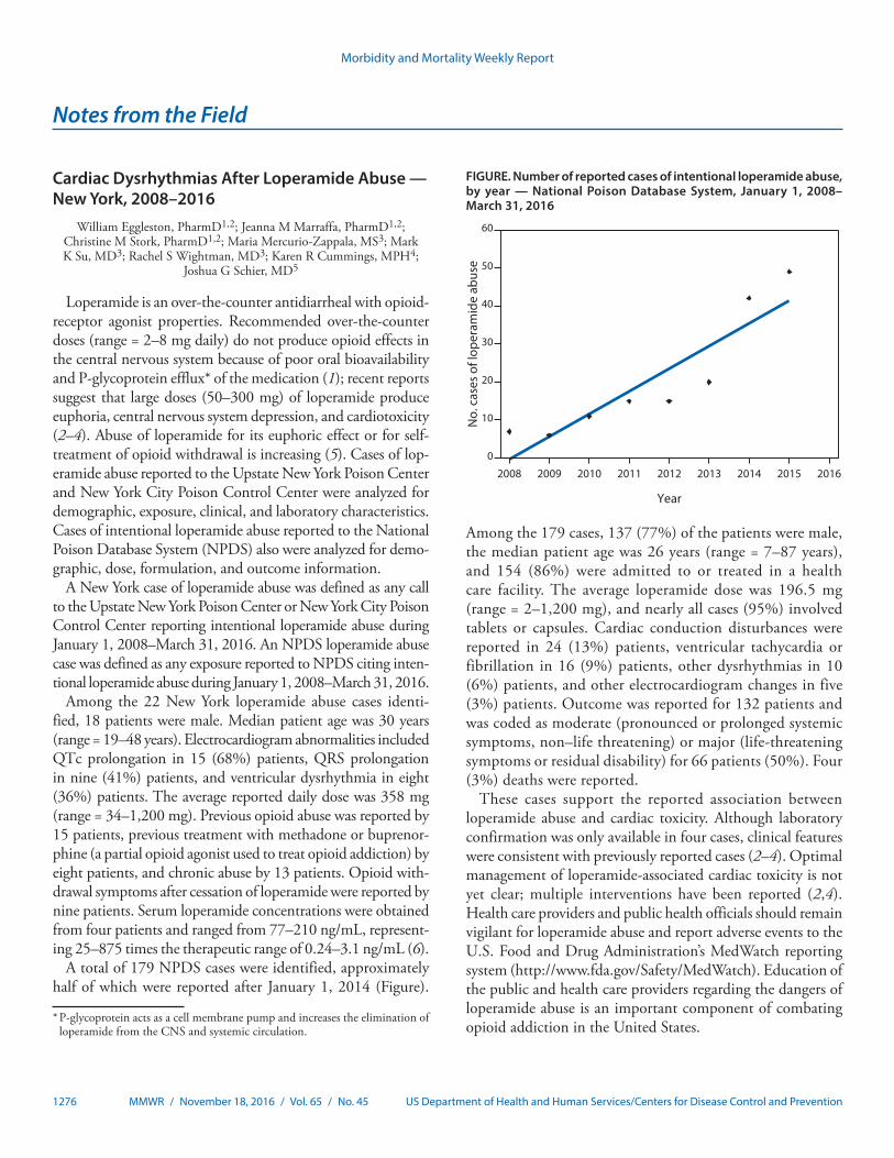
Morbidity and Mortality Weekly Report
1276 MMWR / November 18, 2016 / Vol. 65 / No. 45 US Department of Health and Human Services/Centers for Disease Control and Prevention
Cardiac Dysrhythmias After Loperamide Abuse — New York, 2008–2016
William Eggleston, PharmD1,2; Jeanna M Marraffa, PharmD1,2; Christine M Stork, PharmD1,2; Maria Mercurio-Zappala, MS3; Mark K Su, MD3; Rachel S Wightman, MD3; Karen R Cummings, MPH4;
Joshua G Schier, MD5
Loperamide is an over-the-counter antidiarrheal with opioid-receptor agonist properties. Recommended over-the-counter doses (range = 2–8 mg daily) do not produce opioid effects in the central nervous system because of poor oral bioavailability and P-glycoprotein efflux* of the medication (1); recent reports suggest that large doses (50–300 mg) of loperamide produce euphoria, central nervous system depression, and cardiotoxicity (2–4). Abuse of loperamide for its euphoric effect or for self-treatment of opioid withdrawal is increasing (5). Cases of lop-eramide abuse reported to the Upstate New York Poison Center and New York City Poison Control Center were analyzed for demographic, exposure, clinical, and laboratory characteristics. Cases of intentional loperamide abuse reported to the National Poison Database System (NPDS) also were analyzed for demo-graphic, dose, formulation, and outcome information.
A New York case of loperamide abuse was defined as any call to the Upstate New York Poison Center or New York City Poison Control Center reporting intentional loperamide abuse during January 1, 2008–March 31, 2016. An NPDS loperamide abuse case was defined as any exposure reported to NPDS citing inten-tional loperamide abuse during January 1, 2008–March 31, 2016.
Among the 22 New York loperamide abuse cases identi-fied, 18 patients were male. Median patient age was 30 years (range = 19–48 years). Electrocardiogram abnormalities included QTc prolongation in 15 (68%) patients, QRS prolongation in nine (41%) patients, and ventricular dysrhythmia in eight (36%) patients. The average reported daily dose was 358 mg (range = 34–1,200 mg). Previous opioid abuse was reported by 15 patients, previous treatment with methadone or buprenor-phine (a partial opioid agonist used to treat opioid addiction) by eight patients, and chronic abuse by 13 patients. Opioid with-drawal symptoms after cessation of loperamide were reported by nine patients. Serum loperamide concentrations were obtained from four patients and ranged from 77–210 ng/mL, represent-ing 25–875 times the therapeutic range of 0.24–3.1 ng/mL (6).
A total of 179 NPDS cases were identified, approximately half of which were reported after January 1, 2014 (Figure).
Notes from the Field
Among the 179 cases, 137 (77%) of the patients were male, the median patient age was 26 years (range = 7–87 years), and 154 (86%) were admitted to or treated in a health care facility. The average loperamide dose was 196.5 mg (range = 2–1,200 mg), and nearly all cases (95%) involved tablets or capsules. Cardiac conduction disturbances were reported in 24 (13%) patients, ventricular tachycardia or fibrillation in 16 (9%) patients, other dysrhythmias in 10 (6%) patients, and other electrocardiogram changes in five (3%) patients. Outcome was reported for 132 patients and was coded as moderate (pronounced or prolonged systemic symptoms, non–life threatening) or major (life-threatening symptoms or residual disability) for 66 patients (50%). Four (3%) deaths were reported.
These cases support the reported association between loperamide abuse and cardiac toxicity. Although laboratory confirmation was only available in four cases, clinical features were consistent with previously reported cases (2–4). Optimal management of loperamide-associated cardiac toxicity is not yet clear; multiple interventions have been reported (2,4). Health care providers and public health officials should remain vigilant for loperamide abuse and report adverse events to the U.S. Food and Drug Administration’s MedWatch reporting system (http://www.fda.gov/Safety/MedWatch). Education of the public and health care providers regarding the dangers of loperamide abuse is an important component of combating opioid addiction in the United States.
0
10
20
30
40
50
60
2008 2009 2010 2011 2012 2013 2014 2015 2016N
o. c
ases
of l
oper
amid
e ab
use
Year
FIGURE. Number of reported cases of intentional loperamide abuse, by year — National Poison Database System, January 1, 2008–March 31, 2016
* P-glycoprotein acts as a cell membrane pump and increases the elimination of loperamide from the CNS and systemic circulation.

Morbidity and Mortality Weekly Report
MMWR / November 18, 2016 / Vol. 65 / No. 45 1277US Department of Health and Human Services/Centers for Disease Control and Prevention
1Upstate New York Poison Center, Syracuse, New York; 2SUNY Upstate Medical University Hospital, Department of Emergency Medicine, Syracuse, New York; 3New York City Poison Control Center; 4New York State Department of Health; 5National Center for Environmental Health, Division of Environmental Hazards and Health Effects, CDC.
Corresponding author: William Eggleston, [email protected], 315-464-8906.
References1. Baker DE. Loperamide: a pharmacological review. Rev Gastroenterol
Disord 2007;7(Suppl 3):S11–8.2. Wightman RS, Hoffman RS, Howland MA, Rice B, Biary R, Lugassy D.
Not your regular high: cardiac dysrhythmias caused by loperamide. Clin Toxicol (Phila) 2016;54:454–8. http://dx.doi.org/10.3109/15563650.2016.1159310
3. Enakpene EO, Riaz IB, Shirazi FM, Raz Y, Indik JH. The long QT teaser: loperamide abuse. Am J Med 2015;128:1083–6. http://dx.doi.org/10.1016/j.amjmed.2015.05.019
4. Marraffa JM, Holland MG, Sullivan RW, et al. Cardiac conduction disturbance after loperamide abuse. Clin Toxicol (Phila) 2014;52:952–7. http://dx.doi.org/10.3109/15563650.2014.969371
5. Daniulaityte R, Carlson R, Falck R, et al. “I just wanted to tell you that loperamide WILL WORK”: a web-based study of extra-medical use of loperamide. Drug Alcohol Depend 2013;130:241–4. http://dx.doi.org/10.1016/j.drugalcdep.2012.11.003
6. Eggleston W, Nacca N, Marraffa JM. Loperamide toxicokinetics: serum concentrations in the overdose setting. Clin Toxicol (Phila) 2015;53:495–6. http://dx.doi.org/10.3109/15563650.2015.1026971

Morbidity and Mortality Weekly Report
1278 MMWR / November 18, 2016 / Vol. 65 / No. 45 US Department of Health and Human Services/Centers for Disease Control and Prevention
National Chronic Obstructive Pulmonary Disease Awareness Month — November 2016
Approximately 15.7 million U.S. adults have received a diagnosis of chronic obstructive pulmonary disease (COPD), which includes chronic bronchitis and emphysema (1). However, many more adults with symptoms of COPD, includ-ing frequent coughing, shortness of breath, excess phlegm or sputum production, wheezing, or difficulty taking a deep breath, might not be aware that they have COPD, or they may not be receiving treatment for COPD because they have never received a diagnosis. Geographic variations in the availability of primary care physicians and COPD specialists for the U.S. population suggest that 3.7 million adults do not have access to a pulmonologist within 50 miles; in many counties where patients have access to a pulmonologist within 50 miles, the COPD patient-to-pulmonologist ratio may exceed 6,000 (2). Therefore, early diagnosis, treatment, and management
Announcement
of COPD is dependent on adults communicating COPD symptoms to their primary care physician.
November is National COPD Awareness Month, an obser-vance supported by the National Heart, Lung, and Blood Institute’s campaign, “COPD: Learn More, Breathe Better.” This year’s theme, “Spotlight on COPD,” will raise awareness about the signs and symptoms of COPD, and encourage persons with symptoms to speak to their physicians. More information about COPD is available at http://www.cdc.gov/copd and http://www.nhlbi.nih.gov/health/educational/copd.
References:1. Wheaton AG, Cunningham TJ, Ford ES, Croft JB. Employment and
activity limitations among adults with chronic obstructive pulmonary disease—United States, 2013. MMWR Morb Mortal Wkly Rep 2015;64:289–95.
2. Croft JB, Lu H, Zhang X, Holt JB. Geographic accessibility of pulmonologists for adults with COPD: United States, 2013. Chest 2016;150:544–53. http://dx.doi.org/10.1016/j.chest.2016.05.014

Morbidity and Mortality Weekly Report
MMWR / November 18, 2016 / Vol. 65 / No. 45 1279US Department of Health and Human Services/Centers for Disease Control and Prevention
Announcement
World Day of Remembrance for Road Traffic Victims — November 20, 2016
In October 2005, the General Assembly of the United Nations (UN) adopted a resolution calling for governments and nongovernmental organizations to mark the third Sunday in November each year as World Day of Remembrance for Road Traffic Victims. World Remembrance Day is dedicated to remembering persons killed or injured in road crashes and their families and communities. The day also pays tribute to the emergency crews, police and medical professionals who deal with the traumatic aftermath of road deaths and injuries (http://www.worlddayofremembrance.org).
Road traffic injuries are the ninth leading cause of death worldwide, and the leading cause of death among persons aged 15–29 years. Approximately 1.25 million persons die each year on the world’s roads, and 20–50 million persons sustain nonfatal injuries (1). A recent CDC report compar-ing the United States with 19 other high-income countries determined that the United States had the highest number of motor vehicle crash deaths per 100,000 persons, and per 10,000 registered vehicles; the second highest percentage of deaths involving alcohol-impaired driving; and the third low-est use of front seat belts (2). During 2015, deaths from car crashes increased in the United States (3), and an increase is projected for the first half of 2016 (4). The U.S. Department of Transportation has joined with partners to launch the “Road to Zero” coalition, with the goal of ending U.S. traffic fatali-ties within 30 years (http://www.nhtsa.gov/About-NHTSA/Press-Releases/nhtsa_zero_deaths_coalition_10052016). Implementing proven effective strategies to prevent road traffic fatalities can save thousands of lives and hundreds of millions of dollars in the United States (2).
CDC supports UN and World Health Organization (WHO) measures to dedicate 2011–2020 as the Decade of Action for Road Safety. The Decade of Action for Road Safety was launched in May 2011 in more than 100 countries, with the goal of preventing 5 million road traffic deaths globally by 2020. The UN is also committed to measures to reduce the number of global road traffic deaths and injuries by half by 2020 as part of the UN’s Sustainable Development Goals (http://www.un.org/sustainabledevelopment/sustainable-development-goals/).
Organizations interested in action strategies to support victims and survivors (5) can find materials and additional information about the World Day of Remembrance at http://www.worlddayofremembrance.org.
References1. World Health Organization. Global status report on road safety 2015.
Geneva, Switzerland: World Health Organization; 2015. http://www.who.int/violence_injury_prevention/road_safety_status/2015/en/
2. Sauber-Schatz EK, Ederer DJ, Dellinger AM, Baldwin GT. Vital signs: motor vehicle injury prevention–United States and 19 comparison countries. MMWR Morb Mortal Wkly Rep 2016;65:672–7. http://dx.doi.org/10.15585/mmwr.mm6526e1
3. National Center for Statistics and Analysis. 2015 motor vehicle crashes: overview. Washington, DC: US Department of Transportation, National Highway Traffic Safety Administration, National Center for Statistics and Analysis; 2016. https://crashstats.nhtsa.dot.gov/Api/Public/ViewPublication/812318
4. National Center for Statistics and Analysis. Early estimates of road traffic fatalities for the first half (Jan–Jun) of 2016. Washington, DC: US Department of Transportation, National Highway Traffic Safety Administration, National Center for Statistics and Analysis; 2016. https://crashstats.nhtsa.dot.gov/Api/Public/ViewPublication/812332
5. World Health Organization; Global Alliance of NGOs. Advocating for road safety and road traffic injury victims: a guide for nongovernmental organizations. Geneva, Switzerland: World Health Organization; 2012. http://www.who.int/violence_injury_prevention/publications/road_traffic/ngo_guide/en/
Morbidity and Mortality Weekly Report
1280 MMWR / November 18, 2016 / Vol. 65 / No. 45 US Department of Health and Human Services/Centers for Disease Control and Prevention
Errata
Vol. 65, No. 39For the report, “Vaccination Coverage Among Children
in Kindergarten — United States, 2015–16 School Year,” on page 1061, the third sentence of the second full paragraph should read, “For example, the California Department of Public Health worked to improve vaccination coverage at schools identified from local-level data as having high levels of provisional enrollment.” In addition, the fifth sentence of the same paragraph should read, “As a result, from 2014–15 to 2015–16, the number of provisionally enrolled kindergart-ners decreased from 36,731 (6.9%) to 24,424 (4.4%), MMR coverage increased from 92.6% to 94.5%, and DTaP coverage increased from 92.4% to 94.2% (4).”
hxv5
Highlight
hxv5
Highlight
hxv5
Highlight
hxv5
Highlight
hxv5
Highlight

Morbidity and Mortality Weekly Report
MMWR / November 18, 2016 / Vol. 65 / No. 45 1281US Department of Health and Human Services/Centers for Disease Control and Prevention
* Infant mortality rate = number of deaths of infants aged <1 year per 1,000 live births.
During 2010–2014, the infant mortality rate averaged approximately 6.00 infant deaths per 1,000 live births each month. The infant mortality rate peaked in February and April at approximately 6.30 and was lowest from July to September with approximately 5.71 infant deaths per 1,000 live births.
Source: CDC/NCHS, National Vital Statistics System, 2010–2014, Mortality and Births. CDC Wonder online database. http://wonder.cdc.gov/ucd-icd10.html and http://wonder.cdc.gov/natality.html.
Reported by: Lee Anne Flagg, PhD, [email protected], 301-458-4699; Arialdi Minino, MPH.
4.00
4.50
5.00
5.50
6.00
6.50
7.00
7.50
8.00
Jan Feb Mar Apr May Jun Jul Aug Sep Oct Nov Dec
Infa
nt m
orta
lity
rate
Month
Monthly average
Overall average
0.00
QuickStats
FROM THE NATIONAL CENTER FOR HEALTH STATISTICS
Average Infant Mortality Rate,* by Month — National Vital Statistics System, United States, 2010–2014


ISSN: 0149-2195 (Print)
The Morbidity and Mortality Weekly Report (MMWR) Series is prepared by the Centers for Disease Control and Prevention (CDC) and is available free of charge in electronic format. To receive an electronic copy each week, visit MMWR’s free subscription page at http://www.cdc.gov/mmwr/mmwrsubscribe.html. Paper copy subscriptions are available through the Superintendent of Documents, U.S. Government Printing Office, Washington, DC 20402; telephone 202-512-1800.
Readers who have difficulty accessing this PDF file may access the HTML file at http://www.cdc.gov/mmwr/index2016.html. Address all inquiries about the MMWR Series, including material to be considered for publication, to Executive Editor, MMWR Series, Mailstop E-90, CDC, 1600 Clifton Rd., N.E., Atlanta, GA 30329-4027 or to [email protected].
All material in the MMWR Series is in the public domain and may be used and reprinted without permission; citation as to source, however, is appreciated.
Use of trade names and commercial sources is for identification only and does not imply endorsement by the U.S. Department of Health and Human Services.
References to non-CDC sites on the Internet are provided as a service to MMWR readers and do not constitute or imply endorsement of these organizations or their programs by CDC or the U.S. Department of Health and Human Services. CDC is not responsible for the content of these sites. URL addresses listed in MMWR were current as of the date of publication.
Morbidity and Mortality Weekly Report