
Poster analysis
5
Poster analysis…
-
Upload
millieoconnor12 -
Category
Education
-
view
9 -
download
0
Transcript of Poster analysis

Poster analysis…

How do you analyse a film poster?
•P: Product – What genre is it? What is the plot?•I: Images – Including colours•L: Lettering – Font style, colour, size•O: Organisation – Where is the title placed? Billing?•C: Codes & conventions – of that particular genre
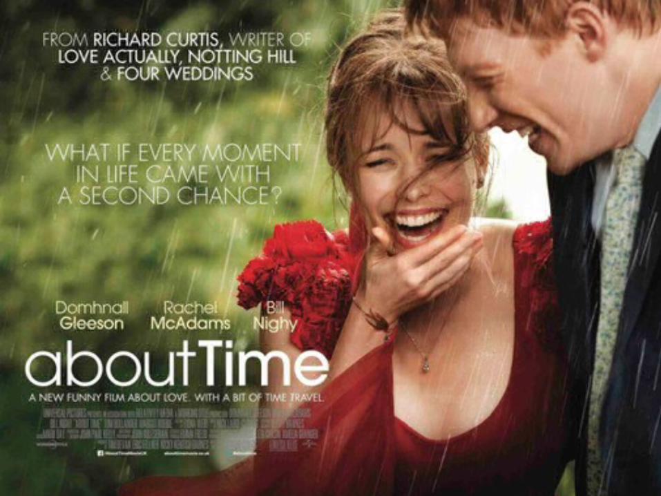

Product: what is the genre and what is the plot?
About time is a romantic comedy with a hint of fantasy. It is set in England, based in London and Cornwall following a young man called Tim who finds out that he has a magical power, which allows him to travel back in time to certain
events when he goes into a dark room and clenches his fists. He uses his powers to help him in his pursuit of gaining a girlfriend which for him is a lot easier said than done.
Images: including colours This poster uses basic natural looking colours which gives off a happy vibe which fits with the genre and the plot of this film. The poster is a shot from the film after the two characters have just gotten married (sorry if that’s a spoiler) their
facial expressions in this shot are extremely happy which also connotes happiness implying that the film is a happy one. The closeness of the two characters physically in this photo also represents how close they could be emotionally as they are within touch proximity. It is a medium shot they could have chosen this shot as a medium shot shows the emotions
on the characters faces clearer than a wide shot but still gives you and idea of location whereas the use of a close up would be too focused on their emotions. Using a medium shot keeps it personal but on a level where you can still
establish what is going on within the film.

Organisation: Where is the title placed? Billing? The title is situated in the left hand corner of the poster, this way it is not covering the image too much but can still be a main focus of the poster. The credits are placed bellow the title which is the generic positioning credits, low down the page as the credits are important but there are so many so it is easiest to fit them all together at the bottom out of the way, alongside the intertextual information. As neither of them are key bits of information like the title or the billing. The billing is at the top of the poster, it was most likely placed there as it has a high level of importance to the film but also is interesting to the reader so is put in plain sight so that the information can be taken in and whether the author or the screenwriters previous work.
Codes & conventions: Of that particular genre
This film poster fits many of the typical codes and conventions for a romantic comedy. The typical demographic for this genre of film is teenager girls and this film is rated a 12a, you could also argue that this film is aimed at young women who may find themselves in this sort of situation. As you can see there are two main characters, one male and one female- This is a typical convention of the genre. The colour of her dress is also fitting of the genres typical codes and conventions, red has the connotations of love and lust and as it is a romantic comedy it fits rather well. The female character is pretty, this is another typical code, making the woman desirable attracts the target audience and makes the film more pleasurable to watch but also making the storyline seem more realistic to the viewer.
