Portfolio of yuan ting
45
description
This is my portfolio.There are 5 projects in it.The first is logo design;The second is poster design;The third is packaging;The fourth is decoration painting;The fifth is book design.
Transcript of Portfolio of yuan ting


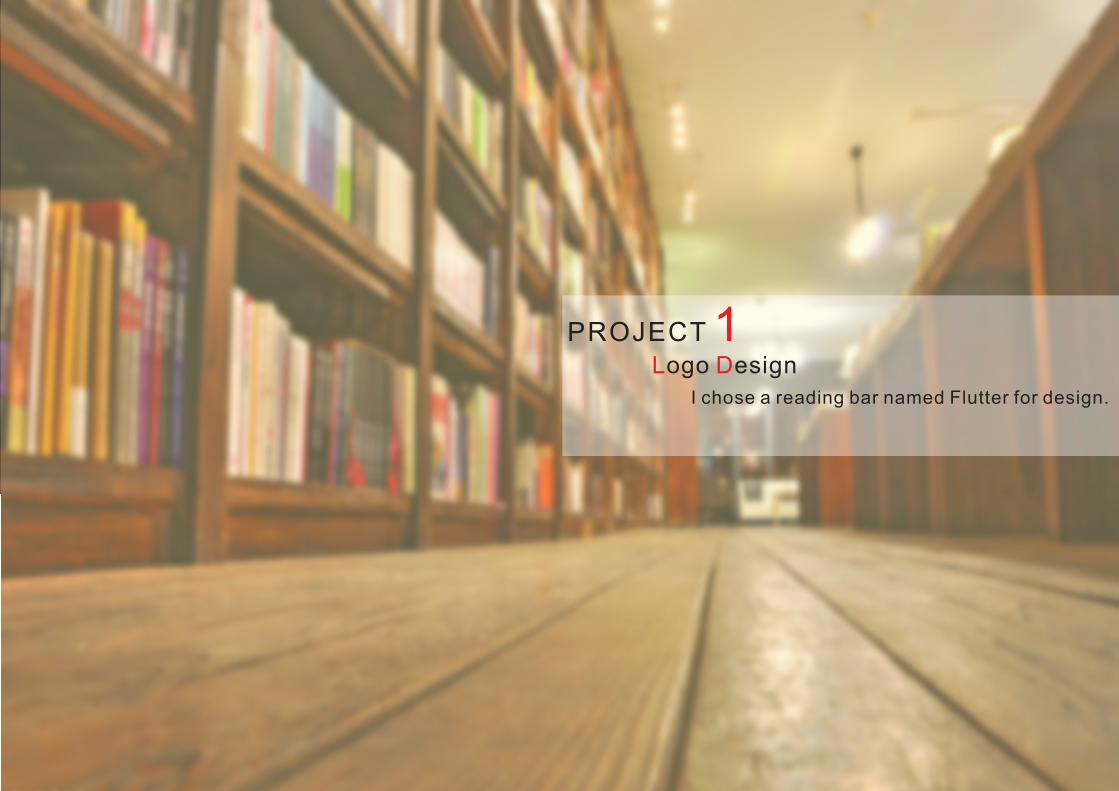
PROJECT 1L Dogo esign
I chose a reading bar named Flutter for design.

B Sasic hape
Since the word Flutter features lightness, tininess and rootlessness, I selected the shape of a leaf for the design of the logo, for in China there is an old saying in China, “fallen leaves go to the roots,” which resonates with the operation ideology of the reading bar---to find your roots in a strange city.
Besides, given the targeted customers are young office workers who are like lonely, rootless leaves leaving the tree, working in a different city for years, this leave-shaped logo can in such sense represents their state of mind.

Fonts
飄 PIAO
飄 PIAO
飄 PIAO
飄 PIAO飄 PIAO
The variation of fonts is to imitate the pattern of a traditional Chinese seal, while the red dot in between is a reflection of the seal’s color.
飄PIAO

P Lrocessing of ogo
C 0 M 100 Y 100 K 0
a
a
| 20a |
| |
10a

P A Lractical pplication of ogo

PROJECT 2
P Doster esign
This poster design was completed in my senior year. Considering the many options faced upon graduation that might pose great influence to my paths of life, I designed this poster with the title of A Way Out.
Inspiration originated from a photo taken during a trip when I was sketching in Yun’nan province.
The main structure in the photo has many windows which provoked my sparkle of inspiration to convert such windows into abstract doors in the work, symbolizing the options faced upon graduation.

S C C Script reation olour chemes&Created based on the windows of the building.
The final script depicts the abstract door opening outwards, leading to the perspective outside so as to coincide with the theme; meanwhile, the overlapping layers are shrunken according to proper scale to represent the various paths ahead.
Besides, based on the script I also used the computer to treat it into four different colors.

Among 4 sets of color schemes, the yellow one was finally chosen, for it is either over passionate as red nor too calm as blue, while comparing with the fresh and delicate of green, it features more maturity of autumn.
As for the format of the picture, I also added many Chinese characters such as “certificate”, “postgraduate entrance examination”, “direction”, “graduation”, “stress” and so on, which represents the issues faced by contemporary college students after graduation.
These words are arranged above the picture, with a reducing density from above to bottom to formulate the comparison within---“push this door and you must face all those practical issues coming out of nowhere.”
S S olution election D Tetail reatment&

"Kindness" “Righteousness” “Propriety” “Wisdom” “Trustworthiness”
T F E T C Vhe ive lements of raditional hinese irtue
Based on the requirements of the theme, it occurred to me that Chinese knot, Chinese ink painting and ancient characters can be used for elements of design, of which the knot symbolizes good luck and happiness, while the different shades of ink painting and seal character feature the profound history foundations.
Two sets of schemes were brought forward for this poster design.

S C C Script reation olour chemes&The drawing of the sketch draws on the symmetric composition of Chinese knot, based on which and different color schemes the design was completed.
The first poster served as the foundation, while by distinguishing the rotating stance of the brushwork in center, the whole poster was made similar yet not identically the same.
C 0 M 40Y 60 K 20
C 0 M 0 Y 0 K 0
C 100 M100 Y 100 K 100
C 55 M 100Y 40 K 0
C 60 M 40Y 0 K40
C 35 M 100Y 100 K5
The first features simple color scheming and layers, as well as scattering character arrangement; considering its lack of presentation, the second set of scheme was modified and brought into being as the final solution.
However, the first scheme was the foundation of the complete work, therefore I exhibit it hereby.

The above-mentioned scheme was the first solution, based on which the second solution was designed with axle wire from the first solution as well as the element of Chinese knot.
Besides, lots of circles were introduced into the picture, for circles in Chinese culture symbolize completeness, reunion, etc., as well as the traditional Chinese culture.
Therefore, such application of the element of circle is a resonance of the theme.
S C C Script reation olour chemes&

sympathycaretreasure
take onuprightprinciple
etiquettecourtesymanners
distinctionreasonwisdom
reputationreliabletrust

PROJECT 3 Packaging
In the lecture of Packaging, we were assigned a homework that can be done in two forms. The first was to complete, on one’s own, a series of packaging, while the other was to complete series of packaging in groups. My classmate and I chose the latter and after abundant market investigation, we decided to design the packaging based on the three albums of the band Pink Floyd, for the artistic, electronic and rock music was prevailingly popular in the moment.
I was responsibled for collecting information, drew some scripts and used the computer to treat them into different colors.

Based on this album we came up with three sets of design, each of which was designed according to the mood of the soundtracks.
To be specific, we gathered all kinds of different scissors to symbolize the inspiration of “cut” based on the album The Final Cut.
D Iesign deology
After integration, summary and modification of the materials collected, we came up with the following shape.
We simplified it and used mainly contrasting orange and blue colors for collocation.

Given this CD gives a sense of direction to light in the dark, the external cover was painted all black with a hole in the middle to feature the aspiration for brightness in the dark.
D Iesign deology

A Mpplication of aterialsBased on the soundtracks, I photographed soil for the design of lyric pages.
The cover of lyric pages.

The design of the CD was based on the following triangle shape, with the dominant tune of green which forms distinctive color contrast with the cover.

F Pinish roduct
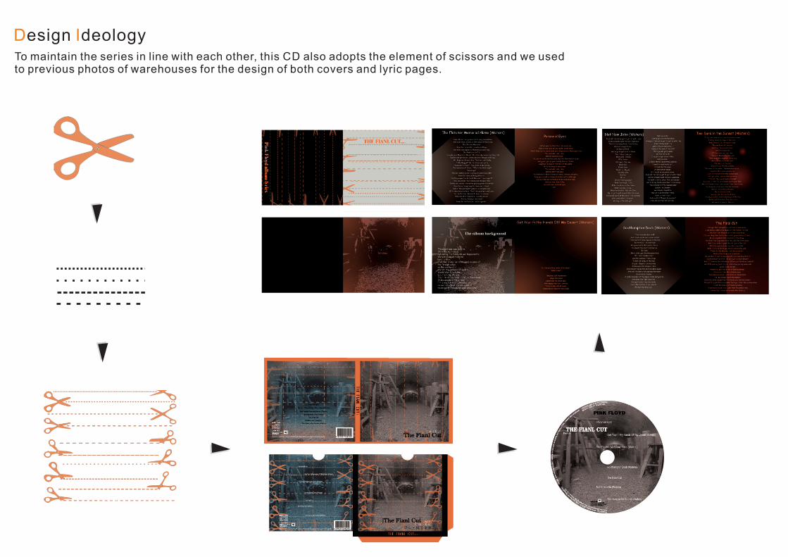
D Iesign deologyTo maintain the series in line with each other, this CD also adopts the element of scissors and we used to previous photos of warehouses for the design of both covers and lyric pages.

F Pinish roduct

The last CD was designed based on the feeling of embracing the land.
The color schemes follow the previous designs to keep it the style in line with each other.
D Iesign deology

F Pinish roduct

T Whe allWhile for the album The Wall, we collected materials according to the lost and psychedelic feature of the album, as well as the direct visual image of wall.
According to the name of the album, we photographed the walls as the materials for design, and represented such design on the CD and lyric pages.

F Pinish roduct

T Whe all

F Pinish roduct

The element of this CD cover still uses wall as the element, with an additional picture of moon to combine the CD so as to form the sense of extension different from the previous two.
The design of CD still uses wall as the element, with characters to match it.
The design of lyric pages adopts another design ideology, for which no wall was adopted, but different segments, tiles of colors to divide the picture, making a less concrete and realistic
wall.
Such practice avoids the dullness and tediousness of repetitive elements of wall, and the similar contrasting colors of orange and blue keep the series unified.
D Iesign deology

F Pinish roduct

T D S T Mhe ark ide of he oon
The design ideology of this CD is also based on the moon.
The color arrangement of the cover was inspired by the name of the album, “dark”;
Since the soundtracks of this album give out a feeling of contradiction of confusion yet directive, we designed a man down below the cover, standing before a cave with strong light, so as to conform to the feeling brought by the album.
The external shell was based on the moon.
The shell adopts axle wire as the composition direction, above which a moon was placed to be in line with the album name.
Besides, the shell uses basically white as the main tune to form contrasting color of the cover.

The design of CD neutralizes the design ideology of the cover and shell.
The design of lyric pages uses various colors, for the color scheme of the cover so as to enrich the overall color of the album.
D Iesign deology

F Pinish roduct

PROJECT 4 Decoration PaintingAs early as the conception of the decoration painting, I thought about to draw a decoration painting presenting the school landscape with my own style.
Therefore, I photographed the campus and drew the general script through further treatment, summary and integration.
This work is named My University, it is a photo of our school gate, through which we walk every day during school life.
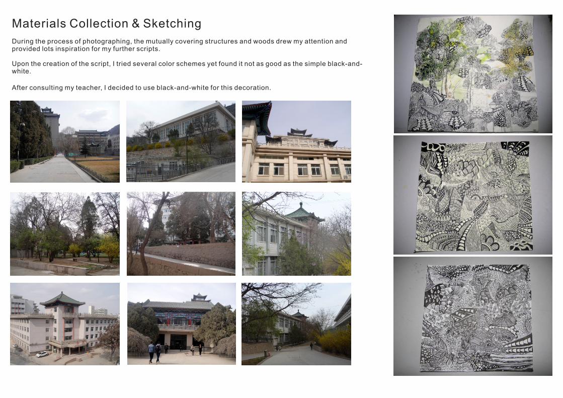
Materials Collection & Sketching
During the process of photographing, the mutually covering structures and woods drew my attention and provided lots inspiration for my further scripts.
Upon the creation of the script, I tried several color schemes yet found it not as good as the simple black-and-white.
After consulting my teacher, I decided to use black-and-white for this decoration.

Details of the sketch.

Process

F Pinish roduct
The outermost layer of glass is mounted, so the shooting will be reflective.

PROJECT 5 ook esignB D
Creative Products of 2015
During my internship in graduation year, we visited a creative home furniture industrial base in Chongqin city.
The profound charm of design and creativity deeply appealed to us.
Meanwhile, I also photographed lots of material for inspiration in my further study.
The internship investigation proved to be provokingly beneficial to me; in the topic choosing for graduation project, I decided to choose the topic of book design.

D Iesign deology
As per the contents of the books, I decided to present what I gained during the internship investigation and finally determined the creative home furnishing as the content of my book design.
As for the size of the book, I attempted to use rectangle shape which is the prevailing format in the market.
After consulting my teacher, I finally decided to use square book size, for my teacher suggested, quote, “the creativity shall be felt upon seeing this book.”
?
inspiration

Draft
I came up 5 solutions for the book cover.
The first solution was to present the collision of ice and fire;
The second was to place a tree of inspiration in the middle with surrounding dots symbolizing the sparkle of inspiration;
The third and fourth, comparatively, focus more on the arrangement of the format, while the fifth uses the public decoration fiber art work I created upon graduation, since the framework of the fiber art work is a exaggeratingly stretched chair, which is also a significant element in home furnishing.
I finally decided to use the fifth solution as the book cover; with the size for the book is 20cm*20cm.
The font on cover is placed in the middle to be distinctive and clear.
2014
创
意
家
居
2014
创
意
家
居
2014
创
意
家
居
2014
创
意
家
居
2014
创
意
家
居
2014
创
意
家
居
no.1
no.2
no.3
no.4
no.5
Creat iveHomeFurnish ing
创意家居
2015
Creat iveCreat ive
Creat iveCreat ive
HomeHome
Home
HomeHome
HomeCreat iveCreat iveCreat iveFurnish ing
Furnish ing
Furnish ing
Creat ive
Furnish ing
Furnish ing
创意
家居
2015

C F Donfirmation of ormat & raft
I bound a pile of scripts at a scale of 1:1 for further work.
As for the layout design, large quantities of hollow and blankness for the beauty of emptiness and to strength the connection between pages, as well as to enrich the spatial levels of the layout.

C Solour chemesThe dominant tune of the book is pure color of highly contrast, with gray and little black as well as medium colorful ash to present coordination and elegance to enhance the class of the book.
The characters for inner pages use fonts of Microsoft Accor Black, Song Typeface and Black Body to present the integrity.

F Pinish roduct

Design is a vital part of my life, and I shall keep going further along this path.
I hope you enjoy this portfolio.Thank you.
6.19.2015