Portfolio Cams Design
30
CAMS DESIGN CAMS DESIGN
-
Upload
camila-campos -
Category
Documents
-
view
227 -
download
0
description
Graphic Designer Portfolio
Transcript of Portfolio Cams Design

CAMS DESIGNCAMS DESIGN
CAMILA ANDREA CAMPOS CONTRERASGRAFIK DESIGNERIN
BOGOTA, KOLUMBIEN

Camila Campos
I’m a Graphic Designer from the University Jorge Tadeo Lozano in Bogota, Colombia. I’m creative, responsible and I show leadership in the projects I develop. It is easy for me to work in a group and to have good relations with people. I work well with others in finding effective solutions for the problems presented. Order and punctuality are essential characteristics not only in my profession, but also in my life. I always take care of every detail to get always the best results. I have a huge passion for Packaging and Branding design, and I believe that good design is one of the most important points in a company for it to succeed.
WHO?


MANIFESTO FOR GROWTH - BRUCE MAU
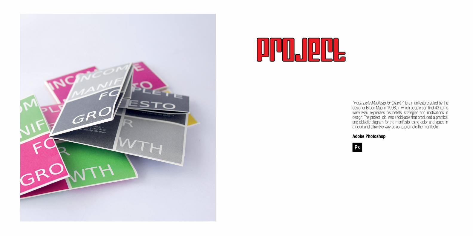
“Incomplete Manifesto for Growth”, is a manifesto created by the designer Bruce Mau in 1998, in which people can find 43 items were Mau expresses his beliefs, strategies and motivations in design. The project I did, was a fold-able that produced a practical and didactic diagram for the manifesto, using color and space in a good and attractive way so as to promote the manifesto.
Adobe Photoshop
PROJECT
The goal of the project was to propose a different diagram for the manifesto, so that it can better represent what the designer wanted to say in the text. I wanted to make it easier for the people to read by making it lighter, distinguishing each item. By doing so I hoped to generate more interest from people, and encourage them to read it. To achieve this, I divide the paper in regular squares of different colors, in each square an item was placed. This make the fold-able more practical and dynamic.
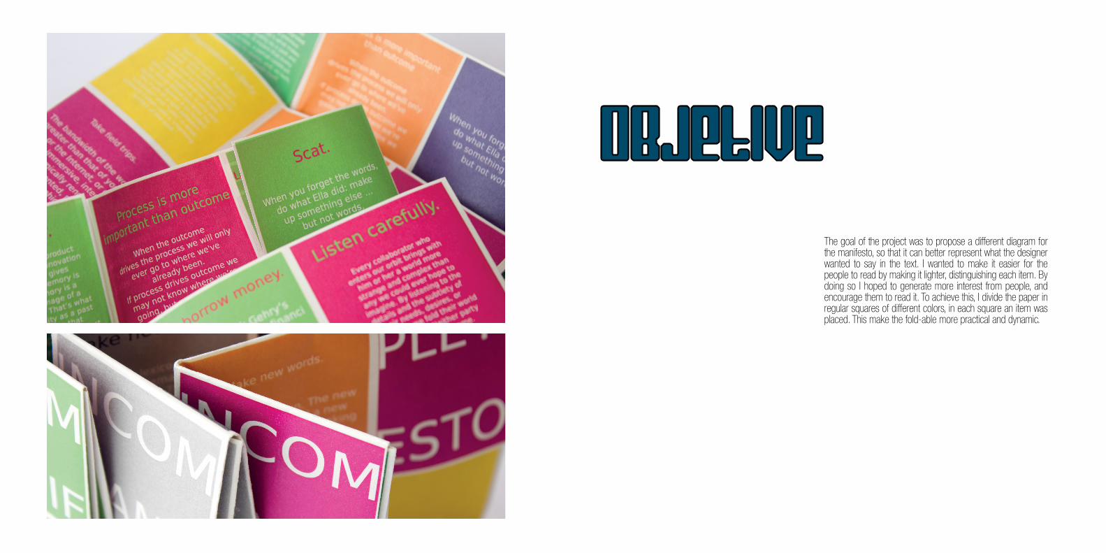
oBJETIVe
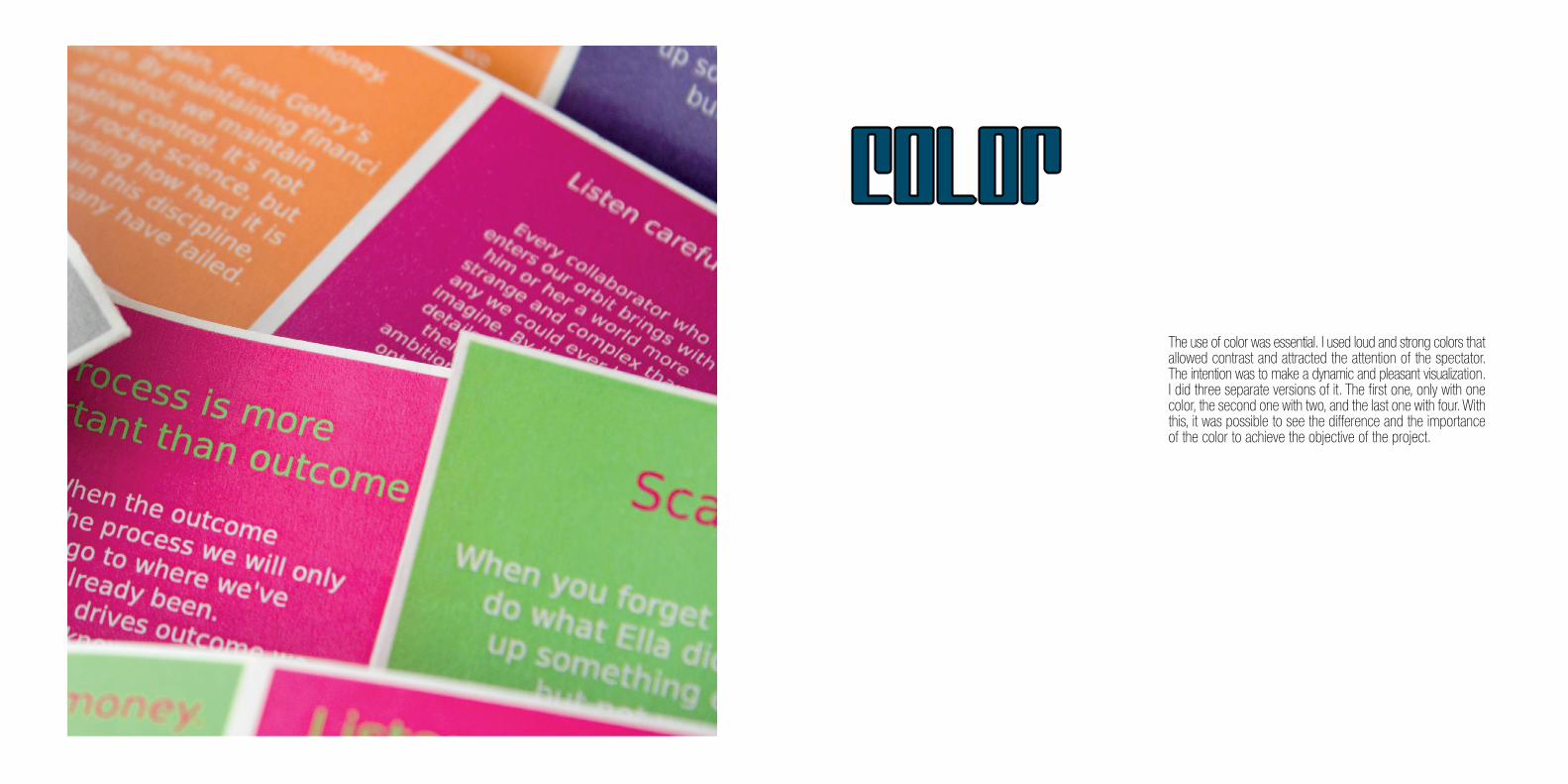
The use of color was essential. I used loud and strong colors that allowed contrast and attracted the attention of the spectator. The intention was to make a dynamic and pleasant visualization. I did three separate versions of it. The first one, only with one color, the second one with two, and the last one with four. With this, it was possible to see the difference and the importance of the color to achieve the objective of the project.
COLOR
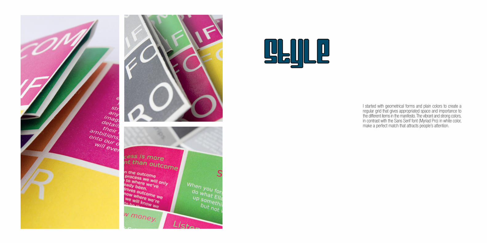
I started with geometrical forms and plain colors to create a regular grid that gives appropriated space and importance to the different items in the manifesto. The vibrant and strong colors, in contrast with the Sans Serif font (Myriad Pro) in white color, make a perfect match that attracts people’s attention.
STYLE


CHURCHES IN THE CENTER OF BOGOTA
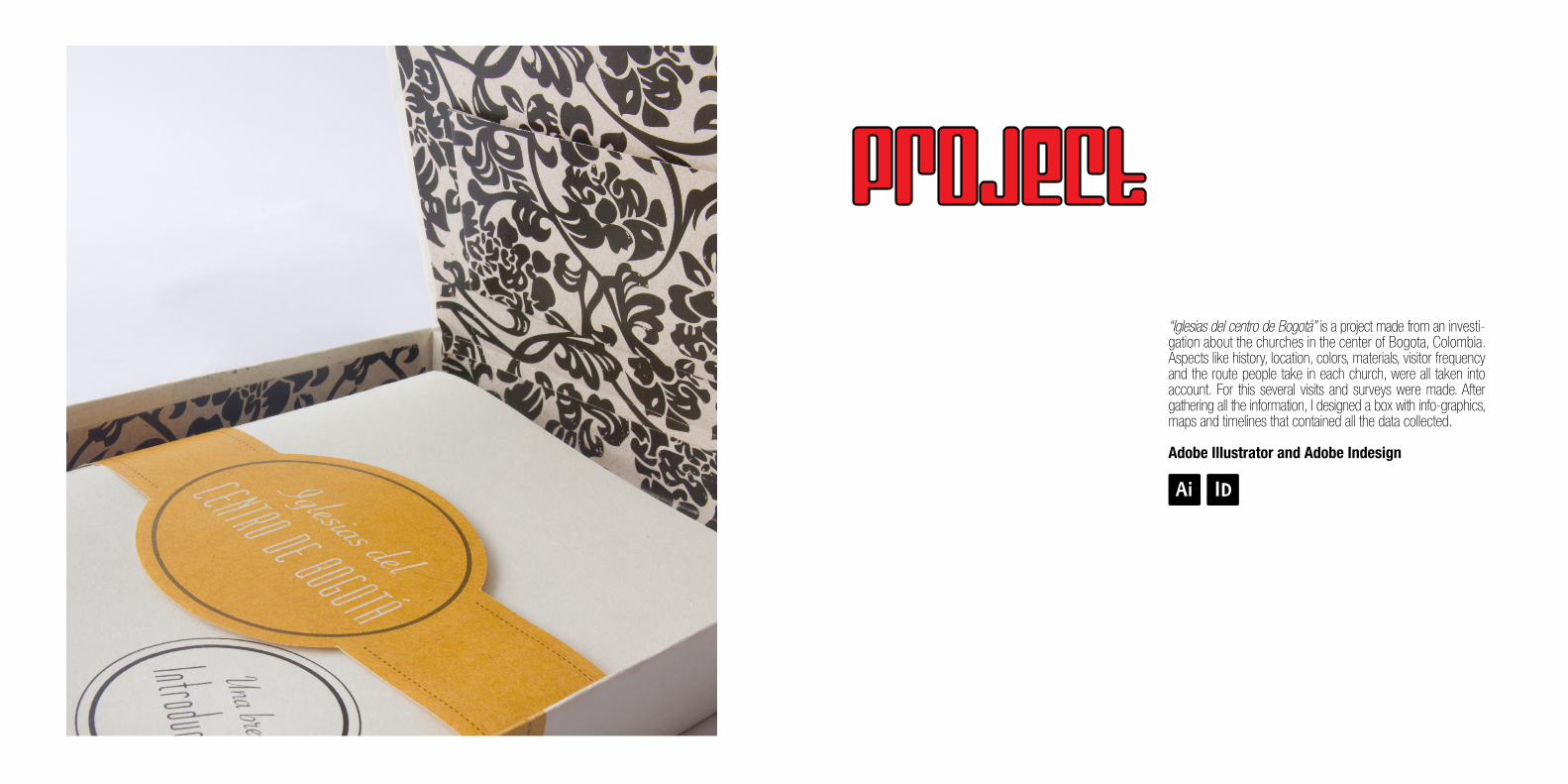
“Iglesias del centro de Bogotá” is a project made from an investi-gation about the churches in the center of Bogota, Colombia. Aspects like history, location, colors, materials, visitor frequency and the route people take in each church, were all taken into account. For this several visits and surveys were made. After gathering all the information, I designed a box with info-graphics, maps and timelines that contained all the data collected.
Adobe Illustrator and Adobe Indesign
PROJECT
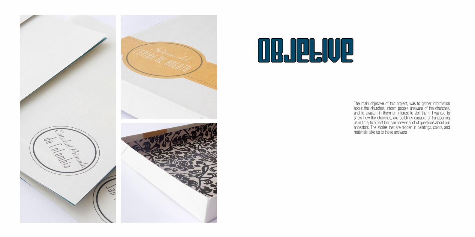
The main objective of this project, was to gather information about the churches, inform people unaware of the churches, and to awaken in them an interest to visit them. I wanted to show how the churches, are buildings capable of transporting us in time, to a past that can answer a lot of questions about our ancestors. The stories that are hidden in paintings, colors, and materials take us to these answers.
oBJETIVe
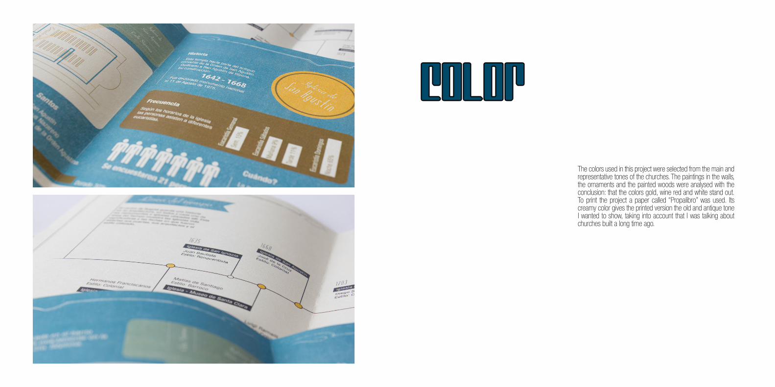
The colors used in this project were selected from the main and representative tones of the churches. The paintings in the walls, the ornaments and the painted woods were analysed with the conclusion: that the colors gold, wine red and white stand out. To print the project a paper called “Propalibro” was used. Its creamy color gives the printed version the old and antique tone I wanted to show, taking into account that I was talking about churches built a long time ago.
COLOR
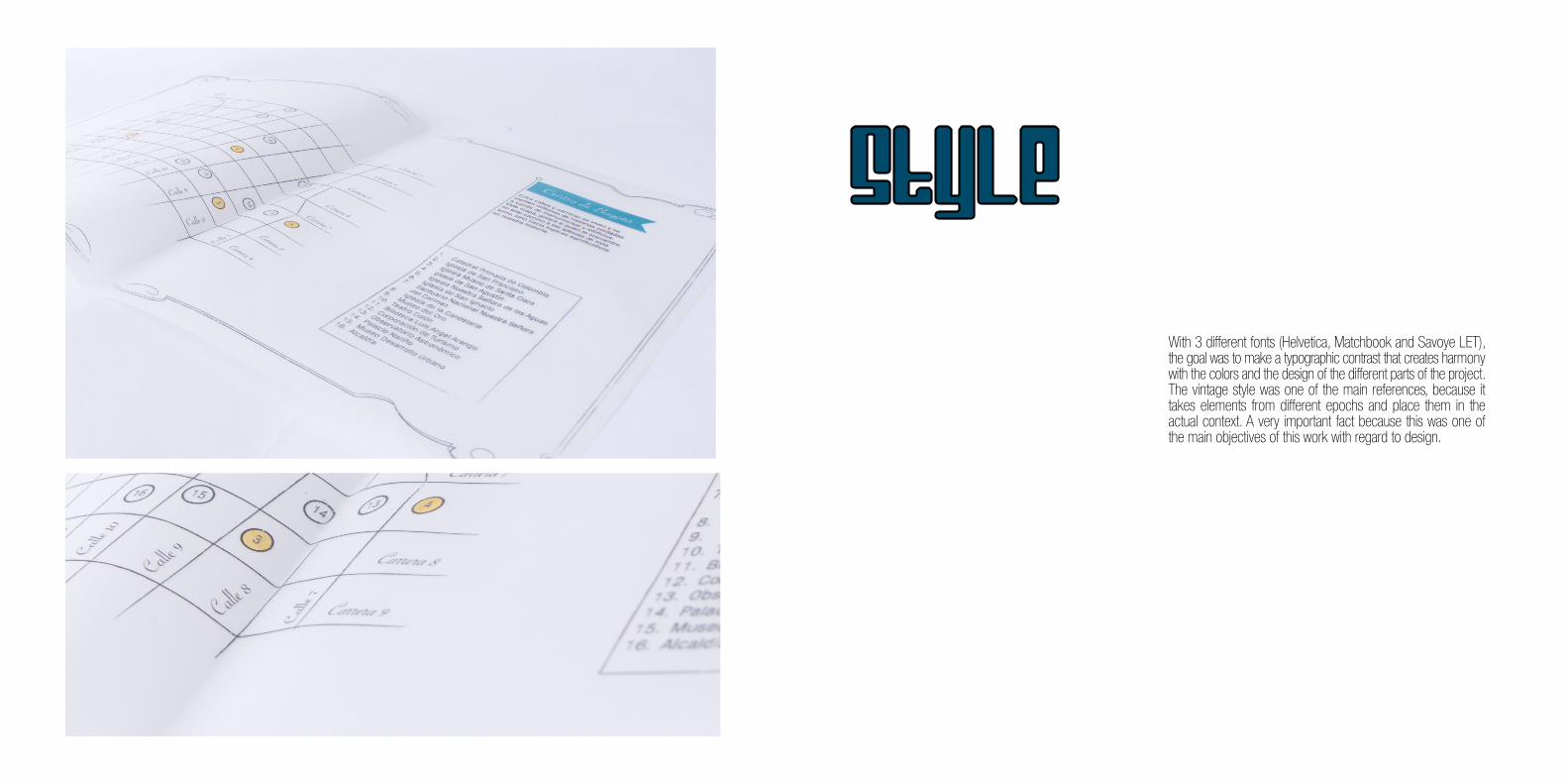
With 3 different fonts (Helvetica, Matchbook and Savoye LET), the goal was to make a typographic contrast that creates harmony with the colors and the design of the different parts of the project. The vintage style was one of the main references, because it takes elements from different epochs and place them in the actual context. A very important fact because this was one of the main objectives of this work with regard to design.
STYLE


FOSSIL waTCHES
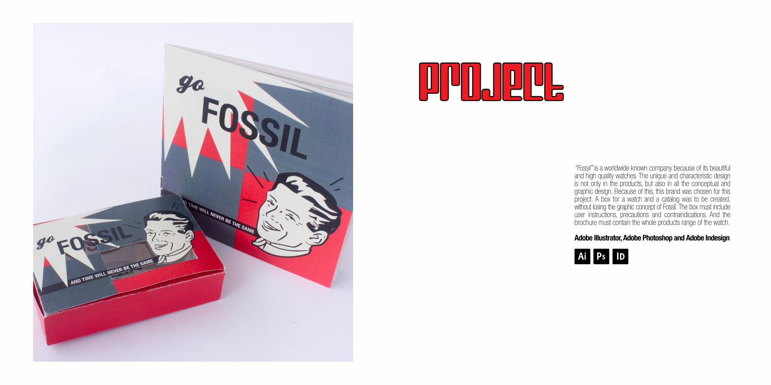
“Fossil” is a worldwide known company because of its beautiful and high quality watches. The unique and characteristic design is not only in the products, but also in all the conceptual and graphic design. Because of this, this brand was chosen for this project. A box for a watch and a catalog was to be created, without losing the graphic concept of Fossil. The box must include user instructions, precautions and contraindications. And the brochure must contain the whole products range of the watch.
Adobe Illustrator, Adobe Photoshop and Adobe Indesign
PROJECT
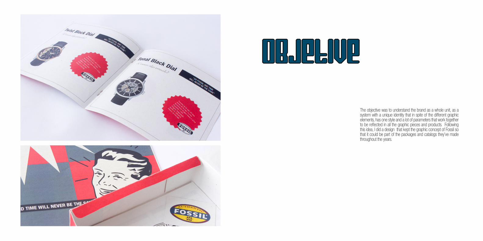
The objective was to understand the brand as a whole unit, as a system with a unique identity that in spite of the different graphic elements, has one style and a lot of parameters that work together to be reflected in all the graphic pieces and products. Following this idea, I did a design that kept the graphic concept of Fossil so that it could be part of the packages and catalogs they’ve made throughout the years.
oBJETIVe
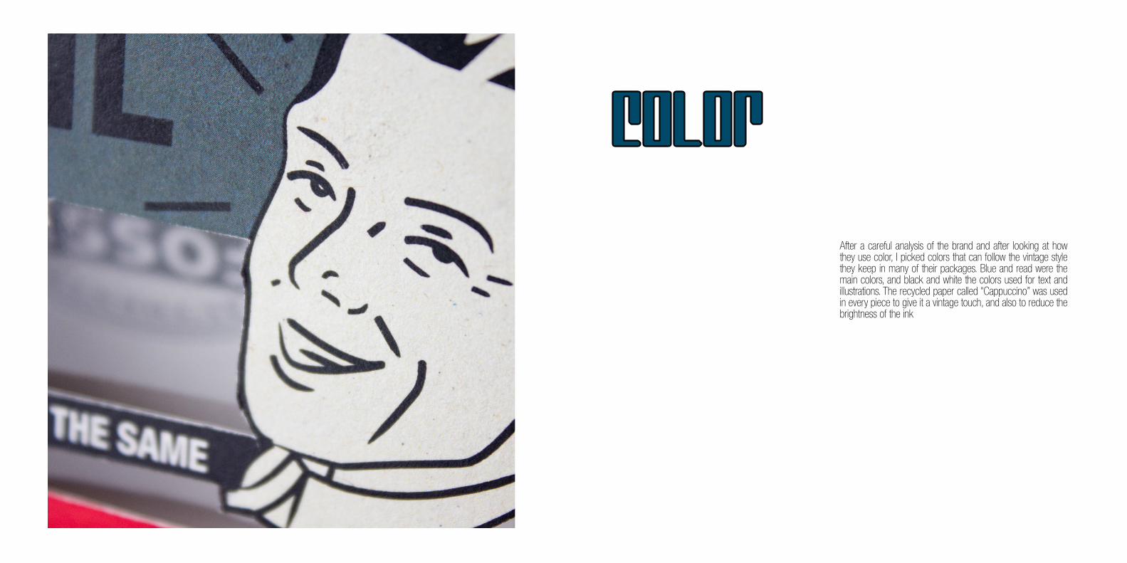
After a careful analysis of the brand and after looking at how they use color, I picked colors that can follow the vintage style they keep in many of their packages. Blue and read were the main colors, and black and white the colors used for text and illustrations. The recycled paper called “Cappuccino” was used in every piece to give it a vintage touch, and also to reduce the brightness of the ink
COLOR
I used Sans Serif and Oblique fonts that represent the perfect mixture in this type of design (Savoye LET, Helvética, Dante MT, Franklin Gothic). I also tried to represent the elegant man of the epoch by using serious colors and illustrations with strong and emphasized lines.
STYLE


COCOLOMBIA
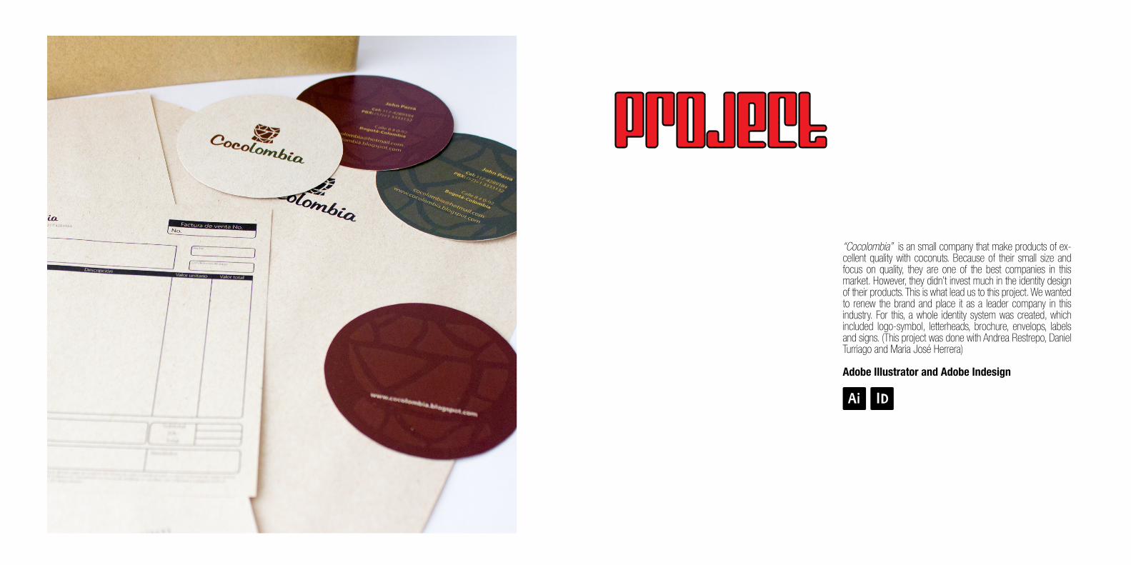
“Cocolombia” is an small company that make products of ex-cellent quality with coconuts. Because of their small size and focus on quality, they are one of the best companies in this market. However, they didn’t invest much in the identity design of their products. This is what lead us to this project. We wanted to renew the brand and place it as a leader company in this industry. For this, a whole identity system was created, which included logo-symbol, letterheads, brochure, envelops, labels and signs. (This project was done with Andrea Restrepo, Daniel Turriago and Maria José Herrera)
Adobe Illustrator and Adobe Indesign
PROJECT
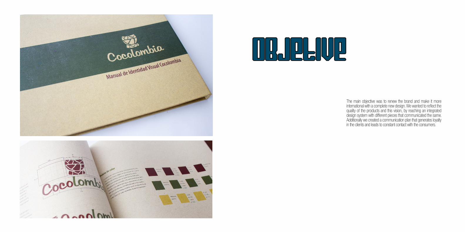
The main objective was to renew the brand and make it more international with a complete new design. We wanted to reflect the quality of the products and this vision, by reaching an integrated design system with different pieces that communicated the same. Additionally we created a communication plan that generates loyalty in the clients and leads to constant contact with the consumers.
oBJETIVe
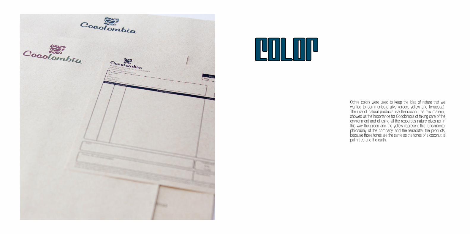
Ochre colors were used to keep the idea of nature that we wanted to communicate alive (green, yellow and terracotta). The use of natural products like the coconut as raw material, showed us the importance for Cocolombia of taking care of the environment and of using all the resources nature gives us. In this way the green and the yellow represent this fundamental philosophy of the company, and the terracotta, the products, because those tones are the same as the tones of a coconut, a palm tree and the earth.
COLOR
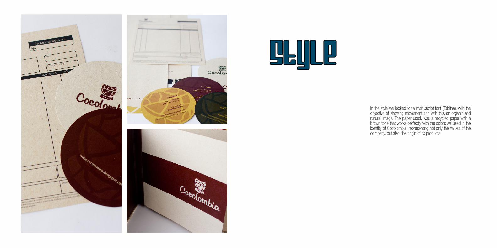
In the style we looked for a manuscript font (Tabitha), with the objective of showing movement and with this, an organic and natural image. The paper used, was a recycled paper with a brown tone that works perfectly with the colors we used in the identity of Cocolombia, representing not only the values of the company, but also, the origin of its products.
STYLE


Aproved