portfolio
20
-
Upload
nathan-reed -
Category
Documents
-
view
214 -
download
2
description
This is my portfolio.
Transcript of portfolio


BAKER RESIDENCELifecycle Home426 W. 1st Ave.Denver, CO2008-9
The Baker residence is a new constructiondesign for a multi-income neighborhoodnear downtown Denver. The site waschosen because of the eclectic nature ofthe neighborhood and the presence of bothhistoric and modern construction.
ThThe building was designed using the principlesof universal design. This means that thebuilding is accessible and effective for allpeople. The goal of the design is to createa house that can be utilized from birth untildeath.
ThiThis concept led to a design that dividesthe house into two parts without necessarilyalienating one side from the other. A couplewith no children could use the front portion ofthe house and rent out the back portion. Theback portion was equipped with a kitchenand all things necessary for a stand-alonehousehouse. As the couple has children, the backportion will then become part of their homeagain and act as a bedroom/play area for thechildren. As the children grow up they willdesire a measure of independence. Theirpartial disconnect from the rest of the housewill allow the adolescents to have privacy andthethey can begin to gain independence andeventually do everything on their own. Whenall the children have left home, the couple canonce again rent out a portion of the house.If only one spouse eventually remains theycan choose to live in either the front or backportion and rent out the rest.

BAKER RESIDENCELifecycle Home426 W. 1st Ave.Denver, CO2008-9
Sustainability was also a key considerationin the design of the Baker Residence. Thesite is oriented east-west. The disconnecteddesign aided in splitting the house into twounits with a maximum of south facing glazing.The ample overhangs were calculated to blocksummer sun while allowing winter sun in. Thetwtwo portions of the house are just far enoughapart to allow the sun to shine into the southwindows of each. The materials used in thehouse are either recycled or low environmentalimpact materials. Photovoltaic panels areinstalled on the south sloping roof to providethe house with clean energy.
In order to be accessible to all people, peoplewith disabilities have to be considered. Thecounters are at ADA regulation height, thedoors are all barn door style sliding doors,bathroom sinks are ADA compliant, theaccessible showers are level with the bathroomfloor, and there are ramps to all entrances.ThThe location is within close proximity to buslines, grocery stores, and a public park.

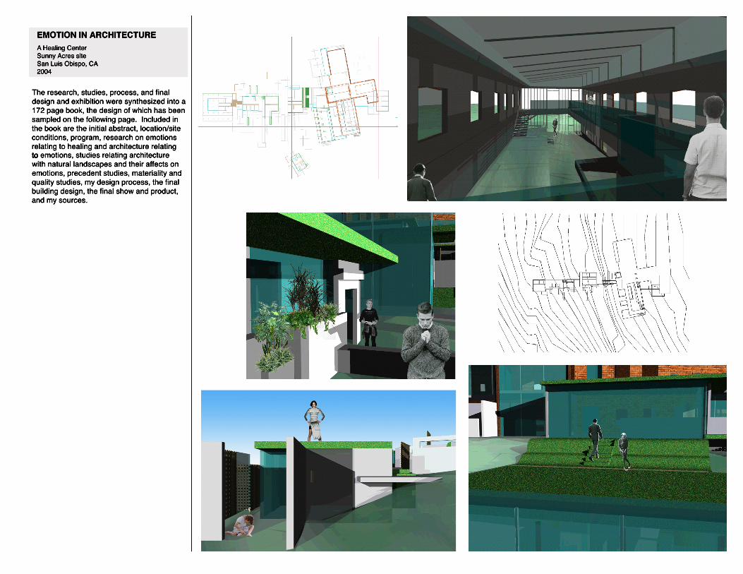
EMOTION IN ARCHITECTUREA Healing CenterSunny Acres siteSan Luis Obispo, CA2004
The healing center project focuses on peopleliving with life-threatening illnesses suchas cancer and AIDS. Physical healing isa goal of the center with emotional healingbeing the primary focus. The architecturalspace facilitates emotional healing as well aspromotes sustainability and adaptive reuse.ResearcResearch and analysis was performed tounderstand how architecture affects theemotions. Programmatically the center wouldhouse qualified natural healing practitionersand consultants. The goal being to providean alternative or supplement to unhelpful orharmful conventional treatments.
One s emotions affect one s health andability to heal. A center that facilitatesemotional healing, both in its program and inits architecture, will facilitate physical repair.A sensitivity to the site and a connection tonature were key in the design as well as afocus on materiality, light, and spatial comfort.AlonAlong with this research, this project provideda way to exhibit my photography and usephotography to relate the ways natureand architecture both affect our emotionssimilarly. The qualities focused on wereformal spectacle/repetition, texture/color,soft/enveloping qualities, monumentality,colocolor plays in light, desolation, and plays oflight and dark/diffusion.

EMOTION IN ARCHITECTUREA Healing CenterSunny Acres siteSan Luis Obispo, CA2004
The site is largely a grassy slope that affordsan excellent view of San Luis Obispo and thepeaks beyond. Most of the trees and largervegetation is around the existing building.Grass provided much of the inspiration for thedesign, as did the slope of the site and theviews. I explored and utilized various usesofof grass, such as formed earth features andgrass roofs. Other natural materials exploredand utilized were rammed earth walls, interiorand exterior planters, and wool insulation.Some Varia panels with embedded grasseswere specified to continue the grass themeinside. Where poured in place concrete isusedused, felt will be used inside the form. Thiswill leave the imprint of the natural folds andtexture of felt, creating an impression ofsoftness.
The concept of the guesthouses comesfrom the desire for every guest to have aunique sense of place. In order to achievethis I created a kit of parts that could beconfigured in various ways to create manyunique spaces. In order to demonstrate thevariety possible I asked ten different people todesigdesign a guesthouse with the kit of parts. Thisexperiment was very successful and confirmedmy idea that a wide variety of options can bearrived at with a limited kit of parts.
The intention of the final built model wasalso to explore materiality. Wax impregnatedfabric was used for a majority of the model.A translucent curtain provided the canvas forthe site plans and sections, a full-scale grassbench was built as well as a full-scale wallsection with wool batting insulation.

EMOTION IN ARCHITECTUREA Healing CenterSunny Acres siteSan Luis Obispo, CA2004
The grass features of the design go beyondjust grass roofs. Also featured are formedearth grass “benches” which are placedthroughout the site around the building as wellas on part of the accessible grass roof. Theexisting building has also been converted intoa useable grassy space. Half of the buildinghashas been converted into offices while theother half has been gutted, fitted with a glassroof and been turned into an indoor park withformed earth knolls. The glass roof offersprotection while the end of the building is leftstripped to its skeleton allowing a free flowof air and movement between indoor andoutdoooutdoor. The year-round mild climate of SanLuis Obispo makes it possible to have this sortof exposure without compromising comfort.
The distinction between indoor and outdoor,between the natural and artificial, and betweenground and shelter has been consciouslyblurred as often as possible. The groundbecomes a seat, the roof becomes a usablepark, the indoor area has a growing, livecarpet, some walls are made of earth, thevegetatiovegetation growing in planters outside alsogrows in planters inside, indoor walls continueout to become outdoor spatial definers, trellisesalso act as vegetative walls defining outdoor“rooms,” and the new building is largely nestledinto the hillside.
EMOTION IN ARCHITECTUREA Healing CenterSunny Acres siteSan Luis Obispo, CA2004
The research, studies, process, and finaldesign and exhibition were synthesized into a172 page book, the design of which has beensampled on the following page. Included inthe book are the initial abstract, location/siteconditions, program, research on emotionsrelating to healing and architecture relatingtoto emotions, studies relating architecturewith natural landscapes and their affects onemotions, precedent studies, materiality andquality studies, my design process, the finalbuilding design, the final show and product,and my sources.

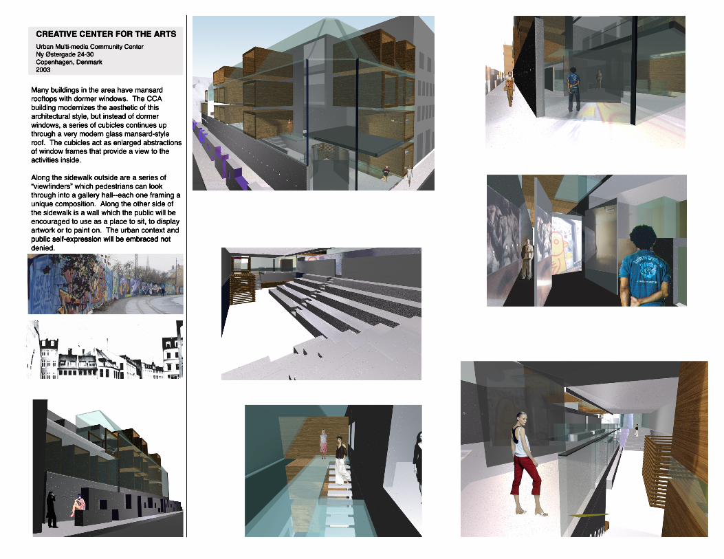
CREATIVE CENTER FOR THE ARTSUrban Multi-media Community CenterNy Østergade 24-30Copenhagen, Denmark2003
Art facilities in Copenhagen are generallyspread out all over the city. The creation ofa creative center in this highly artistic citywould provide its citizens with the means andopportunity to perfect their art or dabble invarious art forms and media in one location.The center would also provide the entirecommunitcommunity with a place to appreciate localtalent and attend lectures.
Gathering inspiration from the phenomenologytheories of architecture, the design ofthe building itself appeals to the sensualconsciousness of the inhabitants. Thepleasures of visual, tactile, olfactory, and auralsensations are incorporated as key elementsto the experience of the building.
SituateSituated in an historical area in centralCopenhagen, the site was given muchconsideration as well as elements of thesurrounding buildings both modern andhistoric.
Located on floor -1 is a lecture/ performanceLocated on floor -1 is a lecture/ performancehall and on floor 0 (street level) are an entrancelobby with scrims for multi-media projections, agallery with “viewfinder” apertures to the streetoutside, office, and large-scale workshop.On floor -1 a kitchen and café provide theolfactory experience. Floor 1 focuses on auralconsiderations and sound isolation for theconsiderations and sound isolation for thecinematography studio, recording studio andrestroom/ interstitial gallery spaces. Floor 2provides a variety of visual opportunities witha large photography studio, a multipurpose artstudio, a solarium, and a roof garden greenspace. Floor 3 is largely tactile with dance,sculpture, and ceramics studios.sculpture, and ceramics studios.
cross-section
length section
Floors -1 and 0 Floor 1 Floor 2 Floor 3
CREATIVE CENTER FOR THE ARTSUrban Multi-media Community CenterNy Østergade 24-30Copenhagen, Denmark2003
Many buildings in the area have mansardrooftops with dormer windows. The CCAbuilding modernizes the aesthetic of thisarchitectural style, but instead of dormerwindows, a series of cubicles continues upthrough a very modern glass mansard-styleroof. The cubicles act as enlarged abstractionsofof window frames that provide a view to theactivities inside.
Along the sidewalk outside are a series of“viewfinders” which pedestrians can lookthrough into a gallery hall--each one framing aunique composition. Along the other side ofthe sidewalk is a wall which the public will beencouraged to use as a place to sit, to displayartwork or to paint on. The urban context andpublic self-expression will be embraced notpublic self-expression will be embraced notdenied.

PRADARefashioning RetailSan Francisco, CA2002
The design for Prada's new store in downtownSan Francisco is a study of a skin vocabulary,the attempt at providing an "unpedestrian"experience, and the luxury of openness. Thedesign process provided the precedents for awell-developed skin vocabulary, the choice ofconcept aided in the exploration of a solutionto ato a problem with retail, and the final designintegration provided an opportunity to expressideas concerning what a Prada building couldbe.
The vocabulary of the design is the directoffspring resulting from the coupling of digitaland analog methods of design development.The analog method provided tactile exercisesthat allowed for exploration into how thingswill be touched and seen in real life, and thedigital method provided more opportunityfofor complexity and an endless array ofconfigurations and vocabularies.
A light box provided inspiration for the way aspace can constantly shift and look new. Aslight moves, so the scene shifts and morphs.The result is a multi-layered, exposedstructure aesthetic with maximum opennessand the luxury of empty spaces. Part retailspaces, part open-air catwalks, Prada sculture gets maximum exposure.culture gets maximum exposure.
Shadow shifting inspirations and design integration/evolution

PRADARefashioning RetailSan Francisco, CA2002

NIDUSSchool of Architecture2002
Steel structure respresented in red.
Nidus is a collaborative effort to design a newschool of architecture. Nidus comes from theword for a nest. As a bird incorporates piecesof material from many different sources, soNidus incorporates pieces from the arts andhumanities, agriculture and sustainability, theculinary arts and sociology. These pieces arewovewoven together to form a place that fostersthe holistic development of the individual.This is of highest importance for the study ofarchitecture.
An important architectural feature of thisbuilding is the use of three systems to usethe sun for heat, to protect from overheating,and to provide interesting shadows. Anotherimportant feature is the prevalence of steel inthe structural design.
ThThe first system is direct gain/loss. Southfacing windows with shading devices allowlow winter sun in to be reradiated and keepout high summer sun. The second is asunspace circulation corridor on the south.Steel subway grating material preventsdirect gain in summer. The direct heat gaininin winter is directed into inhabited spacesvia convection. The third system is that ofundulating louvers--a series of wide to narrowsteel slats--the narrow areas letting in shardsof light while the wide slats block all directsunlight creating interesting light patterns.

NIDUSSchool of Architecture2002
Inspired by the “servant” and “served”distinction emphasized by Louis Kahn, Nidusdraws a distinction between the administrative“servant” and the pupils being “served.” Oneside of the building houses the offices andadministrative side of the school while theother side is primarily architecture studioswith specially designed cubicles that promotewith specially designed cubicles that promotecollaboration. There is also a distinctionbetween the corridors and stairwells (theservant spaces) and the classrooms andoffices (the served).

FREE AND SUSTAINABLE TRANSITPublic Transportation System RedesignSan Luis Obispo, CA2005
This project was a collaboration for thedesign of a new public transportationsystem. My responsibilities included thedesign of bus stops, transit center masterplan, proposal of hybrid buses, pedestrianstreet and transfer station design, 3Dmodeling, identity concept and logodesigndesign, presentation graphic design, andbus schedule design. Other elementsof the project included a reconfigurationof all routes, major pick up locations andschedules to make them more efficientand convenient as well as additionalresearch and a feasibility analysis.
This project won the American Institute ofArchitects Committee on the Environment s“Ecoliteracy Project” competition in 2005.

SKETCHESWorks by Josep Jujol
2000
These drawings were made for anassignment in which I chose an architectand made drawings of some of my favoriteworks by them.

GRAPHIC DESIGN“Be tween Life & No where” art showAdvertisements and Program2008
These posters and program weredesigned for an evening of performanceart, installation art, and reception. Theartwork used is a mixture of the artist soriginal work, my artwork, scenes fromthe performance, and symbolism directlyrelated to the concepts in the artwork.

GRAPHIC DESIGNPostcardsMission San Luis Obispo2005
I was hired by the Mission San Luis Obispoto design new postcards for the museumgift shop. I used all my own photos withthe exception of the picture of the originalmission, which is a scan of a picture fromthe 1800s. The postcards can be foundtoday at the mission.

GRAPHIC DESIGNSenior Thesis BookEmotion in Architecture2004
Accompanying my senior design projectwas a 172 page book designed entirelyby me with my designs, research andinspirations. I used my own photographywhenever possible. The graphic design ofthe book represents aesthetic features ofthe building design. The lines that I usedas aas a theme throughout the book work notonly as tools to move one s eye around thepage and highlight important features, butalso reflect the plan of walls and spatialdividers on the site. The cover of the bookis made from the same wax impregnatedfabric as much of the final model. Thisworkworks well as both a pleasing tactilesensation and a material which representsthe concept of wabi-sabi, or becomingmore pleasing with age and wear (anotherconcept found in the research section ofthe thesis).