
Portfolio 2010
36
Contact. Architect: Roberto Andonie Cardo Phone: +52 (81) 8362 67 62 Email: [email protected] Website: Andonie.Tumblr.com PORTFOLIO 2010
-
Upload
roberto-andonie -
Category
Documents
-
view
214 -
download
0
description
My Architectural design portfolio 2010.
Transcript of Portfolio 2010
Contact. Architect:Roberto Andonie Cardo
Phone:+52 (81) 8362 67 62
Email:[email protected]
Website:Andonie.Tumblr.com
PORTAFOLIO 2009PORTFOLIO 2010

Roberto Andonie.Portfolio 2010.
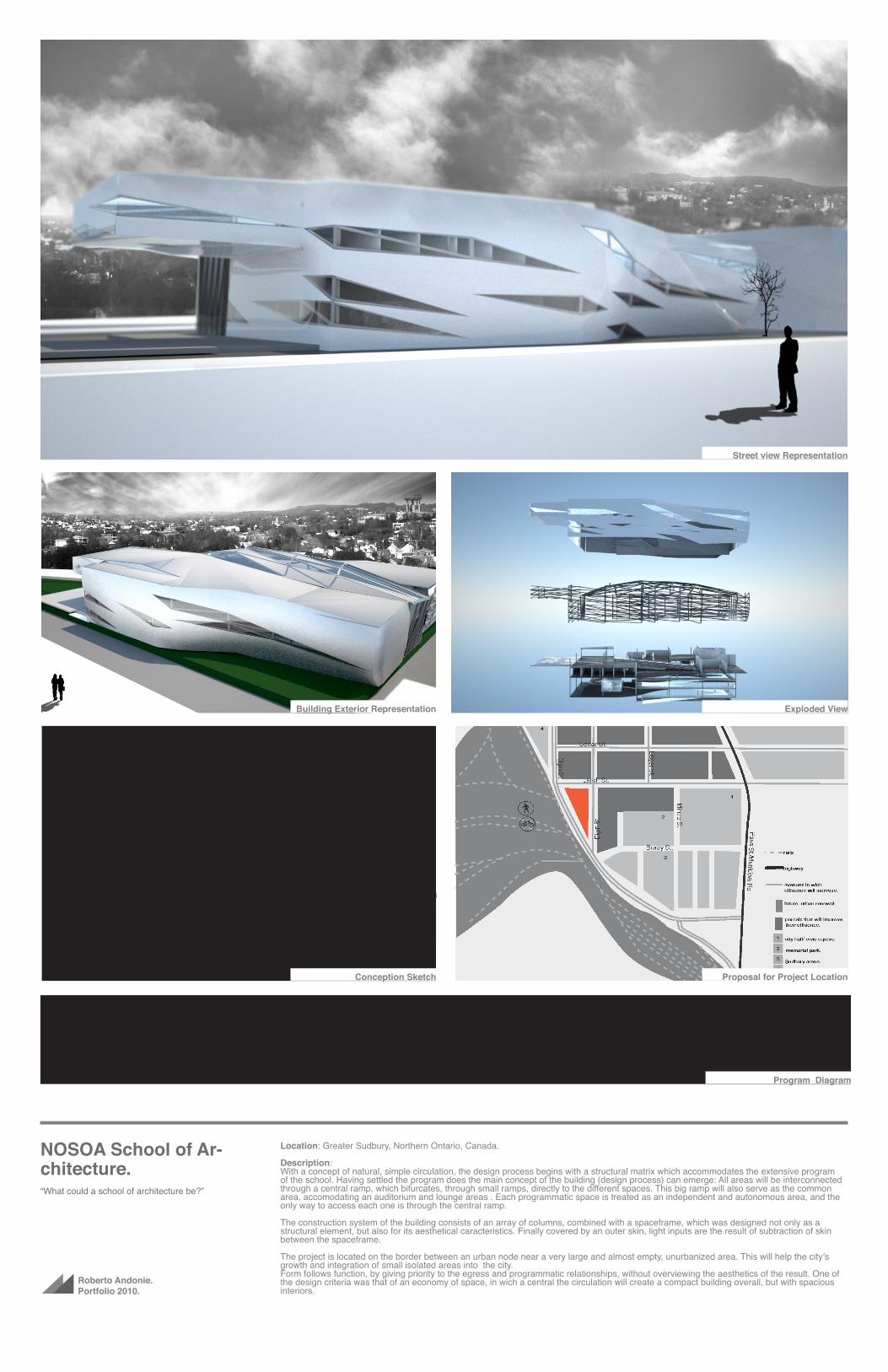
NOSOA School of Ar-chitecture.“What could a school of architecture be?”
Location: Greater Sudbury, Northern Ontario, Canada.
Description:The project is a proposal for a competition to design a new school of architecture in the city of Greater Sudbury in Canada.The objective of this competition was to explore “What Could a School of Architecture Be?”
The intention is to create an iconic building that would serve as a landmark for the city,and simbolize the begining of a development towards a new architecture in the Greater Sudbury. Part of the challenge is choosing a place for the building in order to help the revitalization of down-town city. Greater Sudbury’s urbanization was afected by the decline of the steel industry, the city’s main economic engine, and seeking for a solution that will generate an urban renewal, the building of a modern school of architecture is proposed.
The picture above shows the first board layout sent to the competition.
Board A for NOSOA Competition
Roberto Andonie.Portfolio 2010.
NOSOA School of Ar-chitecture.“What could a school of architecture be?”
Location: Greater Sudbury, Northern Ontario, Canada.
Description:With a concept of natural, simple circulation, the design process begins with a structural matrix which accommodates the extensive program of the school. Having settled the program does the main concept of the building (design process) can emerge: All areas will be interconnected through a central ramp, which bifurcates, through small ramps, directly to the different spaces. This big ramp will also serve as the common area, accomodating an auditorium and lounge areas . Each programmatic space is treated as an independent and autonomous area, and the only way to access each one is through the central ramp.
The construction system of the building consists of an array of columns, combined with a spaceframe, which was designed not only as a structural element, but also for its aesthetical caracteristics. Finally covered by an outer skin, light inputs are the result of subtraction of skin between the spaceframe.
The project is located on the border between an urban node near a very large and almost empty, unurbanized area. This will help the city’s growth and integration of small isolated areas into the city.Form follows function, by giving priority to the egress and programmatic relationships, without overviewing the aesthetics of the result. One of the design criteria was that of an economy of space, in wich a central the circulation will create a compact building overall, but with spacious interiors.
Street view Representation
Exploded View
Proposal for Project Location
Program Diagram
Conception Sketch
Building Exterior Representation

Roberto Andonie.Portfolio 2010.
NOSOA School of Ar-chitecture.“What could a school of architecture be?”
Location: Greater Sudbury, Northern Ontario, Canada.
Description:The ramp centralizes all the flow of the building, allowing a more compact building, yet, the ramp is large enough to serve as a common area, with different lounge areas and an auditorium (View). Circulation is as simple and straightforward as possible, following linear paths to nearly all areas (flow diagram). The studios, the work area for students, is designed with the same language as the rest of the school. Following popular architectural school models, where a big space is shared by all the students as their collavorative studios, benefits students by the coexistence and comunication between different class students and the feedback this convivence.
Vista Exterior.
Estructura Explotada.
Sketch inicial del Proyecto.
Vista Exterior Elevada.
Retail StoresFaculty LoungeStudent StudiosLibrary
Vista Interior de Area Común.
Student Studios.
Spaceframe DesignCirculation Diagram

Roberto Andonie.Portfolio 2010.
NOSOA School of Ar-chitecture.“What could a school of architecture be?”
Location: Greater Sudbury, Northern Ontario, Canada.
Description:Each program area has its own internal circulation system designed to direct the circulation back to the central ramp.The ramp has a 10% slope (Central Court the ramp).
The design of the library and studies have the same language of the ramps. The library circulation consists of a spiral of slabs that takes you through al the levels. (Cut to Library).
Estructura Explotada.
Localización del Proyecto.
Proceso de Diseño.
Vista Exterior Elevada.
Building Section.Esc 1:300.
Inside.
What Could A School Of Architecture Be?
Exploded View.
Site Plan. Building Layers.
School Life.
Students Studios.
All the studios are together in an big room. The slab is slightly inclined in order to connect the first studio with the rest.
The students lounge and the studios recieve plenty of natural light and have the best view in the building.
Plans.
1
Students.ManufactoringIT & media.Miscellaneous.Library.Faculty.Administration.
-8.000-2 Story
-8.000-2 Story
-4.000-1 Story
-4.000-1 Story
±0.0000 Ground Floor
±0.000
+4.0001 Story
+4.0001 Story
+8.0002 Story
+8.0002 Story
+12.0003 Story
+12.0003 Story
C
Building Section.
What Could A School Of Architecture Be?
Scale Model.
Skin.
Flux Diagram.
Based on this diagram we started to accomodate the different spaces. This diagram shows what’s the desired proximity to the next type of area. The criteria was: 1. Desired proximity ( bold black line), 2. Indifferent about proximity ( Thin gray line, and 3. Not desired ( Dashed red line).
Space Frame.
The structural space frame started from a simple modular structure, from where extractions were made to create windows and entrances. Then it was manipulated to cover the bulding resulting in the final skin.
1
D
RetailsStudents
ManufacturingLibrary
Circulation. Process.
2.00m
1.00m
1.30m
1.50m
6.40m
1.00m
.60m
1
2
3
5
6
4
Library
Students
Manufacturing
Miscelaneous
IT & Media
Administration
Faculty Staff
-8.000-2 Story
-8.000-2 Story
-4.000-1 Story
-4.000-1 Story
±0.0000 Ground Floor
±0.0000 Ground Floor
+4.0001 Story
+4.0001 Story
+8.0002 Story
+8.0002 Story
+12.0003 Story
+12.0003 Story
5m
5m
5m
Students.
Manufactoring
IT & media.
Miscellaneous.
Library.
Faculty
Administration
Section through central ramp.
PlansSection through Library
Overal Plan

Roberto Andonie.Portfolio 2010.
Omotesando Fashion Museum.“Fashion is Architecture, it is a matter of propor-
tions” - Coco Channel.
Location: Omotesando Street, Tokyo, Japan.
Description:The project is proposed for the design competition “Omotesando Tokyo Street Fashion Museum” with the goal of building a museum dedicated to fashion and haute couture of all history. The building will be located in Omotesando Street, a major commercial avenue, home of some of the most exclusive boutiques in Japan. This avenue also accomodates a large number of iconic works of architecture. The buildings around the distric are of moderate height, rarely rising to more than 25 meters. One of the caracteristics of the contest is to design a 100 meters high build-ing, towering far from its surroundings.
We propose a striking building, operating as a reference point in the city, and with the same architectural language that its context.
The picture above shows the exterior view of the building, seen from Omotesando Avenue.
Exterior View.

Roberto Andonie.Portfolio 2010.
Omotesando Fashion Museum.“Fashion is Architecture, it is a matter of propor-
tions” - Coco Channel.
Location: Omotesando Street, Tokyo, Japan.
Description:The building is a representation of the use of clothing and architecture. The purpose of clothing is to protect the body from the outside and decorate it. Thus arises the building’s main concept: An iluminated box of glass, fragile and light, which houses the circulation arteries, is protected from the outside, and decorated by the architectural programmatic spaces. The shape of the building is obtained from an analysis of circulation in a downward spiral. Light entries are diagonal cuts in the body of the building.
Inside the glass box, the lobby rises 100 meters height, with an imponent view, were passing bridges and halls that connect the viewing rooms throughout the different levels of the building are visible.
Vista Exterior.
Frontal View. Interior View. Floor Plans.
Intial Concept Sketches.
Exterior View.

Roberto Andonie.Portfolio 2010.
Omotesando Fashion Museum.“Fashion is Architecture, it is a matter of propor-
tions” - Coco Channel.
Location: Omotesando Street, Tokyo, Japan.
Description:The design process begins with a flux diagram between the areas required by the program. Then arranging the areas of the building accord-ingly. The main egress occurs in the center, with the hallways, stairs and elevators.That stablishes the initial form of the building.
-12.000-4 Story
-12.000-4 Story
-9.000-3 Story
-9.000-3 Story
-6.000-2 Story
-6.000-2 Story
-3.000-1 Story
-3.000-1 Story
±0.0000 Ground Floor
±0.0000 Ground Floor
+5.0001 Story
+5.0001 Story
+10.0002 Story
+10.0002 Story
+20.0003 Story
+20.0003 Story
+30.0004 Story
+30.0004 Story
+40.0005 Story
+40.0005 Story
+50.0006 Story
+50.0006 Story
+60.0007 Story
+60.0007 Story
+70.0008 Story
+70.0008 Story
+80.0009 Story
+80.0009 Story
+90.00010 Story
+90.00010 Story
+100.00011 Story
+100.00011 Story
-12.000-4 Story
-12.000-4 Story
-9.000-3 Story
-9.000-3 Story
-6.000-2 Story
-6.000-2 Story
-3.000-1 Story
-3.000-1 Story
±0.0000 Ground Floor
±0.0000 Ground Floor
+5.0001 Story
+5.0001 Story
+10.0002 Story
+10.0002 Story
+20.0003 Story
+20.0003 Story
+30.0004 Story
+30.0004 Story
+40.0005 Story
+40.0005 Story
+50.0006 Story
+50.0006 Story
+60.0007 Story
+60.0007 Story
+70.0008 Story
+70.0008 Story
+80.0009 Story
+80.0009 Story
+90.00010 Story
+90.00010 Story
+100.00011 Story
+100.00011 Story
Building Section
Design Process
Transversal Section. Longitudinal Section.

Roberto Andonie.Portfolio 2010.
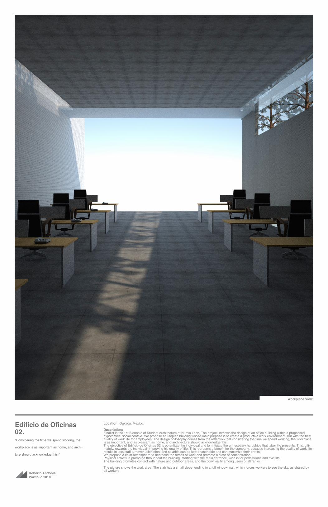
Edificio de Oficinas 02.“Considering the time we spend working, the
workplace is as important as home, and archi-
ture should acknowledge this.”
Location: Oaxaca, Mexico.
Description:Finalist in the 1st Biennale of Student Architecture of Nuevo Leon, The project involves the design of an office building within a propossed hypothetical social context. We propose an utopian building whose main purpose is to create a productive work environment, but with the best quality of work life for employees. The design philosophy comes from the reflection that considering the time we spend working, the workplace is as important, and as pleasant as home, and architecture should acknowledge this.The objective of Edificio de Oficinas 02 is potentiate the individual and to mitigate the unnecesary hardships that labor life presents. This, ulti-mately, rewards the individual improving his quality of life. This represent a benefit for the company, because increasing the quality of work life results in less staff turnover, alienation, and salaries can be kept reasonable and can maximize their profits.We propose a calm atmosphere to decrease the stress of work and promote a state of concentration.Physical activity is promoted throughout the building, starting with the main entrance, wich is for pedestrians and cyclists. The building promotes contact with nature and outdoor areas, and the conviviality among users of all ranks.
The picture shows the work area. The slab has a small slope, ending in a full window wall, which forces workers to see the sky, as shared by all workers.
Vista Exterior.Workplace View.

Roberto Andonie.Portafolio 2010.
Edificio de Oficinas 02.“Vivimos mas tiempo trabajando que en casa y
la arquitectura debe tomar esto en cuenta.”
Ubicación: Proyectado en un contexto hipotético.
Descripción:La forma surge de una experimentación con la función y se economía estructural. Se decide no sacrificar absolutamente nada referente a la funcionalidad de los espacios, aunque sea para favorecer la estética de el edificio. Se compromete la estructura lo menos posible. Los mate-riales escogidos fueron escogidos por su capacidad de transmitir serenidad, y favorecer las condiciones laborales(Vista Exterior).
Mientras que los espacios de oficina estan orientados al noreste, para recibir luz del sol principalmente en la mañana, las cabinas de visita se encuentran orientadas al suroeste, para poder tener una contemplación del atardecer desde las alturas (Sala de Visitas).
Los pisos de oficina cuentan con pequeñas cabinas para visitas, que son cuartos elevados sobre la fachada lateral. Para entrar a ellas se tiene que bajar 60 cm, y tienen una altura menor que el resto de la planta. (Exterior de Salas de Visitas)
Las oficinas tienen acceso a una terraza en donde se encuentra el área de refrigerio. El espacio muerto que la elevación producida por la inclinación de la losa de las oficinas crea, es utilizado como bancas(Fachada Frontal).
La planta mas alta es dedicada como un area de relajación y descanso. Estando lo mas aislados posible, se brinda un jardín con árboles, un gimnasio y el restaurante(Techo Terraza).
Vista Exterior.
Exterior View.
Side View.
Bycicle Parking.Roof garden.
Visiting rooms. Inside Visiting Rooms.

Roberto Andonie.Portafolio 2010.
Edificio de Oficinas 02.“Vivimos mas tiempo trabajando que en casa.
La arquitectura debe tomar esto en cuenta.”
Ubicación: Proyectado en un contexto hipotético.
Descripción:La losa esta ligeramente inclinada hacia arriba, apuntando al cielo(Corte Longitudinal). Esta termina en una apertura de todo el muro, impo-niendo así una vista al horizonte para todos los trabajadores. Esta apertura sirve también como fuente de luz y aire natural, y como acceso a la zona de terrazas que comparten todos los pisos de oficinas. Las oficinas estan diseñadas para que, aunque se pueda establecer una dife-rencia en la jerarquía de trabajo, el convivio entre estos sea directo, sin muros. Esto ayuda, por un lado, a que los directivos sean parte activa de la comunidad de trabajo, y por otro lado a que los trabajadores a no se sientan subordinados, mejorando la comunicación entre todos. Se proponen 20 espacios de trabajo por piso modulo de oficinas. La finali- dad es tener una comunidad de trabajo pequeña, ya que la calidad de vida laboral se ve afectada en grupos grandes. Cabe mencionar que los servicios públicos y de departamentos son mucho menos eficientes si son muy grandes(Area de Oficinas).
El estacionamiento principal esta dedicado a bicicletas y peatonales, para fomentar y favorecer la actividad física. El estacionamiento de auto-moviles se encuentra en el area subterranea.
Vista Exterior.
Northwest Façade Southeast Façade
Longitudinal Section.
Area de Oficina.
Roof Plan.

Roberto Andonie.Portfolio 2010.
Edificio de Oficinas 02.“Considering the time we spend working, the
workplace is as important as home, and archi-
ture should acknowledge this.”
Location: Oaxca, Mexico.
Description:In each office floor, and in the rest area, there are various fruit trees. It is proposed that users can cut fruit, and can thus have a direct experi-ence with nature (Exterior view).
Story -1 This plant is parking for cars, the building maintenance area, and the fourth of waste. The motorist are slightly penalized, giving prefer-ence to cyclist and pedestrians, forcing forcing them to take the back entrance and use the stairs, imposing some physical activity.
Story 0: The hall, the main entrance, parking for bicycles, central post office, surveillance room and waiting rooms for guests. Stairs have a special focus, these being the most visible and early-pal to reach the upper floors. It sanctions the use of the elevator, marginalizing turn away from the entrance. The waiting rooms are between two internal courtyards are submerged 90 cm on the floor.
Story 1: A Library for research area, auditorium, medical service area, service area of the building and balcony, and a propossed nursery with outdoor patio and cribs. Leaving a double height in the center of the plant, in order to remove and to provide less distraction to the research area and reduce the conviviality between individuals external to us and the nursery. It is worth mentioning that from the terrace of each office floor is eye contact with the court of the nursery.
Vista Exterior.
Front View.
Southeast Façade Northeast Façade
Northwest Façade Southwest Façade Story -1
Story 0
Story 1
Story 2 - 6

Roberto Andonie.Portfolio 2010.
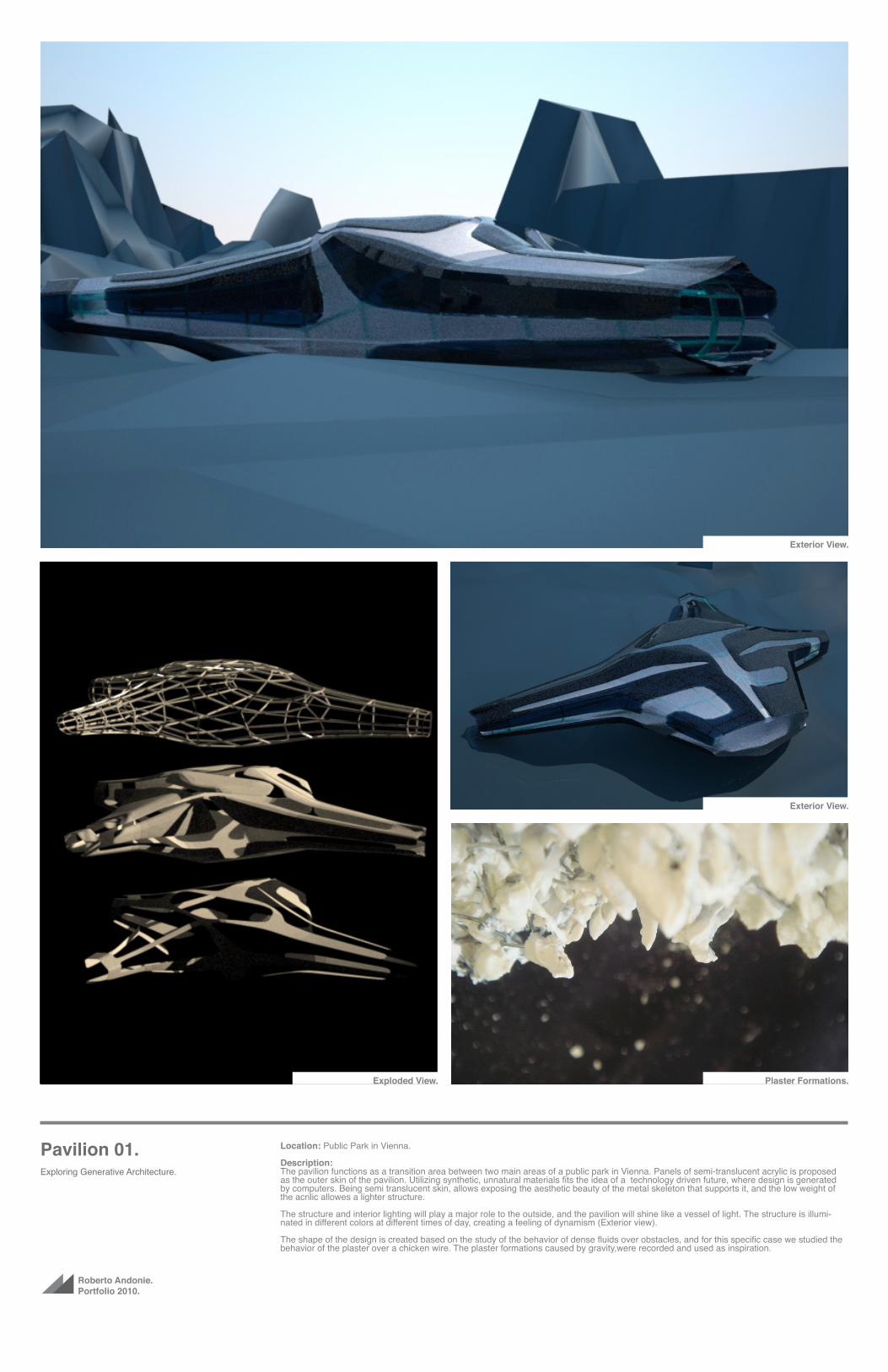
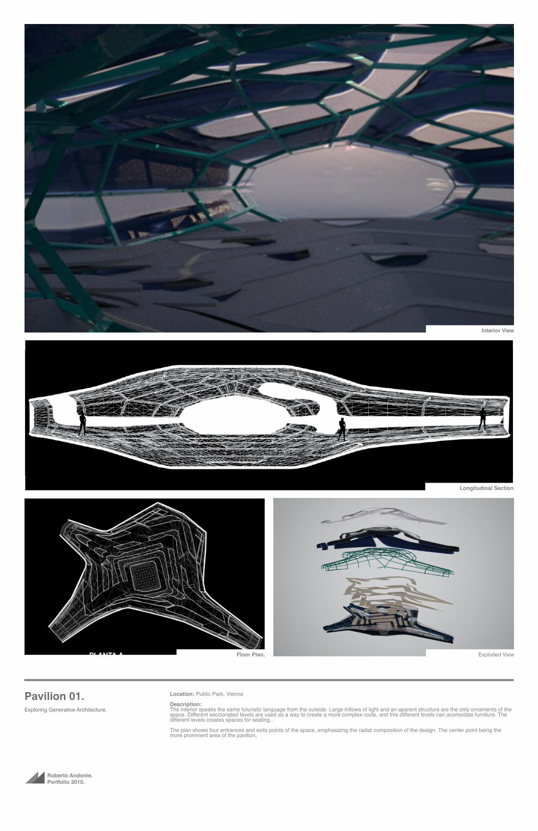
Pavilion 01.Exploring Generative Architecture.
Location: Public Park in Vienna
Description:Pavilion 01 emerges as an exercise in exploring the design possibilities of generative architecture. The design is derived from the analysis of certain natural phenomena, which applied to architecture, using specialized software generates forms that can be exploited by the architecture. The tendency to use these methods of design is especially strong in these times, where software support is a requirement for new architecture. Resulting in complex possiblities for futures development of spaces. The architectural language of the pavillion is based on this thought, and inspired by this future world where design is largely generated by computers.
It employs the use of a metal spaceframe as the main structural system, and the use of synthetic materials to emphasize the futuristic concept of the pavilion.
The picture above shows a display outside the pavilion during the night, where the spaceframe is illuminated by LEDs and a semi-translucent skin reveals its skeleton.
Vista Exterior.Exterior View.
Roberto Andonie.Portfolio 2010.
Pavilion 01.Exploring Generative Architecture.
Location: Public Park in Vienna.
Description:The pavilion functions as a transition area between two main areas of a public park in Vienna. Panels of semi-translucent acrylic is proposed as the outer skin of the pavilion. Utilizing synthetic, unnatural materials fits the idea of a technology driven future, where design is generated by computers. Being semi translucent skin, allows exposing the aesthetic beauty of the metal skeleton that supports it, and the low weight of the acrilic allowes a lighter structure.
The structure and interior lighting will play a major role to the outside, and the pavilion will shine like a vessel of light. The structure is illumi-nated in different colors at different times of day, creating a feeling of dynamism (Exterior view).
The shape of the design is created based on the study of the behavior of dense fluids over obstacles, and for this specific case we studied the behavior of the plaster over a chicken wire. The plaster formations caused by gravity,were recorded and used as inspiration.
Vista Exterior.
Exterior View.
Exploded View.
Exterior View.
Plaster Formations.
Roberto Andonie.Portfolio 2010.
Pavilion 01.Exploring Generative Architecture.
Location: Public Park, Vienna
Description:The interior speaks the same futuristic language from the outside. Large inflows of light and an aparent structure are the only ornaments of the space. Different seccionated levels are used as a way to create a more complex route, and this different levels can acomodate furniture. The different levels creates spaces for seating. .
The plan shows four entrances and exits points of the space, emphasizing the radial composition of the design. The center point being the more prominent area of the pavilion,
Vista Exterior.
Interior View
Longitudinal Section
Floor Plan. Exploded View

Roberto Andonie.Portafolio 2010.
Pavilion 01.Exploring Generative Architecture.
Location: Public Park in Vienna
Description:The plaster, being thrown into the chicken wire form stalactites. The size and shape of these stalactites depend on the amount of stagnant plaster through the openings in the mesh, and the inclination of this. With this observation, the most acumulated plaster on an inclined, open-ing, the greater the size of the stalactites. Translating the plaster to the capacity of people inside the pavilion, and the size of the stalactite at the height of the place, it proposes a form which grows at the point where most users will contain. As a radial composition, the center is the end of the tour, where users will be “accumulate”, and that is why the size of the center grows in comparison to the elements that come out of this (Process Design).
The interior is designed as a multipurpose area. The small platforms serve as display areas for installations, and the amphitheater shape of the pavilion center serves as a temporary auditorium.
Design Studies.
Interior View.

Roberto Andonie.Portafolio 2010.
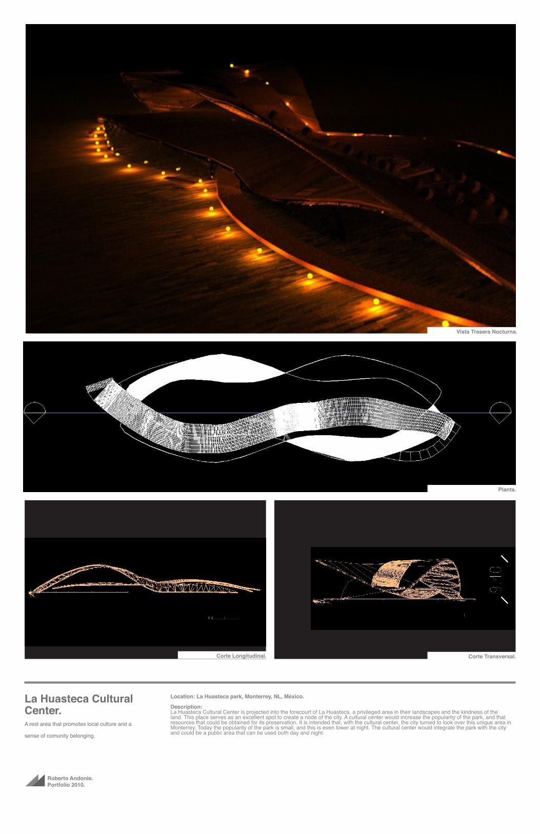
La Huasteca Cultural Center.A rest area that promotes local culture and a
sense of comunity belonging.
Location: La Huasteca park, Monterrey, NL, México.
Description:The project is a proposal to start a new cultural center in the of Monterrey, Mexico. The integrated structure is prepared to house an auditorium, a public library, rest areas, reading areas and a cafe. This proposal aims to rehabilitate and integrate the park into the city, attracting more people to this beutiful park. The design of the proposal considers the ecological impact it will have on the park, aiming for a low invasive con-struction, with an integration to the context, allowing the beautiful mountains of the park become the central point of attention.
La Huasteca cultural center aims to be a convivial place for the city, a place of rest that promotes culture and a sense of community belonging.
The picture above shows the area of the auditorium, which can be acclimated for concerts, lectures or plays.
Auditorium.

Roberto Andonie.Portfolio 2010.
La Huasteca Cultural Center.A rest area that promotes local culture and a
sense of comunity belonging.
Location: La Huasteca park, Monterrey, NL, México.
Description:The cultural center has the property that can be accesed and walked on its entirety. You have access to all areas of the east, and the roof has a walking route accesible from the floor, mimicking the complexity of a mountain walk. It promotes a healthier lifestyle to the public. Both physi-cally and mentally, and for that reason the journey can be a challenge for the user due to its inclination. It uses natural materials and the use of vegetation to reduce the impact it will have on the park and integrate it to irs sorroundings.In the course of the ceiling proposed several personal cabins can be used as reading rooms, or rest (rear view).
A metal armor is proposed as an structural system. These two surfaces loaded structures bent and intertwined that will be generated spaces are used as libraries, concert halls and cafes (exploded view).
Vista por el Auditorio.
Back View.
Auditorium. Exploded View.
Front View. Exterior View.
Roberto Andonie.Portfolio 2010.
La Huasteca Cultural Center.A rest area that promotes local culture and a
sense of comunity belonging.
Location: La Huasteca park, Monterrey, NL, México.
Description:La Huasteca Cultural Center is projected into the forecourt of La Huasteca, a privileged area in their landscapes and the kindness of the land. This place serves as an excellent spot to create a node of the city. A cultural center would increase the popularity of the park, and that resources that could be obtained for its preservation. It is intended that, with the cultural center, the city turned to look over this unique area in Monterrey. Today the popularity of the park is small, and this is even lower at night. The cultural center would integrate the park with the city and could be a public area that can be used both day and night.
Corte Transversal.
Vista Trasera Nocturna.
Planta.
Corte Longitudinal.

Roberto Andonie.Portfolio 2010.
United Colors of Ben-etton TeheranDesignin in Teheran.
Location: Teheran, Iran
Description:United Colors of Benetton set the starting grounds for our initial approach in terms of it`s proficient capacity for graphic range. Through an inspiring revisit of it`s marketing campaigns, we came across a persistent nature of human relations and united cultures, a founda-tion set for us to experience, and put into practice in this case, through this project.We decided to join United Colors of Benetton`s ambitions to continue this visual treatment by offering a design wich encourages and facilitates wide possibilities of graphic intervention through the strategic distribution and orientation of clean surfaces.
Exterior View.

Roberto Andonie.Portfolio 2010.
United Colors of Ben-etton TeheranDesignin in Teheran.
Location: Teheran, Iran
Description:
We conceived the building`s initial wireframe by establishing an ideal middle point for volume encounter, space organizing, natural light and air flow concentration/ distribution , that would also provide an open, informative and inviting fachade.
We concentrated most of the primary structure in a “U” shaped metal-skin concrete perimeter , also serving as an exclusive container and distributor of main electric and hydraulic installations, as well as emergency stairs
West View. North View.
South View.East View.

Roberto Andonie.Portfolio 2010.
United Colors of Ben-etton TeheranDesignin in Teheran.
Location: Teheran, Iran
Description:. This structure is joined by a secondary internal offset, wich restricts the lobby and main vertical transit.
Both system provide the support for all lighter internal areas.
Most levels, including ground levels, interconnect through air escapes, resulting in a constant vertical flow through the entire buildings. The same system can also be seen in the perimeter of the volume. Green areas were also strongly considered.
Drawing Scale
1:300
16
x 0
.14
4 =
2.3
00
m
16
x 0
.14
4 =
2.3
00
m
Building MassA: 1,209.250 m2
H: 2.30 m
S-0
5S
-05
S-06S-06
North Elevation
Ea
st
Ele
va
tio
n
South Elevation
We
st
Ele
va
tio
n
16
x 0
.14
4 =
2.3
00
m
16
x 0
.14
4 =
2.3
00
m
Building MassA: 1,209.250 m2
H: 2.30 m
S-0
5S
-05
S-06S-06
North Elevation
Ea
st
Ele
va
tio
n
South Elevation
We
st
Ele
va
tio
n
16
x 0
.14
4 =
2.3
00
m
16
x 0
.14
4 =
2.3
00
m
Building MassA: 1,209.250 m2
H: 2.30 m
S-0
5S
-05
S-06S-06
North Elevation
Ea
st
Ele
va
tio
n
South Elevation
We
st
Ele
va
tio
n
16
x 0
.14
4 =
2.3
00
m
16
x 0
.14
4 =
2.3
00
m
S-0
5S
-05
S-06S-06
Building MassA: 584.143 m2
H: 2.30 m
Building MassA: 626.969 m2
H: 2.30 m
North Elevation
Ea
st
Ele
va
tio
n
South Elevation
We
st
Ele
va
tio
n
6 x 0.167 = 1.000 m
123456
S-0
5S
-05
S-06S-06
North Elevation
Ea
st
Ele
va
tio
n
South Elevation
We
st
Ele
va
tio
n
Building MassA: 1,209.250 m2
H: 2.70 m
S-0
5S
-05
S-06S-06
North Elevation
Ea
st
Ele
va
tio
n
South Elevation
We
st
Ele
va
tio
n
S-0
5S
-05
S-06S-06
North Elevation
Ea
st
Ele
va
tio
n
South Elevation
We
st
Ele
va
tio
n
S-0
5S
-05
S-06S-06
North Elevation
Ea
st
Ele
va
tio
n
South Elevation
We
st
Ele
va
tio
n
6 x
0.1
67 =
1.0
00 m
1
2
3
4
5
6
S-0
5S
-05
S-06S-06
North Elevation
Ea
st
Ele
va
tio
n
South Elevation
We
st
Ele
va
tio
n
S-0
5S
-05
S-06S-06
North Elevation
Ea
st
Ele
va
tio
n
South Elevation
We
st
Ele
va
tio
n
19 x
0.1
84 =
3.5
00 m
S-0
5S
-05
S-06S-06
North Elevation
Ea
st
Ele
va
tio
n
South Elevation
We
st
Ele
va
tio
n
-4. Parking Story 1:300-3. Parking Story 1:300-2. Parking Story 1:300-1. Storage Story 1:3000. Ground Floor 1:300
1. Comercial Story 1:3002. Office Story 1:3004. Office Story 1:3005. Office Story 1:3006. Office Story 1:300
7. Apartment Story 1:300 S-05 Transversal Building Section 1:300 S-06 Longitudinal Building Section 1:300
FLOOR PLANS
10 m 50 m
Back View Front View
Floor Plans.


Roberto Andonie.Portfolio 2010.
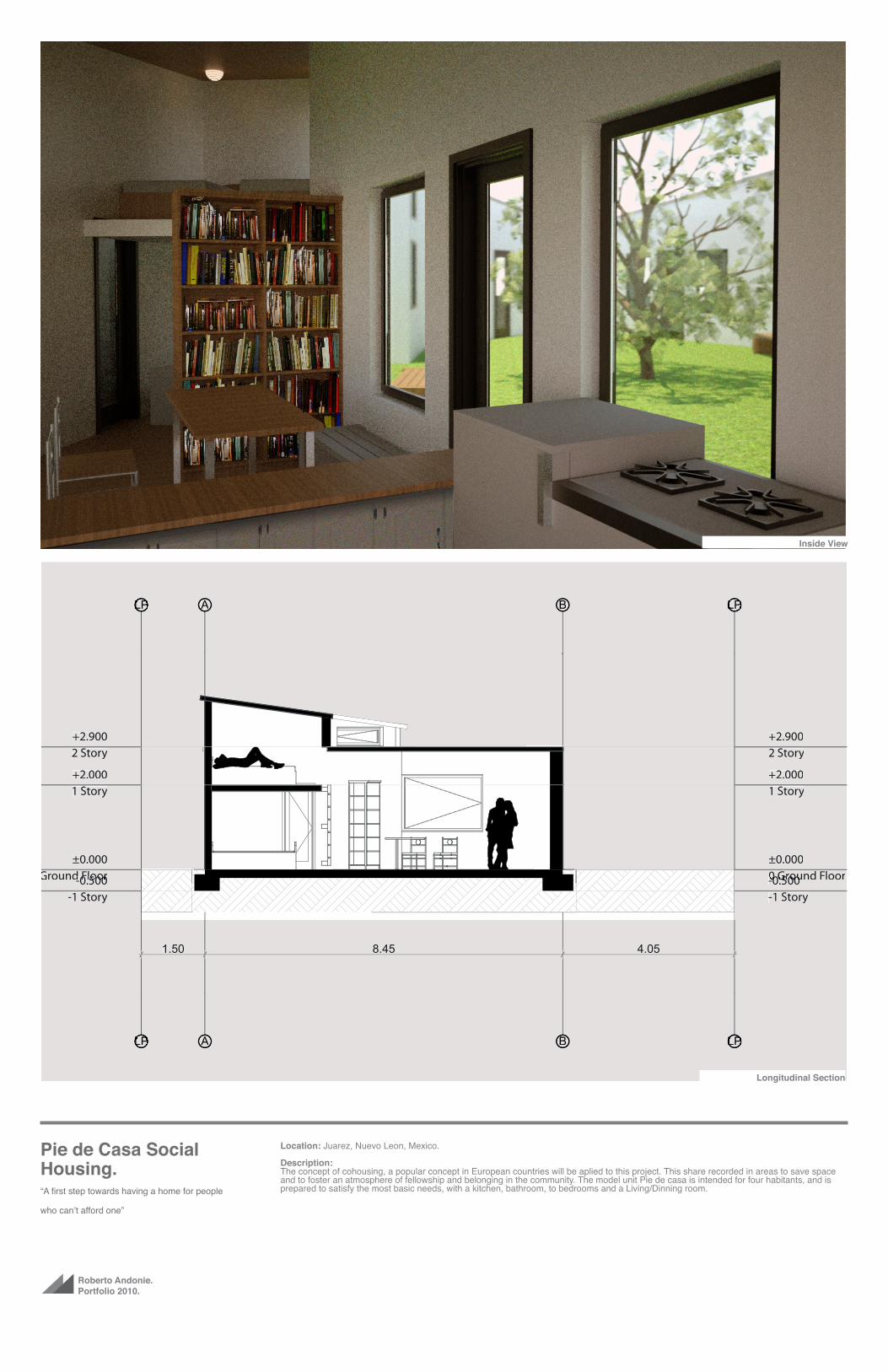
Pie de Casa Social Housing.“A first step towards having a home for people
who can’t afford one”
Location: Juarez, Nuevo Leon, Mexico.
Description:Pie de Casa is a program made by INFONAVIT, a mexican credit company, in wich the company gives ellegible people a place would eventu-ally become a full-featured home. It is the first step towards a having a home for people who can’t afford one. There are some basic rules for this kind of social housing. The pie de casa must be 25 square meters (270 sq Ft) construction, over a 98 square meters (1055 sq ft) terrain per unit. All the materials and suppliers are defined by INFONAVIT, as a mean of mass production and the cost per unit is $5,000 dlls. The proposal stems from the concept of Cohousing. This concept consisits in sharing common areas with other houses. This has the benefits of space efficient project, representing a cost savings for the company and bigger, more confortable spaces for the users.Sharing spaces promotes a connivance and integration between neighbors, thus helping to improve the quality of life of the community. This also creates safer communities and areas that are constantly monitored by the residents in the project. The main shared area is the backyard. Due to the small size of the projects, neighbors joining patios benefits the user because it creates big green areas that everyone can share. Users also have a private patio in the front area, which serves to further home expansion.
Exterior View.Central Patio.

Roberto Andonie.Portfolio 2010.
Pie de Casa Social Housing.“A first step towards having a home for people
who can’t afford one”
Location: Juarez, Nuevo Leon, Mexico
Description:The Project 01 is located in a subdivision in Ciudad Juarez, NL. Which is composed of several types of social housing. A common problem for the pie de casa in other subdivisions with mixed type is the marginalization and lack of integration of the former with other homes. Following this observation, this solution is presented, aiming to integrate this type with the rest. The main reason for the shape of the floor plan is to allow is to privatize the bedroom area from the rest without the need for walls and thus lowering costs. It also serves to delimit the shared patios without the need for walls and fences, while also reducing the costs..Materials are restricted to block walls, concrete slab, and stone founda-tions.It is worth mentioning that the area considered for future expansion of the house is the front façade,
Vista Exterior.
Frontal View.
F
RG
LP
LP
I
I
1
1
2
2
LP
LPII
II
LPLP
LPLP
AA
B B
1.19
S-08
S-08
S-09S-09
S-11 S-11
S-12
S-12
E-05
E-06
E-07
E-08
LPLP
LPLP
I
1
1
2
2
LPLP
LPLPII
IIII
LPLPLPLP
LPLPLPLP
AAAA
B B
1.19
S-08
S-08
S-09S-09
S-11 S-11
S-12
S-12
E-05
E-06
E-07
E-08
LP
LP
B
B
A
A
LP
LP
4.05 8.45 1.50
LPLP
LPLP
B
B
AA
AA
LPLP
LPLP
4.05 8.45 1.50
LP
LP
2
2
1
1
LP
LP
1.05 2.32 3.64
LPLP
LPLP
2
2
1
1
LPLP
LPLP
1.05 2.32 3.64
LP
LP
1
1
2
2
LP
LP
3.64 2.32 1.05
LPLP
LPLP
1
1
2
2
LPLP
LPLP
3.64 2.32 1.05
Floor Plan. North Elevation South Elevation
East Elevation
WholeBlock Front View
LP
LP
A
A
B
B
LP
LP
1.50 8.45 4.05
-0.500-1 Story
-0.500-1 Story
±0.0000 Ground Floor
±0.0000 Ground Floor
+2.0001 Story
+2.0001 Story
+2.9002 Story
+2.9002 Story
LPLP
LPLP
AA
AA
B
B
LPLP
LPLP
1.50 8.45 4.05
-0.500-1 Story
-0.500-1 Story
±0.0000 Ground Floor0 5000 500
±0.0000 Ground Floor0 5000 500
+2.0001 Story
+2.0001 Story
+2.9002 Story
+2.9002 Story
Roberto Andonie.Portfolio 2010.
Pie de Casa Social Housing.“A first step towards having a home for people
who can’t afford one”
Location: Juarez, Nuevo Leon, Mexico.
Description:The concept of cohousing, a popular concept in European countries will be aplied to this project. This share recorded in areas to save space and to foster an atmosphere of fellowship and belonging in the community. The model unit Pie de casa is intended for four habitants, and is prepared to satisfy the most basic needs, with a kitchen, bathroom, to bedrooms and a Living/Dinning room.
Longitudinal Section
Inside View

Roberto Andonie.Portfolio 2010.
Pie de Casa Social Housing.“A first step towards having a home for people
who can’t afford one”
Location: Juarez, Nuevo Leon, Mexico.
Description:The proposed expansion is necessary for a pie de casa, since the intent of it is to be the beginning of a family home, and in some cases, multi-familiar. Acknowledging the most common method of growth for this type of housing is self construction, we propose the following expansion project. Expands mainly towards the front in order to facilitate the implementation of a public area, which can be used as a business. An extra Room is proposed, to leave the existing room as a complete dining room, and you can add bedrooms with en suite on the first floor. In the second stage of growth, you can implement a second plant, which proposes more rooms, a raised terrace and a small laundry service yard, shared with the neighbor, following the language of cohousing.
Vista Exterior.
Frontal View. Interior View. Floor Plans.
Intial Concept Sketches.
F
RG
F
RG
F
RG
F
RG
F
RG
F
RG
F
RG
F
RG
F
RG
F
RG
F
RG
F
RG
0 1 2 3 4 50 1 2 3 4 5
Central Patio
Block Plan

Roberto Andonie.Portfolio 2010.
Casa 03.A habitat that inspires freedom and promotes a
more austere, pure lifestyle.
Location: Monterrey, Nuevo León, México.
Description:We try to achieve a feeling of freedom by a house with a circulation as linear as possible, including high ceilings in the corridors, using glass shades in the most appropriate places, leaving low walls in areas outside and point to the apparent and translucent materials. This last quality achieves a coexistence with natural daylight.It seeks to promote a form of life that includes the elements of the place, and take advantage. That’s why the language of the home is as simple as possible, leaving much of the terrain open to the outside.
Vista por el Auditorio.Vista Interior.

Roberto Andonie.Portfolio 2010.
Casa 03.A habitat that inspires freedom and promotes a
more austere, pure lifestyle.
Location: Monterrey, Nuevo León, México.
Description:The house has two floors which in turn separate the private area (second floor) of social and service area on the first floor. The rooms are distributed on the second floor so that the grandmother’s room is close to that of children who likes to live. Pablito’s room is close to his parents and has a bathroom a little bigger than the other bedrooms. Parking is ample minding the likely acquisition of other cars, and large patio which allows coexistence and hosting of a pet in the future.The materials are mainly glass, polished concrete, and wood.
The house was designed specifically for a family of four living in the city of Monterrey to meet their specific needs.
PLANTA BAJA.1. ZONA DE ASADOR2. LAVANDERIA3. LACENA4. COCINA5. COMEDOR6. SALA DE TELEVISIÓN7. PASILLO8. PATIO9. SALA DE ESTAR10. BAÑO DE VISITAS11. RECIBIDOR12. COCHERA
PLANTA ALTA.1. RECAMARA PRINCIPAL2. VESTIDOR PRINCIPAL3. BAÑO PRINCIPAL4. BAÑO PABLITO5. VESTIDOR PABLITO6. RECAMARA PABLITO7. RECAMARA MARIA A.8. PASILLO9. VESTIDOR MARIA A.10. BAÑO MARIA DE JESUS 11. BAÑO MARIA A.12. VESTIDOR MARIA DE J.13. RECAMARA MARIA DE J.
Vista Exterior.
Corte Transversal.
Plantas.
Corte Longitudinal.

Roberto Andonie.Portfolio 2010.
Hacienda 01.An Outdoor Living.
Location: Los Angeles, California, USA.
Description:The project is under design specifications required by the client, to live in the city of Los Angeles, California. With a limited budget, we pro-poses an hacienda style house with modern elements. Conservative Materials are used with an apparent structure. The terrain is built into the house, diggin as little as possible and using its slope.
The picture shows a stylized view of the outside of the project, which conveys the intenton: an outdoor living.
Vista por el Auditorio.Vista Exterior.
Roberto Andonie.Portfolio 2010.
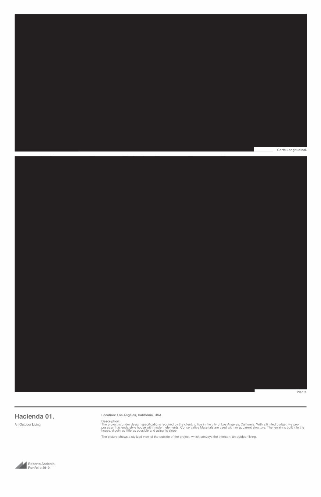
Hacienda 01.An Outdoor Living.
Location: Los Angeles, California, USA.
Description:The project is under design specifications required by the client, to live in the city of Los Angeles, California. With a limited budget, we pro-poses an hacienda style house with modern elements. Conservative Materials are used with an apparent structure. The terrain is built into the house, diggin as little as possible and using its slope.
The picture shows a stylized view of the outside of the project, which conveys the intenton: an outdoor living.
Corte Longitudinal.
Planta.

Roberto Andonie.Portfolio 2010.
Hacienda 01.An Outdoor Living.
Location: Los Angeles, California, USA
Description:The project is under design specifications required by the client, to live in the city of Los Angeles, California. With a limited budget, we pro-poses an hacienda style house with modern elements. Conservative Materials are used with an apparent structure. The terrain is built into the house, diggin as little as possible and using its slope.
The picture shows a stylized view of the outside of the project, which conveys the intenton: an outdoor living.
Corte Transversal.
Fachada Oeste.
Fachada Sur.Fachada Norte.
Fachada Este.


Roberto Andonie.Portfolio 2010.
Contact. Architect:Roberto Andonie Cardo
Phone:+52 (81) 8362 67 62
Email:[email protected]
Website:Andonie.Tumblr.com
Lámina “A” para Concurso.


