Pones_brand_2
21
TABLE OF CONTENTS What is a brand? ................................................... 2 BRAND PRINCPLES Who is PONES INC.? .................................... 3 Mission & Using the brand ............................ 4 Brand Tone .................................................... 5 BRAND ELEMENTS Logo ..................................................................... 6 Tagline ................................................................... 7 Spatial Relationships ............................................ 8 Logo usage Guidelines ......................................... 9 Mistreatment ...................................................... 10 Color Variations ................................................... 11 Color Palette........................................................ 12 Typeface ............................................................. 13 Photogrpahy ....................................................... 14 BRAND APPLICATIONS Business Card ............................................. 15 Letterhead ................................................... 16 Envelope ...................................................... 17 Promotinal Advertising ....................................... 18 Web .................................................................... 19 Stencil ................................................................. 20 BRAND CONTACT 1
-
Upload
kyle-brinker -
Category
Documents
-
view
222 -
download
4
description
2nd version. A few more pages still need to bed added. And gramer still needs to be corrected.
Transcript of Pones_brand_2

TABLE OF CONTENTS
What is a brand? ................................................... 2
BRAND PRINCPLES
Who is PONES INC.? .................................... 3Mission & Using the brand ............................ 4 Brand Tone .................................................... 5
BRAND ELEMENTS
Logo ..................................................................... 6Tagline ................................................................... 7 Spatial Relationships ............................................ 8Logo usage Guidelines ......................................... 9Mistreatment ...................................................... 10Color Variations ................................................... 11Color Palette ........................................................ 12Typeface ............................................................. 13Photogrpahy ....................................................... 14
BRAND APPLICATIONS
Business Card .............................................15Letterhead ...................................................16Envelope ......................................................17Promotinal Advertising ....................................... 18Web .................................................................... 19Stencil ................................................................. 20
BRAND CONTACT
1

2
WHAT IS A BRAND?
“A great brand taps into emotions. Emotions drive most, if not all, of our decisions. A brand reaches out with a powerful connecting experience. It’s an emotional connecting point that transcends the product.” –Scott BedburyMarketing Executive behind Nike’s “Just Do It” campaign

3
WHO IS PONES INC.?
PONES INC.
• moves audiences through participatory performance art, • inspires reactions by focusing on relevant concepts, • and promotes change in the community by inviting artists and audience members to participate in our performances and expand their impact on the community.

4
MISSION STATEMENT
PONES INC. is a non-profit performance art group dedicated to creating original work that blends various disciplines and focuses on community, collaboration, site-specific performance and educational outreach. The company explores theatre for social change through its combination of dance and theatre in its signature style of pedestrian-influenced movement.
USING THE PONES INC. BRAND
The PONES INC. brand identity is one of a kind. There are no other organizations that create change in the community the way PONES INC does. Any time the brand identity is used, it represents PONES INC. and should adhere to the guidelines in this manual.

5
BRAND TONE
The voice of PONES INC. is young, free spirited, and strong. We are a unique arts organization and we are passionate about what we do. This personality is displayed through out the PONES INC. brand identity. This is achieved through the use of grunge textures, splatters, bold typefaces, and strong contrasts within design.

6
PONES INC. LOGO
The PONES INC. logo is a visual representation of the impact that we leave behind on our audience members. The splatters within the logo cannot be re created. Much like our performances, they are one of a kind. With our bold unique style of pedestrian influenced movements, we are PONES INC.

7
TAGLINE
The tagline represents the PONES INC. mission, and is expressed through the words: MOVE, REACT, CHANGE. The tagline should always be displayed in all capital letters when displayed through out all elements of the brand.
MOVE.REACT.CHANGE.

8
SPATIAL RELATIONSHIPS
SIZE RESTRICTIONS
The logo should never be presented smaller than 1.2896 X 1.2965 .
SAFE AREA
In order to maintain a clear representation of where the logo should be placed, the logo itself should always be treated as a full circle.
The minimum safe space around the logo is the width of the “O” in “PONES” regardless of the size at which the logo is presented.
1.2965 in
1.2896 in

9
LOGO USAGE GUIDELINES
The logo is an original mark created for PONES INC. The logo should not recreated or altered in any way.
The guidelines stated throughout this manual must be applied when using the PONES INC. visual brand identity. This includes: color, minimum size, safe space, and approved applications.
The CD included with this manual includes all print materials that pertain to the PONES INC. brand identity.
The logo should be presented on a background that has enough contrast to identify the logo clearly. (examples will be shown and explained)
10
2 3 4
5
6
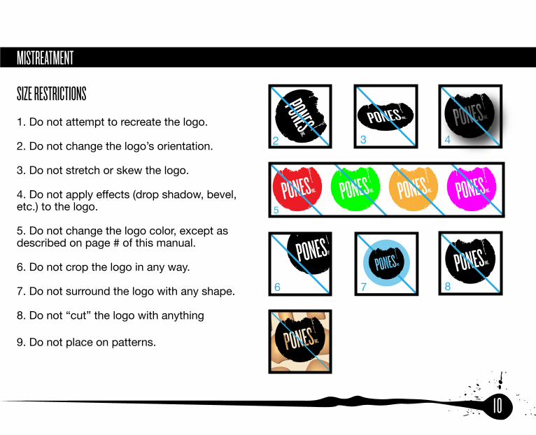
MISTREATMENT
SIZE RESTRICTIONS1. Do not attempt to recreate the logo.
2. Do not change the logo’s orientation.
3. Do not stretch or skew the logo.
4. Do not apply effects (drop shadow, bevel, etc.) to the logo.
5. Do not change the logo color, except as described on page # of this manual.
6. Do not crop the logo in any way.
7. Do not surround the logo with any shape.
8. Do not “cut” the logo with anything
9. Do not place on patterns.
7 8
9

11
COLOR VARIATIONS
-Default LogoIn most circumstances the logo should appear in PONES INC. black(PMS-Black 6C 2X - CMYK 0,0,0,100 – RGB 0,0,0 – Hexadecimal #000000)
-ReversedIn circumstances where the background to the logo is too dark and there is not enough contrast to identify the logo clearly, the logo should be PONES INC. white.
INC
REVERSED
DEFAULT
12
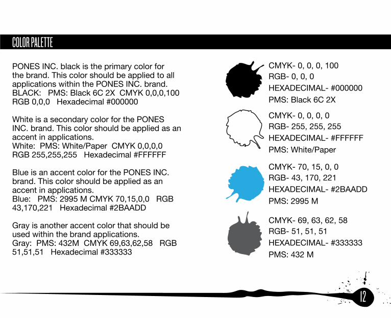
COLOR PALETTE
PONES INC. black is the primary color for the brand. This color should be applied to all applications within the PONES INC. brand.BLACK: PMS: Black 6C 2X CMYK 0,0,0,100 RGB 0,0,0 Hexadecimal #000000
White is a secondary color for the PONES INC. brand. This color should be applied as an accent in applications.White: PMS: White/Paper CMYK 0,0,0,0 RGB 255,255,255 Hexadecimal #FFFFFF
Blue is an accent color for the PONES INC. brand. This color should be applied as an accent in applications.Blue: PMS: 2995 M CMYK 70,15,0,0 RGB 43,170,221 Hexadecimal #2BAADD
Gray is another accent color that should be used within the brand applications.Gray: PMS: 432M CMYK 69,63,62,58 RGB 51,51,51 Hexadecimal #333333
CMYK- 70, 15, 0, 0
HEXADECIMAL- #2BAADD PMS: 2995 M
RGB- 43, 170, 221
CMYK- 69, 63, 62, 58
HEXADECIMAL- #333333PMS: 432 M
RGB- 51, 51, 51
CMYK- 0, 0, 0, 100
HEXADECIMAL- #000000PMS: Black 6C 2X
RGB- 0, 0, 0
CMYK- 0, 0, 0, 0
HEXADECIMAL- #FFFFFFPMS: White/Paper
RGB- 255, 255, 255

13
TYPEFACES
The typefaces of PONES INC. include: Knockout, League Gothic, and Helvetica Neue.
Headers in print should be set in Knockout HTF46 Flyweight,w all caps.
Headers on the web should be set to Helvetica Neue Bold.
Navigation on the web should be set to League Gothic Regular.
Body copy in any application should be set in Helvetica Neue Regular.
If in any instance these typefaces are not available, Helvetica or Arial are a proper substitute used in the same guidelines.
ABCDEFGHIJKLMNOPQRSTUVWXYZArial
abcdefghijklmnopqrstuvwxyz0123456789!@#$%^&**(){}”’;:,./?<>
ABCDEFGHIJKLMNOPQRSTUVWXYZ
Helvetica Neue
abcdefghijklmnopqrstuvwxyz0123456789!@#$%^&**(){}”’;:,./?<>
ABCDEFGHIJKLMNOPQRSTUVWXYZKNOCKOUT
0123456789!@#$%^&**(){}”’;:,./?<>
ABCDEFGHIJKLMNOPQRSTUVWXYZabcdefghijklmnopqrstuvwxyz
Legaue Gothic
0123456789!@#$%^&**(){}”’;:,./?<>

14
PHOTOGRAPHY
When using photography as a design element in brand applications it should represent what we do as an organization in a clear manner. Photos shown to the right are a few examples that fit the PONES INC. brand identity. They show dancers expressing pedestrian influenced movement.

15
BUSINESS CARD
Size – 3.5” x 2”
Front
Logo – uniformly scaled to the size of 1.7” x 1.7”
Name Title Text: Knockout size=36 pt
Other Text: Helvetica Neue size=8 pt
LINDSEY [email protected]
513-828-9952www.ponesinc.com44 east 6th street cincinnati, ohio 45202||
MOVE. REACT. CHANGE.
2”
3.5 “
1.7 ”
1.7 “

16
LETTERHEAD
All formal documents composed by PONES INC. should be presented on this letterhead template. This letterhead template is available on the CD provided and can be used in Microsoft® Word.
Logo –uniformly scaled to the size ofContact Information
Text –Helvetica Neue size= 12
May 19th, 2011
Attn: John Smith467 5th StreetCincinnati, Oh 45202
Dear John Smith,
Lorem ipsum dolor sit amet, consectetur adipiscing elit. Nam facilisis enim eu nibh sollicitudin suscipit. Nullam non erat tortor, et lobortis nibh. Sed iaculis, turpis aliquet aliquam, sapien nibh varius lectus, eget molestie lorem justo vel mauris.
Maecenas sapien quam, vulputate ut iaculis eget, congue vel lacus. Aenean vel volutlibero. Curabitur a felis vel neque pharetra semper eu at est. Lorem ipsum dolor sit
amet, consectetur adipiscing elit. Maecenas vel est id nulla dapibus eleifend. Nam
ultricies consectetur dui, ut ornare nisl eleifend consectetur. Integer ac arcu vitae turpispretium convallis at porttitor dolor. Pellentesque quis erat massa. Vivamus quis dui etlorem rutrum posuere non ac leo. Donec elementum suscipit sem vitae adipiscing.Integer ullamcorper gravida nunc. Aliquam vitae nibh in lectus fermentum tristique sed ac nisl. Donec mattis, libero et viverra molestie, orci dui vehicula massa, vel porttitor dui dolor vitae nunc. Aenean feugiat libero eget nunc accumsan a viverra elit mattis. Vestibulum ac elit eu sem rhoncus venenatis. Sed pretium est sit amet libero hendrerit faucibus. Cras auctor mattis nibh fermentum suscipit. Fusce hendrerit dolor vehicula enim eleifend faucibus. Proin ac sem lectus. Etiam nec dolor at elit pharetra pellentesq
Suspendisse elementum gravida lorem nec volutpat. In convallis turpis non arcu molultrices. Nunc tincidunt ligula a est ultrices rutrum. Donec magna orci, ullamcorper idcongue sed, hendrerit ut massa. Fusce fringilla nisl ut eros mollis a posuere sem conv Mauris ac lectus nulla, a faucibus elit. Curabitur neque nisl, vulputate eget ornare ac,commodo eu odio. Praesent mattis interdum tempor. Aenean iaculis nunc nec
Best Regards
Lindsey JonesPones Inc513-828-9952www.ponesinc.com
44 east 6th street | cincinnati, ohio 45202 | www.ponesinc.com

17
ENVELOPE
Envelope size= #10 (4.125” x 9.5”)
Logo –uniformly scaled to the size of 1.7” x 1.7”
Contact Information Text –Helvetica Neue size= 12 pt
9.5 “
4.125 “
www.ponesinc.com
44 east 6th streetcincinnati, ohio 45202
18
PROMOTIONAL ADVERTISING
Promotional and advertising elements should reflect the PONES INC brand and follow the guidelines stated throughout this manual. This includes remaining consistent with all design splatter elements, color palette, typography, and photography. Refer to the poster and web banner as examples.

19
WEB
Envelope size= #10 (4.125” x 9.5”)
Logo –uniformly scaled to the size of 1.7” x 1.7”Contact Information Text –Helvetica Neue size= 12 pt
20
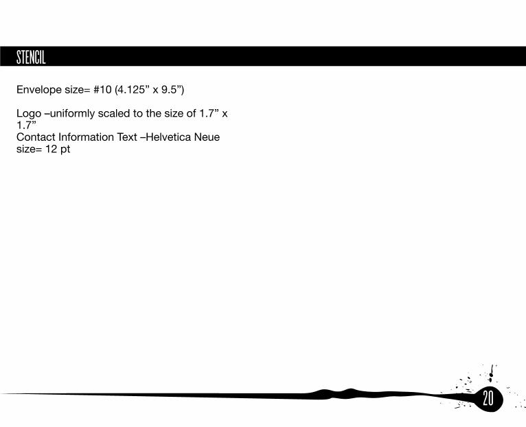
STENCIL
Envelope size= #10 (4.125” x 9.5”)
Logo –uniformly scaled to the size of 1.7” x 1.7”Contact Information Text –Helvetica Neue size= 12 pt

21