PLOTCON NYC: At Least 23 Visualizations and When to Use Them in 30 Minutes
52
25 VISUALIZATIONS EDUARDO ARIÑO DE LA RUBIA CHIEF DATA SCIENTIST [email protected] AN “OUT OF MY LEAGUE” PRODUCTION AND WHEN TO USE THEM
-
Upload
plotly -
Category
Data & Analytics
-
view
243 -
download
2
Transcript of PLOTCON NYC: At Least 23 Visualizations and When to Use Them in 30 Minutes

25 VISUALIZATIONS
E D U A R D O A R I Ñ O D E L A R U B I A C H I E F D A T A S C I E N T I S T
E D U A R D O @ D O M I N O D A T A L A B . C O M
A N “ O U T O F M Y L E A G U E ” P R O D U C T I O N
A N D W H E N T O U S E T H E M
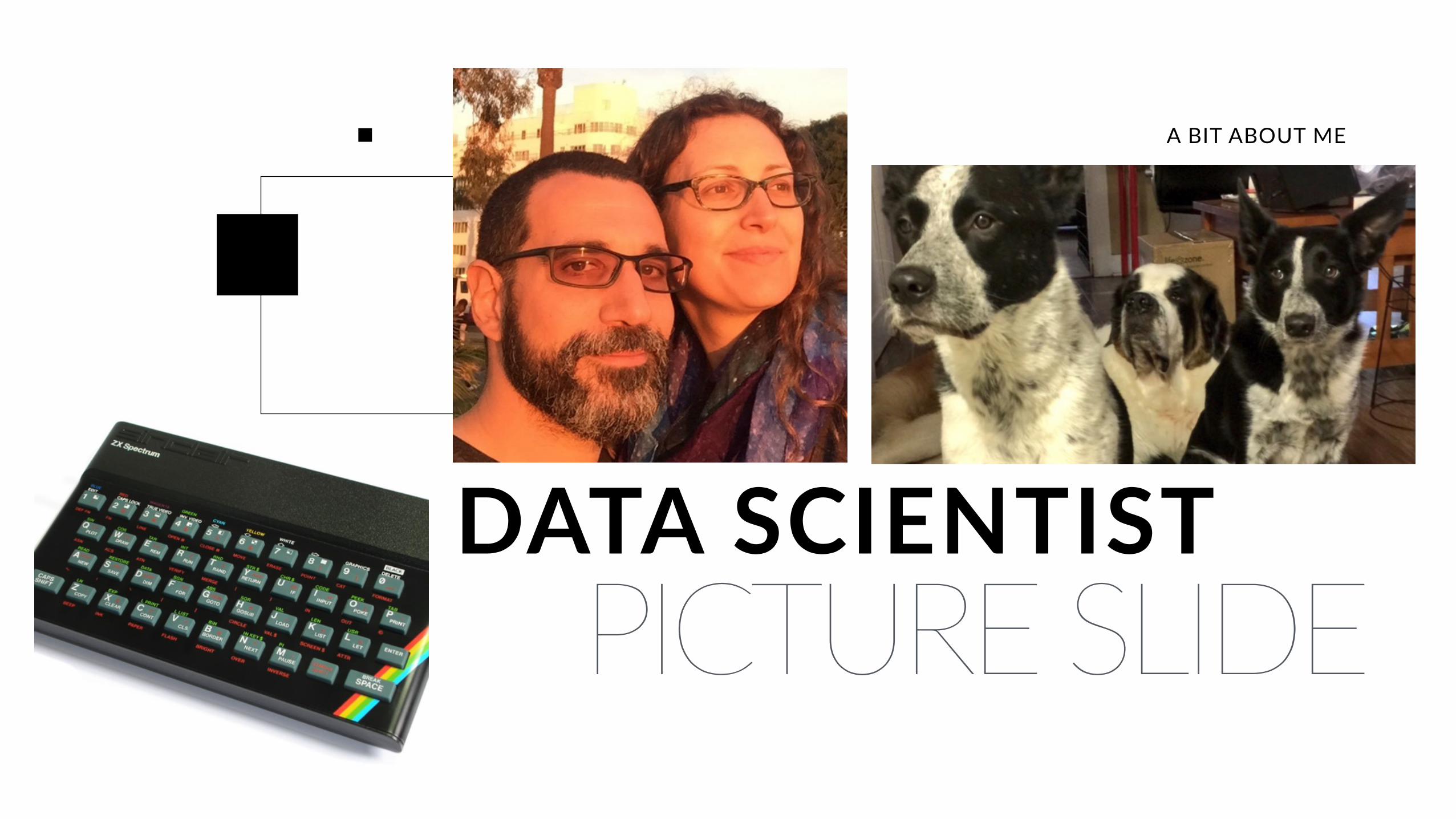
PICTURE SLIDEDATA SCIENTIST
A BIT ABOUT ME
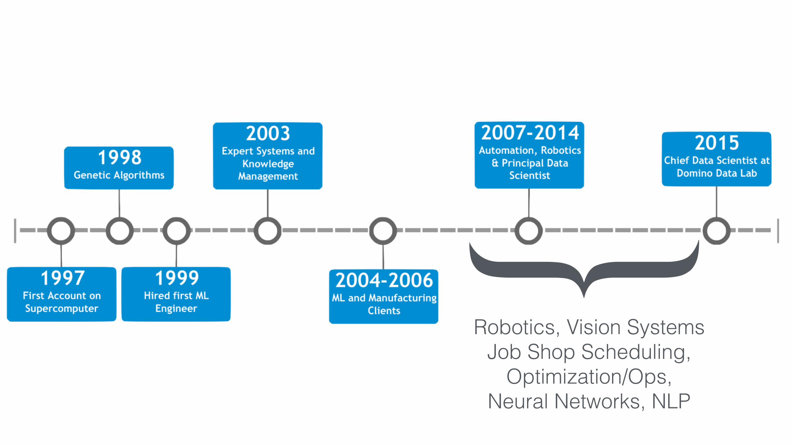
{Robotics, Vision Systems
Job Shop Scheduling, Optimization/Ops,
Neural Networks, NLP


GOD

THE GUY GOD ASKS DATAVIZ ADVICE

???


A DISCLAIMERThere are many kinds of dataI am only talking about tabular data.
That is, arranged in a table or systema7c arrangement by columns,
rows, etc…
There is non-tabular data out there, like networks and trees and
whatnot. I ain’t messin’ with that. (Except maps)
C O W A R D L Y S T A T E M E N T

STANDING ON THE SHOULDERS OF GIANTS IS NICE…
This presentation is based on the work of Dr. Andrew Abela’s “Extreme Presentation” method, as well as the Financial Times fantastic Chart Doctor feature. There is a lot of amazing work out there
to help you pick the right way to present your data. None of what I’m saying is my own personal research. It’s reading other smart peoples stuff and then telling you.
CITATION

Product: Open/Flexible + Full-Lifecycle Support
3. Opera&onalize / Deploy
2. Experiment & HardenFaster Experimenta&on
More Collabora&on
Reproducibility &Audi&ng
Integrate models into the business
More Time for Research
AutomaVc Version Control
Environment Management
Sharing and Discussion
Publishing & DeploymentTools
Data
Code
Compute automaVon
https://app.dominodatalab.com/u/earino/plotcon2016

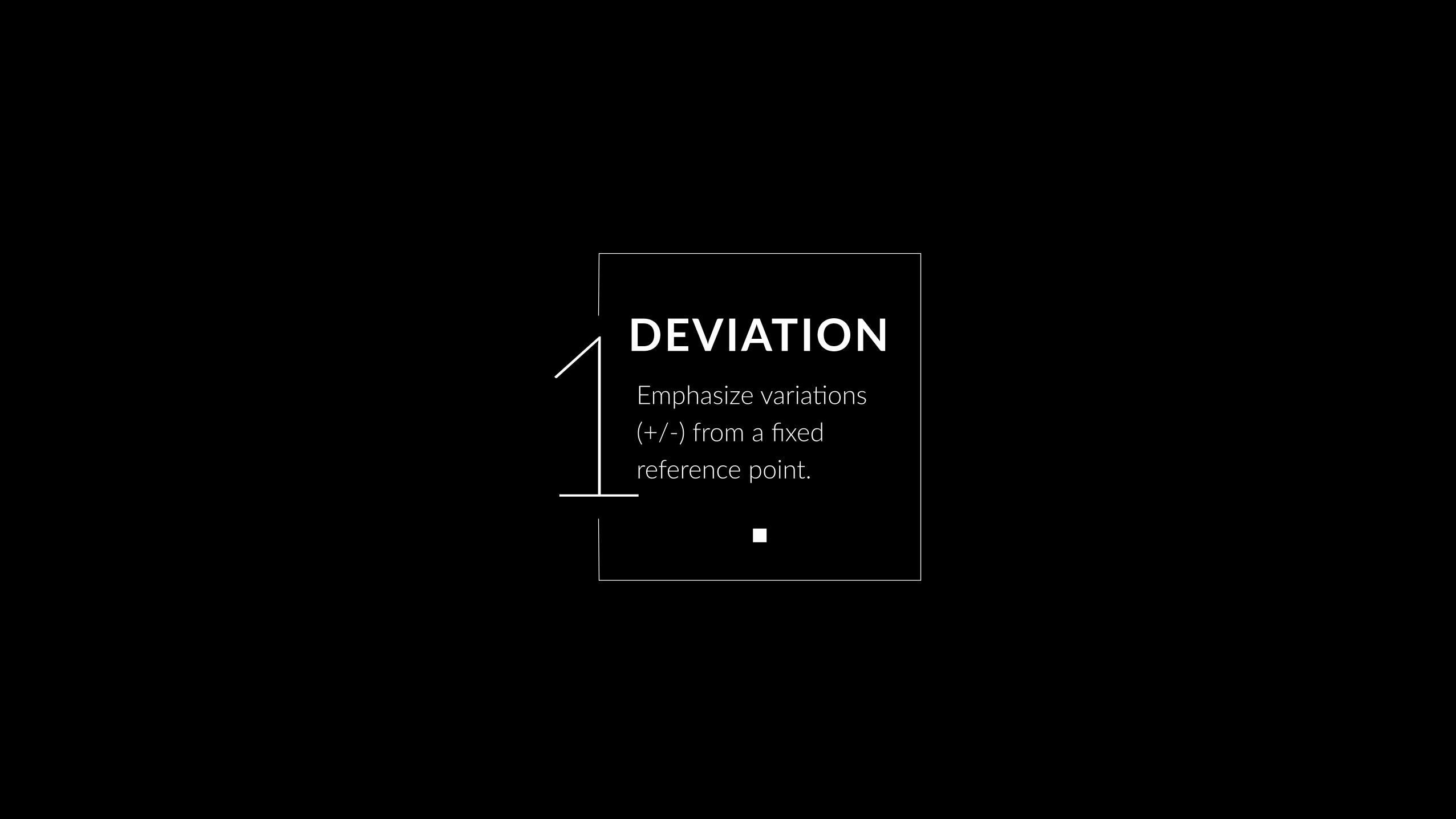
DEVIATION
Emphasize varia7ons (+/-) from a fixed reference point. Typically
the reference point is zero but it can also be a target or a long-
term average. Can also be used to show sen7ment (posi7ve/
neutral/nega7ve).
OUR CATEGORIES
CORRELATION
Show the rela7onship between two or more variables. Be mindful
that, unless you tell them otherwise, many readers will assume the rela7onships you
show them to be causal (i.e. one causes the other).
RANKING
Use where an item’s posi7on in an ordered list is more important than its absolute or rela7ve value.
Don’t be afraid to highlight the points of interest.
DISTRIBUTION
Show values in a dataset and how oSen they occur. The shape (or ‘skew’) of a distribu7on can be a memorable way of highligh7ng
the lack of uniformity or equality in the data.

CHANGE
Give emphasis to changing trends. These can be short (intra-
day) movements or extended series traversing decades or
centuries: Choosing the correct 7me period is important to
provide suitable context for the reader.
OUR CATEGORIES
COMPOSITION
Show how a single en7ty can be broken down into its component elements. If the reader’s interest
is solely in the size of the components, consider a
magnitude-type chart instead.
SPATIAL
Used only when precise loca7ons or geographical paXerns in data
are more important to the reader than anything else.
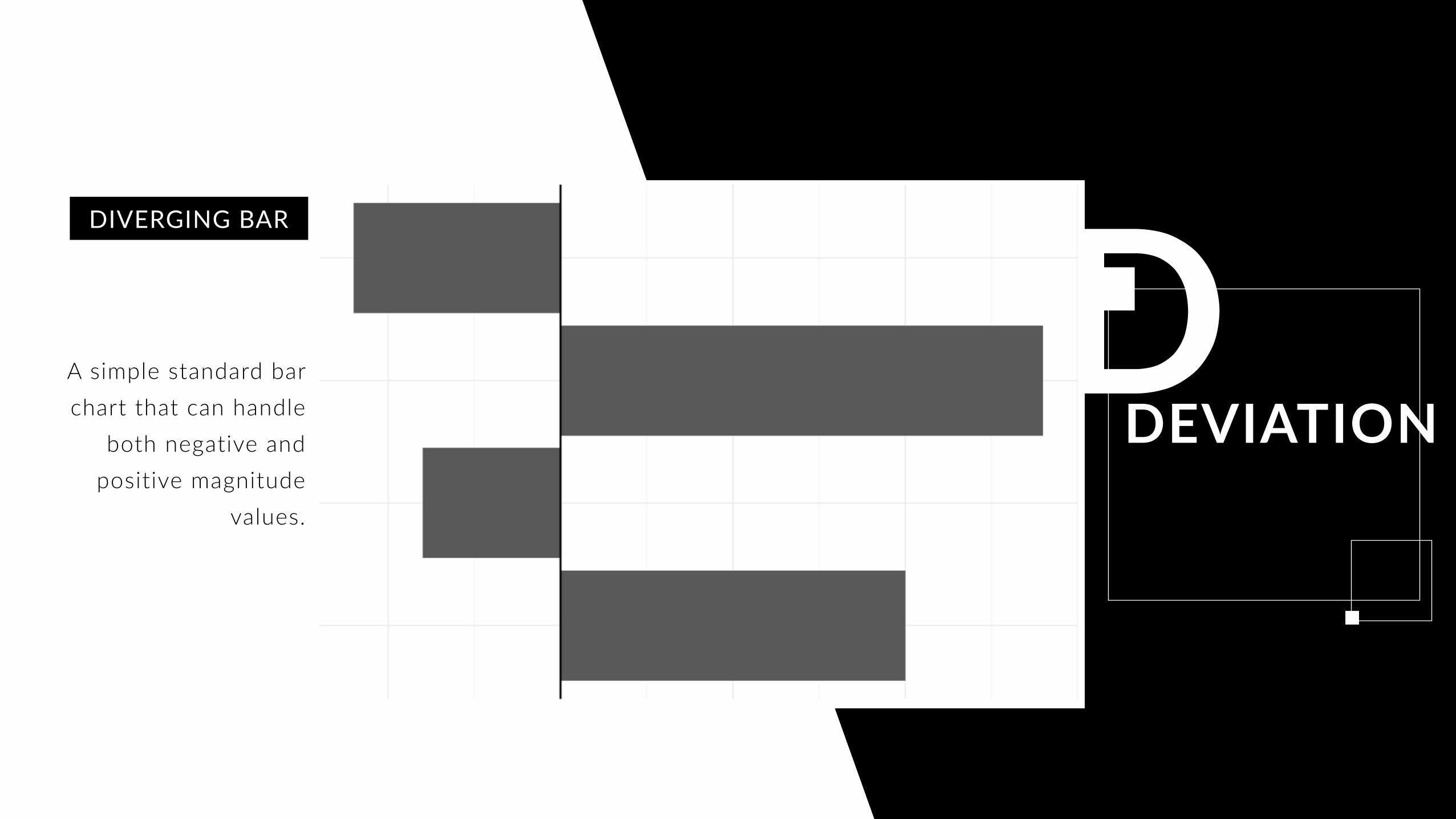
1DEVIATIONEmphasize varia7ons (+/-) from a fixed reference point.
Da
DEVIATIONA simple standard bar chart that can handle
both negative and positive magnitude
values.
DIVERGING BAR
Da
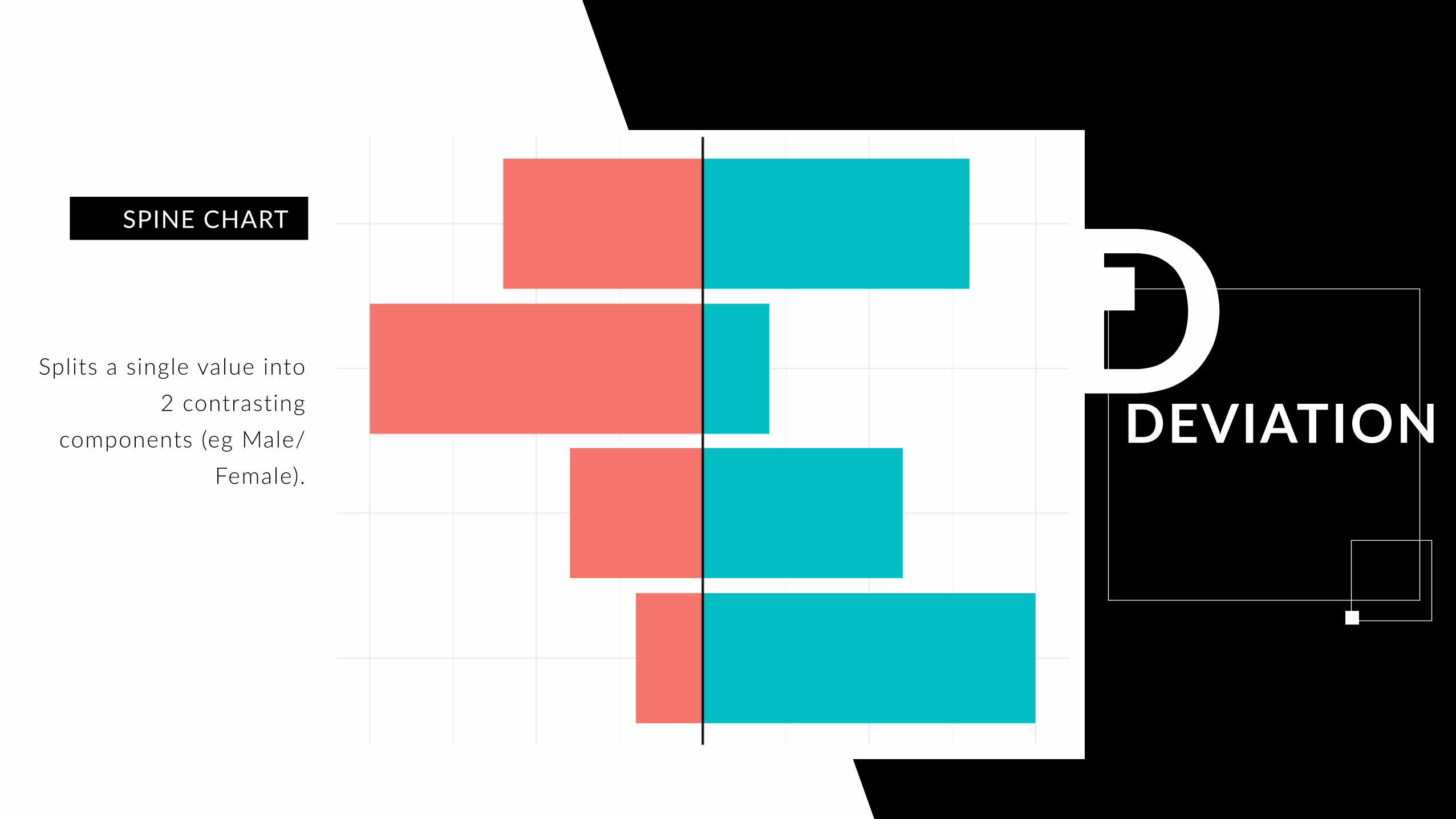
DEVIATIONSplits a single value into
2 contrasting components (eg Male/
Female).
SPINE CHART

DDEVIATION
The shaded area of these charts allows a balance to be shown – either against
a baseline or between two series.
AREA CHART

2CORRELATION
Show the rela7onship between two or more variables.

SCATTERPLOT
The standard way to show the rela7onship between two
con7nuous variables, each of which has its own axis.
C O R R E L A T I O N

BUBBLE
Like a scaXerplot, but adds addi7onal detail by sizing the
circles according to a third variable and color to a fourth
C O R R E L A T I O N

ANIMATED BUBBLE
Like a scaXerplot, but adds addi7onal detail by sizing the
circles according to a third variable and color to a fourth
and anima7on for a fiSh!
C O R R E L A T I O N

HEAT MAPA good way of showing the
paXerns between 2 categories of data, less good at showing fine differences in amounts.
Ordering the entries can be quite powerful!
C O R R E L A T I O N

3Use where an item’s posi7on in an ordered list is more important than its absolute or rela7ve value.
RANKING

Ra
RANKINGStandard bar charts display the ranks of
values much more easily when sorted into order.
ORDERED BAR
Ra
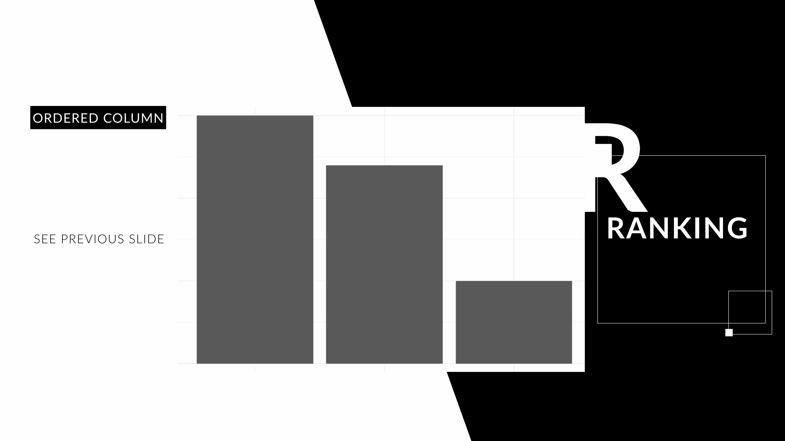
RANKINGSEE PREVIOUS SLIDE
ORDERED COLUMN

Ra
RANKING
Perfect for showing how ranks have changed over
time or vary between categories.
There are many ggplot2 implementations :)
SLOPE GRAPH
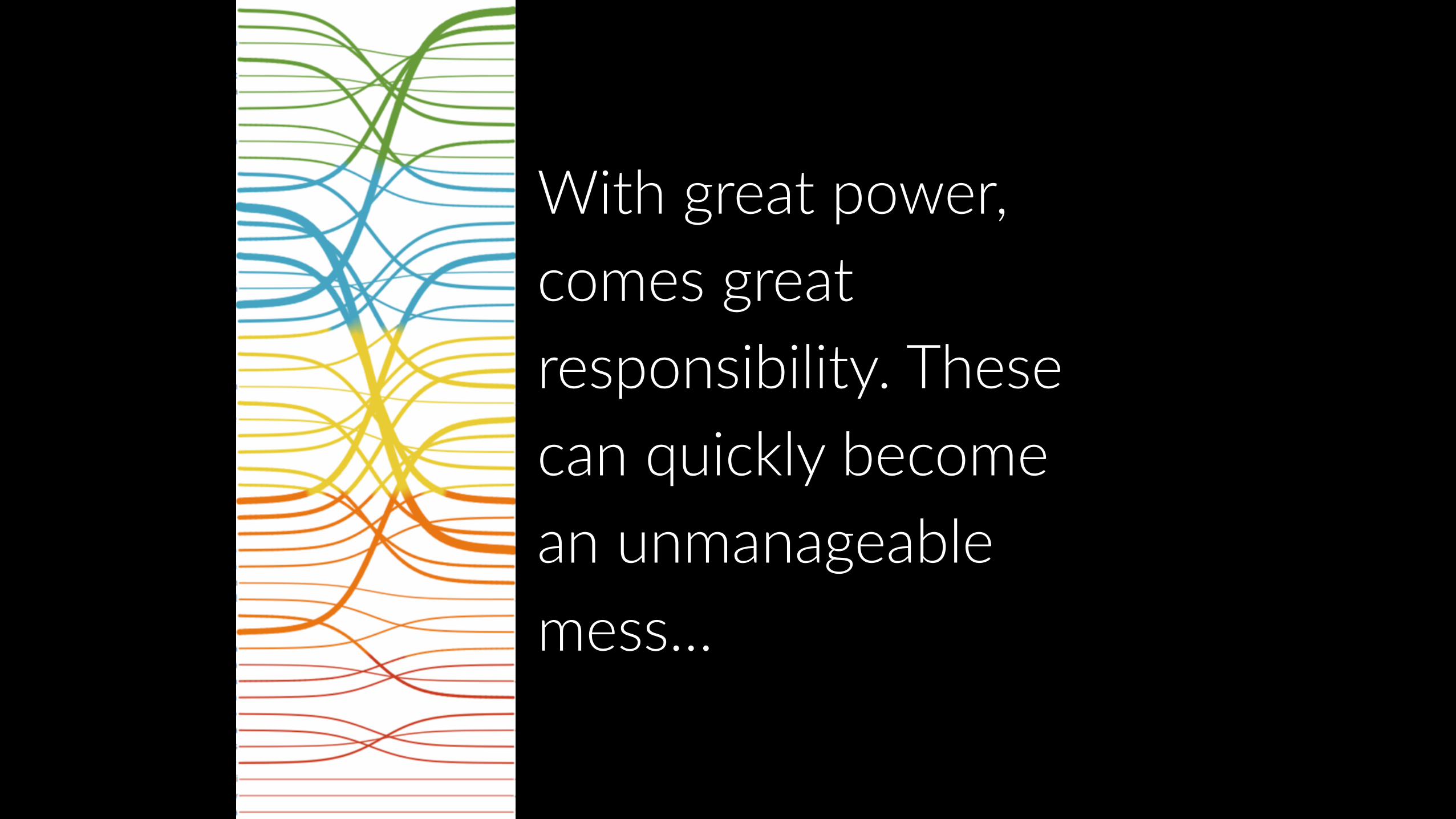
With great power, comes great responsibility. These can quickly become an unmanageable mess…

Ra
RANKINGLollipops draw more
attention to the data value than standard bar/
column and can also show rank and value
effectively.
LOLLIPOP CHART

4Show values in a dataset and how oSen they occur.
DISTRIBUTION

HISTOGRAM
The standard way to show a sta7s7cal distribu7on - keep the gaps between columns
small to highlight the ‘shape’ of the data.
D I S T R I B U T I O N

BOX PLOT
Summarize mul7ple distribu7ons by showing the median (centre) and range of
the data
D I S T R I B U T I O N
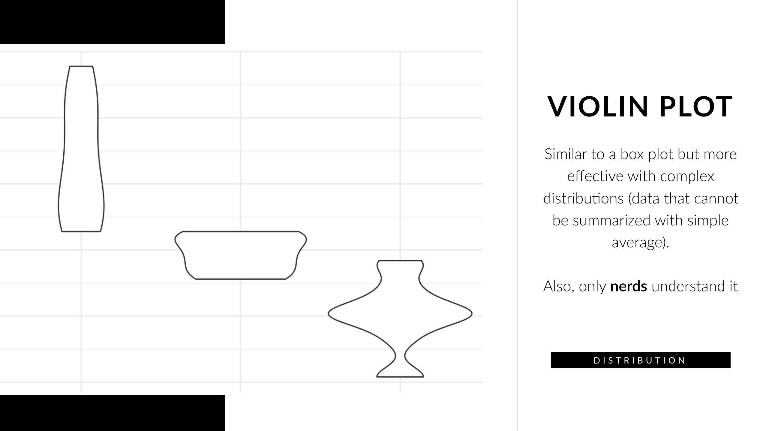
VIOLIN PLOTSimilar to a box plot but more
effec7ve with complex distribu7ons (data that cannot
be summarized with simple average).
Also, only nerds understand it
D I S T R I B U T I O N

POPULATION PYRAMID
A standard way for showing the age and sex breakdown of
a popula7on distribu7on; effec7vely, back to back
histograms.
D I S T R I B U T I O N

5 Give emphasis to changing trends. These can be short (intra-day) movements or extended series
CHANGE
Ca
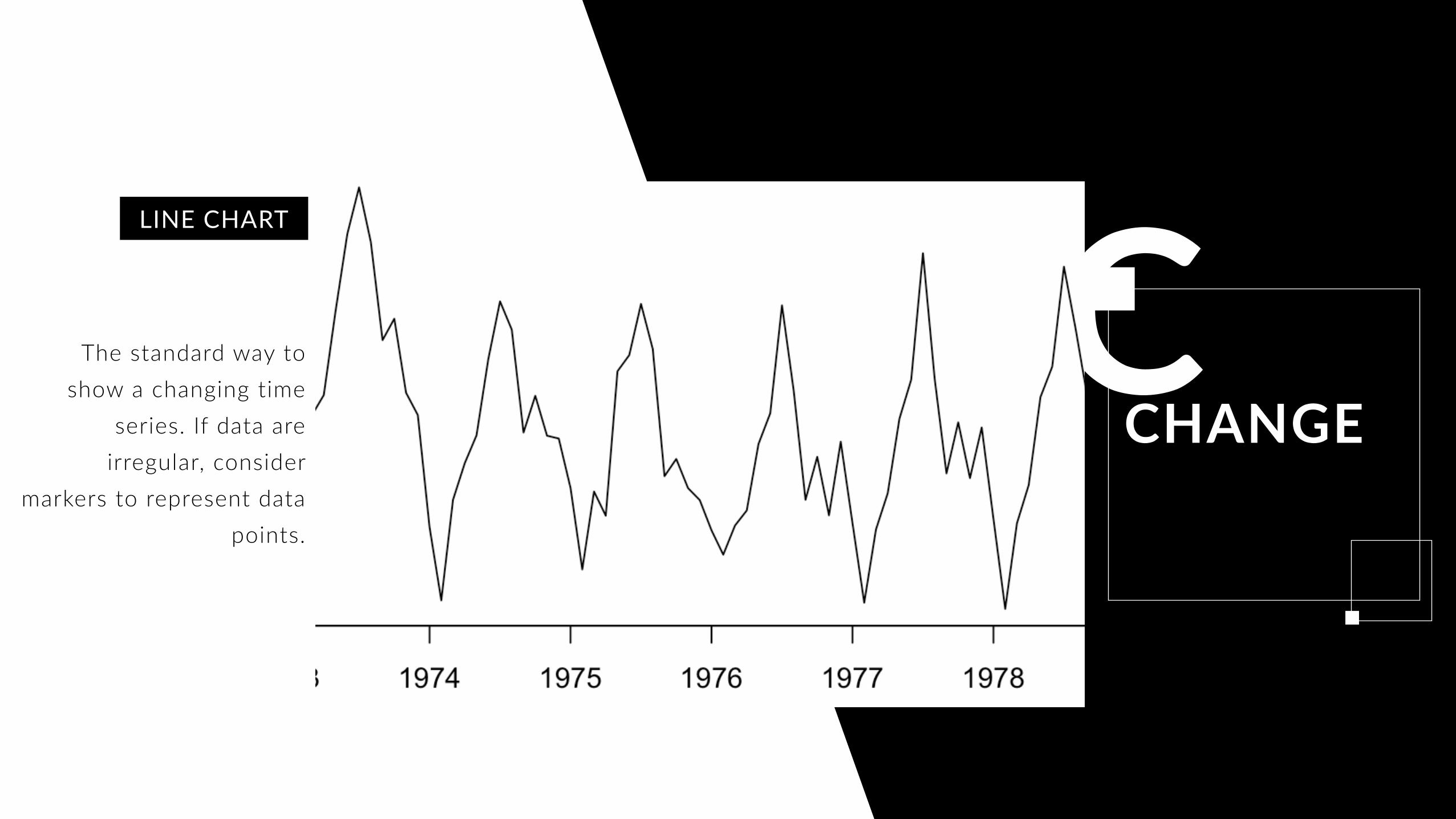
CHANGEThe standard way to
show a changing time series. If data are
irregular, consider markers to represent data
points.
LINE CHART

Ca
CHANGEUse to show the
uncertainty in future projections - usually this
grows the further forward to projection.
FAN CHART

Ca
CHANGEUse with care – these are good at showing changes
to total, but seeing change in components
can be very difficult.
AREA CHART
Ca
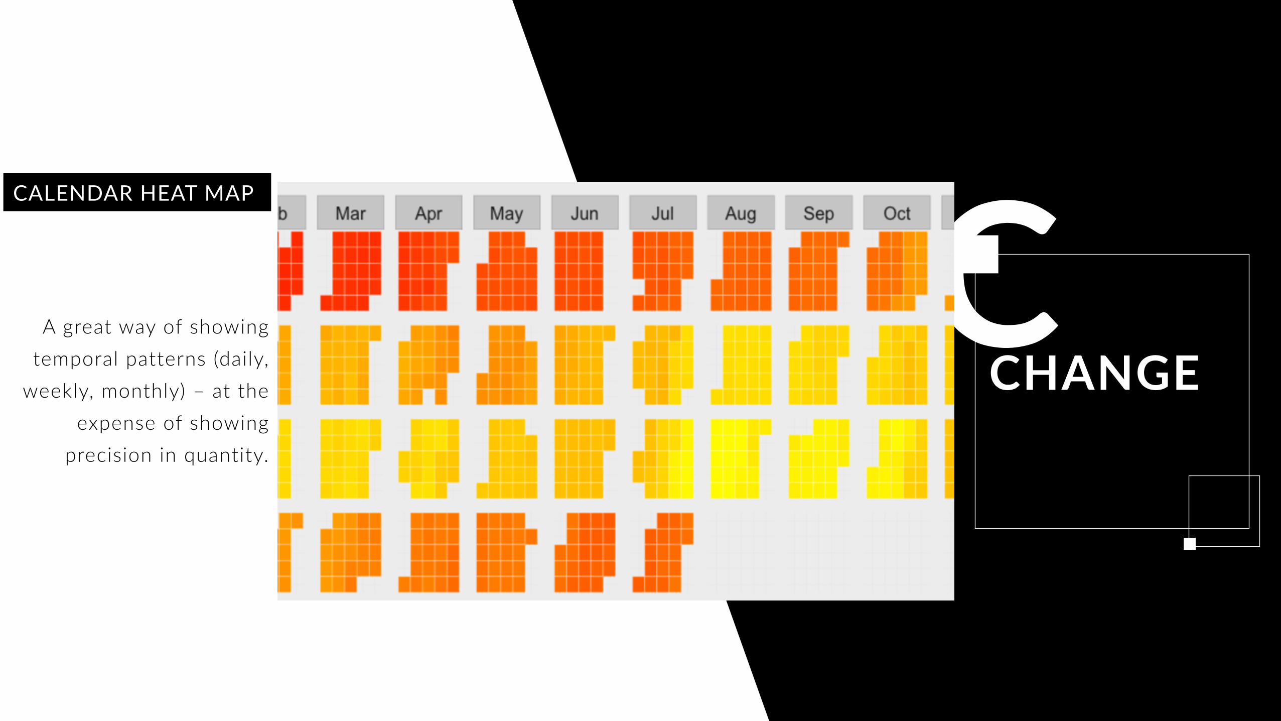
CHANGEA great way of showing
temporal patterns (daily, weekly, monthly) – at the
expense of showing precision in quantity.
CALENDAR HEAT MAP
6 Show how a single en7ty can be broken down into its component elements.
COMPOSITION

STACKED COLUMN
A simple way of showing part-to-whole rela7onships but can be difficult to read with more
than a few components.
C O M P O S I T I O N
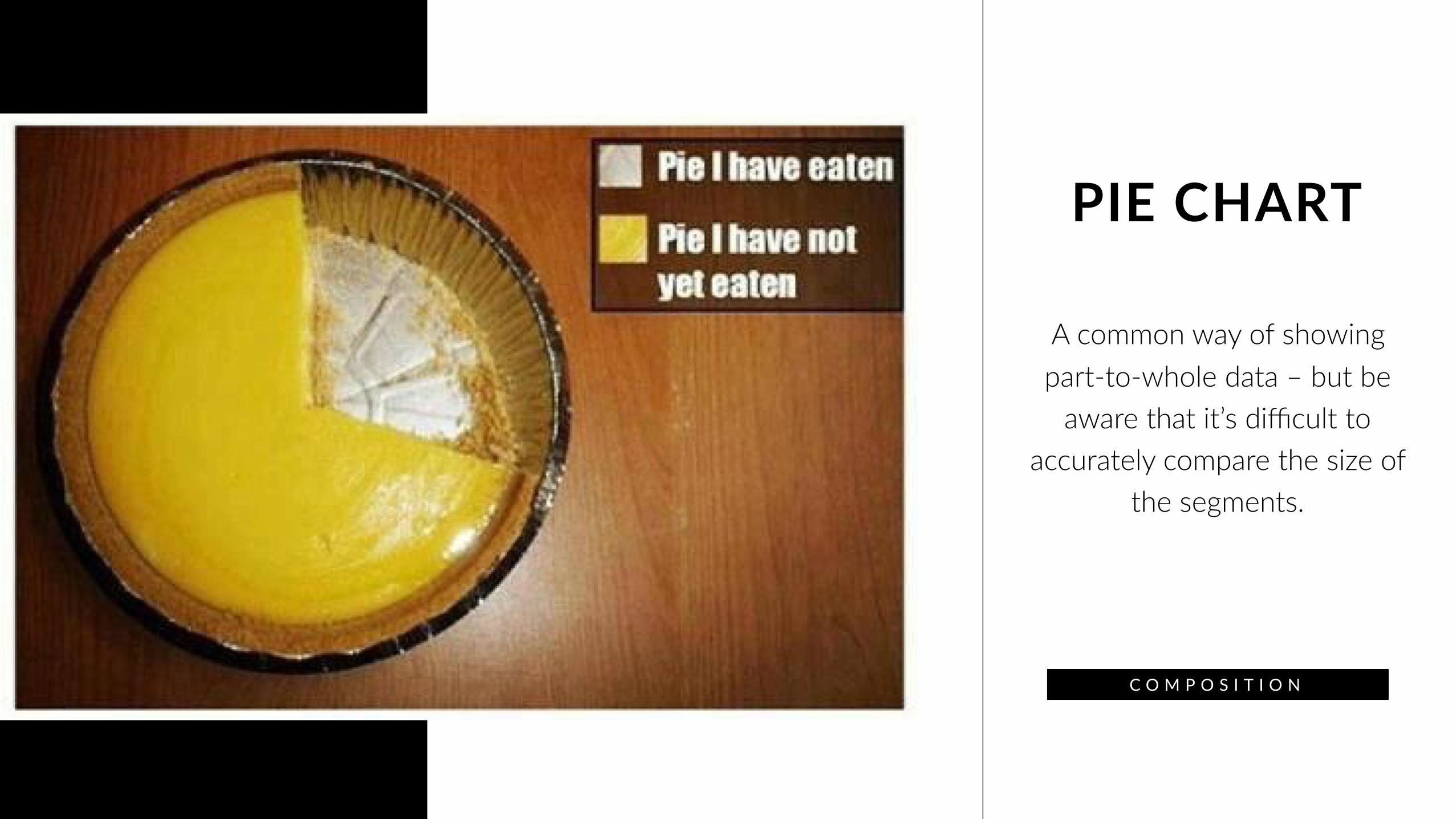
PIE CHART
A common way of showing part-to-whole data – but be
aware that it’s difficult to accurately compare the size of
the segments.
C O M P O S I T I O N

WAFFLE
Good for showing % informa7on, they work best
when used on whole numbers and work well in mul7ple
layout form.
C O M P O S I T I O N

7 Used only when precise loca7ons or geographical paXerns in data are more important to the reader than anything else.
SPATIAL
Sa
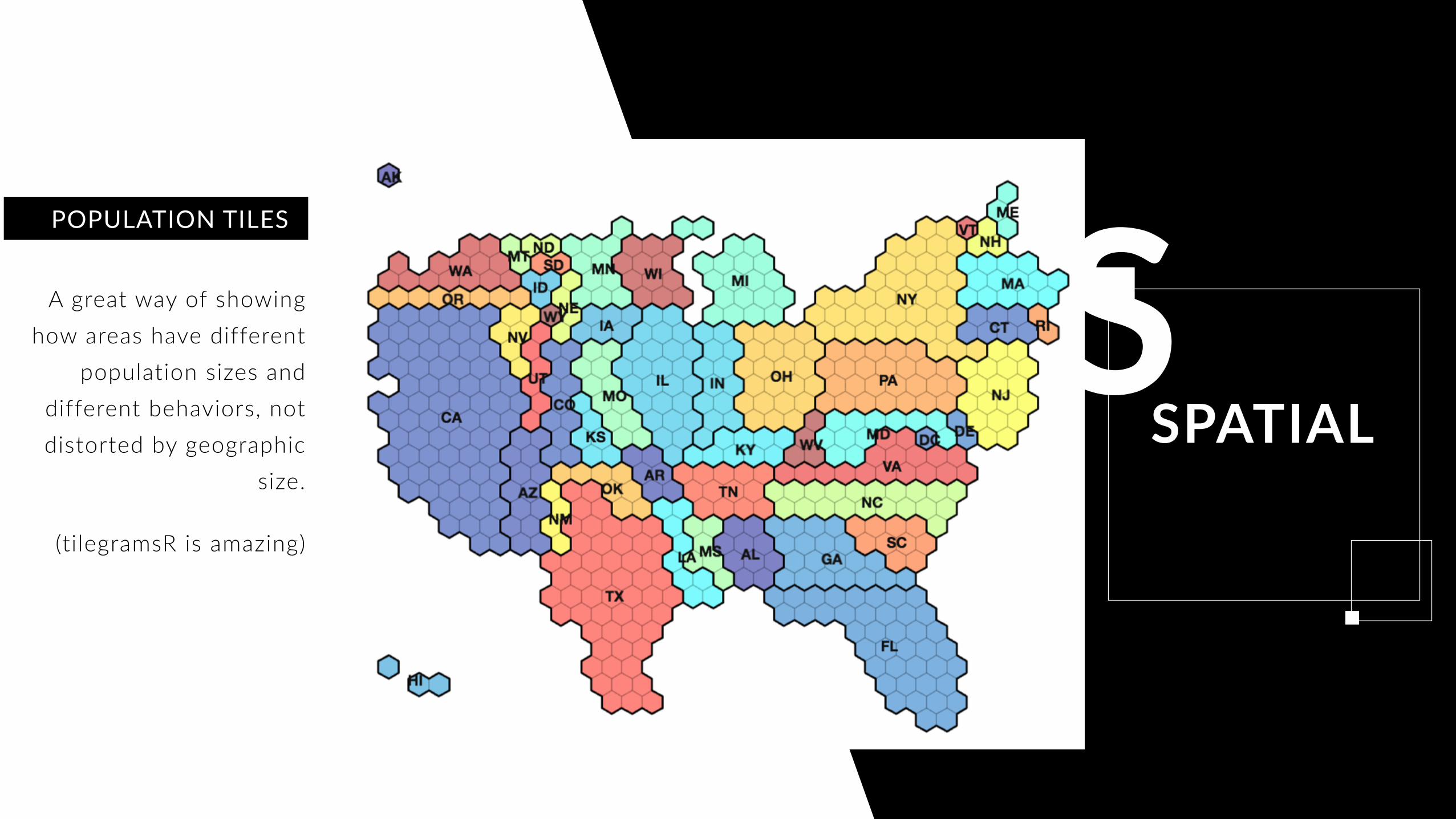
SPATIAL
A great way of showing how areas have different
population sizes and different behaviors, not distorted by geographic
size.
(tilegramsR is amazing)
POPULATION TILES
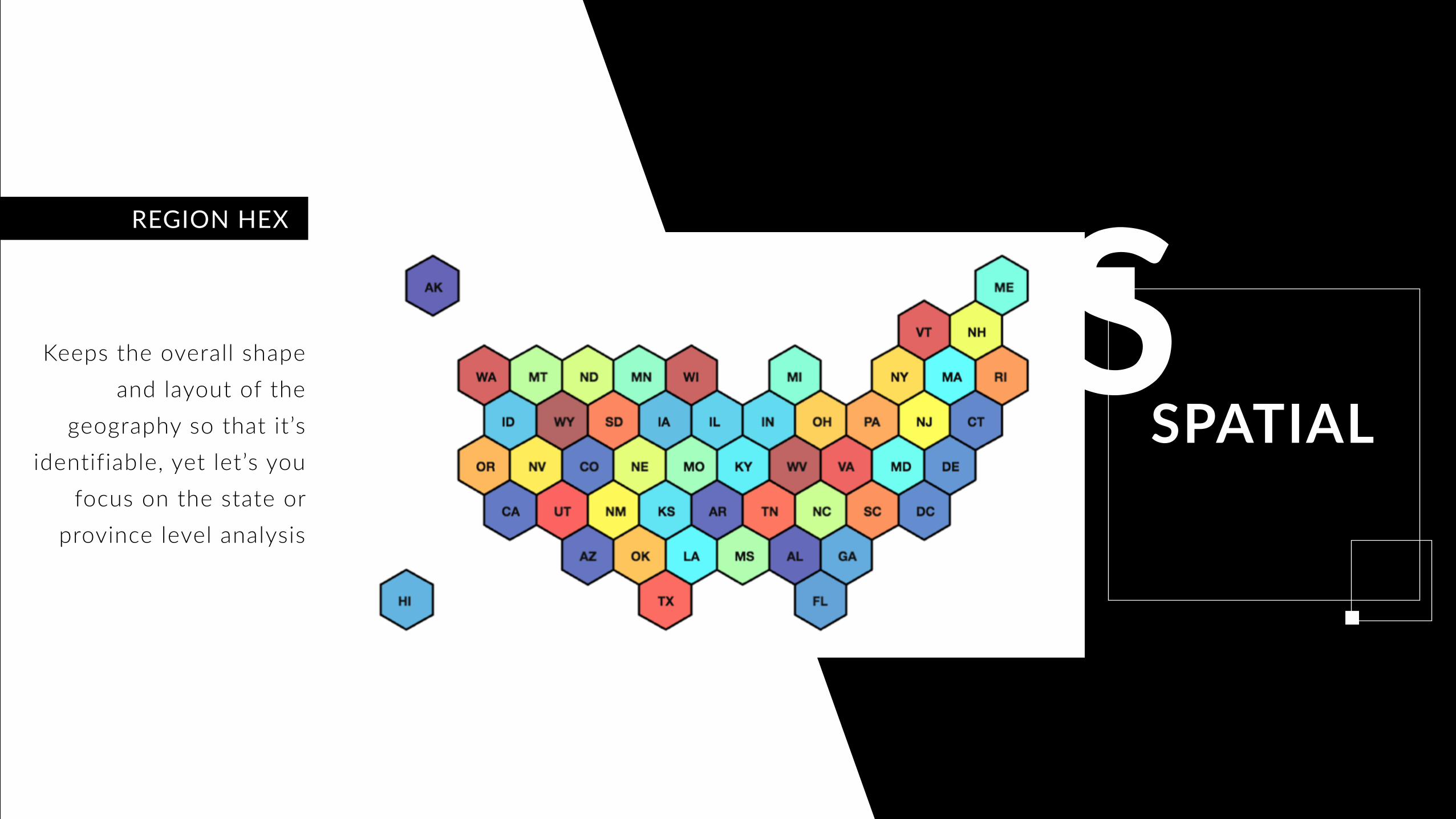
Sa
SPATIALKeeps the overall shape
and layout of the geography so that it’s
identifiable, yet let’s you focus on the state or
province level analysis
REGION HEX
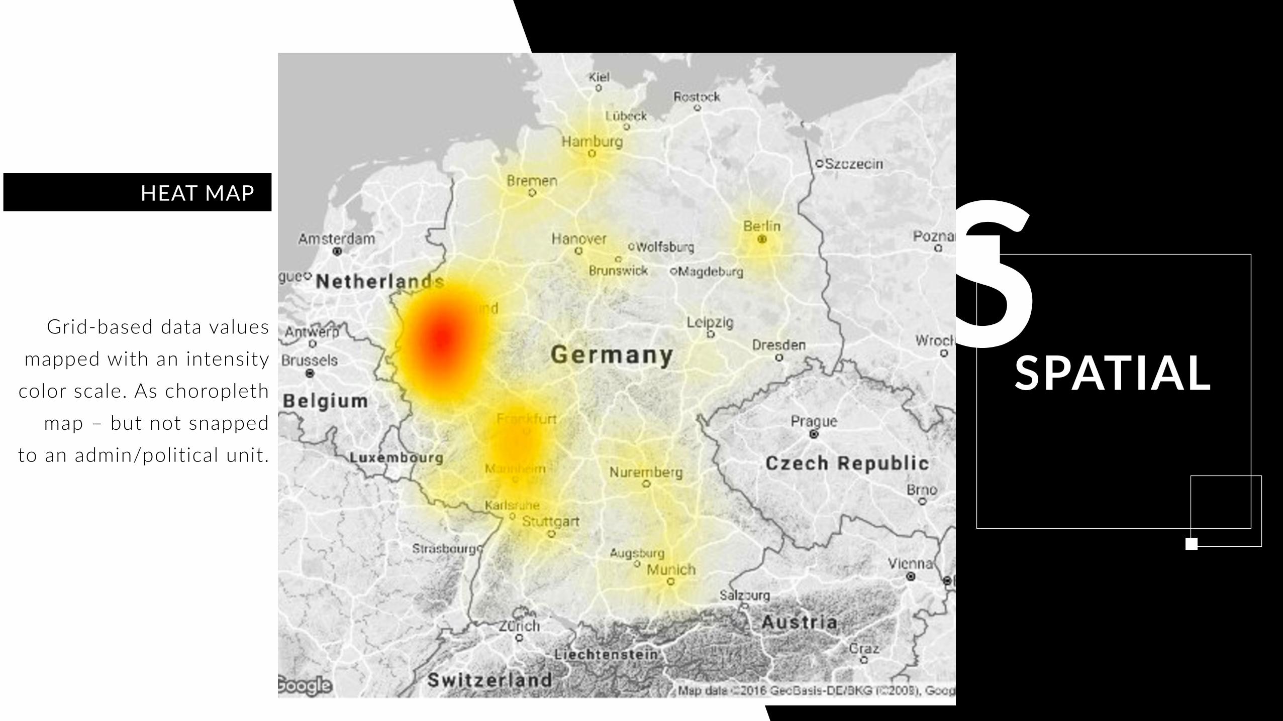
Sa
SPATIALGrid-based data values
mapped with an intensity color scale. As choropleth
map – but not snapped to an admin/political unit.
HEAT MAP
AND FINALLY…
Gosh there are a lot of choices. You mean you can’t just pick whichever one is prettiest? Well, you can, it just may not communicate anything to anyone, that’s up to you. Understanding what you’re
trying to communicate, and what the key components of that communication are, makes the difference between effective and ineffective data visualization.
CONCLUSION
THANK YOUE D U A R D O A R I Ñ O D E L A R U B I A
C H I E F D A T A S C I E N T I S T D O M I N O D A T A L A B
P L O T L Y A N D P L O T C O N A N D A N N A !
H T T P S : // A P P . D O M I N O D A T A L A B . C O M / U / E A R I N O / P L O T C O N 2 0 1 6