PHILATELI-GRAPHICS · PHILATELI-GRAPHICS ... roughs of a story outline in the background (Sc1434,...
5
With Pen in Hand—Calligraphy on Postage Stamps by Margaret Challenger PHILATELI-GRAPHICS QUARTERLY PUBLICATION OF THE GRAPHICS PHILATELY ASSOCIATION ISSN 9739-6198 Volume 29, Number 3 ● Whole Number 116 ● July 2007 Affiliate 133 Study Unit We know not where or when, dawned upon some mind, the fact that all words which people uttered are expressed by a few sounds. From the confused mass of idiograms and their kin, were selected signs to denote these sounds. That was the birth of the alphabet. –Edward Clodel Writing systems, which are used univer- sally on postage stamps, come in many differ- ent forms, such as Cyrillic, Persian, Arabic, Asian, as well as the Roman alphabet. Ancient systems, such as cuneiform and hieroglyph- ics, are also used. Within the Roman alphabet there are different styles and forms of letters in the languages of origin that appear on stamps, often commemorating a country’s his- tory. The term calligraphy means “beautiful let- tering,” from the Greek, kallos (beauty) and graphos (writing). Today’s letter forms stem from the great Roman capitals of two thou- sand years ago. With the perfecting of human- istic script for manuscript books in the 15 th century, classic forms were firmly established as ideal archetypes for type design, and the various expressions of the alphabet were di- vided into three classes—formal, semi-formal, and epistolary, which, when subsequently rendered into type faces, became capitals, lower case letters, and italics. My collection of calligraphic postage stamps is based on this comprehensive theme, includ- ing the expressive handwriting called for by the subject matter, as well as the depiction of tools used by the calligraphic designer. From the reproduction of historic manuscripts to fast-written modern pen lettering, calligraphic postage stamps have much to tell us. Consider, for example, national constitu- tions as depicted on postage stamps. Differ- ent countries have shown their constitu- tions in a variety of ways, from historic and formal, to modern and loose. Canada's 1982 stamp (Sc916), de- signed by calligrapher and type designer Frie- drick Peter of Vancou- ver, is a good example of the latter (Fig. 1). The 1987 issue by the United States (Sc2360), featuring a hand and quill with a reproduc- tion of the handwritten 1786 Constitution as background, shows the historic approach (Fig. 2). Italy (Sc741) com- memorated the 10 th an- niversary of its consti- Figure 1: Canada Sc916 Figure 2: United States Sc2360 Figure 3: Italy Sc741
Transcript of PHILATELI-GRAPHICS · PHILATELI-GRAPHICS ... roughs of a story outline in the background (Sc1434,...
With Pen in Hand—Calligraphy on Postage Stamps by Margaret Challenger
PHILATELI-GRAPHICS QUARTERLY PUBLICATION OF THE
GRAPHICS PHILATELY ASSOCIATION ISSN 9739-6198 Volume 29, Number 3 ● Whole Number 116 ● July 2007 Affiliate 133 Study Unit
We know not where or when, dawned upon some mind, the fact that all words which people uttered are expressed by a few sounds. From the confused mass of idiograms and their kin, were selected signs to denote these sounds. That was the birth of the alphabet.
–Edward Clodel
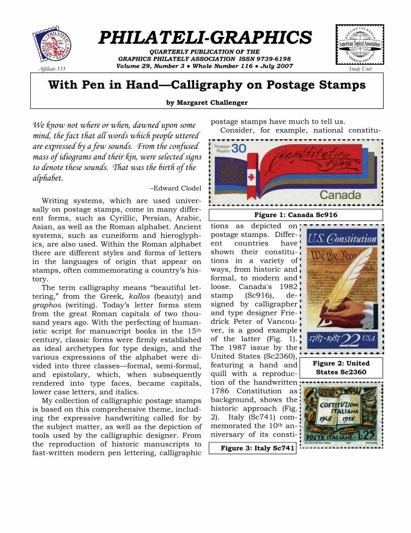
Writing systems, which are used univer-sally on postage stamps, come in many differ-ent forms, such as Cyrillic, Persian, Arabic, Asian, as well as the Roman alphabet. Ancient systems, such as cuneiform and hieroglyph-ics, are also used. Within the Roman alphabet there are different styles and forms of letters in the languages of origin that appear on stamps, often commemorating a country’s his-tory. The term calligraphy means “beautiful let-tering,” from the Greek, kallos (beauty) and graphos (writing). Today’s letter forms stem from the great Roman capitals of two thou-sand years ago. With the perfecting of human-istic script for manuscript books in the 15th century, classic forms were firmly established as ideal archetypes for type design, and the various expressions of the alphabet were di-vided into three classes—formal, semi-formal, and epistolary, which, when subsequently rendered into type faces, became capitals, lower case letters, and italics. My collection of calligraphic postage stamps is based on this comprehensive theme, includ-ing the expressive handwriting called for by the subject matter, as well as the depiction of tools used by the calligraphic designer. From the reproduction of historic manuscripts to fast-written modern pen lettering, calligraphic
postage stamps have much to tell us. Consider, for example, national constitu-
tions as depicted on postage stamps. Differ-ent countries have shown their constitu-tions in a variety of ways, from historic and formal, to modern and loose. Canada's 1982 stamp (Sc916), de-signed by calligrapher and type designer Frie-drick Peter of Vancou-ver, is a good example of the latter (Fig. 1). The 1987 issue by the United States (Sc2360), featuring a hand and quill with a reproduc-tion of the handwritten 1786 Constitution as background, shows the historic approach (Fig. 2). Italy (Sc741) com-memorated the 10th an-niversary of its consti-
Figure 1: Canada Sc916
Figure 2: United States Sc2360
Figure 3: Italy Sc741
PHILATELI-GRAPHICS Vol. 29, No. 3 (July 2007) Page 31
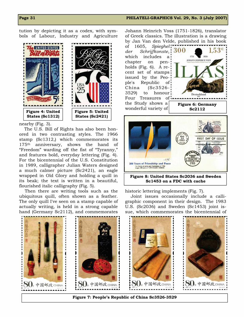
tution by depicting it as a codex, with sym-bols of Labour, Industry and Agriculture
nearby (Fig. 3). The U.S. Bill of Rights has also been hon-
ored in two contrasting styles. The 1966 stamp (Sc1312,) which commemorates its 175th anniversary, shows the hand of “Freedom” warding off the fist of “Tyranny,” and features bold, everyday lettering (Fig. 4). For the bicentennial of the U.S. Constitution in 1989, calligrapher Julian Waters designed a much calmer picture (Sc2421), an eagle wrapped in Old Glory and holding a quill in its beak; the text is written in a beautiful, flourished italic calligraphy (Fig. 5). Then there are writing tools such as the ubiquitous quill, often shown as a feather. The only quill I've seen on a stamp capable of actually writing, is held in a strong capable hand (Germany Sc2112), and commemorates
Johann Heinrich Voss (1751-1826), translator of Greek classics. The illustration is a drawing by Jan Van den Velde, published in his book of 1605, Spieghel der Schrijfkonste, which includes a chapter on pen-holds (Fig. 6). A re-cent set of stamps issued by the Peo-ple's Republic of China (Sc3526-3529) to honour Four Treasures of the Study shows a wonderful variety of
historic lettering implements (Fig. 7). Joint issues occasionally include a calli-graphic component in their design. The 1983 U.S. (Sc2036) and Sweden (Sc1453) joint is-sue, which commemorates the bicentennial of
Figure 4: United States (Sc1312)
Figure 5: United States (Sc2421)
Figure 6: Germany Sc2112
Figure 7: People’s Republic of China Sc3526-3529
Figure 8: United States Sc2036 and Sweden Sc1453 on a FDC with cache

Page 32 PHILATELI-GRAPHICS Vol. 29, No. 3 (July 2007)
the Treaty of Amity and Commerce between the two countries, shows a smartly dressed Benjamin Franklin holding a feather as if preparing to sign it (Fig. 8). Franklin’s pen-manship is actually featured on the FDC ca-chet of a 2006 joint issue by Canada (Sc2155) and the United States (Sc4073, not shown) that recalls the 400th anniversary of the exploration of the eastern coast of North
America by Samuel de Champlain (Fig. 9). The People's Republic of China and Hun-gary produced a joint issue of two stamps in 2003 that featured both the Ritual of Zhou (Hungary, Sc3864; PRC, Sc3309), and the Hungarian Illuminated Chronicle of 1358 (Hungary, Sc3863; PRC Sc3310). The set from the PRC naturally has Chinese script, the complementary set from Hungary, an un-cial-type script. (Fig. 10). The subjects illustrated on stamps that feature lettering are numerous, and include
literacy and writers, stories and celebrations, wars, religion and festivals, even love. Various children’s stories provide comic relief, such as
the 1993 issue from Great Britain that features A Christmas Carol by Charles Dickens (Sc1528-1532). A skinny, mean-looking Scrooge, and footprints in the snow that trav-
erse across all five stamps, lead ulti-
mately to the happy butcher, fat turkey, and Scrooge’s nephew. No ghosts in this set! I think the wobbly writing is meant to be that of Scrooge, but, remember, he was a clerk in the
office of Fezziwig and must have had perfect penmanship in those days be-fore clerks used typewriters (Fig 11). Edward Lear's crazy poetry and nonsensical draw-ings appear on a 1988 issue from Grea t B r i t a i n
(Sc1226-1229a). All stamps in the set feature Lear's own drawings and handwriting, includ-ing “C” is for cat (Fig. 12), which reads: C was a lovely pussy cat, his eyes were large and pale; And on his back he had some stripes and several on his tail. The bicentennial of the birth of Hans Christian An-dersen (1805-1895) prompted many countries to issue com-memorative stamps. Those issued by his native country, Denmark, may be among the best (Sc1323-1326). The 6.50 krone value shows a very re-alistic depiction of Andersen’s pen and inkwell, along with a handwritten text by the au-
Figure 9: Canada Sc2155 on a FDC with cache
Figure 10: Hungary Sc3864 & Sc3863 (top), and People’s Republic of China Sc3309 &
Sc3310 (bottom)
Figure 11: Great Britain Sc1530
Figure 12: Great Britain Sc1228
Figure 13: Denmark Sc1325

PHILATELI-GRAPHICS Vol. 29, No. 3 (July 2007) Page 33
thor (Fig. 13). Canada's 2003 issues (Sc1994-1997) to commemorate the National Library’s 50th anniversary feature portraits of four au-thors and use a holographic manuscript as background (Fig. 14).
Germany seems to do the best job rec-ognising in picture and script its many authors, from the dramatic signature of Franz Kafka (Sc1395, Fig. 15) in 1983, to the 1985 issue showing a photograph of Wilhelm and Jacob G r i m m w i t h roughs of a story outline in the b a c k g r o u n d (Sc1434, Fig. 16). Earlier this year, Finland marked
the 450th death anniversary of Mikael Agri-cola, the reformer of the Finnish Lutheran
Church and the father of written Finnish. The sheet depicts Agricola’s Primer (1542), an ABC book printed in Stockholm in Fraktur script by A. Laurentsson, the first book printed in Fin-nish, plus the title-page from Agricola's Fin-
nish translation of the New Testament (Fig. 17). The Millennium brought a plethora of com-memoratives, many with calligraphic aspects. Royal Post of Great Britain, for example, must have kept designers very busy! Calligrapher and artist Brody Neuenschwander created a joyful “Hark, The Herald Angels Sing” (Sc1879) in memory of John and Charles Wesley, found-ing Methodists and hymn writers (Fig. 18). To accompany this stamp, C. Melincky drew a de-piction of King James I with his 1611 Bible translated into English “out of the original tongues with the former translations diligently compared and revised by His Majesty's special command” (Sc1880, Fig. 19). In 1988, a beautiful British set (Sc1205-
1208) commemorated the 400th anniversary of the translation of the Bible into Welsh, with illustrations of those responsible, all rendered in a neat gothic calligraphy in both English
Figure 14: Canada Sc1994-1997
Figure 15: Germany Sc1395
Figure 16: Germany Sc1434
Figure 17: Finland Sc1286
Figures 18 & 19: Great Britain Sc1879 & 1880
Figure 20: Great Britain Sc1205-1208 FDC
Page 34 PHILATELI-GRAPHICS Vol. 29, No. 3 (July 2007)
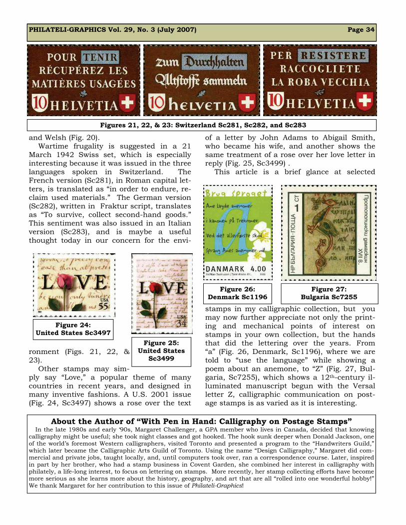
and Welsh (Fig. 20). Wartime frugality is suggested in a 21 March 1942 Swiss set, which is especially interesting because it was issued in the three languages spoken in Switzerland. The French version (Sc281), in Roman capital let-ters, is translated as “in order to endure, re-claim used materials.” The German version (Sc282), written in Fraktur script, translates as “To survive, collect second-hand goods.” This sentiment was also issued in an Italian version (Sc283), and is maybe a useful thought today in our concern for the envi-
ronment (Figs. 21, 22, & 23). Other stamps may sim-ply say “Love,” a popular theme of many countries in recent years, and designed in many inventive fashions. A U.S. 2001 issue (Fig. 24, Sc3497) shows a rose over the text
of a letter by John Adams to Abigail Smith, who became his wife, and another shows the same treatment of a rose over her love letter in reply (Fig. 25, Sc3499) . This article is a brief glance at selected
stamps in my calligraphic collection, but you may now further appreciate not only the print-ing and mechanical points of interest on stamps in your own collection, but the hands that did the lettering over the years. From “a” (Fig. 26, Denmark, Sc1196), where we are told to “use the language” while showing a poem about an anemone, to “Z” (Fig. 27, Bul-garia, Sc7255), which shows a 12th-century il-luminated manuscript begun with the Versal letter Z, calligraphic communication on post-age stamps is as varied as it is interesting.
Figures 21, 22, & 23: Switzerland Sc281, Sc282, and Sc283
Figure 24: United States Sc3497
Figure 25: United States
Sc3499
Figure 26: Denmark Sc1196
Figure 27: Bulgaria Sc7255
About the Author of “With Pen in Hand: Calligraphy on Postage Stamps” In the late 1980s and early ‘90s, Margaret Challenger, a GPA member who lives in Canada, decided that knowing calligraphy might be useful; she took night classes and got hooked. The hook sunk deeper when Donald Jackson, one of the world’s foremost Western calligraphers, visited Toronto and presented a program to the “Handwriters Guild,” which later became the Calligraphic Arts Guild of Toronto. Using the name “Design Calligraphy,” Margaret did com-mercial and private jobs, taught locally, and, until computers took over, ran a correspondence course. Later, inspired in part by her brother, who had a stamp business in Covent Garden, she combined her interest in calligraphy with philately, a life-long interest, to focus on lettering on stamps. More recently, her stamp collecting efforts have become more serious as she learns more about the history, geography, and art that are all “rolled into one wonderful hobby!” We thank Margaret for her contribution to this issue of Philateli-Graphics!