PERSPECTIVE - Art Directors Guild · 36 | PERSPECTIVE It’s the summer of ... Marlboro Man rise...
12
APRIL – MAY 2013 APRIL – MAY 2013 US $6.00 US $6.00 THE JOURNAL OF THE ART DIRECTORS GUILD THE JOURNAL OF THE ART DIRECTORS GUILD PERSPECTIVE PERSPECTIVE
-
Upload
vuongthuan -
Category
Documents
-
view
216 -
download
1
Transcript of PERSPECTIVE - Art Directors Guild · 36 | PERSPECTIVE It’s the summer of ... Marlboro Man rise...
APRIL – MAY 2013APRIL – MAY 2013US $6.00US $6.00
T H E J O U R N A L O F T H E A R T D I R E C T O R S G U I L DT H E J O U R N A L O F T H E A R T D I R E C T O R S G U I L DPERSPECT IVEPERSPECT IVE

Apri l – May 2013 | 1
contents
12
32
12 ADG AwArDs
32 oscArs®
34 plAyinG with the bAnD eric rosenberg
44 wheel’s 30th AnniversAry renée hoss-Johnson
52 sAvinG the plAnet… John Zachary
features
3 eDitoriAl
4 contribUtors
7 FroM the presiDent
8 news
10 the Gripes oF roth
11 lines FroM the stAtion point
56 proDUction DesiGn
58 MeMbership
61 cAlenDAr
62 Milestones
64 reshoots
34
44
departments
tM
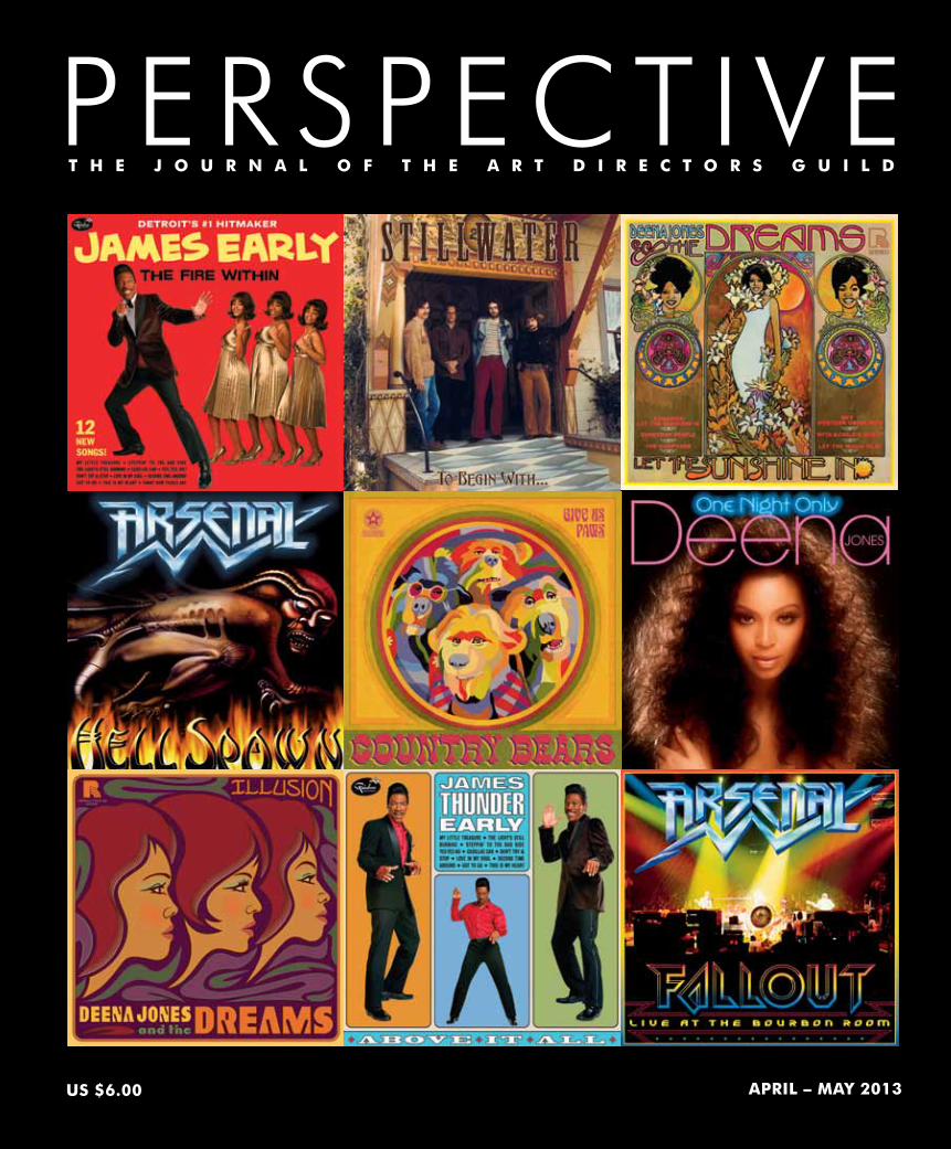
COVER: A small selection of record album covers from the many dozens designed by Graphic Artist Eric Rosenberg over the past several years for music-themed films such as ALMOST FAMOUS, DREAMGIRLS, THE COUNTRY BEARS and ROCK OF AGES. The albums’ illustrations were done by Rosenberg, along with artists Jules Kmetzko and Robert Kalafut. Rosenberg draws most of his work in Macromedia FreeHand® and imports it into Photoshop® to finish it.
libby
Highlight
libby
Highlight

34 | PERSPECTIVE
Playing with theBAND
Apri l – May 2013 | 35
by Eric Rosenberg, Graphic Designer
Designing Music Graphics for the Movies
libby
Highlight

36 | PERSPECTIVE
It’s the summer of 1987 on the neon-lit Sunset Strip of Los Angeles; we’re following the story of two young strivers eager to join the boulevard’s thriving music scene right at its heart, the venerable rock club, The Bourbon Room. In reality it’s the summer of 2011 and production of Adam Shankman’s film Rock of Ages is in full swing on location in Miami, where the Strip has been re-created just blocks from the MacArthur Causeway linking the city with South Beach (see PERSPECTIVE, October/November 2012). On these three streets of empty storefronts and industrial supply stores, landmarks from the era like Tower Records, Filthy McNasty’s, and the Marlboro Man rise again.
In March 2011, Production Designer Jon Hutman asked me to join him as Lead Graphic Designer on this adaptation of the Broadway musical. I was very glad for the opportunity; this is the kind of film project I enjoy most, one with music at its core. Rock of Ages is one of eight music-themed movies I’ve worked on. These cinematic journeys into the music world began in 1999 with Almost Famous, and also include The Country Bears, Laurel Canyon, Dreamgirls, The Runaways, CBGB, and the television special Tony Bennett: An American Classic. Designing record albums, band logos, gig posters, rock magazines, and signs for concert venues will always thrill a music lover like me.
In the late 1970s while attending LaGuardia High School of Music & Art in New York, I was greatly inspired by the record graphics of the punk and new wave era. They were the catalyst for my interest in graphic design, and the decision to major in that area during my subsequent studies at the School of Visual Arts. At SVA I took classes with a few top album cover designers, dreaming of joining their ranks one day. As it turned out, those doors weren’t especially open to new graduates. I found instead that career opportunities in magazine design were more accessible. I went on to work as an art director for several publications over the course of five years before moving into Graphic Design for films in late 1991. This new career would in time allow me to
“Nothing sells musical legitimacy in a film quicker than seeing the characters underneath that instantly
recognizable ROLLING STONE logo.”
Apri l – May 2013 | 37
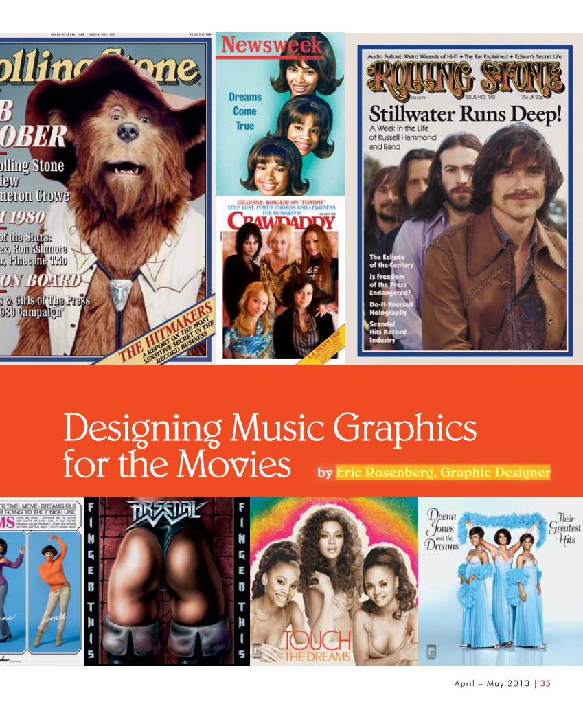
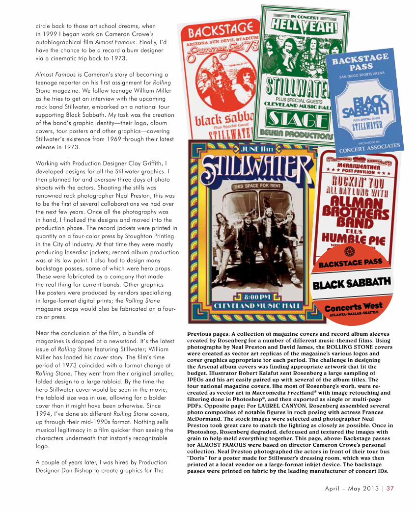
Previous pages: A collection of magazine covers and record album sleeves created by Rosenberg for a number of different music-themed films. Using photographs by Neal Preston and David James, the ROLLING STONE covers were created as vector art replicas of the magazine’s various logos and cover graphics appropriate for each period. The challenge in designing the Arsenal album covers was finding appropriate artwork that fit the budget. Illustrator Robert Kalafut sent Rosenberg a large sampling of JPEGs and his art easily paired up with several of the album titles. The four national magazine covers, like most of Rosenberg’s work, were re-created as vector art in Macromedia FreeHand® with image retouching and filtering done in Photoshop®, and then exported as single or multi-page PDFs. Opposite page: For LAUREL CANYON, Rosenberg assembled several photo composites of notable figures in rock posing with actress Frances McDormand. The stock images were selected and photographer Neal Preston took great care to match the lighting as closely as possible. Once in Photoshop, Rosenberg degraded, defocused and textured the images with grain to help meld everything together. This page, above: Backstage passes for ALMOST FAMOUS were based on director Cameron Crowe’s personal collection. Neal Preston photographed the actors in front of their tour bus “Doris” for a poster made for Stillwater’s dressing room, which was then printed at a local vendor on a large-format inkjet device. The backstage passes were printed on fabric by the leading manufacturer of concert IDs.
circle back to those art school dreams, when in 1999 I began work on Cameron Crowe’s autobiographical film Almost Famous. Finally, I’d have the chance to be a record album designer via a cinematic trip back to 1973.
Almost Famous is Cameron’s story of becoming a teenage reporter on his first assignment for Rolling Stone magazine. We follow teenage William Miller as he tries to get an interview with the upcoming rock band Stillwater, embarked on a national tour supporting Black Sabbath. My task was the creation of the band’s graphic identity—their logo, album covers, tour posters and other graphics—covering Stillwater’s existence from 1969 through their latest release in 1973.
Working with Production Designer Clay Griffith, I developed designs for all the Stillwater graphics. I then planned for and oversaw three days of photo shoots with the actors. Shooting the stills was renowned rock photographer Neal Preston, this was to be the first of several collaborations we had over the next few years. Once all the photography was in hand, I finalized the designs and moved into the production phase. The record jackets were printed in quantity on a four-color press by Stoughton Printing in the City of Industry. At that time they were mostly producing laserdisc jackets; record album production was at its low point. I also had to design many backstage passes, some of which were hero props. These were fabricated by a company that made the real thing for current bands. Other graphics like posters were produced by vendors specializing in large-format digital prints; the Rolling Stone magazine props would also be fabricated on a four-color press.
Near the conclusion of the film, a bundle of magazines is dropped at a newsstand. It’s the latest issue of Rolling Stone featuring Stillwater; William Miller has landed his cover story. The film’s time period of 1973 coincided with a format change at Rolling Stone. They went from their original smaller, folded design to a large tabloid. By the time the hero Stillwater cover would be seen in the movie, the tabloid size was in use, allowing for a bolder cover than it might have been otherwise. Since 1994, I’ve done six different Rolling Stone covers, up through their mid-1990s format. Nothing sells musical legitimacy in a film quicker than seeing the characters underneath that instantly recognizable logo.
A couple of years later, I was hired by Production Designer Dan Bishop to create graphics for The

38 | PERSPECTIVE
Above and top: DREAMGIRLS Production Designer John Myhre suggested a Fats Domino concert poster from 1964 as inspiration for this poster which Rosenberg designed in Macromedia FreeHand and imported into Photoshop for compositing, filtering and surface texturing to give it a silk-screened look. The posters were inkjet-printed on heavyweight matte stock at Ford Graphics. The logo for the tour bus was adapted from the same art, along with an overall paint scheme. A full-scale pounce of the logo and lettering was provided to the production’s sign painter who hand-painted them on the bus. An additional cut-vinyl version was made for application on the Early band’s drum skin. Right: The Palace Theater in downtown Los Angeles was used for the Detroit Theater exterior and interior. The “Detroit” script lettering on three sides of the marquee had to allow all of the ornamental neon of the existing sign to remain as is. Scaled vector art was provided for fabrication. Additional marquee graphics for the Dreams farewell concert were produced at the Warner Bros. sign shop.
Country Bears, based on the popular attraction at Disneyland. While the job was similar to Almost Famous, the graphics required would be more numerous, as this band had been together for twenty years. Director Peter Hastings wanted everything done with great authenticity; everything was to be designed just as if the band were four people, not seven-foot-tall talking bears. Photo shoots were set up, and I again found myself facing a fictitious band, but this time they were performers in very stylized, yet amazingly life-like bear costumes, whose faces were being controlled by puppeteers. This was one of the truly memorable experiences in my career.
Photo composites for props and set decoration have long been one of my favorite tasks. Whether as standalone images or as part of a prop, the call for these photos has grown steadily over the years. One of my favorite composite projects was set in the world of rock ‘n’ roll. In late 2001, Production Designer Catherine Hardwicke asked me to do a four-part photo composite project for Lisa Cholodenko’s Laurel Canyon. Frances McDormand starred as a famous record producer living in the fabled neighborhood that had brought forth the California Sound in the late 1960s. Her estranged son (Christian Bale) and his wife (Kate Beckinsale) would be coming to stay. These four photos would be the first items that told the audience we were in the home of a music business heavyweight.
This was my second photo composite collaboration with Ms. McDormand and photographer Neal Preston; we had previously done a series featured in Almost Famous. For this shoot Ms. McDormand was to be placed among several rock music legends: Bruce Springsteen, David Bowie, Iggy Pop, The

Apri l – May 2013 | 39
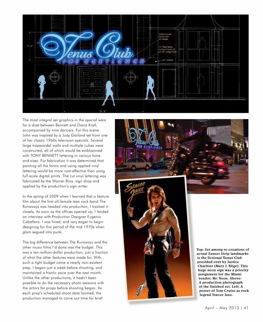
Left: For a duet between Tony Bennett and Diana Krall, Production Designer John Myhre found inspiration for the set’s graphics in a classic Judy Garland television special from the 1960s. The set pieces emblazoned with TONY BENNETT lettering in various fonts and sizes were first painted and then covered in applied vinyl lettering cut by the Warner Bros. sign shop. This technique proved to be far more cost-effective than applying full-scale digital prints (Scale model by Set Designer Richard Romig). Below: A screen capture of the number with Krall and Bennett.
Red Hot Chili Peppers and one of the real Laurel Canyon’s most notable voices, Joni Mitchell. The images in which Ms. McDormand would be placed were selected prior to our photo shoot. Some had been shot by Preston, others were licensed stock photos. Everything that went into the planning and execution of this project gave me the very best elements to work with, resulting in very successful composite images.
In late 2005, I was hired by Production Designer John Myhre to do the graphics for Bill Condon’s adaptation of the 1981 Broadway musical Dreamgirls. This trip into musical graphics would take me further back in time, from the late 1950s’ world of R&B, on through to the disco era of the mid-1970s. One of my first projects was designing the neon sign lettering for the Detroit Theater. For this set the production would be using a real location, the Palace Theater in downtown Los Angeles. The Palace has a beautiful art deco marquee, and we would use all of its decorative neon, replacing only the “Palace” lettering with “Detroit.” Everyone liked the script style of the Palace lettering, I sought out a similar period script font from which to start the process, and created the scaled vector graphics from which the signs would be built. A local neon vendor was chosen to fabricate the three sets of sign lettering. For scenes set at The Dreams farewell concert at the film’s conclusion, I designed translite graphics for the marquee faces. These were produced at the Warner Bros. sign shop.
For the pivotal scene where The Dreams first meet singer James “Thunder” Early (Eddie Murphy) at the Detroit Theater, and are hired as his backup singers, I designed a concert poster inspired by graphics of the era found in the book The Art of Rock. Not only was the poster a key piece of set dressing, but it included Early’s JTE logo which was also needed for the character’s tour bus that would be featured several times early on in the film.
Above: For the Columbia Records recording studio set, four-foot enlargements of Bennett’s album covers were required. The original LPs in Bennett’s archive were quite worn and discolored, requiring several days of digital restoration work in Photoshop before they were ready for prime time.

40 | PERSPECTIVE
There were two sets of album cover projects done for the film. For The Dreams I first had to design their debut release, Meet the Dreams, which would be a central piece of set dressing, sized to six-feet square, at a press conference celebrating the album’s gold record status. Along with the cover, which was inspired by several Supremes’ jackets, there was the Rainbow Records label design too. It would be seen on the award held by band manager Curtis Taylor (Jamie Foxx). I also created eight other covers for The Dreams, and the solo recordings of lead singers Deena Jones (Beyoncé Knowles) and Effie White (Jennifer Hudson). Some were a direct homage to actual Supremes’ covers which we had legal clearance for, others were original designs.
For James “Thunder” Early, I designed eight albums and two singles. The covers were meant for an un-filmed scene in which Taylor is presented with options for the next Early LP release. They ultimately found use as background set dressing in the Rainbow Records office. The two singles, Cadillac Car and Steppin’ to the Bad Side, were both scripted props. The sleeves were three-color Pantone, printed traditionally, each holding a labeled, dummy-groove 45 rpm single.
Magazine covers are a graphics staple of these kinds of films. The rise and success of the artist are marked by their appearance on covers of the most prominent publications of the day. For the pre-Rolling Stone era portion of Dreamgirls, circa 1962-64, I designed the covers of Newsweek, Look, Life, and Time. In all cases, I took great care to re-create the exact logos and formats used.
Within a few weeks of the Dreamgirls wrap, I began another project with John Myhre, Tony Bennett: An American Classic, directed by Rob Marshall, his frequent collaborator. This special for NBC would harken back to the heyday of the television variety show.
Much of the work I did on the Tony Bennett project entailed re-creating a variety of dimensional sign designs integral to the singer’s past. From the sound booth at Columbia Recording Studios to the 1960s’ NBC logo, and on to the Sahara Hotel in Las Vegas; these were all custom fabricated for a duet with Stevie Wonder. I also re-created a multi-story version of the poster advertising Bennett’s debut at Carnegie Hall. For the Columbia recording studio set, there was a series of Bennett’s album covers that were enlarged to four-foot squares. The original LPs provided to us by Bennett’s archive were quite worn, requiring several days of digital restoration work in Photoshop before they were ready for prime time.
Top and above: Rosenberg’s first task on ROCK OF AGES was the design of The Bourbon Room logo. The large exterior sign was an open-faced dimensional can structure with inset neon borderlines. The stage version would be built the opposite way, with neon backlighting and a solid face with metal mesh in the negative spaces. Working with Set Designer Richard Fojo, he provided scaled vector art EPS files created in Macromedia FreeHand to the vendor for fabrication. Other graphics applications like posters and T-shirts followed. Right: This poster announcing Arsenal’s final concert at The Bourbon Room brought together all of the film’s key graphic elements he’d designed for the film. The flaming guitar is a surefire rock motif.
Apri l – May 2013 | 41
The most integral set graphics in the special were for a duet between Bennett and Diana Krall, accompanied by nine dancers. For this scene John was inspired by a Judy Garland set from one of her classic 1960s television specials. Several large trapezoidal walls and multiple cubes were constructed, all of which would be emblazoned with TONY BENNETT lettering in various fonts and sizes. For fabrication it was determined that painting all the forms and using applied vinyl lettering would be more cost-effective than using full-scale digital prints. The cut vinyl lettering was fabricated by the Warner Bros. sign shop and applied by the production’s sign writer.
In the spring of 2009 when I learned that a feature film about the first all-female teen rock band The Runaways was headed into production, I tracked it closely. As soon as the offices opened up, I landed an interview with Production Designer Eugenio Caballero. I was hired, and very eager to begin designing for this period of the mid-1970s when glam segued into punk.
The big difference between The Runaways and the other music films I’d done was the budget. This was a ten-million-dollar production, just a fraction of what the other features were made for. With such a tight budget came a nearly non-existent prep. I began just a week before shooting, and maintained a frantic pace over the next month. Unlike the other productions, it hadn’t been possible to do the necessary photo sessions with the actors for props before shooting began. As each prop’s scheduled shoot date loomed, the production managed to carve out time for brief
Top: Set among re-creations of actual Sunset Strip landmarks is the fictional Venus Club presided over by Justice Charltier (Mary J. Blige). This huge neon sign was a priority assignment for the Miami vendor, Mr. Neon. Above: A production photograph of the finished set. Left: A poster of Tom Cruise as rock legend Stacee Jaxx.

42 | PERSPECTIVE
photo sessions. The high pressure pace was unrelenting throughout, but it all got done.
Rock of Ages found me once more designing vast amounts of period music graphics, this time in the arena of late 1980s’ heavy metal, and the so-called “hair” bands. While I wasn’t listening to this music back in the day, I was working at a record store, and remember selling many copies of the music featured in the film. What’s undeniable is that while this genre wasn’t on my personal top ten list, designing for it was an absolute blast. The graphics
and aesthetics, were so outrageous that any Graphic Designer couldn’t help but have fun working with them. My enthusiasm served me well, as I didn’t have a huge amount of time to get the key elements of the Rock of Ages graphics designed and approved. There were only about eight weeks of prep before shooting began, and the schedule was often in flux.
First up was the The Bourbon Room logo design. Large dimensional neon signs of The Bourbon Room logo for the club’s exterior and the interior stage had to be fabricated out of metal by local Miami sign vendor Mr. Neon. The logo would also be featured on T-shirts worn by the lead characters Drew (Diego Boneta) and Sherrie (Julianne Hough) while at their jobs.
Concurrently, I began working on the sign lettering for the other featured locale on the Boulevard, The Venus Club, a high-end strip joint. Like The Bourbon Room, this lettering also had to be fabricated as a very large exterior neon sign, running nearly the width of the club. I also did some of the many vector art re-creations of landmark Sunset Strip club and shop signage, along with Graphic Designer Vivian Galainena, who was hired locally in Miami. Though she was a very experienced designer, Vivian hadn’t yet worked on a film. She took to it all very quickly, and proved to be a valuable asset as we all raced to complete The Strip.
As the film begins, the specter of heavy metal band Arsenal, and their final concert at The Bourbon Room hangs over all the characters in the film. Graphically, Arsenal began for me with their logo. This design came about quickly. Everyone involved had a clear idea of what was needed, and there were a few specific logo references cited by the producer and director that helped speed the process along. When Sherrie arrives at the bus station in Los Angeles, she quickly makes a souvenir of a concert poster announcing this last Arsenal show. In it a flaming guitar unites the logos of both the band and The Bourbon Room.
Top and center: Appearing in several key scenes, Fallout: Live at The Bourbon Room is the film’s featured Arsenal album. The album’s most important appearance comes near the film’s conclusion when the gatefold is opened to a shocking ten-year-old photo revealing the mayor’s wife, anti-rock crusader Patricia Whitmore (Catherine Zeta-Jones) as a former Stacee Jaxx groupie. Unit photographer David James did a backstage session with extras to glean the many photos needed for the final images, along with the hero setup using a Stacee Jaxx stand-in. Rosenberg replaced heads with stock photos of Zeta-Jones and Cruise, on whom he added long hair. The director approved the prop, but on the eve of shooting, Cruise didn’t like this version, and a photo shoot was quickly scheduled for the next evening at call. The new composite and a fabricated album were created while the night shooting progressed, and were ready by three AM for a hero close-up. Above: The show logo created during early prep.
Apri l – May 2013 | 43
Much of the drama and comedy in Rock of Ages comes from reactions to and interactions with Arsenal’s front man, Stacee Jaxx (Tom Cruise). I designed several items for his character, including a poster that draws the ire of the mayor’s wife Patricia Whitmore (Catherine Zeta-Jones), as well as an enormous pyrotechnic logo for a concert sequence. Capping it off is a Rolling Stone magazine cover and article that tears Stacee apart. I was very pleased to have the opportunity to design the article. The layout was a personal homage to the magazine’s transformative Art Director Fred Woodward, who had just begun his position at about the same time as Rock of Ages takes place.
My challenge in designing the Arsenal records was finding appropriate pre-existing artwork. We didn’t have the budget for originals and these covers had to be illustrated to look authentic. I contacted Robert Kalafut, an artist with whom I’d previously worked. I knew he’d done paintings in the heavy metal style, and was hopeful I might find a few Arsenal covers amongst them. A list of cleared album titles had been compiled, and as I reviewed Robert’s artwork I knew I’d hit the jackpot; I easily paired up his art with approved title choices. By that point preproduction was moving fast, and a call came to present the director with comps of the illustrated Arsenal covers in less than a day’s time. I proceeded with the initial layouts over the course of an afternoon. By morning they were approved; I would be able to make refinements later on.
Though several Arsenal albums are referenced in the script, Live at The Bourbon Room is the hero prop record, appearing in three scenes. Its gatefold design features a photo reveal at the film’s conclusion that brings a big shock to the audience and several of the characters. Near the end of the movie, Lonny (Russell Brand), the sidekick to club owner Dennis Dupree (Alec Baldwin), takes the album from the club’s office and brings it outside to confront Patricia Whitmore and her band of anti-rock protesters. He unfolds the jacket revealing a gatefold photo collage of rock debauchery, its focal point an image of a young, leather-clad Patricia Whitmore, now exposed to all as a former Stacee Jaxx groupie and extreme hypocrite.
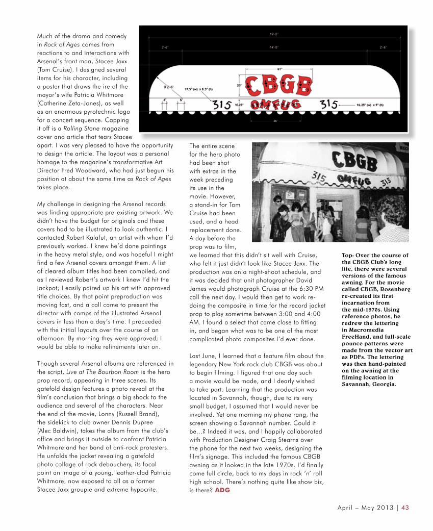
Top: Over the course of the CBGB Club’s long life, there were several versions of the famous awning. For the movie called CBGB, Rosenberg re-created its firstincarnation from the mid-1970s. Using reference photos, he redrew the letteringin Macromedia FreeHand, and full-scale pounce patterns were made from the vector art as PDFs. The lettering was then hand-painted on the awning at thefilming location in Savannah, Georgia.
The entire scene for the hero photo had been shot with extras in the week preceding its use in the movie. However, a stand-in for Tom Cruise had been used, and a head replacement done. A day before the prop was to film, we learned that this didn’t sit well with Cruise, who felt it just didn’t look like Stacee Jaxx. The production was on a night-shoot schedule, and it was decided that unit photographer David James would photograph Cruise at the 6:30 PM call the next day. I would then get to work re-doing the composite in time for the record jacket prop to play sometime between 3:00 and 4:00 AM. I found a select that came close to fitting in, and began what was to be one of the most complicated photo composites I’d ever done.
Last June, I learned that a feature film about the legendary New York rock club CBGB was about to begin filming. I figured that one day such a movie would be made, and I dearly wished to take part. Learning that the production was located in Savannah, though, due to its very small budget, I assumed that I would never be involved. Yet one morning my phone rang, the screen showing a Savannah number. Could it be...? Indeed it was, and I happily collaborated with Production Designer Craig Stearns over the phone for the next two weeks, designing the film’s signage. This included the famous CBGB awning as it looked in the late 1970s. I’d finally come full circle, back to my days in rock ‘n’ roll high school. There’s nothing quite like show biz, is there? ADG