PERFORMING REGRESSION ANALYSIS USING MICROSOFT EXCEL … · International Journal of Arts and...
17
International Journal of Arts and Commerce Vol. 1 No. 5 October 2012 192 PERFORMING REGRESSION ANALYSIS USING MICROSOFT EXCEL John O. Mason, Ph.D., CPA Professor of Accountancy Culverhouse School of Accountancy The University of Alabama Abstract: This paper introduces you to the Excel regression tool. It shows you how this tool can be used to perform linear regression analysis (one independent variable) as well as multiple-regression analysis (two or more independent variables up to a maximum of 16). It also shows you how to interpret Excel’s regression output. For regression analysis involving only one independent variable, the paper shows you how to select the Line Fit Plots option so that Excel will create an XY (Scatter) chart at the time that Excel computes and writes the regression output to the workbook. Moreover, you will learn how to modify the XY (Scatter) chart so that it communicates better. KEYWORDS: Linear regression, multiple regression, regression chart, intercept, coefficient of determination, coefficient of X in linear regression analysis, coefficients of X 1 and X 2 in multiple regression analysis, and residuals REGRESSION ANALYSIS Excel’s regression analysis tool performs linear regression analysis, which fits a line through a set of observations using the "least squares" method. Regression is used in a wide variety of applications in finance and accounting to analyze how the value of a single dependent variable is affected by the values of one or more independent variables. You can then use the regression results to predict the value of the dependent variable based on values of the independent variable(s). With Excel, you can perform both regression analysis (one independent variable) and multiple-regression analysis (two or more independent variables up to a maximum of 16). Excel also enables you to choose the Line Fit Plots option to create a Line Fit Plots column chartand the Residuals Plots option to create a residuals column chart. However, because Excel can create only two-dimensional XY charts, only one independent variable and one dependent variable can be represented in a regression chart or a residuals chart. Whenever you select the line fit plots option or the residuals plots option and there are two or more independent variables, Excel will create a single column chart or residuals column chart for twoor more independent variables. However, the XY (Scatter) chart, which is changed from the column chart,will not include the predicted value of the dependent variable with a straight line. The examples that follow include regression analysis using one independent variable, modifying a column chart created by the Line Fits Plot option so Note: The Data Analysis command displays a Data Analysis dialog box that lists statistical and engineering tools. These tools are part of the Analysis ToolPak add-in that is included with Microsoft Excel. If you do not see the Data Analysis button in the Analysis group of the Data tab’s Ribbon, then the Analysis ToolPak add-in was not installed. See the Appendix on installing the Analysis ToolPak.
Transcript of PERFORMING REGRESSION ANALYSIS USING MICROSOFT EXCEL … · International Journal of Arts and...
International Journal of Arts and Commerce Vol. 1 No. 5 October 2012
192
PERFORMING REGRESSION ANALYSIS USING MICROSOFT EXCEL
John O. Mason, Ph.D., CPA
Professor of Accountancy
Culverhouse School of Accountancy
The University of Alabama
Abstract:
This paper introduces you to the Excel regression tool. It shows you how this tool can be used to perform linear
regression analysis (one independent variable) as well as multiple-regression analysis (two or more
independent variables up to a maximum of 16). It also shows you how to interpret Excel’s regression output.
For regression analysis involving only one independent variable, the paper shows you how to select the Line Fit
Plots option so that Excel will create an XY (Scatter) chart at the time that Excel computes and writes the
regression output to the workbook. Moreover, you will learn how to modify the XY (Scatter) chart so that it
communicates better.
KEYWORDS: Linear regression, multiple regression, regression chart, intercept, coefficient of determination,
coefficient of X in linear regression analysis, coefficients of X1 and X2in multiple regression analysis, and
residuals
REGRESSION ANALYSIS
Excel’s regression analysis tool performs linear regression analysis, which fits a line through a set of
observations using the "least squares" method. Regression is used in a wide variety of applications in finance
and accounting to analyze how the value of a single dependent variable is affected by the values of one or more
independent variables. You can then use the regression results to predict
the value of the dependent variable based on values of the independent
variable(s).
With Excel, you can perform both regression analysis (one independent
variable) and multiple-regression analysis (two or more independent
variables up to a maximum of 16). Excel also enables you to choose the
Line Fit Plots option to create a Line Fit Plots column chartand the
Residuals Plots option to create a residuals column chart. However,
because Excel can create only two-dimensional XY charts, only one
independent variable and one dependent variable can be represented in
a regression chart or a residuals chart. Whenever you select the line fit
plots option or the residuals plots option and there are two or more
independent variables, Excel will create a single column chart or
residuals column chart for twoor more independent variables. However,
the XY (Scatter) chart, which is changed from the column chart,will not
include the predicted value of the dependent variable with a straight
line. The examples that follow include regression analysis using one
independent variable, modifying a column chart created by the Line Fits Plot option so
Note: The Data Analysis
command displays a Data
Analysis dialog box that lists
statistical and engineering tools.
These tools are part of the
Analysis ToolPak add-in that is
included with Microsoft Excel. If
you do not see the Data Analysis
button in the Analysis group of
the Data tab’s Ribbon, then the
Analysis ToolPak add-in was not
installed. See the Appendix on
installing the Analysis ToolPak.

International Journal of Arts and Commerce Vol. 1 No. 5 October 2012
193
that it becomes a an XY (Scatter) chart, and multiple regression with two independent variables.
To perform regression analysis, click on the Data Analysis button in the Analysis group, which is on the far
right of the Data tab’s Ribbon. If you do not see the Data Analysis button or the Analysis group in the Data
tab’s Ribbon, it means that, although the Analysis Toolpakadd-in was placed on your hard drive when
Microsoft Office 2010 or 2007 was installed, this add-in was not installedfor Microsoft Excel. Thus, you should
review Appendix at the back of this paper to see how to install the Analysis Toolpakadd-in.
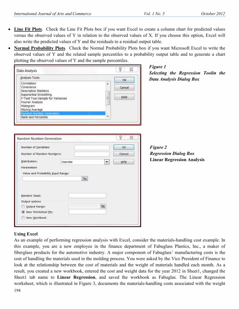
If you click on the Data Analysis button, you will then see a list of data analysis tools in the Analysis Tools list
box of the Data Analysis dialog box. Scroll down the list until you see Regression, as shown in Figure 1. Click
on Regression and then click on the OK button. Excel then displays a Regression dialog box, as shown in
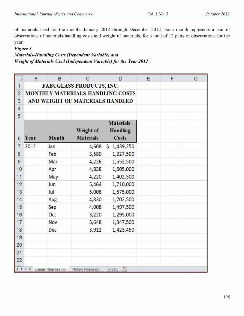
Figure 2. The required ranges and options in the Regression dialog box are as follows:
• Input Y Range. Allows you to enter the range of the dependent variable. The data for the input range must be
in a column.
• Input X Range. Allows you to enter the range of the independent variable(s). The data for the Input X Range
must be in columns. If two or more independent variables are present, they must be located in adjacent columns.
Excel orders the independent variables in ascending order from left to right, using 1, 2, 3, and so on for the
variable names in the summary output table.
• Labels. If the first row in the input range includes labels (i.e., text) that describe the independent variables,
check the Labels box. Excel then generates the appropriate row titles for the summary output table. If your input
range does not contain labels, then the Labels check box should be clear.
• Constant is Zero. Check the Constant Is Zero box only if you want to force the regression line to pass through
the origin.
• Confidence Level. The default confidence level is 95%. If you want an additional level included in the
summary output table, check the Confidence Level box, click on the text box to the right, and enter a confidence
level (i.e., 99% or 90%) that you want Excel to apply to the regression in addition to the default 95% confidence
level.
• Output Options. Excel writes the regression output, in the form of a summary output table, to (1) an output
range in the active worksheet, (2) a separate worksheet within the active workbook, or (3) a separate workbook.
Choose any one of the three options by clicking on its option box. If you choose the output range option, click
on the text box at the right and enter the cell address of the upper-left corner where you want the summary
output table to appear. When Excel writes the summary output table, it will consist of nine columns and
eighteen or more rows, depending upon the other options selected.
• Residuals. Check the Residuals box if you want Excel to write the predicted values of Y and the residuals to a
residual output table.
• Standardized Residuals. Check the Standardized Residuals box if you want Excel to write the predicted
values of Y, the residuals, and the standardized residuals to a residuals output table.
• Residual Plots. Check the Residual Plots box if you want Excel to create a column chart for the independent
variable(s) versus the residual. If you choose this option, Excel will also write the predicted values of Y and the
residuals to a residual output table.
International Journal of Arts and Commerce
194
• Line Fit Plots. Check the Line Fit Plots
versus the observed values of Y in relati
also write the predicted values of Y and th
• Normal Probability Plots. Check the N
observed values of Y and the related sam
plotting the observed values of Y and the
Using Excel
As an example of performing regression
this example, you are a new employee
fiberglass products for the automotive in
cost of handling the materials used in the
look at the relationship between the cost
result, you created a new workbook, ente
Sheet1 tab name to Linear Regressio
worksheet, which is illustrated in Figure
rce Vol. 1 No. 5
t Plots box if you want Excel to create a column cha
relation to the observed values of X. If you choose
and the residuals to a residual output table.
the Normal Probability Plots box if you want Micro
ted sample percentiles to a probability output table a
d the sample percentiles.
Figure 1
Selecting the R
Data Analysis Di
Figure 2
Regression Dialo
Linear Regressio
ssion analysis with Excel, consider the materials-han
loyee in the finance department of Fabuglass Plas
tive industry. A major component of Fabuglass’ man
in the molding process. You were asked by the Vice P
e cost of materials and the weight of materials hand
, entered the cost and weight data for the year 2012
ression, and saved the workbook as Fabuglas. T
igure 3, documents the materials-handling costs asso
October 2012
n chart for predicted values
hoose this option, Excel will
Microsoft Excel to write the
table and to generate a chart
e Regression Toolin the
s Dialog Box
ialog Box
gression Analysis
handling cost example. In
s Plastics, Inc., a maker of
s’ manufacturing costs is the
Vice President of Finance to
s handled each month. As a
2012 in Sheet1, changed the
las. The Linear Regression
ts associated with the weight
International Journal of Arts and Commerce
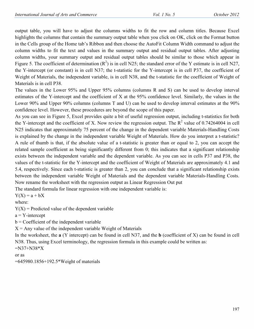
of materials used for the months Janua
observations of materials-handling costs a
year.
Figure 3
Materials-Handling Costs (Dependent V
Weight of Materials Used (Independent V
rce Vol. 1 No. 5
January 2012 through December 2012. Each mont
costs and weight of materials, for a total of 12 pairs
nt Variable) and
ent Variable) for the Year 2012
October 2012
195
month represents a pair of
pairs of observations for the

International Journal of Arts and Commerce
196
Now open the workbook FabUGlas and se
click on the Data Analysis button in the
Analysis dialog box, and then click on O
box:
1. Click on the Input Y Range text box and e
keyboard.
2. Click on the Input X Range text box and e
keyboard.
3. Check the Labels option box.
4. Check the Confidence Level box, click o
level of 90%).
5. If necessary, click on the Output option
worksheet immediately to the left of the
the option box to the right of New Worksh
6. Check the Line Fit Plots box (Selecting t
residuals to a residual output table below
box, it is not necessary to check the Resid
7. If your Regression dialog box matches t
regression analysis, write the summary an
chart.
After performing the regression analysis
upper-left corner of the output range), to
output table to columns A through C and
rce Vol. 1 No. 5
and select the Linear Regression worksheet. To perfo
the Analysis group of the Data tab’s Ribbon; choose
k on OK. Select the following ranges and options in
x and either select the range D6:D18 with the mouse o
x and either select the range C6:C18 with the mouse o
lick on the related text box at the right, and then ente
optionNew Worksheet Ply:.If you don’t want the o
f the Linear Regression worksheet, then enter the n
rksheet Ply:.
cting this box also causes Excel to write the predicte
below the summary output table. Therefore, if you se
Residuals options box.).
tches the one shown in Figure 4, click on OK to h
ary and residual output tables to the output range, and
Figure 4
Entering R
Options in
Box for F
Example
alysis, Excel writes the summary output table, beg
ge), to column I (nine columns) and rows 1 throug
and rows 24 through 36. In order to see all of the in
October 2012
perform regression analysis,
hoose Regression in the Data
ons in the Regression dialog
ouse or enter the range at the
ouse or enter the range at the
en enter 90 (for a confidence
t the output to be in a new
the new worksheet name in
redicted values of Y and the
you select the Line Fit Plots
to have Excel perform the
e, and create the line fit plots
g Ranges and Selecting
in Regression Dialog
r Fabuglass Regression
e, beginning in cell A1 (the
through 18; and the residual
f the information in summary
International Journal of Arts and Commerce Vol. 1 No. 5 October 2012
197
output table, you will have to adjust the columns widths to fit the row and column titles. Because Excel
highlights the columns that contain the summary output table when you click on OK, click on the Format button
in the Cells group of the Home tab’s Ribbon and then choose the AutoFit Column Width command to adjust the
column widths to fit the text and values in the summary output and residual output tables. After adjusting
column widths, your summary output and residual output tables should be similar to those which appear in
Figure 5. The coefficient of determination (R2) is in cell N25; the standard error of the Y estimate is in cell N27,
the Y-intercept (or constant) is in cell N37; the t-statistic for the Y-intercept is in cell P37, the coefficient of
Weight of Materials, the independent variable, is in cell N38, and the t-statistic for the coefficient of Weight of
Materials is in cell P38.
The values in the Lower 95% and Upper 95% columns (columns R and S) can be used to develop interval
estimates of the Y-intercept and the coefficient of X at the 95% confidence level. Similarly, the values in the
Lower 90% and Upper 90% columns (columns T and U) can be used to develop interval estimates at the 90%
confidence level. However, these procedures are beyond the scope of this paper.
As you can see in Figure 5, Excel provides quite a bit of useful regression output, including t-statistics for both
the Y-intercept and the coefficient of X. Now review the regression output. The R2 value of 0.74264004 in cell
N25 indicates that approximately 75 percent of the change in the dependent variable Materials-Handling Costs
is explained by the change in the independent variable Weight of Materials. How do you interpret a t-statistic?
A rule of thumb is that, if the absolute value of a t-statistic is greater than or equal to 2, you can accept the
related sample coefficient as being significantly different from 0; this indicates that a significant relationship
exists between the independent variable and the dependent variable. As you can see in cells P37 and P38, the
values of the t-statistic for the Y-intercept and the coefficient of Weight of Materials are approximately 4.1 and
5.4, respectively. Since each t-statistic is greater than 2, you can conclude that a significant relationship exists
between the independent variable Weight of Materials and the dependent variable Materials-Handling Costs.
Now rename the worksheet with the regression output as Linear Regression Out put
The standard formula for linear regression with one independent variable is:
Y(X) = a + bX
where:
Y(X) = Predicted value of the dependent variable
a = Y-intercept
b = Coefficient of the independent variable
X = Any value of the independent variable Weight of Materials
In the worksheet, the a (Y intercept) can be found in cell N37, and the b (coefficient of X) can be found in cell
N38. Thus, using Excel terminology, the regression formula in this example could be written as:
=N37+N38*X
or as
=645980.1856+192.5*Weight of materials

International Journal of Arts and Commerce
198
Whenever you check one of the Residual
box, Excel creates a residual output table
Excel computed a predicted value of Y (
residual, which is the difference between
Rename the worksheet as Linear Regressi
Modifying the Regression Chart
Because you selected the Line Fit Plots
Plots chart to the right of the summar
present form, the chart is difficult to r
changing the chart type and modifying
clicking on it. When you select a chart,
appear along it borders. Next, copy the ch
size as follows:
1. Copy the chart to cell A22of the Linear R
• Copy the chart to the clipboard (e.g., pres
upper-left corner of the chart in cell V21.
• Select cell A22of the Linear Regression w
V).
rce Vol. 1 No. 5
siduals options, such as the Line Fits Plots option, in
t table as part of the regression output. In creating th
of Y (i.e., a value on the regression line) for each ob
etween the observed and predicted values of Y for e
gression Output
t Plots box, Excel created theLine Fit
mmary output table. However, in its
lt to read and interpret. To facilitate
ifying the chart, select the chart by
hart, round handles with holes in them
the chart, paste it, and then increase its
ear Regression worksheet as follows:
., press Ctrl + C). You should find the
21.
sion worksheet and then paste the chart from the clipb
TIP: Crea
Line Fit
modify t
should y
copy w
the chart,
recopy th
and mod
over agai
October 2012
Figure 5
Regression
Summary
Output
and Residual
Output
Tables
ion, in the Regression dialog
ing the residual output table,
ach observation of X and the
for each observation of X.
e clipboard (e.g., press Ctrl +
: Create a copy of the
e Fit Plots chart and
dify the copy. Thus,
uld you damage the
y when modifying
chart, you can always
opy the original chart
modify the copy all
er again.

International Journal of Arts and Commerce Vol. 1 No. 5 October 2012
199
2. Increase the chart’s size as follows:
• Position the mouse pointer on the black handle in the lower-right border of the chart until you see the double-
headed arrow.
• Press the right mouse button, drag the lower-right border down and to right until the chart extends to the lower-
right corner of cell J48, and then release the mouse button.
3. If necessary, click on the Full Screen button in the Worksheet Views group of the View tab’s Ribbon in order to
display rows 22 to 48 simultaneously on the screen.
Next, modify the chart by completing the steps below:
• The square data markers (symbols) that appear to form along a diagonal in the chart represent the predicted Y
data series. Change the data markers from symbols to a regression line as follows:
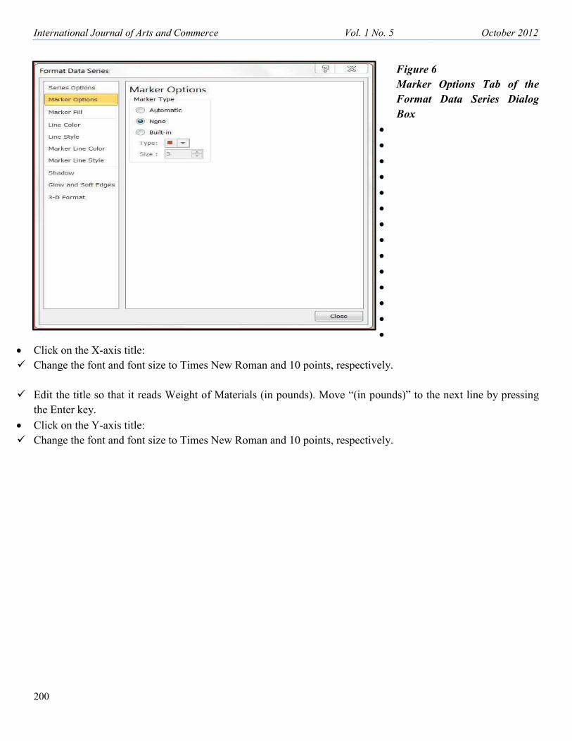
⇒ Click on any of the data markers and then choose the Format Data Series command from the shortcut menu.
Excel will display a Format Data Series dialog box.
⇒ Click on the Marker Options tab in the dialog box and choose the None option, as shown in Figure 6.
⇒ Click on the Line Color tab and choose the Solid Line option.
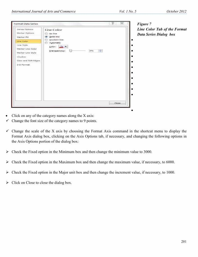
⇒ Click on the arrow at the right end of the Color list box to display the color palette and choose the color Dark
Red, which is in the left-most color under Standard Colors in the color palette, as illustrated in Figure 7.
⇒ Click on Close to close the dialog box. As a result, Excel will replace the data marker symbols with a dark red
regression line.
• Click on the chart title:
⇒ Change the font and font size to Times New Roman and 12 points, respectively.
⇒ Edit the chart title so that it reads as follows: MONTHLY COST OF HANDLING MATERIALS RELATIVE
TO WEIGHT OF MATERIALS FOR YEAR 2012. Insert a line immediately before “TO” and move that part of
the title beginning with “TO” to the next line by pressing the Enter key.
International Journal of Arts and Commerce
200
• Click on the X-axis title:
� Change the font and font size to Times Ne
� Edit the title so that it reads Weight of M
the Enter key.
• Click on the Y-axis title:
� Change the font and font size to Times Ne
rce Vol. 1 No. 5
Figure 6
Marker
Format
Box
•
•
•
•
•
•
•
•
•
•
•
•
•
•
es New Roman and 10 points, respectively.
t of Materials (in pounds). Move “(in pounds)” to th
es New Roman and 10 points, respectively.
October 2012
re 6
ker Options Tab of the
at Data Series Dialog
to the next line by pressing
International Journal of Arts and Commerce
• Click on any of the category names along
� Change the font size of the category name
� Change the scale of the X axis by choo
Format Axis dialog box, clicking on the
the Axis Options portion of the dialog box
� Check the Fixed option in the Minimum b
� Check the Fixed option in the Maximum b
� Check the Fixed option in the Major unit b
� Click on Close to close the dialog box.
rce Vol. 1 No. 5
Figure 7
Line Co
Data Ser
•
•
•
•
•
•
•
•
•
•
•
•
along the X axis:
names to 9 points.
choosing the Format Axis command in the shortcu
n the Axis Options tab, if necessary, and changing th
og box:
mum box and then change the minimum value to 3000
mum box and then change the maximum value, if nec
r unit box and then change the increment value, if nec
October 2012
201
re 7
Color Tab of the Format
Series Dialog box
hortcut menu to display the
ging the following options in
o 3000.
if necessary, to 6000.
if necessary, to 1000.

International Journal of Arts and Commerce Vol. 1 No. 5 October 2012
202
• Click on any of the values along the Y axis:
� Change the font size of the category names to 9 points.
� Change the scale of the X axis by choosing the Format Axis command in the shortcut menu to display the
Format Axis dialog box, clicking on the Axis Options tab, if necessary, and changing the following options in
the Axis Options portion of the dialog box:
� Check the Fixed option in the Minimum box and then change the minimum value to 1000000.
� Check the Fixed option in the Maximum box and then, if necessary, change the maximum value to 2000000.
� Check the Fixed option in the Major unit box and then, if necessary, change the increment value to 200000.
� Click on Close to close the dialog box.
• Click on the Legend:
� Change the font size to 9 points.
� Right-click on the legend and choose the Format Legend command from the shortcut menu to display the
Format Legend dialog box.
� In the dialog box, click on the Border Color tab, click on the Solid Line option, click on the arrow on the right
of the Color box, and then click on the fourth color from the right under Standard colors in the palette of colors.
� Next, click on the Border Styles tab and change the width to 1.25.
� After changing the width, click on the Close button to close the dialog box.
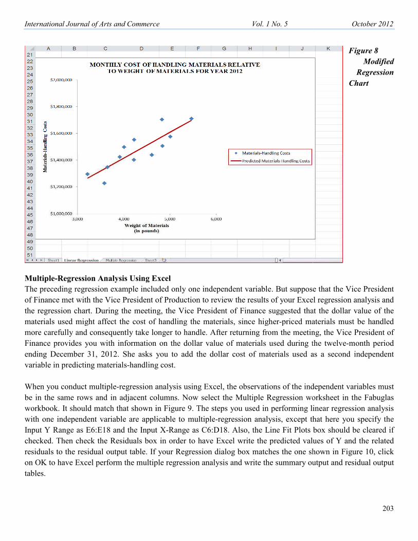
After completing the above steps, view the modified regression chart. It should look like the one shown in
Figure 8. If it does not, repeat one or more of the above steps in order to make the necessary changes. In your
chart, the individual markers (i.e., symbols) represent the observed values of Materials-Handling Costs. The
straight line represents the values along the regression line (i.e., the predicted values of Materials-Handling
Costs).
Since the regression analysis quantified the relationship between materials-handling costs and the weight of the
materials handled and indicated that the relationship was significant, you should be able to observe this
relationship in the chart. And in fact, the sample observations are tightly clustered around the regression line.
Thus, the regression chart reinforces your observations from regression analysis. It is also a lot easier to explain
the relationship between the dependent and independent variables to nonstatisticians by presenting the data in a
regression chart than by trying to explain to them statistical terms such as R2, the Y-intercept, the coefficient of
X, and the t-statistic.
International Journal of Arts and Commerce
Multiple-Regression Analysis Using Ex
The preceding regression example include
of Finance met with the Vice President of
the regression chart. During the meeting,
materials used might affect the cost of h
more carefully and consequently take lon
Finance provides you with information o
ending December 31, 2012. She asks yo
variable in predicting materials-handling c
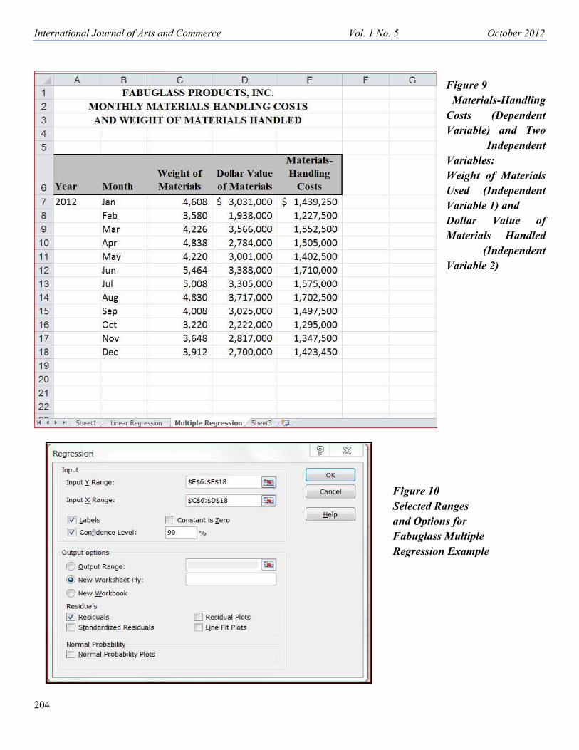
When you conduct multiple-regression an
be in the same rows and in adjacent colu
workbook. It should match that shown in
with one independent variable are applic
Input Y Range as E6:E18 and the Input X
checked. Then check the Residuals box i
residuals to the residual output table. If y
on OK to have Excel perform the multiple
tables.
rce Vol. 1 No. 5
ng Excel
included only one independent variable. But suppose
ent of Production to review the results of your Excel
eeting, the Vice President of Finance suggested that
st of handling the materials, since higher-priced mat
ke longer to handle. After returning from the meeting
tion on the dollar value of materials used during th
sks you to add the dollar cost of materials used as
dling cost.
ion analysis using Excel, the observations of the inde
nt columns. Now select the Multiple Regression wor
wn in Figure 9. The steps you used in performing lin
applicable to multiple-regression analysis, except tha
Input X-Range as C6:D18. Also, the Line Fit Plots bo
box in order to have Excel write the predicted value
e. If your Regression dialog box matches the one sho
ultiple regression analysis and write the summary out
October 2012
203
Figure 8
Modified
Regression
Chart
ppose that the Vice President
Excel regression analysis and
d that the dollar value of the
d materials must be handled
eeting, the Vice President of
ing the twelve-month period
ed as a second independent
e independent variables must
n worksheet in the Fabuglas
ing linear regression analysis
ept that here you specify the
lots box should be cleared if
values of Y and the related
ne shown in Figure 10, click
ry output and residual output
International Journal of Arts and Commerce
204
rce Vol. 1 No. 5
Figure 10
Selected R
and Option
Fabuglass
Regression
October 2012
Figure 9
Materials-Handling
Costs (Dependent
Variable) and Two
Independent
Variables:
Weight of Materials
Used (Independent
Variable 1) and
Dollar Value of
Materials Handled
(Independent
Variable 2)
e 10
ed Ranges
ptions for
lass Multiple
ssion Example
International Journal of Arts and Commerce
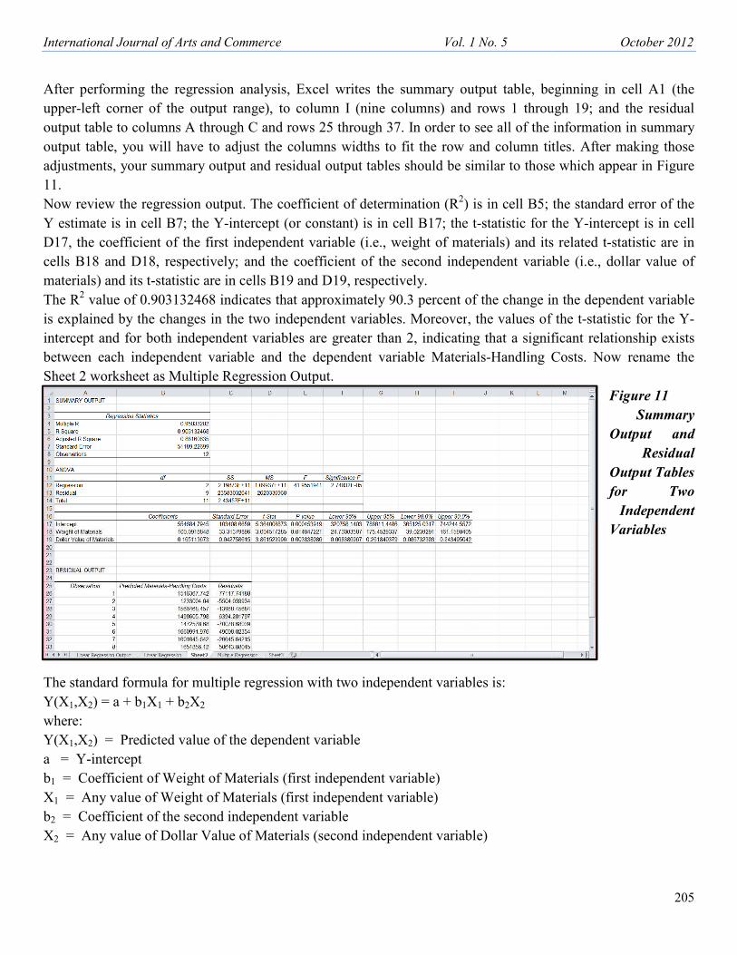
After performing the regression analysis
upper-left corner of the output range), to
output table to columns A through C and
output table, you will have to adjust the
adjustments, your summary output and re
11.
Now review the regression output. The co
Y estimate is in cell B7; the Y-intercept (
D17, the coefficient of the first independ
cells B18 and D18, respectively; and the
materials) and its t-statistic are in cells B1
The R2 value of 0.903132468 indicates th
is explained by the changes in the two in
intercept and for both independent variab
between each independent variable and
Sheet 2 worksheet as Multiple Regression
The standard formula for multiple regress
Y(X1,X2) = a + b1X1 + b2X2
where:
Y(X1,X2) = Predicted value of the depen
a = Y-intercept
b1 = Coefficient of Weight of Materials (
X1 = Any value of Weight of Materials (
b2 = Coefficient of the second independe
X2 = Any value of Dollar Value of Mate
rce Vol. 1 No. 5
alysis, Excel writes the summary output table, beg
ge), to column I (nine columns) and rows 1 throug
and rows 25 through 37. In order to see all of the in
st the columns widths to fit the row and column title
and residual output tables should be similar to those w
The coefficient of determination (R2) is in cell B5; th
rcept (or constant) is in cell B17; the t-statistic for th
ependent variable (i.e., weight of materials) and its r
nd the coefficient of the second independent variabl
B19 and D19, respectively.
ates that approximately 90.3 percent of the change in
two independent variables. Moreover, the values of t
variables are greater than 2, indicating that a signific
e and the dependent variable Materials-Handling C
ession Output.
egression with two independent variables is:
dependent variable
erials (first independent variable)
rials (first independent variable)
pendent variable
Materials (second independent variable)
October 2012
205
e, beginning in cell A1 (the
through 19; and the residual
f the information in summary
n titles. After making those
those which appear in Figure
5; the standard error of the
or the Y-intercept is in cell
d its related t-statistic are in
variable (i.e., dollar value of
ge in the dependent variable
es of the t-statistic for the Y-
ignificant relationship exists
ing Costs. Now rename the
Figure 11
Summary
Output and
Residual
Output Tables
for Two
Independent
Variables

International Journal of Arts and Commerce Vol. 1 No. 5 October 2012
206
As noted previously, the Y-intercept can be found in cell B17, the coefficient b1 of X1 can be found in cell B18,
and the coefficient b2 of X2 can be found in cell B19. Thus, using Excel terminology, the regression formula in
this example could be written as:
=B17+B18*X1 +B19*X2
or as
=554684.79+100.09*Weight of Materials +0.165*Dollar Value of Materials
Because you selected the Residuals box, Excel wrote the residual output, including a predicted value of Y for
each observation of Weight of Materials and Dollar Value of Materials, to the range A25 through C37. There
are two possible reasons for having Excel compute the predicted values of Y and the residuals: One, you may
want to compare the predicted values of Y with the observed values of Y (or review the residuals, which
represent the differences between the predicted and the observed values of Y); and, two, at some later point in
time, you may want to chart the observed and predicted values of Y relative to one of the independent variables.
Moreover, if you have access to a graphics program that can create a three-dimensional (i.e., 3-D) XY chart,
you may want to create a multiple-regression chart.
SUMMARY
The regression feature in Excel allows you to perform both linear regression with one independent variable and
multiple-regression analysis using the “least squares” method. After you specify the range of the independent
and dependent variables and choose options in the Regression dialog box, Excel performs the regression
analysis and writes the regression results to a summary output table. Included in the summary output table are
R2, the standard error of the Y estimate, the Y-intercept, the standard error and t-statistic of the Y intercept, the
coefficient of each independent variable, and the standard error and t-statistic of each coefficient. Other
regression options create a line fit plots chart and write the predicted values of Y and related residuals to a
residual output table.

International Journal of Arts and Commerce
APPENDIX – INSTALLING THE ANA
With Microsoft Excel 2010 (similar but
clicking on the Filecommand on the left-
the bottom of the dialog box. Excel displ
side of the dialog box. Next, click on Ana
that the Manage list box near the bottom
appears to the right side of the Manage lis
13. Make sure that the Analysis Toolpak
Analysis button in the Analysis group of t
Figure 12
Excel Options Dialog Box
rce Vol. 1 No. 5
E ANALYSIS TOOLPAK
lar but different from Excel 2007), you add in the
-side of the screen and then clicking on Options
l displays the Excel Options dialog box. Click on the
on Analysis Toolpak to highlight it, as shown in Figu
bottom of the screen containsExcel Add-Ins, and the
age list box. Excel then displays the Add-Ins dialog b
lpak has a check in its box and then click OK. You sh
up of the Data tab’s Ribbon.
October 2012
207
the Analysis ToolPak by
tions on the left side and near
on the Add-ins tab at the left
n Figure 12. Next, make sure
nd then click on Go, which
g box, as shown in Figure
ou should then see the Data
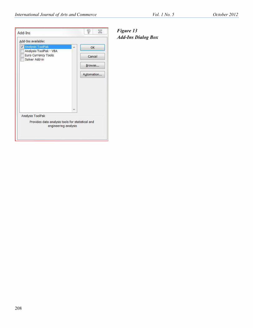
International Journal of Arts and Commerce
208
rce Vol. 1 No. 5
Figure 13
Add-Ins Dialog Box
October 2012