Part 2 of 3_Fastest Growing Duolingo Courses
37
1 Part 2 of 3: Fastest growing Duolingo courses? Lisa M. Beck Subsections: - Worldwide trends - Access to the World Wide Web - Russia - Middle East/North Africa vs. Latin America/Caribbean - Top movers in Internet Penetration Growth Rates for … - Some differences between World Bank and Internet Live Stats … - Equatorial Guinea To view Part 1, click on the link below: Part 1/3: Fastest growing Duolingo courses? Part 1 shouldn’t look too different from the first version that was posted. The second post — the one you see here — contains a lot of supplementary/amplifying material that I collected, observed, and studied as I took a look at some of the growing numbers of people using Duolingo as a language learning tool. Perhaps the best two words to describe this next part would be “worldwide trends.”
-
Upload
lisa-m-beck -
Category
Documents
-
view
18 -
download
0
Transcript of Part 2 of 3_Fastest Growing Duolingo Courses

1
Part 2 of 3:
Fastest growing Duolingo courses?
Lisa M. Beck
Subsections:
- Worldwide trends
- Access to the World Wide Web
- Russia
- Middle East/North Africa vs. Latin America/Caribbean
- Top movers in Internet Penetration Growth Rates for …
- Some differences between World Bank and Internet Live Stats …
- Equatorial Guinea
To view Part 1, click on the link below:
Part 1/3: Fastest growing Duolingo courses?
Part 1 shouldn’t look too different from the first version that was posted. The second post — the
one you see here — contains a lot of supplementary/amplifying material that I collected,
observed, and studied as I took a look at some of the growing numbers of people using Duolingo
as a language learning tool. Perhaps the best two words to describe this next part would be
“worldwide trends.”

2
Worldwide trends
As I mentioned earlier, popularity in a Duolingo course may be indicative of worldwide trends in
general. And in the process of collecting information that would supplement what I’ve observed
about the various levels of popularity for a number of Duolingo courses, I came upon a web page
that may be of further interest to you. The link to it is below:
The most popular language studied on Duolingo in each country
After initially posting this article, I decided to revise it a bit and add a map showing the
popularity of just some of the courses Duolingo offers. It is a cruder map than the one you’ll find
at the link above, but I hope you find it interesting nonetheless.
In the map above, I try to show you the location of those enrolled in various Duolingo courses.
However, this is simply based off of language and not something more exact such as IP address.
Also, to be consistent, I drew a line from the Middle East to Sweden to represent those who are
taking the Swedish course for Arabic speakers, but it is likely that those Arabic speakers actually
reside in Sweden.
A disclaimer I should make (considering my user name) is that I don’t work for Duolingo, nor
am I privy to all the many reasons any particular course may have jumped in popularity. It could
be that it recently emerged from the incubator. It could be that a course’s subscribers, for
whatever reason (e.g., competing interests, seasonal fluctuations), weren’t all that large back in
August. It could be due to adoption of Duolingo as a tool for teachers, which may be a growth

3
area that has not been fully saturated yet and, therefore, ebbs and flows from language-to-
language may be seen as that growth potential matures. With the exception of perhaps incubator
release information, most of these factors, due to lack of access to such information, are
unknowns for me.
Access to the World Wide Web
Another influencing factor when assessing growth rates for Duolingo courses is the degree to
which various regions have access to the World Wide Web. This is also known as internet
penetration — the percentage of a population that can access the internet — and it is an
important factor to consider when assessing a language’s overall popularity for an online
language learning tool such as Duolingo. In countries with greater access to the internet, it is far
more likely that resources such as Duolingo can be accessed and, therefore, have more of a
chance to attract interest and grow. In other words, the key to advantage, as with anything else,
comes down to one’s ability to access resources. And in this way, Duolingo shares a mutually
beneficial relationship with the internet and those who have the ability and desire to tap into it. In
the graph below:
4
among the seven languages shown, Spanish speaking countries have the lowest internet
penetration rate (49.4%). Sweden has the highest (93.1%), followed by select German speaking
countries (Germany, Austria, and Lichtenstein) — the countries with the largest German
speaking populations. The average for these German speaking countries is currently at 88.3%.
But figures can be misleading. Let’s take a look at the bars on the far right of the graph above.
The bars are for Spanish speakers who are learning Italian via Duolingo, many of whom may
live in Spain, which has a penetration rate of 82.2%. However, many of the other Spanish
speaking countries have a much lower rate and the figures shown are averages for all of them.
Even with eliminating the highest and lowest 10% (which I did for both Spanish speaking
countries and Arabic speaking countries in the chart above), the average of 49.4% pales in
comparison to Spain’s 82.2.
As the chart above illustrates, access to the internet varies by region. For example, anyone who
has taken a look at internet statistics knows that Asia, by far, has the largest number of internet
users. But, if you eliminate Asia from the mix, Europe has the largest number (615 million users
as of June 30, 2016), according to Internet World Stats. This site also reports that Europe had a
growth rate of 16.7% between 2000 and 2016 (as of January 1, 2017). Russia is among the
countries included in the data for Europe, so perhaps it should be no surprise that as globalization
via the internet penetrates more deeply into Russia, people will be interested in learning the
Russian language and Russians, in turn, will be interested in learning the languages of other
foreign countries, to include Spanish. As mentioned earlier, Spanish for Russian speakers is one
of the courses with the largest growth at Duolingo in the last couple of months.
Russia
As a matter of fact, a Pew Research Global Attitudes and Trends study reports that 72% of
Russia’s adult population used the internet and 45% owned a smart phone in 2015. For this and
other statistics and findings, you may want to read, “Smartphone Ownership and Internet
Usage Continues to Climb in Emerging Economies.” It contains some information on
internet/smartphone users with respect to social networking sites, which Duolingo users may find
particularly interesting. You may also want to read the previously mentioned publication by the
British Council — “Languages for the Future.” In it, you will find a section on internet usage
with respect to languages. For example, after English and Chinese, Spanish is the third most used
language on the internet.
For comparison, I decided to take a look at Russia’s internet penetration relevant to the other
countries/regions in this study, which you can see below:

5
I purposely used a 3-D chart and tried to change the perspective a bit so that you could see which
areas have shown the most growth during these last two years. Turkey was the biggest mover
between 2014 and 2016, with a growth of 14%. It went from 51% penetration in 2014 to 58% in
just two years. Latin America was the next biggest mover. It grew 9%. Sweden, Russia, and the
United States showed the slowest growth of all during this time period. The fact that Sweden and
the United States have more than 85% penetration doesn’t make this all that surprising, but the
fact that Russia only has 71.3%, as of the latest figures at Internet Live Stats, makes one
wonder why it didn’t show more growth during the last two years. The two factors that come to
mind first are population and GDP growth rates. Let’s take a look, using charts and data from
Google Public Explorer (which uses World Bank data):
6
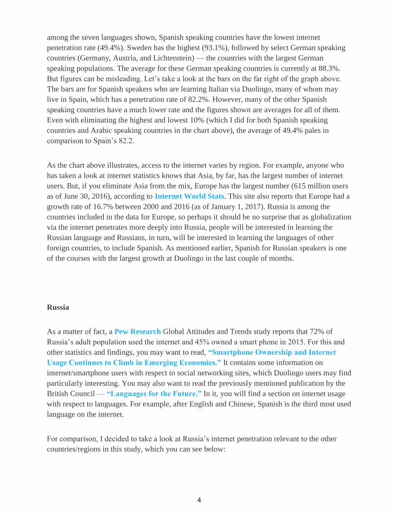
The population chart doesn’t tell you much about why Russia may not have experienced more of
a growth rate in internet penetration, other than the fact that it remains relatively flat. (Using
World Bank data to calculate, Russia’s population growth rate was just .19% between 2014 and
2015; six times less than that of the world average.) On the other hand, Russia’s GDP growth
rate speaks volumes and after seeing that, perhaps it really isn’t a surprise that internet
penetration has not grown much during the past couple of years for this country.
GDP growth rates only tell part of the story, however. In addition to a declining growth rate in
GDP, the strength of the Russian ruble took a precipitous tumble in 2014. This was the result, in
part, of sanctions that were implemented after the Crimea annexation and the low-level conflict
bubbling up between Russia and Ukraine. Additional sanctions after a Malaysian passenger jet
was downed by a missile from pro-Russian separatist-controlled territory as it flew over
Ukraine could not have helped the ruble either. But the fall of the ruble was also due to the fall
in the price of oil on which Russia’s economy largely rests. For a good article that goes into
more detail about this, read “Russian ruble’s fall: A classic ‘currency collapse.’” Compared to
Sweden, Turkey, Germany and likely many other countries in the region, the Russian ruble has,
indeed, taken a tumble.

7
Exchange rates compared
The map below shows just how high Russia’s exchange rate is compared to Sweden’s, Turkey’s,
and Germany’s, but compared to other countries/regions (which will be focused on in later
sections of this post), you can see that other countries have an even higher exchange rate:

8
Nevertheless, some are predicting more trouble ahead for Russia’s ruble. Sergey Aleksashenko, a
nonresident senior fellow at the Brookings Institution, is quoted in an article posted by the
Institute of Modern Russia, a nonprofit, non-partisan U.S. think tank. Aleksashenko is “…
almost certain there will be a future weakening of the ruble.” The article was posted November
1, 2016, a full week before the U.S. presidential elections. It makes one wonder if his predictions
factored in the outcome of that election, to what degree, and whether or not the results were a
surprise to him. Regardless, if you read the article, it appears that he bases his prediction for the
Russian ruble largely on historical predictors, rather than on unknown factors of the future.
Furthermore, he also provides some data that back up the claim that the pressure of sanctions has
been weak. Regardless of the effects of such sanctions, with newly elected Donald Trump
chomping at the bit to take over the reins, most would imagine that those sanctions would
become even weaker, if not disappear altogether. This can only bode well for increased internet
penetration and I foresee rising rates of Duolingo enrollment coming out of Russia during the
next four years.
A bit later, I talk about the World Wide Web, taking a look at periods of time before 1995 and
after. I use 1995 as a breakpoint because I think it represents the year in which globalization (as
we know it today) really started to kick into high gear. The year prior, NAFTA had been signed,
and though it wasn’t the first free trade agreement for the U.S. (which was signed with Israel in
1985), 1995 also marks the year the World Trade Organization was formed. It is true that one
could make the case that globalization has been around since the days of the domesticated camel
trekking across desert sands with Arabian nomads on their backs controlling the long distance
trade in spices and silk from the Far East, but for modern times, I think 1995 is as good of a
breakpoint as any. Whether you agree or not, let me just point out in this section here that the
average exchange rate for Russia was .622 between 1976 and 1995; it averaged 27.616 between
1996 and 2015. The chart below shows you the percent change in these two time periods for
Russia and select pairings of countries/regions:

9
The next set of charts pairs the same countries/regions for inflation rate:
Slopes may be similar, but each chart is on a different scale.
What I find most interesting about the exchange rate and GDP charts is that the GDP for
Germany and Sweden grew more than its exchange rate (8 times more for Germany and 6 times
for Sweden). This is also true for the Middle East/North Africa (MENA) and Latin America, but
to a much smaller degree (1.2 times for MENA and 1.9 for Latin America). This is not true for
Russia or Turkey where the exchange rate grew significantly larger compared to its GDP (more
than 35 times for Russia and almost 60 times for Turkey). Sweden’s exchange rate, in 2014, was
significantly higher than Germany’s, but it appears that Sweden’s inflation rate isn’t as high as it
once was, and has been below both the world rate and Germany’s for the last few years, so it’s
possible we could see the Swedish krona strengthen in the future. According to this Financial
Times article, currency traders agree. As for the other countries/regions, the charts for inflation
all show declines for these countries and as the future progresses, I would imagine that the
growth rates between exchange rate and GDP begin to converge. I added in the rates for the
world in the inflation charts above so that you could put these rates into even more perspective.

10
As for Russia, specifically, and how its GDP has compared to the world average over the years,
what follows is some data on its GDP growth rate. Internet penetration growth rate (IPGR) data
is added and compared to world rates as well. World Bank data via Google Public Explorer only
goes out to 2015 for some data, so let’s turn to other sources to get data that covers the years
between 2014 and 2016. Using rounded figures from Worldometers, the population growth rate
for Russia between 2014 and 2016 was .01% and 2.34% for the world. IPGR for Russia between
2014 and 2016, using Internet Live Stats data, was 1.10%; for the world, it was 15.85%. The
GDP growth rate for the world was estimated at 2.7% for 2014 and 2.4% for 2016; Russia’s
GDP growth rate was .8% for 2014 and -1.2% for 2016 (a drop of 250% compared to the 11%
drop for the world).
Middle East/North Africa (MENA) vs. Latin America/Caribbean
Sometimes insight about a topic or worldwide trend can reveal itself through a comparison of
regions and this section does just that by comparing the Middle East/North Africa (MENA) with
Latin America/Caribbean beginning with the chart you see below. This chart below breaks out
internet penetration, percent change from 2015 to 2016, and latest population figures (cited
elsewhere in this post) for countries where Arabic is spoken and countries where Spanish is
spoken. Tiers were divided into thirds by each category seen below:
Source of internet figures: Internet Live Stats

11
The major difference in the data above is the difference between the percent change in internet
penetration growth for those countries that showed the most growth in their respective regions.
Arabic speaking countries in this tier have two and a half times the area that the Spanish
speaking countries do, half as much water, and twice the population density.
In fact, the Arabic speaking countries in this group — those who had the largest growth in
internet penetration between 2015 and 2016 — have a per capita GDP (PPP) exceeding that of
the Spanish speaking countries by 13.5% which is commensurate with the increased amount of
overall internet penetration they have. Internet penetration in this tier ranges from 13.0% (Iraq)
to 71.1% (Oman), with an average of 38.5% for all Arabic speaking countries in this category.
The range is not quite as wide for the Spanish speaking countries in this tier with the lowest
figure at 19.4% (Nicaragua) and the highest at 56.9% (Colombia). The average for the Spanish
speaking countries is 34.3%.
From these figures, it appears that per capita GDP is a more influencing factor on internet
penetration growth than the population density of an area. Though one might think a more
sparsely populated area may have more need for access to the internet, it is likely that more
densely populated areas have more of the infrastructure in place to enable such access. It is also
quite likely that populations in less densely populated areas may be more agricultural than those
with higher population densities, and consequently, the requirements for daily life, subsistence,
and growth are less reliant upon access to the World Wide Web. Furthermore, incomes for those
who reside in more densely populated areas may further increase one's ability to obtain access to
the internet.
All figures on per capita GDP were retrieved from the Wikipedia article, “List of countries by
GDP (PPP) per capita,” specifically data from the column containing IMF data from 2015, with
one exception. Cuba was not listed in that column, so figures for Cuba were retrieved from the
adjacent column containing World Bank data. GDP for Cuba in that column is from 2013. This
also applies to the next chart.
The following chart shows GDP (PPP) by country. I include this graph here to show that GDP
is not necessarily an indicator that internet penetration rates will experience impressive rates of
growth. In the Latin American countries in the chart below you’ll note that Spain is included,
which, at 82.2% internet penetration, is likely to be getting pretty close to the maximum it can
expect to achieve. However, 100% penetration is possible. Iceland is at 100% penetration now
and nearly 20 countries have more than a 90% internet penetration rate.
Paraguay showed some impressive growth with 3.9%. Yet, as you can see, the GDP of Paraguay
is a mere fraction of Spain’s. That said, rates of growth are likely to occur in countries which
have room to grow in this area. As mentioned earlier, Spain’s overall internet penetration is at
82.2% while Paraguay’s is at 48.6.
12
Middle East/North Africa (MENA) and Latin America/Caribbean together by Internet
Penetration Growth Rate (IPGR) tier — the potential influence of GDP growth rate,
inflation rate, and percentage of employment to population
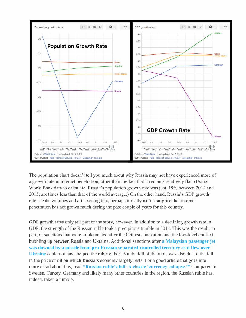
The GDP shown for the countries above is just a snapshot in time — 2015 data. I went back and
took a look at how the GDP growth rates have fluctuated between 2011 and 2015 for the various
Arabic speaking and Spanish speaking countries used in this study. Perhaps not too surprisingly,
the middle and top tiers of internet penetration growth also show the most fluctuation in GDP
growth rates in terms of number of countries per tier that experienced the largest year-to-year
fluctuations. Four of the largest drops in GDP growth rate were found in the Middle Tier of
IPGR and six in the Top Tier. Six of the highest spikes in GDP were found in the Middle Tier of
IPGR and four in the Top Tier. Only two of each — highest drops and spikes — were found in
the Bottom Tier of IPGR.
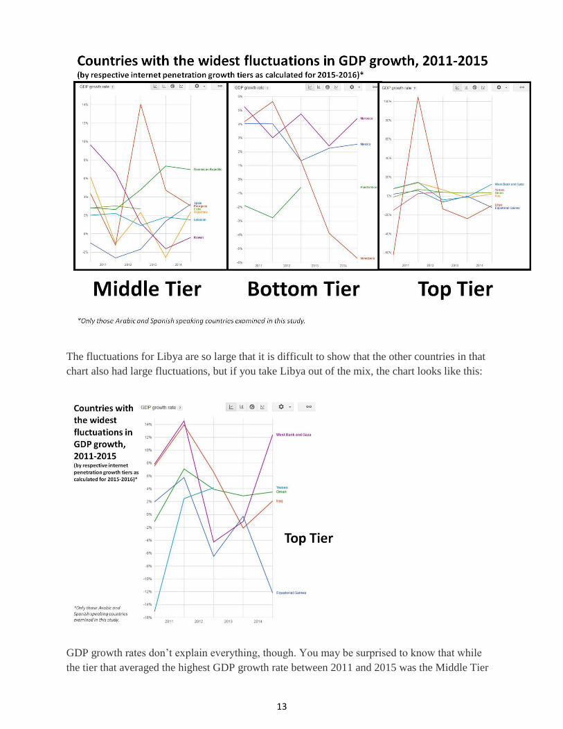
13
The fluctuations for Libya are so large that it is difficult to show that the other countries in that
chart also had large fluctuations, but if you take Libya out of the mix, the chart looks like this:
GDP growth rates don’t explain everything, though. You may be surprised to know that while
the tier that averaged the highest GDP growth rate between 2011 and 2015 was the Middle Tier
14
of IPGR [averaging (annually) 3.26% for GDP growth rate (2011-2015) and 3.15% for IPGR
(2015-2016)], the tier with the lowest GDP growth rate was the Top Tier of IPGR, averaging just
2.21% (annually) for GDP (2011-2015) and 6.15% IPGR (2015-2016).
To put this into perspective, the world average for GDP growth rate was 2.62% during this same
period (2011-2015); the world IPGR for 2015-2016 was 7.50%, according to Internet Live
Stats data. But, according to World Bank data, IPGR for the world averaged 8.5% a year
between 2011 and 2015. The 8.5% average a year growth rate is lower for 2011-2015 than it was
for 2006-2010, where the growth rate averaged 13.5% a year. In comparison, the average growth
rate using Internet Live Stats averaged 8.1% for 2011-2015. Both the World Bank and Internet
Live Stats show an average growth rate for 2006-2010 of 13.5%. Though the rate of growth does
appear to be slowing, at a penetration of 44% (World Bank) and 46.1% (Internet Live Stats),
clearly there is still room to grow.
Another thing I noticed after breaking these countries into thirds by IPGR was the differences in
lows and highs in inflation rates. The Bottom Tier of IPGR had the most number of lows and
highs, followed by the Top Tier; the Middle Tier had the least number. More insightful are the
averages for these tiers. Those countries in the Bottom Tier of internet penetration growth also
had the highest rates of inflation, averaging 9.45% between 2011 and 2015. The Top Tier
followed with 7.14% (24% lower than the Bottom Tier) and the Middle Tier, 5.77% (39% lower
than the Bottom Tier). The world average was 3.11%. This indicates that a region can expect
growth in internet penetration rates even with some amount of inflation, but it appears that
inflation rates begin to have negative effects past a certain threshold. This is a bit of speculation
on my part, but it doesn’t take too much of an analytical leap of faith to think that any country
experiencing inflation rates that are three times that of the world rate aren’t likely to see growth
in internet penetration. In fact, inflation, when it really takes off on a tear, makes it difficult to
even put beer in a pub or toilet paper on the shelves. At that point, access to the internet is a
luxury that few can afford.
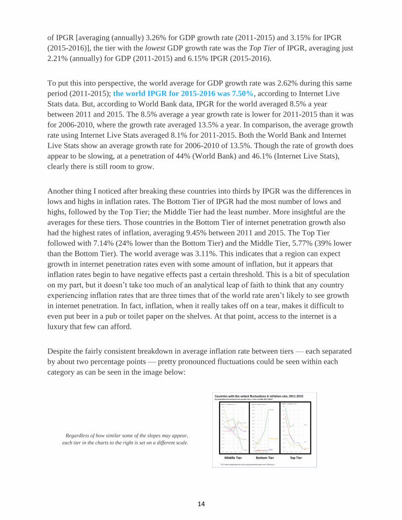
Despite the fairly consistent breakdown in average inflation rate between tiers — each separated
by about two percentage points — pretty pronounced fluctuations could be seen within each
category as can be seen in the image below:
Regardless of how similar some of the slopes may appear,
each tier in the charts to the right is set on a different scale.

15
In the image above, it is difficult to see how Morocco and Bahrain fluctuate because, compared
to the soaring rates of inflation in Venezuela (121.74% in 2015 alone) and Syria, their
fluctuations are small, but when Venezuela and Syria are eliminated, those fluctuations look like
this:
If those fluctuations still seem relatively modest, they may indeed be, but with the exception of
countries that were not included, these fluctuations were more significant than the others.
(Google Public Explorer did not provide data for all countries.) Puerto Rico, Palestine (West
Bank and Gaza), and the United Arab Emirates (UAE) were three countries that were not
included. Puerto Rico and the UAE are part of the bottom tier of internet penetration growth for
2015-2016, and Palestine is part of the top tier. As you can see, from the images above, if World
Bank data was provided for at least some of the years, I included the country (e.g., Syria, Yemen,
and Libya). Only countries that fell into the top 10% highest spike or lowest drop were included
and this was determined by the percentage rise or fall from the year previous. Countries that
were included fell into the top 10% highest/lowest category for at least one year and some [like
Morocco and Syria (bottom tier); Lebanon (middle tier); and El Salvador, Iraq, and Libya (top
tier)] fell into one or both of those categories more than once.
I also took a look at the ratio of employment to population for those aged 15 and older, but the
averages for the tiers were surprisingly similar. Those with the least internet penetration growth
between 2015 and 2016 did not have the lowest ratio of employment to population. In fact, the

16
averages were 57.69%, 56.61%, and 57.82% for the Bottom, Middle, and Top IPGR tiers.
Averages spanned 2011 to 2014 (2015 data not available yet). As a comparison, the world
average for this same time period was 59.64% and for the United States, 57.83. Assuming the
data I have for employment to population data is accurate, that ratio doesn’t tell us what kind of
influence it might have because all three tiers of internet penetration growth for 2015 to 2016
have roughly the same ratio (of employment to population). So, based off of the limited number
of factors I’ve taken a look at thus far, it appears that rates of inflation may be one of the single
biggest factors determining whether or not a country will see increased rates of internet
penetration growth and not necessarily GDP growth rate.
I should add that I did consider focusing on a bigger slice of IPGR. In other words, I
contemplated using growth rates between 2014 and 2016, rather than those between 2015 and
2016, but when I realized many of the same countries were present for both time periods, I kept
it to a one-year slice. In the next section I do widen that slice a bit and you will see for yourself
that it includes many of the same countries.
Top movers in IPGRs for the Middle East/North Africa (MENA) and Latin
America/Caribbean
For another interesting look at the differences in how internet penetration rates have changed
over the years, I took a look at internet penetration growth between 2014 and 2016 for the three
largest movers in the Arabic speaking countries — Libya (19%), Palestine (aka West Bank and
Gaza)(17%), and Iraq (15%) — and again for the three largest movers in Spanish speaking
countries — Peru (62%), El Salvador (29%), and Costa Rica (14%). I then used a tool providing
a moving timeline that goes back to 1990 for the category “Internet users as a percentage of the
population.” You can easily make these types of charts at Google Public Explorer. To view the
ones I made, click on the links below:
Internet Penetration Growth, 3 Largest Movers, Arabic Speaking Countries
Internet Penetration Growth, 3 Largest Movers, Spanish Speaking Countries
I don’t want to paint too narrow of a picture in terms of internet penetration between the regions.
In fact, despite my previous dissections of data, don’t walk away with the impression that the
Middle East has a higher internet penetration rate than Latin America. According to the World
Bank, the reverse is true. In fact, World Bank data via Google Public Explorer shows that
internet penetration rates for Latin America/Caribbean are 24.6% higher than for the Middle
East/North Africa (MENA). On the other hand, my rates of internet penetration for these two
regions show that MENA has a higher internet penetration rate (by 23.7%). What may explain

17
this flip flop of data is the fact that the World Bank includes many Caribbean countries along
with Latin America. My tabulations also included Caribbean countries, but only those whose
official or predominant language is Spanish. Likewise, my study of MENA also only included
those countries whose official or predominant language is Arabic. Though a certain percentage
of the population (in these countries I did not include) may speak Arabic, since Arabic is not the
official or predominant language, I did not include them. It is likely that the World Bank includes
some countries that tip the overall internet penetration rate in Latin America’s favor. As noted
earlier, I do also include Spain, but I also include Equatorial Guinea. This, however, was not
enough to tip the scale in Latin America’s favor, and you’ll see why if you keep reading. Since
World Bank data only goes out to 2015 via Google Public Explorer, I’ll use 2015 figures
throughout this section, and to make it even more consistent, I’ll use World Bank data for all
figures in this section (rather than rely on previously tabulated data from Internet Live Stats).
Keep in mind that these two sources of data use different terminology. The World Bank tabulates
“Internet users as percentage of population” and describes it as: “People with access to the
Internet per 100 inhabitants.” Internet Live Stats refers to this as “penetration.” They each use
slightly different sources and (I have to conclude) different collection, tabulation, and estimation
methods, but for the most part the numbers provided by each are roughly similar. The following
shows you the different sources used:
In addition to what you see listed for Internet Live Stats, its current internet user population estimates are
“delivered by Worldometers' RTS algorithm, which processes data elaborated through statistical analysis” after
being collected from the sources you see listed for it above.
As for the peculiarities of my averages, namely, I include Spain and Equatorial Guinea in my
averages for Latin America, at 2015 internet penetration rates of 78.7% and 21.3%, respectively,
any bump my average for Latin America might have received from the inclusion of Spain is
rather offset by the inclusion of Equatorial Guinea. With a combined average of 50.0% for these

18
two countries, this is higher than the average for all countries I included for Latin America
(48.6%), but not by much.
The World Bank includes five countries for MENA that I do not. For the sake of full disclosure, I
should shed some light on the additional countries the World Bank includes for the MENA
region. Those countries are: Algeria, Djibouti, Iran, Israel, and Malta. Three of those countries
— Algeria, Djibouti, and Iran — have internet penetration rates that fall below my average for
MENA (60.1%). Rates of penetration are listed in the chart below. The average for these three
countries is 31.4% (47.8% below my average for MENA). Two of the countries I did not include
for MENA — Israel and Malta — have a higher internet penetration rate than the averages for
MENA as a whole — 78.9% and 76.2%, respectively — with a combined average of 77.6%
(29.1% higher than my average for MENA). The average for non-Arabic speaking countries in
MENA is 49.9% (17.0% below the Arabic speaking countries in MENA).
The World Bank also includes several countries in its Latin America/Caribbean region that I do
not. You can see the full list in the table below. Again, I only included Spanish speaking
countries. 12 of the 18 countries you see below have internet penetration rates that are above the
average I calculated for the Spanish speaking countries of Latin America (plus Spain and
Equatorial Guinea). Internet penetration for these 12 countries ranges from 51.8% (St. Vincent
and the Grenadines) to 88.7% (Aruba) and average 67.5% (38.9% above my average for Latin
America/Caribbean). Countries falling below my average range from Haiti (12.2%) to Jamaica
(43.2%), with a combined average of 35.9% (26.1% below my average). The average for the
non-Spanish speaking countries in Latin America/Caribbean is 57.0% (17.3% above the Spanish
speaking countries in Latin America/Caribbean). World Bank data (as viewed via Google Public
Explorer) also includes the Turks and Caicos Islands, but the only data listed is 0% (for 1990), so
I omitted it. Several other countries comprise the Caribbean archipelago, but only those that
Google Public Explorer showed data for were included.

19
I threw a lot of stats at you in the last couple of paragraphs, so I decided to create a visual that
might help you see the differences between regions with respect to internet penetration:

20
To view a moving timeline comparing MENA with Latin America/Caribbean (using World Bank
data via Google Public Explorer), click on the link below:
Internet Penetration Growth, MENA vs. Latin America/Caribbean
In case you cannot access the links above, below is an example of what you will find in the form
of static images (using screenshots for the 3 largest movers in Spanish speaking countries). It is a
composite of three snapshots in time — the beginning (1990), 15 years later (2005), and five
years beyond that (2010). The sliding timeline at the bottom lets you know what year it is. The
unlabeled bubbles are other countries in the region. You can pause the timeline and hover on
each individual bubble to see where various countries are situated in relation to the ones you
have selected to study. In the last section of the digital triptych below, you’ll notice a new label

21
— Puerto Rico. That’s what was revealed when I hovered my mouse pointer over one of the
bubbles. You’ll also notice that Peru looks as if it might edge out Costa Rica by the time they get
to 2015. Be sure to check out this link here to see who comes out ahead. You’ll find that it’s
almost as exciting as a horse race. Anyway, I thought it was pretty cool and it’s free,
compliments of Google Public Explorer. I recommend you check it out.
Some differences between World Bank data and data from Internet Live Stats
In some sections of this post, internet data came from Internet Live Stats. The data Google Public
Explorer uses is from the World Bank and as far as internet penetration figures go, there appears
to be some pretty wide variances for certain countries. The chart below illuminates the ones for
just the six countries mentioned above:

22
Be sure to take note of how large the discrepancy is for Iraq’s figures and for El Salvador’s. I am
not aware of the reasons for these discrepancies. Initially, I might have been inclined to believe
that data is more difficult to retrieve from Iraq and El Salvador, but any more so than from
Libya? Clearly, different collection and/or estimation methods must be used in gathering this
data. I’ve alluded to some of this already by laying out the different sources each uses, but if you
have any additional insight on this, please post a comment.
To be fair to both the World Bank and Internet Live Stats, these countries just happen to have
some fairly large discrepancies. I didn’t look at every country on planet earth, but for the ones I
used in this study, most of the time, the figures between the World Bank and Internet Live Stats
were not off by much. Overall, Internet Live Stats tended to be slightly higher, by 1.4% to be
exact, but if you remember the statistics I included earlier, when all countries of the world are
considered and over a period of time, World Bank data may actually be slightly higher (by 5%
possibly?) than data found at Internet Live Stats. (I base this off of the averages of internet
growth rates I observed for 2011-2015). This is despite the fact that for 2016, Internet Live Stats
shows a higher figure for overall internet penetration than does the World Bank by 2.1
percentage points. Of the countries I looked at (the ones discussed in this study), no country had

23
a larger discrepancy between internet penetration rates, as reported by the World Bank and
Internet Live Stats, than the one I pointed out for Iraq.
Before I move on to a slightly different topic, I want to show you one more chart of the six
countries previously mentioned. Keep in mind that these six countries — Libya, Palestine, Iraq,
Peru, El Salvador, Costa Rica — showed the largest growth in internet penetration between 2014
and 2016 (among their respective regions). World Bank data via Google Public Explorer doesn’t
go out to 2016 yet, but it can show you trends between 2013 and 2015:
It should leave no doubt in anyone’s mind that GDP growth is a significant factor in internet
penetration growth. Five of the six countries saw GDP growth between 2013 and 2015. Three of
those six countries saw significant growth in GDP. The question is, by how much and for how
long does GDP growth help facilitate access to the internet? Can a country/region achieve
internet penetration growth without a concomitant rise in GDP? Is foreign aid/direct investment
the answer and if so, how much will it really help? If a country truly needs foreign aid, wouldn’t
money be better spent elsewhere rather than on developing an internet infrastructure allowing
more access to the World Wide Web? Furthermore, by what do we measure the effects of
internet access and what is its overall impact on a nation’s human development and overall well-
being? And lastly, and perhaps most germane to this post/article, what is the relationship
between internet penetration rates and user growth for social media sites, specifically educational

24
ones such as Duolingo? These surely can’t be new questions, and someone, somewhere, has
likely attempted to answer them already, but if you have any thoughts or opinions of your own
on this, or recommendations for further study/reading, please post your
thoughts/recommendations in the comment section.
Equatorial Guinea
In the meantime, let me leave you with some additional food for thought. The questions that I
posed in the preceding section were generated, in part, with some data about Equatorial Guinea
that continues to linger in my mind. If you look back on my chart titled, “Countries in the Top
Tier of Internet Penetration Growth (2015-2016),” you will notice that Equatorial Guinea’s
GDP (PPP) per capita is $43,522 (IMF data). The only country on that chart that has a higher per
capita GDP is Oman and no other country in Africa has a higher GDP (PPP) per capita than
Equatorial Guinea. And yet, the internet penetration rate of this country (21%) is one of the
lowest in the world. In fact, the world average is more than twice the amount of Equatorial
Guinea’s.
In terms of countries with comparable GDPs [those ranging from $34,054 (Israel) to $65,806
(Ireland)], the average internet penetration is 85%. Even when I take a look at just those
countries in this range whose GDP (PPP) per capita is lower than Equatorial Guinea’s, the
internet penetration is still 84%. In fact, the country with the lowest internet penetration in this
entire range — Israel to Ireland — is Saudi Arabia, yet, with a penetration of 64.7%, it has three
times the amount of penetration that Equatorial Guinea has. Countries with an internet
penetration ranging between 15 and 25% have an average GDP (PPP) per capita of $7,297.
Equatorial Guinea’s GDP (PPP) per capita is almost six times that amount.
Naturally, this caught my attention and made me want to look into it further, so I took a look at
some data via Google Public Explorer and put together a couple of charts for you to look at. I
decided to compare Equatorial Guinea to the top movers in terms of internet penetration growth
in MENA and Latin America between 2014 and 2016 — Libya and Peru. To help put things in
perspective, Libya’s overall internet penetration currently stands at 19%, Peru’s at 62%, and
Equatorial Guinea’s at 21% (figures rounded). GDP (PPP) per capita for these countries is
$14,679, $12,518, and $43,522, respectively. IPGRs between 2015 and 2016 were 9.9, 2.1, and
6.1%, respectively. All things considered, I am surprised Equatorial Guinea’s internet
penetration is still under 25%. This means less than one in four citizens of this country have
access to the internet.

25
The charts in the image above are interesting, but none of them explain Equatorial Guinea’s high
GDP per capita with respect to its relatively low internet penetration. (If you’re curious about
“net migration,” keep reading. It is explained in the section, “Growth in language vs. growth in
population — German, Spanish, and Turkish,” which you will find in Part 3 of this series.)

26
These charts are also interesting, but again, none of them explain why Equatorial Guinea might
have a higher GDP per capita than others without the concomitant internet penetration, although
Equatorial Guinea certainly did receive a lot of foreign direct investment in the 1990s. This is
due, in part, to the discovery of offshore oil deposits, which were made in 1995. At an
estimated reserve level of just a little more than a billion barrels, it ties with Brunei for 39th/40th
place in world oil reserve rankings. To put this in perspective, Argentina and Colombia have
more than twice as much as Equatorial Guinea and the next highest ranked Latin American
country — Ecuador — has eight times as much. And to put Equatorial Guinea’s GDP (PPP) per
capita into even more perspective, check out how it stacks up against these other countries with
vastly more oil reserves:

27
Despite these relatively modest reserves of oil in Equatorial Guinea, according to Santander (a
Spanish banking group), the main investors have been the United States, followed by China and
France. Investors should think twice, however, before investing money in Equatorial Guinea. For
reasons why this might not be such a good idea, read the U.S. State Department report, “2013
Investment Climate Statement - Equatorial Guinea.”
Continuing to try to see why Equatorial Guinea’s internet penetration would be so low,
compared to other countries in its GDP per capita bracket, I even threw in the mobile users per
100 people chart thinking that perhaps Equatorial Guinea’s lack of internet penetration might be
somewhat compensated for with mobile cell phone use, but clearly the figures in that chart don’t
explain Equatorial Guinea’s relatively low internet penetration. As can be seen in the chart
below, literacy rates don’t explain it either …

28
… but perhaps the level of spending on public education does shed some light on government
priorities for the intellectual enlightenment of its citizens. The only data that can even be seen for
Equatorial Guinea is a small red dot that indicates Equatorial Guinea spent 2.19% of its GDP on
education in 1998. Growth, or lack thereof, is difficult to quantify if you’re not collecting any
data to measure it by. That graph shouldn’t make the next statistic all that surprising. Among, the
following countries — Argentina, Colombia, Ecuador, Libya, and Peru — Equatorial Guinea
also scores the lowest on the Human Development Index (HDI). At .534, it falls 22% below
the average of those countries just mentioned and ranks 138 out of the total number of countries
on the entire list (193 in total). In other words, two-thirds of the countries on this list rank higher
than Equatorial Guinea in terms of human development and yet it has a GDP (PPP) per capita
that has it ranked at #24, which, by this standard, makes it one of the top 15% richest countries in
the world. In fact, if you take a look at that first column of data (the IMF data, mentioned earlier
in this article and which you can access by clicking on the link to “#24”), you’ll notice that the
United Kingdom, France, and Japan have less GDP (PPP) per capita than Equatorial Guinea.
Note: Since having written this, 2015 data has been replaced with 2016 data and I see that
Equatorial Guinea has dropped to $38,699 [GDP (PPP) per capita], and is now ranked at #31.
This still has it ranked above countries such as South Korea, Spain, and Italy.
Despite the findings above, I also decided to turn to the CIA World Factbook, taking a specific
look at the following factors:

29
I don’t know that this explains the relatively low penetration of internet access in Equatorial
Guinea, but Equatorial Guinea does have more of its GDP based in agriculture. However, the
amount based in agriculture is not that much more than what is found in Peru, which has an
internet penetration of 65% (according to Internet Live Stats). Peru’s access to the internet
started seeing growth at the beginning of the millennium, but really only began adding
significant growth during the past couple of years. According to World Bank data, it has had
more than 40% internet penetration since 2014. Equatorial Guinea, on the other hand, didn’t
really start seeing movement until 2010 and remains under 25%. To see a moving timeline
focusing on the internet growth for these two countries, click on the link below:
Internet Users as Percentage of Population — Equatorial Guinea and Peru
Another thing I noticed about the data from the CIA World Factbook was how much more
Equatorial Guinea is saving than the other countries. This may be due, in part, to the fact that it
has a sizeable number of citizens under the age of 14 (almost twice as much as the other
countries), so Equatorial Guinea may just be planning for the future, but one thing to keep in
mind is that 1 in 5 children in Equatorial Guinea don’t even make it to the age of 5. In fact, it
may be naïve to think Equatorial Guinea is planning ahead for the future of its citizens; in
addition to what I have already pointed out, it has one of the worst human rights records in the
world. Human trafficking is a particularly significant problem in this country.
Before leaving this section, I should point out that foreign direct investment is not the same as
foreign aid. For a well written and researched paper related to this topic, read “Funding Self-
Sustaining Development: The Role of Aid, FDI and Government in Economic Success,” by
Stephen Kosack and Jennifer Tobin. Whether you take the time to read it or not, you may find
the following series of charts worth looking at. The map charts show you the surrounding
countries for each of these three countries — Equatorial Guinea, Libya, and Peru — and relative
amounts of foreign aid distributed in the area. The darker the shading, the more aid the country
received.

30
The figures you see above come from the World Bank page and interactive database titled, “Net
official development assistance and official aid received (current US$).” If English is not
your first language, the site is also available in Spanish, French, Arabic, and Chinese.
If you take a look at 2010, a year in which Equatorial Guinea and Libya received a considerable
amount of foreign aid (compared to other years), you’ll see that the aid appears to have been
relatively modest compared to other countries in the region. You’ll notice that Peru shows a
substantial decline in foreign aid in 2010, but relatively speaking, appears to be receiving
roughly the same amount as surrounding countries. The noticeable dip in aid that you see for
Peru in the line chart for 2010 may be due to a diversion of funds to Chile or other areas in the
world affected by natural disasters during this year. As you can see in the chart below, Chile
does receive a spike in foreign aid during 2010:

31
Note that data for Equatorial Guinea only goes back to 1973. As for why I chose to focus on the
year 2010, it was simply because a lot of aid was distributed (or dropped as in the case of Peru)
on or around this time period. Major world events that may or may not have influenced the
distribution of foreign aid during 2010 include: the drawdown of troops in Iraq; the earthquakes
in Haiti, Chile, and Indonesia; the closure of embassies in Yemen; the bailout package for
Greece and subsequent rescue package for Ireland; and, in December, the launch of the Arab
Spring. In 2010, the World Health Organization also declared the end of the H1N1 influenza
pandemic, which had begun a year prior in Mexico. Another potentially influencing factor during
this year was a reform of the IMF which shifted 6% of the voting shares to developing nations
and countries with emerging markets. If that wasn’t enough to stir the foreign aid pot, it was
also designated as the “Year for Combating Poverty and Social Exclusion” by the European
Union.
So, for now, Equatorial Guinea has wealth via oil from offshore deposits and timber from the
forest, but for how much longer either of these will continue to be a source of income for
Equatorial Guineans depends on available reserves and sustainability. For a quick, fun overview
of Equatorial Guinea that touches on the oil issue a bit, take a look at, “Geography Now!
Equatorial Guinea,” specifically minutes 3:43 to 4:18. For a more serious treatment of life in
Equatorial Guinea, see “Equatorial Guinea: Poverty stricken and the new capital city deep
in the forest,” a short video that aired on BBC in 2012. You’ll actually get to see and hear the

32
president of the country speaking in Spanish, and since he rarely gives interviews, you may want
to check it out.
But what a country does with its wealth is another factor altogether. Equatorial Guinea caught
my attention, in part, because I happened to notice that its GDP was almost as high as Oman’s, a
country known for its oil wealth. Oman has a GDP (PPP) per capita of $43,707 and an internet
penetration rate of 71.1%. Its human development is considered high with an estimated 2014
HDI score of .793. Regarding one aspect of investment in its citizens — public education on
spending — Oman has shown a steady and sharp rise in education since 2005, according to
World Bank data. In 2013, it spent 5.01% of its GDP on education, more than the world average,
and up from what it spent in 2005 — 3.52% (an increase of more than 40%). But education and
access to the internet are somewhat irrelevant if citizens are struggling just to stay alive. And in
these areas — education and health — Equatorial Guinea falls short on both. From an article in
African Affairs titled, “The Oil Boom in Equatorial Guinea,” Jędrzej George Frynas writes:
IMF figures suggest that Equatorial Guinea’s government expenditure on health and
education is much lower than elsewhere in Africa, even in comparison with other petro-
states. In 1997–2002, the country spent a mere 1.23% of its government expenditure on
health, …
And adds this about Equatorial Guinea’s education spending:
Equatorial Guinea spent 1.67% on education …. Indeed, Equatorial Guinea’s share has
markedly decreased since the development of oil; education spending dropped from 6.43
to 1.67% in the period 1992–6. As a result, health and education indicators for Equatorial
Guinea are far lower than in countries with comparable GDP per capita levels.
As mentioned earlier, 1 in 5 Equatorial Guineans don’t make it to the age of 5. For those who do
make it past the age of 5, life expectancy in Equatorial Guinea is approximately 57 years of age
according to some estimates. In contrast, someone born in Oman can expect to live to the age
of 74. Those born in the United States can expect to live to the age of 78 and those born in Japan
to 83. In fact, only about a dozen countries have a lower life expectancy than Equatorial Guinea
and yet, due to oil revenue, its per capita GDP (PPP) is one of the highest in the world. It doesn’t
appear that the oil money is trickling down to the people at least as far as health and longevity is
concerned.
But Equatorial Guinea isn’t the only country in which revenue from resources isn’t making its
way to everyone in the country. Below is a GIF of an interview I recently viewed in an Al
Jazeera documentary titled, “The Secret of the Seven Sisters 3 of 4, The Dancing Bear.” In it,
a man refers to the Tengiz oil field in Kazakhstan, which was originally discovered in 1979 and
is the sixth largest oil field in the world. In this clip, the man refers to oil projects that got under
way in the 1990s.

33
According to World Bank data, Kazakhstan’s GDP growth rate went from negative 12.6% in
1994 to a high of 13.5% in 2001, the same year that a pipeline was built to transport oil from
Tengiz to the Black Sea port of Novorossiysk in Russia. Kazakhstan produces almost 30 times
the amount of oil Equatorial Guinea does and its population is 15 times the size, but its GDP
(PPP) per capita is just $25,912. So, for those who think the high GDP (PPP) per capita
Equatorial Guineans “enjoy” is simply due to having a smaller number of people with which to
spread the wealth, that clearly doesn’t explain everything.
Even when oil money does trickle down, often times jobs connected to the oil industry are reliant
upon skilled workers and are often granted to foreign workers rather than to the ones living in the
oil rich nation. For example, using the latest figures listed at the CIA World Factbook, the
unemployment rate for Oman is 15.0%, 5.0% for Kazakhstan, and 22.3% for Equatorial Guinea.
However, when I take a look at all of those between the ages of 15 and 65 and compare that
figure to the number in the labor force, it paints a different picture [kind of like how the U.S.
reports an unemployment rate of 4.9% (June 2016), even though a third of the country is no
longer in the labor force]. If you do the math for the countries of Oman, Kazakhstan, and
Equatorial Guinea, it shows the following:

34
I added the figures for the percentage of those below the poverty line to further illustrate that the
GDP (PPP) per capita for Equatorial Guinea is clearly a bit misleading. The CIA World
Factbook doesn’t actually list 75% for Equatorial Guinea, but adds this in its demographic
profile of the country:
Despite a boom in oil production in the 1990s, authoritarianism, corruption, and resource
mismanagement have concentrated the benefits among a small elite. These practices have
perpetuated income inequality and unbalanced development, such as low public spending
on education and health care. Unemployment remains problematic because the oil-
dominated economy employs a small labor force dependent on skilled foreign workers.
The agricultural sector, Equatorial Guinea’s main employer, continues to deteriorate
because of a lack of investment and the migration of rural workers to urban areas. About
three-quarters of the population lives below the poverty line.
35
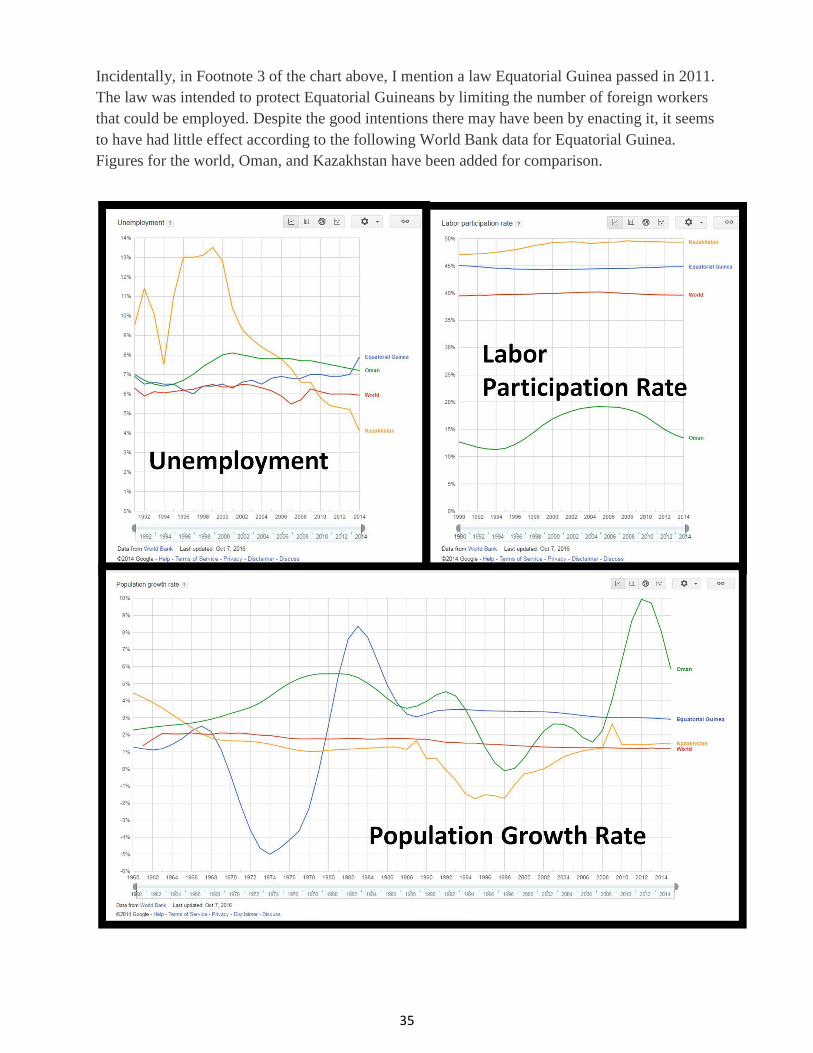
Incidentally, in Footnote 3 of the chart above, I mention a law Equatorial Guinea passed in 2011.
The law was intended to protect Equatorial Guineans by limiting the number of foreign workers
that could be employed. Despite the good intentions there may have been by enacting it, it seems
to have had little effect according to the following World Bank data for Equatorial Guinea.
Figures for the world, Oman, and Kazakhstan have been added for comparison.

36
As you can see, the labor participation rate really hasn’t risen all that much since the 2011 law
was enacted, and, at the same time, the unemployment rate has also continued to rise.
Regardless of the apparent income inequality that exists in Equatorial Guinea, during times when
oil prices are high, the economy of oil-producing countries does well and when it falls, so do
those same countries, especially in those with a lack of diversification. Falling oil prices, which
affect how much revenue a country can bring in, can only do so much, however. The prevalence
and strength of corruption will ultimately affect how that revenue is spent. All three of these
countries — Oman, Kazakhstan, and Equatorial Guinea — will be affected by the rise or fall of
oil prices and if corruption is already helping to destabilize these countries and/or limit their
growth, what will happen as oil prices continue to decline?
Oman should be of the least concern. In 2015, Oman was ranked 60 (out of 168) on the
Corruption Perceptions Index (CPI). Furthermore, Oman is not an anchor holding its region
together. It produces oil, but not nearly as much as the very oil rich countries of the Middle East
— Saudi Arabia, Iraq, Iran, the UAE, and Kuwait. Kuwait, which produces fewer barrels of oil
than Saudi Arabia, Iraq, Iran, and the UAE, produces more than three times as much oil as Oman
on a daily basis. Kazakhstan, on the other hand, was ranked 125 on the CPI, and unlike Oman, it
is an anchor in its region; it has the largest economy in Central Asia. As for Equatorial Guinea, it
was among 20 countries with the highest level of corruption in the world in 2013. I have seen
little to make me think that has changed during the last few years.
But what’s the big deal about corruption anyway? How might corruption impact a country?
Well, among several other factors, it can deter other countries from wanting to do business with
it or invest in it. But even beyond that, it can hinder investment in a country’s citizens through
programs such as education. Let’s take a look at Kazakhstan, for example. Despite the discovery
of the Tengiz oil field, Kazakhstan’s spending on education fell in a rather precipitous and
jagged downward trajectory from 1997 to 2004. Though it has risen since then, in 2009, public
education spending was just 3.06%, down 30% since its peak in 1997. Though it does show signs
of improvement in this area, clearly profits from oil aren’t funneling a great deal to education.
But, at least 55.8% of its citizens have access to the internet. With the rise of Massive Open
Online Courses (MOOCs) and other online educational opportunities (to include Duolingo),
perhaps those in Kazakhstan can find other ways to educate themselves.
With an internet penetration rate of just 20.9%, many in Equatorial Guinea won’t have that
opportunity and with far fewer oil reserves than Kazakhstan and a forest whose resources are
being uprooted by China, Equatorial Guinea may need to diversify more than most other oil-
producing nations. Investment in its people via public education and access to the World Wide
Web could help it do just that.

37
You may think that giving people access to the World Wide Web is silly or frivolous in a country
where the citizens are just struggling to stay alive, and you may be right, but allow me to point
out another country whose internet penetration is roughly the same as Equatorial Guinea’s —
Cuba. According to Internet Live Stats, Cuba had an internet penetration rate of 32.4% in 2016.
This is actually pretty good when you consider that as of at least 2015, it was still illegal to have
an internet connection inside of one’s home. Needless to say, Cubans, like anyone else want
access, and so it should come as no surprise that there is a black market in Cuba for access to the
information and entertainment that technology and the World Wide Web can provide.
It is true that Cuba has a lot of things going for it that Equatorial Guinea doesn’t. For example,
when you take a look at things such as infant mortality rate, life expectancy, and public spending
on education, Cuba is well ahead of Equatorial Guinea. However, as I’ve mentioned previously,
Equatorial Guinea’s GDP (PPP) per capita is $43,522. Do you know what Cuba’s is? $20,646.
Though Equatorial Guinea may have some obstacles standing in the way of its development, so
does Cuba. Eric Schmidt, executive chairman of Google, visited Cuba in 2014. When he
returned, he declared that:
Cuba was trapped in the Internet of the 1990s and heavily censored, with American-
engineered hardware and software losing out to Chinese ICT [information and
communication technology] infrastructure…. If you wish the country to modernize … the
best way to do this is to empower the citizens with smartphones and encourage freedom
of expression and put information tools into the hands of Cubans directly.
—From “Overcoming Cuba’s Internal Embargo,” Current History printed in its
February 2015 issue, excerpt from p. 75.
Maybe what’s good for Cuba would be good for Equatorial Guinea, too.
Part 3 is more or less a wrap up covering the World Wide Web, a bit more on smartphone
penetration, as well as language and population trends.