Pareto Chart - kisi.deu.edu.trkisi.deu.edu.tr/banu.atrek/PRD 4111 product and... · A Pareto Chart...
21
Pareto Chart Gizem YILDIZGÖR – 2014432116 İbrahim ULU - 2500432040 Quality Control Tools in Problem Solving
Transcript of Pareto Chart - kisi.deu.edu.trkisi.deu.edu.tr/banu.atrek/PRD 4111 product and... · A Pareto Chart...

Pareto Chart
Gizem YILDIZGÖR – 2014432116İbrahim ULU - 2500432040
Quality Control Tools in Problem Solving

What does the problem word tell us?

First we define the problem means;
‘The problem is the situations that need to be resolved, whichcan prevent or hinder the achievement of the targeted results.’

History
Named after Vilfredo Pareto –an Italian economist
He observed in 1906 that 20% of the Italian population owned 80% of Italy’s wealth.

What Is It? One of the 7 tools of Quality Management
Statistical technique in decision making for selection of limited tasks which havesignificant overall impact.

Pareto Principle Doing 20% of work generates advantage of 80% of
entire job
Focus on identifying the ‘vital few’ from the ‘trivialmany’
The exact percentages may vary in each situation.
However, most of the activity is caused by relativelyfew of its factors.
Helps focusing on what really matters.
In terms of quality improvement, large majority of problems (80%) are created by a few key causes(20%).

‘PARETO CHART’ A Pareto Chart is a series of bars whose heights reflect the frequency or impact of
problems.
Normally plots the frequencies of categorical data:• Such as defect and errors.
The most frequent activities are placed in order from left to right.
The horizontal axis represents the types of activities:• Such as issues,problems or causes.
The vertical axis represents the frequencies of those activities.
Separates the vital from the trival

Purpose of the Pareto Chart;
In the problems or conditions, identifying uncertain situationsidentifying critical elements

Topics that can be explained with pareto diagram
1)which cause / factor is most important and what is the significancelevel,
2) within all the reasons, what each cause is,
3) which cause must be resolved to make the most effective kaizen,

Kai is change and Zen even better
The aim of Kaizen: the primary objective is to make theprocess in production better with small but effectivechanges.
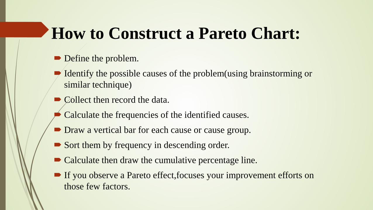
How to Construct a Pareto Chart: Define the problem. Identify the possible causes of the problem(using brainstorming or
similar technique) Collect then record the data. Calculate the frequencies of the identified causes. Draw a vertical bar for each cause or cause group. Sort them by frequency in descending order. Calculate then draw the cumulative percentage line. If you observe a Pareto effect,focuses your improvement efforts on
those few factors.

Pareto chart is simple but it is extremely effective technique in the diagnosis and analysis of the problem.

The Pareto Principle in Work-Lİfe
Problem Solving
To-Do List of the day
Passion
Relationship
Cut the Clutter


Pareto Chart example;
If a business was investigating the delay associatedwith processing credit card applications,the data could be grouped into the following categories: nosignature,residential address not valid, non-legiblehandwriting, already a customer, and other.

Step 1:Record the raw data
Category Frequency
No Address 9
Non- legible writing 22
Current Customer 15
No Signature 40
Other 8

Step 2: Order the Data
Category Frequency
No Signature 40
Non-legible writing 22
Current Customer 15
No Address 9
Other 8

Step 3:Determine the Percentage That Each Category Represents
Category Frequency Percentage
No Signature 40 43%
Non-legible Writing 22 23%
Current Customer 15 16%
No Address 9 10%
Other 8 8%

Step 4: Determine the Percentage That Each Category Represents
Category Frequency Percentage CumulativePercentage
No Signature 40 43% 43%
Non-legible Writing 22 23% 66%
Current Customer 15 16% 82%
No Address 9 10% 92%
Others 8 8% 100%