Parallels Sg
12
Essential guidelines to help you create in the Parallels style Updated November 2010 Parallels ® Corporate Style Guide
-
Upload
srtaalmendra -
Category
Documents
-
view
231 -
download
0
Transcript of Parallels Sg

8/7/2019 Parallels Sg
http://slidepdf.com/reader/full/parallels-sg 1/12
Essential guidelines to help you create in the Parallels style
Updated November 2010
Parallels® Corporate Style Guide

8/7/2019 Parallels Sg
http://slidepdf.com/reader/full/parallels-sg 2/12
2
This updated style guide provides the most recent direction for our most important brand elements. Effective
Nov. 1, 2010, all new digital, print and other communications should reflect these guidelines.These guidelines contain the basic building blocks to create communications in the Parallels “style.” When used
appropriately and consistently, our brand expression will solidify our standing in customers‟ and prospects‟
minds.
Please note:
• Those responsible for consumer marketing and communications should also refer to the Consumer Brand
Guidelines, which work in conjunction with this corporate style guide.• All new consumer-oriented marketing should follow the Consumer Guidelines, first published in September
2010 and updated quarterly.
• Updated Partner-specific Guidelines are also currently in development, to be published in Q4 2010.
If you have any questions regarding the Parallels brand or these guidelines, please contact:
• Donna Sellers, Director of Brand Marketing
[email protected], +1 425.282.1738or
• Kerry McGowne, Vice President, Corporate [email protected], +1 425.282.1758
Parallels Style Guide
Parallels Style Guide -- November 2010

8/7/2019 Parallels Sg
http://slidepdf.com/reader/full/parallels-sg 3/12
3
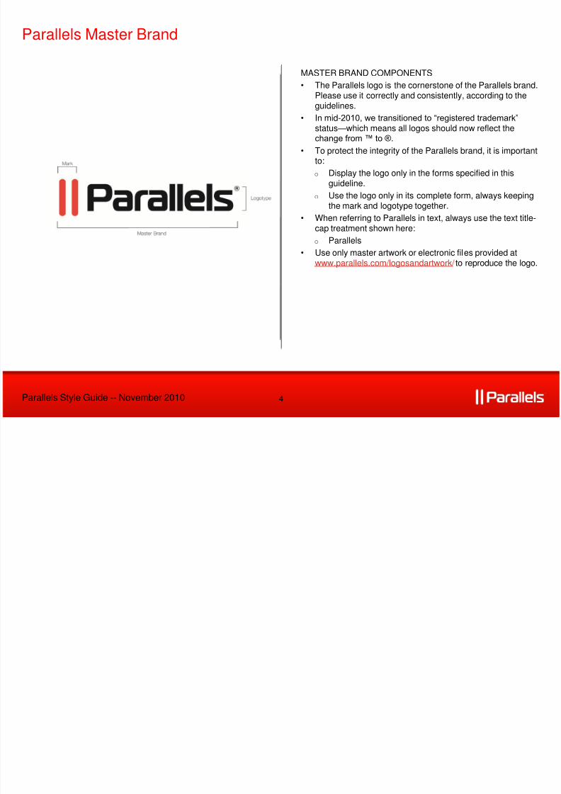
• The Parallels logo consists of two elements: a graphic device and a “wordmark” in a specific font.
• The distinctive graphic device that is the core visual descriptor for the Parallels brand are referred to as“the parallel bars.”
• The “parallel bars” are simple, yet powerful, graphical elements, and they reinforce our key attributes as a
symbol of efficiency and optimization. The parallel bars must be used with the Parallels logo and cannotbe combined with any other logo or messaging.
• The Parallels wordmark should never be altered, nor stand alone as an image without the distinct redbars.
The Parallels Logo
Parallels Style Guide -- November 2010
8/7/2019 Parallels Sg
http://slidepdf.com/reader/full/parallels-sg 4/12
4
MASTER BRAND COMPONENTS
• The Parallels logo is the cornerstone of the Parallels brand.
Please use it correctly and consistently, according to theguidelines.
• In mid-2010, we transitioned to “registered trademark”
status—which means all logos should now reflect thechange from ™ to ®.
• To protect the integrity of the Parallels brand, it is importantto:
o Display the logo only in the forms specified in thisguideline.
o Use the logo only in its complete form, always keepingthe mark and logotype together.
• When referring to Parallels in text, always use the text title-cap treatment shown here:
o Parallels
• Use only master artwork or electronic files provided atwww.parallels.com/logosandartwork/ to reproduce the logo.
Parallels Master Brand
Parallels Style Guide -- November 2010
8/7/2019 Parallels Sg
http://slidepdf.com/reader/full/parallels-sg 5/12
5
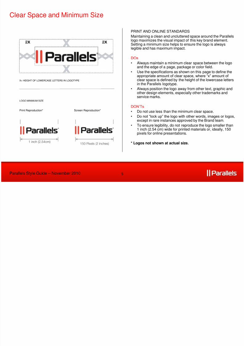
PRINT AND ONLINE STANDARDS
Maintaining a clean and uncluttered space around the Parallelslogo maximizes the visual impact of this key brand element.Setting a minimum size helps to ensure the logo is alwayslegible and has maximum impact.
DOs
• Always maintain a minimum clear space between the logoand the edge of a page, package or color field.
• Use the specifications as shown on this page to define theappropriate amount of clear space, where “x” amount of clear space is defined by the height of the lowercase letters
in the Parallels logotype.• Always position the logo away from other text, graphic and
other design elements, especially other trademarks andservice marks.
DON‟Ts
• Do not use less than the minimum clear space.
• Do not “lock up” the logo with other words, images or logos,except in rare instances approved by the Brand team.
• To ensure legibility, do not reproduce the logo smaller than1 inch (2.54 cm) wide for printed materials or, ideally, 150pixels for online presentations.
* Logos not shown at actual size.
Clear Space and Minimum Size
Parallels Style Guide -- November 2010
X= HEIGHT OF LOWERCASE LETTERS IN LOGOTYPE
Print Reproduction* Screen Reproduction*
LOGO MINIMUM SIZE

8/7/2019 Parallels Sg
http://slidepdf.com/reader/full/parallels-sg 6/12

8/7/2019 Parallels Sg
http://slidepdf.com/reader/full/parallels-sg 7/12
7
LOGO GUIDELINES
• Do not attempt to re-create any portion of the logo.
• Do not separate the “red bars” mark from the logotype. • Do not rotate, skew, redraw, re-proportion, or otherwise
alter or distort the logo or its elements in any way.
• Do not combine the logo with any other element—such aslogos, words, graphics, photos, slogans or symbols—thatmight seem to create a hybrid mark.
• Do not reproduce the logo in colors other than thosesuggested in this document.
• Do not place the logo on a patterned background that
makes it difficult to read.
Improper Use of Logo
Parallels Style Guide -- November 2010

8/7/2019 Parallels Sg
http://slidepdf.com/reader/full/parallels-sg 8/12
8
PRODUCT BRANDS
• Within its Master Brand architecture, Parallels supports a
variety of products and services in their respective markets.In all cases, these product brands are secondary to theParallels master brand.
• The product brands do not have individual logos; theyshould be typeset in accordance with the approved fonts ofParallels.
• The Parallels Master Brand comes first with a ® symbol
(registered trademark), followed by the product name,except in the case of Parallels Desktop, where the entire
phrase is a registered trademark.
Parallels Products
Parallels Style Guide -- November 2010

8/7/2019 Parallels Sg
http://slidepdf.com/reader/full/parallels-sg 9/12
9
WORKING WITH PRODUCT BRANDS
DOs• When creating an image for packaging or product
interfaces, the company and product names should betypeset according to guidelines and with the approved fontsof Parallels.
• Be mindful to add the registered trademark after “Parallels,”
except in the case of Parallels Desktop, where it follows“Desktop”.
• In text, the company and product names should match the
font of the surrounding text; in Parallels materials, the fontshould be one of the approved fonts covered in this StyleGuide.
DON‟Ts
• Do not typeset Parallels and the product names using twodifferent colors. Keep it simple and stick to the approvedcolor.
• Do not mix the Parallels logo with any of the product
names. It should be consistent, only to be typeset with oneof the approved fonts of Parallels.
• Qualifiers and edition numbers may be treated differently.Contact the Brand team to discuss specific instances.
Parallels Product Brand Application
Parallels Style Guide -- November 2010

8/7/2019 Parallels Sg
http://slidepdf.com/reader/full/parallels-sg 10/12
10
TRADEMARK GUIDANCE
Parallels Logo
• The company logo includes a ® (registered trademark). • Do not try to reproduce the ® (registered trademark) on the
logo. Use only master artwork or electronic files to preservedesign integrity and legal protection.
Parallels Company Name
• When the Parallels company name is used in body copy,the ® (registered trademark) symbol is required in the first
occurrence.
• All subsequent references may omit the trademark.
Product Names
• When referring to a product name, the Parallels MasterBrand comes first with a ® symbol, followed by the product
name (except in the case of Parallels Desktop).
• Products do not have product logos and should be typesetin line with the approved fonts of Parallels.
Trademark Sizing
• In text, all trademark symbols should be set in super-script
and then further reduced in size. Trademark symbolsshould be clearly legible, but not visually distracting.
• In text and imagery sizing, it is typically necessary tomanually adjust trademark symbols, as they do not scaleproportionally.
Parallels Trademarks
Parallels Style Guide -- November 2010
THE COMPANY NAME USED IN COPY FOR HEADERS OR SUBHEADS
PRODUCT NAMING AND TRADEMARKING
8/7/2019 Parallels Sg
http://slidepdf.com/reader/full/parallels-sg 11/12
11
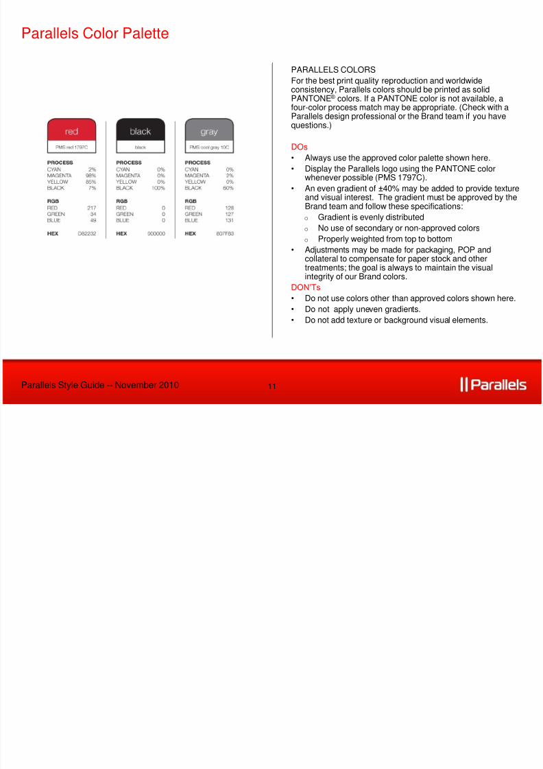
PARALLELS COLORS
For the best print quality reproduction and worldwideconsistency, Parallels colors should be printed as solidPANTONE® colors. If a PANTONE color is not available, afour-color process match may be appropriate. (Check with aParallels design professional or the Brand team if you havequestions.)
DOs
• Always use the approved color palette shown here.
• Display the Parallels logo using the PANTONE colorwhenever possible (PMS 1797C).
• An even gradient of ±40% may be added to provide textureand visual interest. The gradient must be approved by theBrand team and follow these specifications:
o Gradient is evenly distributed
o No use of secondary or non-approved colors
o Properly weighted from top to bottom
• Adjustments may be made for packaging, POP andcollateral to compensate for paper stock and othertreatments; the goal is always to maintain the visualintegrity of our Brand colors.
DON‟Ts • Do not use colors other than approved colors shown here.
• Do not apply uneven gradients.
• Do not add texture or background visual elements.
Parallels Color Palette
Parallels Style Guide -- November 2010

8/7/2019 Parallels Sg
http://slidepdf.com/reader/full/parallels-sg 12/12
12
FONT OPTIONS
• To help establish a consistent and credible brand style, two
type style „families‟ have been chosen to allow for flexibilityand individuality, while also ensuring universality acrosssoftware programs and online applications.
• The Helvetica Neue family has been chosen for collateraldevelopment because of its universal acceptance, legibilityand range of font weights.
• Arial has been chosen exclusively for online and electronicapplications such as Microsoft Word and PowerPoint. Thefoundry for the font is Adobe.
Corporate Fonts
Parallels Style Guide -- November 2010
ONLINE AND ELECTRONIC MEDIA FONT USAGE
Arial Family