panamax boards2nddraft
7
I initially started this brief with the intention of developing a brand identity and producing a range of packaging solutions for the new identity to feature on. However, this proved not to be my focus when exploring where I could take the brief and make it my own. I soon decided to focus on typography and layout and use packaging as a format to deliver my ideas, instead of crafting intricate packaging solutions. Once my focus shifted I felt more relaxed with the brief and I could use my concept to deliver meaningful resolutions appropriate to my target audience. WHAT’S YOUR CONCEPT? The concept is ‘Panamax: the only hangover cure you will need’. This product will act as something that is bought on inpulse. That means that it will become part of their everyday lives and will be a regular purchase. WHO’S YOUR TARGET AUDIENCE? They are bus commuters who work during the week and socialise with friends during the evenings and weekends. They are in touch with the latest technology and use the social networking sites. They go to pubs and clubs and drink regularly. They like going out but don’t enjoy the experience after. They drink responsibly but will throw caution to the wind every now again. BACKGROUND INFORMATION The brief was simple: Panamax wanted to launch their brand of paracetamol products in the UK for the first time. They needed a new image, a target audience, and they wanted to establish a market position. Their new identity needed to be contemporary but not alienating. This would be applied across a range of newly designed packaging and promotional artwork, therefore it had to be recognisable on the side of a building and on the side of a pen.
-
Upload
adam-townend -
Category
Documents
-
view
221 -
download
1
description
2nd draft of panamax boards
Transcript of panamax boards2nddraft

I initially started this brief with the intention of developing a brand identity and producing a range of packaging solutions for the new identity to feature on. However, this proved not to be my focus when exploring where I could take the brief and make it my own. I soon decided to focus on typography and layout
and use packaging as a format to deliver my ideas, instead of crafting intricate packaging solutions. Once my focus shifted I felt more relaxed with the brief and I could use my concept to deliver meaningful resolutions appropriate to my target audience.
WHAT’S YOUR CONCEPT?The concept is ‘Panamax: the only hangover cure you will need’. This product will act as something that is bought on inpulse. That means that it will become part of their everyday lives and will be a regular purchase.
WHO’S YOUR TARGET AUDIENCE?They are bus commuters who work during the week and socialise with friends during the evenings and weekends. They are in touch with the latest technology and use the social networking sites. They go to pubs and clubs and drink regularly. They like going out but don’t enjoy the experience after. They drink responsibly but will throw caution to the wind every now again.
BACKGROUND INFORMATIONThe brief was simple: Panamax wanted to launch their brand of paracetamol products in the UK for the first time. They needed a new image, a target audience, and they wanted to establish a market position. Their new identity needed to be contemporary but not alienating. This would be applied across a range of newly designed packaging and promotional artwork, therefore it had to be recognisable on the side of a building and on the side of a pen.

Researching for this product was a difficult task as this was to be a new product. Most of my research proved to be secondary appose to the packaging that I collected to inform my design direction. My visual research gave me a wide variety to take ideas from and use to inform my own design decisions.
My work for this brief was heavily influenced by the Swiss graphic design movement of the 1950’s. It informed much of my typographic and layout decisions and its timelessness meant that it was appropriate for an audience of today.
THE RESEARCH
SECONDARY
PRIMARY
My initial ideas led me towards the reliability of other hangover cures, and I soon started finding recipes for homemade hangover cures. I considered my audience as ones who would try anything for attention and that is where my content came from. There was little point trying to say this product was
different to any other because I felt that they would see it as more coroporate rubbish. I know that by putting the ingredients on the pack, it would not only be an open invitation to try the remedy but they will still have the paracetamol tablets when it doesn’t work.
THE DEVELOPMENT

My initial ideas led me towards the reliability of other hangover cures, and I soon started finding recipes for home made hangover cures. I considered my audience as ones who would try anything for attention and that is where my content came from. There was little point trying to say this product was
different to any other because I felt that they would see straight through it as more coroporate rubbish. I know that by putting the ingredients on the pack, it would not only be an open invitation to try the remedy but they will still have the paracetamol tablets when it doesn’t work.
THE DEVELOPMENT STAGE 2

These final designs went beyond what I initially planned my range to be. I originally thought that I would create a range of three packs with varied quantities. Each pack would contain 8, 16 or 30 tablets but my focus switched to other products after crit feedback. I thought about how one might feeling
after a heavy night out and designed a full hangover pack, which would cater for all their hangover needs. Although this created more work for myself it was worth the extra effort to get it all done. I then could consider the distribution and screen delivery of the brief.
THE FINAL DESIGNS

These show all the products I designed working as one. The hangover kit provides a good distribution platform to bolster the sales of the paracetamol product. The other products in the range would not signal the start of a new line, they would be there to purely aid the focus on the panamax brand to show them
as user friendly. The packaging is supported by additional material in the form of a information leaflet come poster which would have a simple side and a detailed side. The important stuff needed to be on the front and the drier copy would be presented on the back.
THE DELIVERY
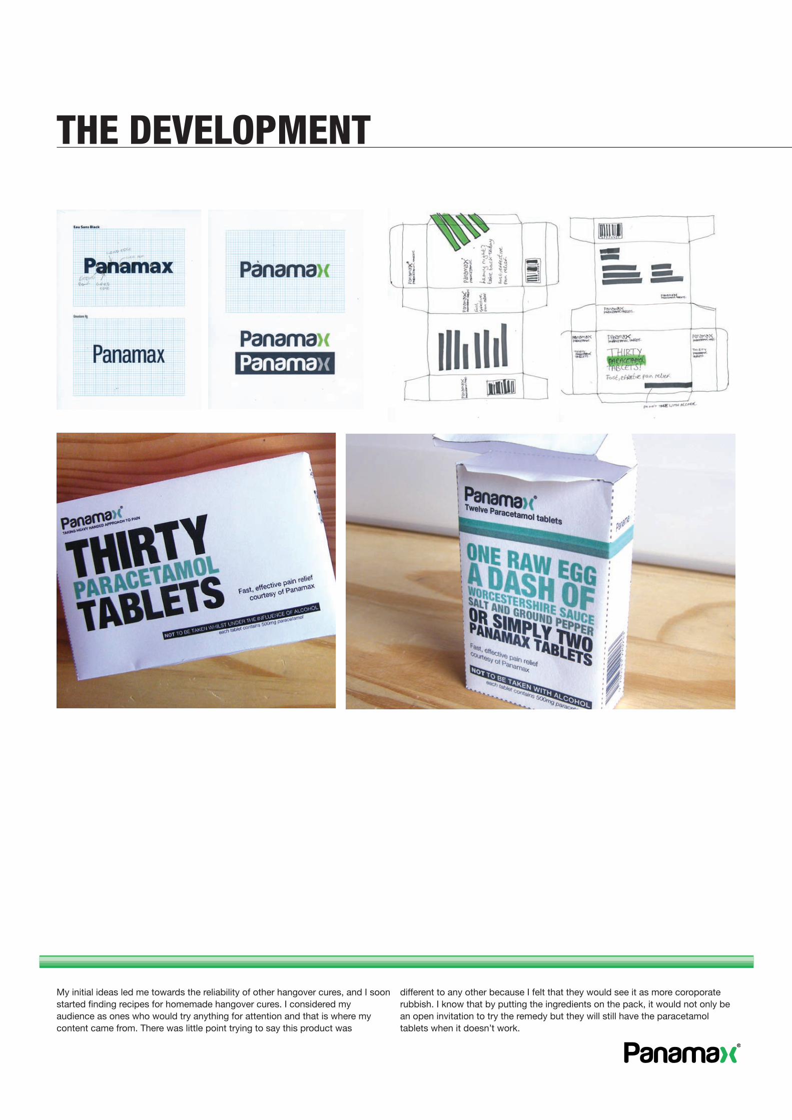
My distribution method and screen delivery became one in the same, which is how I envisaged it at the start of the brief. My attention turned towards giving my audience information on how to create their own hangover remedies, and using Panamax to sponsor it.
I thought it was a good way of indirectly advertising the Panamax product as I believe these hangover cures are purely based on myth. I felt the content suited the audience and the app would be well recieved as the majority of iPhone applications are not to be taken too seriously.
THE DISTRIBUTION