PAINTINGS SPECIALTY GROUP AMERICAN INSTITUTE FOR ......"Dear Mr. Bernstein: I hear you are looking...
58
PAINTINGS SPECIALTY GROUP AMERICAN INSTITUTE FOR CONSERVATION POSTPRINTS OF PAPERS PRESENTED AT THE SEVENTEENTH ANNUAL MEETING CINCINNATI, OHIO, MAY 31 - JUNE 4, 1989
Transcript of PAINTINGS SPECIALTY GROUP AMERICAN INSTITUTE FOR ......"Dear Mr. Bernstein: I hear you are looking...

PAINTINGS SPECIALTY GROUP AMERICAN INSTITUTE FOR CONSERVATION
POSTPRINTS OF PAPERS PRESENTED AT THE SEVENTEENTH ANNUAL MEETING CINCINNATI, OHIO, MAY 31 - JUNE 4, 1989


The following are papers presented during the Paintings Specialty Group sessions at the 1989 Cincinnati Meeting. A fen of the presentations Mill be subiitted for publication to the Journal or Studies in Conservation and in these cases an abstract is provided in lieu of a paper as a record of this Meeting.
These papers have not been edited and are published as received. Responsibility for Methods and/or Materials described herein rests solely Mith the contributor. The papers are listed alphabetically by contributor.


Table of Contents
Jaies Bernstein, Studio Tips * I
E»il Bosshard and Mervin J. Richard, Cliiatized Vitrines for Paintings, an Uncomplicated but Efficient Method 15
David Erhardt and Jai-sun Tsang, Oil Painting; History vs Technology 17
Eiiett Carl Grin, Restoration of Birth of Bacchus by Guilio Roiano 18
Jaies Scott Martin, Exaiination and Cleaning of a Portrait by Wiliiai Merrit Chase 19
Anik Morrow, Gustave Courbet: Materials, Techniques and Probleis Encountered With the Attribution of The Mill 22 Gianfranco Pocobene and Ian Hodkinson, Use of a Pressure Sensitive Adhesive
to Facilitate the Transfer of a Severely Tented Painting 23
Steven Prins, Panel-Stretcher Design for Conservation 24
J. Nilliai Shank, Treatient of Down by the River, a Panel Painting by Maxfield Parrish 29
Shelley A. Svoboda and Caiilla J. Van Vooren, An Investigation into Albert Pinkhat Ryder's Painting Materials and Techniques with Additional Research on Forgeries 36 Caiilla J. Van Vooren, Artist's Techniques Data File: On-going Research 51

STUDIO TIPS A Session of Brief Contributions for the Paintings Specialty Group
James Bernstein, Session Chair Conservator, San Francisco Museum of Modern Art and Private Practice, San Francisco, CA
Tom Caley, Paintings Conservator, Intermuseum Conservation Association, Oberlin, OH
Neil C. Cockerline, Assistant Conservator, San Francisco Museum of Modern Art, San Francisco, CA
Jay W. Kreuger, Conservator, Perry Huston and Associates, Fort Worth, TX
Steven Prins, Conservator, Steven Prins & Company, Sante Fe, NM
Martin J. Radecki, Head of Conservation, Indianapolis Museum of Art, Indianapolis, IN
The session opened with the reading of a letter containing the first studio tip of the day:
"Dear Mr. Bernstein: I hear you are looking for studio tips. I say to your
Paintings Specialty Group, whatever you do, don't go in the studio! If you do, you are asking for trouble because something is sure to go wrong.
Sincerely yours, Neil C. Cockerline"
Thank you, Mr. Cockerline for that insightful observation!
Even if things do not go wrong, there are times when conservators don't feel good about themselves or their work, wondering if the treatments they perform are truly beneficial to the art at all.
1
Conservation can get down-right depressing. This can result from op-pressive workload, excessive hours, tedium, isolation, lack of feeling ap-preciated, inadequate remuneration, and frustration with the same old, never-entirely-satisfactory studio materials, techniques and conditions. Sharing studio tips with colleagues can turn conservators' lives around! Suddenly, we are reminded that the work we do is special, that each and every one of us have talents and discoveries to contribute, and that we are, in fact, making progress. Every little tip, technique or refinement we develop, while possibly not significant by itself, adds to our body of knowledge, furthering our work, our profession and the mastery of our craft.
It is "tips" or "brief contributions" such as the following that were pre-sented (accompanied by slides and discussion from the floor) at the gath-ering of the Paintings Specialty Group on June 4, 1989. The session was received with great enthusiasm, and the concensus was universal that a similar session be scheduled each year to facilitate open, informal ex-change of practical, studio experiences.
James Bernstein
A "hot tip" I often use is the Weller 12 watt Mini Duty Soldering Pencil. This instrument, weighing only .7 ounce, is ideal for fine cleavage setting or paint manipulation where accuracy and control of the area heated are crucial. The pencil comes with a removable conical tip, that may be interchanged with other conical, spade, and chisel shaped tips available (8 tip sizes in all). The pencil must be used with a rheostat to control the heat. The tool may be plugged into a variable rheostat or transformer; or the electrical cord of the soldering pencil may be fitted with a sliding rheostat pad, such as a light dimmer control (e.g., the LC-300 by Lutron). During use, silicone release mylar is placed between heated tip and the paint surface to facilitate observation of activity and to protect the paint. The Model WM 120 soldering pencil ( cost $30-35, plus $ 3.50 to $4.50 for additional individual tips) may be found in electronic specialty stores or through Weller, The CooperTools Group, PO Box 728, Apex, NC 27502.
James Bernstein
2

The Heated Ruling Pen, invented by Gustav Berger many years ago, has proven to be indispensable for filling, consolidating, etc. with wax, wax-resins and similar thermoplastic materials. It is especially useful for consolidating/filling unsightly cracks and in other situations where common methods of application leave more filler on the surface than in the loss. It is simply made by having the shank of a standard ruling pen threaded to fit a small soldering iron or woodburning tool. It is used with a variable rheostat or a variable transformer (the latter is recommended) to control the temperature.
Steven Prins
Acupuncture Needles are very useful for minute work under magnification. They are made of springy stainless steel and have a rounded rather than a pointed tip. The rounded tip reduce cutting and engraving which can be a problem with etched tungsten needles. They can be held in pin-vises, although they must be bent over to fit firmly in the microscopy vises from MAC. These can be obtained through oriental medical suppliers, although you may have to convince them that you are not an amateur acupuncture practitioner.
Steven Prins
The Full-flush Wire Cutter is an indispensable tool for the removal of tacks from paintings. It gets under tack-heads better than any claw-type tack-puller, with greater control, and even allows the user to grasp the edges of the head when necessary. The one I use is a slim nose model made by Klein Tools (FCD219-5C).
Steven Prins
A thin, Semi-rigid Interleaf Material is suggested for use in the lining and mounting of paintings. A sheet material which we often use as an interleaf in lining supports is Wilsonart® phenolic resin laminate. It is very strong, impact resistant, thin and light in weight. A major advantage is the availability of 4f x 8f and 5 ' x 8 ' sheet sizes. Approximate cost is $1.15 per square foot (stripes and paisleys slightly higher). Use of this material provides all of the rigidity and security of a solid panel without the bulk and appearance of one. It can be employed with new or original stretchers, even butt joined stretchers since the painting is mounted;
3
however, it is advisable to trim the lip off the outside edge of the stretcher so the interleaf lies flat and is fully supported. Crossbars are recommended above 35" in either direction.
The Wilsonart® laminate is much like Formica® in appearance, although it is thinner and does not have the same tenacious machine direction warp. There is however a slight convex warp (when viewed from the decorative/colored side). To use this material without warp causing a problem, it is important to place the colored side away from the painting. For product samples and a local distributor, the Wilsonart toll free number is (800) 433-3222.
Jay W. Krueger
Microprocessor-based Controllers for Hot-tables. The computer age offers new potential for hot-table control and versatility through the use of microprocessor-based process controllers. As a class, these computerized controllers provide more accurate (+/- lgF is possible on some controllers, commonly with <12F overshoot) and dependable (many are programmed to self-calibrate) control of process temperatures. They also provide the opportunity for procedures not easily possible with older control mechanisms. For instance it is possible to cycle between two temperatures over a long period of time. Using such a controller in the on/off mode, we have found that cycling between 1152F and 95-F for 8-24hrs after conditioning with moisture (and solvents) proves to be much more effective in the mitigation of planar deformations of paint and ground than traditional methods in which the entire treatment is carried out in a single process at one temperature. The thermocouple or thermistor used as the temperature sensor need not be permanently located under/in the heated table-top. In the same manner that they have been used as simple temperature detectors, a plug-in sensor can be inserted into the process itself, permitting precise control of the temperature at the level of a paint film or adhesive layer. Such a free sensor may also be used to calibrate tacking irons, etc. Such controllers are available from several manufacturers (e.g., Love Controls, Chromolux, K&E Controls) or through local distributors of industrial controllers. Retrofitting of existing equipment is not generally difficult. However, the services of an electrical engineer are recommended in designing and (re)building the panel housing the controller and necessary switches, circuit-breakers, etc.
Steven Prins
4
Here is a tip involving doing away with tips. Protective gloves are essential for many jobs, but can get extremely warm, uncomfortable, and constrictive-feeling. Inspired by the gloves used for athletic sporting activities, I started to cut the finger tips off of protective cotton gloves as appropriate for the job and the comfort. For inpainting, I make a cut on a diagonal, taking very little off the tips at the pinky end and a considerable amount off the thumb- forefinger-middlefinger group, the latter needing freedom for gripping and movement of the brush. During inpainting, the outer fingers curl in naturally and the pad of the gloved hand may rest safely on the painting, as the exposed finger tips do not in fact touch the surface. For jobs where the finger tips must remain covered, try cutting away circles at the knuckles or the back of the palm, to allow for release of moisture and heat. The cotton gloves I prefer to use and cut-up are the sturdy ones with the little traction "nipples" on the underside surfaces available from Conservation Materials Ltd., 1165 Marietta Way, P.O. Box 2884, Sparks, NV 89431, (702) 331-0582. A colleague at the AIC meeting suggested dyeing the inpainting gloves black to eliminate the glare that white gloves produce.
James Bernstein
Dry Pigments are essential to achieve the color accuracy, intensity and sheen of modern paintings, and all painting conservators - traditional or contemporary - should review their palettes and consider adding some of the excellent new pigments available.
For instance, the more stable Quinacridone Reds should be considered to replace the appallingly impermanent classical madder and alizarin red lakes pigments. Also dye-based, the quinacridones are much more fade resistant and they can be found in a wide variety of hues. The pigments may be sold under another name, such as Winsor Red (Winsor Newton) or Bordeaux Red (Holbein), each supplier offering a least two shades of the color (e.g., a red and a violet), the colors varying from company to company. An unusual one, which Mark Van Gelder introduced to me, is a burnt orange quinacridone "Monastral Maroon" (RT-792-D; pigment red 206) available from the Ciba-Geigy Corporation. Unlike most red lakes which may be characterized by a distinctly purple-violet cast, this pigment has a warm, blood-like quality, giving a color that is akin to burnt sienna, but much deeper and more transparent.
Another favorite, actually not a quinacridone but a Dioxazine Pigment, is Blue Violet - a brilliant deep purple that could aptly be nicknamed
5

"Phthalo Violet11 for its remarkable transparency, depth and tinting strength. This pigment is indispensible for those difficult purple color matches, that may be impossible to simulate without this pigment. Blue violet may also be used for getting blacker blacks and browns when inpainting dark passages of traditional oil paintings. Blue violet and thalo green are mixed together with ivory black, the purple and green largely neutralizing each other out to simulate a black deeper than any straight black. The trick is to add increasing amounts of medium to the color with each successive glaze application to achieve the necessary transparency and depth.
James Bernstein
Superfine Gold Powder, available from Conservation Materials Ltd., is helpful for a variety of retouching applications (e.g., gilded paintings, frames, and ceramics). The powder is manufactured by a crafstman in Japan, who works the gold by hand until it is a finer than other metal powders typically found, and thus more expensive. The powder comes in a glassine paper envelope and may be transferred to a small jar for ready access. The gold may be mixed with any medium desired (synthetic or natural resin, cellulose ether gum, gelatin, etc.). If a second jar is set aside and labeled for diluent or rinse liquid, the gold sediment that settles on the bottom may be retrieved by decanting the superfluous diluent.
Objects conservator Brian Considine relates that a wide variety of gold powder colors can be made by grinding gold leaf. Select the shade of gold desired from gold leaf stock (e.g., "deep11, "pale", "lemon", etc.), and place the leaf in a porcelain mortar with a teaspoon of honey and a few drops of water. With the pestle, work the ingredients into a paste and continue grinding until smooth. The mortar and pestle are then carefully rinsed with water, saving all of the rinse water in a jar. When the gold has settled to the bottom, the water (and washed-away honey) is decanted, leaving the gold powder behind.
If the fineness or genuineness of pure gold powder is not essential for certain applications, the Pearlescent "Metallic" Pigments may be used with good results for the imitation of gold, white gold leaf, bronze and copper alloys, and a range of metal colors and finishes. The pigment lines are known as the Mearlin colors (the Mearl Corporation, 41 E. 42nd Street, NY, NY) and the Afflair colors (EM Industries, 5 Skyline Drive, Hawthorne, NY, (914) 592-4660). These pearlescent, irridescent, and metallic-appearing pigments are achieved by casting mica on particles of
6

titanium oxide. Variation in colors are produced with the addition of other pigments, often earth or very stable pigments since these powders are used extensively for high durability industrial finishes such as for auto lacquers.
James Bernstein
For inpainting losses of pure brilliant colors on contemporary paintings, such as purples, yellows, greens and reds, the key to a successful match may depend upon a brilliant preparatory base. A chalk-gelatin gesso or Polyfix® fine surface filler fill does not provide a sufficiently brilliant or opaque white base to reflect back the necessary luminosity. I have had good success by mixing Liquitex® Acrylic Gesso with Polyfix® to produce a whiter, slightly more plastic fill. This mix, may be diluted with water, brushed into voids and carefully built up in place as desired. This replaces spatula troweling which can permanently alter soft modern paint surfaces, and avoids chalking of surrounding color. The titanium oxide in the Liquitex® provides the opacity and brilliance that is needed beneath the bright color that is to follow.
James Bernstein
Magna®/Encaustic Fills. A filling material with no appreciable shrinkage, useful in replicating stiff, high impasto or detailed brushwork is a mixture of Bocour Magna colors and microcrystalline wax. We generally use a slightly harder, higher melting point wax for filling (Victory White, Bareco, m.p. approx. 175 F.). It is prepared by melting one part wax and adding an equal amount of the Magna color of choice, and stirring it as it cools. It can be applied warm for softer, paste-like effects, or used at room temperature. As it air dries, it becomes stiffer allowing for a range of effects. When kept in a covered container it remains soft for weeks.
This material can be used over a base fill of gesso or wax, or by itself. It dries firm to the touch yet remains quite soluble due to the wax content. It readily accepts most inpainting media, even aqueous media if a surfactant is used. One obvious benefit is the pigmented nature of the fill, which in many cases requires little or no inpainting.
Jay W. Krueger
7

Temperature is an important factor that may be used as an aid in the varnishing of paintings. Many of us are aware of how tricky varnishing paintings on panel or board can be - often through disasters, such as when a spray-applied varnish reticulates making it necessary to undo the varnish, the inpainting, and to start over. One time-honored trick has been to pre-warm a panel (or canvas) slightly prior to spraying, to speed up evaporation of the diluent and to improve film forming when the varnish comes in contact with the painting surface.
Another trick that works remarkably well for improved varnish appearance is to slightly warm paintings - panel or canvas - directly after they have been sprayed. Ceramics and objects conservators warm their objects regularly after glazing or varnishing. This helps drive off moisture often trapped in the film (due to spray mixing with the air, or solvent evaporation and moisture condensation at the object's surface). Since the varnish is still somewhat wet or at least tacky, the heat curing improves flow, leveling, clarity and glossing. I have observed instances where a varnish, appearing somewhat matte or granular, has been made much more continuous and visually pleasing through warming.
One may use a reverse phenomenon to produce eggshell or satin varnish finishes by encouraging rapid evaporation and fallout of a var-nish subsequent to spraying. For instance, a continous, wet, glossy finish may be applied in normal fashion, such as with a spray of Acryloid B-72 (8% in xylenes, at 30 psi). The spray gun is then promptly emptied and rinsed (or spray cups replaced), and the still-tacky varnish surface is sprayed generously with heptane. The fast evaporation, cooling and low solubility of the heptane causes the top-most surface of the varnish to rapidly set-up and fall out of solution. The result is a soft, lustrous finish that has no granularity, is satin in sheen, and is as abrasion resistant as a standard application of B-72 in a slow evaporator.
In this process, although the surface appears somewhat set, the varnish still retains much xylene internally. If one wishes to regain some of the former gloss, the freshly varnished painting may be warmed to accelerate release of the xylene and to restore luminousity. In fact, individual passages of a painting may be treated separately to achieve the effects de-sired. For instance, the lower half of a landscape painting may be warmed to improve glossing and saturation of darks, leaving the lighter sky region less glossy.
James Bernstein
8

Self-Adhesive Backed Felt Stripping is ideal for providing protective cushioning of painting edges where they come in contact with the rabbet of the frame. The felt stripping is available in numerous thicknesses and widths, the popular ones for paintings being 1/16" thick by 1/4" wide and 3/8" wide. The felt is black, uniform in density, and the adhesive is a low-sulphur content pressure sensitive adhesive that adheres well to frame rabbets. For best results, clean the rabbet surfaces thoroughly prior to adhering the felt. 50 foot rolls of the Deccofelt Acrylic, Black, PS Adhesive #771 felt are available from the DeccoFelt Corporation, 555 South Vermont Avenue, P.O. Box 156, Glendora, CA 91740 (818) 963-8511. A minimum order of $100 is equivalent to over 1200 ft. of felt which will last for quite some time.
Neil C. Cockerline
An Innovative Exhaust Design is being incorporated into the new Conservation Facility at the Indianapolis Museum of Art. Since many of the solvents used in conservation are heavier than air and resist removal through overhead exhaust, an exhaust vent is being introduced into the floor of the studio. As the design is novel and still in the construction phase, visuals and details of the floor exhaust system, its fabrication and operation will be presented next year as a follow-up at the Painting Specialty Session.
Martin J. Radecki
It is surprising that many conservators, administrators and conservaton students, who depend so greatly upon their eyes, use computers extensively without consideration of ambient lighting and user eye fa-tigue. Polarizing Filter Screens are important safety devices that should be used by all who use computers. Polarizing filters, designed to fit over most sizes of computer video displays, help protect users by reducing screen glare and eye strain. They are available from computer accessories manufacturers (e.g., Kensington Micro ware Ltd., 251 Park Avenue South, NY, NY 10010, (800)-535-4242) and are easily installed (by Velcro attachments provided) directly to the front of the computer video case.
It is also beneficial to reduce ambient light levels, reflection and glare in the region surrounding the computer work station. If there is a window adjacent to the computer, shade the light with curtains or blinds. If the
9

wall behind the computer is painted white, try painting the wall a deeper neutral middle value, or hang an oversized grey or tan cardboard on the wall. Similarly, white desk tops produce too much reflection. Once again, try covering the table top with a large board or sheet of plastic laminate of neutral middle or deep value. Also, check the position of the computer screen; often a more comfortable viewing angle may be achieved by raising the unit 2" to 5" (e.g., placing it on top of a sturdy stand or platform).
James Bernstein
The Use of an I.R. Viewer as an Aid in Avoiding Metamerism
Blue pigments are discussed, since they are a particular problem; especially mis-matches involving Prussian blue.
I.R. Hand Viewer Made by F.J.W. Industries, Mount Propect, Illinois. Gives an in-
fra-red image on a small fluorescent screen.
Metamerism Two colours which match under a given illuminant, but which
have differing spectral reflectances, are metamers.
Tungsten illumination contains a very much higher proportion of the longer wavelengths visible to the eye than daylight does. Colours matched under either illuminant may not match under the other if the spectral reflectance of each is different. In the case of blues, the most 'spectacular' effects appear to occur with Prussian blue. It has, among blue pigments,a uniquely low red reflectance. If it is matched with other pigments, a mismatch under a different illuminant is very likely. If it were matched this way in daylight, its low red reflectance would cause it to look greener than its match in tungsten light, since a greater proportion of red light will be reflected from the match. The Prussian blue cannot reflect as much red, and so it is no longer matched. It will also appear darker.
It is not always posible to identify the pigments in a picture, and it is not always obvious which ones are present, especially where they are desaturated by age or admixture. The i.r. viewer may be used to check the infra-red reflectance of a colour. In simple terms, most blues will ap-
10
pear lighter through the viewer than they do to the naked eye, because they reflect some infra-red. Prussian blue appears very much darker since it reflects virtually no infra-red.
Azurite reflects less red and infra-red than most blues. It is easily distinguished from ultramarine with the viewer; the distinction is not al-ways as clear to the unaided eye as might be expected. Incidentally, manganese blue most closely approximates the reflectance-curve of azur-ite, though it does require some admixture to desaturate it in matching that pigment.
Cobalt blue is exceptional in that it reflects a fair amount of far red, and the shorter i.r., but it absorbs the longer i.r. wavelengths. This means that, through the i.r. viewer, cobalt blue appears lighter than it does to the naked eye, whilst on an i.r. videcon screen it appears darker than normal.
Swatches of different blues in a range of tints are very useful. They can be compared with the unknown in the visible part of the spec-trum, then in the infra-red through the viewer. The relative shifts in lu-minance are clues.
A similar procedure, switching from (exclusively) daylight to (ex-clusively) tungsten light, watching for chromatic shifts, is also useful.
Tom Caley
Bibliography
Arcadius Lyon, R., Infra-Red Radiations and the Examination of Paintings. Technical Studies, vol. II (1934). pp. 203-212.
Barnes, Norman F., A Spectrophotometric Study of Artists' Pigments. Technical Studies, vol. II (1938-9). pp. 120-138.
Boer, J.R.J. Van Asperen de. Infra-Red Reflectographv of Paintings. Amsterdam, 1970.
Clark, Walter. Photography by Infra-Red. London: Chapman and Hall, Ltd., 1939.
Farnsworth, Marie. Infra-Red Absorption of Paint Materials. Technical Studies, vol. VII (1938-9). pp. 88-98.
Rawling, S.O., Infra-Red Photography. London: Blackie and Son, Ltd., 1936.
Staniforth, Sarah. Retouching and Colour-Matching: The Restorer and Metamerism. Studies in Conservation, vol. 30, no.3 (August 1985). pp. 101-111.
11
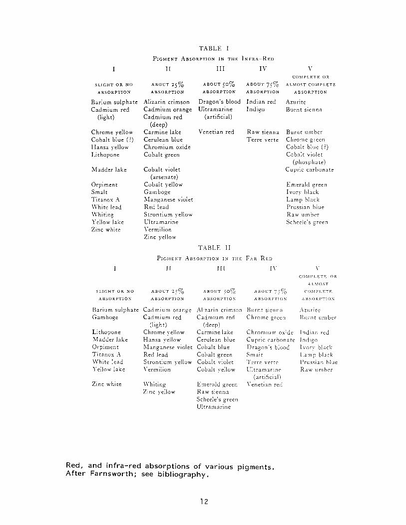
T A B L E I
P I G M E N T A B S O R P T I O N I N T H E I N F R A - R E D
I I I III IV V C O M P L E T E O R
S L I G H T O R N O A B O U T 2 5 % A B O U T 5 0 % A B O U T 7 5 % A L M O S T C O M P L E T E A B S O R P T I O N A B S O R P T I O N A B S O R P T I O N A B S O R P T I O N A B S O R P T I O N
Bar ium su lpha t e Alizarin crimson Dragon ' s blood Ind ian red Azuri te C a d m i u m red C a d m i u m orange U l t r a m a r i n e Ind igo Burn t s ienna dight) C a d m i u m red (artificial)
(deep) Chrome yellow C a r m i n e lake Venet ian red R a w sienna Burn t u m b e r Coba l t blue (?) Ceru lean blue T e r r e ver te Chrome green H a n s a yellow C h r o m i u m oxide Cobal t blue (?) L i thopone Coba l t green Cobal t violet
(phospha te ) M a d d e r lake Coba l t violet Cupric c a r b o n a t e
(arsenate) Orp iment Coba l t yellow Emera ld green Smal t G a m b o g e Ivory black Ti tanox A M a n g a n e s e violet L a m p black Whi te lead Red lead Prussian blue Whit ing S t r o n t i u m yellow Raw u m b e r Yellow lake U l t r a m a r i n e Scheele's green Zinc white Vermilion
Zinc yellow
T A B L E II
P I G M E N T A B S O R P T I O N I N T H E FAR RE D I I I I I I IV V
C O M P L E T E OR A L M O S T
S L I G H T O R N O A B O U T 2 5 % A B O U T 5 0 % A B O U T 7 5 % C O M P L E T E A B S O R P T I O N A B S O R P T I O N A B S O R P T I O N * A B S O R P T I O N A B S O R P T I O N
Barium su lpha t e C a d m i u m orange Alizarin crimson B u r n t sienna Azur i te Gamboge C a d m i u m red C a d m i u m red Chrome green B u r n t umber
(light) (deep) L i thopone C h r o m e yellow Carmine lake C h r o m i u m oxide Ind ian red M a d d e r lake H a n s a yellow Cerulean blue Cupr ic ca rbona te Indigo Orp imen t Manganese violet Cobal t blue Dragon ' s blood Ivory black T i t anox A Red lead Cobal t green Smal t L a m p black Whi t e lead S t ron t ium yellow Cobal t violet Te r r e ver te Pruss ian blue Yellow lake Vermilion Cobal t yellow U l t r a m a r i n e Raw umber
(artificial) Zinc white Whi t ing Emera ld green Venet ian red
Zinc yellow Raw sienna Scheele's green U l t r a m a r i n e
Red, and infra-red absorptions of various pigments. After Farnsworth; see bibliography.
12

W A V E L E N G T H W A V E L E N G T H (m^i)
Reflectance spectra (visible) for various blue pigments. Note the shapes of the curves at the red end (650-700nm). After Barnes; see bibl iography.
13

Reflectance spectra (visible) for various traditional pigments, and matches. Note the shapes of the curves at the red end (650-700nm). After Staniforth; see bibliography.
14
50, 100 | ^ Stamforth
New azurite 90 - Genuine ultramarine Aged azurite French ultramarine
40 - 80 -
70 -
— 30- ^ 6 0 -Q) O CD C O £ y ^ X £ 50 -O / \ £ — / \ 8 <r 20 / % 40 / 7 C \
\ ^ / / \
/ / \ N 30 \ \ 10 / _ 20- \ \ /
10- \ \ / ^ 0 > 1 • 1 ' ol 1 1 T
400 500 600 700 400 500 600 700
Wavelength (nm) Wavelength (nm) Figure 7 b New and aged samples of azurite. The aged azurite Figure 8 Reflectance curves of genuine ultramarine and is taken from the dress in NG 1078: David 'The Deposition'. French ultramarine.
100 | 100 |
90 - 90 -
80 - ^ / 80 -
E 601 - 5 60 "I
1 50 1 X ^ ^ Z r ^ 1 5 0 | o j Jj 1 cr 4 0 Azurite/titanium white cc 4 0 " .
_ | Azurite/titanium white Cerulean blue match
30 - —N . . , | . , 30 - Manganese blue match Cobalt blue match ^
, Monastral blue match French ultramarine match ^ . , ,
20 - 20 - — Prussian blue match
1 0 - 1 0 -
0 i , i i 0 ' ! 1 1 1 400 500 600 700 400 500 600 700
Wavelength (nm) Wavelength (nm) Figure 9 a Higher metamerism matches for azurite I titanium Figure 9b Lower metamerism matches for azurite/titanium white using modern blue pigments. white using modern blue pigments.

CLIMATIZED VITRINES FOR PAINTINGS, AN UNCOMPLICATED BUT EFFICIENT METHOD
Emil Bosshard, Collection Thyssen-Bornemisza, Lugano-Castag-nola, Switzerland and Mervin Richard, National Gallery of Art, Washington, DC Abstract: Conservators realize that a stable environment is important to the preservation of most paintings, particularly those on wooden panels. For many institutions as well as private individuals, providing appropriate environmental conditions is difficult and the problem is magnified when paintings are loaned for special exhibitions. In order to protect paintings from environmental fluctuations, many conservators have encased the paintings in vitrines containing conditioned silica gel. Some vitrines are designed to encase the painting and its frame, while others surround only the painting. In the latter instance, the vitrine fits into the frame rabbet and when exhibited, the painting simply appears to be framed behind glass.
The Thyssen-Bornemisza Collection has used vitrines containing silica gel for the past five years. The paintings placed in these vitrines have been carefully examined during travelling exhibitions and for several years following their return to the Collection. These examinations have indicated that the vitrines provide an appropriate microclimate for the paintings.
An understanding of the performance of the vitrines in various environments has been attained through a scientific study conducted at the National Gallery of Art in Washington, DC. In this study, electronic sensors were used to monitor the temperature and relative humidity inside the vitrines. Measurements with strain gauges showed extremely small dimensional changes in the test panel paintings. Several conclusions were drawn from these experiments.
These vitrines can provide very stable environments for panel paintings if they are properly constructed and sealed. Periodic checking of a humidity indicator placed inside the vitrine will indicate if it has been properly sealed.
It should be assumed that these vitrines will leak. Therefore, the more silica gel placed in the vitrines, the less frequently it may require changing. Also, better results will be obtained if a silica gel is used, such as Art Sorb, which is more effective in the 50% RH range.
15

Changes in both temperature and RH inside the vitrine will cause panel paintings to change dimensionally. When the vitrines were subjected to a rapid 20°C temperature change, the observed expansion and contraction of the panel paintings was equivalent to the dimensional changes which would result from a 1 to 2% variation in relative humidity. This small dimensional change does not appear to be a cause for concern.
Based on this study, these vitrines are recommended when one is placing a painting in an unknown or undesirable environment.
16
OIL PAINTING: HISTORY VS. TECHNOLOGY
by David Erhardt and Jia-sun Tsang
For many centuries, mixing oil and pigment has been the most common method of producing artist's paint. While the drying effect of certain vegetable oils had been known long before, it was only with improvements of oil refining methods in the 15 century that the use of oils as paint media became common practice. These methods included washing with water, sun bleaching, and heating with or without lead added as a pre-drier.
After much initial experimentation, the methods of oil paint preparation remained much the same through the 16 and 17 centuries. The resulting reliance of the artist on procedures developed by others may have paved the way for acceptance of the fundamental changes in the preparation of artist's materials which began in the 18t century and which continue to this day. Industrialization and scientific development resulted in numerous changes in oil processing. Hand presses were replaced by hydraulic presses, which were then replaced by continuous extruders and solvent extraction. Each change in pressing methods resulted in the extraction of more oil, but also removed more gum, wax, protein and other non-lipid compounds along with the oil. Chemical processing methods were developed to refine the oil. In some cases, these methods remove components essential to the paint-making properties of the oil which must then be replaced by additives.
The range of colorants which are used has also changed dramatically. Synthetic pigments were often added to the artist's palette as soon as they were developed, especially if they were cheaper or a previously unknown color. Long-lasting synthetic organic dyes were developed starting i
n the late 19 century, and were often used to replace pigments which contained toxic heavy metals.
Ultimately, the centralization of paint production and the large-scale industrial processes used in the oil and paint industry have had a major influence on how artist's materials are produced, and removed much of the artist's control over what is available. The changes in the raw materials as well as their processing and production are so extensive and accepted that many artist's materials are quite unlike those used historically, and traditionally prepared materials are often difficult to obtain. We review the history of oil paint and discuss the differences between paints prepared by traditional methods and those made using present-day technology.
Research chemist and paintings conservator, respectively, Conservation Analytical Laboratory, Smithsonian Institution, Washington, DC 20560.
17

AESTHETIC REVISIONS OF A GIULIO ROMANO PAINTING AT THE J. PAUL GETTY MUSEUM Emmett Carl Grimm, Guest Conservator, J. Paul Getty Museum.
The Birth of Bacchus by Giulio Romano (oil on panel, ca. 1533), currently in the collection of the J. Paul Getty Museum, is believed to be one of a series of approximately twelve panel paintings depicting the birth or childhood of the gods. The paintings were created for the Ducal Palace at Mantua under the brilliant Gonzaga court. The Birth of Bacchus will be exhibited in the Giulio Romano retrospective at the Palazzo del Te in Mantua in September, 1989. The poor appearance of the painting prompted its restoration prior to the exhibition.
The painting had received considerable damage throughout its life, which was the cause of many consecutive repaintings. By 1727, both sides of the panel had been extended and painted to match the original. However, removal of the most apparent and easily identified restorations did not solve all the problems of its appearance. That the Getty painting was a workshop effort accounted for some but not all inconsistencies in style. There were suspected early changes of certain passages, especially additions of drapery to address concerns of modesty, which would not have been done by the artist.
Decisions made during the restoration were based on a combination of art historical research and materials analysis. X-ray fluorescence, infrared vidicon and media identification by stained cross-section have provided important information to decide which parts are, beyond a doubt, not original. Historical research, yielding descriptions and early prints of this painting and extant companions, supports implications of the analytical results.
18
Aspects of the Examination and Treatment of a Portrait by William Merritt Chase
* by James S. Martin
Abstract — An unvarnished portrait by William Merritt Chase was examined and treated for a heavy accumulation of dark surface grime. An emulsion was used for removal of grime, and the unvarnished paint surface was regained allowing a unique opportunity for study of the artist's painting technique. Aspects of this examination and treatment will be presented.
William Merritt Chase
William Merritt Chase was born in Williamsburg, Indiana in 1849, the eldest of seven children. As a youth, Chase displayed considerable talent as a draughtsman, rendering likenesses of family and friends. In 1867, he began formal study with Indianapolis portrait painter Barton Hays, and, in 1869, went to New York to study at the National Academy of Design.
At the age of 23, Chase enrolled at the Royal Academy in Munich, Germany. His study in Munich was financially supported by prominent St. Louis businessmen and art collectors; in return for their support, Chase acted as agent to acquire European paintings for their collections and provided then with certain of his student paintings, such as Keying-Up, The Court Jester, 1875 (Pennsylvania Academy of the Fine Arts). While at the Royal Academy, Chase developed the technical proficiency and style vhich became the hallmark of his work.
In 1878, Chase returned to America. He taught and maintained studios in New York, Philadelphia, and Shinnecock, Long Island. He married long-time friend and model Alice Gerson in 1886, and they had nine children between the years 1887 and 1904. Chase's nearly fifty-year career as a critically acclaimed painter and sought after teacher continued until his death in 1916.
Chase's student work while at the Royal Academy was marked by a dark, restricted palette, a flair for vigorous brushwork, and attention to precise detail. Chase was deeply taken with the work of the Old Masters whose work he copied in the Alte Pinakothek in Munich. While portraiture and still life dominated much of his work, in the 1880s and 90s he carried his subject matter out-of-doors to include scenes of New York city parks (e.g. Early Morning Stroll, c.1890, private collection) and areas surrounding his summer home in the oceanside coinriunity of Shinnecock (e.g. Near the Beach, Shinnecock, c.1895, Toledo Museum of Art). EUring this time, his palette became lighter and brighter. Into the twentieth century, portraiture and still life again dominated his painting. Although he was primarily known as an oil painter, he was equally skilled, though less prolific, in pastel, and he experimented in watercolor and monotype.
^Third-year Intern, Pennsylvania Academy of the Fine Arts, Philadelphia, PA 19102
19

William Merritt Chase was commissioned about 1909 to paint the portrait of Ellen Butler Scott (1865-1930), wife of wealthy Philadelphia businessman, Charles Scott, Jr.. At the time, Chase maintained a studio in Philadelphia and taught at the Pennsylvania Academy of the Fine Arts. Two portraits were painted — a seated portrait and a standing portrait (The seated portrait was refused by the Scotts as a poor likeness, and Chase later repainted the head with that of a certain Mrs. H. — now titled Lady in Black Dress, American Academy and Institute of Arts and Letters). The standing, three-quarter-length portrait of Mrs. Scott was hung in the family's home in Overbrook, Pennsylvania until it was given to the Pennsylvania Academy in 1935 by the Scott daughters, Alice and Letitia.
In 1988, examination during on-going condition survey of the Academy's painting collection revealed that the painting (PAFA 1935.1) had not been varnished and was covered with black, particulate grime and an opaque, whitish effluorescence generally restricted to darkly-pigmented paint. Several scratches to the reverse of the canvas had resulted in convex planar distortions and associated minor paint loss. A working varnish, evident throughout reworked areas of the head and neck, had discolored. The painting exhibited no evidence of restoration.
Ultraviolet light examination revealed autofluorescence typical of natural resin in the signature, throughout the vigorously-executed background, and throughout the head and neck corresponding to areas of discolored working varnish, confirming observations by students that Chase employed resinous mediums and working varnishes (Chase recoitmended to his students a mastic varnish containing one-third refined linseed oil, and adc ed to his paint this varnish and a siccatif to achieve certain effects).
The proposed treatment of the painting involved consolidation of lifting paint, removal of surface grime, and varnishing to saturate and protect the paint surface. Consolidation was accomplished with dilute Beva 371 adhesive. Aqueous cleaning systems such as saliva, water, and detergents readily removed surface grime, but swelled the size layer on the oonmercially-prepared and stretched canvas, resulting in local micro-flaking of the paint surface. Other solvents ware ineffective for grime removal.
A water-in-benzine emulsion stabilized with a nonionic detergent, Ethofat 242/25 (Armak Chemical), proved safe and efficient for grime removal. The viscosity of the emulsion restricted penetration of the minor water phase, thereby minimizing swelling of the size layer. The pH concentration of the water phase was 7.5 _+ 0.5 units, allowing the emulsion to clear grime frcm the surface without risk of saponifying the underlying oil-bound paint. The nonionic detergent used to stabilize the emulsion enhanced wetting onto surface grime and was free of clearance problems associated with ionic detergents.
Once grime was cleared from the paint surface, the image was considerably brighter and more legible. However, the surface was unsaturated, particularly in darkly-painted areas. A combination of synthetic varnishes was used to saturate and protect the paint surface while simulating the gloss of Chase's reconmended oil-resin varnish. Two thin brushcoats of dilute Acryloid B-72 in xylenes were applied, followed by one thin brushcoat of dilute Winton
20

Picture Varnish and a final light spray of Acryloid B-72 in xylenes. Excellent saturation and surface gloss were achieved. Losses were compensated using glue-chalk gesso and inpainted with Bocour Magna colors. The discolored working varnish was less apparent after varnishing as surrounding paint was saturated, and was left visible. The painting remains a valuable document of Chase's working technique during the last decade of his life.
Acknowledgements The author would like to thank Mark Bockrath for his assistance with the preparation of this paper and Rick Echelmeyer for ultraviolet light photography.
Endnotes 1 Notes from Frances Lauderbach (PAFA student, 1887-89 & 1900-01), vertical file for William Merritt Chase, PAFA Library.
21
Gustave Courbet: Materials, Techniques, and the Problems Encountered with the Attribution of a Painting Entitled 'The Mill".
Anik Morrow Advanced-level Training Program, Center for Conservation and Technical Studies Harvard University Art Museums 32 Quincy Street Cambridge, MA 02138 Tel:(617) 495-2392
While investigating the possible attribution to Courbet of a painting entitled "The Mill", the preparation of a catalog of the Foggs Western Painting Collections which includes Courbet, and the presentation at Brooklyn of the major exhibition, Courbet Reconsidered, prompted the author to undertake a larger investigation of Courbet's materials and techniques.
Several paintings by Gustave Courbet were examined, compared stylistically and radiographed. These x-rays, in addition to those at the Brooklyn Museum and the Boston Museum of Fine Arts allowed the author to detect a criss-cross pattern which occurs in many of Courbet's larger paintings. The radiograph collection at the Center for Conservation and Technical Studies provided an excellent opportunity to determine if the pattern was specific to Courbet.
Results from past pigment analysis were collated and augmented with new analysis, involving x-ray fluorescence and the scanning electron microscope, of a Courbet painting on exhibit in the Fogg Art Museum. Gas chromatography was also performed on samples of the ground revealing new information. This body of information provided a clearer understanding of Courbet's materials and techniques.
Paintings signed "Courbet" but generally not accepted as being by his hand, were studied and analysed in order to determine how they differed from or were similar to the first group of paintings.
Art historical research into the last four years of Courbet's life in exile provided additional insight into the activities at the Swiss studio and the traffic of fakes. This information was extremely useful when examining a small landscape with mill. "The Mill", an "unsigned" painting reveals a startling "Courbet" signature when looked at with ultra-violet light.
Dated "76" in the lower right corner, the picture presents several problems as it may be the product of a collaborative effort - a means frequently used by Courbet during this period to increase production and revenue.
22
USB OF A PRESSURE SENSITIVE ADHESIVE TO FACILITATE THE TRANSFER OF A SEVERELY TENTED PAINTING.
Glanfranco Pocobene, Paintings Conservator and Ian Hodkinson, Professor o£ Art Conservation, Queen's University, Kingston, Canada
This paper gives an account of the conservation and restoration of a late nineteenth century portrait in oil on canvas which was badly water damaged in a flood. The portrait of Professor James Williamson was painted by William Sawyer (1820-1889), in 1887. The mechanism of canvas shrinkage and the causes and characteristics of the damage resulting from the painting materials and techniques are also discussed.
Water damage left much of the painting with severe and complex tenting patterns and in an extremely brittle and hazardous condition. The materials and techniques of the painting; thin, brittle ground and paint, a discrete glue size layer and tightly woven linen canvas all contributed to the severity of damage. The multiple problems of severely distorted paint film and irreversibly shrunken canvas support led to the discarding of traditional conservation approaches and the development of a novel treatment procedure.
Essential to the success of the procedure was the use of an acrylic, pressure sensitive adhesive dispersion (Rhoplex N-580). The tented and detached paint and ground layers were secured with paper tissue (Tengujo) using this adhesive in a modified facing procedure. After further consolidation, the original canvas support was removed and the paint layers returned back to plane without overlap on a vacuum hot table. The treatment was completed with the reattachment of the paint layers to a new canvas support, varnish removal and final retouching.
23
PANEL-STRETCHER DESIGN FOR CONSERVATION BY STEVEN PRINS, STEVEN PRINS & CO., SANTA FE, NM
My interest in panel-stretchers dates back to my years as a student at N.Y.U., when I had the opportunity to observe the cleaning of the Metropolitan Museum's Asher B. Durand, IN THE WOODS. Upon first seeing the painting I was immediately impressed by the condition of the surface. There was a noticeable absence of craquelure, stretcher creases, all of the symptoms of mechanical deterioration one would expect in a painting executed in 1855. The remarkable preservation of the picture was attributed by Mr. Brealey's staff to its secondary support: a commercially manufactured stretcher with floating wooden panel inserts. I have since seen several paintings on such panel-stretchers, and heard of many more, which were similarly well preserved. Most of them were of the Hudson River School, more rarely of European origin, all from the 19th or early 20th centuries. (Two years ago, Soni Veliz, brought to our attention works of much greater antiquity which had likewise benefited from being stretched over wooden panels: three paintings by El Greco from the Convent of Santo Domingo el Antiguo, in Toledo.) Given the remarkable condition of the paintings they have supported, one wishes that panel-stretchers had never fallen out of favor with artists. Moreover they made me wonder if this simple mounting technology should not be adapted by modern conservators as a passive means of better preserving the paintings entrusted to our care.
The superior state of preservation of paintings on panel-stretchers makes sense, and is consistent with recent research on the rheology of paintings on fabric. Their benefits may be summarized as follows: 1) The panel acts as a barrier to atmospheric pollutants, retarding the soiling and deterioration of the fabric support. While wood might not rank very high on the conservator's list of archival mounting materials, we are all aware that canvas in proximity to the wooden bars of ordinary stretchers/strainers is generally better preserved than that exposed to the atmosphere. 2) The panel acts as a barrier to water, mitigating damage in potentially disastrous situations such as fires and floods. At worst, the wetted panel-stretcher might have to be removed. But it will have served well if it prevented water from reaching the reverse of the fabric. 3) Furthermore, wood (and other cellulosic materials) may act as buffers as well as barriers. Their inherent hygroscopicity and moisture content can be drawn upon to mitigate short term fluctuations in ambient RH, reducing cracking and cupping of paint and ground caused by cyclic expansion and contraction of fabric and sizing in response to environmental changes. Again the beneficial effect of such buffering is familiar. Even the wooden members of ordinary stretchers/strainers serve as local buffers, often creating a zone of reduced cracking around the periphery of the painting corresponding to their dimension at the reverse of the canvas. Panel-stretchers have the potential to extend this benefit to the entire area of the canvas.
24
4) Stretcher creases are similarly reduced. One might initially suspect that this effect was the result of eliminating the inner edges of stretcher-bars, thus obviating mechanical damage resulting from contact. But in fact, the panels in traditional panel-stretchers were seldom flush with the front surface of the stretcher-bar. The mitigation of stretcher creases may be due instead to the elimination of the two distinct microclimatic zones which are inherent in normal stretchers/strainers. The edge of the stretcher-bar corresponds to a zone of stress at the boundary between the open, unprotected area of canvas and the area buffered and stabilized by the wooden members. The tendency to develop deformations and cracking along these edges is reduced if this transition zone is eliminated, as it is by the introduction of a panel.
Some will argue that these advantages may be derived from backings as they are widely employed by conservators today, provided the proper materials are used and they are properly fitted. Unfortunately there has been insufficient research into backings to determine their actual effectiveness as environmental barrier/buffers. Backings may also provide protection from blows to the reverse of the painting, again if the proper material is used. But they are ineffectual at mitigating damages resulting from blows to the front of the painting. By the time the impinging object's momentum is dissipated by impact with the backing board severe damage has been done to both the painted surface and the supporting canvas. Herein lie the final benefits of panel inserts which lie close to the reverse of the canvas. 5) A stout panel in close proximity to the reverse of the canvas provides protection from impact from both the front and back. By limiting out of plane deformation from the front of the painting the panel can serve to prevent punctures and minimize local dents by dissipating the energy of impact at a point where the stresses of elongation are sufficiently small to be dispersed throughout the entire canvas. While it cannot prevent damage to the painted surface altogether, such a panel can help to mitigate it. Blows which would otherwise result in punctures accompanied by shattering and loss of paint and ground, in the presence of a panel might result instead in a scuff or gouge, accompanied by much less severe cracking. 6) At the extreme, when the space between the panel and canvas is nil, the panel may also serve to dampen vibrations from movement and transportation, and can prevent the nasty dents which frequently occur around the edges of paintings on beaded or beveled stretchers when they are mishandled. 7) A panel in direct contact with the reverse of the canvas also has potential for contributing to the support of the painting, in the manner of a loose lining. One advantage which it might have over loose linings, if the panel is easily removed, is allowing access to the reverse of the original canvas without removing it from the stretcher.
For several years I ruminated over the possibility of exploiting these benefits in conservation. Finally, two years ago I began to do so on a limited basis where inherent good condition or improvements brought about by conservation treatment might benefit from such passive preservation.
25

At first I went about it by modifying new or original stretchers in much the same manner as traditional panel-stretchers, as follows. To modify an old stretcher (fig. 1, A), the painting is first removed and the stretcher cleaned. The present bead is removed from the front of the stretcher, along with a 3/8" rebate to the depth of the shoulder of the rear tenons. A new, slightly oversized piece of sugar pine is glued into the rebate (fig. 1, B) . The excess along the outer edge is trimmed on a router table with a flush-cutting bit to the exact profile of the original stretcher. The top edge is beveled to the depth of the panel. This edging also serves to reinforce the joins and eliminates the open mortice/tenon along the tacking edge. Plywood is cut into a panel and four retainers, which are then rebated along their common edges to form ship-laps on all four sides (fig. 1, C) . The outer retainers are attached to the faces of the stretcher members with screws, in effect creating a floating panel on the front of the original stretcher. 1/4" mahogany plywood was selected for the panels made to date, somewhat arbitrarily. But on a fairly small scale, less than 36 inches, I felt it would provide the rigid planarity and stability over time I desired. A variety of other plywoods might be used, and some paper products might also be considered. A loose lining has been attached to the stretcher prior to mounting the painting, as a precautionary measure as this was something of an experimental treatment. To date we have had no reports of any adverse effects from these types of treatments, and hope that with time their potential benefits will be realized.
c
Fig. 1 SCHEMATIC CROSS-SECTION OF FRONT-MOUNTED PANEL MODIFICATION A: Original stretcher-bar; B: Edge insert; C: Plywood
panel & retainer. The modification of beveled stretchers is obviously more
complicated, and will not be described here. The modification of new stretchers is done in much the same manner, except that it is often unnecessary to remove the bead and insert edging as the bead on many modern stretchers is adequate to clear the thickness of the panel.
While such modifications have the potential to share in the benefits seen in 19th century panel-stretchers, they also share in some of their drawbacks. Some will find the weight of wooden panels problematic, especially in large paintings. Also the removal of such a panel necessitates the dismounting of the painting and in some cases the disassembly of the stretcher.
26

It was hoped that both of these drawbacks could be overcome by replacing the traditional floating panel with composite panels inserted from the reverse of the stretcher. New panel-stretchers could be made in this manner, or panel inserts could be retrofitted to present stretchers. In the case of old stretchers/strainers which may not be in very good condition, such panels could impart added sturdiness and insure planarity without significantly altering the artifactual character of the painting and its support. Finally in designing this insert it was decided that rather than accommodating present keys, as others have in the preparation of temporary foam inserts, an expansion mechanism incorporated in the panel itself to supercede the original keys might offer some distinct advantages. First it would eliminate any hammer whacking at the reverse of the canvas. It would also allow for the adjustment of tension without the removal of the panel.
My initial panel-stretchers were composed of composite panels which fitted into the reverse of a fairly traditional stretcher. The stretchers themselves were made with closed, single mortice/tenon joins, fitted with an exterior tacking strip with a 3/16" bead along the edge (Fig.2/ A). Again, the new stretchers are shaped on the router-table, using the original stretcher/strainer as a template so that their profiles are exactly reproduced. In order to maximize their buffering potential, the panels are composed entirely of cellulosic materials: a paper honey-comb core (Fig. 2, B), with an 1/8" plywood backing (fig.2, C), an 8-ply ragboard facing (fig. 2, C) , and a wooden surround. The wooden backing extends 3/4" beyond the opening of the stretcher. The panel is held in place with offsets, which allow the stretcher to move laterally for tensioning. Tension is adjusted by a pair of screw mechanisms at each corner. The 8-32 cap screws can be turned with an alien wrench or balldriver to exert outward pressure on the stretcher-bars (Fig. 2, E) . In this manner each bar can be independently adjusted in the proper direction without removing the panel.
Fig. 2 SCHEMATIC CROSS-SECTION OF PANEL INSERT STRETCHER A: Stretcher-bar; B: Paper honeycomb core; C: Plywood backing; D: Ragboard face; E: Expansion screw.
The same sort of panel inserts could be fabricated for any existing stretcher, without removing the painting. Odd angles encountered in old stretchers can be replicated without great
27
D rrfrfrfi/ifrfifffrfJrttbY-'Y ^•.'.• • . ' • . v
' '• '•*• '•'• *'• ' *• '-*• *•*• '•*• 'l 'l !*• I - *'S^^V//.
difficulty. Various thicknesses can be accommodated by the choice of core material and skins. Further depth adjustment might be possible by incorporating a compressible gasket. A variety materials can be used for the skins, depending on the demands of a particular application or the whim of the conservator. Unfortunately weight remains a problem to be overcome. But the density of the system presented here is certainly comparable to that of other composite panels widely used as rigid supports in painting conservation. The materials employed are readily available, and the machinery/equipment necessary for manufacture are common to many museum shops and certainly to most cabinetmakers.
I am pleased to have had the opportunity to share my designs with my colleagues. I hope that they will inspire wider use of panel-stretchers, of all sorts, which I believe warrant a place in modern conservation as a means of passive preservation of paintings on fabric with minimal intervention. From the response to my presentation and the models distributed in Cincinnati, I find that I am not alone in this belief. I am happy to assist in whatever manner possible to encourage further development of such systems and their adaptation to particular conservation treatments. Criticisms and suggestions are welcome, and in fact essential to the ongoing development of my own systems. Perhaps my panel inserts will be commercially manufactured someday. At present I am capable of producing them only in limited quantities, as one-of-a-kind pieces. But I will gladly assist others in securing the necessary materials and establishing procedures for in-house production in museums or in cabinetmakers shops used by private practitioners.
28
TREATMENT OF "DOWN BY THE RIVER," AN OIL-ON-PANEL PAINTING BY MAXFIELD PARRISH
Maxfield Parrish was one of the most phenomenally success-ful artists of the early twentieth century. Born in Philadelphia in 1870, he enjoyed the privileged childhood of the son of well-to-do Quaker parents, who took him on the Grand Tour of Europe and generally created a cultured environment for him. Young Parrish had the added advantage of growing up with an artist-father who, at one point, even shared a studio with him during the son's young-adulthood.
His whole life, in fact, seems like a fairy-tale image from one of his well-known fantastic landscapes. He and his beautiful wife raised their four children in a idyllic setting in the woods of New Hampshire, in a home called "The Oaks," which Parrish de-signed himself. He enjoyed great success during his lifetime (which lasted until 1966, when he died at the ripe old age of 95), and his work has seen some revivals of popularity since.
Illustrator Howard Pyle once refused to take the young artist on as a student at the Drexel Institute as, "there was nothing else he could teach him."l In his forties, he was invited to become head of Yale University's art department, an honor which he declined because it would have meant leaving New Hampshire. Artist John LaFarge said of him, in 1910, "I know of no artist today, no matter how excellent, with such a frank imagination, within a beautiful form, as is the gift of Mr. Parrish."2 His name was such a house-hold word, that, by 1920, when F. Scott Fitzgerald wrote his short story, "May Day," he described the reflection in a restaurant window as being the color of "Maxfield Parrish moonlight."3
Why, then, does the mention of his name bring a slight snicker to the lips of the "serious" art historian? Perhaps it is the very household-name-ness of the artist that keeps his art from being considered seriously. Parrish did spend many years working as an illustrator of books, magazines and posters. He also created a great deal of purely "commercial" art, which was intended to sell everything from Cashmere-Bouquet soap to Jell-0.
One of his clients, a Clarence Crane of Cleveland, who had originally commissioned Parrish to create paintings to be repro-duced on gift boxes of chocolate, hit upon the idea of mass produ-cing color lithographic versions of Parrish's paintings as prints for a general market. Copies of paintings like "Daybreak" (1922), one of his most famous compositions, were soon framed and hanging in thousands of middle-class parlors across America. Parrish earned a great deal of money through the sale of color reproductions, and he was able, by the late 1920's and early 1930's, to leave commercial art behind and to paint whatever pleased him, which was, most often, pure landscape.
29

The paintings of all periods, whether they resemble the illustrators of the Brandywine River School (e.g. Howard Pyle, N. C. Wyeth), pure Art Nouveau, or the Pre-Raphaelites, to all of whom he can claim some kinship, Parrish's paintings are unequalled in superb draftsmanship and in a deft and unique use of color.
Maxfield Parrish?s subject matter came both from his own vivid imagination and also from meticulously laid out still-life arrangements in the form of miniature landscapes and architectural models. The artist set up and photographed on 4 X 5 glass negatives endless arrangements of chunks of granite and quartz, dramatically illuminated by a single light source and often set atop a piece of mirror or plate glass. Photography was used as an aid for transferring models' poses to Parrish's painting surfaces as well. He disliked using professional models, and he called upon the services of family, friends, neighbors and domestic help for this purpose. "The Pied Piper" of 1909, a site-specific painting for a bar in a San Francisco hotel, includes portraits of twenty-three children of New Hampshire neighbors, as well as two of the artist's own sons. His photographic images were transferred by tracing pro-jections from a photo-enlarger or a "magic lantern" onto sheets of paper which had been coated with graphite for further trans-fer onto the white ground of his paintings.
In terms of craftsmanship, Parrish was meticulous beyond compare. His attention to quality-control in every detail ex-tended even to the preparation of his own shipping crates, which he hand-crafted, sanded, and prepared to a polished final product.
For painting supports, he occasionally used canvas, especial-ly for larger works, but more frequently he preferred solid sup-ports. Earlier oils are painted on 3/8"-thick "Upson" board, a sort of multi-ply composition board, to which the artist attached glue-dampened Whatman's paper on both sides. Later oils are paint-ed on panels of Vehisote or Presdwood; these were kept flat by treating both the front and back with two to three coats of natu-ral resin varnish, which was sometimes thinned with turpentine, then allowed to dry thoroughly. All of the varnish preparation and drying work was done in a hot room or in direct sunlight, as working in a warm environment and with warmed materials, the artist felt, facilitated the varnishing procedure. Parrish would then brush-apply a ground layer of lead carbonate in linseed oil, which would dry for at least a full year before the paint layer was applied on top of it. After the mid-1930's, his preferred support was a 5/16"-thick Masonite board with a white Permalba ground, prefabri-cated by the Weber Company of Philadelphia.
30
The paint layers that cover these fastidiously prepared supports are the really interesting part. Parrish applied Winsor and Newton oil colors, directly from the tube, to a 4 X 5 pane of glass (perhaps the same as his slide negatives) which was glued to a piece of white cardboard. The tube paints were thinned with linseed oil or varnish and applied in thin, transparent glaz-es over the bright, white ground, and were never mixed with white or other opaque pigments that might "muddy11 the transparency of the colors. Parrish1s intent was to allow the white ground to show through his multiple layers of transparent glazes in order to create the jewellike, glowing quality of his paintings. He himself compared his method to the four-color, half-tone printing process, which creates its image by the overlapping of multiple layers of diverse colors.
In a rare, unfinished painting ("October," of 1938), we gain some insight into his working method. Originally commissioned as an illustration titled "Dreaming," the piece was altered by the artist after it was returned to him from being reproduced. He was unhappy with a nude figure which had been included to make the prints more salable, and he stripped the painting down, in part, in order to repaint the offending portion. Apparently he was never happy with the composition without the figure, and it remained unfinished at the time of his death. On the right side, however, there is the underpainting of a tree in deep monastral or ultramarine blue, the first layer of several which would have created the final color of the tree. Opaque highlights were saved for the final layer. In between, and on top of, these multiple, transparent layers, Parrish inserted an isolating layer of varnish (variously referred to as "copal," "Damar," or Winsor Newton Amber Varnish"), applied, like the panel preparation, warm, to the paint layer. The varnish coating was then dried thoroughly in the sun, or, later in the artist's career, under heat lamps. This, said the artist, was to drive off all moisture, thus avoiding future "bloom" in the paint or varnish layers. Depending upon the weather and other environmental factors, the drying process of the varnish could become quite time-consuming, and it was not unusual to find ten or more panels in various states of completion drying in his studio. When sufficiently dry, the varnish layer was sanded with a damp rag dipped into pumice stone, in order to remove little irregularities in the smooth surface, then washed and wiped, and the next glaze was applied.
The paint layer was worked with a variety of instruments, most of them tools of the artist's own fabrication, including stipple brushes to apply the paint and pen knives to scrape it away when corrections were called for. The artist painted with a methodical up-and-down motion, with the stipple brush held perpendicular to the panel, and often, with an index card in the other hand to mask previously painted design areas from unwanted stipple marks. Stencils were used to superimpose human figures over already finished landscapes.
31
The entire, meticulous process did not, admittedly, allow for much spontaneity. Technically, however, the paintings were extremely well crafted, and, except for the occasional use of bitumen for glazing, should be assured of a very long life. Darkening of the varnishes, of course, is an inherent problem. The use of traditional organic solvents to clean Parrish paintings is not an option.
Exactly this point was brought to light by the appearance of a panel painting, unsigned and undated (but probably from Parrish's landscapes of the 1930Ts or 1940's), presented by a private collector for conservation treatment to the San Francis-co Museum of Modern Art. The panel, of the thick Masonite vari-ety, measures 15" x 17". Its design, which shows two small, nude figures at lower left, surrounded by a heavily foliated landscape and a distant body of water, is composed of the typi-cal, transparent glazes that identify Parrish's technique. The owner, who had recently acquired the painting, felt that it need-the services of a conservator because of the presence of scattered "mold" on the surface. The painting also exhibited a whitish crizzled quality which made the image generally difficult to read.
Microscopic examination revealed the breakdown of the top-most layer (or layers) of the resinous paint into a fine network of dendritic crack patterns which affected, generally, the right two-thirds of the painting. Most of the approximately left third of the piece had been stripped of this upper layer to reveal the monastral blue of the underpainting in the trees, the water, and the sky. An intermediate horizontal band of distant landscape appeared to be generally intact on the lefthand side. A rough diagonal band that was the border between the stripped area and the crizzled area was broken down in a different manner, which had the appearance of a swollen and reformed resinous paint layer; the whitish surface disturbances were most severe in this area. Solvent damage from the injudicious use of organic cleaning agents in a previous cleaning attempt appeared to be the most likely ex-planation for the peculiar appearance for the painting. There was no mold present.
Reforming tests were performed on the extensive craquelure patterns. A variety of natural and synthetic varnishes success-fully resaturated the crizzled surface locally. Several failed attempts at brushing and spraying natural resin varnishes were followed by a successful spray application of Soluvar gloss varnish in petroleum benzine. The problem of the "skinned" left third of the painting then needed to be resolved. The exposed blue under-painting of the trees was covered with inpainting, executed with dry pigments in Acryloid B-67/F-10, in colors which corresponded to those of nearby foliage. The severely solvent-damaged central band of demarkation, which did not reintegrate visually from re-
32

forming alone, was inpainted fairly extensively with the same materials. (Some physical deformation, the result of former swelling, remained in this area.) The background landscape at the left was treated in the following manner: A mask was cut from thick blotting paper and feathered in a line corresponding to the approximate borders of the overcleaned area. A surface coating of Soluvar, toned with yellow ochre and Indian yellow pigments, was spray-applied with a varnish gun to the unmasked area. The effect of the pigmented varnish was sufficient to mask the jarringly blue quality of the left side of the painting, but not heavy enough actually to match the yellow glow of the right side. Inpainting was further corrected locally after the application of the spray coating.
The treatment, while it did involve a great deal of what could technically be called noverpainting,f? was cautious, subtle, and thoroughly reversible. It seemed to be a reasonable compro-mise as a means of visually reintegrating a picture that had been severely damaged by previous treatment.
J. William Shank San Francisco Museum of Modern Art
33
ENDNOTES
*Coy Ludwig, Maxfield Parrish, New York: Watson-Guptill Publica-tions, 1973. 2 Ibid., p. 201 (LaFarge quoted in a letter to Charles Scribner's Sons, dated January 19, 1910). 3 Ibid., p. 201 (quotation from Fitzgerald's Stories of F. Scott Fitzgerald, first published in 1920, p. 120).
BIBLIOGRAPHY
Ludwig, Coy, Maxfield Parrish. New York: Watson-Guptill Publica-tions, 1973.
N.B. The Parrish monograph was the source for the general histori-cal and technical information about the artist. Chapter 8, "Technique,11 (pp. 189 - 200) is a thorough expose of Maxfield Parrish's working method, based on Mr. Ludwig's correspondence with Maxfield Parrish, Jr., as well as the artist's own notes and letters.
34

35

AN INVESTIGATION OF ALBERT PINKHAM RYDER'S PAINTING MATERIALS AND TECHNIQUES WITH ADDITIONAL RESEARCH ON FORGERIES By: SHELLEY A. SVOBODA and CAMILLA J. VAN VOOREN Graduate Fellows, Art Conservation; University of Delaware/Winterthur Museum
The late 19th Century American painter, Albert Pinkham Ryder is an enigmatic figure in the development of American Modernism. Assessments of his life and work are often inaccurate. Problems in Ryder scholarship and in the conservation of his paintings stem primarily from two sources: the rampant forging of his works and his unorthodox techniques. Complicating these problems are Ryder's own habits, such as generally not signing or dating his pictures and working on them for extended periods of time.
In light of these problems and the lack of published technical information, an investigation was undertaken in an effort not only to clarify the materials and techniques used by Ryder but also to better understand the individual who created these images. The findings come mainly from primary source material in the Ryder Archive5 and from our technical investigation on paintings in the Metropolitan Museum of Art. To characterize the binding media used in these works, the fluorescent staining techniques of Richard Wolbers, Associate Professor at the University of Delaware Art Conservation Training Program, were used. Comparisons were made between cross-sections of the authentic paintings in the Metropolitan Museum and forgeries in the Ryder Archive. Ryder was born in New Bedford, Massachusetts, in 1847.6 Apparently due to an eye problem, his early education was restricted to grammar school. Following his family's move to New York City about 1867, he applied to the National Academy of Design. After initial refusal, Ryder was admitted following instruction by William E. Marshall. He remained at the N.A.D. for four seasons, enrolling in antique and life classes. His first exhibited work, probably a landscape or idyllic scene, was in the Academy's 1873 Exhibition. Following this, he exhibited there only again prior to 1880. 1877 marked the formation of the Society of American Artists, of which Ryder was one of the 22 founding members. Early critical reviews of Ryder's work were often not flattering, frequently condemning his drawing ability. Ryder never considered compromising his individuality for approval, though letters make it clear that he was very sensitive to criticism.
Lloyd Goodrich7 separates Ryder's career into two phases. The first, prior to 1880, resulted in landscapes and idyllic scenes. The second, from about 1880 until the turn of the century produced works classified as more religious, poetic, and legendary.8 Many of his most famous pictures were conceived in this later period. According to Goodrich, the shift of subject
36
focus stems from a combination of factors such as natural maturity, stimulus from his association with other artists, support from his dealer, D. Cottier, trips abroad, and a move away from his family to an apartment in the Benedick Building in New York City. This last source of influence is explained in greater detail by Albert Boime.5 During the last portion of Ryder's life, that from about 1900 to his death in 1917, he rarely, if ever, conceived new works but continued working and reworking those already begun. He often mentioned his frustration with no longer being able to, "...strike in a picture."6
The Ryder Archive at the University of Delaware contains a wealth of information on the artist. This insightful information enables a better understanding of how this visionary artist was able to create such a unique body of pictures using very odd techniques. Housed within the Archive are original letters both by Ryder and to him, an outstanding x-ray collection, and a rare sketch book. The letters, in particular, underline his sensitivity as a person and as an artist, thus enabling a more thorough understanding of the man, his unusual techniques, and the resulting body of works.
A letter by Ryder typically includes an extended formal greeting (often up to a third of the letter's length), a discussion of upcoming plans with the addressee, such as joint travel or the development of a picture, followed by an extended formal closing. From letters written prior to 1900, it is very evident that he devoted tremendous amounts of time to his painting and shows the resulting enthusiasm. In an 1885 letter to Mr. Clark, a collector, Ryder's words are as follows: "I am in ecstacy over my Jonah: such a lovely turmoil of boiling water and everything..If I get the scheme of color that haunts me I think you will be delighted with it."7
As he grew older, however, much of his enthusiasm was replaced with details of his poor health and other problems that blocked his creativity. A letter written shortly before 1900 mentions a burn on his hand and his resulting anxiety from loss of time from his work which would inevitably disappoint anxious clients.8 Countless letters mention his eye inflammation or rheumatism. The degree to which these health problems interrupted both his painting and his interaction with close friends is seen in almost every written correspondence from the last two decades of his life.9 A letter to Dr. Sandon indicates that he would not be celebrating Christmas as the chance of depleting his health was too great.10
His health problems and his life style were interrelated. Countless references exist indicating that Ryder did not devote time to housekeeping or cooking. He lived in a very limited space: working, eating and sleeping in the same room. Letters from patrons tell him in an almost scolding manner to find help for these chores as his time should be spent painting.11
Reliable accounts detail how the piles of junk in close proximity to his easel were encrusted with drips of varnish and paint.12 In the words of Goodrich: "He never threw anything away, and the rooms were piled waist-high with every conceivable kind of object-furniture, trunks,... old newspapers and
37

magazines, canvases, frames, painting materials, soiled clothes, food, unwashed dishes, milk bottles, ashes. There were paths through this rubbish to the door, to the easel, to the fireplace. Ryder did cooking on an open grate... He slept on the floor."13 Ryder, however, was not aware of this environment most of the time. It seems as if his internal world was more of a reality than the external one in which he lived.14 At a neighbor's suggestion, he began eating meals out and was discouraged from using his method of adding food to a continually heated pot.15 He had felt quite clever in this time-saving cooking method.16 Though it is impossible to determine to what extent these habits impacted his health, it seems that their combined effects could easily have been responsible for generating or accelerating the many health problems that affected his creativity.
Much of the literature describes him as a social recluse. His letters, however, do not substantiate this. In fact, they indicate the opposite is true. It seems as if all of Ryder's time not devoted to painting or health problems was devoted to close friends. Many of these were his patrons, dealers, and other artists. His fondness for his friend's families, especially the children, is also evident as he never forgets to mention them in letters. On special occasions he brought small gifts of his poems such as "Spirit of the Flowers."17 In addition to the poems he also gave home-made perfumes.18
In a note to the J. Alden Weir Family dated December 26, 1901, Ryder expresses that the gifts of perfume are a token of his friendship.19 His manufacture of these scents becomes important, as it required having non-drying or "essential oils," as they are called, in his studio for their preparation.
The sentiment that fills his relationships is also infused into his pictures. Even though his paintings may appear on the surface to represent scenes from opera or literature, the essence of the work is the evocative quality of the atmosphere or environment that has touched Ryder and created a vision in his mind. Lloyd Goodrich states that "...nature was not a mere background but a principle actor, as expressive of emotion as the human actors."20 Though not painting directly from nature, he continually observed nature, taking long walks in both daylight and moonlight. The information he gathered there contributed to the capturing of that first vision; in Ryder's words, it is "...the first vision that counts."21
Unorthodox methods were also employed in the capturing of that first vision. Literature and letters reiterate that his paintings took decades to create, as he painted and repainted while patrons gently persisted with their requests for long-sought-after works. In one instance, he said to art critic, Walter Pock, "I was worried somewhat at first by his wanting to take the picture away before I had finished, but lately he has been very nice about it - only comes around once a year or so."22 The Tempest, though exhibited as early as 1891, was still being worked on almost up to his death, over 25 years later.23 Early photographs demonstrate that severe drying cracks appeared in Ryder's painting soon after their completion.24 Albert Groll,
38

friend and artist, watched Ryder in his studio attempt to close open fissures with a red-hot rod.26 This is important because it tells us that, in at least this instance, and probably many more, the cracks opened prior to when the painting left Ryder's studio. It follows that he would not have hesitated to overpaint these cracks if the hot iron did not work. So, although typically paint over cracks indicates retouching by an individual other than the artist, in Ryder's case, this conclusion cannot safely be drawn. Another instance where Ryder's extended working period is documented involves The Lorelei. Though an 1896 letter informs J. Alden Weir that Ryder was, at that point, finished with the painting, a letter ten years later indicates he was still reworking the figure, as he felt she was too perpendicular on the rock.26 The present-day Lorelei, in the National Museum of American Art, of course, has no figure at all.
The powerful form and pattern that characterize Ryder's work are the product of this incessant reworking of composition. As a result, the contours of the masses are often diffused. In x-rays this patterning can be seen as solid masses diffusing into darker backgrounds. It is considered an important characteristic in authentification.
The realization of Ryder's creative vision is manifested with distinctive combinations of materials and techniques. Early literature, and even writings of Goodrich, indicate his use of strange mediums such as wax, candlegrease and alcohol.27 Though art critic, Sadakichi Hartmann, who visited Ryder in his studio several times, described seeing typical artist's materials such as tube paints and sketch books in his apartment, others describe his liberal use of varnish as a medium.28 The presence of bitumen was assumed in the past to be the reason some of his paintings never dried. In this investigation, however, no evidence of bitumen was apparent.
Of course "non-drying" is a problem in a preservation-sense, but it was, perhaps, a desirable aesthetic in the work of Ryder; his paintings were often described in contemporary literature as glowing, gem-like, or appearing as if enamel.29 Hartmann goes further to describe his work as "...self-radiant with liquid dazzle."30 When Kenneth Hayes Miller asked to see Ryder's palette during a visit to his studio, Ryder moved to the easel to show him "...countless jars of medium - resin, oil, wax, candlegrease, even alcohol, and, above all, varnish and more varnish."31 Yasuo Kuniyoshi, another artist interested in Ryder, described his painting technique as glazes of color over a black and white under painting.32 This has also been mentioned by Ryder himself.33
In addition to looking wet, it seems that some of the paintings were not dry decades after creation. Museum condition reports indicate that materials remained plastic, sometimes even creeping to the lower edges.34
Observations by Hartmann describe Ryder pouring the entire contents of a varnish bottle over a painting in addition to painting with half-dried paints.35
Hartmann indicates that patrons were aware not only of the extensive cracking of the paint films but also "...the regular varnish slides moving
39

lava-like through the surface."36 Coin-size pieces of paint were described as just falling out, not off, as the paintings were usually quite thick, sometimes up to 3/8 inch.37 The collector, Gellately, told Hartmann that in Flight to Egypt, "...the head of the infant began to move and wriggle down towards the abdomen where it remained until restored."38
Though his paintings were initially compared to the works of Monticelli in their color,39 they have often darkened to some degree over the period of a century. As a result of this study, another possible explanation for this darkening has been found.
In addition to the problems just elaborated on, the forgery problem40
was another impetus for the investigation. The forging began while Ryder was still alive, and sources indicate he was aware of this problem.41
Complicating the situation further is the fact that the literature was infused early with forgeries. In some instances, it can hardly be believed that an author could have been ignorant of this. The book, Rvder: A Study of Appreciation, published just 15 years after Ryder's death reproduced numerous forged works.42
One of the main tools used previously to help sort out the authentic paintings from the forged Ryder paintings was the x-ray. As mentioned, the diffused form of the subject matter, in an authentic Ryder painting, is typically visible in the x-ray. In some instances, however, a similar result is obtained in known forgeries. Because this method can be inconsistent, this investigation was undertaken in hopes of offering an additional tool to use in conjunction with those used previously.
As stated, comparisons were made between cross-sections taken from three authentic paints, Curfew Hour. Toilers of the Sea, and Landscape, and five known forgeries. The samples were examined with the ultraviolet light microscope and direct reactive fluorescent dyes43 for the purpose of characterizing the binding media used. Curfew Hour, an early Ryder painting, is an extreme example of the severe changes some of his paintings have undergone. A sample (see Figure 1), taken from the scaly, leather-like island on an edge of Curfew Hour shows the tremendous upheaval of material within the painting. Also very evident is the infinite amount of layers that mix and fold - suggesting that Ryder did not wait for his work to dry before placing on another layer.
Another sample (see Figure 2), taken from the edge of a large crack, shows buckles and tears that have resulted from the different drying rates of the materials. The buckling seen in several samples (Figures 1 and 2), is a result of combining such diverse materials as fast-drying proteins and non-drying oils. Fluorescent staining of cross-sections from Curfew Hour provides evidence that clarifies the physical appearance of the painting. Referring to Figures 1 and 2, photomicrographs of cross-sections from Curfew Hour, it can be seen that the protein is in close proximity to the non-drying oil which stains positively with D.C.F. (2, 7 - dichlorofluorescein, a stain for the degree of saturation in oils). In these instances, it stains for the high
40
degree of unsaturation characteristic of such materials as the essential oils used in perfumes, and oils used in cooking. The non-drying nature of these oils could easily be responsible for the still-plastic layers within these paintings.
Evident from the transparent brown layers seen in white light, the blue-white autofluorescence seen in ultraviolet light (see Figure 1), and the absence of pigment particles, is the large amount of natural resin varnish used to construct Curfew Hour. Substantiating this is the inability of this material to react with applied dyes. The application of Rhodamine B in this sample reiterates the literature by confirming Ryder's use of traditional drying-oils in addition to the non-drying materials previously discussed.
Neutral red is a stain which will give a red or yellow appearance in the presence of acidic or basic materials. When applied to a cross-section from Toilers of the Sea, the absence of red or yellow staining in several layers indicates the presence of a neutral material, possibly wax.44 Although some of Ryder's paintings were often consolidated with wax in the past, the mixing and folding of the material indicates that it was an integral part of the fabrication of the picture. Staining with T.T.C. (tripheny/tetrazolium chloride, 5% in methanol) for carbohydrates or reducing sugars, also gave positive results. Possibly used were gums or casein paints, which would carry a sugar component. Like the protein-containing layers, these would also have been extremely fast-drying. One account by a friend, Albert Groll,46 tells of Ryder's coating his pictures after finishing at night with a layer of fast-drying material (perhaps this carbohydrate-containing material ) so that he could rework the painting sooner. The darkening that has occurred in some works may be, in part, the result of carbohydrates and proteins in close proximity (compare Figure 3 to Figures 1 and 2), as this, upon aging, results in a brown polymer.46
The complexity of layering and materials used were consistent in all samples taken from the authentic paintings. The uncommon structural and aesthetic problems that have plagued many of Ryder's works from their inception can be traced to the materials used and the complex aging properties of their admixtures.
The examination of known forgeries yielded distinctly different results. In all instances, materials used were more aligned with traditional art-making materials and simpler layering systems. A conscious attempt to mimic the thickness of authentic Ryder paintings is obvious in samples from all of the paintings, represented here by Forgeries 1 and 2 (see Figure 4). The application of fewer but thicker layers was a device used commonly by the forger to imitate the multitude of layers used by Ryder. Moreover, the convoluted interlayer-mixing resulting from Ryder's incessant reworkings is obviously lacking in the forgery cross-sections. Also characteristically present in the forgers was a greater degree of natural resin varnish, a forger's short-cut to imitate the darkened appearance that many Ryder pictures developed (see Figure 4).
41
Two of the forgery cross-sections stained positively for some of the same materials as those found in authentic Ryder paintings. As it is well known that Ryder invited so many visitors into his studio, other artists included, it is possible and even probable that others would have been aware of his materials.47 Though these similarities exist, the structural complexities found within the authentic Ryder paintings are absent in these forgeries. Much of the classification of these works by Ryder experts, has been based upon connoisseurship, x-rays, and known history. This method of investigation, utilizing cross-sections and direct staining, is an additional tool to aid in forgery identification.
A more accurate knowledge of the materials used in these works gives conservators more information on which to base treatment decisions. When cleaning paintings by Ryder, it should be considered that many of the materials used have darkened with age and removal constitutes removal of original material. Conservators experienced in the treatment of Ryder paintings have concluded that it is often best to accept these changes.
With this investigation, an increased understanding of Ryder was gained through both letters and cross-sections. With this increased understanding, we can experience more of the unique sentiment with which Ryder infused in his work and dedicated his life.
Without the generosity of individuals at both the New York Metropolitan Museum of Art and the University of Delaware, this project could not have been possible. Gracious thanks are extended to the following for their assistance: Doreen Bolger and Ruth Cox from the New York Metropolitan Museum of Art, as they provided both access to and information on the Ryder paintings; the staff at the University of Delaware Morris Library, Special Collections Room for their continued cooperation throughout the project; Dr. William I. Homer for his invaluable expertise in the art of Albert Pinkham Ryder and his interest in this project; Richard Wolbers was instrumental in the interpretation of these complex cross-sections; Joyce Hill Stoner for input, enthusiasm, and support; and both the Brooklyn Museum of Art and the Phillips Collection (Washington D.C.) for generous access to Treatment and Condition records.
42
1. The Ryder Archive is located in the Special Collections Room of Morris Library at the University of Delaware; Newark, Delaware.
2. Reliable background information is given by Lloyd Goodrich in his Albert Pinkham Rvder (Washington, D.C. : The Corcoran Gallery of Art, 8 April - 12 May 1961).
3. Ibid., 11.
4. Ibid.
5. Albert Boime, "Newman, Ryder, Couture and Hero-Worship in Art History," The American Art Journal 3 (Fall 1971): 12. The author discussed the Benedick Building as housing a small colony of American art students upon their return from study in Paris.
6. As recalled by Kenneth Hayes Miller in: Aline B. Louchheim, "Ryder Seen by Marsden Hartley, Walt Kuhn, Yasuo Kuniyoshi, Reginald Marsh, Kenneth Hayes Miller," Art News 46 (November 1947): 30.
7. Ibid., Goodrich, note #45, 115.
8. Undated letter from Albert P. Ryder to Goddard, Special Collections, Morris Library, University of Delaware, Newark.
9. These correspondences include both original letters and copies in the Archive and additional information from letters housed in other archives and in private collections.
10. Letter from A.P. Ryder to Dr. A.T. Sandon, December 24, 1907, copy in Ryder Archive, Special Collections, Morris Library, University of Delaware, Newark.
11. Letter from C.E.S. Wood to Albert P. Ryder, undated. Copy in Ryder Archive, Special Collections, Morris Library, University of Delaware, Newark.
12. Unpublished notes of Sadakichi Hartmann, 1926, New York Metropolitan Museum of Art.
13. Lloyd Goodrich. Albert Pinkham Rvder. New York, 1959, p. 27.
14. Ibid., Goodrich, 1961, p. 12.
43

15. Letter from A.P. Ryder to Mrs. Lloyd Williams (Peggy Cottier Williams, daughter of D. Cottier), December 25, 1911. Copy in Ryder Archive, Special Collections, Morris Library, University of Delaware, Newark.
16. Ibid.
17. A.P. Ryder to Mrs. Cottier c. 1896. Copy in the Ryder Archive, Special Collections, Morris Library, University of Delaware, Newark. Also accompanying this is a letter to the recipient indicating that the poem was given in appreciation for friendship.
18. John Robinson, "Personal Reminiscences of Albert Pinkham Ryder," Art in America 13(June 1925), 187.
19. Letter from A.P. Ryder to Rosalie Warner, December 26, 1901. Copy in Ryder Archive, Special Collections, Morris Library, University of Delaware, Newark.
20. Ibid., Goodrich, 1961, 11.
21. Albert Pinkham Ryder, "Paragraphs from the Studio of a Recluse," Broadway Magazine 14, September 1905, 10.
22. Ibid., Goodrich, 1961, 16.
23. Ibid., Goodrich, 1959, 31.
24. These photographs are located in the Ryder Archive, Special Collections, Morris Library, University of Delaware, Newark.
25. Copy of a letter of Albert Groll's in the Ryder Archives, Special Collections, Morris Library, University of Delaware, Newark.
26. Letter from A.P. Ryder to J. Alden Weir, 1896. Copy in Ryder Archive, Special Collections, Morris Library, University of Delaware, Newark.
27. Ibid., Goodrich, 1961, 13. Also mentioned by Duncan Phillips, "Albert Ryder," The American Magazine of Art Vol. VII, no. 10 (August 1916): 387.
28. Ibid. Hartmann.
44

29. One of these authors is Walter Pach, "On Albert P. Ryder," Scribner's Mflgasme, Vol. 49 (January - June, 1911): 128.
30. Sadakichi Hartmann, "Albert Pinkham Ryder," The Magazine of Art (September 1938): 501.
31. Ibid., Miller, 29.
32. Ibid., Louchheim, 31.
33. Ibid., Pach, 127.
34. Condition and Treatment Report copies from the Brooklyn Museum of Art and the Phillips Collection (Washington D.C.) were generously made available for this investigation.
35. Ibid., Hartmann, unpublished notes.
36. Ibid.
37. Ibid.
38. Ibid.
39. Letter from C.E.S. Woods to Lloyd Goodrich, August 23, 1938. Ryder Archives, Special Collections, Morris Library, University of Delaware, Newark.
40. Doreen Bolger. American Paintings in the Metropolitan Museum of Art. Vol. Ill, New York, 1980, 7. This author states that Ryder is "...the most forged American artist after Ralph Blakelock."
41. Ryder indicated in numerous letters he was aware of the forging. Among them is a letter from Ryder to Mrs. A.T. Sandon, November 20, 1913. Copy in Ryder Archives, Special Collections, Morris Library, University of Delaware, Newark. Another letter from Ryder to Mr. Alexander Morton, November 1915 (copy also in the Ryder Archives) states that the 14 Ryder paintings in the Morton Collection are authentic.
42. Frederick Newlin Price. Rvder: A Study of Appreciation. New York, 1932.
43. Gregory Landrey and Richard Wolbers. AIC Preprints. Vancouver, 1987, 168-202. This gives a discussion of some of the dyes used in ultraviolet-light microscopy.
45
44. Refer to Museum of Modern Art Bulletin 10 (April 1915): 296. The use of wax as a medium for Toilers of the Sea.
45. Copy of a letter in the Ryder Archives, Special Collections, Morris Library, University of Delaware, Newark.
46. Richard Wolbers, Associate Professor, University of Delaware noted in conversation (Fall Semester 1988), that these compounds together are capable of undergoing the Maillard Reaction, resulting in a brown polymer.
47. Frederick F. Sherman, "Notes on the Art of Albert P. Ryder," Art in America 8, September 1905, 10.
46
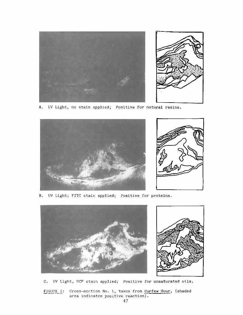
A. UV Light, no stain applied; Positive for natural resins.
B. UV Light; FITC stain applied; Positive for proteins.
C. UV Light, DCF stain applied; Positive for unsaturated oils.
FIGURE 1: Cross-section No. 1, taken from Curfew Hour, (shaded area indicates positive reaction).
47
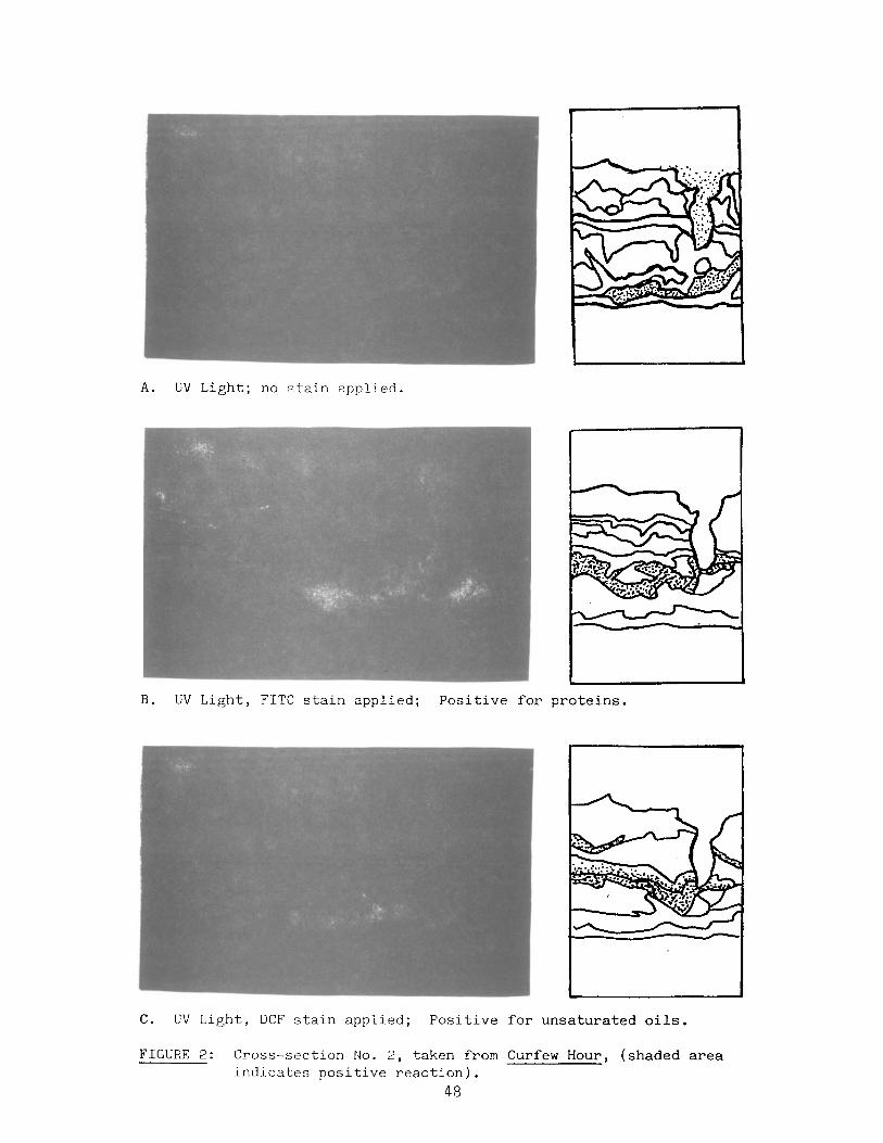
A. UV Light; no stain applied.
B. UV Light, FITC stain applied; Positive for proteins.
C. UV Light, DCF stain applied; Positive for unsaturated oils.
FIGURE 2: Cross-section No. 2, taken from Curfew Hour, (shaded area indicates positive reaction).
48

A. Cross-section No. 1, UV Light.
B. Cross-section No. 2, UV Light.
FIGURE 3: Cross-sections 1 and 2 from Curfew Hour. Stained with TTC, a carbohydrate stain (shaded ^rea indicates positive reaction).
49

A. UV Light, no stain applied.
B. UV Light, no stain applied.
FIGURE 4: Cross-sections from Ryder Forgeries 1 and 2.
50

Update on The Artists1 Technique Data File
Camilla Van Vooren
The artists' techniques data file, formerly under the Aegis of the Mayer Center, is continuing under the University of Delaware/Winterthur Art Conservation Program.
A.T.D.F. was initially conceived as an information source for unusual aspects of contemporary artists1 techniques which would have some effect on treatment choices.
This summer it will be converted from syntrex office systems to IBM and the part-time technical secretary will be entering new materials submitted by conservators, other contributors and two conservation fellows, Shelley Svoboda and myself. The updated file should be available in the fall.
The concentration of our research for the artists' techniques data file was secondary source materials and the editing of existing entries which lacked proper documentation as suggested by Gay Myers, several years ago. Research for the file has been dormant since 1984 when Wendy Samet worked on the file as a summer work project for the Winterthur Program. Because of this, sources such as AATA and Art Index were used to locate articles which included technical data from 1984 to the present. Entries were made from these and from a series of approximately 90 Art News articles from the late 1940fs to the early 1960's on the subject of the techniques of various artists.
One thing I learned from this research is that relevant technical data for A.T.D.F. is often hidden in articles which may not be referenced under such subject headings as artists' methods, materials, techniques, etc..
It is for this reason that increased participation in the gathering of data for the file is crucial. What's more conservators have the unique opportunity to learn of methods employed by artists through technical analysis testing and intimate contact with art objects. The sharing of this information via A.T.D.F. will ultimately provide a useful and reliable reference source that can be accessed at the work place.
In order for the file to be truly reliable, good documentation for entries is stressed. If an artist or a family member of an artist is contacted for technical information, it is crucial that the written entry be dated and clearly stated. Secondly, source material naturally requires standard bibliographic references. The form includes a section indicating whether the source is personal or written communication with the artist, a bibliographic source or the result of technical investigation or treatment. Thus, A.T.D.F. is a means by which we can share our treatment experience and expertise in the work of a certain artist.
I should add that technical data relating to treatment procedures concerning an artist of any period, not only contemporary is appropriate. If you are willing to make contributions, a sample A.T.D.F. form will be included in the next, Painting Specialty Group mailing. For ordering copies when they are available please call or write the Winterthur Art Conservation Program at (302) 451-2479.
51