P9PAul Velasco
21
PORTFOLIO Paul Velasco DESIGNER
-
Upload
paul-velasco -
Category
Documents
-
view
30 -
download
0
description
BYU-i Homework
Transcript of P9PAul Velasco

PORTFOLIOPaul Velasco
DESIGNER

Table Of ContentMontageLogosLetterheadBusiness CardBrochureFlierEvent AdWeb PageImaging

MontageDescription:� is a montage project where the highlight and desaturation are present. Also, the white shape creates a 3d e� ect that help the reader to focus on the message.
Date: February 14th, 2016
Process:Adobe Illustrator was used in this design, creating to layer with the same image. one of them was desaturated and a vector mask was added to express a 3d sensation.
� e blured image create the senssation of a future consequence.
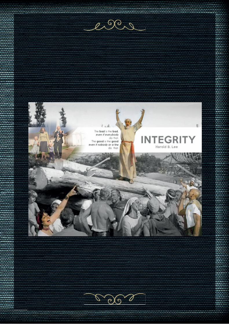
Message:� e good is good, even if nobody understand it.
LogosDescription: Logos for a musicians society, those musicians play the double-bass.
Date:February 21th, 2016
Process Sketches, Illustrator, then the use of the pan tool was painful but fun at the end. I tried to make it easier to understand and read. Align elements, choose and apply the colors, choose the fonts, explore the bene� ts of the path� nder. Also organize each logo in layer groups.
Message: We are an organized group that help and promo to the double-bassists in Ecuador
Audience: Musicians from 10 to 80 years old.


Letterhead
Description:Photographer Diana Guzmán, required a letterhead for his mail and noti� cations. It contains a wattermark and contact information
Date:Febrary 21st, 2016
Process:I created the logo using simple shapes in Adobe Illustrator and Adobe InDesign. I also used the pan tool to create new shapes and my logo and created the business cards.
Message: � e photography studio o� ers a professional services and a fancy ending.


Bussines cardDescription:� e business card match with the letterhead, the color scheme o� ers security and the contact info.
Date:Febrary 22nd, 2016
Process:I created the logo using simple shapes in Adobe Illustrator and Adobe InDesign. I also used the pan tool to create new shapes and my logo and created the business cards .AI � le into this document.
Message: � e photography studio will keep your moments.


BrochureDescription:A two sided (duplex) folding brochure.
Date:March 27yh,2016
Process:I set up the gateway fold in Adobe InDesign & Adobe Illustrator. I split my layout into three sections.
� e vector image helpes with the message and o� ered � ow.
Programs/Tools Used:Adobe InDesign/Adobe Illustrator/Adobe Photoshop/Adobe Capture
Message: Drink water but drink it in our bottle, the water botlle (wattle).

flierDescription:Black & White promotional � ier to promote a graduate leadership conference.
Date:January 23th, 2016
Process:I � rst created some sketches of my layout. � en I used that information to move it to Adobe InDesign. I used gray boxes for repetition and contrast. I also emphasized in a couple of words in my text boxes, and to create an understandable � ow. I le� white space and kept my body copy clear to read. I was given the image, logo, and content for this � ier.
Message:I tried to express the idea that it´s an important and delightful experience. And that the members of the conference will be in a good place and in good hands.
Audience:Recent graduates who are 21-40 years of age.


Description:A color full-bleed event ad to promote an art exhibition to collect founds for a scholarship program organized by colors&hope.com.
Date:January 31st, 2016
Process:Microso� Word was used to create this design then, the sketches were created thinking about the audience, a group of people economically established. I tried this time to create triangular shapes and contrast them with the color. � e opacity was a very good feature that I found in word. I care about the white space and I used the same typefaces.
Message:Come, see or buy a piece of art and help us to collect money.
event ad


Description:Web paged designed for the presentation of a logo.
Date:March 13th, 2016
Process (Programs, Tools, Skills):Adobe´s Brackets was used for the htmal and css design. It was created using Adobe Illustrator. � e hex-code of my color is “#ADD9C7” described as a light-green. � e Monochromatic scheme was called “HOPE.” “HOPE” contribute to the traditional line of the organization. Also, the color “#FFF” (white) is used for the body and iconography in this version of the logo. If is required, a transparency edition is available.
Message: We are bassists, grouped to share and create content regarding our profesional develpment.
Audience:� e “scenarios” and “personas” used as target audience are Musicians, Double-bassists, Classical and Jazz lovers. � ose are around the 14 to 60 years old. � ey can be amateur, music professionals.
web page


Description: Photo edition and book cover
Date:April 2nd, 2016
Process (Programs, Tools, Skills):Adobe Photoshop and Illustrator. � e picture was clari� ed and worked with photoshop. It served to the � ow of the message for the cover of the book.
Message: � e kids and his care is the subject of the book.
Audievnce:Any parent or young people that are preparing themselves for the fatherhood journey.
imaging