
Own images
13
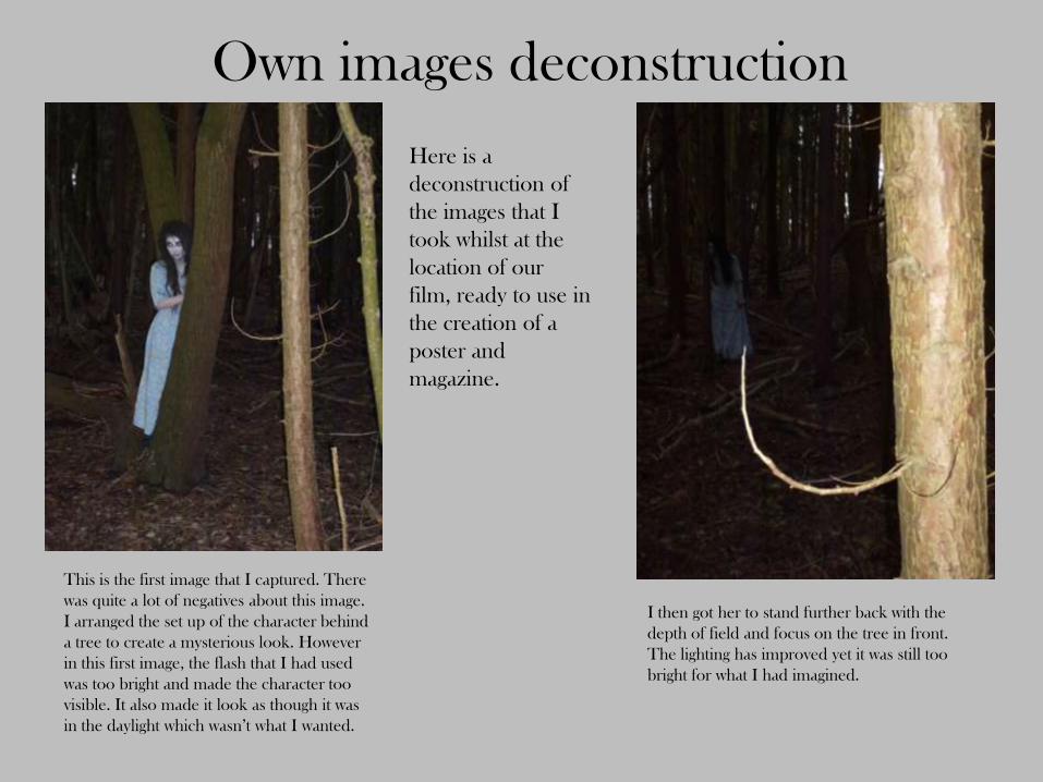
Own images deconstruction Here is a deconstruction of the images that I took whilst at the location of our film, ready to use in the creation of a poster and magazine. This is the first image that I captured. There was quite a lot of negatives about this image. I arranged the set up of the character behind a tree to create a mysterious look. However in this first image, the flash that I had used was too bright and made the character too visible. It also made it look as though it was in the daylight which wasn’t what I wanted. I then got her to stand further back with the depth of field and focus on the tree in front. The lighting has improved yet it was still too bright for what I had imagined.
-
Upload
chloeanne94 -
Category
Documents
-
view
22 -
download
1
Transcript of Own images
Own images deconstruction
Here is a
deconstruction of
the images that I
took whilst at the
location of our
film, ready to use in
the creation of a
poster and
magazine.
This is the first image that I captured. There
was quite a lot of negatives about this image.
I arranged the set up of the character behind
a tree to create a mysterious look. However
in this first image, the flash that I had used
was too bright and made the character too
visible. It also made it look as though it was
in the daylight which wasn’t what I wanted.
I then got her to stand further back with the
depth of field and focus on the tree in front.
The lighting has improved yet it was still too
bright for what I had imagined.

This time I tried a movement shot. I quite liked
this as you could visibly see the swaying of her
dress. The characters face is also not very
visible which doesn’t give away too much of
what the character looks like. I tried to capture
both landscape and portrait images so that I
would have a range of sizes and shaped to work
with when it came to making my magazine and
poster.
I tried that image again however the
flash on this was too bright.

After playing around with the camera, I discovered
different settings. For these images I used a setting called
‘pinhole’ which gave the image a black edge and darkened
shadows and highlighted the brightness. This effect was
perfect, it made the background dark making it look like
night time and made the character more mysterious and
eerie. I decided to take a close up shot so that I could try
and use completely different images for my magazine and
my poster to give the audience more hints as to what the
character to look like. I did like the focus on the branches
in the image, however I still felt as though the character was
still too visible. Yet I decided to carry on and try and take
some more images using this setting.
This image worked much better. I stood further
away so that the character would almost appear to
be lurking. The darkness of this photograph was
clos to what I wanted however, I could still work
with this as I could edit it using Photoshop to
make it appear darker. There is red eye captured
in this photograph, however I feel it works well, it
gives the character an almost demon like feel
about her.

This image was certainly an
improvement. The background was
darker and the character blended in
with that. If I were to use this on my
poster, I’d want this kind of hidden
character idea so that when looking at
the poster it will shock the audience
when they spot the character in the
background.
Once again, the darker
background works well
here, however I didn’t
really like her posture too
much in this shot.
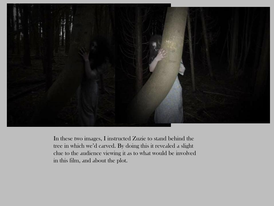
In these two images, I instructed Zuzie to stand behind the
tree in which we’d carved. By doing this it revealed a slight
clue to the audience viewing it as to what would be involved
in this film, and about the plot.
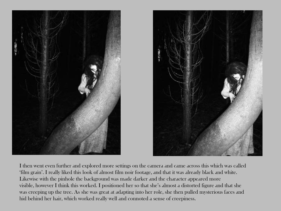
I then went even further and explored more settings on the camera and came across this which was called
‘film grain’. I really liked this look of almost film noir footage, and that it was already black and white.
Likewise with the pinhole the background was made darker and the character appeared more
visible, however I think this worked. I positioned her so that she’s almost a distorted figure and that she
was creeping up the tree. As she was great at adapting into her role, she then pulled mysterious faces and
hid behind her hair, which worked really well and connoted a sense of creepiness.
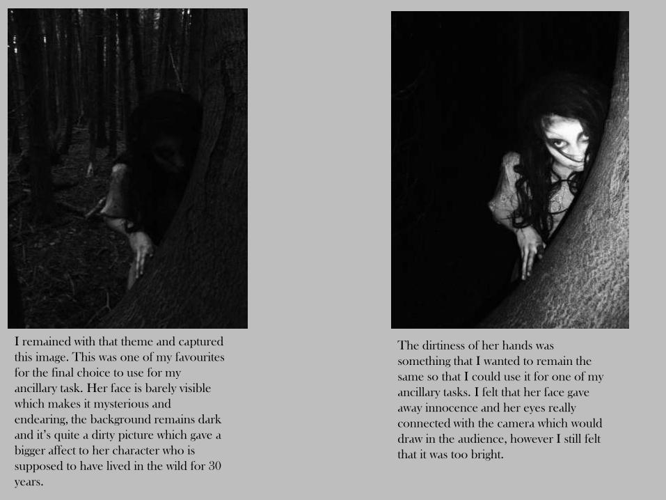
I remained with that theme and captured
this image. This was one of my favourites
for the final choice to use for my
ancillary task. Her face is barely visible
which makes it mysterious and
endearing, the background remains dark
and it’s quite a dirty picture which gave a
bigger affect to her character who is
supposed to have lived in the wild for 30
years.
The dirtiness of her hands was
something that I wanted to remain the
same so that I could use it for one of my
ancillary tasks. I felt that her face gave
away innocence and her eyes really
connected with the camera which would
draw in the audience, however I still felt
that it was too bright.

This image is like the last, I continuously used
the film grain affect which made the
background dark, however Zuzie, as the
character has been exposed to too much flash
and she was too visible. The face that she’s
modelling here is very innocent once again
and almost looks sad.
Same setting, however this face is a
little more eerie, which works
really well in terms of attracting the
audience when they walk past it or
just happen to see it.

For this image, I took a portrait shot of Zuzie in the
distance. This didn’t work so well as she’s barely visible
and most likely too far away, however the way in which
the trees are positioned give them almost a haunting
feel. They’re stood tall and seem long, thin and spindly
which makes them seem over-powering and almost
personifying them. This is the kind of uneasy feeling I
want the audience to take away from seeing this poster
of magazine and in turn want to watch the film.
For this, I reverted back to the pinhole
setting. I tried using it without the flash
and it gave a much darker image. I wanted
to capture movement again, and asked her
to run away from the camera. I still think
in this shot she was too far away.

This image was one of my favourites. There are a lot
of positives in this image. This is a landscape
shot, which like the poster for ‘The Ring’ would
work well as a poster and be different. The darkness
is mainly around the character giving it this aspect of
a halo around her, a light glowing from her which
could be a binary opposition of the character that she
plays. The trees are very tall once again, and they’re
facing all different ways which gives it an uneasy feel
and they appear distorted. The distance between the
camera and the character is how I wanted it, she’s
not too far away, yet not so far away that she’s not
visible to the audience. The only thing I’d change
about this image would be the brightness, I would try
and dull it down so that it wasn’t so light around her.
Once again, I really though this was
successful. The movement is very eerie, and
initially it’s hard to spot the character which
would work well in trying to entice the
audience. The movement is almost 3D and it
appears as though she’s running at the
camera and out of the poster. If I were to use
this image I would have to make it lighter.

For these next two images I changed the positioning of the character.
For the first shot, I took a close up image of half of her face, so that
it would still have the elements of a mystery character. The second
image, I took a close up image using no flash and the characters full
face. As it was quite a windy day, it blew her hair onto her face
hiding features which worked well and maintained the mystery effect
that I wanted. However, these image could be made brighter using
photoshop.

For these two, I decided to completely change
around the positioning and focus on one part of
the body. I didn’t want to use her face or body for
this and experimented with her hands. I asked her
to grab hold of her dress, almost as though it was
draping out of her hand and took the picture so
that only half of her waist was in it. I thought this
was quite successful and her hands looked quite
dirty, which I really liked the effect of.
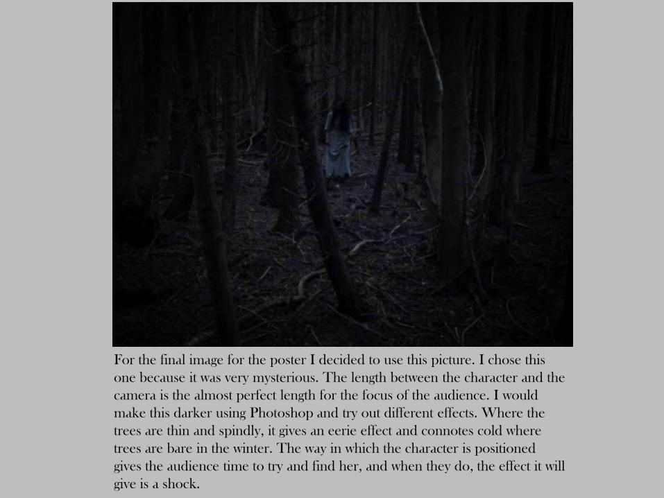
For the final image for the poster I decided to use this picture. I chose this
one because it was very mysterious. The length between the character and the
camera is the almost perfect length for the focus of the audience. I would
make this darker using Photoshop and try out different effects. Where the
trees are thin and spindly, it gives an eerie effect and connotes cold where
trees are bare in the winter. The way in which the character is positioned
gives the audience time to try and find her, and when they do, the effect it will
give is a shock.