Outline Interface Design Roadmap Information Presentation · Interface Design Roadmap Conceptual...
4
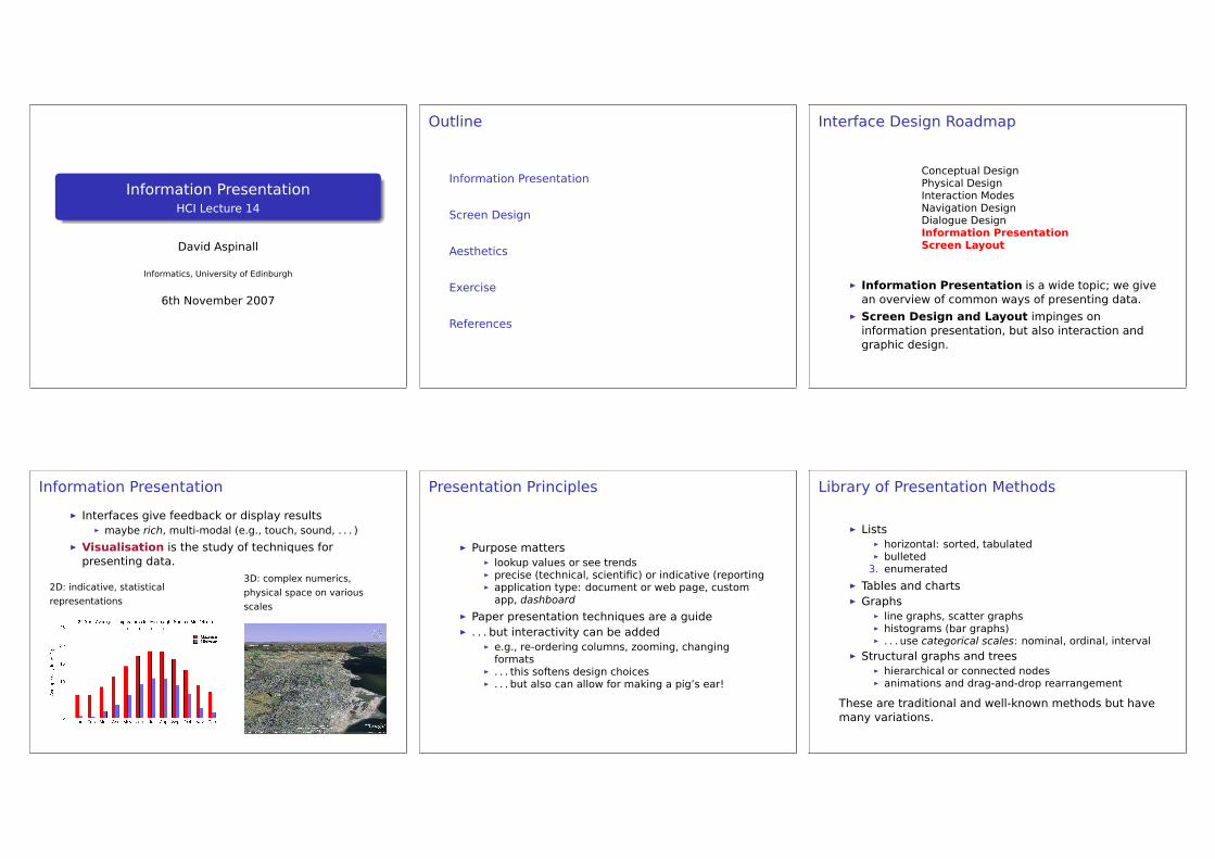
Information Presentation HCI Lecture 14 David Aspinall Informatics, University of Edinburgh 6th November 2007 Outline Information Presentation Screen Design Aesthetics Exercise References Interface Design Roadmap Conceptual Design Physical Design Interaction Modes Navigation Design Dialogue Design Information Presentation Screen Layout Information Presentation is a wide topic; we give an overview of common ways of presenting data. Screen Design and Layout impinges on information presentation, but also interaction and graphic design. Information Presentation Interfaces give feedback or display results maybe rich, multi-modal (e.g., touch, sound, . . . ) Visualisation is the study of techniques for presenting data. 2D: indicative, statistical representations 3D: complex numerics, physical space on various scales Presentation Principles Purpose matters lookup values or see trends precise (technical, scientific) or indicative (reporting application type: document or web page, custom app, dashboard Paper presentation techniques are a guide . . . but interactivity can be added e.g., re-ordering columns, zooming, changing formats . . . this softens design choices . . . but also can allow for making a pig’s ear! Library of Presentation Methods Lists horizontal: sorted, tabulated bulleted 3. enumerated Tables and charts Graphs line graphs, scatter graphs histograms (bar graphs) . . . use categorical scales: nominal, ordinal, interval Structural graphs and trees hierarchical or connected nodes animations and drag-and-drop rearrangement These are traditional and well-known methods but have many variations.
Transcript of Outline Interface Design Roadmap Information Presentation · Interface Design Roadmap Conceptual...
Information PresentationHCI Lecture 14
David Aspinall
Informatics, University of Edinburgh
6th November 2007
Outline
Information Presentation
Screen Design
Aesthetics
Exercise
References
Interface Design Roadmap
Conceptual DesignPhysical DesignInteraction ModesNavigation DesignDialogue DesignInformation PresentationScreen Layout
É Information Presentation is a wide topic; we givean overview of common ways of presenting data.
É Screen Design and Layout impinges oninformation presentation, but also interaction andgraphic design.
Information Presentation
É Interfaces give feedback or display resultsÉ maybe rich, multi-modal (e.g., touch, sound, . . . )
É Visualisation is the study of techniques forpresenting data.
2D: indicative, statisticalrepresentations
3D: complex numerics,physical space on variousscales
Presentation Principles
É Purpose mattersÉ lookup values or see trendsÉ precise (technical, scientific) or indicative (reportingÉ application type: document or web page, customapp, dashboard
É Paper presentation techniques are a guideÉ . . . but interactivity can be added
É e.g., re-ordering columns, zooming, changingformats
É . . . this softens design choicesÉ . . . but also can allow for making a pig’s ear!
Library of Presentation Methods
É ListsÉ horizontal: sorted, tabulatedÉ bulleted3. enumerated
É Tables and chartsÉ Graphs
É line graphs, scatter graphsÉ histograms (bar graphs)É . . . use categorical scales: nominal, ordinal, interval
É Structural graphs and treesÉ hierarchical or connected nodesÉ animations and drag-and-drop rearrangement
These are traditional and well-known methods but havemany variations.
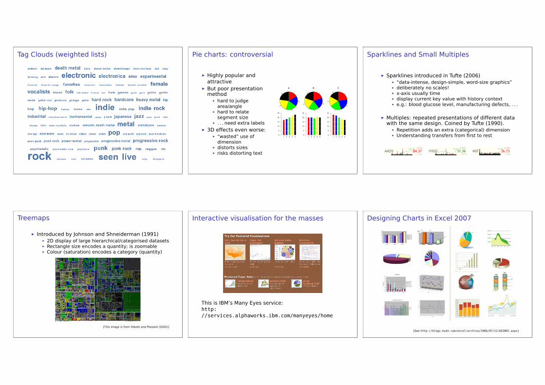
Tag Clouds (weighted lists) Pie charts: controversial
É Highly popular andattractive
É But poor presentationmethodÉ hard to judgearea/angle
É hard to relatesegment size
É . . . need extra labelsÉ 3D effects even worse:
É “wasted” use ofdimension
É distorts sizesÉ risks distorting text
Sparklines and Small Multiples
É Sparklines introduced in Tufte (2006)É “data-intense, design-simple, word-size graphics”É deliberately no scales!É x-axis usually timeÉ display current key value with history contextÉ e.g.: blood glucose level, manufacturing defects, . . .
É Multiples: repeated presentations of different datawith the same design. Coined by Tufte (1990).É Repetition adds an extra (categorical) dimensionÉ Understanding transfers from first to rest
Treemaps
É Introduced by Johnson and Shneiderman (1991)É 2D display of large hierarchical/categorised datasetsÉ Rectangle size encodes a quantity; is zoomableÉ Colour (saturation) encodes a category (quantity)
[This image is from Fekete and Plaisant (2002)]
Interactive visualisation for the masses
This is IBM’s Many Eyes service:http://services.alphaworks.ibm.com/manyeyes/home
Designing Charts in Excel 2007
[See http://blogs.msdn.com/excel/archive/2006/07/12/663801.aspx]
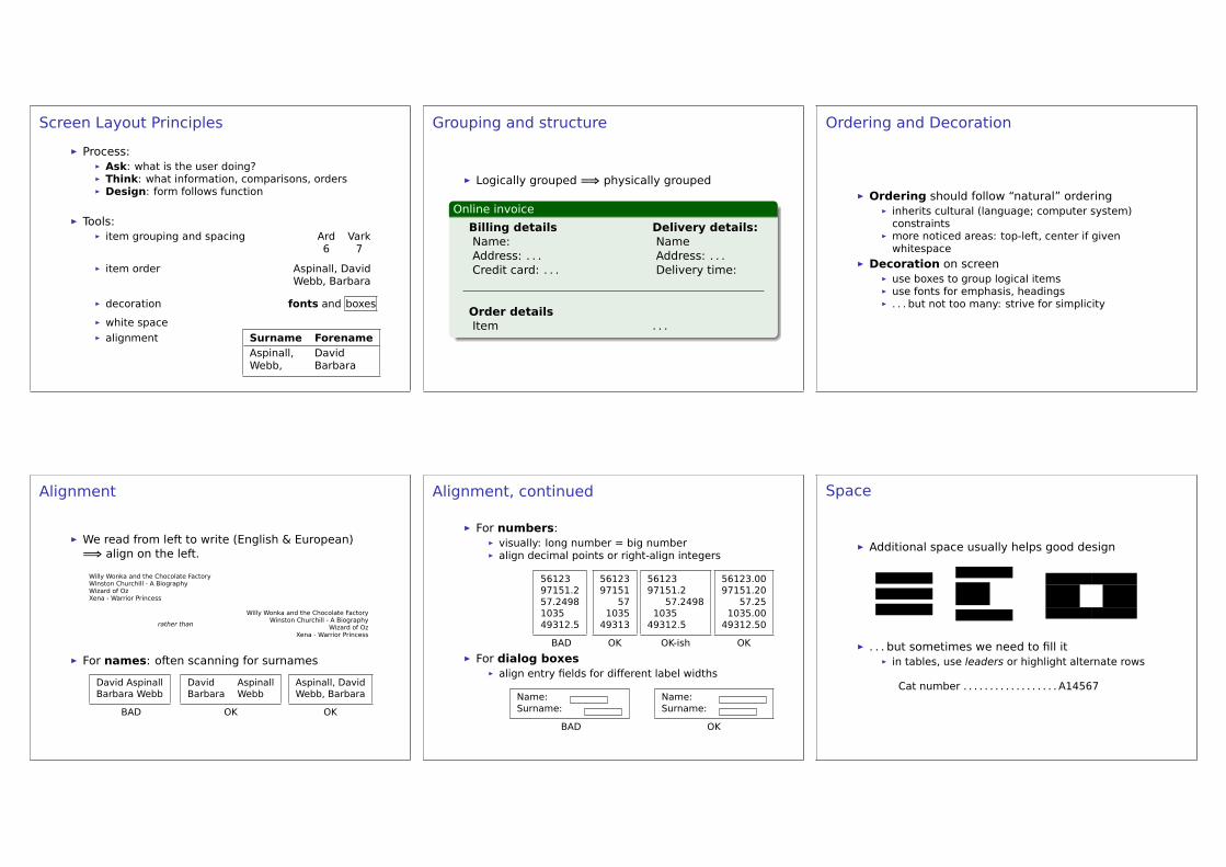
Screen Layout Principles
É Process:É Ask: what is the user doing?É Think: what information, comparisons, ordersÉ Design: form follows function
É Tools:É item grouping and spacing Ard Vark
6 7
É item order Aspinall, DavidWebb, Barbara
É decoration fonts and boxes
É white spaceÉ alignment Surname Forename
Aspinall, DavidWebb, Barbara
Grouping and structure
É Logically grouped =⇒ physically grouped
Online invoice
Billing details Delivery details:Name: NameAddress: . . . Address: . . .Credit card: . . . Delivery time:
Order detailsItem . . .
Ordering and Decoration
É Ordering should follow “natural” orderingÉ inherits cultural (language; computer system)constraints
É more noticed areas: top-left, center if givenwhitespace
É Decoration on screenÉ use boxes to group logical itemsÉ use fonts for emphasis, headingsÉ . . . but not too many: strive for simplicity
Alignment
É We read from left to write (English & European)=⇒ align on the left.
Willy Wonka and the Chocolate FactoryWinston Churchill - A BiographyWizard of OzXena - Warrior Princess
rather than
Willy Wonka and the Chocolate FactoryWinston Churchill - A Biography
Wizard of OzXena - Warrior Princess
É For names: often scanning for surnames
David AspinallBarbara Webb
BAD
David AspinallBarbara Webb
OK
Aspinall, DavidWebb, Barbara
OK
Alignment, continued
É For numbers:É visually: long number = big numberÉ align decimal points or right-align integers
5612397151.257.2498103549312.5
BAD
5612397151
571035
49313
OK
5612397151.2
57.24981035
49312.5
OK-ish
56123.0097151.20
57.251035.00
49312.50
OK
É For dialog boxesÉ align entry fields for different label widths
Name:Surname:
BAD
Name:Surname:
OK
Space
É Additional space usually helps good design
É . . . but sometimes we need to fill itÉ in tables, use leaders or highlight alternate rows
Cat number . . . . . . . . . . . . . . . . . . A14567
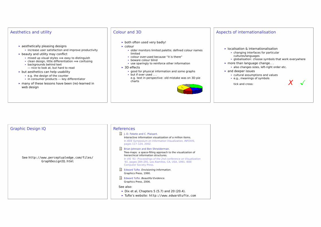
Aesthetics and utility
É aesthetically pleasing designsÉ increase user satisfaction and improve productivity
É beauty and utility may conflictÉ mixed up visual styles =⇒ easy to distinguishÉ clean design, little differentiation =⇒ confusingÉ backgrounds behind text— nice to look at, but hard to read
É but aesthetics can help usabilityÉ e.g. the design of the counterÉ in consumer products — key differentiator
É many of these lessons have been (re)-learned inweb design
Colour and 3D
É both often used very badly!É colour
É older monitors limited palette; defined colour nameslimited
É colour over-used because “it is there”É beware colour blindÉ use sparingly to reinforce other information
É 3D effectsÉ good for physical information and some graphsÉ but if over used . . .e.g. text in perspective: old mistake was on 3D piecharts
Aspects of internationalisation
É localisation & internationalisationÉ changing interfaces for particularcultures/languages
É globalisation: choose symbols that work everywhereÉ more than language change. . .
É also changes sizes, left-right order etc.É and deeper issues
É cultural assumptions and valuesÉ e.g., meanings of symbols
tick and cross: X Ø
Graphic Design IQ
See http://www.perceptualedge.com/files/GraphDesignIQ.html
ReferencesJ.-D. Fekete and C. Plaisant.Interactive information visualization of a million items.In IEEE Symposium on Information Visualization, INFOVIS,pages 117–124, 2002.
Brian Johnson and Ben Shneiderman.Tree-maps: a space-filling approach to the visualization ofhierarchical information structures.In VIS ’91: Proceedings of the 2nd conference on Visualization’91, pages 284–291, Los Alamitos, CA, USA, 1991. IEEEComputer Society Press.
Edward Tufte. Envisioning Information.Graphics Press, 1990.
Edward Tufte. Beautiful Evidence.Graphics Press, 2006.
See also:É Dix et al, Chapters 5 (5.7) and 20 (20.4).É Tufte’s website: http://www.edwardtufte.com