Ottawa Real Estate Stats & Charts July 2016
13
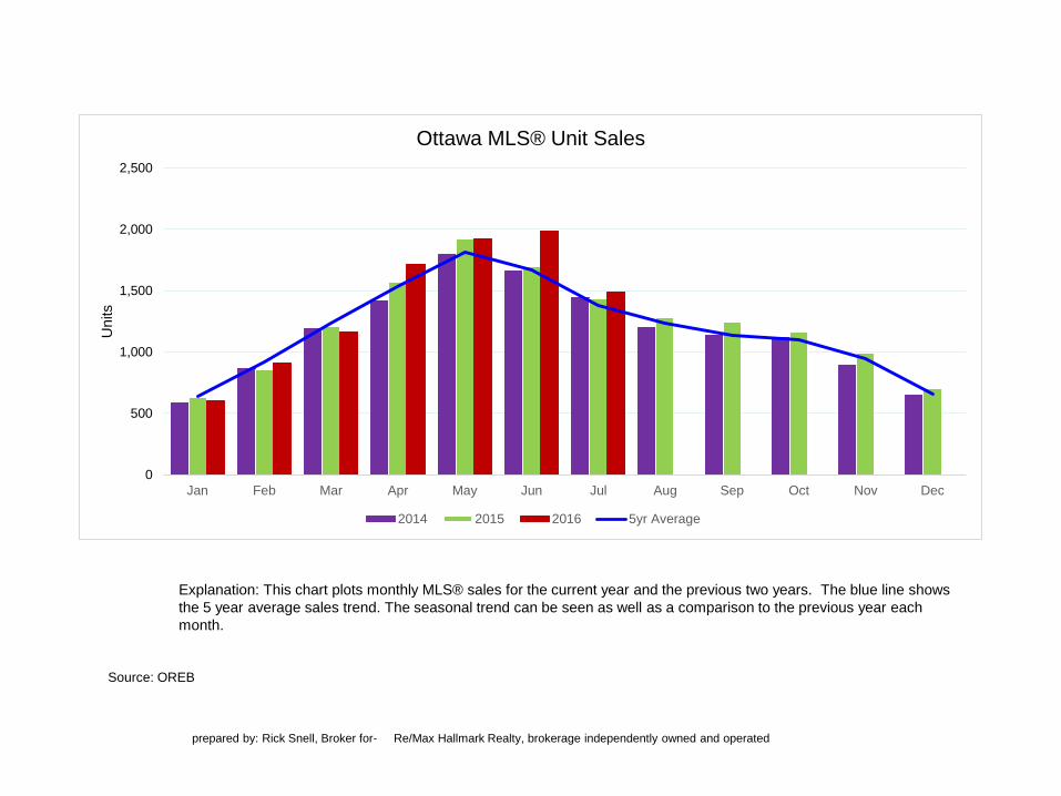
Source: OREB Explanation: This chart plots monthly MLS® sales for the current year and the previous two years. The blue line shows the 5 year average sales trend. The seasonal trend can be seen as well as a comparison to the previous year each month. prepared by: Rick Snell, Broker for- Re/Max Hallmark Realty, brokerage independently owned and operated 0 500 1,000 1,500 2,000 2,500 Jan Feb Mar Apr May Jun Jul Aug Sep Oct Nov Dec Units Ottawa MLS® Unit Sales 2014 2015 2016 5yr Average
-
Upload
rick-snell -
Category
Real Estate
-
view
14 -
download
0
Transcript of Ottawa Real Estate Stats & Charts July 2016
Source: OREB
Explanation: This chart plots monthly MLS® sales for the current year and the previous two years. The blue line shows
the 5 year average sales trend. The seasonal trend can be seen as well as a comparison to the previous year each
month.
prepared by: Rick Snell, Broker for- Re/Max Hallmark Realty, brokerage independently owned and operated
0
500
1,000
1,500
2,000
2,500
Jan Feb Mar Apr May Jun Jul Aug Sep Oct Nov Dec
Units
Ottawa MLS® Unit Sales
2014 2015 2016 5yr Average
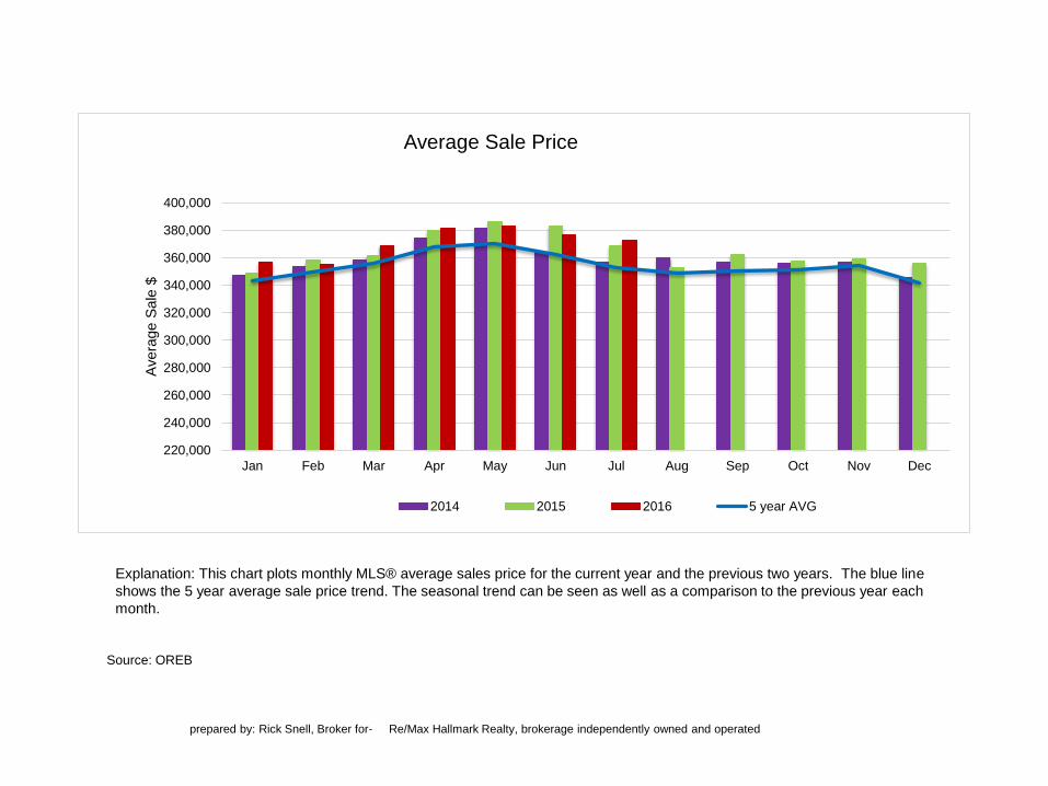
Source: OREB
Explanation: This chart plots monthly MLS® average sales price for the current year and the previous two years. The blue line
shows the 5 year average sale price trend. The seasonal trend can be seen as well as a comparison to the previous year each
month.
prepared by: Rick Snell, Broker for- Re/Max Hallmark Realty, brokerage independently owned and operated
220,000
240,000
260,000
280,000
300,000
320,000
340,000
360,000
380,000
400,000
Jan Feb Mar Apr May Jun Jul Aug Sep Oct Nov Dec
Avera
ge S
ale
$
Average Sale Price
2014 2015 2016 5 year AVG
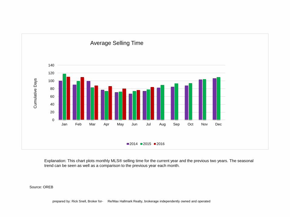
Source: OREB
Explanation: This chart plots monthly MLS® selling time for the current year and the previous two years. The seasonal
trend can be seen as well as a comparison to the previous year each month.
prepared by: Rick Snell, Broker for- Re/Max Hallmark Realty, brokerage independently owned and operated
0
20
40
60
80
100
120
140
Jan Feb Mar Apr May Jun Jul Aug Sep Oct Nov Dec
Cum
ula
tive D
ays
Average Selling Time
2014 2015 2016
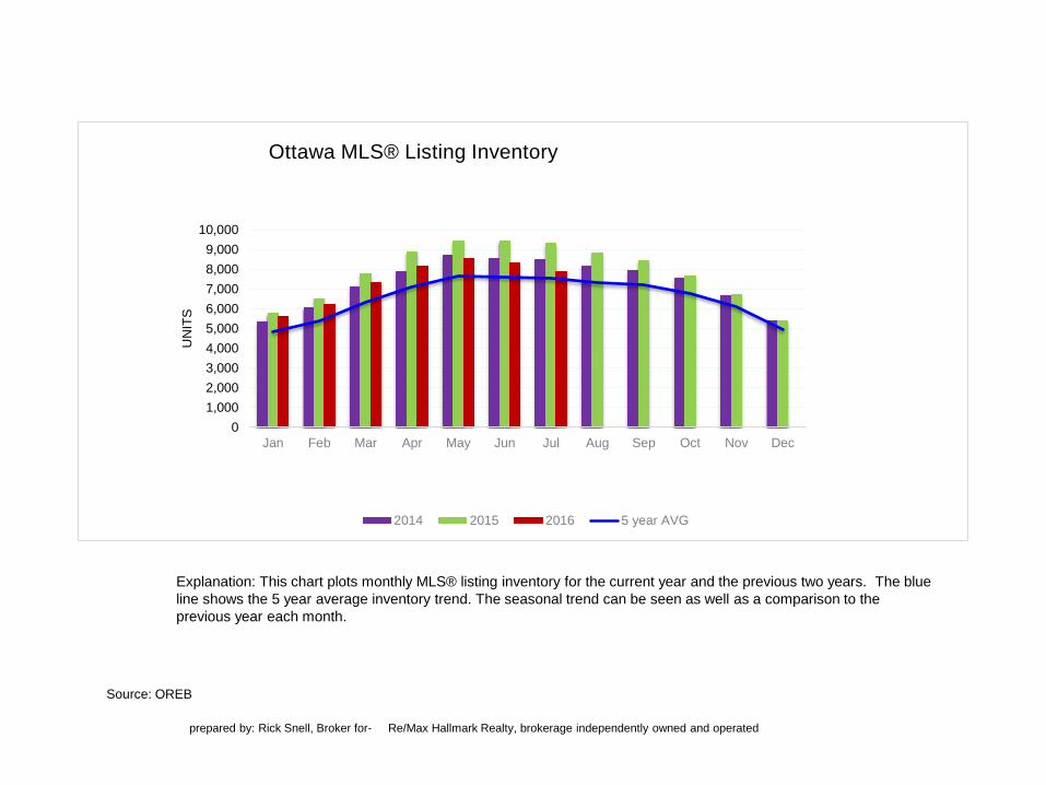
Source: OREB
Explanation: This chart plots monthly MLS® listing inventory for the current year and the previous two years. The blue
line shows the 5 year average inventory trend. The seasonal trend can be seen as well as a comparison to the
previous year each month.
prepared by: Rick Snell, Broker for- Re/Max Hallmark Realty, brokerage independently owned and operated
0
1,000
2,000
3,000
4,000
5,000
6,000
7,000
8,000
9,000
10,000
Jan Feb Mar Apr May Jun Jul Aug Sep Oct Nov Dec
UN
ITS
Ottawa MLS® Listing Inventory
2014 2015 2016 5 year AVG
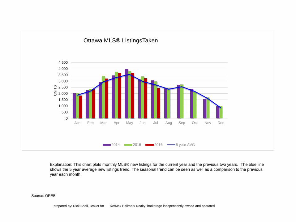
Source: OREB
Explanation: This chart plots monthly MLS® new listings for the current year and the previous two years. The blue line
shows the 5 year average new listings trend. The seasonal trend can be seen as well as a comparison to the previous
year each month.
prepared by: Rick Snell, Broker for- Re/Max Hallmark Realty, brokerage independently owned and operated
0
500
1,000
1,500
2,000
2,500
3,000
3,500
4,000
4,500
Jan Feb Mar Apr May Jun Jul Aug Sep Oct Nov Dec
UN
ITS
Ottawa MLS® ListingsTaken
2014 2015 2016 5 year AVG

Source: OREB
Explanation: This chart plots monthly MLS® absorption rate for two years. The absorption rate is the # of months it
would take to sell off existing listing inventory at the current pace of sales. The red line shows the residential homes
absorption rate, the green line shows the rate for condominiums and the blue line is residential & condos combined.
prepared by: Rick Snell, Broker for- Re/Max Hallmark Realty, brokerage independently owned and operated
0
2
4
6
8
10
12
14Jul'1
4
Au
g'1
4
Se
p'1
4
Oct'1
4
Nov'1
4
Dec'1
4
Jan
'15
Fe
b'1
5
Ma
r'1
5
Ap
r'1
5
Ma
y'1
5
Jun
'15
Jul'1
5
Au
g'1
5
Se
pt'15
Oct'1
5
Nov'1
5
Dec'1
5
Jan
'16
Fe
b'1
6
Ma
r'1
6
Ap
r'1
6
Ma
y'1
6
Jun
'16
Jul'1
6
Mo
nth
s o
f S
up
ply
Inventory Absorption Rate
RES CONDO Res+Condo

5%
10%
15%
20%
25%
30%Jul'1
3
Au
g'1
3
Se
pt'13
Oct'1
3
Nov'1
3
Dec'1
3
Jan
'14
Fe
b'1
4
Ma
r'1
4
Ap
r'1
4
Ma
y'1
4
Jun
'14
Jul'1
4
Au
g'1
4
Se
p'1
4
Oct'1
4
Nov'1
4
Dec'1
4
Jan
'15
Fe
b'1
5
Ma
r'1
5
Ap
r'1
5
Ma
y'1
5
Jun
'15
Jul'1
5
Au
g'1
5
Se
pt'15
Oct'1
5
Nov'1
5
Dec'1
5
Jan
'16
Fe
b'1
6
Ma
r'1
6
Ap
r'1
6
Ma
y'1
6
Jun
'16
Jul'1
6
Sales To Inventory Ratio - Ottawa
Res Condo RES+CDO
Source: OREB
Explanation: This chart plots monthly MLS® sales to listing inventory ratio for three years. This ratio indicates the
market balance. A ratio between 15%-25% is a balanced market which favors neither buyer or seller. A ratio below
15% favors buyers (supply is high - demand is low). A ratio above 25% favors sellers (supply is low - demand is high)
The red line shows the residential homes ratio, the green line shows the ratio for condominiums and the blue line
represents residential & condos combined..
prepared by: Rick Snell, Broker for- Re/Max Hallmark Realty, brokerage independently owned and operated
Buyer’s Market
Balanced Market
Seller’s Market
prepared by: Rick Snell, Broker for- Re/Max Hallmark Realty, brokerage independently owned and operated
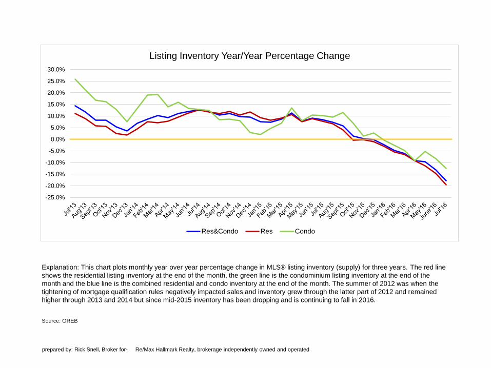
Explanation: This chart plots monthly year over year percentage change in MLS® listing inventory (supply) for three years. The red line
shows the residential listing inventory at the end of the month, the green line is the condominium listing inventory at the end of the
month and the blue line is the combined residential and condo inventory at the end of the month. The summer of 2012 was when the
tightening of mortgage qualification rules negatively impacted sales and inventory grew through the latter part of 2012 and remained
higher through 2013 and 2014 but since mid-2015 inventory has been dropping and is continuing to fall in 2016.
Source: OREB
-25.0%
-20.0%
-15.0%
-10.0%
-5.0%
0.0%
5.0%
10.0%
15.0%
20.0%
25.0%
30.0%
Listing Inventory Year/Year Percentage Change
Res&Condo Res Condo
prepared by: Rick Snell, Broker for- Re/Max Hallmark Realty, brokerage independently owned and operated
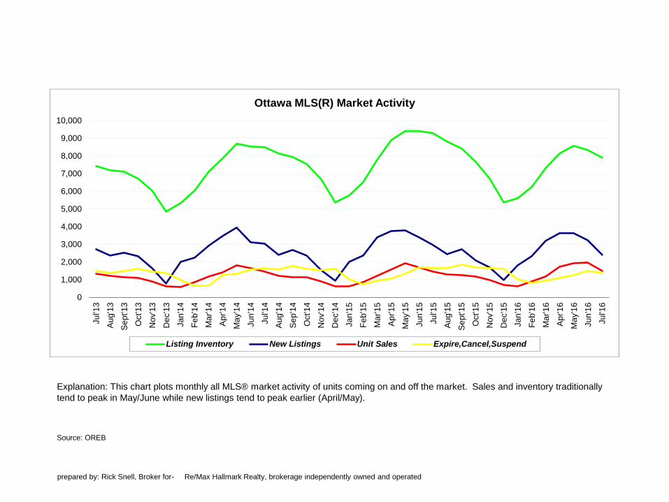
Explanation: This chart plots monthly all MLS® market activity of units coming on and off the market. Sales and inventory traditionally
tend to peak in May/June while new listings tend to peak earlier (April/May).
Source: OREB
0
1,000
2,000
3,000
4,000
5,000
6,000
7,000
8,000
9,000
10,000
Jul'1
3
Au
g'1
3
Se
pt'13
Oct'1
3
Nov'1
3
Dec'1
3
Jan
'14
Fe
b'1
4
Ma
r'1
4
Ap
r'1
4
Ma
y'1
4
Jun
'14
Jul'1
4
Au
g'1
4
Se
p'1
4
Oct'1
4
Nov'1
4
Dec'1
4
Jan
'15
Fe
b'1
5
Ma
r'1
5
Ap
r'1
5
Ma
y'1
5
Jun
'15
Jul'1
5
Au
g'1
5
Se
pt'15
Oct'1
5
Nov'1
5
Dec'1
5
Jan
'16
Fe
b'1
6
Ma
r'1
6
Ap
r'1
6
Ma
y'1
6
Jun
'16
Jul'1
6
Ottawa MLS(R) Market Activity
Listing Inventory New Listings Unit Sales Expire,Cancel,Suspend
Source: OREB
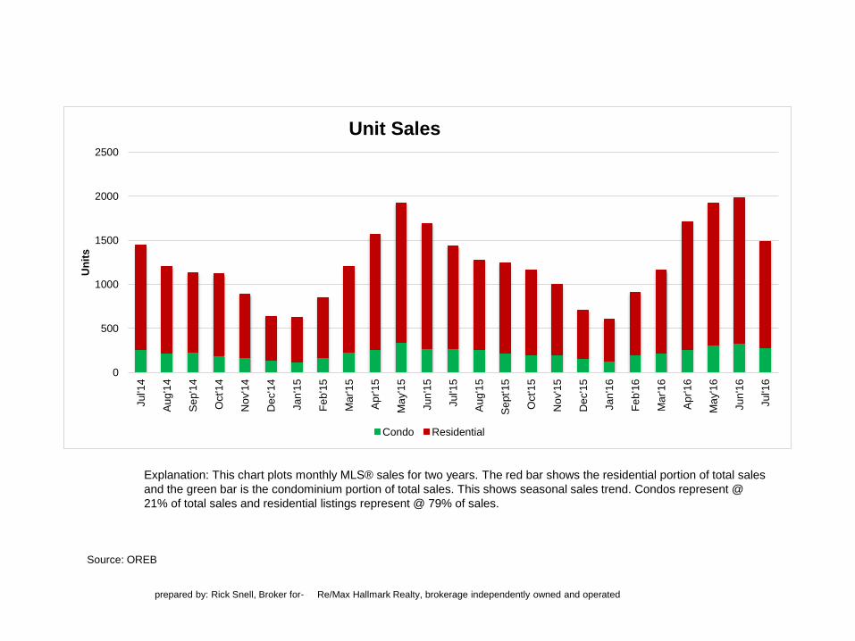
Explanation: This chart plots monthly MLS® sales for two years. The red bar shows the residential portion of total sales
and the green bar is the condominium portion of total sales. This shows seasonal sales trend. Condos represent @
21% of total sales and residential listings represent @ 79% of sales.
prepared by: Rick Snell, Broker for- Re/Max Hallmark Realty, brokerage independently owned and operated
0
500
1000
1500
2000
2500Jul'1
4
Au
g'1
4
Se
p'1
4
Oct'1
4
Nov'1
4
Dec'1
4
Jan
'15
Fe
b'1
5
Ma
r'1
5
Ap
r'1
5
Ma
y'1
5
Jun
'15
Jul'1
5
Au
g'1
5
Se
pt'15
Oct'1
5
Nov'1
5
Dec'1
5
Jan
'16
Fe
b'1
6
Ma
r'1
6
Ap
r'1
6
Ma
y'1
6
Jun
'16
Jul'1
6
Un
its
Unit Sales
Condo Residential
Source: OREB
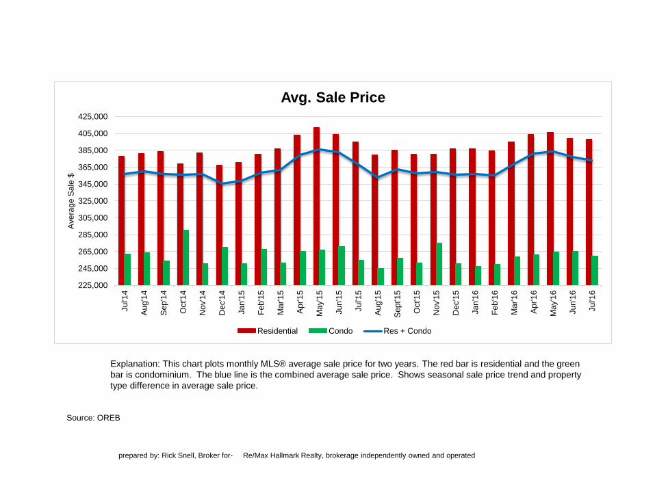
Explanation: This chart plots monthly MLS® average sale price for two years. The red bar is residential and the green
bar is condominium. The blue line is the combined average sale price. Shows seasonal sale price trend and property
type difference in average sale price.
prepared by: Rick Snell, Broker for- Re/Max Hallmark Realty, brokerage independently owned and operated
225,000
245,000
265,000
285,000
305,000
325,000
345,000
365,000
385,000
405,000
425,000Jul'1
4
Au
g'1
4
Se
p'1
4
Oct'1
4
Nov'1
4
Dec'1
4
Jan
'15
Fe
b'1
5
Ma
r'1
5
Ap
r'1
5
Ma
y'1
5
Jun
'15
Jul'1
5
Au
g'1
5
Se
pt'15
Oct'1
5
Nov'1
5
Dec'1
5
Jan
'16
Fe
b'1
6
Ma
r'1
6
Ap
r'1
6
Ma
y'1
6
Jun
'16
Jul'1
6
Ave
rag
e S
ale
$
Avg. Sale Price
Residential Condo Res + Condo
Source: OREB
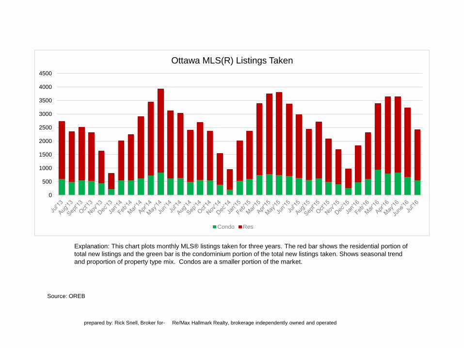
Explanation: This chart plots monthly MLS® listings taken for three years. The red bar shows the residential portion of
total new listings and the green bar is the condominium portion of the total new listings taken. Shows seasonal trend
and proportion of property type mix. Condos are a smaller portion of the market.
prepared by: Rick Snell, Broker for- Re/Max Hallmark Realty, brokerage independently owned and operated
0
500
1000
1500
2000
2500
3000
3500
4000
4500
Ottawa MLS(R) Listings Taken
Condo Res
Source: OREB
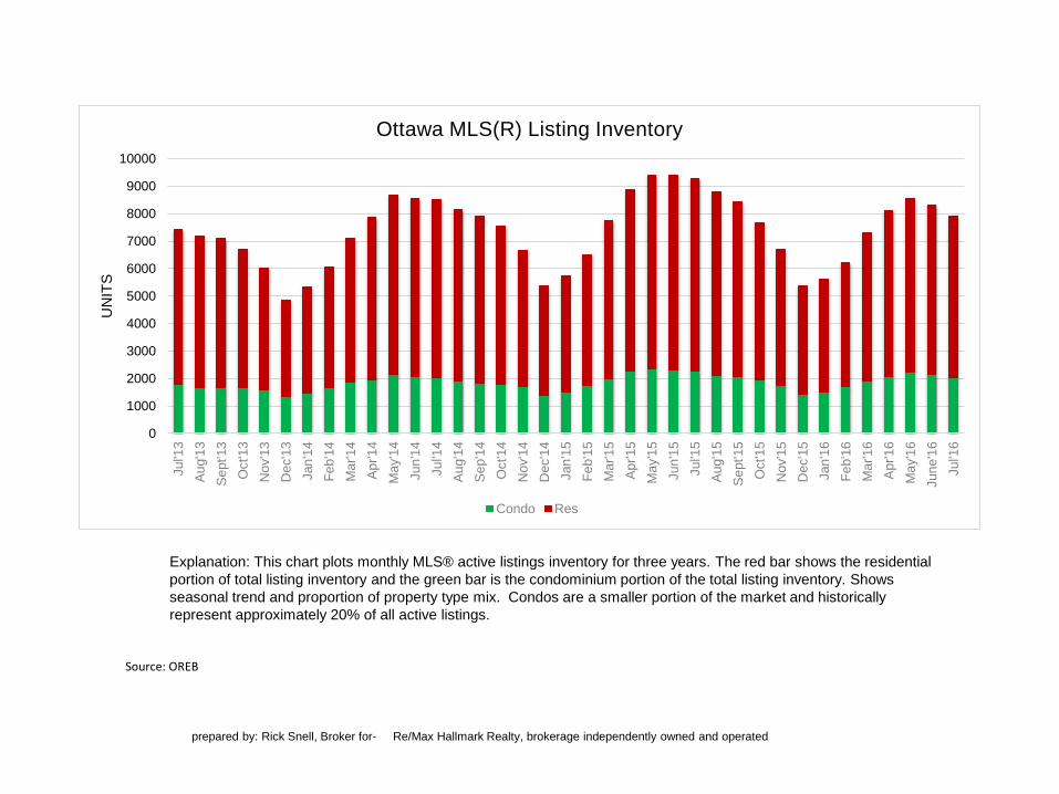
Explanation: This chart plots monthly MLS® active listings inventory for three years. The red bar shows the residential
portion of total listing inventory and the green bar is the condominium portion of the total listing inventory. Shows
seasonal trend and proportion of property type mix. Condos are a smaller portion of the market and historically
represent approximately 20% of all active listings.
prepared by: Rick Snell, Broker for- Re/Max Hallmark Realty, brokerage independently owned and operated
0
1000
2000
3000
4000
5000
6000
7000
8000
9000
10000
Jul'1
3
Au
g'1
3
Se
pt'13
Oct'1
3
Nov'1
3
Dec'1
3
Jan
'14
Fe
b'1
4
Ma
r'1
4
Ap
r'1
4
Ma
y'1
4
Jun
'14
Jul'1
4
Au
g'1
4
Se
p'1
4
Oct'1
4
Nov'1
4
Dec'1
4
Jan
'15
Fe
b'1
5
Ma
r'1
5
Ap
r'1
5
Ma
y'1
5
Jun
'15
Jul'1
5
Au
g'1
5
Se
pt'15
Oct'1
5
Nov'1
5
Dec'1
5
Jan
'16
Fe
b'1
6
Ma
r'1
6
Ap
r'1
6
Ma
y'1
6
Jun
e'1
6
Jul'1
6
UN
ITS
Ottawa MLS(R) Listing Inventory
Condo Res