Nighttime Legibility of Ground-Mounted Traffic Signs as a ... · NIGHTTIME LEGIBILITY OF...
76
Technical Report Documentation Page 1. Report No. FHWA/TX-03/1796-2 2. Government Accession No. 3. Recipient's Catalog No. 4. Title and Subtitle NIGHTTIME LEGIBILITY OF GROUND-MOUNTED TRAFFIC SIGNS AS A FUNCTION OF FONT, COLOR, AND RETROREFLECTIVE SHEETING TYPE 5. Report Date September 2002 6. Performing Organization Code 7. Author(s) Susan T. Chrysler, Paul J. Carlson, and H. Gene Hawkins 8. Performing Organization Report No. Report 1796-2 10. Work Unit No. (TRAIS) 9. Performing Organization Name and Address Texas Transportation Institute The Texas A&M University System College Station, Texas 77843-3135 11. Contract or Grant No. Project No. 0-1796 13. Type of Report and Period Covered Research September 1999 – August 2002 12. Sponsoring Agency Name and Address Texas Department of Transportation Research and Technology Implementation Office P. O. Box 5080 Austin, Texas 78763-5080 14. Sponsoring Agency Code 15. Supplementary Notes Research performed in cooperation with the Texas Department of Transportation and the U.S. Department of Transportation, Federal Highway Administration. Research Project Title: Impacts of Retroreflectivity on Sign Management, Maintenance, and Design 16. Abstract A closed course nighttime legibility study measured legibility distance for 6 inch letters using Highway Series D and two experimental fonts, Clearview Condensed Road and a D-Modified font. The Clearview font has a thinner stroke width than Series D and was used for white-on-green signs. The D-Modified font has a thicker stroke width than Series D and was used for black letters on white, yellow, and orange backgrounds. Three types of retroreflective sheeting were tested: ASTM Types III, VIII, and IX. Forty- eight signs were used; all sign blanks were 12 inch x 30 inch with a border. Twenty-four participants, aged 55 - 75, drove a passenger sedan around a closed course at 30 mph while attempting to read ground- mounted signs on the right shoulder. Results showed no difference between drivers aged 55 - 64 and those aged 65 - 75. Overall legibility distances ranged from 143 ft to 206 ft, producing legibility indexes in the range of 24 - 34 ft of legibility per inch of letter height. Color was found to be a significant factor in legibility with yellow and white producing the longest legibility distances followed by green and then orange. Across all colors, retroreflective sheeting type was a significant factor with specific differences among sheetings dependent on color. The font results were surprising in that Highway Series D was better than or equivalent to both alternatives tested and the version of Clearview tested performed slightly worse than the standard font. 17. Key Words Traffic Signs, Legibility, Retroreflective Sheeting, Human Factors, Visibility, Font, Typeface, Color 18. Distribution Statement No restrictions. This document is available to the public through NTIS: National Technical Information Service 5285 Port Royal Road Springfield, Virginia 22161 19. Security Classif.(of this report) Unclassified 20. Security Classif.(of this page) Unclassified 21. No. of Pages 76 22. Price Form DOT F 1700.7 (8-72) Reproduction of completed page authorized
Transcript of Nighttime Legibility of Ground-Mounted Traffic Signs as a ... · NIGHTTIME LEGIBILITY OF...

Technical Report Documentation Page 1. Report No.FHWA/TX-03/1796-2
2. Government Accession No. 3. Recipient's Catalog No.
4. Title and SubtitleNIGHTTIME LEGIBILITY OF GROUND-MOUNTED TRAFFICSIGNS AS A FUNCTION OF FONT, COLOR, ANDRETROREFLECTIVE SHEETING TYPE
5. Report DateSeptember 2002
6. Performing Organization Code
7. Author(s)Susan T. Chrysler, Paul J. Carlson, and H. Gene Hawkins
8. Performing Organization Report No.Report 1796-210. Work Unit No. (TRAIS) 9. Performing Organization Name and Address
Texas Transportation InstituteThe Texas A&M University SystemCollege Station, Texas 77843-3135
11. Contract or Grant No.Project No. 0-179613. Type of Report and Period CoveredResearchSeptember 1999 – August 2002
12. Sponsoring Agency Name and AddressTexas Department of TransportationResearch and Technology Implementation OfficeP. O. Box 5080Austin, Texas 78763-5080
14. Sponsoring Agency Code
15. Supplementary NotesResearch performed in cooperation with the Texas Department of Transportation and the U.S. Departmentof Transportation, Federal Highway Administration.Research Project Title: Impacts of Retroreflectivity on Sign Management, Maintenance, and Design16. AbstractA closed course nighttime legibility study measured legibility distance for 6 inch letters using HighwaySeries D and two experimental fonts, Clearview Condensed Road and a D-Modified font. The Clearviewfont has a thinner stroke width than Series D and was used for white-on-green signs. The D-Modified fonthas a thicker stroke width than Series D and was used for black letters on white, yellow, and orangebackgrounds. Three types of retroreflective sheeting were tested: ASTM Types III, VIII, and IX. Forty-eight signs were used; all sign blanks were 12 inch x 30 inch with a border. Twenty-four participants, aged55 - 75, drove a passenger sedan around a closed course at 30 mph while attempting to read ground-mounted signs on the right shoulder. Results showed no difference between drivers aged 55 - 64 and thoseaged 65 - 75. Overall legibility distances ranged from 143 ft to 206 ft, producing legibility indexes in therange of 24 - 34 ft of legibility per inch of letter height. Color was found to be a significant factor inlegibility with yellow and white producing the longest legibility distances followed by green and thenorange. Across all colors, retroreflective sheeting type was a significant factor with specific differencesamong sheetings dependent on color. The font results were surprising in that Highway Series D was betterthan or equivalent to both alternatives tested and the version of Clearview tested performed slightly worsethan the standard font.17. Key WordsTraffic Signs, Legibility, Retroreflective Sheeting,Human Factors, Visibility, Font, Typeface, Color
18. Distribution StatementNo restrictions. This document is available to thepublic through NTIS:National Technical Information Service5285 Port Royal RoadSpringfield, Virginia 22161
19. Security Classif.(of this report)Unclassified
20. Security Classif.(of this page)Unclassified
21. No. of Pages76
22. Price
Form DOT F 1700.7 (8-72) Reproduction of completed page authorized


NIGHTTIME LEGIBILITY OF GROUND-MOUNTED TRAFFIC SIGNSAS A FUNCTION OF FONT, COLOR, AND RETROREFLECTIVE
SHEETING TYPE
by
Susan T. Chrysler, Ph.D.Associate Research Scientist
Texas Transportation Institute
Paul J. Carlson, P.E.Associate Research EngineerTexas Transportation Institute
and
H. Gene Hawkins, Ph.D., P.E.Division Head
Texas Transportation Institute
Report 1796-2Project Number 0-1796
Research Project Title: Impacts of Retroreflectivity on Sign Management, Maintenance, andDesign
Sponsored by theTexas Department of Transportation
In Cooperation with theU.S. Department of TransportationFederal Highway Administration
September 2002
TEXAS TRANSPORTATION INSTITUTEThe Texas A&M University SystemCollege Station, Texas 77843-3135


v
DISCLAIMER
The contents of this report reflect the views of the authors, who are responsible for the
facts and the accuracy of the data presented herein. The contents do not necessarily reflect the
official view or policies of the Federal Highway Administration (FHWA) or the Texas
Department of Transportation (TxDOT). This report does not constitute a standard,
specification, or regulation. The engineer in charge was H. Gene Hawkins, Jr., P.E. (TX-
#61509).

vi
ACKNOWLEDGMENTS
The authors would like to thank the Texas Department of Transportation and Federal
Highway Administration, who sponsored the research, and the following individuals who
provided guidance and expertise in various phases of the project: Rick Collins of TxDOT who
served as project director; Richard Kirby of TxDOT who served as the project coordinator; and
the members of the Project Monitoring Committee.
The authors also wish to acknowledge the following individuals at the Texas
Transportation Institute who provided valuable assistance during this project: Melisa Finley,
Todd Hausman, Andrew Holick, Nada Trout, and Dan Walker.

vii
TABLE OF CONTENTS
Page
List of Figures............................................................................................................................. viiiList of Tables ................................................................................................................................ ixChapter 1: Background and Organization of Report .............................................................. 1
Background................................................................................................................................. 1Organization of the Report.......................................................................................................... 1
Chapter 2. Literature Review ..................................................................................................... 3Highway Fonts and Legibility Studies........................................................................................ 3Driver Age .................................................................................................................................. 8Color Recognition and Legibility ............................................................................................. 10Retroreflective Sheeting............................................................................................................ 11
Chapter 3. Experimental Sign Development ........................................................................... 15Materials ................................................................................................................................... 15Fonts and Sign Design .............................................................................................................. 16
Chapter 4. Nighttime Field Study Method .............................................................................. 19Subjects ..................................................................................................................................... 19Experimental Vehicle................................................................................................................ 19Experimental Design................................................................................................................. 20Data Collection Procedure ........................................................................................................ 22
Chapter 5. Results and Data Analysis..................................................................................... 25Results....................................................................................................................................... 25Data Analysis ............................................................................................................................ 25
Green Signs........................................................................................................................... 28Orange Signs......................................................................................................................... 29White Signs........................................................................................................................... 30Yellow Signs......................................................................................................................... 31
Chapter 6. Discussion and Recommendations ....................................................................... 33Discussion................................................................................................................................. 33Comparisons to Previous Studies ............................................................................................. 34Recommendations..................................................................................................................... 35
References.................................................................................................................................... 37Appendix A: Font and Letter Series Frequency Analysis……………………….…………..41Appendix B: Results of Vision Testing……………………………………………………….59Appendix C: Instructions, Informed Consent, and Subject Information Forms………….61

viii
LIST OF FIGURES
Page
Figure 1. Example of the Fonts Tested in the Project.................................................................. 17Figure 2. Test Vehicle 1998 Chevrolet Lumina Sedan................................................................ 20Figure 3. Driving Course and Sign Positions. ............................................................................. 22Figure 4. Legibility Distances as a Function of Sheeting Type and Font for Green Signs. ........ 28Figure 5. Legibility Distances as a Function of Sheeting Type and Font for Orange Signs. ...... 29Figure 6. Legibility Distances as a Function of Sheeting Type and Font for White Signs. ........ 30Figure 7. Legibility Distances as a Function of Sheeting Type and Font for Yellow Signs. ...... 31

ix
LIST OF TABLES
Page
Table 1. Legibility Index for Place Names “Without Knowledge”. .............................................. 8Table 2. Replacement Luminance Values. .................................................................................. 12Table 3. Independent Variable Summary. ................................................................................... 17Table 4. Experimental Design and Words Used in the Project.................................................... 21Table 5. Mean Legibility Distances (ft) for Each Treatment Condition...................................... 26

x

1
CHAPTER 1: BACKGROUND AND ORGANIZATION OF REPORT
BACKGROUND
The last 50 years have seen continual improvements in retroreflective sign sheeting
materials. Today’s sign materials have better color and brightness than previous generations.
The basic sign designs and typefaces used on highway signs have not changed much in those 50
years. The Highway Series font is still the only approved typeface in the Manual on Uniform
Traffic Control Devices (MUTCD) (1). All the fonts in this series share the same basic letter
shape but vary in the interletter spacing, stroke width, and the height:width ratio. The MUTCD,
and the accompanying Standard Highway Signs book (2), specify which series font is to be used
on which signs. So, for instance, a large freeway guide sign may require Highway Series
E(Modified), which has a broad height:width ratio, a thick stroke width and ample interletter
spacing. A destination sign on a low-speed secondary road may require a Highway Series C that
has a more condensed letter form, a thinner stroke, and tighter spacing. These font
recommendations do not take into account the type of retroreflective sheeting, the presence of
ambient lighting, or the color of a specific sign.
In addition to examining the effect of fonts, the goals of this project included an
evaluation of the relative performance of various types of retroreflective sheeting for small,
ground-mounted signs. In practical use, a traffic engineer typically is setting policy for a specific
series of signs. The results of this project can be used in practice by examining the results for a
specific color and selecting the font and sheeting type that produced the greatest legibility
distances for that color.
ORGANIZATION OF THE REPORT
The research project described herein was conducted by the Texas Transportation
Institute (TTI) from September 1, 1999 to August 31, 2002. The activities that were completed,
as well as the report organization, are described below.
• Literature Review. The research team reviewed previous research on sign
legibility, color recognition, and sign retroreflectivity. In addition, basic concepts
of visibility, reflectivity, and legibility are explained in Chapter 2.

2
• Experimental Sign Development. The design of the experimental signs, in terms
of font selection and material choice are described in Chapter 3.
• Nighttime Field Study Method. The details of the data collection procedures for
the nighttime closed course driving study are explained in Chapter 4.
• Results and Data Analysis. The legibility distance results and comments from
drivers, as well as a detailed data analysis, are presented in Chapter 5.
• Discussion and Recommendations. Chapter 6 contains a discussion of the results
and recommendations for TxDOT practice

3
CHAPTER 2. LITERATURE REVIEW
HIGHWAY FONTS AND LEGIBILITY STUDIES
Recent developments in sign fabrication and font design make it possible to design a font
specifically for retroreflective sheeting of a certain color. Garvey et al. (3) report on the
development and testing of the Clearview font for positive contrast highway signs. Like the
Highway Series fonts, there are several versions of Clearview varying in stroke width, interletter
spacing, and height:width ratio. In general, this font has thinner stroke width than corresponding
Highway Series fonts. The lettershapes are more refined than the simple block letters of the
Highway Series. With these two improvements, the designer found that interletter spacing could
be reduced. Reducing spacing allows signs either to be smaller or letter size could be increased
12 percent without increasing the physical size or cost of the sign. This font was designed for
positive contrast signs (white letters on green, brown, or blue backgrounds) using mixed upper-
and lower-case legends. Most of the design work went into refining the lower-case letters of the
alphabet.
The first edition of the Clearview fonts were evaluated for day and night legibility by the
Pennsylvania Transportation Institute (4). Five-inch letters were used, and all signs were white-
on-green Type III and Type IX sheeting (5). Participants were all over the age of 65 and were
passengers in the test vehicle. The studies used two distinct methodologies that produced
different results. One was a legibility task where subjects were to simply read a single unknown
word. In another study, subjects completed a recognition task where they were asked to identify
a target word on a three-line sign. Two sizes (100 and 112 percent of the capital letter height) of
each of two series of Clearview were tested. The series named Clearview was similar in
height:width ratio as Highway Series E(Modified). The one named Clearview Condensed was
closer in proportion to Highway Series D. They found that the Clearview Condensed mixed-
case performed worse than Highway Series D when letter sizes were equal, and when the larger
version of Clearview was used, legibility was about the same as Series D all upper-case. For
recognition of words, Clearview Condensed mixed-case performed better than the all upper-case
Series D. For the E(Modified) comparison, there were no daytime differences but at night the
Clearview 112 performed better on both the legibility and recognition tasks. There was no
4
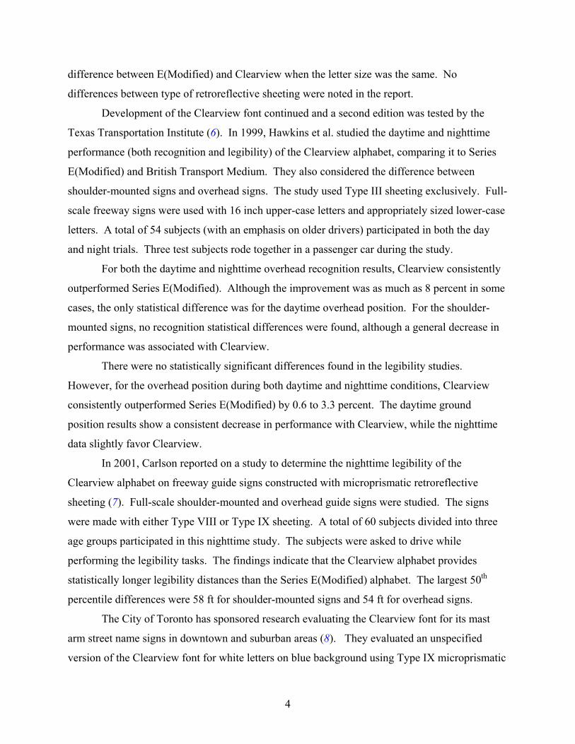
difference between E(Modified) and Clearview when the letter size was the same. No
differences between type of retroreflective sheeting were noted in the report.
Development of the Clearview font continued and a second edition was tested by the
Texas Transportation Institute (6). In 1999, Hawkins et al. studied the daytime and nighttime
performance (both recognition and legibility) of the Clearview alphabet, comparing it to Series
E(Modified) and British Transport Medium. They also considered the difference between
shoulder-mounted signs and overhead signs. The study used Type III sheeting exclusively. Full-
scale freeway signs were used with 16 inch upper-case letters and appropriately sized lower-case
letters. A total of 54 subjects (with an emphasis on older drivers) participated in both the day
and night trials. Three test subjects rode together in a passenger car during the study.
For both the daytime and nighttime overhead recognition results, Clearview consistently
outperformed Series E(Modified). Although the improvement was as much as 8 percent in some
cases, the only statistical difference was for the daytime overhead position. For the shoulder-
mounted signs, no recognition statistical differences were found, although a general decrease in
performance was associated with Clearview.
There were no statistically significant differences found in the legibility studies.
However, for the overhead position during both daytime and nighttime conditions, Clearview
consistently outperformed Series E(Modified) by 0.6 to 3.3 percent. The daytime ground
position results show a consistent decrease in performance with Clearview, while the nighttime
data slightly favor Clearview.
In 2001, Carlson reported on a study to determine the nighttime legibility of the
Clearview alphabet on freeway guide signs constructed with microprismatic retroreflective
sheeting (7). Full-scale shoulder-mounted and overhead guide signs were studied. The signs
were made with either Type VIII or Type IX sheeting. A total of 60 subjects divided into three
age groups participated in this nighttime study. The subjects were asked to drive while
performing the legibility tasks. The findings indicate that the Clearview alphabet provides
statistically longer legibility distances than the Series E(Modified) alphabet. The largest 50th
percentile differences were 58 ft for shoulder-mounted signs and 54 ft for overhead signs.
The City of Toronto has sponsored research evaluating the Clearview font for its mast
arm street name signs in downtown and suburban areas (8). They evaluated an unspecified
version of the Clearview font for white letters on blue background using Type IX microprismatic

5
sheeting. They compared letter sizes of 4, 6, and 8 inches for mast arm signs and 5- and 8-inch
letters for ground-mount advance street name signs. They had participants over the age of 50
drive a passenger car in live traffic in non-rush hour periods in the daytime and the evening
following a predetermined route. They were told to turn at specified intersections and the
measure of effectiveness was the distance at which they activated their turn indicator. The
results of this study led to a recommendation of use of 8 inch Clearview mixed-case for these
types of signs.
Review of the literature revealed experimentation with improving fonts for negative
contrast signs (black letters on light-colored background). Shepard (9) recommended using a
thicker stroke width for construction work zone signs made with high-intensity sheeting. Mace,
et al. (10) examined different stroke widths of Highway Series fonts. They found no effects of
stroke width in the daytime and only a slight improvement at night for orange signs of Type I
material. This idea of increased stroke width was further tested by Kuemmel (11) who compared
Series B, C, and E with versions with an 18 percent increased stroke width. This study showed
no benefit, and in some cases a detriment, to increasing stroke width for negative contrast signs.
It should be noted that in this study, each experimental sign with the thicker stroke width had an
unusual legend and was being compared to the standard fonts with typical work zone sign
legends. This confound in the experimental design may explain the results. Several states have
been informally experimenting with a version of Series D that has a thicker stroke width on the
interior of the letters. The interletter spacing, overall width of each letter, and overall size of the
sign is the same as if Highway Series D were used. The version tested in the present project was
obtained through a sign software vendor who had prepared it for the Alabama DOT.
In two major studies, Forbes performed pioneering work on the legibility of traffic signs.
His 1939 research with Holmes established legibility indices for the Series B and D alphabets
(12). His 1951 research with Moskowitz and Morgan established the legibility of the lower-case
Series E(Modified) alphabet (13).
In his 1939 study, Forbes evaluated the Series B and D block letter alphabets and found a
legibility index of 33 ft/inch for Series B and 50 ft/inch for Series D. These are 80th percentile
values from observations by 412 different people representing normal (20/20) vision. Letter size
ranged from 6 to 24 inches, with 6-letter place names. Letters were black paint on a white board.
Floodlighted signs at night gave a legibility distance 10 to 20 percent less than daytime values.

6
Glass ball reflectors were also evaluated with headlights, and results were similar up to about
300 ft. The measurements represented “pure” legibility (test subjects were given an unlimited
response time). The visual acuity of the test subjects was measured for only 52 of the 412
subjects. The results of the visual acuity test indicated that the median legibility distances
represented better than 20/20 vision, the 80th percentile distances represented 20/20 vision, and
the 95th percentile distance represented 20/30 vision.
Forbes (12) also showed a nonlinear relationship between letter size and legibility
distance, and showed that wider letters are more effective than narrow ones. The practical
importance of a curvilinear relationship between letter size and legibility distance is that
experimental relationships among alphabet styles, letter spacing, etc. for small test letters may
not be directly applicable for large-scale letters.
Forbes’ 1951 research (13) is the basis for the modern Series E(Modified) alphabet and
laid the groundwork for the adoption of the lower-case alphabet for freeway guide signs. The
purpose of this experiment was to determine the distances at which lower-case signs could be
read as compared to rounded capital letters on overhead mounted signs. Experiments on
ordinary printed pages with type forms have shown that lower-case printing gives more rapid
reading than solid block printing with capital letters. This advantage has been attributed to more
definite pattern characteristics of the lower-case words. However, the factors that produce the
rapid reading at a close range may not be the same as the factors that allow the reading of large
signs at a maximum distance.
The letters used in Forbes’ study were 5 to 18 inches in height. The letters were white,
standard Series E rounded letters, with the stroke widened to correspond to that deemed most
satisfactory from experience of the California Highway Division. They were placed on a black
background. The lower-case letters were approximately the same average height:width ratio.
When an initial upper-case letter was used with the lower-case letters, it was Series D of 1.5
times the loop height of lower-case. The letters were placed on an experimental sign bridge that
had a background 24 ft X 6 ft high. The bottom edge of the sign was 17 ft above the ground.
Letters and sign background were both non-retroreflectorized. Nighttime conditions had
illumination levels of 41.1 to 61.7 cd/m2 (candelas per square meter) from fluorescent lighting.

7
To obtain the best control possible and still obtain a comparison of familiar and
unfamiliar words created from upper/lower-case letters and capital letters, observations of three
types were used:
• Six nonsense scrambled-letter combinations (upper-case not used with lower-
case),
• 12 place names (6- to 9-letter California cities and counties) “without knowledge”
(lower-case had initial upper-case), and
• 12 place names (6- to 9-letter California cities and counties) “with knowledge”
(lower-case had initial upper-case).
Each of the words was presented in both capital letter and lower-case letter (with upper-
case letters as indicated above) formats. A total of 3939 observations were made by an average
of 55 observers for each condition. Each observer made six observation trips “reading” six
different signs on each trip during a given afternoon or evening. These observations were carried
out during two afternoon and evening sessions in July 1950. The observers consisted of both
males and females between the ages of 18 to 70 years and consisted of office staff from
departments other than the traffic department. The 85th percentile acuity was 20/20. The
observers would start from a distance where no one could identify the six test words. They then
walked toward the sign boards until they could read each word and the exact spelling of each
word. Once a word was “read,” they would record the next distance marker ahead. The
observers also faced in an easterly direction so that the afternoon observations could be made
with the sun directly on the sign boards and out of the direct field of vision.
In general, the researchers found that the 85th percentile daytime legibility distance
(representing 20/20 vision) was 32 ft/inch of letter height for lower-case scrambled letters and 48
ft/inch for lower-case place names “without prior knowledge.” The nighttime legibility index
was found to be 33 ft/inch for scrambled lower-case letters and 53 ft/inch for lower-case place
names “without prior knowledge.” Both day and night legibility indices are calculated using the
upper-case letter height appropriate to the lower-case letter. Table 1 summarizes legibility
results for the 85th percentile “without knowledge” words. The Forbes researchers
recommended that these values be used for design purposes.

8
The fonts designed and tested in the Forbes’ research have been used since that time as
the standard typeface and spacing for all signs in the MUTCD. Only recently has their use with
modern retroreflective sheeting been examined. Efforts to improve legibility for older drivers, in
particular, have been the impetus for most of the examinations of font improvement.
Table 1. Legibility Index for Place Names “Without Knowledge.”
85th Percentile Legibility Index
(feet of legibility distance / inch of letter height)
Daytime Nighttime
Letter Height (inches) Upper-case Lower-case Upper-case Lower-case
6 74 45 60 658 76 48 64 5312 79 50 67 53
Source: Reference (13)
DRIVER AGE
The U.S. Census Bureau predicts that the number of older drivers will increase over the
next six decades, both in number and as a proportion of the population (14). It is also known that
older drivers are more likely to have impaired vision, which is of great concern when addressing
nighttime driving. Consequently, to increase motorist safety, the design of roadway signs should
consider the nighttime visual needs of this growing population of drivers.
Age is an important factor in sign legibility due to the expected growth in elderly drivers
over the next 20 years and the higher accident rate among older drivers (15). Mace (16) studied
the characteristics of guide sign legibility regarding luminance, contrast, and the age of the
motorist and found that:
• Older drivers require more contrast between legend and background to achieve
the same level of recognition as younger drivers.
• Legibility losses with age are greater at low levels of background luminance.
• Legibility losses with age increase when luminance increases beyond the
optimum level on partially reflectorized signs.

9
In other words, older drivers are less sensitive to contrast, but are more sensitive to the
degrading effects of brightness extremes than younger drivers. In addition, the aging process
diminishes depth perception, glare recovery (the ability of the eye to readapt to low light levels
after exposure to high light levels), and the ability of the eye to focus. While the legibility index
of Series E lettering 50 ft/inch is a generally accepted minimum legibility index for guide signs
within the professional community, Mace contends that safety engineers should not expect a
legibility index of more than 40 ft/inch for older drivers (16).
A report from the University of Michigan (17) found that with partially retroreflectorized
signs, irradiation is particularly serious for older drivers. Irradiation is an effect where the edges
of bright objects become blurred; it is also called overglow, blooming, and halation. The authors
recommend that at high levels of luminance, the stroke width of white letters on dark
backgrounds (as is the case with freeway guide signs) be decreased to offset the effects of
irradiation. With regard to the effect of driver age on sign legibility, the report noted the
following generalizations (17):
• Older drivers require more contrast between the legend and the background of a
sign than younger drivers to achieve the same level of legibility.
• Legibility losses with age are greater at low levels of background luminance. A
reduction in legibility distance of between 10 to 20 percent should be assumed
when signs are not fully reflectorized.
• Signs are more likely to suffer a loss in legibility for older drivers when
luminance is increased beyond the optimum level on a partially reflectorized sign.
• Higher surround luminance improved the legibility of signs more for older drivers
and reduced the negative effects of excessive contrast.
Increasing luminance extends legibility up to a point, after which irradiation begins to
degrade legibility. The loss of legibility is difficult to document with any confidence since
conflicting results have been found in the literature. Some researchers report a small loss, only
occurring with very high levels of luminance (18). Others have shown irradiation to be a more
pervasive problem, particularly for older drivers (19).

10
A 1979 paper suggested that older drivers should not be expected to achieve a legibility
index of 50 ft/inch under most nighttime circumstances (20). The data provided by this report
give some expectation that 40 ft/inch is a reasonable goal under most conditions. Their data
compared younger and older drivers on luminance and contrast requirements for different
legibility criteria, different colors, background, and surrounding luminance. A 40 ft/inch index
can generally be achieved by older drivers with contrast ratios greater than 5:1 (slightly higher
for guide signs) and luminance greater than 10 cd/m2 for partially retroreflectorized signs.
The current MUTCD guideline for legibility index is 40 ft/inch. Other work on older
driver sign legibility (16) recommends a value of 33 ft/inch be used for design and sign
placement. In the proposed revision to the MUTCD (Section 2A-12) 40 ft/inch is listed in the
Guidance section as a “should statement” while in the Support section it states that “33 ft/inch
could be beneficial.”.
COLOR RECOGNITION AND LEGIBILITY
The impact color has on sign legibility is mostly related to luminance. A white sign has
much higher luminance than a blue sign. In fact, several studies have shown that color, by itself,
has no measurable impact on legibility but can add to conspicuity, especially with the fluorescent
sign sheetings (21,22).
Olson examined several possibilities in hopes to explain the conspicuity differences
associated with color (22). One promising possibility is usually referred to as heterochromatic
brightness matching. A typical approach to research in this area requires subjects to adjust the
luminance of a white surface until it appears to be the same brightness as an adjacent colored
surface. When a subject determines a match, the samples are photometrically measured. The
luminance ratio of the white to colored surface (B/T) is generally greater than one. The ratio
increases with increasing saturation of the test surface. However, and most interestingly, yellow
is a color that has been cited as an exception to this rule. Data show that the luminance ratio
remains near one even as the saturation of a yellow surface approaches maximum.
In an attempt to account for the color findings of the field study, Olson conducted a
laboratory brightness evaluation. In general, the results are in accord with those from
heterochromatic brightness matching studies. However, although colors such as red, green, and
blue were judged brighter than would be indicated on the basis of their photometric properties,

11
they were not judged brighter than white or yellow from the same family of materials. The
results of this study indicate that colors such as red, orange, green, and blue have inherently
greater conspicuity per unit retroreflectivity than yellow and white in the context of road signs.
Lacking more definitive data on the effect of color, recommendations were based on the
assumption that orange, red, green, and blue have conspicuity equal to that provided by yellow in
the same family of materials. However, further work on color effects should be tried out to
better define the relationship.
In terms of age effects, Olson found 85th percentile detection distance differences of
about 150 and 200 ft for high and low surrounding complexities, respectively (for yellow
enclosed lens sign panel). These detection differences were generally equal throughout a range
starting at the 99th percentile and continuing to the 25th percentile.
In a study of sign legibility with participants as passengers in a vehicle driven on a closed
course, Chrysler et al. (23) found white-on-green signs had slightly longer legibility distances
than black-on-white signs. These signs were all engineering grade (Type I) material with an 8-
inch Landolt Ring as the legibility target. They also found that aged white material had a
significantly shorter legibility distance than all other conditions. They hypothesized that as the
white material aged, the retroreflectivity decreased, thus also decreasing the contrast ratio
between the black letters and the background material. This effect was seen in both younger and
older driver groups.
RETROREFLECTIVE SHEETING
The last 10 years have seen a proliferation of types of retroreflective sheetings, especially
those using microprismatic optics. Each type of sheeting identified in the ASTM (American
Society for Testing and Materials, 5) specification has unique characteristics in terms of
retroreflection measured in the laboratory. On the road, drivers see the luminance of a sign,
which is controlled by the vehicle headlamps and the retroreflective characteristics of the sign
material. Sivak and Olson (24) provide a review of the literature on driver needs for luminance.
The sign materials available today meet those needs to varying extents. Part of this project was
to quantify the differences among sheeting types in terms of sign legibility for small signs. Sign
brightness helps not just legibility, but also detection, color and shape recognition, and locating
the sign along the roadway. While the focus of the current project is on legibility, it is important
12
to note that retroreflective characteristics may affect other visual processing in addition to
legibility.
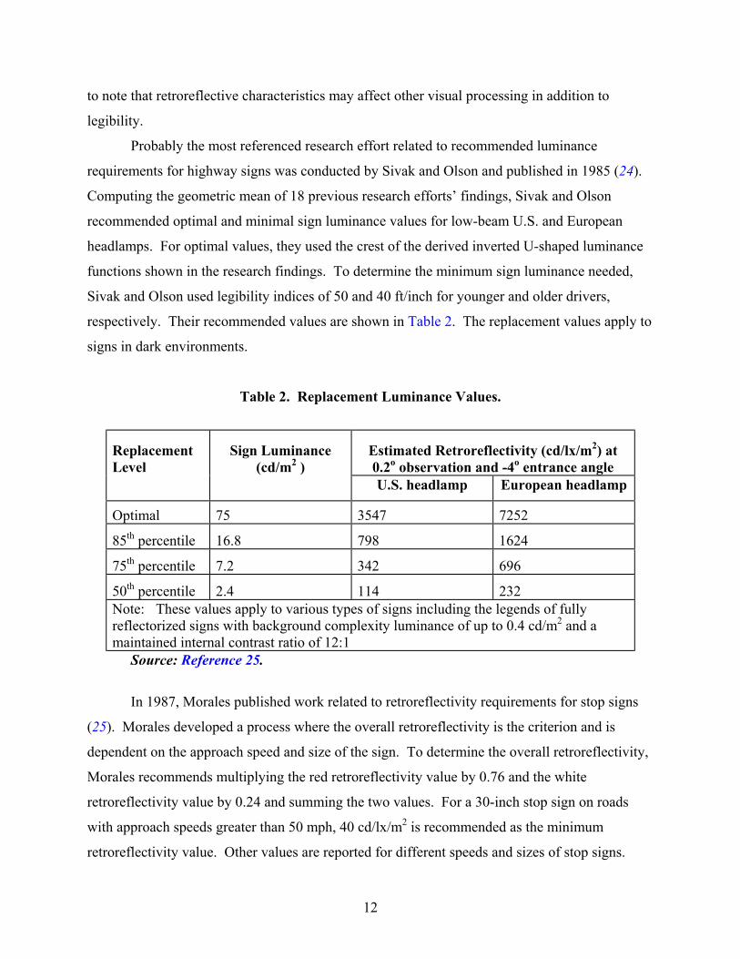
Probably the most referenced research effort related to recommended luminance
requirements for highway signs was conducted by Sivak and Olson and published in 1985 (24).
Computing the geometric mean of 18 previous research efforts’ findings, Sivak and Olson
recommended optimal and minimal sign luminance values for low-beam U.S. and European
headlamps. For optimal values, they used the crest of the derived inverted U-shaped luminance
functions shown in the research findings. To determine the minimum sign luminance needed,
Sivak and Olson used legibility indices of 50 and 40 ft/inch for younger and older drivers,
respectively. Their recommended values are shown in Table 2. The replacement values apply to
signs in dark environments.
Table 2. Replacement Luminance Values.
ReplacementLevel
Sign Luminance(cd/m2 )
Estimated Retroreflectivity (cd/lx/m2) at0.2o observation and -4o entrance angleU.S. headlamp European headlamp
Optimal 75 3547 7252
85th percentile 16.8 798 1624
75th percentile 7.2 342 696
50th percentile 2.4 114 232Note: These values apply to various types of signs including the legends of fullyreflectorized signs with background complexity luminance of up to 0.4 cd/m2 and amaintained internal contrast ratio of 12:1
Source: Reference 25.
In 1987, Morales published work related to retroreflectivity requirements for stop signs
(25). Morales developed a process where the overall retroreflectivity is the criterion and is
dependent on the approach speed and size of the sign. To determine the overall retroreflectivity,
Morales recommends multiplying the red retroreflectivity value by 0.76 and the white
retroreflectivity value by 0.24 and summing the two values. For a 30-inch stop sign on roads
with approach speeds greater than 50 mph, 40 cd/lx/m2 is recommended as the minimum
retroreflectivity value. Other values are reported for different speeds and sizes of stop signs.

13
In 1985, Mace et al. investigated visual complexity and its impact on sign luminance
(26). The researchers used warning signs at three different luminance levels to determine
detection and recognition distances. The major finding was that increases in visual complexity
had detrimental impacts on recognition and no effect on legibility, but brightness improved both
recognition and legibility. Based on their findings, the researchers recommended warning sign
retroreflectivity values of 18 cd/lx/m2 for low complexity and 36 cd/lx/m2 for high complexity
areas.
Brekke and Jenssen (27) tested the legibility of 7.8-inch letters on ASTM Types I, III,
VII, and IX in yellow and orange. The mean nighttime legibility distances for their older
participants were 187 ft for orange Type III compared to 216 ft for Fluorescent Orange Type VII
and 213 ft for orange Type III compared to 233 ft for Yellow Type IX. It should be noted that in
the present project, a fluorescent orange version of Type IX was used that was not available at
the time of the Brekke and Jenssen research. One explanation of these results is that the Type III
orange signs were below luminance threshold for some participants and the shift to the
microprismatic material raised the sign brightness above threshold. For the yellow signs, Type
III may have been above threshold due to the lighter color, so the difference between that and the
microprismatic was lessened.
Another study (10) showed that Type VII microprismatic increased nighttime legibility
distances compared to Type III orange signs with Series D letters. They did not see the same
effect of sheeting with Series C letters. This study had subjects seated in a static car with signs
containing individual letters which were exposed for 10 seconds.
The majority of studies on legibility are conducted with participants who are not driving a
vehicle. In some studies, the subjects remain static and signs are moved toward them (11,28)
and in others groups of subjects are moved toward the sign (3,27). Most studies done on closed
courses have the subject seated in the front passenger seat. While each of these methods has
advantages in terms of experimental control and repeatability, they are not very challenging to
participants. There have been a few studies where the subject was the driver of the experimental
vehicle on a closed course (24,28). Chrysler et al. (29) examined the effects of sheeting type on
sign legibility using older drivers in real traffic. They found that as intersection complexity
increased from a dark residential neighborhood to a complex urban intersection, the differences
between the types of retroreflective sheeting became more apparent. They tested 6 inch white

14
letters on green background (Series C font) on ASTM Types I, III, VII, and IX. The results
showed the two microprismatic types to be statistically equivalent and both microprismatics to
be better than Type III. Across the three intersection types and across test positions on both sides
of the street, the mean legibility distances were 142 for Type III, 170 for Type VII, and 172 for
Type IX. The Toronto study (8) also had research participants driving in actual traffic.
The present project sought to provide information on nighttime sign legibility distances
using participants aged 55 - 75 who were actively driving a passenger sedan on a closed course.
The signs were all actual road-related words in 6-inch letters mounted on the right shoulder of
the road. The parameters varied in the fabrication of the test signs were retroreflective sheeting
type, font, and color.

15
CHAPTER 3. EXPERIMENTAL SIGN DEVELOPMENT
The researchers conducted a nighttime legibility experiment to determine the best font
and sheeting for small ground-mount signs. This chapter describes the details of the preparation
of the signs. The coefficient of retroreflection is reported as RA.
MATERIALS
This project used a mixed design with age group as a between-subjects variable and with
font, sheeting type, and color as within-subjects variables. Three types of retroreflective sheeting
were tested:
• ASTM Type III: high-intensity encapsulated lens glass bead material (minimum new
RA at 0.2o observation angle and –4 o entrance angle for white material of 250
cd/lx/m2 and 95 cd/lx/m2 at 0.5 o observation angle and –4 o entrance angle). Material
was purchased from the 3M Company.
• ASTM Type VIII: super-high-intensity microprismatic material (minimum new RA
at 0.2o observation angle and –4 o entrance angle for white material of 700 cd/lx/m2
and 250 cd/lx/m2 at 0.5 o observation angle and –4 o entrance angle). Material was
purchased from the Avery-Denison Company.
• ASTM Type IX: very-high-intensity microprismatic material (minimum new RA at
0.2o observation angle and –4 o entrance angle for white material of 380 cd/lx/m2 and
240 cd/lx/m2 at 0.5 o observation angle and –4 o entrance angle). Material was
purchased from the 3M Company.
Four colors of signs were tested: green, yellow, orange, and white. For the
microprismatic materials, a fluorescent version of orange was used since this is the material
typically used when microprismatic retroreflective performance is selected. All material was
purchased from a third-party sign fabricator (Interstate Signs, Little Rock, Arkansas), with the
exception of fluorescent orange Type IX, which was obtained directly from the manufacturer.

16
FONTS AND SIGN DESIGN
The focus of this project was on conventional road guide signs that would be shoulder
mounted, such as distance/destination signs. In addition, warning, regulatory, and post-mounted
regulatory sign positions were of interest as well. To simplify the experimental design, it was
advantageous to have a single font represent the standard current practice for all these varied sign
types. A thorough review of the TxDOT Standards and Specifications Sheets and the Texas
Standard Highway reference material revealed a variety of fonts used on these signs. The
specific font depended mostly on message length, with more condensed fonts being used on
longer messages. Appendix A shows the results of this analysis. Based on this review, the
research team decided to use Highway Series D as the baseline font, as it is used on signs of all
four colors. In addition to the font identification, this analysis revealed that the most common
letter height was 6 inches. Thus, all words used in the nighttime legibility project were 6 inch
letters in all upper-case. All of the sign layouts were created by TTI staff using the TrafficCad
software. These files were transmitted electronically to the fabricator.
For positive contrast signs (white letters on green background), the experimental font was
Clearview Condensed Road. This font is very similar to Highway Series D in its height:width
ratio, but has a thinner stroke width. At the time of the study, the ClearviewOne Highway ™
series of fonts was undergoing additional revisions by its creator. The research team felt that
instead of testing a new version, it would be best to test a version from the same edition of the
typeface that was used in earlier TTI research (7). The Clearview Road Condensed, particularly
for upper-case letters, does not represent a radical change (see Figure 1). Refinements can be
seen in the opening in the R where the loop has been made larger and more elongated. The letter
W also illustrates the changes to reduce areas where the bright white reflective material may
create halation.
For the negative contrast signs (black letters on white, orange, and yellow backgrounds),
a font called D-Modified was used. This font was created for the Alabama DOT for use on its
work zone signs. The font was the same height:width ratio and interletter spacing as Highway
Series D, but has a thicker stroke width. The lettershapes for this font were obtained
electronically from the SignCad software. The spacing for this typeface was not functioning

17
properly, so the letters were placed by hand in TrafficCad using the default spacing for Highway
Series D as a guide.
Table 3. Independent Variable Summary.
Age Group Background Color Sheeting Type Font55 – 64 Green ASTM Type III Highway Series D65 -75 White ASTM Type VIII D-Modified
Yellow ASTM Type IX Clearview Condensed RoadOrange
Key: Series D Series D
D-Modified Clearview Condensed Road
Figure 1. Example of the Fonts Tested in the Project.

18

19
CHAPTER 4. NIGHTTIME FIELD STUDY METHOD
The research team created a driving course containing the test signs at the Riverside
Campus of Texas A&M University. A group of participants between the ages of 55 - 75 drove
the course at night while attempting to read the signs. This chapter describes the study method.
SUBJECTS
Twenty-four licensed drivers were recruited for the project through personal contacts and
past research participants lists. Subjects were evenly split between two age groups: 55 - 64 and
65 - 74. Gender was evenly split among each of the age groups. Subjects were paid $20 for their
participation. When subjects arrived they were briefed on the purpose of the project, but no
details of the font or sheeting type manipulations were revealed. After reading and signing an
informed consent form (see Appendix C), the subject’s vision was tested. Binocular acuity was
assessed using a standard Snellen eye chart under room illumination. Contrast sensitivity was
measured using the VisTech ™ Vision contrast test system (30). This test asks subjects to
identify the orientation of a series of sine wave gratings that vary in their contrast. Results of the
vision test are given in Appendix B. Color vision was tested by using a simplified Ishihara color
plate. Participants completed a short questionnaire about their driving habits.
EXPERIMENTAL VEHICLE
All testing took place after sunset with low-beam headlamps. The test vehicle was a
1998 Chevy Lumina sedan with HB4 halogen headlamps equipped with a Numetrics Nitestar
distance measuring instrument (DMI). The windshield and headlamps were cleaned at the start
of each night’s testing. The test vehicle is shown in Figure 2.

20
Figure 2. Test Vehicle 1998 Chevrolet Lumina Sedan.
EXPERIMENTAL DESIGN
Word selection is another crucial aspect to any legibility study. All of the signs contained
words that could be expected to be found on real traffic signs, with all signs containing words
that were four letters in length. Short words were selected for several reasons. One is that the
time to articulate short words may be more uniform than longer words, thus reducing variability.
The other consideration was cost of sign fabrication and ease of installation on the closed
course. A list of 65 four-letter words was generated based on signs in the MUTCD. The final
48 words were selected based on a small pilot test where the 65 candidate words were flashed on
a projection screen briefly and subjects were asked to identify each word. Any candidate word
that produced errors in four out of five subjects was rejected. The goal of this prescreening was
to weed out any word that may be extraordinarily easy or difficult to read.
For the field study, each word was randomly assigned to a font-color-sheeting sign
condition. Each word occurred only once. Table 4 shows the experimental design and the words
used in the project.

21
Table 4. Experimental Design and Words Used in the Project.
Sheeting BackgroundColor
LegendColor Font Word 1 Word 2
Clearview Cond. Road REST SLOWGreen White
Highway Series D LEFT WORKD-Modified CREW WITH
Orange BlackHighway Series D ENDS NEXT
D-Modified PASS TURNWhite Black
Highway Series D EAST LOOPD-Modified CARE ONLY
Typ
e II
I
Yellow BlackHighway Series D MILE RAMP
Clearview Cond. Road FINE TONSGreen White
Highway Series D GEAR TESTD-Modified TIRE WHEN
Orange BlackHighway Series D ZONE HERE
D-Modified FROM PATHWhite Black
Highway Series D CURB LANED-Modified DEAD WALK
Typ
e V
III
Yellow BlackHighway Series D EXIT FARM
Clearview Cond. Road OVER RAILGreen White
Highway Series D AREA CITYD-Modified BIKE BOAT
Orange BlackHighway Series D LINE WEST
D-Modified DEER ROADWhite Black
Highway Series D PARK ROCKD-Modified DRAW LOAD
Typ
e IX
Yellow BlackHighway Series D FOOT KEEP
Note: Words were randomly assigned to treatment condition.

22
DATA COLLECTION PROCEDURE
A test course with 48 sign positions was laid out on a closed-course facility (see Figure
3). All signs were offset 14 ft from the right edge line with a height of 8 ft to the center of the
sign. The driving path was clearly delineated through the use of retroreflective raised pavement
markers.
Figure 3. Driving Course and Sign Positions.
The sign positions were 500 ft apart at a minimum. The research team had some
concerns that the specific sign locations may affect legibility distance. While the test course is
generally very dark, there are a few outdoor lights and other objects visible that may have posed
a slight distraction to the driver. In addition, some locations were preceded by more complicated
driving maneuvers that may also have distracted participants from the legibility task. One
would expect some learning to take place, so the initial sign positions may be at a disadvantage
as well. In order to minimize any systematic effects of sign position, the placement of the signs
along the course was randomly determined. This was accomplished by treating each sign
position as an independent location and numbering the locations sequentially according to the
2 5
46
10 13
34 4
47
25 26 29 30
39 38 37 36 34
48
32
31
300 X 5500
3 0 0 X
5 0 0 0
12
11 4
27
9
16 17
40
24 23
22 21 20
28
19 18
45
150 X 7000
150 X 7000
300 X 5500
3 0 0 X
5 0 0 0
11
6
8
44
7
XX X
14 15 XX X
33 35
43

23
driving path. Then each sign was randomly assigned a number and placed in that location. Due
to the labor involved in rearranging the signs, it was not feasible to change them after every
subject or even after every night of testing. Instead, a compromise was reached to create three
sign orders and change the signs after every set of eight subjects.
The subject sat in the driver’s seat and was in control of the vehicle at all times during the
experiment. The experimenter sat in the front passenger seat. Subjects were told that they would
be driving on a closed-course roadway simulating roads typically encountered in Texas. They
were instructed to drive with prudence at speeds not to exceed 30 mph. Subjects were told to say
the word as soon as they could correctly identify it, but were also told that there was no penalty
for being wrong and that it was alright to guess. The researcher provided verbal directions to the
subject about where to drive and the maximum speed allowed on the course segment. The
course was clearly marked on the roadway through the use of retroreflective raised pavement
markers. At the start of each straight segment of road, there was a pair of traffic cones to mark
the “starting gate.” This served to notify the subject that a sign was coming soon and it also gave
the experimenter a chance to clear the DMI. Errors in measurements can be introduced
following the hard corners and U-turns necessitated by the test course.
Subjects drove for approximately three minutes on approach roads prior to beginning the
study trials. The driving course took approximately 20 minutes to complete. If participants made
any comments during the legibility portion of the task, these were noted on the response form.

24

25
CHAPTER 5. RESULTS AND DATA ANALYSIS
The researchers analyzed the data from the field study using standard statistical
procedures from engineering and the behavioral sciences. This chapter presents the results and
the details of the statistical analysis.
RESULTS
The legibility distance data were obtained through a subtractive procedure. The actual
distances recorded during the experiment were cumulative distances since the last zeroing of the
instrument. Without subjects present, the research team drove the course multiple times to
ascertain the actual distance between the starting points and the sign positions. These calibrated
distances were used to calculate the actual distance from the sign where subjects correctly
identified the word. The experimental design of 48 signs viewed by 24 subjects produces a total
of 1152 data points. Due to equipment errors, seven observations were lost. All data are
legibility distance, in feet, for correct word identification. Table 5 shows the mean legibility
distance for each of the treatment conditions along with the corresponding standard deviation.
DATA ANALYSIS
First, a test of sign position was conducted to assure that there were no systematic errors
introduced into the data due to position on the test course. This analysis, which simply regressed
legibility distance onto sign position, showed a non-significant effect (F 47, 1097 = 0.79, p = 0.85).
Sign position was thus dropped from further analysis. Whatever error was introduced by the
individual sign positions was spread across the three counter-balancing groups.
A mixed-model Analysis of Variance (ANOVA) with Age Group as a between-subjects
factor and Font, Sheeting, and Color as within-subjects factors was performed. This overall
ANOVA 2 X 3 X 3 X 4 model with 24 subjects produced an R2 value of 0.88 (F 574, 1144 = 7.25, p
< 0.0001). This means that the 88 percent of the variance in the legibility data can be explained
by the factors varied in the experiment.
The main effect of Age Group was not significant (F 1,22 = 2.47, p = 0.13). Age Group
did produce a significant interaction with Color, but otherwise was never a significant factor.

26
Table 5. Mean Legibility Distances (ft) for Each Treatment Condition.
Color Sheeting Type Font Mean StandardDeviation
Clvw Cond Road 167 61III Hwy D 179 68Clvw Cond Road 171 71VIII Hwy D 180 70Clvw Cond Road 176 69
Gre
en
IX Hwy D 200 71D-Modified 153 61III Hwy D 143 61D-Modified 166 59VIII Hwy D 185 62D-Modified 163 71O
rang
e
IX Hwy D 175 70D-Modified 203 75III Hwy D 180 66D-Modified 184 76VIII Hwy D 181 68D-Modified 198 67
Whi
te
IX Hwy D 184 65D-Modified 179 73III Hwy D 186 74D-Modified 206 72VIII Hwy D 192 75D-Modified 181 79
Yel
low
IX Hwy D 194 69Note: Each cell represents the average of two different words per condition viewed by 24
subjects.

27
Color was a significant main effect (F 3, 66 = 25.25, p <0.0001). A Bonferroni post hoc t-
test reveals that yellow and white signs are equivalent at means of 190 and 188 ft respectively.
White was not different from green (mean of 179 ft), but yellow was. Orange signs performed
worst at 164 ft and were significantly different than all other colors. The interaction between
Color and Age group seemed to be due to the poor performance of orange signs for the younger
age group compared to the other colors. For the older group, orange was worst, but not by quite
as large a factor.
The main effect of Sheeting was significant (F 2, 44 = 10.84, p <0.0001). Across all fonts
and colors, post hoc tests show that the two microprismatic types were not significantly different
(Type IX mean = 184, Type VIII mean = 183) and both were better than Type III (mean = 174).
Note that the Sheeting X Color interaction was significant (F 6, 132 = 6.38, p <0.0001). The
relative performance of the three sheeting types changed depending on the color as detailed
below. Likewise, because Font and Color were not fully crossed, subsequent ANOVAs were
performed for each color separately to examine the Font main effect and interactions with Age or
Sheeting. The effects of Font and Sheeting are different for each color, so further results will be
reported for each color separately.
For the overall test of Series D compared to D modified, an ANOVA was performed on
data from the three colors used for the negative contrast signs. The Bonferroni t-tests from
subsequent ANOVAs on each individual color show mixed results as detailed in the following
sections.

28
Green Signs
For the comparison between Series D and Clearview Condensed Road, the legibility
distances for only the green signs were evaluated. The results for green signs by font and
sheeting type are shown in Figure 4. The difference between the two fonts was significant (F 1, 22
= 9.31, p = 0.006) with the Series D mean at 187 ft and the Clearview Condensed Road mean at
171 ft. This result is opposite of what was predicted based on previous research that shows the
Clearview font producing modest gains in legibility distance.
Retroreflective sheeting type was a significant main effect (F 2,44 = 4.80, p = 0.013). Post
hoc tests using a Bonferroni t (degrees of freedom (df) = 44, Minimum Significant Difference =
13.30) show that the differences between the two microprismatics is not statistically significant
(Type VIII mean = 175 and Type IX mean = 188). Likewise, Types VIII and Type III (mean =
173) were not statistically different, but Type IX was different than Type III.
Note: Error bars indicate + / - one standard deviation unit for that condition mean
Figure 4. Legibility Distances as a Function of Sheeting Type and Font for Green Signs.

29
Orange Signs
The results for orange signs by font and sheeting type are shown in Figure 5. In this
analysis, the font main effect was not significant, but font did interact significantly with color
(F 2, 66 = 7.39, p = 0.002).
For orange signs, the two fonts were not significantly different with D-Modified having a
mean of 160 and Series D at 167. Retroreflective sheeting type was a significant main effect (F
2, 44 = 10.99, p = 0.0001). Post hoc tests using Bonferroni t (df = 44, Minimum Significant
Difference = 15.31) showed that the differences between the two microprismatics is not
statistically significant (Type VIII mean = 175 and Type IX mean = 169). Both microprismatic
materials were significantly different than Type III (mean = 148).
Note: Error bars indicate + / - one standard deviation unit for that condition mean
Figure 5. Legibility Distances as a Function of Sheeting Type and Font for Orange Signs.

30
White Signs
For white signs, the D-Modified font (mean distance = 195 ft) did produce significantly
longer legibility distances than Series D (mean distance = 181 ft). The main effect of sheeting
was not significant in the analysis of the subset of white signs (F 2, 44 =2.32, p = 0.11). The
means were 191, 182, and 191 for Types III, VIII, and IX, respectively. The results for white
signs by font and sheeting type are shown in Figure 6.
Note: Error bars indicate + / - one standard deviation unit for that condition mean
Figure 6. Legibility Distances as a Function of Sheeting Type and Font for White Signs.

31
Yellow Signs
For yellow signs, the differences were not significant with D-Modified having a mean of
189 and Series D at 191. The results for yellow signs by font and sheeting type are shown in
Figure 7. The main effect of sheeting was significant in the analysis of the subset of yellow
signs (F 2, 44 =6.84, p = 0.0026). The post hoc Bonferroni t (df = 44, Minimum Significant
Difference = 11.43) showed that the Type VIII (mean = 200) was statistically different than both
the other microprismatic, Type IX (mean = 188) and the encapsulated lens, Type III (mean =
183). Legibility for Type III and Type IX were not statistically different for yellow signs.
Note: Error bars indicate + / - one standard deviation unit for that condition mean
Figure 7. Legibility Distances as a Function of Sheeting Type and Font for Yellow Signs.


33
CHAPTER 6. DISCUSSION AND RECOMMENDATIONS
DISCUSSION
Overall, yellow and white signs provided the greatest legibility distances, followed by
green, and then orange. This order follows closely the relative brightness of the different
materials, thus illustrating the role of sign luminance in legibility.
The comparisons among the three types of retroreflective sheeting (Types III, VIII, and
IX) were quite mixed, depending on color. With the exception of orange signs, the three
materials produced legibility distances within 17 ft of each other. Given the measurement
procedure which relied on the experimenter reacting to the subject’s verbal response, 17 ft may
well be within the error range of the procedure. This distance is not much greater than the 11-15
ft difference needed to establish statistical significance between two averages given the standard
deviations of this data. In a practical sense, as well, 17 ft represents just 0.2 of a second when
traveling at 60 mph. This small performance gain in legibility may not justify the cost
difference. As mentioned in the introduction, previous studies (11) have shown large
performance gains in detection and color and shape recognition when moving from encapsulated
lens to microprismatic sheeting. And one study (7) that compared legibility for large guide signs
did show an advantage for microprismatic materials. When selecting sign material, all visual
performance factors must be considered: detection, color recognition, shape recognition, and
legibility. This performance should be evaluated for all lighting and weather conditions. In
addition, durability, ease of fabrication, and cost must be weighed against the benefits of each
product. The current project only examined nighttime legibility in clear conditions for signs with
6-inch legends, so it provides only part of the answer.
The results of this project demonstrate that it is not practical to identify one combination
of font, sheeting, and color that optimizes sign performance in all conditions. The lack of font
effects was surprising based on informal viewings prior to the project. Given the particular
experimental design, it is impossible to separate out what effect word difficulty may have had on
the results. Each word was used in only one experimental treatment. So, if two particularly easy
words happened to have been assigned to a particular treatment, the results may favor that
treatment unfairly. The experimental design was largely driven by the cost of fabricating signs
and testing additional participants so that any one driver would not see the same word repeatedly.

34
Word difficulty could be assessed in a separate, non-driving test, similar to the small pre-
screening study done here. This could be the focus of additional research.
The finding that the all upper-case Clearview Condensed Road was not as legible as the
Standard Highway Series D was surprising in light of past research. All previous research on
Clearview has used mixed-case (upper and lower) case legends. Other than the initial Clearview
evaluation, there has not been any legibility evaluations of words presented in all upper-case
Clearview. As such, the current upper-case letters of Clearview have not been refined through
field evaluation to the extent of the lower-case letters. FHWA is currently considering adopting
the latest edition of the Clearview Highway font as an approved alternative for highway signs,
but the version to be adopted by the FHWA is a refinement of the version evaluated in this
experiment. Given the limited number of Clearview signs evaluated in this experiment (two
words each for three sheeting types) and the subsequent refinements to Clearview, additional
evaluations may be appropriate to assess the legibility impacts of using Clearview on post-
mounted signs.
COMPARISONS TO PREVIOUS STUDIES
This project provides a chance to compare actual legibility distances to other nighttime
studies. A comparison can be made by converting the results of all studies to a legibility index
of mean legibility distance per inch of letter height. The effect of having the subject actually
drive the car becomes clear immediately. Chrysler, et al. (23) report on a study in which older
persons actually drove a car in real, uncontrolled traffic at night while reading experimental
street name signs. These signs were mixed-case Highway Series C with a 6 inch initial upper-
case and 4.5 inch lower-case letter. All signs were white letter on green background but four
different types of retroreflective sheeting were tested. This study found an overall legibility
index of 29 ft/inch averaged across Types III, VII and IX. The second TTI project examining the
Clearview font for large guide signs did have the subject drive (7). For microprismatic ground-
mounted green signs (Types VIII and IX) viewed by drivers aged 55 and over, the legibility
index averaged across the Highway Series E(Modified) and Clearview Expressway font used by
Carlson (7) is 32 ft/inch of letter height. The corresponding value from the current project for
green microprismatic signs (Types VII and IX) averaged across Clearview Condensed Road and

35
Highway Series D is 30 ft/inch. It is worth noting that these legibility indices are very close to
each other in spite of the fact that the current project used all upper-case letters and the other two
studies used mixed-case letters.
Two previous studies tested older drivers at night with white-on-green signs. As
described earlier, Garvey et al. (4) tested several subjects at a time in a van. The legibility index
for Types III, VII, and IX across the Clearview Condensed, Clearview, Highway Series D, and
Highway Series E(Modified) fonts was 38 ft/inch. Hawkins, et al. (6) tested only Type III
sheeting with multiple subjects as passengers in a moving car. They found a legibility index of
40 ft/inch. Clearly, as the subject’s task becomes more difficult, legibility index decreases.
RECOMMENDATIONS
The key results of the project are listed below. This list contains the results that were
statistically significant and that the research team felt had practical significance as well.
• For small signs with white, yellow, or green backgrounds in unlighted areas,
microprismatic retroreflective sheeting is not consistently better than encapsulated
lens high intensity. TxDOT should not change the current standard of Type III
material on all ground-mounted signs.
• For work-zone signs with orange background, microprismatic materials did provide
for greater legibility distance than high intensity. TxDOT should continue with its
recent change to use fluorescent microprismatic sheeting for work zone signs.
• The D-Modified font with a thicker stroke width did not improve legibility compared
to Highway Series D for white, yellow, and orange signs. The Clearview Condensed
Road font (with a thinner stroke) in all upper-case letters did not improve when
compared to Highway Series D for white-on-green signs. TxDOT should not change
the current standard of Highway Series D for ground-mounted signs with upper-case
legends.
• The legibility index used for design and sign placement should be 40 feet of sign
legibility per inch of letter height at a maximum. A more conservative value,
supported by the current project, is 33 feet/inch.

36
Ground-mounted Signs Retroreflective Sheeting Type
TxDOT should continue to evaluate the necessity of specifying microprismatic material
for ground-mounted signs. These signs include regulatory, warning, and distance / destination
signs. This project, conducted with a particular passenger sedan, did not show a significant
difference between the currently specified Type III sheeting and either Type VIII or Type IX
microprismatics. This finding may not hold true across a variety of vehicle and headlamp types.
Different vehicles can provide vastly different amounts of illumination to ground-mounted sign
positions. The sign luminance provided by the combination of the Chevy Lumina and Type III
sheeting produced sufficient luminance for legibility for the subjects in this project. Those same
drivers placed in a vehicle with a larger observation angle or a sharper cut-off on the headlamps
may find that the luminance of a Type III sign is not sufficient for legibility. Future research
efforts in this area may want to consider the use of a variety of vehicle types. Another recent
project by TTI (Project 0-4269) did conduct a study in which the same participant read signs
both from a Chevy Lumina and from a heavy truck. Interested readers are referred to Report
4269-1.
Work Zone Signs Retroreflective Sheeting Type
This project confirms the wisdom of TxDOT’s recent decision to specify microprismatic
materials for work zone applications. Some practitioners have expressed concern over the
legibility of these materials while acknowledging their superior conspicuity and detection
performance. This project demonstrates that the microprismatic fluorescent orange materials
perform better than the Type III that was formerly specified.
Font Type
This research project did not find an advantage for either of the alternative fonts. The all
upper-case Highway Series D that is currently specified for the majority of ground-mounted
signs performed equal to or better than both the Clearview Condensed Road and the D-Modified.
Past research with Clearview suggests that this font may show a benefit only when used in
mixed-case messages.

37
REFERENCES
1. US-DOT / FHWA. Manual on Uniform Traffic Control Devices. FHWA, U.S. Departmentof Transportation, 2000.
2. US-DOT / FHWA. Standard Highway Signs. FHWA, U.S. Department of Transportation,2002.
3. Garvey, P.M., M.T. Pietrucha, and D.T. Meeker. Clearer Road Signs Ahead. In Ergonomicsin Design, July 1998, pp. 7 - 11 .
4. Garvey, P.M., M.T. Pietrucha, and D.T. Meeker. Effects of Font and Capitalization onLegibility of Guide Signs. Transportation Research Record 1605, TRB, National ResearchCouncil, Washington, D.C., 1997, pp. 73-79.
5. ASTM D 4956-01a Standard Specification for Retroreflective Sheeting for Traffic Control.ASTM, Warrendale, Penn., 2001.
6. Hawkins, H.G., M.D. Wooldridge, A.B. Kelly, D.L. Picha, and F.K. Greene. LegibilityComparisons of Three Freeway Guide Sign Alphabets, FHWA/TX-99/1276-1F, TexasTransportation Institute, College Station, Texas, May 1999.
7. Carlson, P.J. Evaluation of Clearview Alphabet with Microprismatic RetroreflectiveSheeting, Research Report 4049-1, Texas Transportation Institute, College Station, Texas,October 2001.
8. Smiley, A., C. Courage, T. Smahel, and G. Fitch. Driver Response to Toronto Street NameSigns: An On-road Study. Human Factors North, Inc. Final report to TorontoTransportation, August 24, 1999.
9. Shepard, F. Sign Legibility for Modified Messages, Virginia Transportation Research Council,Charlottesville, Virginia. June 1987.
10. Mace, D.M, P.M. Garvey, and R.F. Heckard. Relative Visibility of Increased Legend Size vs.Brighter Materials for Traffic Signs. (Publication No. FHWA-RD-94-035). FHWA, U.S.Department of Transportation, 1994.
11. Kuemmel, D.A. Maximizing Legibility of Traffic Signs in Construction Work Zones.Transportation Research Record 1352, TRB, National Academies of Science, WashingtonD.C., 1992, pp. 25-34.
12. Forbes, T.W., and R.S. Holmes. Legibility Distances of Highway Destination Signs inRelation to Letter Height, Width, and Reflectorization. In Highway Research BoardProceedings, Highway Research Board, Washington, D.C., Vol. 19, 1939, pp. 321-335.

38
13. Forbes, T.W., K. Moskowitz, and G. Morgan. A Comparison of Lower-case and Capital
Letters for Highway Signs. In Proceedings of the 30th Annual Meeting of the HighwayResearch Board, Highway Research Board, Washington, D.C., 1951, pp. 355-373.
14. Day, J.C. Population Projections of the United States, by Age, Sex, Race, and Origin: 1993to 2050. U.S. Bureau of the Census, Current Population Reports, P25-1104, U.S.Government Printing Office, Washington, D.C., 1993.
15. McKelvey, F.X. and N. Stamatiadis. Highway Accident Patterns in Michigan Related toOlder Drivers. In Transportation Research Record 1210, TRB, National Research Council,Washington, D.C., 1989.
16. Mace, D.J. Sign Legibility and Conspicuity, Transportation in an Aging Society: ImprovingMobility and Safety for Older Persons, Special Report 218, Vol. 2, TransportationResearch Board, Washington, D.C., 1988.
17. Olson, P.L., M. Sivak, and J.C. Egan. Variables Influencing the Nighttime Legibility ofHighway Signs, Technical Report No. UMTRI-83-36, University of MichiganTransportation Research Institute, Ann Arbor, Michigan, June 1983.
18. Allen, T.M., and A.L. Straub. Signs Brightness and Legibility. In Highway Research BoardBulletin No. 127, Highway Research Board, Washington, D.C., 1956, pp. 1-14.
19. Forbes, T.W., and R.S. Holmes. Legibility Distances of Highway Destination Signs inRelation to Letter Height, Letter Width, and Reflectorization, Traffic and Safety, 1940, pp.321-335.
20. Olson, P.L., and A. Bernstein. The Nighttime Legibility of Highway Signs as a Function ofTheir Luminance Characteristics, Human Factors, Vol. 21, 1979, pp. 145-160.
21. Adrian, W. Visibility of Targets: Model for Calculation, Lighting Research Technology,Volume 21, No. 4, Great Britain, 1989.
22. Olson, P.L. Minimum Requirements for Adequate Nighttime Conspicuity of HighwaySigns. Technical Report UMTRI-88-8, University of Michigan Transportation ResearchInstitute, Ann Arbor, Michigan, 1988.
23. Chrysler, S.T., S.M. Danielson, and V.M. Kirby. Age Differences in Visual Abilities inNighttime Driving Field Conditions. In W.A. Rogers (Ed.) Designing for an AgingPopulation, Human Factors and Ergonomics Society, Santa Monica, Calif., 1997, pp. 310 -314.
24. Sivak, M., and P.L. Olson. Optimal and Minimal Luminance Characteristics forRetroreflective Highway Signs. In Transportation Research Record 1027, TRB, NationalResearch Council, Washington, D.C., 1985, pp. 53-57.

39
25 . Morales, J. Retroreflective Requirements for Traffic Signs – A Stop Sign Case Study.
Public Roads, Federal Highway Administration, Washington, D.C., December 1987.
26. Mace, D.J., R.B. King, and G.W. Dauber. Sign Luminance Requirements for VariousBackground Complexities, FHWA/RD-85/056, Federal Highway Administration,Washington, D.C., 1985.
27. Brekke, B., and G.D. Jenssen. A Comparison of the Visibility of Fluorescent and StandardRetroreflective Traffic Signs Day and Night. PAL ’97 - Progress in Automobile Lighting,Darmstadt University of Technology, Darmstadt, Germany, 1997, pp. 108-118.
28. Zwahlen, H.T., and T. Schnell. Legibility of Traffic Sign Text and Symbols. InTransportation Research Record 1692, TRB, National Research Council, Washington,D.C., 1999, pp. 142-151.
29. Chrysler, S.T., S. Stackhouse, D. Tranchida, and E. Arthur. Improving Street Name SignLegibility for Older Drivers. Proceedings of the Human Factors and Ergonomics Society45th Annual Meeting. HFES, Santa Monica, Calif., 2001.
30. Vistech Consultants, Inc. Part # PG000013. Dayton, Ohio, 1988.


APPENDIX A: FONT AND LETTER SERIES FREQUENCY ANALYSIS
In order to identify the most common font series and letter size, an analysis of the Texas Standard Highway Signs book was conducted. The following tables illustrate the letter series and size for each class of signs. They also indicate any changes suggested to the standard inter-letter spacing. Some legends, due to their size, call for a reduction in spacing in order to fit the words on the standard sized sign blank. Changes to spacing are indicated as negative percentages of the standard spacing. So, for instance, the standard spacing table may call for a two inch space between a particular pair of letters for Series C in general, but for a specific sign the indication is -40 percent spacing. This means that the letters should be spaced an inch and a quarter apart, which is a 40 percent reduction of the standard 2 inches. Where no spacing column is listed, no adjustments to letter spacing are recommended. For lines with optional multiple lines of text, additional columns are shown. Separate tables are provided for signing in the following categories:
• School and civil defense, • construction work-zone, • regulatory, and • warning
The distribution of letter series for each sign type is given at the end of each table (Tables A1-A4).
41
41
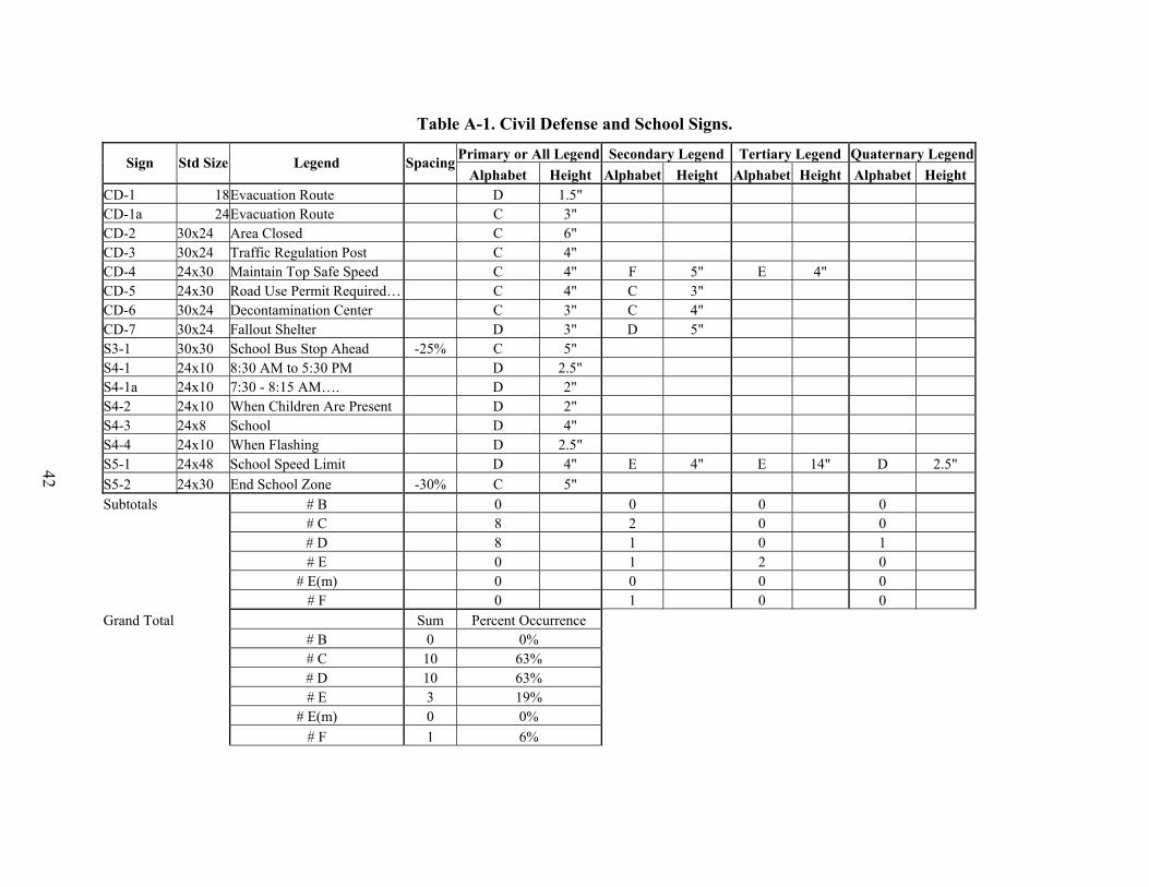
42
Table A-1. Civil Defense and School Signs.
Primary or All Legend Secondary Legend Tertiary Legend Quaternary LegendSign
Std Size Legend SpacingAlphabet Height Alphabet Height Alphabet Height Alphabet Height
CD-1 18Evacuation Route D 1.5" CD-1a 24Evacuation Route C 3" CD-2 30x24 Area Closed C 6" CD-3 30x24 Traffic Regulation Post C 4" CD-4 24x30 Maintain Top Safe Speed C 4" F 5" E 4" CD-5 24x30 Road Use Permit Required… C 4" C 3" CD-6 30x24 Decontamination Center C 3" C 4" CD-7 30x24 Fallout Shelter D 3" D 5" S3-1 30x30 School Bus Stop Ahead -25% C 5" S4-1 24x10 8:30 AM to 5:30 PM D 2.5" S4-1a 24x10 7:30 - 8:15 AM…. D 2" S4-2 24x10 When Children Are Present D 2" S4-3 24x8 School D 4" S4-4 24x10 When Flashing D 2.5" S5-1 24x48 School Speed Limit D 4" E 4" E 14" D 2.5" S5-2 24x30 End School Zone -30% C 5" Subtotals # B 0 0 0 0 # C 8 2 0 0 # D 8 1 0 1 # E 0 1 2 0 # E(m) 0 0 0 0 # F 0 1 0 0 Grand Total Sum Percent Occurrence # B 0 0% # C 10 63% # D 10 63% # E 3 19% # E(m) 0 0% # F 1 6%

43
Table A-2 Construction Work-zone Signs.
Primary or
All Legend
Secondary
Legend Tertiary Legend
Sign
Std Size Legend Spacing
Alphabet Ht.
Spacing
Alphabet Ht. Alphabet Ht.
CW9-3 48x48 Center Lane Closed C 7" CW20-1D 48x48 Road Work Ahead D 7" C 6" CW20-2D 48x48 Detour Ahead -40% D 8" C 8" CW20-3A 48x48 Road Closed 1500 FT D 7" C 7" CW20-4A 48x48 One Lane Road 1500 FT C 7" CW20-5R 48x48 Right Lane Closed D 8"
Plaque 30x12 1/2 Mile C 6" CW20-5aR 48x48 Right Two Lanes Closed C 8" C 6"
CW20-6 54x48 Lane Blocked 1 2 3 4 X D 7" D 6" CW20-7a 48x48 Flagger 1500 FT -40% C 7" CW20-7b 36x36 Be Prepared To Stop D 5" CW20-8 48x48 Narrow Lanes Ahead C 6" D 6" E 12"
CW21-1b 30x30 Workers Ahead C 5" CW21-1t 48x48 Give Us a BRAKE C 8" CW21-2 30x30 Fresh Oil -20% D 6" -50%
CW21-3d 36x36 Road Machinery Ahead -40% D 5" CW21-5 30x30 Shoulder Work -25% C 5"
CW21-5aR 48x48 Right (Left) Shoulder Closed C 8" Plaque 30x12 500 FT D 5" C 6"
CW21-6 30x30 Survey Crew Ahead D 5" CW21-6D 30x30 Survey Crew Ahead C 5" CW21-7d 48x48 Utility Work Ahead D 7" CW21-9 30x30 Mowers Ahead D 5"
CW21-10 48x48 Work Convoy D 8" CW21-16 18x24 Next 14 Miles C 4" D 5" CW21-17 36x36 Guardrail Damage Ahead C 5" CW21-18 36x36 Bridge Rail Damage Ahead C 5"

Table A-2 Construction Work-zone Signs (continued).
44
Primary or
All Legend
Secondary
Legend Tertiary Legend
Sign
Std Size Legend Spacing
Alphabet Ht.
Spacing
Alphabet Ht. Alphabet Ht.
CW22-1b 48x48 Blasting Zone 1000 FT -40% C 7"
CW22-2a 60x36 Turn Off Two-Way Radios and Telephones C 6"
CW22-3 42x36 End Blasting Zone C 7" CW23-1 48x48 Shoulder Lane Ahead -40% C 7" CW23-2 48x48 Begin Shoulder Lane C 8" CW23-3 48x48 End Shoulder Lane C 8" CW25-1 48x48 Use Next Ramp D 8" CW26-1t 96x24 Exit Closed E 10"
G20-1 60x24 Road Work Next 5 Miles D 6" C 6" G20-1a 72x36 Road Work Next 15 Miles D 6" C 6"
G20-1bl 72x24 Road Work Next 5 Miles
D 6" C 6" G20-2a 48x24 End Road Work C 6" G20-4 36x18 Pilot Car Follow Me -40% C 5" G20-6 60x42 Contractor Info sign D 4"
G20-7 96x48 Working For You Give Us a BRAKE D 5" E(m) 8"
G20-8 72x72 Highway Project Sign C 5" G20-9 24x18 Work Zone D 5" E5-2 48x48 Exit Open E 10"
CW2-6B 48x48 Highway Intersection 1000 FT C 6" CW2-8 36x36 Traffic Islands Ahead C 5" CW3-1 36x36 Stop Ahead -20% D 7" C 7" Plaque 24x18 Stop Ahead D 4" CW3-2 36x36 Yield Ahead C 7" Plaque 24x18 Yield Ahead D 4"
CW3-3a 36x36 Signal Ahead D 6" CW4-1aR 36x36 Thru Traffic Merge Right (Left) D 4" E 4"

Table A-2 Construction Work-zone Signs (continued).
45
Primary or
All Legend
Secondary
Legend Tertiary Legend
Sign
Std Size Legend Spacing
Alphabet Ht.
Spacing
Alphabet Ht. Alphabet Ht.
CW5-1 36x36 Road Narrows -25% D 6" CW5-2 30x30 Narrow Bridge -25% D 5" -30% CW5-3 36x36 One Lane Bridge C 6" CW6-1a 36x36 Divided Highway D 5" CW6-2a 36x36 End Freeway 1/2 Mile D 5" CW6-4 48x48 Hill E 6" CW7-1a 30x30 Use 2nd Gear E 8" CW7-2 24x18 Use Low Gear C 4" E 6" CW7-2a 24x18 Trucks Use Lower Gear C 4" E 6" CW7-2b 24x18 9% Grade 25% C 3" CW7-3 24x18 Next 7 miles 75% D 4" CW7-3a 24x18 9% Grade 7 Miles C 4" CW7-4 78x48 Runaway Truck Ramp 1 Mile E 6" CW7-4a 78x60 Runaway Truck Ramp C 8" CW8-1 30x30 Bump D 8" D 4" CW8-2 30x30 Dip 50% E 8" CW8-3 30x30 Pavement Ends C 5" CW8-4 30x30 Soft Shoulder -25% C 5" CW8-6 30x30 Truck Crossing C 5" CW8-7 30x30 Loose Gravel -40% D 5" CW8-8 30x30 Rough Road D 5"
CW8-8T 30x30 Grooved Pavement Ahead C 5" CW8-9 30x30 Low Shoulder C 5" CW8-9a 36x36 Shoulder Drop-Off C 6" CW8-11 36x36 Uneven Lanes D 6" CW8-12 36x36 No Center Stripe C 6" 0 CW8-13 30x30 Water Crossing D 4" 0 CW8-14 30x30 Water Over Road C 5" 1
Table A-2 Construction Work-zone Signs (continued).
46
Primary or
All Legend
Secondary
Legend Tertiary Legend
Sign
Std Size Legend Spacing
Alphabet Ht.
Spacing
Alphabet Ht. Alphabet Ht.
CW8-15 36x36 Watch for Water on Road C 6" C 4" 3 CW9-1r 36x36 Right (Left) Lane Ends D 6" 0 CW9-2l 36x36 Lane Ends Merge Left (Right) C 4" D 6"
CW10-1a 24x12 Exempt CW10-5 30x30 Uneven Tracks C 5"
CW12-2p 24x18 Low Clearance D 5" C 3"
CW12-4 Varx36
Low Clearance 10 miles ahead Loads over 12 ft high detour by way of Austin D 5" D 3"
CW12-5 36x36 Load Zoned Bridge D 5" CW13-1 18x18 35 M.P.H D 8" 100% E 3" CW13-2 48x60 Exit 25 M.P.H. E 8" E 16" CW13-3 48x60 Ramp 25 M.P.H. E 8" E 16" CW13-4 18x18 On Ramp D 4" CW14-1 30x30 Dead End D 6" CW14-2 30x30 No Outlet C 6" CW14-3 36x48x48No Passing Zone -20% D 5" -35% C 5" CW19-1 30x30 Draw Bridge Ahead C 5" CW19-2 36x36 Watch for ICE on Bridges C 5" D 7": D 4" CW19-3 36x36 Ramp Metered When Flashing D 4" CW19-4 36x36 Ramp Signal Ahead D 5" CW19-5 30x30 Loose Sand D 5"
CW19-6T 30x30 Cattle Guard D 5" CW19-10 30x30 Falling Rock -50% D 5" CW19-11 30x30 Rock Slides D 5" CW19-12 30x30 Earth Slides D 5" CW19-14 36x36 Watch for SMOKE on Road D 4" E 5" CW19-15 36x36 Watch for MUD on Road D 4" E 6"

Table A-2 Construction Work-zone Signs (continued).
47
Primary or
All Legend
Secondary
Legend Tertiary Legend
Sign
Std Size Legend Spacing
Alphabet Ht.
Spacing
Alphabet Ht. Alphabet Ht.
# B 0 0 0 # C 46 12 0 # D 52 6 1 # E 8 6 3 # E(m) 0 1 0 # with Spacing Change 24 Max 100% Min -50% Sum Percent Occurrence # B 0 0% # C 58 43% # D 59 44% # E 17 13% # E(m) 1 1%

48
Table A-3 Regulatory Signs.
Primary or
All Legend
Secondary
Legend Tertiary Legend
Sign Std Size Legend Spacing
Alphabet Ht.
Spacing
Alphabet Ht. Alphabet Ht R1-2a 21x15 To Ramp D 4"
MR1-2b 36x24 To Oncoming Traffic D 6" E 6" R1-5R 36x18 Cross Traffic Does Not Stop -15% D 3" R2-1 24x30 Speed Limit 50 E 4" E 10" R2-2 24x24 Trucks 40 -32% D 4" E 10" R2-2a 24x36 Truck Speed Limit 50 E 4" E 10" R2-3 24x24 Night 45 50% F 3" E 10" R2-4 24x30 Minimum Speed 40 C 4" D 10" R2-4a 24x48 Speed Limit 50 Minimum 30 E 4" E 10" C 4" R2-4t 138x42 Maximum Legal Speeds…. D 6"
FR2-4TA 318x96 Maximum Legal Speeds…. D 10" FR2-4Tb 318x80 Maximum Legal Speeds…. D 10"
R2-5a 24x30 Reduced Speed Ahead -50% B 6" C 6" R2-5b 24x30 Reduced Speed 30 C 4" E 10" R2-5c 24x30 Speed Zone Ahead -40% C 6" R3-3 24x24 No Turns D 6" -35% D 5" R3-4a 24x30 No U Turn D 5" F 8" R3-5l 30x36 Only D 6"
R3-7R 30x30 Right Lane MUST Turn Right C 4" C 5"
Plaque 30x8 500 FT C 4" R3-8L 30x30 Only -50% D 4" R3-8u 24x30 Only D 4" R3-9a 30x36 Only D 6" R3-9b 24x36 Center Lane Only E 3" R3-10 30x42 Restricted Lane Ahead B 4" 100% C 4" R3-11 30x42 Buses and Car Pools Only… C 3" -25% C 4" D 2" R3-12 30x42 Restricted Lane Ends B 4" 100% C 4"

Table A-3. Regulatory Signs (continued).
49
Primary or
All Legend
Secondary
Legend Tertiary Legend
Sign Std Size Legend Spacing
Alphabet Ht.
Spacing
Alphabet Ht. Alphabet Ht R3-13 66x36 Restricted Lane Ahead -50% C 6" D 6" R3-14 72x60 Buses and 4 Rider… D 6" C 6" C 3" R3-15 66x36 Restricted Lane Ends -50% C 6" D 6" R3-16 24x30 Lane Ahead 100% C 3" R3-17 24x30 Right Lane Only D 3" C 5" R3-20 48x48 Left Lane MUST Enter Ramp C 6" D 8"
R3-21R 48x48 Right Lane Must Exit C 6" D 10" R3-22 48x60 All Traffic Must Exit C 8" D 10" R4-1 24x30 Do Not Pass -40% D 6" R4-2 24x30 Pass with Care C 6" R4-2a 24x36 Left Lane for Passing Only -25% D 4" R4-3 24x30 Slower Traffic Keep Right -25% D 4" R4-3a 36x30 Do Not Drive on Shoulder C 5"
R4-3b 36x36 Do Not Cross Double White Line C 4"
R4-3c 36x36 Do Not Change Lanes C 6" R4-3c 48x32 Shoulder Lane Use OK C 6"
R4-4 36x30 Begin Right Turn Lane Yield to Bikes -20% C 4" B 4"
R4-5 24x30 Trucks Use Right Lane -32% D 4" R4-6 24x30 Truck Lane 500 FT E 4" R4-7a 24x30 Keep Right -30% D 5" R4-7b 24x30 Keep Right -30% D 5" R4-8a 24x30 Keep Left D 5" R4-8b 24x30 Keep Left D 5" R5-1T 48x18 Ramp D 9" R5-2a 24x24 No Trucks D 6" C 5" R5-3 24x24 No Motor Vehicles C 4" B 4"
R5-3T 30x18 Motor-Driven Cycles Prohibited C 3"

Table A-3. Regulatory Signs (continued).
50
Primary or
All Legend
Secondary
Legend Tertiary Legend
Sign Std Size Legend Spacing
Alphabet Ht.
Spacing
Alphabet Ht. Alphabet Ht
R5-4 24x30 Commercial Vehicles Excluded -50% B 4"
R5-5 24x30 Vehicles with Lugs Prohibited -20% B 4"
R5-6T 30x18 Nonmotorized Traffic Prohibited C 3"
R5-10a 30x36Pedestrians Bicycles Motor Drive…. B 4"
R5-10b 24x12Pedestrians and Bicycles Prohibited C 3"
R5-10c 24x12 Pedestrians Prohibited C 3"
R5-11 30x30 For Official or Emergency Vehicle Use ONLY C 3" C 6"
R6-1l 36x12 One Way D 4" R6-2R 18x24 One Way D 5" R6-3 24x18 Divided Highway E 2" R6-3a 24x18 Divided Highway E 2" R8-1 24x30 No Parking on Pavement D 5" -50% C 5" D 3"
R8-1T 24x30 No Parking on Bridge D 5" -50% C 5" D 3"
R8-2 24x30 No Parking Except on Shoulder D 5" -0.5 C 5" C 3"
R8-2T 24x30 No Parking Within 10 Feet of Pavement C 4" C 3"
R8-3 24x30 No Parking 80% D 6" -50% C 5" R8-3R 24x30 No Parking 80% D 5" -50% C 5" R8-5 24x30 NO Stopping on Pavement D 5" -25% B 5" D 3"
R8-6 24x30 No Stopping Except on Shoulder D 5" -25% B 5" C 3"
R8-8 24x30 Do Not Stop on Tracks D 4" R8-9 24x24 Tracks Out of Service C 4"

Table A-3. Regulatory Signs (continued).
51
Primary or
All Legend
Secondary
Legend Tertiary Legend
Sign Std Size Legend Spacing
Alphabet Ht.
Spacing
Alphabet Ht. Alphabet Ht
R9-1 18x24 WALK on Left Facing Traffic D 4" D 3" D 2"
R9-4 18x24 NO Hitchhiking C 6" R9-5 12x18 Use Ped Signal C 2" R9-6 12x18 Yield to Peds C 2" R9-7 12x18 KEEP Left/Right B 4" -50% B 2"
R10-5 24x30 Left on Green Arrow Only C 3" D 3" R10-6 24x36 Stop Here on Red D 5" D 3" R10-6a 24x30 Stop Here on Red D 5" D 3" R10-7 24x30 Do Not Block Intersection -55% C 6" -50% B 4" R10-8 24x30 Use Lane with Green Arrow E 3"
R10-9 18x12 Protected Left on Green Arrow -20% C 2"
R10-10L 24x30 Left Turn Signal C 5" R10-11a 24x30 NO Turn on Red E 5" D 5" R10-11b 24x30 NO Turn on Red E 4" D 4" R10-11c 24x30 No Right Turn on Red E 5" D 4" R10-12 30x36 Left Turn Yield on Green C 3" C 4" R10-15 24x18 Emergency Signal D 2.5" D 3" R11-1 24x30 Keep Off Median 50% C 5" -20% R11-2 48x30 Road Closed D 8"
R11-3a 60x30Road Closed 10 Miles Ahead… C 6" C 5" C 4"
R11-3b 60x30Bridge Out 10 Miles Ahead… C 6" C 5" C 4"
R11-4 60x30 Road Closed to Thru Traffic C 6" C 5" R12-1 24x30 Weight Limit 10 Tons D 4" E 5" D 5"
R12-1T 24x36Weight Limit Gross 58420 LBS C 3" C 4"
R12-2 24x30 Axle Weight Limit 5 Tons D 4" -0.5 D 5"

Table A-3. Regulatory Signs (continued).
52
Primary or
All Legend
Secondary
Legend Tertiary Legend
Sign Std Size Legend Spacing
Alphabet Ht.
Spacing
Alphabet Ht. Alphabet Ht
R12-2Ta 24x36Weight Limit Axle 15000 LBS C 3" C 4"
R12-2Tb 24x36Weight Limit Axle or Tandem 17500 Lbs C 3" C 4" B 3"
R12-2Tc 24x36Weight Limit Tandem Axle 28000 LBS C 3" C 4" B 3"
R12-3 24x36 NO TRUCKS Over 7000 LBS Empty WT D 6" C 5" D 3"
R12-4 36x24 Weight Limit 2 Tons Per Axle… -60% C 4" -55%
R12-4Ta 24x36Weight Limits Gross 25000 LBS… C 3" B 3"
R12-4Tb 24x42Weight Limits Gross 23000 LBS… C 3" B 3"
R12-4Tc 24x42Weight Limits Gross 60000 LBS… C 3" B 3"
R12-5 30x36 Weight Limit E 4" D 4"
R12-6Ta VARx36 Load Zoned Bridge D 5" D 3"
R12-6Tb VARx30 Load Zoned Road D 5" D 3"
R12-7Ta VARx36 Load Zoned Road D 5" D 3"
R12-7Tb VARx30 Load Zoned Road D 5" D 3" R12-8a 78x36 Weight Limit… C 4" R12-8b 78x24 Weight Limit… C 4" R12-8c 78x24 Weight Limit… C 4" R12-9 24x36 Width Limit 8 FEET D 4" E 9" E 3" R12-9a 48x60 Width Limit 8 ft 6 in E 8" C 18"
R13-1 72x48 All Trucks Commercial Vehicles Next Right E 6"

Table A-3. Regulatory Signs (continued).
53
Primary or
All Legend
Secondary
Legend Tertiary Legend
Sign Std Size Legend Spacing
Alphabet Ht.
Spacing
Alphabet Ht. Alphabet Ht
R13-1a 48x48All Trucks Stop Ahead When Flashing C 6"
R13-1T 72x30 All Trucks Next Exit D 7"
R13-1Ta 48x36All Trucks MUST Stop Ahead C 6" D 8" C 5"
R14-1 24x18 Truck Route D 5" R14-2 24x24 HC C 10" R14-3 24x24 No HC C 10" R14-6 18x18 HC Must Follow Routes E 12" R15-1 48x9 Rail Road Crossing D 5.5"
R15-2 9x9 and
27x9 3 Tracks D 5.5" D 4" R15-3 24x12 Exempt D 4" R15-4 24x12 To Report Malfunction… C 1"
R19-1 48x60 STOP for School Bus Loading… D 8" D 5"
R19-2 60x30 STOP Ask Flagger for Road Information E 8" D 4"
R19-3 36x18 Damaging Trees or Plants…. D 2"
R19-4 30x18 Unlawful to Write on or Mar… D 1.5"
R19-5 24x30 NO Dumping Allowed D 6" C 4" R19-6 48x30 Littering Prohibited E 4" D 4" D 2.5"R19-6a 48x30 Don't Mess with Texas E(m) 4" C 3" R19-7 24x30 No Fishing from Bridge D 4" C 4" R19-8 30x30 Fasten Safety Belts State Law D 4" D 2.5" R20-1 24x18 Next X Miles C 4"
R20-2R 48x60 Form One Line Right (Left) E 8"
R20-3 48x42 Observe Warning Signs State Law D 4" C 6"

Table A-3. Regulatory Signs (continued).
54
Primary or
All Legend
Secondary
Legend Tertiary Legend
Sign Std Size Legend Spacing
Alphabet Ht.
Spacing
Alphabet Ht. Alphabet Ht R20-4 48x42 2 Miles Ahead D 6" R20-5 24x30 Traffic Fines Double C 5" C 3"
# B 7 9 2# C 47 24 6 # D 47 21 7 # E 12 8 0
# E(m) 0 0 0# F 1 1 0
# with Spacing Change 40 Max 100% Min -60%
Sum Percent Occurrence
# B 11 8% # C 30 22%# D 28 21%# E 8 6%
# E(m) 0 0% # F 1 1%

55
Table A-4. Warning Signs Primary or All Legend
Secondary Legend Tertiary Legend Sign
Std Size Legend Spacing
Alphabet Ht.Spacing
Alphabet Ht. Alphabet Ht.W2-6B 48x48 Highway Intersection 1500 FT C 6" W2-8 36x36 Traffic Islands Ahead C 5" W3-1 36x36 Stop Ahead -20% D 7" C 7" Plaque 24x18 Stop Ahead D 4" W3-2 36x36 Yield Ahead C 7" Plaque 24x18 Yield Ahead D 4" W3-3a 36x36 Signal Ahead D 6"
W4-1aR(L) 36x36 Thru Traffic Merge Right (Left) D 4" E 4" W5-1 36x36 Road Narrows -25% D 6" W5-2 30x30 Narrow Bridge -25% D 5" -30% W5-3 36x36 One Lane Bridge C 6"
BW5-4 18x18 Bikeway Narrows -50% C 3" W6-1a 36x36 Divided Highway D 5" W6-2a 36x36 Divided Highway Ends D 5" W6-4 48x48 End Freeway 1/2 MI E 6" W7-1a 30x30 Hill E 8" W7-2 24x18 Use 2nd Gear C 4" W7-2a 24x18 Use Low Gear C 4" W7-2b 24x18 Trucks Use Lower Gear C 3" W7-3 24x18 9 % Grade 25% D 4" W7-3a 24x18 Next 7 Miles 75% C 4" W7-3b 24x18 9 % Grade 7 Miles C 3" W7-4 78x48 Runaway Truck Ramp 1 Mile E 6" W7-4a 78x60 Runaway Truck Ramp C 8" W8-1 30x30 Bump D 8" W8-2 30x30 Dip 50% E 8" W8-3 30x30 Pavement Ends C 5" W8-4 30x30 Soft Shoulder -25% C 5" W8-6 30x30 Truck Crossing C 5" W8-7 30x30 Loose Gravel -40% D 5"

Table A-4. Warning Signs (continued).
56
Primary or All Legend
Secondary Legend Tertiary Legend Sign
Std Size Legend Spacing
Alphabet Ht.Spacing
Alphabet Ht. Alphabet Ht.W8-8 30x30 Rough Road D 5"
W8-8T 36x36 Grooved Pavement Ahead C 5" W8-9 30x30 Low Shoulder -25% C 5" W8-9a 36x36 Shoulder Drop-off C 6" W8-11 36x36 Uneven Lanes D 6" W8-12 36x36 No Center Stripe C 6" W8-13 30x30 Water Crossing D 4" W8-14 30x30 Water Over Road C 5" W8-15 36x36 Watch for Water on Road C 6" C 4" W9-1R 36x36 Right Lane Ends D 6" W9-2L 36x36 Lane Ends Merge Left C 4" D 6" W10-1a 24x12 Exempt W10-6 30x30 Uneven Tracks C 5"
W11-11 36x36 Watch for Emergency Vehicles D 4" W12-2P 24x18 LOW Clearance D 5" C 3"
W12-4 Varx36
Low Clearance 10 Miles Ahead Loads over 12 FT High Detour by Way of Austin D 5" D 3"
W12-5 36x36 Load Zoned Bridge D 5" W13-1 18x18 35 M.P.H. D 8" 100% E 3" W13-2 48x60 Exit 25 M.P.H. E 8" E 16" E 6" W13-3 48x60 Ramp 25 M.P.H. E 8" E 16" E 6" W13-4 18x18 On Ramp D 4" W14-1 30x30 Dead End D 6"
W14-1P 36x8 Dead End C 4" W14-2 30x30 No Outlet C 6"
W14-2P 36x8 No Outlet C 4" W14-3 36x48x48 No Passing Zone -20% D 5" -35% C 5" W19-1 30x30 Draw Bridge Ahead C 5" W19-2 36x36 Watch for Ice on Bridges C 5" D 7" D 4" W19-3 36x36 Ramp Metered When Flashing D 4"

Table A-4. Warning Signs (continued).
57
Primary or All Legend
Secondary Legend Tertiary Legend Sign
Std Size Legend Spacing
Alphabet Ht.Spacing
Alphabet Ht. Alphabet Ht.W19-4 36x36 Ramp Signal Ahead D 5" W19-5 30x30 Loose Sand D 5" W19-6 30x30 Loose Livestock D 4"
W19-6T 30x30 Cattle Guard D 5" W19-7 30x30 Hospital D 5" W19-8 30x30 Church D 6" W19-9 30x30 Military Entrance C 5" B 5"
W19-10 30x30 Falling Rock -50% D 5" W19-11 30x30 Rock Slides D 5" W19-12 30x30 Earth Slides D 5" W19-14 36x36 Watch for SMOKE on Road D 4" E 5" W19-15 36x36 Watch for MUD on Road D 4" E 6" W20-1 36x36 Weigh Station 1 Mile C 6" W20-2 36x36 Weigh Station 1/2 Mile C 5"
W20-DPA 24x18 Next 1500 Feet C 5"
#B 0 1 0 #C 31 4 0 #D 36 3 1 #E 6 6 2
Sum Percent Occurrence # with Spacing
Change 17 #B 1 1.4 Max 100%#C 35 48.6 Min -50%#D 40 55.6
14 19.4
#E

58

APPENDIX B: RESULTS OF VISION TESTING
Table B-5 Distribution of Snellen Acuity scores.
Acuity Score Frequency 20 / 15 3 20 / 20 9
9 20 / 30 1 20 / 40 1 20 /50 1
The contrast sensitivity test is reported in terms of the ordered number of the column the subject
was last able to correctly identify. The manufacturers of the test provide a range of normal
performance in these terms. Table B-2 shows the range of scores for the participants in
the current study. Note that on the higher spatial frequency, one subject performed below the
normal vision range.
Table B-2 Raw scores and normal ranges for contrast sensitivity test.
Spatial Frequency (cycles per degree) 1.5 3 6 12 18 Minimum 5 4 4 0 0 Maximum 6 7 7 6 Median 5 6 5.5 5 3 Normal Range
4.5 - 6.75 4.2 - 7.1 3 – 7 1.2 – 6.6
Another way to present these data is in terms of percent contrast threshold. This is, in essence,
an expression of how much contrast is necessary in order for the subject to see that there are lines
present in the stimulus. A score of 2.5 would mean that the luminance of the white portion of the
striped stimulus would have to be 2.5 times brighter than the gray portion in order for the stripes
to be detected. This scoring is included in this project for the benefit of visual performance
researchers. Table B-3 shows the percent contrast scores.
High luminance binocular acuity was measured at a distance of 20 feet. Table B-5 lists the
frequency distribution for the twenty-four participants.
20 / 25
6
5 - 7.1
59

Table B-3 Percent contrast scores for contrast sensitivity test.
Spatial Frequency (cycles per degree) 1.5 3 6 12 18 Minimum 1.43 0.59 0.54 1.14 2.5 Maximum 2.86 33.33 2.22 33.33 33.33 Median 2.86 1.13 1.115 1.82 10
60

APPENDIX C: INSTRUCTIONS, INFORMED CONSENT, AND SUBJECT INFORMATION FORMS
Prior to Study - Verbal Instructions to Subjects
My name is ________________________________; I work for the Texas Transportation Institute, which is part of the Texas A&M University System. I would first like to thank you for volunteering to participate in this study. The study is being sponsored by the Texas Department of Transportation. The purpose of this study is to determine how well drivers can see and read highway signs. Before I tell you about the study, I need to get a little information from you. First, we need to confirm that you are 55 or older, and you currently have a Texas driver’s license. NOTE: The above questions should have been asked when they were recruited. They are repeated at this time for added assurance. Now, we’re going to give you a simple visual screening test: Snellen acuity “eye chart” (visual acuity screening test): Binocular only. Record acuity (e.g., 20/20, 20/50) based on last line of which participant reads all letters correctly. If participant misses only one or two letters, have them try to read the next larger line. If they get all the letters correct, continue to the next line down. If they can’t read it, go back to the previous line. If they still make errors, use last all correct line to determine acuity. Vistech (contrast sensitivity screening test) Binocular only. First point out the sample patches at the bottom of the chart with the three possible responses (left, right, or straight up). Start with Row A and ask the participant to identify the last patch in which lines can be seen and tell you which direction they tilt. If a response is incorrect, have them describe the preceding patch. Once the participant has correctly identified a patch, have them guess which way the lines tilt in the next patch to the right. Record the last patch the patient correctly identifies in each row by marking the corresponding dot on the Evaluation Form. Record the lowest acuity (e.g., 20/20, 20/50-highest number is lowest acuity) that the line falls through. Do Color Vision test Now, let me tell you a little about your task tonight. You will be driving a state-owned passenger vehicle on a closed course we’ve set up on the runway system here at the Riverside Campus. The vehicle is specially equipped to record and measure various driving characteristics, but drive just like normal vehicles. While driving through the selected route, you will encounter various signs. For each sign you encounter you are to say the word out loud as soon as you feel you can correctly identify it. I will press a button in the car which will record the distance. This button makes a little beeping sound. It’s
61

alright to guess and then correct yourself. There’s no penalty for being wrong. Some signs will be easier to read than others, so don’t feel bad if there’s one or two that you can’t make out. There will be two cones for you to line up with prior to the study area to assist you in your driving path. There will be about 48 signs to evaluate. After you have completed the study course, a researcher will ask you a series of questions about what you have seen. You will be driving through a number of different areas. Parts of the course will look very much like rural Texas roads you have driven on in the past. Other areas may not look much like roadways at all and may be confusing, but a researcher will always be in the car with you and will direct you where to drive. You are to drive 30 mph. It is important that you follow the researchers instructions very carefully when we’re out on the test course. An ID number will identify you during the data collection part of the study. The only information I will collect that identifies you by name is the Consent Form, and the disbursement log that I will ask you to sign. Nothing that identified you will be included in any data collected or reports written about this study. There will be a cellular telephone and/or two-way radio available at all times during the study. In case of an accident or medical emergency, appropriate emergency medical services will be called. However, neither TTI nor Texas A&M University will assume financial responsibility for any medical costs incurred due to your participation in this study. Continuing medical care and/or hospitalization for research-related injury will not be provided free of charge nor will financial compensation be available, or be provided by TAMU or the investigator. As you were told, the complete study will take about one hour. Upon completion of the study, you will be compensated $20.00 for your participation. If you are uncomfortable during any part of the study or have any questions, please let me know. I will try to answer any questions you have, except those that may affect the results of the study. If for any reason you choose not to continue to participate in the research study, you are free to quit at any time. If you do quit before the end of the study, you will receive compensation based on the portion of time you participated. Unforeseen circumstances such as equipment breakdown may cause the study to stop before it is completed. In that event, you will be compensated $10.00. This study has been reviewed and approved by the Texas A&M's Institutional Review Board for the use of human subjects in research. Before, we can begin you will need to read, understand, and sign this document (hand the subject the consent form). It’s an informed consent document that confirms that you are volunteering to participate in this study and that you understand what is being asked of you. It summarizes the things that I’ve just gone over with you. Allow the participant to read the consent form, ask questions, sign form, and then give a copy of a signed form to the subject. Now, unless you have some questions, we are ready to go. Once in the study vehicle, the researcher will give you more specific instructions on the study procedures. (Offer restroom opportunity before leaving).
62

Verbal Instructions to Participants in Test Vehicle Make sure participants fasten their seat belt. Make sure the participant is wearing glasses if required on drivers license. Direct subject to the first study location. NOTE: Make sure low beam headlights are on. Okay, a few things we need to go over are:
• Drive 30 mph. • There will be two cones for you to line up with prior to each study area to assist you in
your driving path. • There will be RPMs on your left to help guide you through the study area.
We are approaching our first study area.
63

INFORMED CONSENT This research study is being conducted by the Texas Transportation Institute (TTI), which is part of the Texas A&M University System (TAMU). It is sponsored by the Texas Department of Transportation. The study is being conducted to determine how well drivers can see and read highway signs. Approximately 24 subjects will be participating in the study. I have been selected because I have a current Texas drivers license and am 55 years old or older. The study will take approximately one hour to complete. At the end of my participation in the study I will be compensated $20.00. If I am uncomfortable with any part of the procedure, I will not hesitate to make it known to the researcher. If I choose not to continue to participate in the research for any reason, I am free to quit at any time. If I do quit before the end of the study, I will receive compensation based on the portion of time I participated. Unforeseen circumstances such as equipment breakdown may cause the researcher to excuse me from further participation on the project. In that event, I will be compensated at least $10.00. Other than the compensation, I understand that there are no special benefits to me for participating. I understand that if I accept payment for participating in this study, the fact that I participated in this study may be obtained under the Texas Open Records Act, even though any information that I give to the investigator is confidential. Records that identify me by name or in any other way will be kept in locked storage in Room 410 of the CE/TTI Building on the Texas A&M University campus. I understand that I may incur travel costs to the Texas A&M Riverside campus, and that these expenses will not be reimbursed. I will be asked to drive a state-owned passenger vehicle. This vehicle is specially equipped to record and measure various driving characteristics, but drive just like normal vehicles. The study will be done at night on a simulated highway set up at the Texas A&M Riverside Campus of Texas A&M University. Upon traveling through the selected route, I will encounter various signs, I am to say the word displayed out loud as soon as I feel I can correctly identify it. There will be approximately 48 different types of signs to evaluate. I will not be asked to exceed 30 mph at the Riverside Campus during the study. A cellular telephone or two way radio will be available to the researcher at all times. In case of an accident or medical emergency, appropriate emergency medical services will be called. However, neither TTI nor Texas A&M University will assume financial responsibility for any medical costs incurred due to my participation in this study. Continuing medical care and/or hospitalization for research-related injury will not be provided free of charge nor will financial compensation be available, or be provided by TAMU or the investigator. I understand that this research study has been reviewed and approved by the Institutional Review Board - Human Subjects in Research, Texas A&M University. For research-related problems or questions regarding subjects' rights, the Institutional Review Board may be contacted through
64

Dr. Michael W. Buckley, IRB Coordinator, Office of the Vice President for Research and Associate Provost for Graduate Studies at (979) 845-1811 (e-mail: [email protected]). I have read and understand the explanation provided me. I have had all my questions answered to my satisfaction, and I voluntarily agree to participate in this research project. I have been provided a copy of this consent form. ____________________________________________________ Research Participant Date ____________________________________________________
Researcher Date Principal Investigator: Dr. Susan Chrysler Associate Research Scientist Operations and Design Division Texas Transportation Institute The Texas A&M University System (979) 862-3928
65

66
Project # 1796 Date _____________
SUBJECT INFORMATION Name: _______________________________________________________________________ Address: _____________________________________________________________________ City: ____________ State: __________________ Zip Code: ______________ Phone (Home): ______________________ Phone (Work): __________________________ Date of Birth: ___________ Age: _______ Gender: ______________________ Do you have a current Texas driver’s license (Yes/No)? ________________________________ Does your driver’s license have any restrictions, such as corrective lenses or no nighttime driving (Yes/No)? If yes, please explain. _________________________________________ ______________________________________________________________________________ Approximately how many miles per year do you drive in Texas? _________________________ Do you have any visual problems, such as cataracts (Yes/No)? If yes, please explain. ______________________________________________________________________________ Have you ever had eye surgery, such as cataracts or laser (Yes/No)? If yes, please explain. ______________________________________________________________________ Are you colorblind (Yes/No)? _________ Would you be interested in participating in any future surveys (Yes/No)? __________________
Visual Acuity Test: _______________
Contrast Sensitivity Test: __________ Color Vision Test: ___________________