NewTXfontpackage - TeXdoc · NewTXfontpackage MichaelSharpe May11,2018 1 Introduction...
21
New TX font package Michael Sharpe May , Introduction This package is meant to be a replacement for Young Ryu’s txfonts. It is a complete text (newtxtext) and math (newtxmath) package with roman text font provided by a Times clone, sans serif based on a Helvetica clone, typewriter faces, plus math symbol fonts whose math italic letters are from a Times Italic clone. As of version ., newtxtext no longer depends on txfonts but is based on the richer source TeXGyre Termes, but newtxmath continues to use the txfonts math glyphs with many metric adjustments and some wholesale modifications. V I: The math package changed substantially as of version ., changing a number of glyphs, adding an option to reduce the sizes of large operators, and changing the integral signs to a choice of upright and slanted forms, each available in twelve variants. The new options are upint (upright integrals) and smaerops (smaller large operators.) Some previously available options may no longer have any effect. The changes are described in detail in the section on math mode options. A summary of the changes in version . is given in the Appendix. This math package works, after possibly replacing its math Roman and Greek letters, with fonts other than Times that are intermediate in weight between Computer Modern and Times. The free font Linux Libertine is one particular target—it is of nearly the same x-height as Computer Modern, but, not being a modern font, does not have a high contrast ratio, and so appears denser than Computer Modern but not as much so as Times. It is meant as a replacement for Times, but differs from it in many characteristics, more similar to MinionPro than Times, and provides a better range of variants than Times—three weights (regular, semi-bold and bold) rather than just two, and has expert features in all weights: old-style figures, more extensive and more interesting ligatures, and small caps. In my opinion, material typeset in Linux Libertine looks better than the corresponding material typeset in Times. This seems especially true on the screen. As of version ., the package also offers support for MinionPro as a math font, but with limitations described in detail below. More recently, an option to provide math support for the garamondx text font package was added. Version . adds support for the SticksToo text fonts, a reworking of the newly released STIX2 text fonts. The newtx package differs from txfonts in the following ways: • the new package is split into separate text and math packages that do not need to be used in conjunction; • both text and math packages offer options not present in the original package, described below, including the option to use libertine Latin and Greek letters to replace Times, as well as a similar option minion; • wide accent glyphs have been corrected (they should have zero depth) so that they no longer collide with the underlying glyph;
-
Upload
truongkhanh -
Category
Documents
-
view
215 -
download
0
Transcript of NewTXfontpackage - TeXdoc · NewTXfontpackage MichaelSharpe May11,2018 1 Introduction...

New TX font package
Michael Sharpe
May 11, 2018
1 Introduction
This package is meant to be a replacement for Young Ryu’s txfonts. It is a complete text (newtxtext) andmath (newtxmath) package with roman text font provided by a Times clone, sans serif based on a Helveticaclone, typewriter faces, plus math symbol fonts whose math italic letters are from a Times Italic clone. Asof version 1.4, newtxtext no longer depends on txfonts but is based on the richer source TeXGyre Termes,but newtxmath continues to use the txfontsmath glyphs with many metric adjustments and some wholesalemodifications.
Very Important: The math package changed substantially as of version 1.5, changing a number of glyphs,adding an option to reduce the sizes of large operators, and changing the integral signs to a choice of uprightand slanted forms, each available in twelve variants. The new options are upint (upright integrals) andsmallerops (smaller large operators.) Some previously available options may no longer have any effect.The changes are described in detail in the section on math mode options. A summary of the changes inversion 1.5 is given in the Appendix.
This math package works, after possibly replacing its math Roman and Greek letters, with fonts other thanTimes that are intermediate in weight between Computer Modern and Times. The free font Linux Libertineis one particular target—it is of nearly the same x-height as Computer Modern, but, not being a modernfont, does not have a high contrast ratio, and so appears denser than Computer Modern but not as much soas Times. It is meant as a replacement for Times, but differs from it in many characteristics, more similar toMinionPro than Times, and provides a better range of variants than Times—three weights (regular, semi-boldand bold) rather than just two, and has expert features in all weights: old-style figures, more extensive andmore interesting ligatures, and small caps. In my opinion, material typeset in Linux Libertine looks betterthan the correspondingmaterial typeset in Times. This seems especially true on the screen. As of version 1.0,the package also offers support for MinionPro as a math font, but with limitations described in detail below.More recently, an option to provide math support for the garamondx text font package was added. Version1.55 adds support for the SticksToo text fonts, a reworking of the newly released STIX2 text fonts.
The newtx package differs from txfonts in the following ways:
• the new package is split into separate text andmath packages that do not need to be used in conjunction;
• both text and math packages offer options not present in the original package, described below,including the option to use libertine Latin and Greek letters to replace Times, as well as a similar optionminion;
• wide accent glyphs have been corrected (they should have zero depth) so that they no longer collidewith the underlying glyph;
1

• for those who do not like the integral in txfonts, an emboldened version of the Computer Modernintegral is made available, matching the weight of the txfonts symbols;
• an upright partial derivative symbol has been added, named \uppartial;
• there is now an option to get braces more pleasing to older eyes;
• macros have been added to bring the calls to Greek symbols more into conformity with psnfss andMathtime Pro 2;
• problems using ams macro packages before txfonts are settled;
• \coloneq and \eqcolon now point to the correct glyphs;
• The problem with the ogonek accent and tabular environments (bad definition of \k) is fixed;
• The default encoding for newtxtext is now T1, but support is offered also for OT1 and LY1. As someadd-on packages are available only in T1, that seems the best current choice.
• Sans serif is by default taken from TeXGyreHeros, and by default at 90% of the scale factor (set byscaled, default value 1). The option helvratio=.98 will change that to 98%.
• \varkappa < has been moved from AMSb to lettersA, and is now accompanied by an upright form\upvarkappa = which behaves as it should when using the frenchmath option.
2 Text mode options
Beginning with version 1.4, the text font component of newtx is no longer dependent on the txfonts, and isconstructed entirely from TeXGyre Termes and some modifications thereof.
The text mode environment invoked by
\usepackage{newtxtext}
has several options, a number new to version 1.4: you may write
\usepackage[scaled=.93]{newtxtext}
to load the roman and typewriter text fonts at 93% of normal size, and the sans serif (Helvetica clone) at scale0.9 ∗ 0.93. This is not of much utility if the package is used with the math package newtxmath to which it isalready matched, but may be with other math packages. The options
\usepackage[scaled=.95,helvratio=.96]{newtxtext}
load roman and typewriter text fonts at 95% of normal size, and the sans serif (Helvetica clone) at scale0.95 ∗ 0.96.
The option osf instructs the text fonts to use old-style figures 1234567890 rather than the default liningfigures 1234567890. As of version 1.23, newtxtext loads initially with lining figures so the math packageuses lining figures in math mode. The option osf changes the default to old-style figures in text at the veryend of the preamble, forcing the use of old-style figures in text, but not math. In earlier versions, it wasnecessary to run \useosf after loading newtxmath. This is no longer required.
If you use the babel package, you should load it before newtxtext—for example:
2

\usepackage[<babel options>]{babel}\usepackage[osf]{newtxtext}
More generally, the pattern of the preamble should be:
<encoding options>[optional] \usepackage{substitutefont} % so you can change babel's fonts[optional] \usepackage[<babel options>]{babel}\usepackage[p,osf]{newtxtext}% osf in text, lining figures in math[optional] redefine the plain theorem style if necessary<other font loading commands>\usepackage{newtxmath}<substitutefont commands>
As an example of a theoremstyle definition,
\usepackage[theoremfont]{newtxtext}%%% modify the default definition of plain to reduce spacing above and below\newtheoremstyle{plain}{0pt} % ABOVESPACE, extra space above{0pt} % BELOWSPACE, extra space below{\slshape} % BODYFONT, italic with upright figures and punctuation{} % INDENT (empty value is the same as 0pt){\bfseries} % HEADFONT{.} % HEADPUNCT{5pt plus 1pt minus 1pt} % HEADSPACE{} % CUSTOM-HEAD-SPEC\newtheorem{thm}{Theorem}[section]
Here is a specific example following this pattern, but without theoremfont.
\usepackage[LGR,T1]{fontenc} % spell out all text encodings used\usepackage[utf8]{inputenc} %\usepackage{substitutefont} % so we can use fonts other than those in babel\usepackage[greek.polutoniko,english]{babel}\usepackage[largesc,osf]{newtxtext} %\usepackage[varqu,varl]{zi4}% inconsolata\usepackage{cabin}% sans serif\usepackage[vvarbb]{newtxmath}\useosf % use oldstyle figures except in math\substitutefont{LGR}{\rmdefault}{Tempora} % use Tempora to render Greek text
As of version 1.4, there are four normal figure styles: tabular lining, tabular oldstyle, proportional lining andproportional oldstyle, the default figure alignment being tabular. To make proportional the default, usethe option p or proportional.
Option defaultsups (same effect as defaultsups=true) forces the package to use the LATEX defaultfootnote markers (or, at least, those in force when the package is loaded) instead of those preferred by thepackage—Times Roman superior figures instead of spindly ordinary Times lining figures reduced to about70%. (Footnote markers in minipages use the default lowercase italic alphabetic characters, unless otherwisespecified by redefining \thempfootnote.) For better control over position and size of footnote markers, usethe superiors package after loading newtxtext. The \sustyle font switch and its related \textsu macro
3

know not only about figures, but also the lower case letters, including egrave, so that traditional Frenchexpressions like 1ière may be typeset correctly.
Option largesc changes the small cap glyphs from the default petite caps defined in TeXGyre Termes (samesize as in txfonts) to a larger size that, in upright shapes, is metrically compatible with Adobe’s small caps.These are about 10% larger than petite caps. For a comparison, Small Caps, Petite Caps, and Italic SmallCaps, Italic Petite Caps.
Option adobesc is only for those who own licenses for Adobe Times Small Caps and install them into theptmsc package downloaded from ctan. This option loads largesc and substitutes the Adobe glyphs, whereavailable, including their larger Regular and Bold tabular oldstyle figures.
The theoremfont option changes the default font used for the plain theoremstyle of amsthm, keepingitalic text but substituting upright figures and punctuation, and, provided you have loaded amsthm beforenewtxtext, it will redefine the plain theoremstyle. For example, with this option, you get theorem statementslike this:Theorem 2.1. This is Theorem Italic: text numbers are upright—12345; punctuation is in many cases upright(also, parens, braces {} and brackets []). What about question marks and exclamations? Also upright![These fit better with math mode punctuation and figures, like: for all x ∈ [0, 1], let f (x) B exp(αx)].
Compare this to traditional plain theoremstyle with the same text:Theorem2.1. This is Theorem Italic: text numbers are upright—12345; punctuation is inmany cases upright(also, parens, braces {} and brackets []). What about question marks and exclamations? Also upright![These fit better with math mode punctuation and figures, like: for all x ∈ [0, 1], let f (x) B exp(αx)].
If you are using another theorem package (e.g., ntheorem, theorem) you will have to add your own descriptorsas specified in the its documentation and set the body font to \slshape.
3 Spacing issues
This new version of newtxtext has spacing that is a little different, in its default state, from that of the oldnewtxtext. In small part this is due to the finer kerning of TeXGyre Termes, but mostly because the threeparameters that govern inter-word spacing are not the same.
txfonts Termesfontdimen2 (interword space) .25em .25emfontdimen3 (interword stretch) .15em .2emfontdimen4 (interword shrink) .06em .1em
That is, Termes has the same normal spacing as txfonts but its spacing is more flexible in terms of bothstretch and shrink. More frequently than not, a paragraph built with Termes will occupy more space than thesame built with txfonts. For this reason, the package offers some ways to change the spacing parameters.This may be important if you are trying to imitate the pagination of a document built using txfonts.
Option tighter sets the three fontdimen values to those of txfonts.
Option looser sets the three fontdimen values to {.3em,.2em,.1em} respectively.
If you want full control, the options spacing, stretch, shrink allow you to modify one or more of theabove fontdimens. For example,
\usepackage[stretch=.15em,shrink=.095em]{newtxtext}
4

4 Math mode options
The package invoked by
\usepackage{newtxmath}
loads the math part of the txfonts (with revised metrics and additional glyphs) and should be loaded afterthe text font and its encoding have been specified, as it uses the text font settings to define how operators,numbers, math accents, \mathrm, \mathbf etc. are rendered. You should also load a Typewriter font so asnot to generate mysterious error messages about metafont trying to generate ectt10. The package offers anumber of options.
• upint (new as of version 1.5) selects upright integrals—the default shape is slanted. Each shape/sizeof integral takes one of twelve form, illustrated below in the case of display size slanted integrals.∫ ∮ ∬ ∭ ⨌ ∯ ∰ ∲ ∳ ⨏ ⨋ ⨖named respectively
\int \oint \iint \iiint \iiiint \oiint\oiiint \varointclockwise \ointctrclockwise \fint \sumint \sqint
The three sizes of the upright integrals look like:
Glyph Command∫ \smallint[up]∫
\int[up]∫\displaystyle{\int[up]}
Note that the suffix up is not required unless the document’s integral style is slanted. You may find the\smallint is useful for inline math mode when it is important not to change the line spacing.
• smallerops (new as of version 1.5) causes big operators other than integrals to render up to 20% lesstall, so that displayed formulas may occupy less vertical space. For example, in the following display,the first operator is the usual \sum, the second is what you would get with smallerops, the third is\sum and the fourth is \smallsum, the latter being used mainly with inline math.∑∑∑
∑
Similarly, there are \smallprod and \smallcoprodwhich, alongwith \smallsum, are of class mathop,unlike their Greek letter equivalents.
• (New as of version 1.5.) Two macros allow you to change fontdimen values in math mode:\setSYdimens and \setEXdimens, which allow you to change the fontdimen parameters for thesymbol and extension fonts respectively. They may be used only in your preamble. Their argumentscan be any valid TEX commands to change fontdimen values. For example:
\def\setSYdimens{\fontdimen16\font=2pt\fontdimen17\font=1.15\fontdimen17\font }
Don’t use these unless you know what you’re doing.
• varg causes the math italic letters g,v,w,y to be replaced by versions which are more distinctive—eg,useful for distinguishing math italic v from \nu;
5
• varvw causes the math italic letters v,w to be replaced by versions which are more distinctive—eg,useful for distinguishing math italic v from \nu;
• libertine loads different versions of math italic and bold math italic based on Libertine rather thanTimes—the varg and varvw options are disabled in this case, as the equivalent variant forms are madeavailable by default;
• (new in version 1.55) stix2 loads different versions of math italic and bold math italic based onStixTwoMath rather than Times—the varg and varvw options are disabled in this case. See thedocumentation to the SticksToo package, which contains more details and some math samples.
• minion loads different versions of math italic and bold math italic based on MinionPro rather thanTimes—the varg and varvw options are disabled in this case, as the equivalent variant forms are madeavailable by default—see the extended discussion below;
• garamondx loads different versions of math italic and bold math italic based on garamondx rather thanTimes—the varg and varvw options are disabled in this case, as the equivalent variant forms are madeavailable by default.
• baskervaldx (or Baskervaldx) loads different versions of math italic and bold math italic based onBaskervaldx rather than Times—the varg and varvw options are disabled in this case, as the equivalentvariant forms are made available by default.
• baskerville (or Baskerville, or baskervillef or BaskervilleF) loads different versions of mathitalic and bold math italic based on BaskervilleF rather than Times—the varg and varvw options aredisabled in this case, as the equivalent variant forms are made available by default.
• charter (or xcharter) loads different versions of math italic and bold math italic based on XCharterrather than Times—the varg and varvw options are disabled in this case, as the equivalent variantforms are made available by default. As of version 1.53, Greek letters in all styles are taken fromnew alphabets constructed to match the Charter style.
• noxchvw (or noXchvw is new as of version 1.54, and applies only when math mode uses Charteralphabets. It causes math italic v and w to be rendered using Charter italic glyphs. Use this only ifyou don’t care if math italic v is hard to distinguish from Greek \nu.
• cochineal loads different versions of math italic and bold math italic based on cochineal rather thanTimes—the varg and varvw options are disabled in this case.
• utopia (or heuristica or erewhon) loads different versions of math italic and bold math italic basedon Utopia rather than Times—the varg and varvw options are disabled in this case, as the equivalentvariant forms are made available by default. The Heuristica or Erewhon font package must be installedto use this option. (Erewhon is based on Heuristica, but is 6% smaller and has more complete figuresstyles and small cap styles, as well as a variety of smaller figures—superior, inferior, numerator,denominator.) For example:
\usepackage[osf]{erewhon} %extension of Utopia\usepackage[varqu,varl]{inconsolata} % sans typewriter\usepackage[scaled=.95]{cabin} % sans serif\usepackage[utopia,vvarbb]{newtxmath}
• the libertine option also replaces both slanted and upright Greek symbols by the correspondingLibertine glyphs, and similarly for minion, garamondx, stix2 and cochineal;
6
• cmintegrals instructs newtxmath to load a thicker version of the Computer Modern integral in placeof the newtxmath default—the txfonts integral (identical to the integral in the Wolfram fonts), whichis not to everyone’s taste—a consequence is that none of the special forms of txfonts integrals areavailable; as of version 1.5, this option does nothing, as the new default is slanted integrals.
• the combination
% The next line is no longer needed, as newtxmath Requires it%\usepackage{amsmath}% loads amstext, amsbsy, amsopn but not amssymb\usepackage{newtxmath}
causes no error, unlike the same combination with txfonts, but does nothing significant. (Recall thatamsmath is loaded automatically if you use an ams document class such as amsart or amsbook, as isamsthm.)
• If you wish to use \usepackage{amsthm}, place it before loading newtxmath or the result will be
! LaTeX Error: Command \openbox already defined.
• uprightGreek and slantedGreek determine the form of Greek alphabet loaded—the default isuprightGreek, which loads upright uppercase and slanted lowercase Greek symbols, as is customaryin Anglo-American mathematical typesetting. With the option slantedGreek, which you might wantto use if you cared about ISO standards, all Greek symbols are slanted. No matter which is set,\Gammaup (or \upGamma) gives you upright \Gamma, etc, and \Deltait, \zetait give you italic (i.e.,slanted) versions of those letters. If you are using a text font family with properly constructed OT1–encoded versions, then, no matter what you chose as the default shape for upper case Greek letters,\mathnormal{\Omega} etc will always produce the slanted version. (The macro \mathnormalmeansessentially “use the version of the symbol in letters”—i.e., the math italic form. This did not alwayswork as expected in versions prior to 1.45.) Currently, this works as expected with newtxtext andlibertine.
• Option frenchmath sets the default style in math mode for rendering uppercase Roman and Greekletters to upright, and lowercase Greek letters to upright. (Introduced in v. 1.28.)
• The option cmbraces instructs newtxmath to ignore the brace collections from txfonts, substitutinga collection based on thickened versions of the Computer Modern braces, which I find much easier todistinguish from other delimiters. This works quite well in regular weight but looks a bit clunky inbold. The option bigdelims, which superseded cmbraces, is now not necessary—it is the default asof version 1.5.
• Option nonewtxmathopt (or scale, a mistake I cannot now erase) causes newtxmath to not make useof the optical math sizes (7pt, 5pt), as preferred by some.
• Option subscriptcorrection enables the special spacing of some subscripts. (The default isnosubscriptcorrection.)
• The newtxmath package contains three different Blackboard Bold alphabets, where original txfontscontained two. The default, triggered by \mathbb{}, takes its glyphs from the font which replacesmsbm and has the same overall appearance of a hollowed-out text font, which I find neither boldnor blackboard-like. The second option, taken from txfonts, is triggered by \varmathbb{}, is moregeometric and, in my opinion, preferable but not optimal. The option varbb makes \mathbb{} syn-onymous with \varmathbb{}. The third option is the double-struck glyphs from the STIX collection.See the expanded discussion below.
7

• nosymbolsc causes the package to not load the symbolsC fonts, saving a math family. (This fontcontains mostly exotic symbols, along with some very useful, commonly used symbols like \coloneqB, \eqcolon C, \notin <, \notni =, \neq ,, \nsubset 1 and \nsupset 2, but these have beenmoved (virtually) to lettersA so theymay continue to be used even if you use the option nosymbolsc.)If this option is selected, then, as of version 1.53, new definitions are made for the missing negatedsymbols. The package centernot is now required.
• amssymbols (the default) and noamssymbols determine whether the txfonts versions of the amssymbols (AMSm) are loaded—if so, they override previous settings in amsmath. If you use the optionnoamssymbols, then \mathbb{} is set to mean the same as \varmathbb{}. (One advantage ofnoamssymbols is that you save two of your precious math families for other purposes, such as settinga couple of external math alphabets by means of the mathalfa package.) Important note: if you loadan AMS class, like amsart, then some trickery will be involved. The AMS classes have an option,noamsfonts which currently (2017) does not work as advertised, but is fixed in TEXLive 2018. It issupposed to prevent the loading of AMSa and AMSb, which waste two slots. The following workaroundseems like a reasonable stopgap until then.
\def\symAMSb{5}\documentclass[noamsfonts]{amsart} %or other AMS classes\let\symAMSb\@undefined
This method of loading the AMS class will save you two slots.
• libaltvw has effect only if the libertine option is selected—in this case, it substitutes for math italicv and w hand-crafted versions based on the Libertine upsilon glyphs.
• bigdelims loads a differentmath extension font and redefinesmost of the small and bigmath delimitersto have larger sizes so that, for example, there is more of a distinction between ( and \big( in mathmode. If this option is specified, cmbraces is ignored. (This option is unnecessary, as of version 1.5.)
• liby has an effect only if the libertine option is selected—with this option, the math italic y is chosento be Libertine’s italic y instead of the default one from txfonts.
• As of version 1.18 of newtxmath (and version 1.07 of newpxmath) there are new math accents andmacros available.
– \widehat and \widetilde have been extended from 3 to 6 sizes, and the smallest is now not aswide as in previous versions. In particular, you can now use, eg, $\widehat{X}^2$, which givesX̂2 without the hat colliding with the superscript.
– The math double bracket delimiters have been moved to another family so their use is less likelyto cause a “too many math families” error. The ordinary sizes now have their own macros, \dlband \drb, giving, eg, n0,To, as commonly used in probability theory.
– The new macros \overgroup, \undergroup, \overgroupra, \overgroupla, \undergroupraand \undergroupla are intended as replacements for the \wideparen and related macros fromthe yhmath and fourier packages. In fact, \overgroup and \undergroup are variants of theexisting macros \overbrace and \underbrace, while the suffixes ra and la signify right arrowand left arrow respectively. The macro \widering places a ring centered over an \overgroup,not dissimilar from its use in yhmath. Example:
\[\overgroup{ABC}\quad\overgroupra{ABC}\quad\undergroup{ABC}\quad\undergroupla{ABC}\quad \widering{ABCD}\]
8
gives N OABC
N SABC ABCP Q ABCT Q ˚N O
ABCD
• As of version 1.23, the package contains new math accents \widearc and \wideOarc similar in effectto those from fourier and kpfonts. Example:
\[\widearc{BC}\quad\widearc{ABC}\quad\widearc{ABCD}\quad\wideOarc{BC}\quad\wideOarc{ABC}\quad\wideOarc{ABCD}\]
givesNBC PABC RABCD SBC UABC WABCD
• The option timesmathacc changes the default selection of math accents from the Roman text font,forcing the use of the heavier Times accents. (Libertine has much lighter accents which can seem toalmost disappear under some conditions.) If your language uses accented operator names, do not usethis option.
4.1 Bold Math Italic macros
It can be a little awkward to specify bold math italic letters without using the bm package, which may havesome unintended consequences for some users. The option useBImacros enables the definitions of macrosof the form \BIA—\BIz that may be used instead, all based on the macro
\DeclareRobustCommand{\BI@}[1]{%\begingroup\text{\mathversion{bold}$#1$}\endgroup}
following which, the package conditionally defines, e.g.,
\DeclareRobustCommand{\BIA}{\BI@{A}}
so that \BIA works as expected in all math styles (display, text, script, scriptscript). These macros may becopied with minor changes so that other alphabets may be specified similarly.
IMPORTANT: The Libertine text package is now once again named libertine, but requires argumentsthat are different from the original libertine package.
Example 1:
\usepackage[osf]{newtxtext} % T1, lining figures in math, osf in text\usepackage{textcomp} % required for special glyphs%\usepackage{amsmath} % not needed, as it is Required by newtxmath\usepackage[varvf,vvarbb]{newtxmath}\usepackage{bm} % load after all math to give access to bold math%\useosf %no longer required if osf specified
Example 2:
\usepackage[lining,semibold]{libertine} % a bit lighter than Times--no osf in math\usepackage[T1]{fontenc} % best for Western European languages\usepackage{textcomp} % required to get special symbols\usepackage[varqu,varl]{inconsolata}% a typewriter font must be defined
9

\usepackage{amsthm}% must be loaded before newtxmath\usepackage[libertine,vvarbb]{newtxmath}\usepackage[scr=rsfso]{mathalfa}\usepackage{bm}% load after all math to give access to bold math%After loading math package, switch to osf in text.\useosf % for osf in normal text
Caution: If your text font lacks an OT1 encoded version with uppercase Greek, \mathrm and \mathitapplied to Greek letters won’t give you what you expect.
5 Usage with LuaLATEX and XeLATEX
As far as I can tell, newtxmath works with both, but requires a very specific loading order and choice ofoptions. Briefly, except for libertine text, the math options must all be loaded prior to loading and usingfontspec. Be aware that some text packages (eg, cabin) may contain a line like
\RequirePackage{fontspec}
which would prevent (“option clash” error) a subsequent
\usepackage[no-math]{fontspec}
unless suppressed by an appropriate option. E.g.,
\usepackage[type1]{cabin}
prevents the problem with the cabin package.
The following examples illustrate some general models, the most unintuitive being the first because it loadsa small version, minlibertine, of libertine text for use in math mode as numbers, basic symbols andoperators.
Example 3:
%load text components other than libertine text to be used in math\usepackage[T1]{fontenc}\usepackage[scaled=.85]{beramono}% used only by \mathtt\usepackage[type1]{cabin}% used only by \mathsf\usepackage{amsthm}% must be loaded before newtxmath\usepackage[libertine]{newtxmath}% loads minlibertine because no other Roman text package was specified% so that \mathrm and \mathbf also use minlibertine\usepackage[scr=rsfso]{mathalfa}\usepackage{bm}% load after all math to give access to bold math%Now load the otf text fonts using fontspec---won't affect math\usepackage[no-math]{fontspec} % process with XeLaTeX or LuaLaTeX\usepackage{libertine}%\usepackage[osf,semibold]{libertine} for osf in text, semibold as bold
The next example is similar, but in math mode, numbers, basic symbols, operator names, \mathrm and\mathbf will render with fbb-LF, though math italic and math Greek letters will be from libertine. (Notethat one specifies the encoding and redefines \rmdefault. For reasons I don’t yet understand, it may not
10

work to load the font package—ie, don’t substitute \usepackage{fbb}, as that will mess up bold in thelibertine text package.)
Example 4:
%load text components other than libertine text to be used in math\usepackage[T1]{fontenc}\renewcommand{\rmdefault}{fbb-LF}% Roman font for use in math mode\usepackage[scaled=.85]{beramono}% used only by \mathtt\usepackage[type1]{cabin}% used only by \mathsf\usepackage{amsthm}% load before newtxmath\usepackage[libertine,vvarbb]{newtxmath}% does not load minlibertine because another Roman text package was specified\usepackage[scr=rsfso]{mathalfa}\usepackage{bm}% load after all math to give access to bold math%Now load the otf text fonts using fontspec---won't affect math\usepackage[no-math]{fontspec} % process with XeLaTeX or LuaLaTeX\usepackage{libertine}
6 Alternate forms of glyphs
Prior to version 1.5, several math glyphs had alternate forms:
Command Result Alternate Commands Alternate Forms\emptyset ∅ \varnothing, \emptysetAlt �, �
\forall ∀ \forallAlt ∀
\exists ∃ \existsAlt ∃
\nexists � \nexistsAlt �
To use an alternate form throughout your document without changing all occurrences of the usual command,insert something like the following in your preamble after loading newtxmath:
\let\forall\forallAlt
As of version 1.5, the old txfonts versions of \forall, \exists and \nexists have been removed andthe Alt versions substituted. Both \forall and \forallAlt generate ∀, and similarly with \exists and\nexists.
7 Conformity with amsmath
The newtxmath package now contains a \RequirePackage{amsmath}, as it uses a number of the macrosdefined there. To pass options to amsmath, you can pass the options as options to \documentclass. Forexample,
\documentclass[11pt,intlimits]{article}\usepackage{newtxtext}\usepackage{newtxmath}
11

will load amsmath with option intlimits. As of version 1.14, newtxmath respects the amsmath macros forplacement of limits on integrals.
8 The minion option
This option allows the use of MinionPro as math letters (Latin and Greek) within the math font, but there aresome caveats:
• you must use a recent version of MinionPro, such as the version that comes with recent versions ofAdobe Reader. In addition, the fonts must installed under special names so they can be recognized bythe support files—this is spelled out in the documentation for the minion2newtx package that must bedownloaded from CTAN.tug.org and installed separately.
9 The TEX math font problem
Math font packages in LATEX are susceptible to the “Too many math alphabets” error, due to exceeding thelimit of just sixteen math font families, or mathgroups, as they are called in LATEX. Put in oversimplifiedterms that do however correctly represent how this all works in newtxmath, the following math fonts arealways loaded and permanently (if you didn’t prevent loading of some features) occupying slots immediatelyfollowing \begin{document}, and others that may be called for in typesetting a mathematical expressioncan add to the list as the document grows.
Always loaded:
0: operators1: letters2: symbols3: largesymbols4: AMSm (a combination of the old AMSa and AMSb)5: lettersA6: symbolsC7: largesymbolsTXA8: boldoperators9: boldletters10: boldsymbols11: boldlargesymbols
Notes:
• If using one of the AMS classes (e.g., amsart, amsbook), you can save two or more math families byadding the option noamsfonts in your \documentclass call. As of early 2018, This works only withthe most recent versions the AMS classes available in both TexLive and MiKTeX.
• The operators font is essentially the Roman text font, used for names of operators and as the targetfor \mathrm—its bold version is used as the target for \mathbf;
• operators is defined to be the OT1 encoded version of the text font in cases where that version isknown to contain upright uppercase Greek letters in its forst eleven slots—eg, newtxtext, libertine.
12

• if you typeset an expression that, say, calls for a single bold glyph from symbolsC, that costs you anentire new slot, leaving only two remaining;
• same with, eg, \mathit;
• same with an external Fraktur, Blackboard Bold or Script glyphs;
• if you run out of math alphabets, look first to dropping AMSm as well as symbolsC, which can save youat least two slots;
• if space is tight, do not call bold versions of the fonts listed above where the bold version is not alreadyloaded, to avoid loading a new mathgroup;
• if you absolutely need a letter (not a math symbol) from some math font that would normally cost youanother mathgroup, you might consider using as if it were text, with something like
\mbox{{\usefont{U}{ntxmia}{b}{n} X}}
which allows you to use letter X from boldlettersA but without any math features;
• there is a macro \ShowMathFonts in newtxmath which may be called at any point in your document,which will provide you a list of the mathgroups currently in use. This can be helpful in figuring outwhere problems occur. The output lines take the form
(<fam number>: <internal font id> = <tfm name> [newtx name])
10 Bold math fonts
Every math font in the txfonts package, and in the newtx package, is accompanied by a bold version. Someusage examples are given below. Generally, one may use either \boldmath to change an entire formula tobold, or \boldsymbol to change one symbol, but the spacing generally works better after loading the bmpackage and using the \bm macro.
The text glyphs dotlessi (\i) and dotlessj (\j) are rarely needed in actual text—in many fonts, roman dotlessiis very similar to the numeral 1. They are however sometimes needed to build special math glyphs. Thefollowing table shows how to generate the mathematical forms of dotlessi and dotlessj. I illustrate with onlydotlessi—dotlessj is entirely analogous.
Type Weight Command ResultMath Italic Regular $\hat{\imath}$ ı̂
Math Italic Bold $\bm{\hat{\imath}}$ ı̂Roman Regular $\hat{\textrm{\i}}$ ı̂Roman Bold $\bm{\hat{\textbf{\i}}}$ ı̂
In math, bold roman characters are often used to indicate vector quantities, and for this one uses constructionslike
• $\mathbf{x}$ produces x;
• $\bm{\mathrm{x}}$ produces x (same as previous but may offer improved spacing);
• $\bm{x}$ produces x (not roman);
• $\bm{\hat{\mathbf{x}}}$ produces x̂ (with a bold accent);
13
• $\bm{\dot{x}}$ produces Ûx (bold but not roman);
• the macro definition
\newcommand{\xyvec}[2]{%\ensuremath{#1\mkern1.5mu\bm{\textbf{\i}}#2\mkern1.5mu\bm{\textbf{\j}}}}
allows you to write \xyvec{x}{+y} to output x ı + y ;
• $\bm{\Gamma}$ produces Γ (bold Gamma);
• $\bm{\hat{\Gamma}}$ produces Γ̂ (bold Gamma with bold accent).
(The last two assume that you have effectively set the option uprightGreek—the default.)
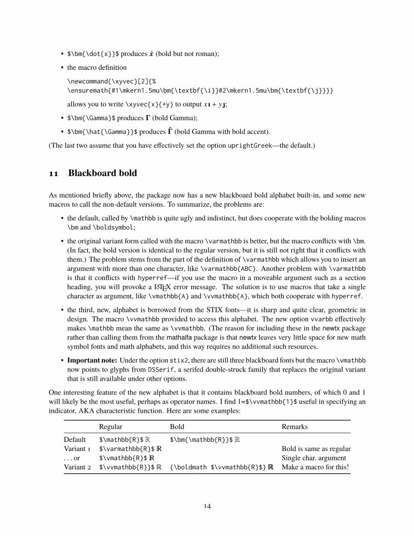
11 Blackboard bold
As mentioned briefly above, the package now has a new blackboard bold alphabet built-in, and some newmacros to call the non-default versions. To summarize, the problems are:
• the default, called by \mathbb is quite ugly and indistinct, but does cooperate with the bolding macros\bm and \boldsymbol;
• the original variant form called with the macro \varmathbb is better, but the macro conflicts with \bm.(In fact, the bold version is identical to the regular version, but it is still not right that it conflicts withthem.) The problem stems from the part of the definition of \varmathbbwhich allows you to insert anargument with more than one character, like \varmathbb{ABC}. Another problem with \varmathbbis that it conflicts with hyperref—if you use the macro in a moveable argument such as a sectionheading, you will provoke a LATEX error message. The solution is to use macros that take a singlecharacter as argument, like \vmathbb{A} and \vvmathbb{A}, which both cooperate with hyperref.
• the third, new, alphabet is borrowed from the STIX fonts—it is sharp and quite clear, geometric indesign. The macro \vvmathbb provided to access this alphabet. The new option vvarbb effectivelymakes \mathbb mean the same as \vvmathbb. (The reason for including these in the newtx packagerather than calling them from the mathalfa package is that newtx leaves very little space for new mathsymbol fonts and math alphabets, and this way requires no additional such resources.
• Important note: Under the option stix2, there are still three blackboard fonts but themacro \vmathbbnow points to glyphs from DSSerif, a serifed double-struck family that replaces the original variantthat is still available under other options.
One interesting feature of the new alphabet is that it contains blackboard bold numbers, of which 0 and 1will likely be the most useful, perhaps as operator names. I find 1=$\vvmathbb{1}$ useful in specifying anindicator, AKA characteristic function. Here are some examples:
Regular Bold Remarks
Default $\mathbb{R}$ R $\bm{\mathbb{R}}$ RVariant 1 $\varmathbb{R}$ � Bold is same as regular. . . or $\vmathbb{R}$ � Single char. argumentVariant 2 $\vvmathbb{R}}$ R {\boldmath $\vvmathbb{R}$} R Make a macro for this!
14

Themacros \vmathbb and \vvmathbb have been substantially rewritten as of version 1.55 and can now acceptstrings as arguments rather than just single characters. At some point in time, the \bm and \boldsymbolmacros stopped working with the prior versions of these macros, and that remains a problem with the newversions. If you need only a few blackboard bold symbols, it may be better practice to define macros foreach, including bold versions you might need. E.g., the your preamble:
\let\bbZ\undefined\DeclareMathSymbol{\bbZ}{\mathord}{lettersA}{218} $ Z may not always be in this location
Then, \bm will correctly understand
\bbZ\;\bm{\bbZ}
and render it asZ Z
12 Samples from free Times and Libertine packages
TXFONTS:
\usepackage{txfonts}
A formula from the LATEX Companion, 2nd Edition, p.390:
t[u1, . . . , un] =
n∑
k=1
(
n − 1
k − 1
)
(1 − t)n−ktk−1
uk.
The ISO would prefer that a formula like
Φ(u) =1√
2π
∫
u
−∞
e−t
2/2dt
be typeset instead as
Φ(u) =1√
2π
∫
u
−∞
e−t2/2 dt,
with upright π, e and d. I dislike the look of dt when the slope of t is too
great.
• Complete match between text and math size and weight;
• first formula much too cramped;
• upper limit of integral much too close to integral sign;
• square on t in integrand comes very close to colliding with it;
• square root in denominator aligned too far right.
NEWTXFONTS:
\usepackage{newtxtext}
15

\usepackage{newtxmath}
A formula from the LATEX Companion, 2nd Edition, p.390:
t[u1 , . . . , un] =
n∑
k=1
(
n − 1
k − 1
)
(1 − t)n−k tk−1uk .
The ISO would prefer that a formula like
Φ(u) =1√
2π
∫
u
−∞
e−t
2/2dt
be typeset instead as
Φ(u) =1√
2π
∫
u
−∞
e−t2/2 dt ,
with upright π, e and d. I dislike the look of dt when the slope of t is too
great.
• Complete match between text and math size and weight;
• first formula much less cramped;
• upper limit of integral not too close to integral sign;
• square not too close to t in exponent;
• better alignment of square root in denominator.
MathTimePro2:
\usepackage{newtxtext}\usepackage[lite]{mtpro2}
A formula from the LATEX Companion, 2nd Edition, p.390:
t Œu1; : : : ; un� D
nX
kD1
n � 1
k � 1
!
.1 � t /n�ktk�1uk :
The ISO would prefer that a formula like
ˆ.u/ D1
p2�
Z u
�1
e�t2=2 dt
be typeset instead as
˚.u/ D1
p2
Z u
�1
e�t2=2 dt;
with upright , e and d. I dislike the look of dt when the slope of t is too
great.
• Complete match between text and math size and weight;
• first formula quite spread out;
• upper limit of integral not too close to integral sign;
16

• plenty of space between square and t in exponent.
Libertine and MathTimePro2:
\usepackage{libertine}\usepackage[T1]{fontenc}\usepackage[lite]{mtpro2}
A formula from the LATEX Companion, 2nd Edition, p.390:
t Œu1; : : : ; un� D
nX
kD1
n � 1
k � 1
!
.1 � t /n�ktk�1uk :
The ISO would prefer that a formula like
ˆ.u/ D1
p2�
Z u
�1
e�t2=2 dt
be typeset instead as
˚.u/ D1
p2
Z u
�1
e�t2=2 dt;
with upright , e and d. I dislike the look of dt when the slope of t is too
great.
• Mismatch of weight between text and math;
• first formula quite spread out;
• upper limit of integral not too close to integral sign;
• plenty of space between square and t in exponent.
Libertine and newtxmath:
\usepackage{libertine}\usepackage[T1]{fontenc}\usepackage[libertine]{newtxmath}
17

A formula from the LATEX Companion, 2nd Edition, p.390:
t[u1 , . . . ,un] =
n∑
k=1
(
n − 1
k − 1
)
(1 − t)n−ktk−1uk .
The ISO would prefer that a formula like
Φ(u) =1√
2π
∫
u
−∞
e−t
2/2dt
be typeset instead as
Φ(u) =1√
2π
∫
u
−∞
e−t2/2 dt ,
with upright π, e and d. I dislike the look of dt when the slope of t is too
great.
• Very good match between text and math in size and weight;
• first formula not cramped;
• upper limit of integral not too close to integral sign;
• space between square and t in exponent;
• better alignment of square root in denominator.
Mathptmx:
\usepackage{mathptmx}
A formula from the LATEX Companion, 2nd Edition, p.390:
t[u1, . . . ,un] =n
∑k=1
(
n−1
k−1
)
(1− t)n−ktk−1
uk.
The ISO would prefer that a formula like
Φ(u) =1
√
2π
∫
u
−∞e−t
2/2dt
be typeset instead as
Φ(u) =1
√
2π
∫
u
−∞e−t
2/2 dt,
with upright π , e and d. I dislike the look of dt when the slope of t is too
great.
• Good match between text and math size and weight, though the summation symbol (from the systemsymbol font) is too small and too dark;
• first formula well spread;
• upper limit of integral not too close to integral sign;
• space between square and t in exponent;
• there are no upright Greek lowercase letters in this package;
18

• good alignment of square root in denominator;
• infinity symbol not sufficiently large?
• the package lacks a number of amenities that are present in other packages.
13 Items installed
As well as a collection of PostScript fonts, virtual fonts, font definition files and the central newtxtext.styand newtxmath.sty files, the package contains one map file newtx.map that must be enabled for thepackage to function correctly. Its name was changed from ntx.map to mirror the package name.) Thefile implementation.pdf in this distribution provides a manifest of all files installed together with a briefindication of the sources. (This file is somewhat outdated. The file mathnotes.pdf adds details about thesources for the math fonts, though it is rather cursory.)
The font files ntxexmods.pfb and ntxbexmods.pfb were derived from cmex10.pfb by FontForgery, thick-ening the Computer Modern braces to match the weight of the txfonts braces. The pair ntxexb.pfb andntxbexb.pfbwere similarly derived from cmsy7.pfb and cmex10.pfb to producemore braces andmatchingintegral signs based on Computer Modern. The .tfm files rtx[b]mio.tfm are simply unslanted versions ofrtxmi, from which we construct upright partial derivative symbols. The last two entries provide us with away to access custom-encoded versions of fxlri.pfb and fxlbi.map in order to access some of the unen-coded alternate characters—eg, Greek letters, J.alt and v.alt. The font file LibertineTheta-Regular.pfbwascreated from the Theta symbol in fxlri.pfb, which requires some FontForge help to look correct.
This version contains optical versions of the math italic and symbol fonts at 7pt and 5pt, allowing betterrendering in \scriptstyle and \scriptscriptstyle.
14 Appendix: Changes made in version 1.5
• The large delimiters have been modified so match the heights in common usage by cmex10 andother packages. (Those formerly used by newtxmath were somewhat shorter, resulting in unexpectedbehavior of \Big, \bigg, etc.)
• The integrals used in previous versions have been discarded and replaced by an upright and a slantedform, the latter being the default. The option upint switches to the upright form. (The formeroption cmintegrals now has no effect.) Integrals are of three types: small, textstyle and displaystyle.Each size is available in twelve variants. Assuming slanted (the default) is selected, there are 36regular-weight forms:
19
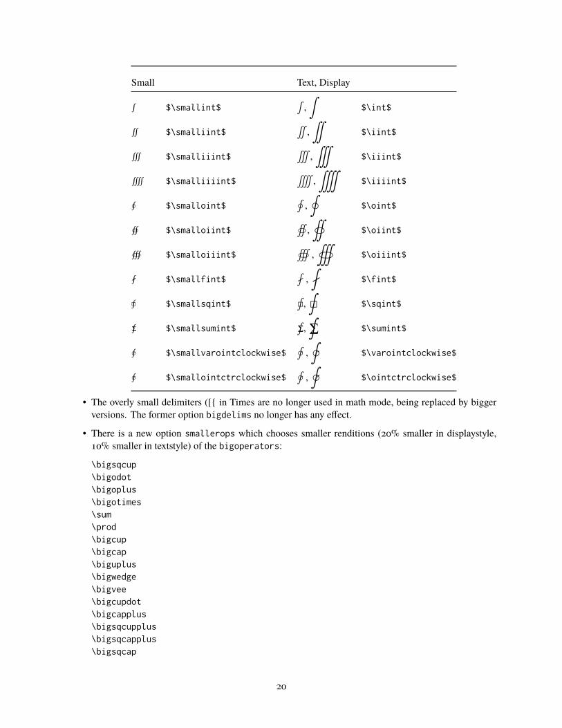
Small Text, Display
∫ $\smallint$∫,∫
$\int$
∬ $\smalliint$∬,∬
$\iint$
∭ $\smalliiint$∭
,∭
$\iiint$
⨌ $\smalliiiint$⨌
,⨌
$\iiiint$
∮ $\smalloint$∮,∮
$\oint$
∯ $\smalloiint$∯
,∯
$\oiint$
∰ $\smalloiiint$∰
,∰
$\oiiint$
⨏ $\smallfint$⨏,
⨏$\fint$
⨖ $\smallsqint$⨖,
⨖$\sqint$
⨋ $\smallsumint$⨋,
⨋$\sumint$
∲ $\smallvarointclockwise$∲,
∲$\varointclockwise$
∳ $\smallointctrclockwise$∳,
∳$\ointctrclockwise$
• The overly small delimiters ([{ in Times are no longer used in math mode, being replaced by biggerversions. The former option bigdelims no longer has any effect.
• There is a new option smallerops which chooses smaller renditions (20% smaller in displaystyle,10% smaller in textstyle) of the bigoperators:
\bigsqcup\bigodot\bigoplus\bigotimes\sum\prod\bigcup\bigcap\biguplus\bigwedge\bigvee\bigcupdot\bigcapplus\bigsqcupplus\bigsqcapplus\bigsqcap
20
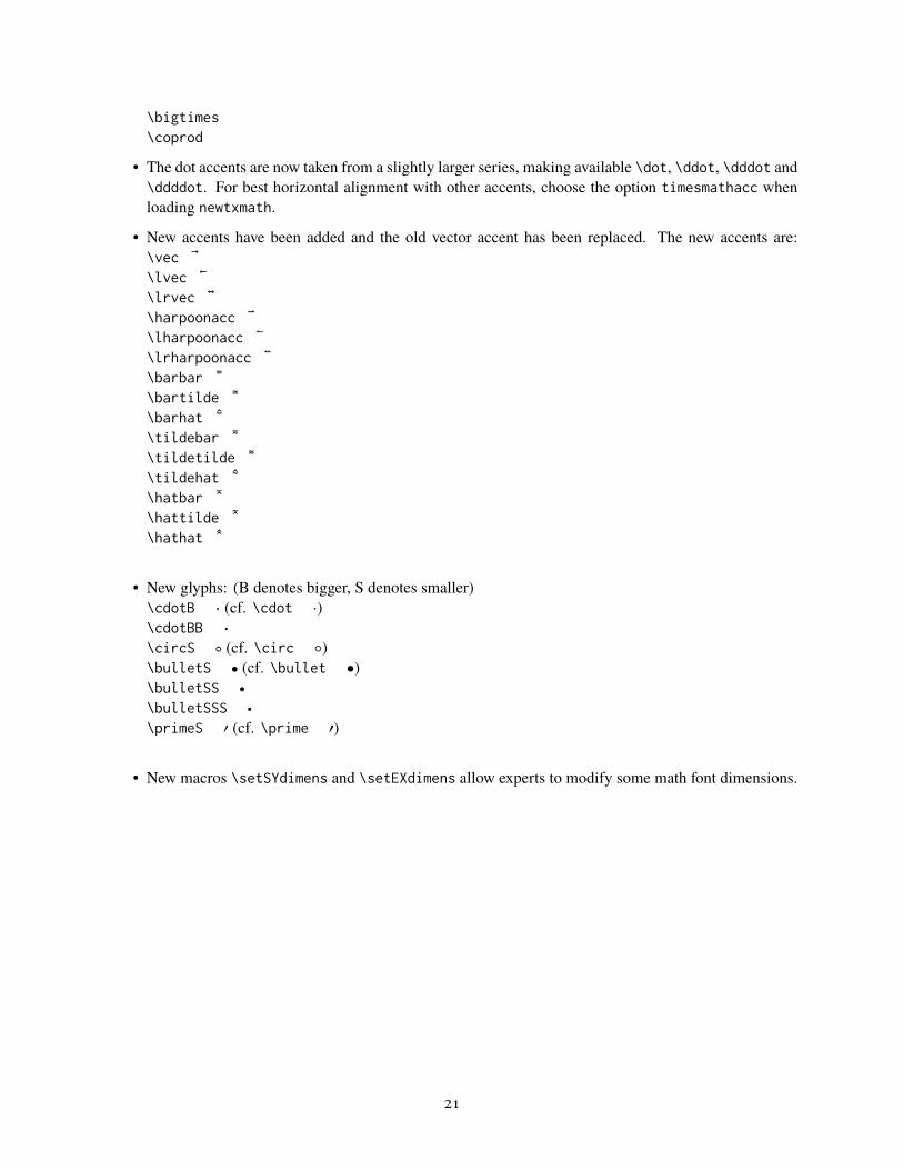
\bigtimes\coprod
• The dot accents are now taken from a slightly larger series, making available \dot, \ddot, \dddot and\ddddot. For best horizontal alignment with other accents, choose the option timesmathacc whenloading newtxmath.
• New accents have been added and the old vector accent has been replaced. The new accents are:\vec ®\lvec ©\lrvec ¬\harpoonacc ª\lharpoonacc «\lrharpoonacc \barbar ½\bartilde ¾\barhat ¿\tildebar À\tildetilde Á\tildehat Â\hatbar Ã\hattilde Ä\hathat Å
• New glyphs: (B denotes bigger, S denotes smaller)\cdotB Ð (cf. \cdot ·)\cdotBB Ñ
\circS Ò (cf. \circ ◦)\bulletS Õ (cf. \bullet •)\bulletSS Ô
\bulletSSS Ó
\primeS Ö (cf. \prime ′)
• New macros \setSYdimens and \setEXdimens allow experts to modify some math font dimensions.
21

![Customizing lists with the - TeXdoc Onlinetexdoc.net/texmf-dist/doc/latex/enumitem/enumitem.pdf\begin{enumerate}[resume*] •To use the three basic list in line: just add the package](https://static.fdocuments.us/doc/165x107/5ec9f2fa25f7df63e05915dd/customizing-lists-with-the-texdoc-beginenumerateresume-ato-use-the-three.jpg)