New Visual Language
26
new visual language
-
Upload
rowan-hunt -
Category
Documents
-
view
217 -
download
3
description
Â
Transcript of New Visual Language

new visual language


4 Modernism and Post ModernismAn exploration into modernism and post modernism, a look at the different movements and some of the artists that inspired them.
12 Street GraphicsA look at the hustle and bustle of life
16 Cabinet of CuriosityA victorian idea in a modern world
20 Earth ArtefactOur world and the planets beyond
24 Artist inspired TypefaceThe inspiration of Wassily Knadinsky
Page 8
Page 12
Page 21
Follow me @Rowan_HuntorVisit the blog rowanmhunt.wordpress.com
All information in this magazine was correct at the time of publishing. All photos in this publication are the property of New Visual Language unless otherwise stated, please don’t reproduce without permission.“Earth” image courtesy of foreverfraiche.com. “Starry Night” image courtesy of wikimedia.org. “
april 2014 contents
newlanguagevisual

Modern art is a term that describes artistic works produced during the period extending roughly from the 1860s to the 1970s. Modern art is usually associated with art in which classical traditions of
the past (painting something realistically to the best of ones ability etc.) have been rejected in favour for spirit of experimentation. Modern artists looked at the world with a fresh perspective and had different ideas about materials and what the function of art actually was. These artists tended to lean away from
the narrative and towards abstraction which is by far the characteristic of most modern art. The heritage of modern art without doubt began with painters such as van Gogh, Cézanne and Toulouse-Lautrec. At the beginning of the 20th century Henri Matisse and several other young artists revolutionised
the art world of Paris with wild, multi-coloured, expressive landscapes and figure paintings that the critics called ‘Fauvism’. Matisse’s two versions of The Dance signified a key point in his development of modern in primitive art, the colours and rhythmical succession of the dancing nudes convey emotional liberation. Initially influenced by Lautrec, Gauguin aswell as other 19th century innovators such as Pablo Picasso made his first cubist paintings based on Cézanne’s very Bauhaus ideas that nature can be reduced to three solids: cube, sphere and cone. With this Picasso created the painting Les Demoiselles d’Avignon in which woman appear very reminiscent of tribal masks mixed with his Cubist inventions.
modern artfrom Monet to Duchamp what is it really all about?
“...nature can be reduced
to three solids: cube, sphere and
cone.”

Les Demoiselles d’Avignon by Pablo Picasso

Realism 1850-1880 Realism in France appears after the 1848 Revolution. These realists positioned themselves against romanticism, a genre dominating French literature and artwork in the late 18th and early 19th centuries. Realists believed in being objective and revolted against the exaggerated emotionalism of the romantic movement. Such artists included Rosa Bonheur, Thomas Eakin and Gustav Courbet. Fin du travail by Jules Breton (left)
Impressionism 1867-1886 Impressionism originated with a group of Paris-based artists whose
exhibitions brought them to prominence during the 1870s and 80s. Characteristics of Impressionist
paintings are small brush strokes, open composition, and accurate depictions of changing light. As well
as common subject matter and the inclusion of movement and strange visual angles. Such artists
include Édouard Manet, Claude Monet, Edgar Degar and Auguste Renoir.
Impression, soleil levant by Claude Monet (right)
Post Impressionism 1885-1905 The Post Impressionists were a few independent artists at the end of the 19th century who rebelled against the limitations of Impressionism to develop a range of personal styles that influenced the development of art in the 20th century. The movement was massively influential to many other movements such as Cubism, Fauvism and Expressionism. Such artists include Vincent van Gogh, Georges Seurat, Paul Signac and Paul Cézanne.Portrait de Félix Fénéon by Paul Signac (left)
Symbolism 1885-1910 Symbolism originated in France, and was part of a 19th century movement
in which art became infused with mysticism. It was a continuation of the Romantic tradition and a
reaction to the realistic approach of impressionism. The term Symbolism means the systematic use
of symbols or pictorial conventions to express an allegoric meaning. Such artists include Odilon Redon,
Henri Rousseau, Edvard Munch and Paul Gauguin.La Bohémienne endormie by Henri Rousseau (right)
art history
modern art and it’s movements

Art Nouveau 1890-1910 Art Nouveau is a global approach to decoration and architecture that dates back to 1890s. A reaction to academic art of the 19th century, it was inspired by natural forms and structures, not only in flowers and plants but also in curved lines. Architects tried to harmonise with the natural environment. Art Nouveau is considered a “total” art style, embracing all aspects of art and design. Such artists include Gustav Klimt, Antonio Gaudi, Henri de Toulousse Lautrec and Egon Schiele. Sagrada Familia nave roof detail by Antonio Gaudí (left)
Fauvism 1900-1907 Fauvism is the style of les Fauves (French for “the wild beasts”), a short-
lived and loose group of early twentieth-century modern artists whose works emphasised painterly
qualities and strong colour over the representational or realistic values retained by Impressionism.
Such Artists include Henri Matisse, Andre Derain, Maurice de Vlaminck and Georges Rouault.
Impression, soleil levant by Claude Monet (right)
Expressionism 1905-1925 Started in Germany out of fauvism as a way to use distortion and exaggeration to have a more emotional effect with the use of intense colors and bold brush strokes and outlines. Such artists include Ernst Ludwig Kirchner, Emil Nolde, Wassily Kandinsky and Oskar Kokoschka.Komposition VII by Wassily Kandinsky (left)
Futurism 1909-1916 Artistic Movement that originated in Italy and was founded by Filippo Tommaso Marinetti. The artists expressed movement, speed, technology and violence as their subjects in their work. Such artists include Filippo Tommaso Marinetti, Bruno Munari, Igor Severyanin and Vladimir Mayakovsky.Abstract Speed + Sound by Giacomo Balla (left)
Cubism 1908-1914 This was a movement that looked at the subject in a new way and from
different viewpoints by analysing breaking it up into an abstracted form. Such artists included Pablo Picasso,
Georges Braque, Marc Chagall and Jean Metzinger.Nu Couché by Jean Metzinger (right)
art history

Suprematism 1915-1916 Russian abstract art movement that officially began with its first show in December 1915. It was founded by Kasimir Malevich, who began developing the style in 1913. The style put emphasis on basic geometric shapes, namely the square, along with circles, rectangles and traignels. Such artists include Kasimir Malevich, El Lisitzky, Iya Chashnik and Alexander Rodchenko.Suprematism by Kasimir Malevich (left)
Dada 1916-1922 Dada or Dadaism was an art movement of the European avant-garde in the early 20th century. Dada was a movement that
responded to the horrors of war and modern society. They saw World War I as being so insane
that its existence called into question the validity of the society that produced it. Dada proclaimed itself anti-war, anti-art, and was, in many ways, anarchic.
The nonsense name and works of the movement were meant to draw attention to how nonsensical violence and war can be, and how insane it is to
carry on with everyday life when such atrocities are occurring. Such artists include Marcel Duchamp,
Max Ernst, Jan Tschichold and Kurt Schwitters.Fountain by Marcel Duchamp (right)
De Stijl 1917-1931 De Stijl was a Dutch artistic movement that also goes by the name of “neoplasticism.” The artists attempted to create a utopian ideal by reducing objects into pure, abstracted images that utilised horizontal and vertical lines as well as primary colors and “non-colors.” Such artists include Piet Mondrian, Theo van Doesburg, Bart van der Leck and Jean Gorin.Broadway Boogie Woogie by Theo van Doesburg (left)
art history
Constructivism 1919-1934 Constructivism was a Russian movement founded by Vladimir Tatlin
and Alexander Rodchenko in 1915. Stylistically, it was influence by Cubism and Suprematism, but
ideologically, it was a response to the modern world and its new technologies. Such artists include
Vladimir Tatlin, El Lissitzky, Laszlo Moholy-Nagy and Alexander Rodchenko.
Corner Counter-Relief by Vladimir Tatlin

Art Deco 1920-1930 This movement finds itself as the most “modern” style for the time. Mostly associated with architecture, the machine-like chrome and industrialised metals, created a new look that caught the wave of the “The Golden Age” and the Roaring Twenties. Such artists include William Van Alen, Tadeusz Lucjan Gronowski, Tamara de Lempicka and Josef Hoffmann.Chrysler Building, Manhattan, New York by William van Allen (left)
Surrealism 1920-1940 A literary and artistic movement of dream-like expressionism. Combining
prose, poetry, story, and art works, the authors and movers of this movement were specifically
obsessed with capturing imagination and solving the mysteries that lie beneath the subconscious matters of the human mind. Such artists include
Salvador Dali, Man Ray, Paul Klee and Andre Breton.The Persistence of Memory by Salvador Dalí (right)
art history
The Starry Night by van Gogh is a perfect example of post impressionism

Postmodernism is a late 20th Century movement that encompassed most art and design disciplines. It included
skeptical interpretations of culture and society at the time and was heavily influenced by both world wars. It is often associated with deconstruction and post-structuralism because its use gained popularity at the same time as post-structural thought. The term postmodern was first used around the 1870s. John Watkins Chapman suggested “a Postmodern style of painting” in a bid to move away from French Impressionism. In 1921 and 1925, postmodernism had been used to describe new forms of art and music. In 1942 H. R. Hays described
it as a new literary form. However, as a general theory for a historical movement it was first used in 1939 by Arnold J. Toynbee: “Our own Post-Modern Age has been inaugurated by the general war of 1914-1918.” In 1949 the term was used to show a distaste with modern architecture and led to the post modern architectural movement, perhaps also a response to the modernist architectural movement known as the International Style. In 1971, in a lecture delivered at the Institute of Contemporary Art, London, Mel Bochner described “post-modernism” in art as having started with Jasper Johns, “who first rejected sense-data and the singular point-of-view as the basis for his art, and treated art as a critical investigation.”
postmodern artis it about the quality? or does the most obscure win?
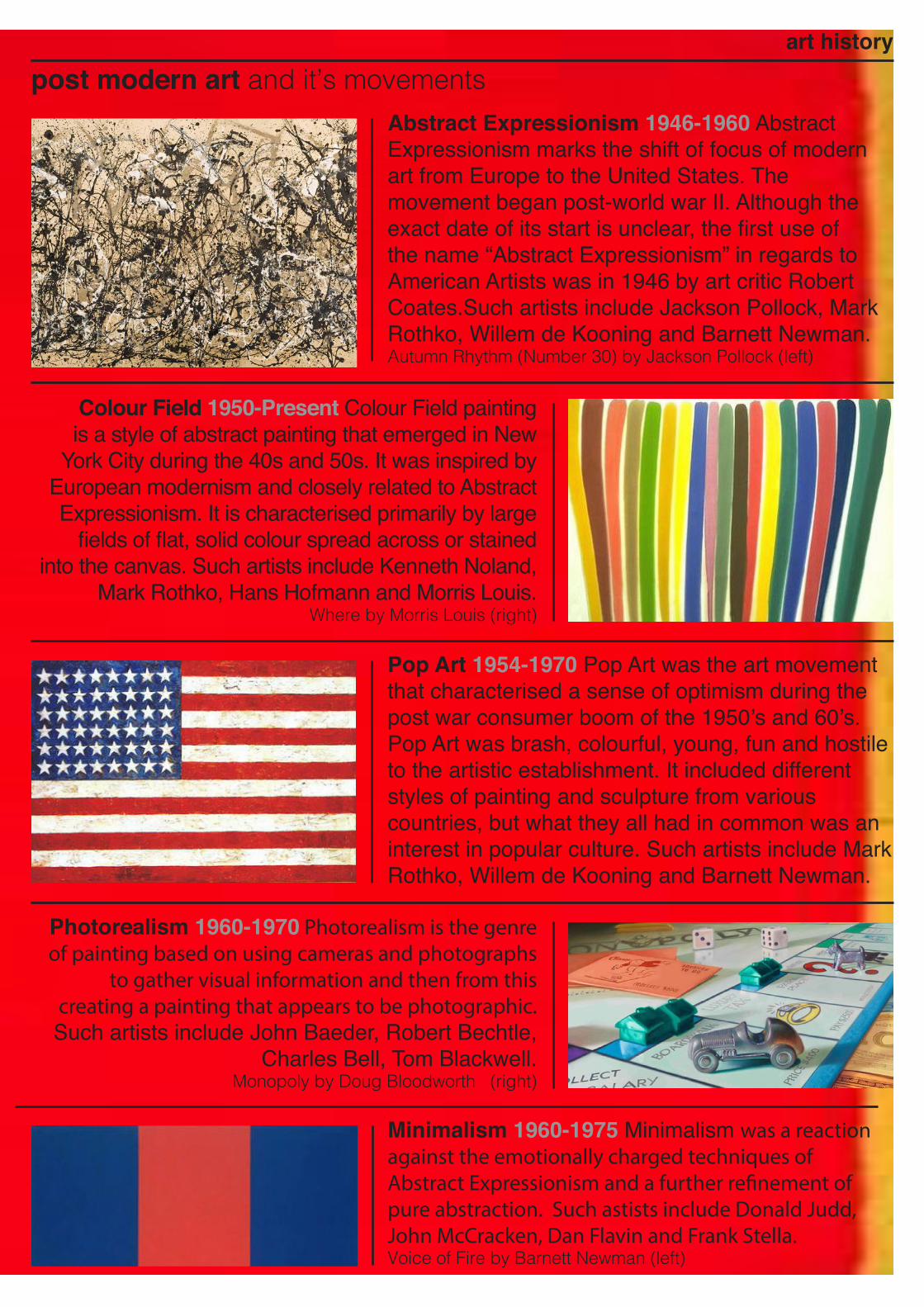
Abstract Expressionism 1946-1960 Abstract Expressionism marks the shift of focus of modern art from Europe to the United States. The movement began post-world war II. Although the exact date of its start is unclear, the first use of the name “Abstract Expressionism” in regards to American Artists was in 1946 by art critic Robert Coates.Such artists include Jackson Pollock, Mark Rothko, Willem de Kooning and Barnett Newman.Autumn Rhythm (Number 30) by Jackson Pollock (left)
Colour Field 1950-Present Colour Field painting is a style of abstract painting that emerged in New
York City during the 40s and 50s. It was inspired by European modernism and closely related to Abstract Expressionism. It is characterised primarily by large
fields of flat, solid colour spread across or stained into the canvas. Such artists include Kenneth Noland,
Mark Rothko, Hans Hofmann and Morris Louis.Where by Morris Louis (right)
Pop Art 1954-1970 Pop Art was the art movement that characterised a sense of optimism during the post war consumer boom of the 1950’s and 60’s. Pop Art was brash, colourful, young, fun and hostile to the artistic establishment. It included different styles of painting and sculpture from various countries, but what they all had in common was an interest in popular culture. Such artists include Mark Rothko, Willem de Kooning and Barnett Newman.
Minimalism 1960-1975 Minimalism was a reaction against the emotionally charged techniques of Abstract Expressionism and a further refinement of pure abstraction. Such astists include Donald Judd, John McCracken, Dan Flavin and Frank Stella.Voice of Fire by Barnett Newman (left)
Photorealism 1960-1970 Photorealism is the genre of painting based on using cameras and photographs
to gather visual information and then from this creating a painting that appears to be photographic. Such artists include John Baeder, Robert Bechtle,
Charles Bell, Tom Blackwell.Monopoly by Doug Bloodworth (right)
art history
post modern art and it’s movements

street graphics
“The life of our city is rich in poetic and marvellous subjects. We are enveloped and steeped as though in an atmosphere of the marvellous; but we do not notice.” - Charles Baudelaire
When I first received this brief I was really excited, I was glad to be getting my teeth stuck in straight away with some graphics.
That and the fact I would be conducting my research around an alien town was very exciting. As I was studying for my driving theory test when I began this project, I started out by looking at road signs. It was in July 1963 that the Worboys Report was published, with its recommendation for radical change to almost every road sign in the land.Until Worboys, waymarking of roads and destinations had been achieved by a jumble of signs produced by the Ministry of Transport, local councils, motoring and cycling organisations and private concerns. With their endless variety of shape, size, colour and typeface, it made for a cluttered and confusing roadscape. Kinneir’s signs were installed on the very first motorway, the Preston bypass in 1958, and to considerable acclaim.
‘...recommendation for radical change to almost every road sign
in the land.’My final outcome for the street
graphics project (right)

Joch Kinneir revolutionised the way our streets look today, how difficult and confusing it must have been when different typefaces and icons were used everywhere. Whilst watching TV I came across the first episode of BBC’s Sherlock. This contains a chase scene in which they incorporate lots of street signs etc.I found this really interesting because they were able to show a chase scene without much footage of the participants instead using static images of street signs. I also looked at art on the streets in my local area, whether it be signage or graffiti on the wall. This is a painting on the platform of a local railway station. After watching the news I decided to look up some statistics showing the change in our high streets and how since the recession shops such as clothes and game shops are closing down while the number of outlets specialising in gambling and pay day loans are increasing.

Since I was on the theme of infographics I decided to look at David McCandless, the author of the book completely dedicated to infographics, “Information is Beautiful”. David McCandless is a London-based author, writer and designer. He’s written for The Guardian, Wired and others. He’s currently working as an independent data journalist and information designer. His passion is visualising information with the minimum of words. He loves pie, but hates pie-charts. I absolutely adore McCandless’ work. It conveys information so concisely and beautifully. I also looked at other graphic designers/
illustrators that focus on producing infographics such as Martin and Simon Toseland, Jonathan Quintin and Anton Egorov. The Toseland brothers, similar to David McCandless , focus on simple brightly coloured illustrations as does Jonathan Quintin (though he also works with interactive media design). Anton Egorov however focuses on photo-real information graphics and data visualization, He loves infographics the reason being he’s fond of simple explanations of complicated things. In his work he uses photo manipulations, compositing, matte painting, 3D tools and drawing. My favourite style of
infographics is the simple illustrations so I decided to focus on that for my final piece. I took a look at some statistics comparing my home town and university town. Whilst crossing the road one morning I decided to compare traffic. Coming

from a relativly small market town the amount of traffic is relatively small compared to that of Huddersfield, the largest town in Europe. So I decided to put a camcorder in my student halls window and record the cars that go past for an entire day. I
then made a record of the number of vehicals and their colours at different times throughout the day. I then put a camcorder in the window of a family friend who lives on the high street of my home town. I then recorded the data of this day aswell. For my final idea I thought of making a roundabout (each exit and entrance representing 3 hours in a day) After working on my infographic I decided that this wasn’t going to work so I decided to take a different approach and make illustrated bar charts and pie charts. I created bar charts showing the total number of different vehicals that I recorded over the day. Whilst in Huddersfield
I may have recorded a far higher number of cars, every other type of vehical is more popular in Pateley Bridge due to the large number of tourists that visit. I also made a pie chart of the different colours of cars. I think the reason colours such as white are more popular in Huddersfield is because in Pateley Bridge the roads aren’t very well sufaced or are tracks so people tend to have darker colour cars so they don’t show dirt as easily. Finally I illustrated the flags of the foreign number plates my camera recorded. Whilst I only recorded one in Huddersfield, Pateley had lots because of the American Air Base and the tourist industry.
When sea levels attack by David McCandless (top left)
Agricultural Infographics by Anton Egorov (top right)
My initial idea (left)

cabinet ofcuriosity“Derive ideas from the world around you, from your own background, from your childhood, from relationships with others, from the social and political environment. Don’t be confined to a pond...in which the water is always in danger of becoming stagnant” - Ken Garland

Upon first read of the brief requirements, I was a little bit worried about
this brief. It appeared to require a deep seeded emotional response that being a ‘cold fish’, as my grandmother puts it, I am not capable of. I prefer to look on situations with facts and figures and to make a desision based on the pros and cons as opposed to my emotional response. I started off by looking at the God of all cabinet curiosity makers, Joseph Cornell. He made glass fronted boxes mainly to entertain his younger brother who was dependant on Joseph to be his primary care giver. After this I wanted to look at a wide variety of other artists and in doing so came across aself-taught Albanian artist Adrian Limani. He believes anyone can take a picture but not everyone
can be a photographer and that ‘everyone has a photographic memory, some just don’t have film.’ I enjoy Adrian’s work with light bulbs as it is a cross between snow globes and a ship in the bottle. His work has an artificial vintage style which I enjoy and believe could only be successfully achieved by a very young person. After looking at Limani’s work I decided to have a go at creating my own light bulbs. I found a stock light bulb and removed the background using photoshop. I then used the clone and patch tools to remove undesirable features such as the filament. I took an image of a pine cone and removed it’s background and placed this inside the bulb. I then duplicated the light bulb,
turned the blending mode to ‘Soft Light’ and masked it so it was only visable over my addition to the bulb and experimented with the opacity and rotation. (see back cover).
One of Joseph Cornell’s boxes (left)A range of paper insects by Zim&Zou (right)
I then made various spider diagrams of my childhood and how my life then differed from what I am like now. I came across a French studio Zim&Zou. They explore different fields my favourite of which is their paper sculpture. I really like Zim and Zou’s unique style. I think it shows a lot of dedication and patience. Each feather on the birds are individually cut by hand, I just think they’re brilliant. It’s like origami only better.

member of my close family.After some indecission about what to put in the box, I simply walked around my house and gathered things that when you look at them you know exactly who in my family owns them instantly becasue it just gives off their personality. It was easy to find things since everyone in my family seems to be a hoarder
Tom Phillips was another artist’s work I enjoyed. He uses various media and techniques to mask the contents of a page leaving only the words he desire behind. I think that Phillips’ work is very interesting. It looks beautiful and simple but is actually suprisingly hard. He manages to pull off the very difficult taskof making something hard look easy and effortless.I made my own version by using the Photoshop Touch app available for iOS. Since I didn’t want to use a real book I took a screenshot of a digital book page and opened it in the app. I chose to use a page from The Lord of the Rings: Two Towers, since this is one of my favourite books. I picked specifically this page because it contains a poem about rowan trees (The trees after which I am named). I added an antique paper effect behind the text to make it look like a real book page. I then found this rather beautiful texture in my camera roll and imported it to the image. I used the marque tool to
select the words I desired (after much deliberation) and cut the selection out of the pattern to reveal the words behind. I made a sort of poem out of the words on the page. I think this is quite a good idea and quite beautiful once you’ve perfected the final result. If i did it again I would use the Photoshop on my computer to get a more precise and higher quality finish. As well as this I would probably scan in a physical book page as opposed to creating a fake effect, because I still don’t feel i could damage a book. I then decided upon two possible final ideas, a box of me which would be a box filled with bits and bobs that I associate with myself.My likes and dislikes, hobbies and interests etc. since these are easy to visually interpret or a book with the pages removed and made into a box, containing a collage of photos and an explanation of the contents along with a small bound book with each page a collage dedicated to each member of my family. I decided upon creating the family book. However, whilst researching what I could put in for each person I came across a box for sale at a craft shop that I absolutely fell in love with. I decided to keep my idea simple and dedicate each section of the box to a

of something or other.
Grandad top leftFor this compartment I stuck on a collage of stamps for the background since my grandad was a keen philatalist. A chess piece due to his love of the game and the unbelievable number of chess sets and books dedicated to chess in our house and the four
medals he received when he fought in World War Two (after lying about his age).
Grandma top rightThe background here is books because beforeretiring my grandma was a qualified librarian. Her toy of William Shakespeare becasue of her love for the bard and her personalised wooden trefoil badge because she was a rainbow and brownie leader and is now a member of the trefoil guild.
Mum middle leftOld Trafford is thebackground here because of my mum’s life long love for the red devils. The Russian nesting dolls she was so fond of and hanging infront are some charms from her conformation bracelet.
Auntie middle rightThe picture as the background of the section is a heart monitor since my auntie is a children’s nurseone of her old awards for badminton and two glass pigs that are part of her large figurine collection.
Me bottom left An image of a circuit board is my background to show mylove for all things computers. My movie prop ring as my love for Lord of the Rings, a Girl Guide badge to show how I have followedin my grandma’s footsteps
and am also a girlguiding leader. A glass heart bead for my love of making jewellry and in the back my love for lego with one of my many lego keyrings.
My Family bottom rightHere I have put an old fashioned map of Europe and stuck in map pins. This is to show my family’s heritage. Whilst my maternal grandmother’s family have more or less all come from Huddersfield, my paternal grandmother is Welsh and my maternal grandfather’s parents had Scottish, Polish and Germanic heritage.
Front Lawn the backdropI took the photo of my cabinet on my front lawn because we were the first familyever to live in my house and everyone with their own compartment in my cabinet have lived in that house.Leaf Humument by Tom Phillips (top left)My Top Phillips experiment (bottom left)A beautiful caged bird by Zim&Zou (below)

I was really happy when we were introduced to this brief. It perfectly chimed with my love for science and academic
subjects. I instantly went crazy with it and started research everything from senses to emotions and human biology to whether the concept of time is a human invention. I also
research the basis for the brief which was the golden records placed on the voyager spacecraft. The Voyager Golden Records are phonograph records, which were included aboard both Voyager spacecraft, which were launched in 1977. They contain sounds and images selected to portray the diversity of life and culture on Earth, and are intended for any intelligent extraterrestrial life form, or for future humans, who may find them. The Voyager spacecraft’s are not heading towards any particular star,
earth artefact“For millions of years mankind lived just like the animals. Then something happened which unleashed the power of our imagination. We learned to talk, we learned to listen. Speech has allowed the communication of ideas enabling ” people to work together ...” - Stephen Halking
“It perfectly chimed with my love for science...”
My final piece for my earth
artefact breif (right)


but Voyager 1 will be within 1.6 light years of the star Gilese 445, curretly in the constellation C a m e l o p a r d a l i s i n about 40,000 years. As I viewed this as a primary research heavy brief I didn’t really look into any artists particularly, I looked into more scientific things such as the senses. Senses are capabilities of organisms that provide data for perception. The nervous system has a specific sensory system or organ dedicated to each sense. Humans have a multitude of senses. Sight (ophthalmoception), hearing (audioception), taste (gustaoception), smell (olfacoception) and touch (tacioception) are considered the five main and traditionally recognised ones. While we are able to detect other stimuli such as temperature, kinaesthetic, pain, balance and various internal stimuli, these tend to also be incorporated with another sense for example temperature with touch, as well as this only
a small number of these other senses can safely be c l ass i f i ed as separate senses. What constitutes a sense is a matter
of some debate, leading to difficulties in defining what exactly a sense is. It was suggested to be that since I am so interested in science I should createsomething that shows a holistic approach to science.I thought of creating a web page with a jigsaw style navigation in which each jigsaw piece represented a different branch of science. I started work on this but it quickly became clear that despite my ability to code html, css and javascript, for this I would have to use flash which I am not particularly practiced in and found it difficult even having watched lynda tutorials to get anywhere. However, I came across one artist that did interest me was James Francis. James is a student from Kingston University studying creative technology. I saw an animation he made in which a meteor collided with the earth. Looking at his work I came up with the idea to create the planets in Cinema 4D and see where that took me. Once I started
making the planets I found I was not only making them to scale but tilting them on their axis the correct amountaswell. With a large table of fact and figures I thought perhaps I could create some education materials for children, or “future humans” to teach them about the solar system.Despite my love for Pluto, with it no longer beinga planet I decided to remove it from my composition andjust use the main planets. I had recently bought some anaglyph glasses and remembered how much I used to love looking at the Guiness Book of Records and hunting for the sections that were in 3D with the red and cyan glasses on.I found an option on the display of Cinema 4D that allows you to view your work area in stereoscopic mode and that clinched it for me. I then arranged the planets and saved one image before slightly rotating the planets (for the right eye) and saved another image. I then overlayed these on

planets (for the right eye) and saved another image. I then overlayed these on photoshop and removed the red channel to create an overlayed 3D effect. I did lots ofexperimenting with this effect, as to whether I wanted the planets to appear inside the screen or petruding from the screen and if colour correction was needed because of the red and cyan overlay. I decided to take it a step further and add 3D text too with the names of them planets. Finally I created some cards with facts about
each planet in our solar s y s t e m such as the length of a day and year, or the diameter of the planet. I decided make these 3D aswell.
Deep in the screen and popping out without colour correction (above)
Deep in the screen and popping out with colour correction (above)
I decided to have the planets deep in the scree and the details popping out b e c a u s e there is
only a small amount that letters can be 3D before they become illegable. I really like the effect that’s created and I showed my little cousin and she thought
they were fu to play with, especially with the 3D effect. All the images used are public demain and are form NASA’s Jet Propulsion Labratory .


wassily kandinskymy expression for the expressionist artist that inspired my font
I found starting this brief really difficult. When looking at other peoples work they all seemed so creative and yet all the characters seemed to fit together
and correspond. Every which way I tried, my font either ended up to literal and being a very useful and versatile but looked nothing like the orginal image or I was so picky with the image that I had to pick out every letter form from the image and if I couldn’t manage it I gave up. I tried Demuth, Lissitzky, Stella and every other reference image provided and it just turned into a big frustrated mess. They I remembered that I’d tried to recreate a Kandinsky piece a few years ago in Illustrator. Since my Illustrator skills had grown considerably since then I though I’d give it a go and try to recreate Kandinsky’s ‘Komposition VII’. I was able to recreate it and then pick
letters out of my digital version after a lot of advice from friends, family and tutors and a lot of tinkering and experimenting, I feel I have been able to successfully produce a font that is representational of Kandinsky’s style and that could be used for example on posters for a Kandinsky exhibition or something of that nature.
Kandinsky’s original (above)
My reproduction (above)
“I tried Demuth, Lissitzky, Stella and every other
reference image provided and it just turned into a big
frustrated mess.”