New Graphic Design Sketchbook
48
Module TFD1064 Design for Communication Design Project – “New Graphic Design” Sam Blower U1262183 [email protected] 07565535563 Module TFD1064 New Graphic Design
-
Upload
sam-blower -
Category
Documents
-
view
220 -
download
2
description
Sketchbook for my "New Graphic Design" magazine project.
Transcript of New Graphic Design Sketchbook

Module TFD1064Design for Communication Design
Project – “New Graphic Design” Sam Blower [email protected]
07565535563
Module TFD1064New Graphic Design


BriefYou are to submit design proposals for a new graphic design publication entitled, New Graphic Design. The first issue will focus on Form follows function - an exploration of Modernism and Post Modernism.Part 1Research into Modernism and Post Modernism generating a body of work that explores the origins and philosophy of the movements.Your visual work should be an expression of the movement and not a pastiche.You should aim to convey the essential nature of the movement.You will need to understand the social, industrial and political concerns which influence both movements.
Part 2 You are to submit designs for a magazine, which should be based on your personal and original visual research.You should produce a masthead, a cover design and an inner page/s. Size: A3 Portrait Cover, A3 Portrait Inner.You should experiement with single and double page spreads.

ModernismModernism describes the modernist movement in the arts and the set of cultural tendencies that originally occured in western society in the early 20th century. The effects of World War 1 were one of the main factors that shaped Modernism. Many artists and designers involved with modernist movements felt the “traditional” forms of art, architecture, literature, religious faith, social organization and daily life were becoming outdated in the new economic, social, and political conditions of an emerging fully industrialized world. An important characteristic of Modernism is self consciousness, this often led to experiments with form and work that draws attention to the processes and materials used. The beginning of the 20th century marked the first time that the term “avant-garde” was used for the arts rather than in its original military and political context.


Emil RuderEmil Ruder was a swiss designer who created work that features large amounts of typography. I like how the work is aligned to a grid in various different ways, the contrast works particularly well.

Josef Müller-BrockmannJosef Müller-Brockmann was also a Swiss designer who focuses on graphic design, exhibiton design and photography. His work consists of simple designs with clean typography and images.

BauhausWalter Groupius founded the Bauhaus in 1919. He did it in an attempt to unite industrial production, art and design. He established it in Weimar despite the turmoil in the area caused by world war 1, which ended the year before. Bauhaus students and teachers aimed to bridge the gap between artist and craft worker, but also between art and society. It was influenced by constructivist ideas as well as expressionism.They produced a wide range of work that included typography, paintings, photography, furniture, architecture, household goods, experimental film, theatre design, music and dance. When the school moved premises, the new buildings including the studios and the accomodation was designed by the current students and teachers at the time following their own design style.The book that I read (‘Bauhaus 1919-1933 Bauhaus Archiv’ by Magdalena Droste) contains lots of images of the work produced at the Bauhaus. When looking through it you can see a consistency in the style of the work throughout. It seems to be as though the artist doesn’t want to add too much, with great amount of thought and detail put into the form of the design.


The designs by Herbert Bayer work really well due to their simplicity. Herbert Bayer had ideas about designing structures around advertising. I think this was a great idea, especially for the time.
Herbert Bayer

I particularly like the work by Joost Schmidt because of the way it is layed out. His work is very specific when it comes to aligning to the grid. Even when a piece of his work is on an angle, it still all lines up.
Joost Schmidt

De StijlVan Doesburg started meeting the artists who would eventually become the founders of the journal ‘De Stijl’ in 1915. At the time, Dutch artists were not able to leave the country because of World War 1 so were isolated from the international art world, especially Paris, which was the main centre of the art world at the current time.They wanted to express a new utopian ideal of spiritual harmony and order. They advocated pure abstraction and universality by only using essentials of form and colour. They simplified visual compositions to the vertical and horizontal directions, and only used primary colours along with black and white.The book that I read (‘De Stijl 1917-1831 Visions of Utopia’ by Mildred Friedman) has lots of different images of all the different art featured in the journal over the years. The majority of it fits in with the style and guidelines stated by the founders of De Stijl. Remaining simple with the choice of colours and style, it is in a similar style to much of the work produced by The Bauhaus.


Vilmos HuszarThese prints by Vilmos Huszar work well despite not necessarily being perfect shapes. I like the texture of the ink on the different papers. The colours that he has chosen are similar to those used at the Bahaus.
These prints by Vilmos Huszar work well despite not necessarily being perfect shapes. I like the texture of the ink on the different papers. The colours that he has chosen are similar to those used at the Bahaus.
These prints by Vilmos Huszar work well despite not necessarily being perfect shapes. I like the texture of the ink on the different papers. The colours that he has chosen are similar to those used at the Bahaus.

Theo Van DoesburgTheo Van Doesburg was the founder of De Stijl. In my opinion his work helped define the style of the movement. He makes use of shapes and block colours. His structure designs work well too.

Post ModernismPost Modernism started as visual and decorative movement. It has often been associated with the punk movement but also in the Graffiti and Hiphop culture in the late 70’s. It was particularly popular in western culture. A main focus point is the idea of “deconstructing” what is already there and making something different by recycling existing images and designs.


Wolfgang WeingartWolfgang Weingart is a German graphic designer and typographer. His use of shapes and random letter sizes appeals to me. His mixture of regular and then negative printing creates a unique look.

Barbara KrugerBarbara Kruger creates these poster designs by recyling existing images, and putting altered versions of existing quotes over the top. The use of Helvetica works really well in the red and white colour scheme.

DadaThe Dada art movement started in the early 20th century in Zurich, Switzerland and spread to berlin shortly after. It was born out of the negative reaction to the horrors of World War 1. The movement was started by a group of artists accociated with the Cabaret Voltaire in Zurich.The movement was a protest against nationalist and colonialist interests, because a lot of the Dadaists believed that these were the root cause of war. They followed the idea that Dada was not art, it was “anti art”. Dada represented the opposite of everything which art stood for, it ignored aesthetics and if art was to appeal to sensibilities, Dada was intended to offend.From the work that I have seen, there seems to be an aspect of “organised chaos”. It works well with the idea of being “anti art” and although some of the work is in a different style, it still fits in with the overall theme. I particularly like the collage style work because it works well with the “anti art” theme with all the images randomly distributed with letters and different sections of text. Unlike some of the modernist designs such as those produced at the Bauhaus, they do not follow any particular order or layout.


Raoul HausmanThe collages by Raoul Hausman work well in a grungy style to create different compositions. I like the colour choices as they are faded and don’t always match up which fits the theme of what Dada stands for.

Kurt SchwittersKurt Schwitters was rejected by Dada but his work is of a similar style. His paintings are in a similar style to his collages and his poster work matches the style of the Dada. He also makes similar colour choices.

Masthead DesignThese magazine covers for “Design” by the council of industrial design caught my eye due to the simplicity of the header. The layout of the header is the same on each edition with the name on the right hand side and the name of the company, date, issue number and price on the left hand side.The backgrounds are also very well designed, their use of colour and shape works well. Despite being designed in 1950’s these designs still work well and could easily be used in modern publications.


Masthead DesignThis masthead for Eye stands out to me as a good design. I like the simplicity of the text and the way the end of the ‘e’ curls round to create the shape of an eye. It is immediately recognisable as the logo, even from a distance. The covers of the magazine keep the logo in the top corner with the other information up the side.

The overall cover design for i-D magazine is something that appeals to me due to the playfulness of the masthead. When tipped on its side, it looks like a face with one eye covered. They play with this idea when doing the photoshoot for the front cover. The model or featured person either closes one eye or has it covered.

Masthead DesignI particularly like the masthead for this new magazine. Its use of lots of different fonts for each letter works well in the same way to some of the postmodernist work that I have already looked at. Issue one had the masthead in white over a full page photograph however in the following issues they have decided on a different layout.

Raygun magazine alters the style of its mast head for each edition with it still being in the same approximate position. The text is altered depending on the style of the particular editions cover. Some examples are the R being used to spell REM or the R being reversed on one edition.

Masthead DesignAfter looking at various masthead designs, I have started sketching out rough ideas. I have experimented with different letter placements aswell as different shapes positioned alongside and underneath it. I want to experiment with using different fonts, however Helvetica is one that appeals to me because of it’s prominence in both modernism and post modernism. I am also going to try multiple colour choices and ideas.


Masthead Design


Masthead Design
NewGraphicDesign.
NewGraphicDesign.
NewGraphicDesign.
NewGraphicDesign.

NGD
NGD

Masthead DesignI have decided to go for the simple Helvetica text next to my shape because it looks very similar to something that may be produced at the Bauhaus which fits well with the modernist theme of my magazine/book. I have also tried a couple of different colour schemes however I prefer it in the simple red, yellow and blue, although I was tempted by the faded colours I decided it would be best to stick to the bright ones as they are more simple and minimal.

Cover DesignI decided to go for the layout whith the logo placed diagonally to resemble a D. I also created an inside cove that contains a piece of original artwork in a post modern style to contrast the modernist style of my magazine.I then created a fake rip effect with the same image from the inside cover edited to appear as if it is on the other side of the page. I did this because it creates an interesting contrast between modernism and postmodernism.
Front Cover Before Editing. Inside Cover.

Finished Front Cover. Back Cover.

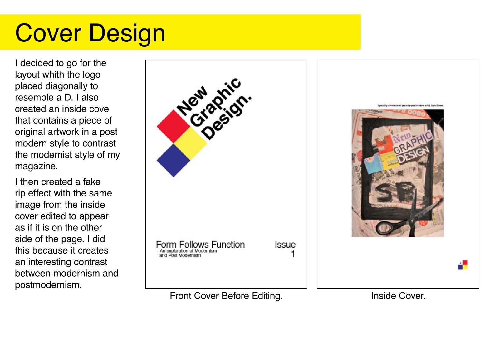
Page Layout Design


Page Layout Design

Page Layout Design


Finished ProductI am pleased with the overall result of my magazine. The ripped effect on the front cover works quite well with the otherwise modernist and minimal cover design. The masthead sits quite well on the page as well as the issue number and sub headings. Idealy I would have liked to have had more real content inside however I was unable to create large amounts of text.

I created this original artwork to feature in my magazine. I based it around some of the collages by Raoul Haussman. I am not overly keen on the “Nuke It” piece however I am proud of the other two.

www.samblower.co.uk