Networks of Florentine Families A tutorial for the ...
29
Networks of Florentine Families — A tutorial for the analysis and visualization of networks using visone and the Padgett dataset By Angus A. A. Mol (Leiden University Centre for Digital Humanities) This tutorial is licensed under a Creative Commons Attribution-ShareAlike 4.0 International license. Introduction In this tutorial you will visualize and explore the network between elite Florentine families in the early 15 th century. This was a time of political conflict and turmoil, which eventually led to the rise of the Medici family. The context for this tutorial is a study by Padgett and Ansell 1 , who used the descriptions of family relations in an earlier work by Kent 2 to understand their network power. A subset of this data was subsequently used by Breiger and Pattison 3 , after which their dataset was made publicly available as part of UCINET 4 as well as online through other channels. The dataset originally consists of two UCINET DL files (PADGM and PADGB): • PADGM is an overview of marriage alliances, presented in the datafiles of this tutorial as PadgettM.csv • PADGB is an overview of business ties, in particular recorded financial ties such as loans, credits, and joint partnerships, presented in the datafiles of this tutorial as PagdgettB.csv Both files represent one-mode networks with undirected and unweighted ties. The dataset also contains a node attribute file (PadgettAttrib.csv), which includes data from PADGW, which provides information on (1) each family's net wealth in 1427 (in thousands of lira) and (2) the number of priorates (seats on the civic council) held between 1282- 1344. 5 To this, longitudinal and latitudinal coordinates were also added, which refer to the (likely) palazzi of the families. For this practical, the original files have been adapted to .csv files and some additional attribute data has been provided. All data that were part of the original dataset have been indicated by column and row headers in CAPITALS. In this practical you will learn how to: • Part 1 o create networks by drawing them directly. o read network data. o work with attribute data in networks. o visualize networks and change node properties based on different attribute data. 1 Padgett, J., & Ansell, C. (1993). Robust Action and the Rise of the Medici, 1400-1434. American Journal of Sociology, 98(6), 1259-1319. Retrieved from http://www.jstor.org/stable/2781822 2 Kent D. (1978). The rise of the Medici: Faction in Florence, 1426-1434. Oxford: Oxford University Press. 3 Breiger R. and Pattison P. (1986). Cumulated social roles: The duality of persons and their algebras. Social Networks, 8, 215-256. 4 Borgatti, S.P., Everett, M.G. and Freeman, L.C. (2002). Ucinet for Windows: Software for Social Network Analysis. Harvard, MA: Analytic Technologies. 5 Dataset and descriptions taken from a webpage of the Center for Computational Analysis of Social and Organizational Systems.
Transcript of Networks of Florentine Families A tutorial for the ...

Networks of Florentine Families — A tutorial for the analysis and
visualization of networks using visone and the Padgett dataset By Angus A. A. Mol (Leiden University Centre for Digital Humanities)
This tutorial is licensed under a Creative Commons Attribution-ShareAlike 4.0 International license.
Introduction In this tutorial you will visualize and explore the network between elite Florentine families in the early
15th century. This was a time of political conflict and turmoil, which eventually led to the rise of the
Medici family.
The context for this tutorial is a study by Padgett and Ansell1, who used the descriptions of family
relations in an earlier work by Kent2 to understand their network power.
A subset of this data was subsequently used by Breiger and Pattison3, after which their dataset was
made publicly available as part of UCINET4 as well as online through other channels. The dataset
originally consists of two UCINET DL files (PADGM and PADGB):
• PADGM is an overview of marriage alliances, presented in the datafiles of this tutorial as
PadgettM.csv
• PADGB is an overview of business ties, in particular recorded financial ties such as loans,
credits, and joint partnerships, presented in the datafiles of this tutorial as PagdgettB.csv
Both files represent one-mode networks with undirected and unweighted ties.
The dataset also contains a node attribute file (PadgettAttrib.csv), which includes data from PADGW,
which provides information on (1) each family's net wealth in 1427 (in thousands of lira) and (2) the
number of priorates (seats on the civic council) held between 1282- 1344.5 To this, longitudinal and
latitudinal coordinates were also added, which refer to the (likely) palazzi of the families.
For this practical, the original files have been adapted to .csv files and some additional attribute data
has been provided. All data that were part of the original dataset have been indicated by column and
row headers in CAPITALS.
In this practical you will learn how to:
• Part 1
o create networks by drawing them directly.
o read network data.
o work with attribute data in networks.
o visualize networks and change node properties based on different attribute data.
1 Padgett, J., & Ansell, C. (1993). Robust Action and the Rise of the Medici, 1400-1434. American Journal of
Sociology, 98(6), 1259-1319. Retrieved from http://www.jstor.org/stable/2781822 2 Kent D. (1978). The rise of the Medici: Faction in Florence, 1426-1434. Oxford: Oxford University Press. 3 Breiger R. and Pattison P. (1986). Cumulated social roles: The duality of persons and their algebras. Social
Networks, 8, 215-256. 4 Borgatti, S.P., Everett, M.G. and Freeman, L.C. (2002). Ucinet for Windows: Software for Social Network Analysis.
Harvard, MA: Analytic Technologies. 5 Dataset and descriptions taken from a webpage of the Center for Computational Analysis of Social and
Organizational Systems.

2
o save networks as images as well as data files.
o read network data.
• Part 2
o import existing network datasets.
o compare the structure of different networks.
o understand and calculate network metrics such as network density and degree and
betweenness centralities.
o visualize networks based on the data resulting from their analysis using different
layouting techniques and visual patterning.
• Part 3
o import attribute data into existing networks.
o visualize attribute data together with network data.
o understand the key difference between network and attribute data.
o bonus: layout networks in geographic space.
All of this we will do in visone. Visone (VISualization Of NEtworks, also Italian for mink) is a free
to download network visualization and analysis tool, developed by Konstanz University’s Centre
for Algorithmics. 6
Visone can be downloaded at http://visone.info
6 Brandes U., Wagner D. (2004) Analysis and Visualization of Social Networks. In: Jünger M., Mutzel P.
(eds) Graph Drawing Software. Mathematics and Visualization. Springer, Berlin, Heidelberg

3
Part 1, getting to know visone Step 1
Make a folder in an easy to navigate to place. I suggest the desktop.
Open visone from Start. We are using version 2.17.
Visone should be available on any PC in Lipsius 126 and 127. You can also download it from visone.info
or start it in your browser. Visone runs on java, so if it does not run on your machine, download the
latest version of java (java.com/download).
Two VERY important things to remember:
1. Visone is freeware and although kept up to high standards may occasionally elicit
bugs that will cause the program to crash or your network to become corrupted.
2. Visone does NOT have an undo button. Any change you make to a network is
permanent, unless you go back to a previous save.
In short, when working with visone SAVE OFTEN and make back-ups and/or copy
networks before you make big changes to them (see below on how to copy networks)!
Step 2
Open a new empty network from the menu bar (for this and following steps, see the blue markings in
the screen captures) alternatively you can open a new network with file -> new

4
Step 3 You can draw networks directly in visone. Make sure the Pencil menu item is selected and create
some nodes by clicking on the empty network space.
You can draw links between these nodes by clicking on an existing node and dragging a link to another
node. Alternatively, you can click on an existing node and click on an empty area in the network to
create a node with a link to the existing node.
Draw at least 4 nodes, each connected by at least one link. Don’t draw too many nodes, because you
will be manually entering data for them in the coming steps.
Step 4
Let’s change the layout of the network you just handmade, but first, let’s create a copy of this network
via file -> create Copy or using the shortcut Ctrl+Y.
Note: every time you see text in italics during the steps of this tutorial it refers directly to text
that should be visible on the screen at that moment.
Once copied you will see network-1* and network-2 in the tabs. The * indicates that the network has
been changed but not been saved. We will get to that in the next step, first let’s change the layout of
network-2.

5
Press the Quick Layout button in the top right corner of visone’s window.
Your network will now be layouted differently from when you first drew it, which you can verify by
changing the tabs between network-1 and network-2.
Step 5
Let’s save the network you created and quick layouted using file -> save as. Navigate to the folder you
created in Step 1 and save your network as a .graphmlz file (e.g. firstone.graphmlz). This file type is
used or can be read by many types of network software. Any network saved as a .graphmlz file can
always be opened by visone, will have the same look as the moment it was saved in visone.

6
Step 6
Aside from saving networks as .graphmlz files, you are also able to export your network in a bunch of
other file formats using file->export.
You can see there are more options for file types now, including the option to save in an image format
such as .jpg or .png or even as a PDF.
Save the network as a .png without changing any of the image export options
Note: if you ever want to increase the export size of an image, you can do so by adjusting the
scalar option, e.g. a scalar of 2.0 will scale up the image of the network by a factor of 2 or 200%.
Note on the note: I found that visone will often crash by running out of memory when
exporting images (especially of large networks) with a scalar of 5.0 or higher.
You will now have a PNG file of your network in the folder you exported to.
Step 7
While you were drawing a network, visone was creating the data structure beneath your network.
This can be used to analyze the network (which we will get to later), but can also be exported using
the same file->export method. This time, choose to export it as a CSV file (.txt, .csv).
In the next window, choose “adjacency matrix” as the data format and untick the directed edges box.
The rest of the settings should be able to remain unchanged, but for reference:

7
You can inspect the exported CSV file by opening it in excel (or in any spreadsheet or text editor. A
text editor will give you a similar idea of the structure of the data, except it will not be in separate
cells but divided by commas). It should be a symmetrical matrix with 0s and 1s and (unless you created
loops, i.e. links from a node to itself) 0s running diagonally through it.
The 1,2,3,4 (or more if you choose to make more nodes) are the names of the nodes. These are auto-
generated by visone, but we can change these if we like.
Try it yourself: Export the network as a .csv but instead of an adjacency matrix, export
it at as a link list (name the file something else than firstone.csv). What does this data
look like in Excel? How does it represent the relations in your network?

8
Step 8
Return to visone and open the attribute manager (the little menu icon shaped like a window with golden
text)
You will see the attributes of the nodes you created. Right now, it only has one: id
You can edit the value of any attribute by checking the allow editing box. Now you can change the id
of the nodes to whatever you would like by double clicking on the value, e.g. to some Medici first
names.

9
Step 9
In our visualization, nodes did not have labels so far, making it hard to identify them. Let’s change that.
While still in the attribute manager, go to the configure tab and check the label tickbox and after press
apply.
Now your nodes should have labels with the names you gave them.
Step 10
Your nodes are probably grey at the moment. Not very exciting is it? You can change the appearance
of nodes in their properties.
First select all the nodes. In order to do that, you can either use nodes->select all or by drawing a
selection window around them. To do that you will first need to uncheck the Pencil menu item,
otherwise you will end up drawing more nodes instead.

10
With all nodes selected either right click on one of them or use nodes->properties.
In the properties screen you can change all the visual aspects (shape, color, width and height [size],
transparency, line [border] style, and border color) and even the location of the nodes in the general tab.
In the general tab use color to change to e.g. a pale blue (204, 204, 255). Also change the line style to
something a bit thicker.
Press apply and your nodes will now have changed color and border thickness.
With this thicker border it is not very pretty to have the labels in the middle of the node. Let’s change
that in properties as well. With all nodes still selected, navigate to the label tab and set the model of the
labels to “sides” and the position to “north.” Don’t forget to press apply and exit the properties window.
11
With the nodes deselected your network will look something like this.
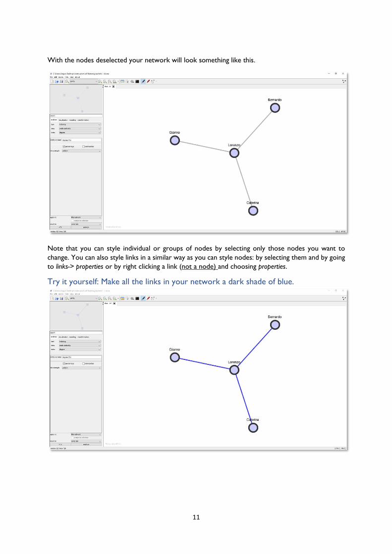
Note that you can style individual or groups of nodes by selecting only those nodes you want to
change. You can also style links in a similar way as you can style nodes: by selecting them and by going
to links-> properties or by right clicking a link (not a node) and choosing properties.
Try it yourself: Make all the links in your network a dark shade of blue.

12
Step 10
As an aside, you are also able to inspect a node’s attributes in the properties window under the attributes
tab. Select a node, right click it and choose properties and navigate to the attributes tab.
Remember the attribute manager? Open it and you will see that in the show & edit tab it will only show
you the attribute of the node you currently have selected.
Step 11
We can also select nodes through their properties, but to make that useful, let’s first add another
attribute to our nodes: the biological sex of the Medici family member.
Navigate to the configure tab of the attribute manager and press create attribute

13
In the newly created attribute fill out the following: name “Sex”, type “text”, default “Male”.
Don’t forget to press apply and then go to the show & edit tab. Make sure you deselect all nodes (by
clicking anywhere in the empty space of the network or via nodes-> deselect all). You will see that all
nodes now have the attribute “Sex”, which in all cases is “Male”.
Change the “Sex” of one or more node to “Female”, by double clicking the value and writing it in
(make sure allow editing is checked).
Step 12
While still in the attribute manager, navigate to the select tab and change the attribute value to “Sex” (if
it is not already selected).

14
By clicking on one of either values (“Female” or “Male”) you will see that you will select all the nodes
with that attribute. Select all the Male nodes and in properties change their shape to a “rectangle”.
Try it yourself: Add an Age attribute to your nodes, make sure your attribute is an
integer, and fill it out for all your nodes. For example:

15
Step 13 Aside from the properties window there is another part of visone that allows you to change the style
and layout of your network: the visualization tab in the sidebar. Navigate there and change category to
“mapping”
Type should be “color” and property “node color.”
In this tab change attribute to “Age”, keep the method on “interpolation” and the scheme on blues.
Press visualize at the bottom of the tab and your nodes will change hue based on the value of their age
(the lightest blue is the ‘youngest’ or the minimum integer value, while the darkest blue will be the
‘eldest’ node, i.e. representing the maximum integer value).
This marks the end of the first part of this tutorial! You already know your way around some of the
features of visone you will use most. Congrats!
Save your final network as both a .png file and as a .graphlmz file and let’s continue to Part 2, where
we will load in and analyze the Padgett dataset.

16
Part 2, Analyzing the network of Florentine families. Step 1
Go to https://infovis.lucdh.nl/datasets and download the zip file named Florentine Families (Padgett Data).
Unzip the file to the same folder you saved your network(s) from Part 1 of the tutorial.
After unzipping, inspect PadgettM.csv and PadgettB.csv (with excel or any text editor). What you will
see are binary, undirected, matrices containing the same type of nodes: the headers of the rows and
columns in both files contain the names of the same Florentine families that played a role in the
turbulent politics of the early 15th century in this city-state.
Even if we would not know the matrix is binary, you would be able to intuit this from the way the
data looks. Remember a “0” at the intersection of a row and column marks the absence of a link, while
a “1” means a link is present. The same applies to its undirectedness as the matrix is symmetrical: the
top diagonal mirrors values of the bottom diagonal. Similarly, you’d be able to guess that this was a
one-mode dataset as all nodes have the same name and thus seem to be of the same type. In addition,
the matrix is square (i.e. has the same number of columns as rows). Two-mode matrices tend to be
rectangular. If you want to know more about two-mode matrices, you will have to continue studying
networks
Despite their similar structure, the two matrices are clearly not the same, which makes sense as they
reflect different types of relations: PadgettM shows marriage ties between families, while PadgettB
shows business ties.
Let’s see what they look like in visone.
Step 2
If visone is not open already, start it.

17
After opening PadgettM via file -> open. One of the good things about visone is that it is able to open
up many file types (files of type) that are standard in network analysis. If you keep files of type on “All
Supported Formats” it will automatically list all the files visone is potentially able to read.
Click ok and visone will ask you to please specify the data format:
While the other types of files could potentially be very useful for historical network analysis, in this
tutorial we will only work with data in regular “CSV files (.txt, .csv)”, so select that option.
In the next screen you will need to make some important choices. If you do not make the correct
ones, your network will not display or display a wrong structure.
Fortunately, we already inspected the data beforehand in Step 1, so we know we are dealing with an
“adjacency matrix” data format, which has a header and row labels. The matrix was square, the nodes
were of the same type and it was symmetrical, so we are also dealing with a “one mode” network type
without directed links (directed edges).
Make sure these values are
selected in the data format
section of the import options
window.
Perhaps you will also need to
set some of the values in the
file format window, if so see the
correct ones in the figure or
use try detection.
If you set everything correctly,
you should see a preview of the
data that looks similar to the
one you’ve inspected during
Step 1.
Press ok.

18
Step 3
You will see a network that should look exactly like this.
Use the configure tab of the attribute manager to check the label box of the id attribute to give names
to the nodes.
Don’t forget to save the file as a .graphmlz (file -> save as) or you will need to re-import the data if
you want to exit visone and later load this network.
Try it yourself: Repeat Step 2 and 3 on the PadgettB.csv file.

19
Step 4
You will see that our hunch that this data would yield very different networks was correct: the
PadgettB(usiness) network is much less connected than the PadgettM(arriage) network.
Let’s analyze this network and find out how different they are from each other by measuring their
density!
Side note: You may ask yourself: Why even analyze these small networks through
measurements? I can simply look at them and draw my conclusions?
True, with smaller networks like these it is relatively easy to spot differences in their
structures and maybe even identify central nodes or detect specific communities (groups)
in the network. When networks become even slightly larger (more nodes) or denser
(more links) analyzing them by eye becomes much harder. There is another argument for
using network metrics in your analysis. Networks have a certain structure with which they
can be compared to each other, (often) regardless of the size of the dataset.
To start measuring the differences between networks, in the
sidebar of the main menu go to the analysis tab, and choose
“network” in the dropdown list of the class option (if you do
not see it, make sure the task is set to “indexing”). You will
see a set of options to index “network statistics” in the
bottom part of the sidebar: from density to # nodes in max
core. Right now, we are only interested in the density of the
network, so uncheck all others.
We are interested in knowing the density of both networks
we currently have open, so at the very bottom change apply
to to “all open networks.” Note that you can keep it on “this
network”, but in that case you would have to analyze both
networks separately.
Push apply
Nothing seemed to happen, but visone in fact just ran through
the following calculation:
𝐴𝑐𝑡𝑢𝑎𝑙 𝐿𝑖𝑛𝑘𝑠
𝑃𝑜𝑡𝑒𝑛𝑡𝑖𝑎𝑙 𝐿𝑖𝑛𝑘𝑠
, where Actual Links are the number of links in the network,
e.g. in PadgettM this number is 20. You can view this in the
extreme bottom left corner of the main window (20/0, i.e. 20
links, of which 0 are currently selected).
And the number of Potential Links for an undirected network
such as this one can be calculated as follows:
𝑁 ∗ (𝑁 − 1)
2
, where N is the number of nodes in the network. In the case
of PadgettM this number is 16, which is also shown next to
the number of links at the bottom of the main window.

20
With this information you could also manually calculate the density of the network.
𝑃𝑜𝑡𝑒𝑛𝑡𝑖𝑎𝑙 𝐿𝑖𝑛𝑘𝑠 = 16∗(16−1)
2= 120 and
𝐴𝑐𝑡𝑢𝑎𝑙 𝐿𝑖𝑛𝑘𝑠
𝑃𝑜𝑡𝑒𝑛𝑡𝑖𝑎𝑙 𝐿𝑖𝑛𝑘𝑠=
20
120= 0,166.
The result of such a density calculation will be always between 0 and 1, so another way to view it is in
percentages: 0,1666 = 16,66%, i.e. the PadgettM network has 16,66% of the density that it could
maximally have.
You can see the result of visone’s calculation in the attribute manager, in this case not under the node
but under the network tab (as this is not an attribute of a single node, but of the entire network).
As you can see in the value of the density attribute is 0,167 (visone rounded up).
Try it yourself: Manually calculate the network density of PadgettB and verify whether
it is correct by checking the value in the attribute manager of PadgettB’s network.
As you will see the density of the PadgettB network is lower than the PadgettM network. This already
tells us something quite interesting: there where (at least according to our data) more marriage
connections between families in Florence than business connections.
The take-away message of Step 4 is that every measurement of any aspect of a network has an
algorithm that could, in theory, be calculated manually. Of course, this is too much work for more
complex measures, which is why we let software like visone compute this for us. Still, whenever you
use a measure in network analytic software like visone, you need to understand what it
calculates. If not, you will not be able to interpret or explain the results of the analysis.
Step 5
Now we have taken a measure of the whole network, let us measure the
position or centrality of nodes in the network. Let’s consider degree centrality
first.
In the sidebar’s analysis tab change class to “node centrality.” Next, make sure
“degree” is selected as the index and in the tickbox in the section below you
have selected percentage.
Apply to “open networks” and press analyze.
Keep all the settings the same, except for unticking the percentage box.
In the PadgettB network using the attribute manager in the show & edit section
of the node tab, inspect the nodes’ degree(%) and degree.
The degree is the total amount of links a node has. In this case the total amount
of marriage ties connecting one family to others. The degree(%) is the
percentage of that node’s degree relative to the sum of all node degrees in the
network.

21
Sort the degree attribute in ascending order, you will see that the MEDICI node has the highest degree
(5), which amounts to 16,666% of the total degree in the PadgettB network.
Step 6
Next we will visualize the degree centrality of the nodes in the PadgettB network. In the main window
go to the sidebar’s visualization tab.
With category on “layout” and layout on “node layout”, pick the “centrality layout” from the dropdown
list at node layout.
In the subsection below these option pick “degree” in the dropdown list under centrality.
Next, press layout.
The network area has changed, adding concentric circles with values to the background and placing
nodes with higher degree centralities closer to the center of the circles.

22
Try it yourself: Make the same visualization for the PAdgettM network. What is the
result for the MEDICI node? What is the position of the LAMBERTESCHI node in both
networks? Note that if you had measured the degree centality on all open networks at the beginning of this step,
you should not have to measure it again for PadgettM.
Step 7
Different measures of centrality can yield different insights into the network position of nodes and
therefore in this case the political power of Florentine families.
To visualize this, calculate the betweenness (%) centrality of the nodes in both networks (in the analysis
tab, change index to “ betweennes” and press analyze).
Now visualize the betweenness centrality of nodes in PadgettB in a centrality layout (in the visualization
tab, change centrality to “betweenness (%)”.
As you can see, both the BARBADORI and MEDICI node have the same position in
terms of their betweenness centrality.
Press the quick layout button in the top right corner and inspect the structure of the
network without centrality layouting.
Suppose you would want to “travel” via the links from, for example, the GUADAGNI node to the
TORNABUONI node in the shortest way (i.e. travelling across the smallest possible number of links)?
Whatever shortest route you take (or in this case whatever route you take, as it is the only route),
you will always move through the BARBADORI node and the MEDICI node. These nodes literally lie
between other nodes. They function as a type of gatekeepers for the network.
This is what betweenness centrality measures: the number of times a node acts as a bridge along the
shortest path between two other nodes. Or as a formula:
𝐵𝑒𝑡𝑤𝑒𝑒𝑛𝑛𝑒𝑠𝑠(𝑛) = ∑𝜎𝑠𝑡(𝑛)
𝜎𝑠𝑡𝑠≠𝑛≠𝑡∈N
The Betweenness of node n is the fraction of all shortest paths between each pair of nodes s and t (σst)
that go through node n, summed (Σ) over all pairs of nodes in the network.

23
Clearly, this would be difficult to calculate by hand, even for a smaller network such as PadgettB, which
is why network analyses rely greatly on a computer-based approach.
Step 7
As they are two different ways of conceptualizing of power in social networks (quantity of relations
vs. strategic position), It would be interesting to be able to visualize the differences between degree
and betweenness centrality of nodes.
This can be done by combining visual patterns, in this case position on the concentric circle
(betweenness) and node color intensity (degree).
To do this first layout the network in a centrality layout based on betweenness (%). Note that you
can drag nodes around with the Pencil tool not selected. So remove the overlap between the MEDICI
and BARBADORI nodes (don’t move them beyond the boundary of the middle circle, since that is the
threshold of the value that both nodes have).
Secondly, while still in the visualization tab, change category to “mapping” and as an attribute choose
“degree” (you can change the color scheme if you like, in this example we stick with blues). Don’t
forget to press visualize.
It is hard to see, but if you look closely, the MEDICI node is a shade darker blue than the BARBADORI,
which has the same hue as the PERUZZI and LAMBERTESCHI nodes. This shows that, while the
Barbadori family may have been as strategically located as the Medici when it came to the larger
network of business ties, the latter still had the highest number of business ties with other families.
Try it yourself: Make the same visualization for the PadgettB network.
Save both the PadgettM and PadgettB networks as .graphmlz files in the folder you have been working
in.
After this it is time for congratulations yet again! With the visualizations of your first network analyses,
you’ve come to the end of Part 2 of this tutorial and you are now getting the hang of network
exploration.

24
Part 3, comparing types of power by contrasting attribute and
network data. All of the data we’ve worked with so far have been based on dependency between nodes (i.e. has
focused on the relations between them). Still, it can also be interesting to add attribute data to nodes.
For example, to contrast the inherent attributes of nodes to their relational characteristics. In this
particular case, we could for example contrast the wealth of these feuding families or the amount of
political offices held to their position in their interfamily networks.
Step 1 This attribute data can be found in PadgettAttrib.csv. To import this attribute data to PadgettB, make
sure you are in the PadgettB network, then navigate to the import & export tab of the attribute manager.
Press the … button next to import, navigate to the folder where you have stored PadgettAttrib.csv,
select it, and press ok.
A window called load options will appear. Here the trick is to connect an attribute of the nodes that
are already in the network (network attribute) to an attribute found in the file we’re importing (file
attribute). In both these cases, they can be identified with the “id” header.
You should not have to change anything in the file format section, but if you do, click try detection and
see if visone can automatically detect the settings for you.
Have a look at the preview of the data. Check if the attributes we are importing have the correct data
type. WEALTH and PRIORS should be integers as they reflect a family’s wealth in lire and the amount
of times, a member of a family had been one of the Priori, a member of the Signoria, the counsel that
governed Florence. Long(itude) and Lat(itude) should be decimals.

25
If everything checks out, press ok.
If you navigate to the show & edit tab of the attribute manager, you should see, aside from all the
centralities we’ve calculated in part 2, the Lat, Long, PRIORS and WEALTH attributes with all their
values with the correct nodes. This type of automated importing will greatly speed up the adding of
attribute data to your nodes, compared to manually adding them in visone’s attribute manager.

26
Step 2
Now let’s provide some insight into this attribute data as part of the current centrality layout
visualization we have created in Part 2.
Go to the visualization tab of the main window and in category mapping and type size, change the node
area to match the “WEALTH” attribute.
Interestingly, while the MEDICI node, may be most central where it comes to business relations (from
both a degree and betweenness centrality-perspective), in terms of wealth it was eclipsed by the
STROZZI.
Try it yourself: See if the same pattern holds up when it comes to political offices and
marriage relations between the families. To do this, import the node attributes into PadgettM and visualize the number of PRIORS.
Step 3
Now let’s reflect on the context of our networks. As we now know the Medici family managed to
become and stay a dominant force in Florence and even European politics for the centuries to come.
As the attribute data indicates, in the early 15th century the Medici were neither the most powerful
from a wealth of political office perspective. What our network analysis shows is that, while they may
not have been the richest or most politically embedded, the Medici family members were excellent at
leveraging a different kind of power: that found in networks between (groups of) people. We’ve
illustrated (one of) the points made in Padgett and Ansell’s The Rise of the Medici paper.
This is also the point of network analysis, to explore the structure of connections between entities,
such as Florentine families and thereby coming to some surprising insights into historic, social, cultural,
and other forms of relational phenomena.
Save your networks as .graphmlz files.

27
Step 4 (Bonus)
As a little extra feature, visone also allows you to use some map-based visualizations to augment
your network visualizations. For this you will need to be connected to the internet as visone will
connect the servers of Open Street Map to acquire the map data.
To show this in action in the visualization tab and with category set to “mapping”, set type to
“coordinates” and property to “geographic(mercator)”
Make sure to set longitude to “Lon” and latitude to “Lat.” Leave all other settings the same and press
visualize.
You will now see a modern map of Florence and a geographically layouted network of the Florentine
families (feel free to give a different color to the links to make them stand out from the map
background more). From this we can safely conclude that (as is to be expected) geographic distance
between palazzi does not seem to factor into either business or marriage relations.

28
Assignment: Visualizing the combined and weighted network of
PadgettM and PadgettB.
In the folder you downloaded for this tutorial you will find the CSV file PadgettB+M_Valued. It
contains a matrix that is the merger of the M(arriage) and B(usiness) networks. This is an undirected,
weighted network. This means that the values of the links, in the intersections of the rows and
columns of the matrix have been given a specific value.
In this network links can be either absent (0) or have a strength of 1 or 2. A link with strength 1
indicates a family that is only connected by a marriage or business tie. A link with strength 2
indicates a family that is connected by both a marriage and business tie.
1. Use this file and the PadgettAttrib.csv file to make a a single network visualization that:
• Uses one of visone’s many visualization options to visualize the strength of the links
o There is a link attribute which should be named “csv value” that holds these
values.
o In the visualization tab and the “mapping” category, you will be able to change to
link properties in the property dropdown list.
• Is a comparison that shows the differences in the measures of betweenness and
eigenvector centrality of nodes in the network. You will make use of the weight of
the links for the link strength in the measure of the eigenvector centrality.
• visualizes the PRIOR attribute of all nodes in some way.
• has node labels showing the family name.
• Is exported as a .png file to the same folder as the one you have used for the tutorial.
2. In a separate word document (saved in the same folder as the one you have used for the
tutorial):
• List all the dyads that are connected by both business and marriage ties
(i.e. all nodes connected by a link with a strength of 2).
• Provide the density of the PadgettB+M network.
• Provide an explanation in your words of what eigenvector centrality is and
how you would interpret it in the case of the Florentine family network of
business and marriage ties.
• The Wikipedia article or this explanation by Massimo Franceschet on
eigenvector centrality should provide some context.
• Provide a legend to your network listing all visual properties used and what they
indicate.
3. You will probably have noticed the isolated PUCCI node. Change the adjacency matrix
in PadgettB+M_Valued.csv to give the PUCCI nodes the following relations (NB this is not
based on any historical data):
• A link of strength 1 with MEDICI
• A link of strength 1 with BARBADORI
• A link of strength 2 with ACCIAUUOLI
Save this matrix as PadgettPUCCI.csv. Use this new matrix to create a visualization
with the same measures and visual properties as you’ve chosen for question 1 of
this assignment. The only thing that should be different are the new PUCCI links. Don’t
forget to export this network as a .png.
29
4. Save both networks as .graphmlz files in the folder you also used for the tutorial. Zip the
entire folder and hand it in via blackboard before the deadline. Your zip file should
contain:
• The original .csv files used for the tutorial and the assignment.
• The PadgettPUCCI.csv file with the matrix you changed to include some Pucci family
relations.
• The .graphmlz of the network you created in Part 1 of the tutorial.
• The .png file of the network you created in Part 1 of the tutorial.
• The .graphmlz files of the networks you created in Part 2.
• The .graphmlz files of the networks you created in Part 3.
• The .graphmlz files of the networks you created as part of this assignment.
• The .png files of the networks you created as part of this assignment.
• The word document you created as part of this assignment.
• Remove all other back-up or other files from the folder.
As always, don’t wait with starting this assignment until the weekend. If there are any technical
issues, e-mail me at [email protected]
Good luck and have fun exploring this network!