Name Class Date 22 . 2 Shape, Cenert , and...
16
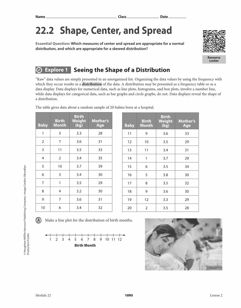
Birth Month 1 2 3 4 5 6 7 8 9 101112 Name Class Date © Houghton Mifflin Harcourt Publishing Company • Image Credits ©Brooklyn Production/Corbis Resource Locker Explore 1 Seeing the Shape of a Distribution “Raw” data values are simply presented in an unorganized list. Organizing the data values by using the frequency with which they occur results in a distribution of the data. A distribution may be presented as a frequency table or as a data display. Data displays for numerical data, such as line plots, histograms, and box plots, involve a number line, while data displays for categorical data, such as bar graphs and circle graphs, do not. Data displays reveal the shape of a distribution. The table gives data about a random sample of 20 babies born at a hospital. Make a line plot for the distribution of birth months. Baby Birth Month Birth Weight (kg) Mother’s Age 11 9 3.6 33 12 10 3.5 29 13 11 3.4 31 14 1 3.7 29 15 6 3.5 34 16 5 3.8 30 17 8 3.5 32 18 9 3.6 30 19 12 3.3 29 20 2 3.5 28 Baby Birth Month Birth Weight (kg) Mother’s Age 1 5 3.3 28 2 7 3.6 31 3 11 3.5 33 4 2 3.4 35 5 10 3.7 39 6 3 3.4 30 7 1 3.5 29 8 4 3.2 30 9 7 3.6 31 10 6 3.4 32 Module 22 1095 Lesson 2 22.2 Shape, Center, and Spread Essential Question: Which measures of center and spread are appropriate for a normal distribution, and which are appropriate for a skewed distribution?
-
Upload
nguyendung -
Category
Documents
-
view
213 -
download
0
Transcript of Name Class Date 22 . 2 Shape, Cenert , and...
Birth Month1 2 3 4 5 6 7 8 9 10 11 12
Name Class Date
© H
oug
hton
Mif
flin
Har
cour
t Pub
lishi
ng
Com
pan
y • I
mag
e C
red
its
©Br
ook
lyn
Pro
du
ctio
n/C
orb
is
Resource Locker
Explore 1 Seeing the Shape of a Distribution“Raw” data values are simply presented in an unorganized list. Organizing the data values by using the frequency with which they occur results in a distribution of the data. A distribution may be presented as a frequency table or as a data display. Data displays for numerical data, such as line plots, histograms, and box plots, involve a number line, while data displays for categorical data, such as bar graphs and circle graphs, do not. Data displays reveal the shape of a distribution.
The table gives data about a random sample of 20 babies born at a hospital.
Make a line plot for the distribution of birth months.
BabyBirth
Month
Birth Weight
(kg)Mother’s
Age
11 9 3.6 33
12 10 3.5 29
13 11 3.4 31
14 1 3.7 29
15 6 3.5 34
16 5 3.8 30
17 8 3.5 32
18 9 3.6 30
19 12 3.3 29
20 2 3.5 28
BabyBirth
Month
Birth Weight
(kg)Mother’s
Age
1 5 3.3 28
2 7 3.6 31
3 11 3.5 33
4 2 3.4 35
5 10 3.7 39
6 3 3.4 30
7 1 3.5 29
8 4 3.2 30
9 7 3.6 31
10 6 3.4 32
Module 22 1095 Lesson 2
22 . 2 Shape, Center, and SpreadEssential Question: Which measures of center and spread are appropriate for a normal distribution, and which are appropriate for a skewed distribution?
DO NOT EDIT--Changes must be made through “File info”CorrectionKey=NL-B;CA-B
Birth Weight (kg)3.0 3.2 3.4 3.6 3.8 4.0
27 28 29 30 31 32 33 34 35 36 37 38 39 40
Mother’s Age
Skewed left Symmetric Skewed right
© H
oug
hton Mifflin H
arcourt Publishin
g Com
pany
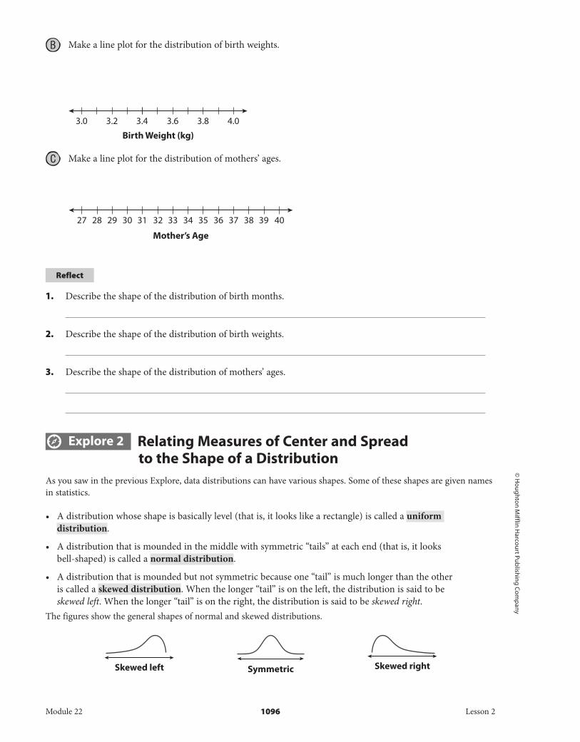
B Make a line plot for the distribution of birth weights.
C Make a line plot for the distribution of mothers’ ages.
Reflect
1. Describe the shape of the distribution of birth months.
2. Describe the shape of the distribution of birth weights.
3. Describe the shape of the distribution of mothers’ ages.
Explore 2 Relating Measures of Center and Spread to the Shape of a Distribution
As you saw in the previous Explore, data distributions can have various shapes. Some of these shapes are given names in statistics.
• A distribution whose shape is basically level (that is, it looks like a rectangle) is called a uniform distribution.
• A distribution that is mounded in the middle with symmetric “tails” at each end (that is, it looks bell-shaped) is called a normal distribution.
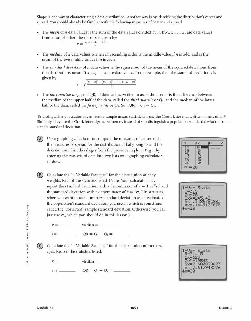
• A distribution that is mounded but not symmetric because one “tail” is much longer than the other is called a skewed distribution. When the longer “tail” is on the left, the distribution is said to be skewed left. When the longer “tail” is on the right, the distribution is said to be skewed right.
The figures show the general shapes of normal and skewed distributions.
Module 22 1096 Lesson 2
DO NOT EDIT--Changes must be made through “File info” CorrectionKey=NL-B;CA-B
© H
oug
hton
Mif
flin
Har
cour
t Pub
lishi
ng
Com
pan
y
Shape is one way of characterizing a data distribution. Another way is by identifying the distribution’s center and spread. You should already be familiar with the following measures of center and spread:
• The mean of n data values is the sum of the data values divided by n. If x 1 , x 2 , ..., x n are data values from a sample, then the mean _ x is given by:
_ x = x 1 + x 2 + ··· + x n ___________ n
• The median of n data values written in ascending order is the middle value if n is odd, and is the mean of the two middle values if n is even.
• The standard deviation of n data values is the square root of the mean of the squared deviations from the distribution’s mean. If x 1 , x 2 , ..., x n are data values from a sample, then the standard deviation s is given by:
s = √____
( x 1 - _ x ) 2 + ( x 2 - _ x ) 2 + ··· + ( x n - _ x ) 2
________________________ n
• The interquartile range, or IQR, of data values written in ascending order is the difference between the median of the upper half of the data, called the third quartile or Q 3 , and the median of the lower half of the data, called the first quartile or Q 1 . So, IQR = Q 3 - Q 1 .
To distinguish a population mean from a sample mean, statisticians use the Greek letter mu, written µ, instead of _ x . Similarly, they use the Greek letter sigma, written σ, instead of s to distinguish a population standard deviation from a sample standard deviation.
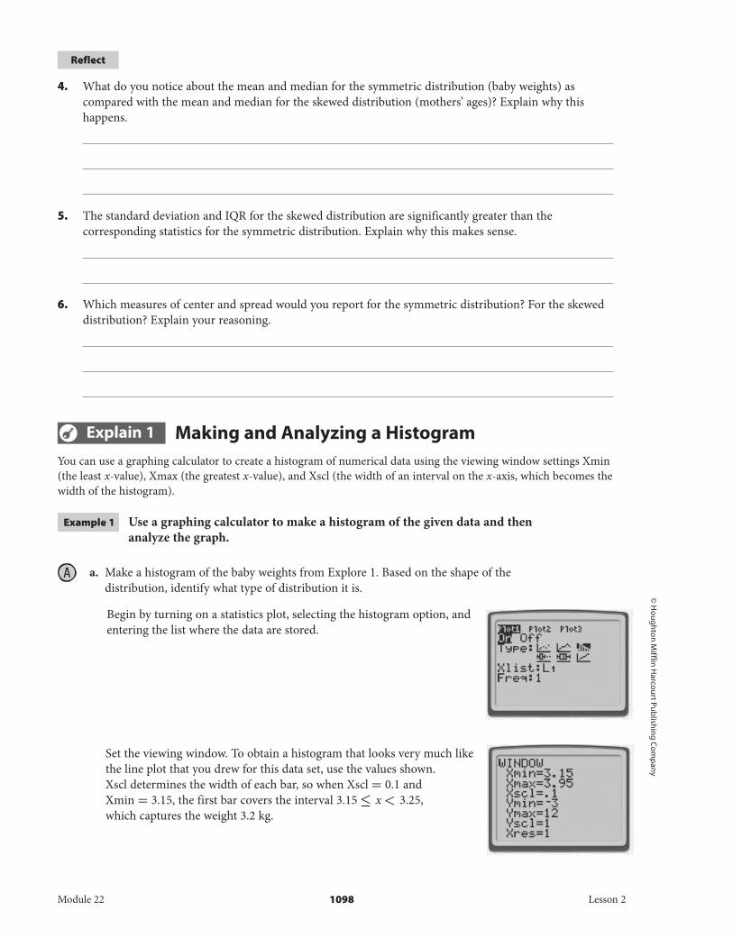
Use a graphing calculator to compute the measures of center and the measures of spread for the distribution of baby weights and the distribution of mothers’ ages from the previous Explore. Begin by entering the two sets of data into two lists on a graphing calculator as shown.
B Calculate the “1-Variable Statistics” for the distribution of baby weights. Record the statistics listed. (Note: Your calculator may report the standard deviation with a denominator of n - 1 as “ s x ” and the standard deviation with a denominator of n as “ σ x .” In statistics, when you want to use a sample’s standard deviation as an estimate of the population’s standard deviation, you use s x , which is sometimes called the “corrected” sample standard deviation. Otherwise, you can just use σ x , which you should do in this lesson.)
_ x = Median =
s ≈ IQR = Q 3 - Q 1 =
C Calculate the “1-Variable Statistics” for the distribution of mothers’ ages. Record the statistics listed.
_ x = Median =
s ≈ IQR = Q 3 - Q 1 =
Module 22 1097 Lesson 2
DO NOT EDIT--Changes must be made through “File info”CorrectionKey=NL-B;CA-B
© H
oug
hton Mifflin H
arcourt Publishin
g Com
pany
Reflect
4. What do you notice about the mean and median for the symmetric distribution (baby weights) as compared with the mean and median for the skewed distribution (mothers’ ages)? Explain why this happens.
5. The standard deviation and IQR for the skewed distribution are significantly greater than the corresponding statistics for the symmetric distribution. Explain why this makes sense.
6. Which measures of center and spread would you report for the symmetric distribution? For the skewed distribution? Explain your reasoning.
Explain 1 Making and Analyzing a HistogramYou can use a graphing calculator to create a histogram of numerical data using the viewing window settings Xmin (the least x-value), Xmax (the greatest x-value), and Xscl (the width of an interval on the x-axis, which becomes the width of the histogram).
Example 1 Use a graphing calculator to make a histogram of the given data and then analyze the graph.
a. Make a histogram of the baby weights from Explore 1. Based on the shape of the distribution, identify what type of distribution it is.
Begin by turning on a statistics plot, selecting the histogram option, and entering the list where the data are stored.
Set the viewing window. To obtain a histogram that looks very much like the line plot that you drew for this data set, use the values shown. Xscl determines the width of each bar, so when Xscl = 0.1 and Xmin = 3.15, the first bar covers the interval 3.15 ≤ x < 3.25, which captures the weight 3.2 kg.
Module 22 1098 Lesson 2
DO NOT EDIT--Changes must be made through “File info”CorrectionKey=NL-B;CA-B
GRAPH
MA04SE.GRAPH.KEYS.BluTRACE
MA04SE.TRACE.KEYS.Blu
© H
oug
hton
Mif
flin
Har
cour
t Pub
lishi
ng
Com
pan
y
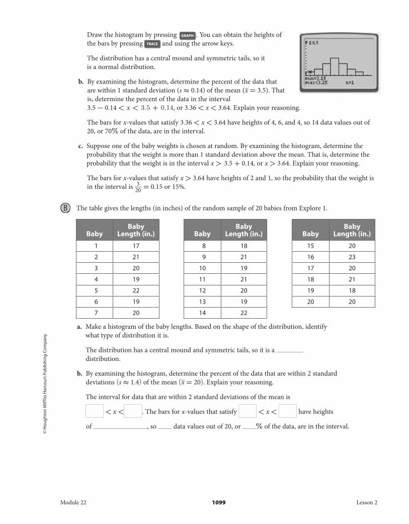
Draw the histogram by pressing . You can obtain the heights of the bars by pressing and using the arrow keys.
The distribution has a central mound and symmetric tails, so it is a normal distribution.
b. By examining the histogram, determine the percent of the data that are within 1 standard deviation (s ≈ 0.14) of the mean ( _ x = 3.5). That is, determine the percent of the data in the interval 3.5 - 0.14 < x < 3.5 + 0.14, or 3.36 < x < 3.64. Explain your reasoning.
The bars for x-values that satisfy 3.36 < x < 3.64 have heights of 4, 6, and 4, so 14 data values out of 20, or 70% of the data, are in the interval.
c. Suppose one of the baby weights is chosen at random. By examining the histogram, determine the probability that the weight is more than 1 standard deviation above the mean. That is, determine the probability that the weight is in the interval x > 3.5 + 0.14, or x > 3.64. Explain your reasoning.
The bars for x-values that satisfy x > 3.64 have heights of 2 and 1, so the probability that the weight is in the interval is 3 __ 20 = 0.15 or 15%.
B The table gives the lengths (in inches) of the random sample of 20 babies from Explore 1.
a. Make a histogram of the baby lengths. Based on the shape of the distribution, identify what type of distribution it is.
The distribution has a central mound and symmetric tails, so it is a distribution.
b. By examining the histogram, determine the percent of the data that are within 2 standard deviations (s ≈ 1.4) of the mean ( _ x = 20) . Explain your reasoning.
The interval for data that are within 2 standard deviations of the mean is
< x < . The bars for x-values that satisfy < x < have heights
of , so data values out of 20, or % of the data, are in the interval.
BabyBaby
Length (in.)
1 17
2 21
3 20
4 19
5 22
6 19
7 20
BabyBaby
Length (in.)
8 18
9 21
10 19
11 21
12 20
13 19
14 22
BabyBaby
Length (in.)
15 20
16 23
17 20
18 21
19 18
20 20
Module 22 1099 Lesson 2
DO NOT EDIT--Changes must be made through “File info”CorrectionKey=NL-B;CA-B
© H
oug
hton Mifflin H
arcourt Publishin
g Com
pany
c. Suppose one of the baby lengths is chosen at random. By examining the histogram,determine the probability that the length is less than 2 standard deviations below the mean. Explain your reasoning.
The interval for data that are less than 2 standard deviations below the mean is
x < . The only bar for x-values that satisfy x < has a height of , so the
probability that the length is in the interval is _ 20 = or %.
Your Turn
7. The table lists the test scores of a random sample of 22 students who are taking the same math class.
a. Use a graphing calculator to make a histogram of the math test scores. Based on the shape of the distribution, identify what type of distribution it is.
b. By examining the histogram, determine the percent of the data that are within 2 standard deviations (s ≈ 6.3) of the mean ( ― x ≈ 83) . Explain your reasoning.
c. Suppose one of the math test scores is chosen at random. By examining the histogram, determine the probability that the test score is less than 2 standard deviations below the mean. Explain your reasoning.
Explain 2 Making and Analyzing a Box PlotA box plot, also known as a box-and-whisker plot, is based on five key numbers: the minimum data value, the first quartile of the data values, the median (second quartile) of the data values, the third quartile of the data values, and the maximum data value. A graphing calculator will automatically compute these values when drawing a box plot. A graphing calculator also gives you two options for drawing box plots: one that shows outliers and one that does not. For this lesson, choose the second option.
Student Math test scores
1 86
2 78
3 95
4 83
5 83
6 81
7 87
8 81
Student Math test scores
9 90
10 85
11 83
12 99
13 81
14 75
15 85
Student Math test scores
16 83
17 83
18 70
19 73
20 79
21 85
22 83
Module 22 1100 Lesson 2
DO NOT EDIT--Changes must be made through “File info” CorrectionKey=NL-B;CA-B
GRAPH
MA04SE.GRAPH.KEYS.BluTRACE
MA04SE.TRACE.KEYS.Blu
© H
oug
hton
Mif
flin
Har
cour
t Pub
lishi
ng
Com
pan
y
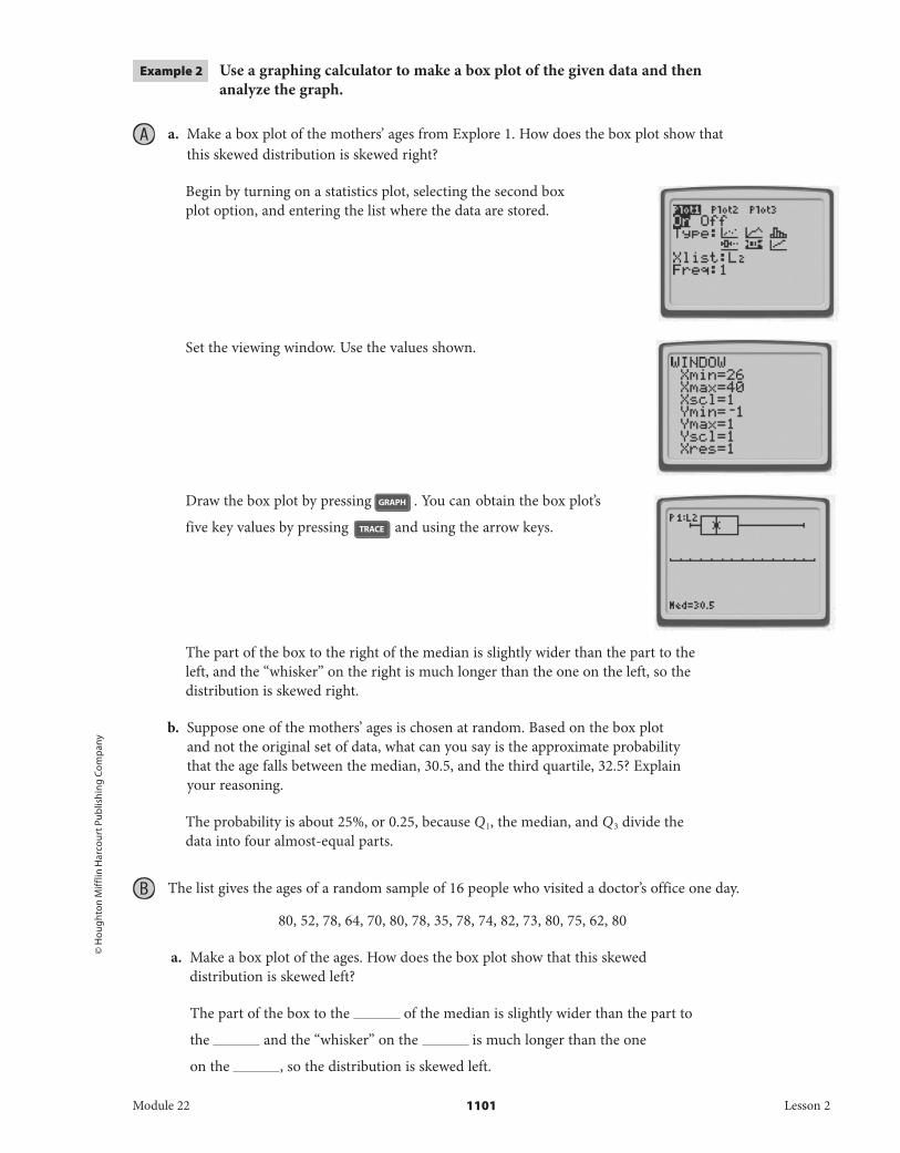
Example 2 Use a graphing calculator to make a box plot of the given data and then analyze the graph.
a. Make a box plot of the mothers’ ages from Explore 1. How does the box plot show that this skewed distribution is skewed right?
Begin by turning on a statistics plot, selecting the second box plot option, and entering the list where the data are stored.
Set the viewing window. Use the values shown.
Draw the box plot by pressing . You can obtain the box plot’s
five key values by pressing and using the arrow keys.
The part of the box to the right of the median is slightly wider than the part to the left, and the “whisker” on the right is much longer than the one on the left, so the distribution is skewed right.
b. Suppose one of the mothers’ ages is chosen at random. Based on the box plot and not the original set of data, what can you say is the approximate probability that the age falls between the median, 30.5, and the third quartile, 32.5? Explain your reasoning.
The probability is about 25%, or 0.25, because Q 1 , the median, and Q 3 divide the data into four almost-equal parts.
B The list gives the ages of a random sample of 16 people who visited a doctor’s office one day.
80, 52, 78, 64, 70, 80, 78, 35, 78, 74, 82, 73, 80, 75, 62, 80
a. Make a box plot of the ages. How does the box plot show that this skewed distribution is skewed left?
The part of the box to the of the median is slightly wider than the part to
the and the “whisker” on the is much longer than the one
on the , so the distribution is skewed left.
Module 22 1101 Lesson 2
DO NOT EDIT--Changes must be made through “File info”CorrectionKey=NL-B;CA-B
© H
oug
hton Mifflin H
arcourt Publishin
g Com
pany
b. Suppose one of the ages is chosen at random. Based on the box plot and not the original set of data, what can you say is the approximate probability that the age falls between the first quartile, 67, and the third quartile, 80? Explain your reasoning.
The probability is about %, or , because Q 1 , the median, and Q 3
divide the data into almost-equal parts and there are two parts that each
represent about % of the data between the first and third quartiles.
Your Turn
8. The list gives the starting salaries (in thousands of dollars) of a random sample of 18 positions at a large company. Use a graphing calculator to make a box plot and then analyze the graph.
40, 32, 27, 40, 34, 25, 37, 39, 40, 37, 28, 39, 35, 39, 40, 43, 30, 35
a. Make a box plot of the starting salaries. How does the box plot show that this skewed distribution is skewed left?
b. Suppose one of the starting salaries is chosen at random. Based on the box plot and not the original set of data, what can you say is the approximate probability that the salary is less than the third quartile, 40? Explain your reasoning.
Elaborate
9. Explain the difference between a normal distribution and a skewed distribution.
10. Discussion Describe how you can use a line plot, a histogram, and a box plot of a set of data to answer questions about the percent of the data that fall within a specified interval.
Module 22 1102 Lesson 2
DO NOT EDIT--Changes must be made through “File info” CorrectionKey=NL-B;CA-B
3 4 5 6 7 8 9 10 11 12
66 67 68 69 70 71 72 73 74 75 76 77 78 79 80
32 33 34 35 36 37 38 39 40
© H
oug
hton
Mif
flin
Har
cour
t Pub
lishi
ng
Com
pan
y
11. Essential Question Check-In Why are the mean and standard deviation not appropriate statistics to use with a skewed distribution?
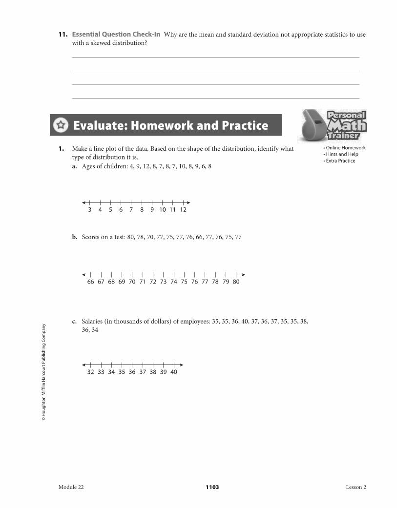
1. Make a line plot of the data. Based on the shape of the distribution, identify what type of distribution it is.a. Ages of children: 4, 9, 12, 8, 7, 8, 7, 10, 8, 9, 6, 8
b. Scores on a test: 80, 78, 70, 77, 75, 77, 76, 66, 77, 76, 75, 77
c. Salaries (in thousands of dollars) of employees: 35, 35, 36, 40, 37, 36, 37, 35, 35, 38, 36, 34
• Online Homework• Hints and Help• Extra Practice
Evaluate: Homework and Practice
Module 22 1103 Lesson 2
DO NOT EDIT--Changes must be made through “File info”CorrectionKey=NL-B;CA-B
© H
oug
hton Mifflin H
arcourt Publishin
g Com
pany
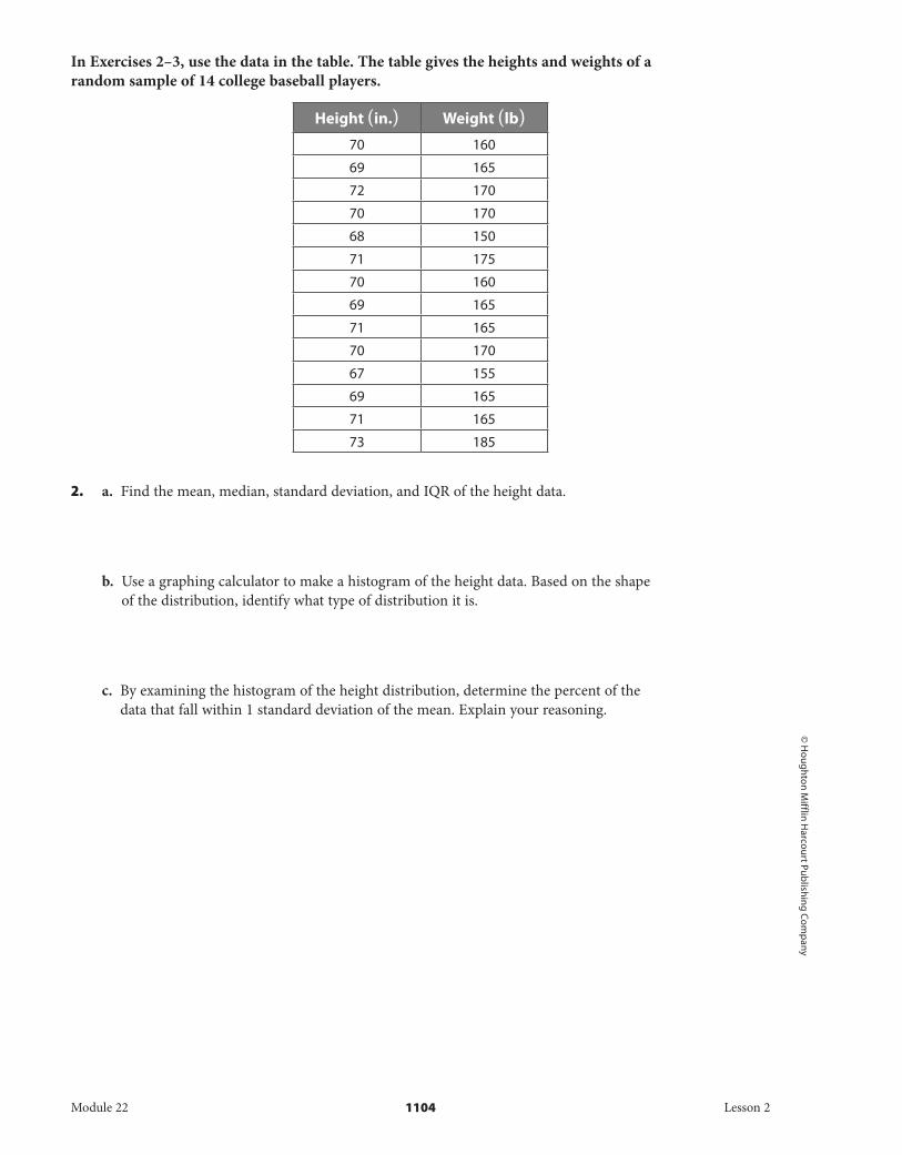
In Exercises 2–3, use the data in the table. The table gives the heights and weights of a random sample of 14 college baseball players.
Height (in.) Weight (lb)
70 160
69 165
72 170
70 170
68 150
71 175
70 160
69 165
71 165
70 170
67 155
69 165
71 165
73 185
2. a. Find the mean, median, standard deviation, and IQR of the height data.
b. Use a graphing calculator to make a histogram of the height data. Based on the shape of the distribution, identify what type of distribution it is.
c. By examining the histogram of the height distribution, determine the percent of the data that fall within 1 standard deviation of the mean. Explain your reasoning.
Module 22 1104 Lesson 2
DO NOT EDIT--Changes must be made through “File info” CorrectionKey=NL-B;CA-B
© H
oug
hton
Mif
flin
Har
cour
t Pub
lishi
ng
Com
pan
y
d. Suppose one of the heights is chosen at random. By examining the histogram, determine the probability that the height is more than 1 standard deviation above the mean. Explain your reasoning.
3. a. Find the mean, median, standard deviation, and IQR of the weight data.
b. Use a graphing calculator to make a histogram of the weight data. Based on the shape of the distribution, identify what type of distribution it is.
c. By examining the histogram, determine the percent of the weight data that are within 2 standard deviations of the mean. Explain your reasoning.
d. Suppose one of the weights is chosen at random. By examining the histogram, determine the probability that the weight is less than 1 standard deviation above the mean. Explain your reasoning.
Module 22 1105 Lesson 2
DO NOT EDIT--Changes must be made through “File info” CorrectionKey=NL-B;CA-B
x xxx
xx x
xxxx
xx
xxxx
xx
xx
xx
x
55 60 65 70
Resting Heart Rate
75 80 85 90
© H
oug
hton Mifflin H
arcourt Publishin
g Com
pany • Im
age C
redits:
©N
athan
Marx/iSto
ckPhoto.com
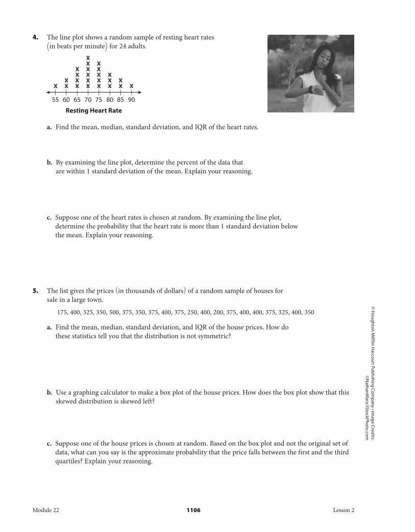
4. The line plot shows a random sample of resting heart rates (in beats per minute) for 24 adults.
a. Find the mean, median, standard deviation, and IQR of the heart rates.
b. By examining the line plot, determine the percent of the data that are within 1 standard deviation of the mean. Explain your reasoning.
c. Suppose one of the heart rates is chosen at random. By examining the line plot, determine the probability that the heart rate is more than 1 standard deviation below the mean. Explain your reasoning.
5. The list gives the prices (in thousands of dollars) of a random sample of houses for sale in a large town.
175, 400, 325, 350, 500, 375, 350, 375, 400, 375, 250, 400, 200, 375, 400, 400, 375, 325, 400, 350
a. Find the mean, median, standard deviation, and IQR of the house prices. How do these statistics tell you that the distribution is not symmetric?
b. Use a graphing calculator to make a box plot of the house prices. How does the box plot show that this skewed distribution is skewed left?
c. Suppose one of the house prices is chosen at random. Based on the box plot and not the original set of data, what can you say is the approximate probability that the price falls between the first and the third quartiles? Explain your reasoning.
Module 22 1106 Lesson 2
DO NOT EDIT--Changes must be made through “File info” CorrectionKey=NL-B;CA-B
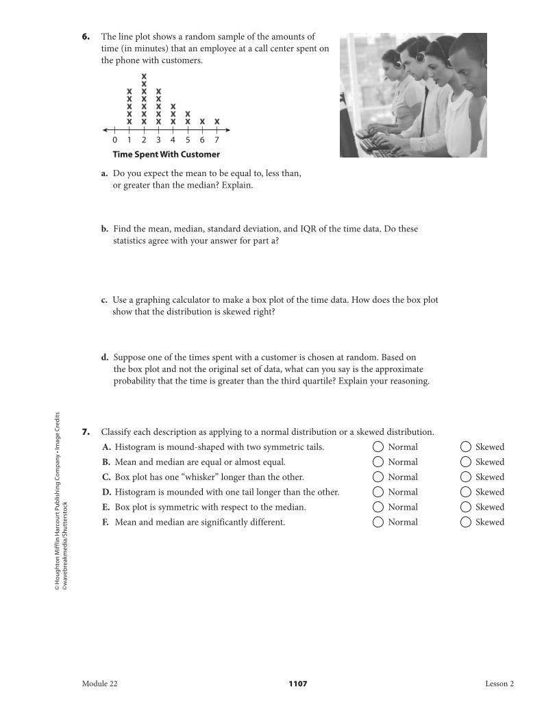
x xx
xx x
xxxxx
xx
xx
xxxx
xx
xx
x
0 1 2 3
Time Spent With Customer
4 5 6 7
© H
oug
hton
Mif
flin
Har
cour
t Pub
lishi
ng
Com
pan
y • I
mag
e C
red
its
©w
aveb
reak
med
ia/S
hutt
erst
ock
6. The line plot shows a random sample of the amounts of time (in minutes) that an employee at a call center spent on the phone with customers.
a. Do you expect the mean to be equal to, less than, or greater than the median? Explain.
b. Find the mean, median, standard deviation, and IQR of the time data. Do these statistics agree with your answer for part a?
c. Use a graphing calculator to make a box plot of the time data. How does the box plot show that the distribution is skewed right?
d. Suppose one of the times spent with a customer is chosen at random. Based on the box plot and not the original set of data, what can you say is the approximate probability that the time is greater than the third quartile? Explain your reasoning.
7. Classify each description as applying to a normal distribution or a skewed distribution.A. Histogram is mound-shaped with two symmetric tails. Normal SkewedB. Mean and median are equal or almost equal. Normal SkewedC. Box plot has one “whisker” longer than the other. Normal SkewedD. Histogram is mounded with one tail longer than the other. Normal SkewedE. Box plot is symmetric with respect to the median. Normal SkewedF. Mean and median are significantly different. Normal Skewed
Module 22 1107 Lesson 2
DO NOT EDIT--Changes must be made through “File info” CorrectionKey=NL-B;CA-B
© H
oug
hton Mifflin H
arcourt Publishin
g Com
pany • Im
age C
redits
©M
oo
db
oard
/Corb
isH.O.T. Focus on Higher Order Thinking
8. Explain the Error A student was given the following data and asked to determine the percent of the data that fall within 1 standard deviation of the mean.
20, 21, 21, 22, 22, 22, 22, 23, 23, 23, 23, 24, 24, 24, 24, 24, 25, 25, 25, 26, 26, 26, 27, 27, 28
The student gave this answer: “The interval for data that are within 1 standard deviation of the mean is 24 - 3.5 < x < 24 + 3.5, or 21.5 < x < 27.5. The bars for x-values that satisfy 21.5 < x < 27.5 have heights of 4, 4, 5, 3, 3, and 2, so 21 data values out of 25, or about 84% of the data, are in the interval.” Find and correct the student’s error.
9. Analyze Relationships The list gives the number of siblings that a child has from a random sample of 10 children at a daycare center.
5, 2, 3, 1, 0, 2, 3, 1, 2, 1a. Use a graphing calculator to create a box plot of the data. Does the
box plot indicate that the distribution is normal or skewed? Explain.
b. Find the mean, median, standard deviation, and IQR of the sibling data. What is the relationship between the mean and median?
c. Suppose that an 11th child at the daycare is included in the random sample, and that child has 1 sibling. How does the box plot change? How does the relationship between the mean and median change?
d. Suppose that a 12th child at the daycare is included in the random sample, and that child also has 1 sibling. How does the box plot change? How does the relationship between the mean and median change?
Module 22 1108 Lesson 2
DO NOT EDIT--Changes must be made through “File info” CorrectionKey=NL-B;CA-B
© H
oug
hton
Mif
flin
Har
cour
t Pub
lishi
ng
Com
pan
y
e. What is the general rule about the relationship between the mean and median when a distribution is skewed right? What has your investigation of the sibling data demonstrated about this rule?
10. Draw Conclusions Recall that a graphing calculator may give two versions of the standard deviation. The population standard deviation, which you can also use for the
“uncorrected” sample standard deviation, is σ x = √_____
( x 1 - _ x ) 2 + ( x 2 - _ x ) 2 +⋯+ ( x n - _ x ) 2
___________________________ n .
The “corrected” sample standard deviation is s x = √_____
( x 1 - _ x ) 2 + ( x 2 - _ x ) 2 +⋯+ ( x n - _ x ) 2
___________________________ n - 1 .
Write and simplify the ratio σ x __ s x . Then determine what this ratio approaches as n increases without bound. What does this result mean in terms of finding standard deviations of samples?
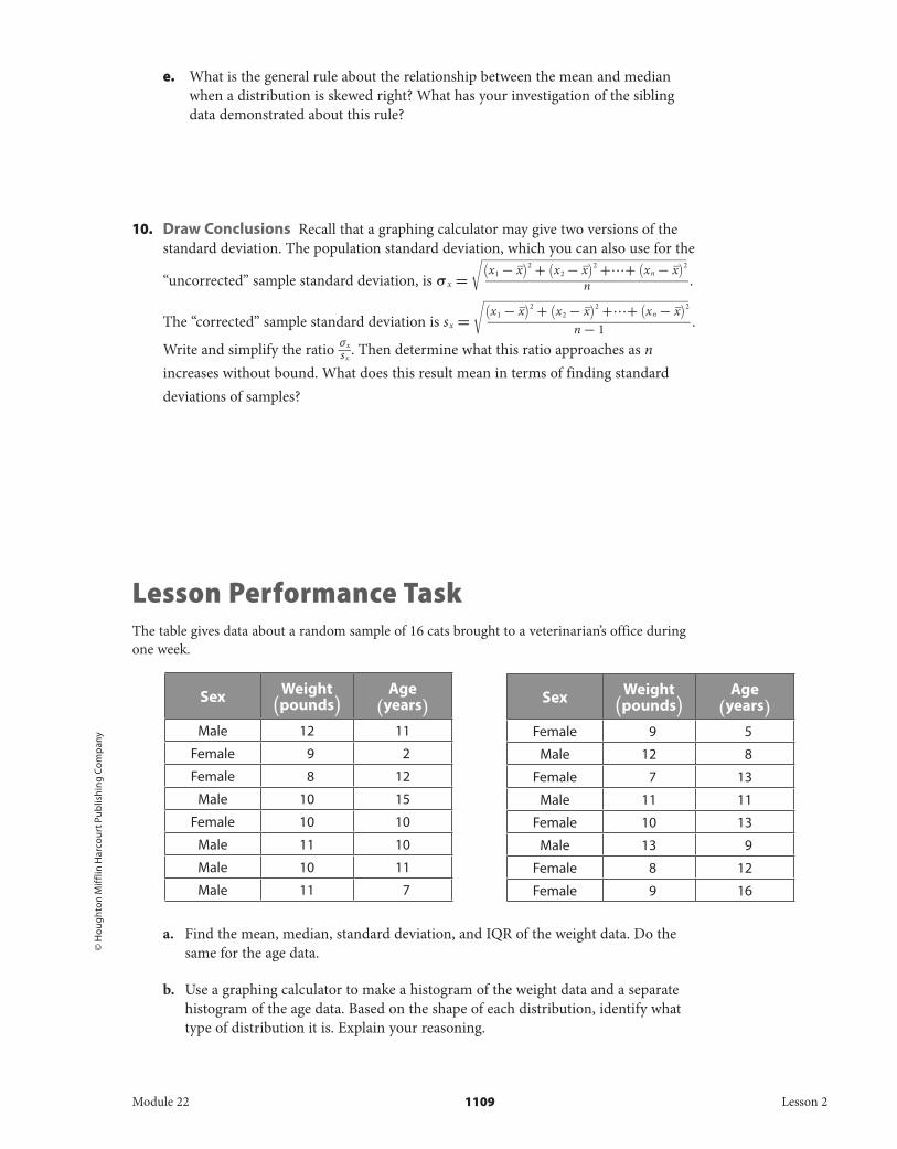
Lesson Performance TaskThe table gives data about a random sample of 16 cats brought to a veterinarian’s office during one week.
a. Find the mean, median, standard deviation, and IQR of the weight data. Do the same for the age data.
b. Use a graphing calculator to make a histogram of the weight data and a separate histogram of the age data. Based on the shape of each distribution, identify what type of distribution it is. Explain your reasoning.
Sex Weight (pounds)
Age (years)
Male 12 11
Female 9 2
Female 8 12
Male 10 15
Female 10 10
Male 11 10
Male 10 11
Male 11 7
Sex Weight (pounds)
Age (years)
Female 9 5
Male 12 8
Female 7 13
Male 11 11
Female 10 13
Male 13 9
Female 8 12
Female 9 16
Module 22 1109 Lesson 2
DO NOT EDIT--Changes must be made through “File info” CorrectionKey=NL-B;CA-B
© H
oug
hton Mifflin H
arcourt Publishin
g Com
pany
c. By examining the histogram of the weight distribution, determine the percent of the data that fall within 1 standard deviation of the mean. Explain your reasoning.
d. For the age data, Q 1 = 8.5 and Q 3 = 12.5. By examining the histogram of the age distribution, find the probability that the age of a randomly chosen cat falls between Q 1 and Q 3 . Why does this make sense?
e. Investigate whether being male or female has an impact on a cat’s weight and age. Do so by calculating the mean weight and age of female cats and the mean weight and age of male cats. For which variable, weight or age, does being male or female have a greater impact? How much of an impact is there?
Module 22 1110 Lesson 2
DO NOT EDIT--Changes must be made through “File info” CorrectionKey=NL-B;CA-B


![Reply Un-Starred Q.N. 367 · gr %kdool wr %kdq\dul urdg np wr gr *dudq %dvwl wr +dul]dq %dvwl np wr gr 071 urdg wr yloodjh 6rkdu np wr 7rwdo -dzdol 'lylvlrq](https://static.fdocuments.us/doc/165x107/5ea6fe24564be16b902fc191/reply-un-starred-qn-367-gr-kdool-wr-kdqdul-urdg-np-wr-gr-dudq-dvwl-wr-duldq.jpg)