‘My Diary’ Design Process - · PDF file‘My Diary’ Design Process...
19
‘My Diary’ Design Process Team Re. Flection Youngdong Kim (ykim2720) Nattinee Srikasumbun (nsri2842) Yoko Tomishima(ytom4097)
Transcript of ‘My Diary’ Design Process - · PDF file‘My Diary’ Design Process...
‘My Diary’
Design Process
Team Re. Flection
Youngdong Kim (ykim2720) Nattinee Srikasumbun (nsri2842)
Yoko Tomishima(ytom4097)
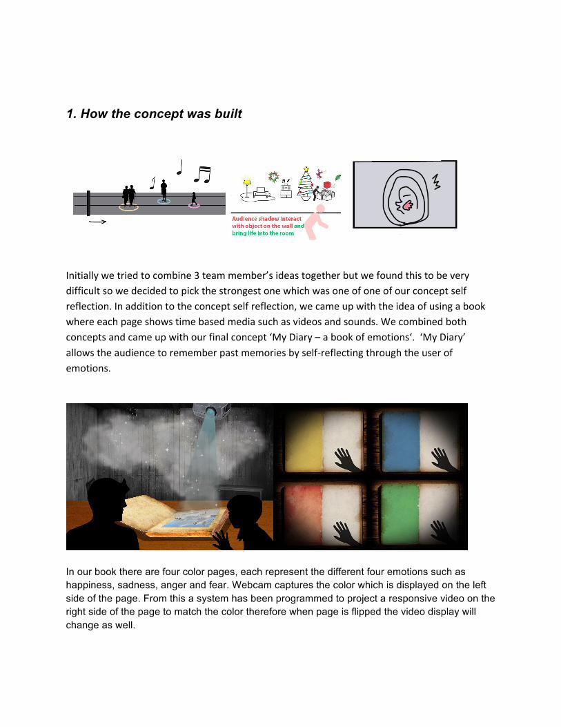
1. How the concept was built
Initially we tried to combine 3 team member’s ideas together but we found this to be very difficult so we decided to pick the strongest one which was one of one of our concept self reflection. In addition to the concept self reflection, we came up with the idea of using a book where each page shows time based media such as videos and sounds. We combined both concepts and came up with our final concept ‘My Diary – a book of emotions‘. ‘My Diary’ allows the audience to remember past memories by self-‐reflecting through the user of emotions.
In our book there are four color pages, each represent the different four emotions such as happiness, sadness, anger and fear. Webcam captures the color which is displayed on the left side of the page. From this a system has been programmed to project a responsive video on the right side of the page to match the color therefore when page is flipped the video display will change as well.

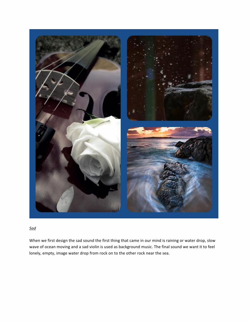
2. Concept development process Our tasks are divided into 4 parts such as a book making, Filming, editing sound and video, and Coding.
2-‐1. Book design
From the initial concept we all agreed to make our book look like old, we designed it as an antique book. First we started with the book as we want it to look real as much as we want it to look old and magical. The process start with searching how to make old texture on paper on Youtube. We researched and found some tutorials that tell how to make a paper looks old. The following websites gave helpful information on how to make an old looking book:
● http://www.wikihow.com/Make-‐Paper-‐Look-‐Old ● https://www.youtube.com/watch?v=QIhUU7K7ScA

We wanted to stick to authentic looking antique book, however we encountered difficulty in creating old looking paper. We failed to make the paper look old firstly because the paper size we used was too large so the colour was uneven and papers started to become warped which made it impossible to bind into a book. This warping would also have more problems as it would distort the image when the video is projected onto it. We eventually decided on printed grunge textures and colors on papers. The final paper we picked is A3 paper 300 gram thick and math giving the best outcome as the pages are not too thick not too thin and the colour are quite flat. This also keeps the paper from reflecting light that would affect, how the webcam will read the colour and when we display video it wouldn’t have wierd light reflecting on it. When we collated the paper to make a book it was too thin for case binding, so we sticked fabric tapes to the pages to make it thicker. Since this is our first time to make a book, we carefully scaled everything and made a diagram to not to be wrong with the scale. Even though we prepared the middle part didn’t have enough gap so we couldn’t close the book. We thought up the following solution for this, to make a plastic book cover so that we didn’t need to stick the page and book but we could insert the first page to the plastic cover. Also it is good when we stick to the table to make it stable.

Making process
1. First make a lot of coffee in a container and wait till it warm. 2. Then put paper on a tray and pour coffee onto the tray just a bit over the paper. Use brushes to make it uneven to make it look like older. 3. Put the tray in the oven. Bake it for around 1 -‐ 2 mins. 4. Take the papers out from the oven and dry it for a while. We did testing the color of coffee by testing with some smaller paper till we get the color right, the outcome looked amazing so we started working on with the real paper. The end of this experiment is not what we though because the actual paper size we use is really big and the biggest tray we have was still not big enough so the outcome of after baked paper was quite disappointing. The paper we baked were not suitable to use for our project as the color was strangely uneven as the paper bigger than the tray so one side of paper sticking out when the other side is soaking with coffee. Also after the paper became wet and

dried it started warping weirdly, as this will cause problem to the binding and how the video will look on the paper. The best solution we came up with is we are going to print an old paper texture onto papers.
Colour range testing template is printed on A4 paper and tested with the webcam to get the color number that work best with the webcam before final printing on the actual paper. The book template design printed out really well on A3 300 gram math paper. Then we started to binding the book with very thick paper board cut into 2 pieces of A3 size, old red paper texture to make the book cover, white thin fabric to hold between the cover thick paper and red paper wrapping, ribbon to hold each page corner before binding and glue. First we prepared the inside pages by glue ribbon onto one corner of each page and leave it to dry. then we put all the pages together then sawing the corner that has ribbon on together to make it stronger then wrapped up the corner with white fabric. We have finish up the binding following instruction from Youtube.
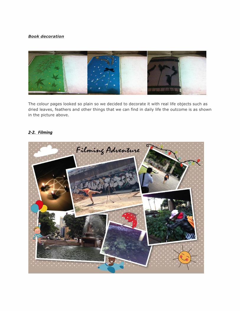
Book decoration
The colour pages looked so plain so we decided to decorate it with real life objects such as dried leaves, feathers and other things that we can find in daily life the outcome is as shown in the picture above. 2-‐2. Filming

During development process, we had to change some of our plans because scheduling was hard. These difficulties arose due to the following: equipment, actor’s availability, the weather and location availability. With locations we had further problems due to areas under construction or too popular therefore a lot of people where there. Initially we were planning to go somewhere suitable whether it’s far or not but because of timeframe and limitations we chose our shooting locations somewhere around the City. Luckily, we sometimes found some nice locations by chance during shooting so we sometimes could record some good moments. 2-‐3. Editing -‐ Video -‐
Our concept is evoking feelings to audience so each page has to attract the audience and remind them of some kind of memories so we designed our videos to be emotional. We used motifs and colors to represent the emotions and we also added words / quotes that are related to the emotion. Some videos

have faster cuts and camera movement to express some feelings. Also we used color grading to make it look like retro & vintage.
Rather than just placing three videos on a white page we made layouts for each video and designed it like an antique photo book. Animations and effects were added to make it more magical like Harry Potter’s magic book. We made opening sequence for the cover, first and last page to show the audience this is an interactive book.

Using multiple types of softwares was difficult. We used programs such as Final Cut Pro X, After Effects and Premiere Pro for editing the sound. The reason we used so many different programs was because each software provided its own unique feature and we needed them to achieve what we wanted for the final outcome. We did encounter some problems by using so many programs. One of these problems was file size, while editing each individual video, the Final cut Pro X file became massive (around 600 GB). We had to consider alternative ways and decided to use After Effects and Premiere for the rest of editing. This turned out to be more suitable as After Effects and Premiere link each other and have more effects options. -‐ Sound -‐
We tried to use surround sound for audiences’ emersion. The problem was we could not use 5.1 channel sound editing with the knowledge we currently have. So we compromised that we were going to use 2 channel sound. Even though it was only 2 Channel we made the sound directional and no coming from the one side. Basically the background sound is the same from both speakers, but the effect sounds are controlled such as appearing one side or weakly appearing another sound for more effective and making

a feeling of the space. The sound sources are from freesound.org and sounddogs.com and we used two sound editing programs to edit the sound, which are Audacity and Soundbooth CS5. Sound design is intended to involve the audience feeling toward each page of emotion. We brainstormed for video selections for each emotion, which include the sound that matches with the picture the audience will see. This also includes the videos and other sound effects that would relate to that emotion and building upon the attachment to audiences memories.
Happy The happy sound design that merry go round will be the main background music as it match with the place where we shoot our actor, the sound effect used in Happy emotion are intended to give the feeling of fresh, sunshine, warm, and relaxing.
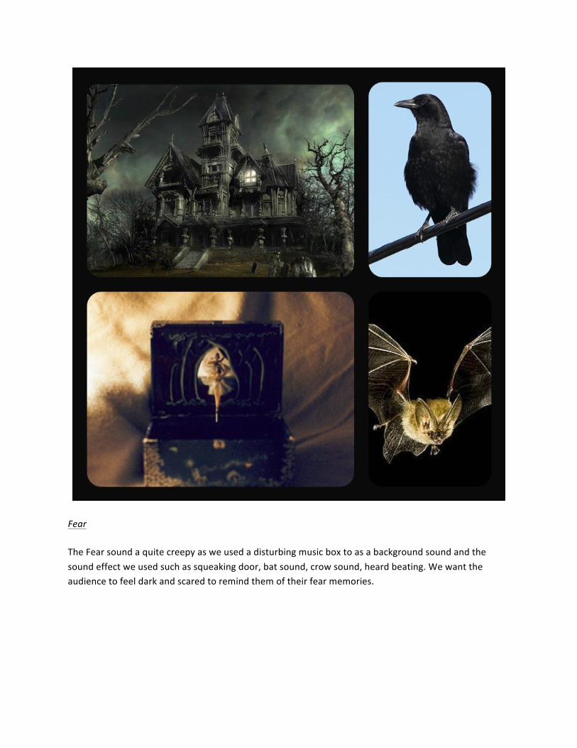
Sad When we first design the sad sound the first thing that came in our mind is raining or water drop, slow wave of ocean moving and a sad violin is used as background music. The final sound we want it to feel lonely, empty, image water drop from rock on to the other rock near the sea.

Angry The sound design for angry used thunder and storm as background sound as we think thunder and storm represent anger. We wanted to create a story around it. The couple fighting and arguing are used along the sound design but we put it quite low, broken glass appearing in some parts and also the people fighting then silent use for danger feeling and push the audience to get more attached with the video they are watching.
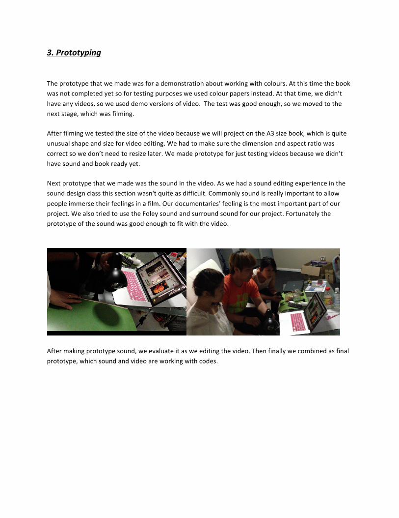
Fear The Fear sound a quite creepy as we used a disturbing music box to as a background sound and the sound effect we used such as squeaking door, bat sound, crow sound, heard beating. We want the audience to feel dark and scared to remind them of their fear memories.

2-‐4. Coding
Coding for this project, it was the first time we used the hue colour range control for detection. We also attempted to use saturation; unfortunately we could not use this method. The light caused the colour to become slightly saturated and it also caused some confusion to the computer. Hue range was really tricky to control. The colours we see and the colours being detected by web camera are totally different. To fix this detection method we decided to use RGB colour detection, and that is not used for a range. We used it to detect which colour is displayed by how close the value summed up of RGB for checking black or white. BUT there were serious 2 big problems: The first big problem was the accuracy. If we set the sum(RGB)ranges for distinguishing between black, white or colours, computer could not detect colours correctly. This was because distortions in the light, distance from ceiling and shadows caused different sum results. The solution for this problem was to set the area being captured, before we only captured 1 pixel. The capturing area (10x10pixels dimension)’s values returned to be averaged. So even if some little shadows from the audience or if lighting’s power or numbers changes, computer can detect very well. This improved the accuracy a lot. The second problem was that the computer could hardly distinguish between black and white. Also this depended on the light position. In some situations even when I was looking with my eyes white and black looked the same. After requesting help from Phil, provided advice to use brightness. As soon as we checked the brightness values difference, we found out the brightness gap between black and white. And also we put some decoration for the book. Black page’s been decorated with some black texture on it (no more glossy). Now it is clear with a use of brightness as well. But still we need to set the values like sum and brightness depends on the location.
3. Prototyping The prototype that we made was for a demonstration about working with colours. At this time the book was not completed yet so for testing purposes we used colour papers instead. At that time, we didn’t have any videos, so we used demo versions of video. The test was good enough, so we moved to the next stage, which was filming. After filming we tested the size of the video because we will project on the A3 size book, which is quite unusual shape and size for video editing. We had to make sure the dimension and aspect ratio was correct so we don’t need to resize later. We made prototype for just testing videos because we didn’t have sound and book ready yet. Next prototype that we made was the sound in the video. As we had a sound editing experience in the sound design class this section wasn't quite as difficult. Commonly sound is really important to allow people immerse their feelings in a film. Our documentaries’ feeling is the most important part of our project. We also tried to use the Foley sound and surround sound for our project. Fortunately the prototype of the sound was good enough to fit with the video.
After making prototype sound, we evaluate it as we editing the video. Then finally we combined as final prototype, which sound and video are working with codes.

4.User testing
From in-‐house exhibition, we noticed some findings. Upon the questionnaires we created to find out what extent our interaction succeeded, we noticed some findings. We interviewed some audiences after finish interacting.
● Most audience liked our interaction. ● Successfully evoked some feelings. ● Successfully reminded them some memories that is related to the emotion ● Actor’s face expression and movement are very effective

Interaction Interaction was successful. Simple interaction didn’t confuse audience and effectively affected to audience’s feelings. Typical interaction pattern was like this 1.Audience comes 2.Think about what this is 3. Open the book 4. Flip the page 5. Watch the 4 videos 6. Leave Some people flipped few pages at the same time so they didn’t realize that there are four pages in our book but most people tend to watch four videos and then they left. Some people tried experimentation. They flipped the page to go back the page before and see what will happen, but our book was designed to respond to the color so it worked well in that situation. Some other people watched videos for longer and few more times. Reactions from audiences were interesting. Some people are smiling, some people were very serious, and some were scared. They seemed like they were thinking something during interaction. From our interview, we want to say that our installation was successful because we successfully evoked some kind of feeling to audience. Depends on the audience the most effective page was different. But overall, our four videos and sounds, which represent emotions, worked well and remind them of some memories. Recommendation There was a recommendation from someone who came with Dr. Lian. She was surprised and said it was brilliant idea. And she commented there was a better way to distinguishing page with an interaction. In another similar project, they used sensor to be detected with attaching on the paper. Also our idea was good enough but the use under some light may not be surprisingly accurate. If we have a chance to improve, we are willing to find the way that she said of course. Here are some words from the audience ^^ “So nice !!!!” “That’s really cool guys !!!”

“It’s really cool and I feel that each pages I can feel the emotion” “Yes I can feel the emotion, I really like the concept where I open the book and things are animated the idea is really great. It’s like Harry Potter world” “It’s great I love the design graphic and even the background layout is really detail and the way you made all three video like theme scenario are connected you can just related directly what sort of mood you are trying to express. Yea even without words it’s pretty obvious, This is great I really like it and fear emotion page are working most for me like the depres the darkness and the happy page it has detail like the flower bright colours those two are the most obvious one it’s great !! but the actor kind of scared me a bit ” “It’s like magic reminds me of harry potter” “it’s really good, that’s really great and my favorite one is the sad one because we are depressing haha, yes I feel attach with the emotion in each page especially the sad one and the anger one that’s great ” “I like it and the happy page is my favorite one it’s very colourful, I feel happy when I look at the page” “ I feel connected with the emotion, each page bring back difference memorie” Lastly… Over all we all really enjoyed this project ‘My Diary’. We are from different profession, but helped each other and managed the tasks very well. From the initial concept proposal we discussed a lot until everyone says ok. We researched a lot until we can get the quality we want. We always contact each other and if there is any problem, every team member gather up and discussed about that problems. We all made efforts to make it work. As a result, our interaction was quite successful. Many audiences liked our project. It was pleasure to see what our efforts come together. We are so happy with the outcome. Thanks for everyone who involved our project! Team Re.Flection