Music magzine conventions
6
Music Magazine Conventions Hamza Hanif
-
Upload
hanifhamza2088 -
Category
Education
-
view
94 -
download
0
Transcript of Music magzine conventions
Music Magazine ConventionsHamza Hanif
Rock
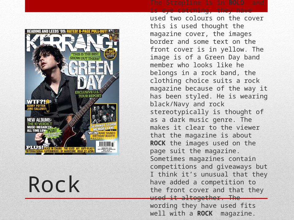
The Strapline is in BOLD and is eye catching, they have used two colours on the cover this is used thought the magazine cover, the images border and some text on the front cover is in yellow. The image is of a Green Day band member who looks like he belongs in a rock band, the clothing choice suits a rock magazine because of the way it has been styled. He is wearing black/Navy and rock stereotypically is thought of as a dark music genre. The makes it clear to the viewer that the magazine is about ROCK the images used on the page suit the magazine. Sometimes magazines contain competitions and giveaways but I think it’s unusual that they have added a competition to the front cover and that they used it altogether. The wording they have used fits well with a ROCK magazine.
Jazz
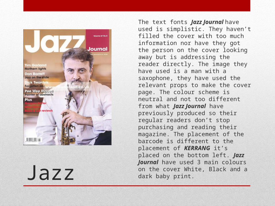
The text fonts Jazz Journal have used is simplistic. They haven’t filled the cover with too much information nor have they got the person on the cover looking away but is addressing the reader directly. The image they have used is a man with a saxophone, they have used the relevant props to make the cover page. The colour scheme is neutral and not too different from what Jazz Journal have previously produced so their regular readers don’t stop purchasing and reading their magazine. The placement of the barcode is different to the placement of KERRANG it’s placed on the bottom left. Jazz Journal have used 3 main colours on the cover White, Black and a dark baby print.
Classical
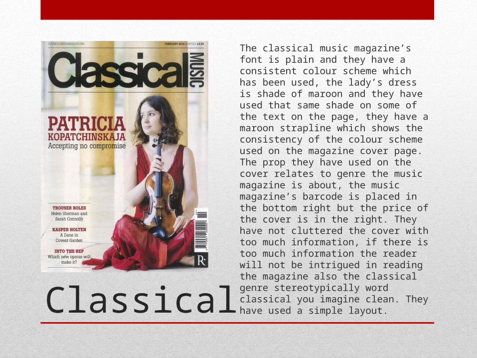
The classical music magazine’s font is plain and they have a consistent colour scheme which has been used, the lady’s dress is shade of maroon and they have used that same shade on some of the text on the page, they have a maroon strapline which shows the consistency of the colour scheme used on the magazine cover page. The prop they have used on the cover relates to genre the music magazine is about, the music magazine’s barcode is placed in the bottom right but the price of the cover is in the right. They have not cluttered the cover with too much information, if there is too much information the reader will not be intrigued in reading the magazine also the classical genre stereotypically word classical you imagine clean. They have used a simple layout.
POP
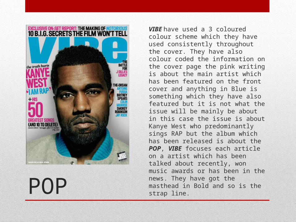
VIBE have used a 3 coloured colour scheme which they have used consistently throughout the cover. They have also colour coded the information on the cover page the pink writing is about the main artist which has been featured on the front cover and anything in Blue is something which they have also featured but it is not what the issue will be mainly be about in this case the issue is about Kanye West who predominantly sings RAP but the album which has been released is about the POP, VIBE focuses each article on a artist which has been talked about recently, won music awards or has been in the news. They have got the masthead in Bold and so is the strap line.
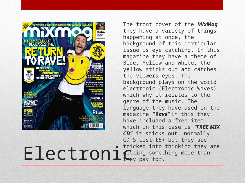
Electronic
The front cover of the MixMag they have a variety of things happening at once, the background of this particular issue is eye catching. In this magazine they have a theme of Blue, Yellow and white, the yellow sticks out and catches the viewers eyes. The background plays on the world electronic (Electronic Waves) which why it relates to the genre of the music. The language they have used in the magazine “Rave” in this they have included a free item which in this case is “FREE MIX CD” it sticks out, normally CD’S cost £5+ but they are tricked into thinking they are getting something more than they pay for.