MSTC 2021 Data Visualization: The Good, The Bad, & The Ugly
80
Data Visualization: The Good, The Bad, & The Ugly MSTC 2021 Missy Butki Shana Holden-Murphy Steven Snead
Transcript of MSTC 2021 Data Visualization: The Good, The Bad, & The Ugly

Data Visualization: The Good, The Bad, & The Ugly
MSTC 2021
Missy ButkiShana Holden-MurphySteven Snead

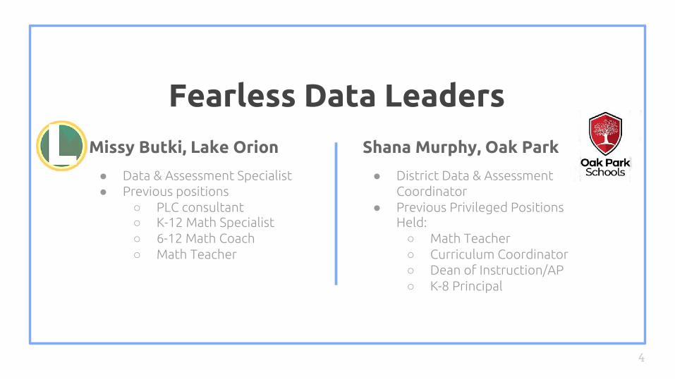
Fearless Data Leaders
4
Missy Butki, Lake Orion
● Data & Assessment Specialist● Previous positions
○ PLC consultant○ K-12 Math Specialist○ 6-12 Math Coach○ Math Teacher
Shana Murphy, Oak Park
● District Data & Assessment Coordinator
● Previous Privileged Positions Held: ○ Math Teacher○ Curriculum Coordinator○ Dean of Instruction/AP○ K-8 Principal
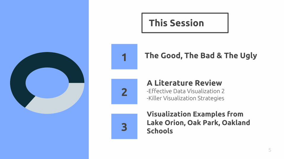
This Session
5
The Good, The Bad & The Ugly
A Literature Review-Effective Data Visualization 2-Killer Visualization Strategies
Visualization Examples from Lake Orion, Oak Park, Oakland Schools
1
2
3
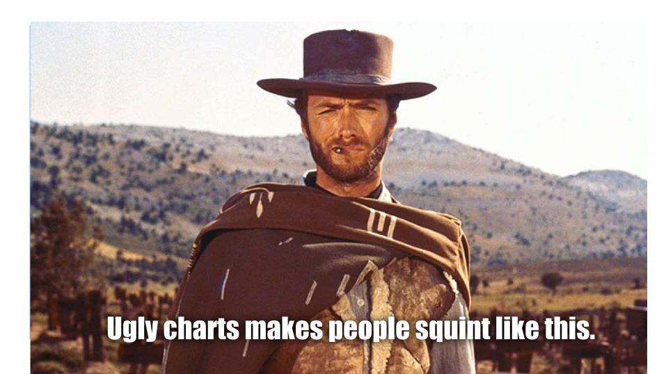
Ugly charts makes people squint like this.


Stephanie Evergreen
11

Dr. Stephanie Evergreen ~ Presenting Data Effectively

Stephanie’s Points
Right Graphic + Relevant Focus =
Effective Data Visualization
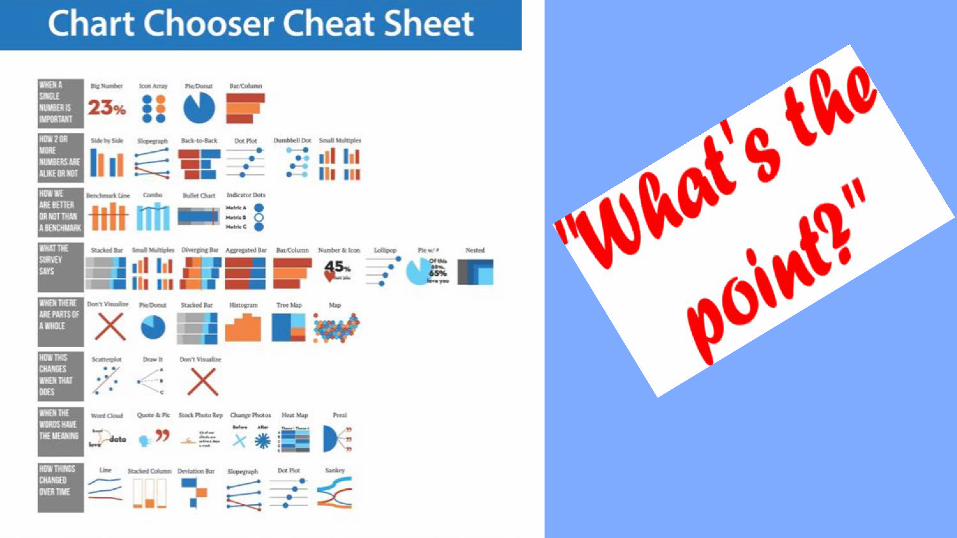
● “What’s Your Point?”○ Choose the right chart to draw
attention to the point you are trying to convey.
● Think of it as art...intended to evoke thoughtfulness and intention
● Everything Matters○ Fonts, color, size
● Data visualization can be harmful....unintentionally as well as intentionally
● Sketch it out● Use of EXCEL (step-by-step in book with
Ninja levels!)

CHOOSE THE RIGHT CHART FOR THE RIGHT DATA!

17
Stephanie Evergreen (p. 320)
"Whether data visualization and good design make a difference in communicating dataalmost shouldn't ever be a question. It has a sort of validity that hits you right between the eyeballs. Once you see what good graphic design can do to data, it can be difficult to go back to the traditional way of reporting. Beyond how good it looks, we have strong evidence that elements like color and font impact comprehension, that the presence of graphs and photographs increases credibility and persuasiveness, and that certain graph types will be better than others at telling an accurate data story."


Amy Balliett
19Missy
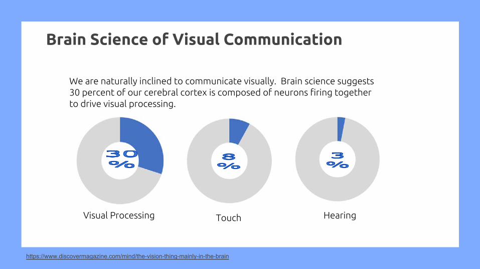
Brain Science of Visual Communication
We are naturally inclined to communicate visually. Brain science suggests 30 percent of our cerebral cortex is composed of neurons firing together to drive visual processing.
https://www.discovermagazine.com/mind/the-vision-thing-mainly-in-the-brain
Visual Processing Touch Hearing
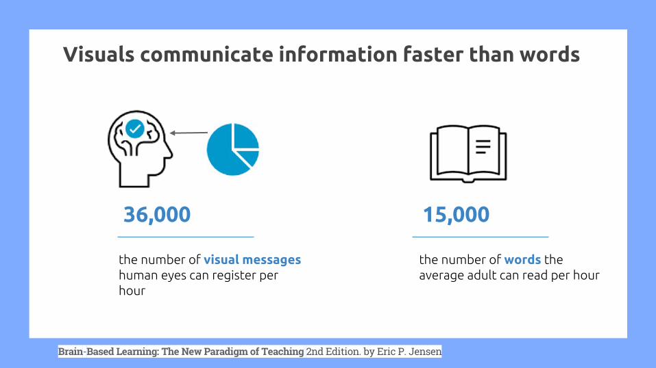
Visuals communicate information faster than words
36,000 15,000
the number of visual messageshuman eyes can register per hour
the number of words the average adult can read per hour
Brain-Based Learning: The New Paradigm of Teaching 2nd Edition. by Eric P. Jensen

8 Rules of Visual Communication
ALWAYS THINK ABOUT CON-TEXT (IT’S A CON WHEN THERE’S TOO MUCH TEXT)

The average person only reads 20% of a web page with 600+ words.
If you have to use too much text to explain your visualization, it becomes a reading assignment.
Suggestions:1. Design your visual content using lorem
ipsum text, forcing you to tell your story with visuals
1. Asks a few colleagues or friends if they can identify the topic without reading
SMALL VISUAL CLUES HAVE A LARGE IMPACT

Use universal imagery
https://thenounproject.com/
By using universal simple icons you can communicate using less words
Microsoft Word>Insert>Pictures>Stock Images>Icons
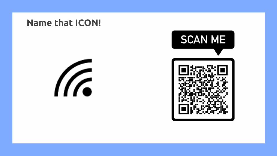
Name that ICON!

THERE’S NOT GOLD AT THE END OF THAT RAINBOW

Choose the right colors for your content

Choose three principal colors
One color should act as your dominant hue and should be used 60 percent of the time
You can use shades of your three main colors to complement the design
Use your third color for important conclusions, a call-to-action, or to draw the eye to key data points

https://graf1x.com/color-psychology-emotion-meaning-poster/

GOOD VISUAL STRATEGISTS ASK “WTF?!”

Why this font?
Font choices elicit emotional responses, they deliver a visual aesthetic before we make meaning of the words
● The right font sets the tone for your content● The right font can bring further context and meaning to the information being shared● The right font can impact the trustworthiness of the content
Serif fonts are those that include a small line at the end of a stroke or letter. Non-serif fonts (sans serif) are those that do not include the extra line.
Times New Roman Veranda


AVOID THE STIGMA OF STOCK
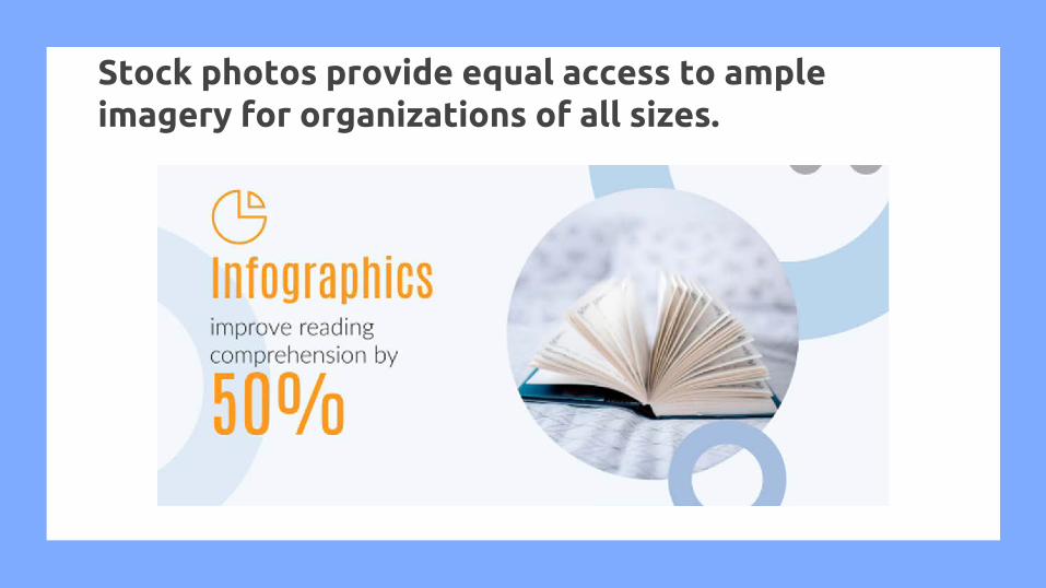
Stock photos provide equal access to ample imagery for organizations of all sizes.

STAND OUT AT THE COCKTAIL PARTY

Know your audience
Visual information has the power to make a very strong impact on its audience but if the audience is not considered the visual content may end up being a waste
SuperintendentSchool BoardCommunity
Building AdminTeachersCommunity
Building AdminTeachersSupport Staff

USE PROPER DATA VIZ THROUGHOUT

Don’t Skip the Scale
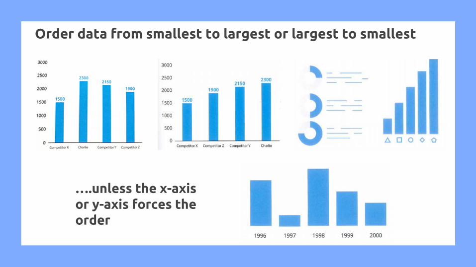
Order data from smallest to largest or largest to smallest
….unless the x-axis or y-axis forces the order

Always progress pie chart clockwise

Show 100% benchmark if graph is being used to show a percentage of something
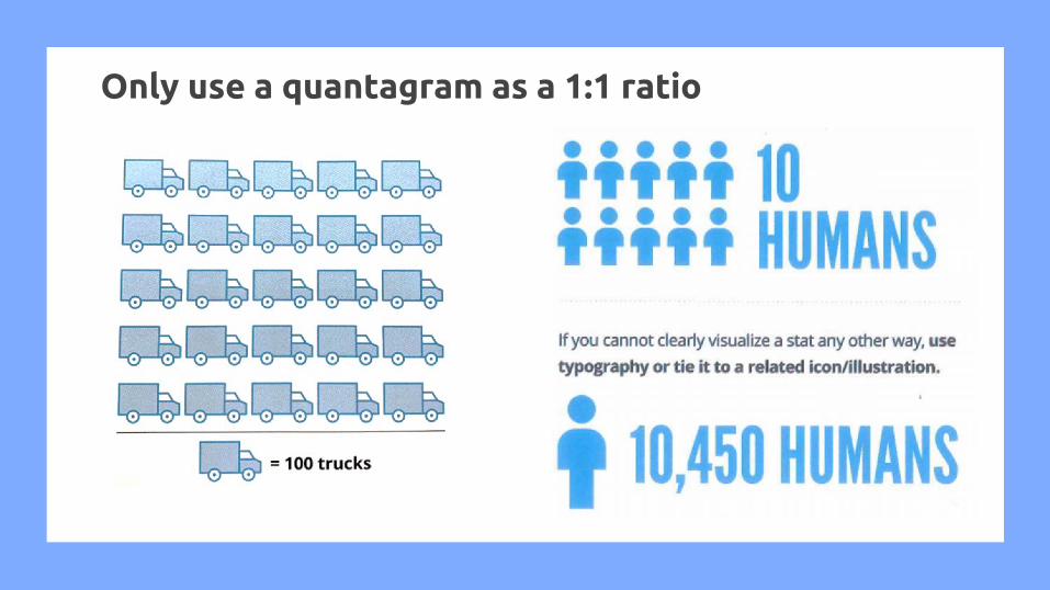
Only use a quantagram as a 1:1 ratio

COMMIT TO THE TRUTH AND PROVE IT


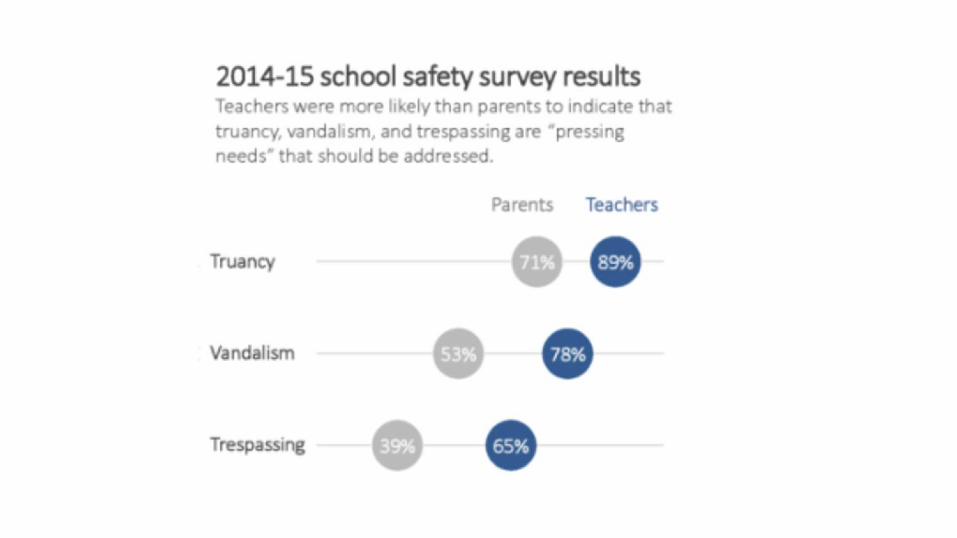
Data Visualizations used in Oak Park Schools
Shana

My New Process1. WHAT is the task? WHO is it for? 2. I consider my audience (School Board vs.
Central Office vs. School Leaders vs. Teachers vs. Parents/Community).
3. I consider my intention:a. Knowledge & Understanding
(sometimes decision-making) ORb. Knowledge, Understanding,
Uncovering→ Action4. I consider what data/information I am
displaying and how to best display it(using Stephanie Evergreen’s charts) given the answers to numbers 1 and 2.
5. I sketch it!6. I create it!

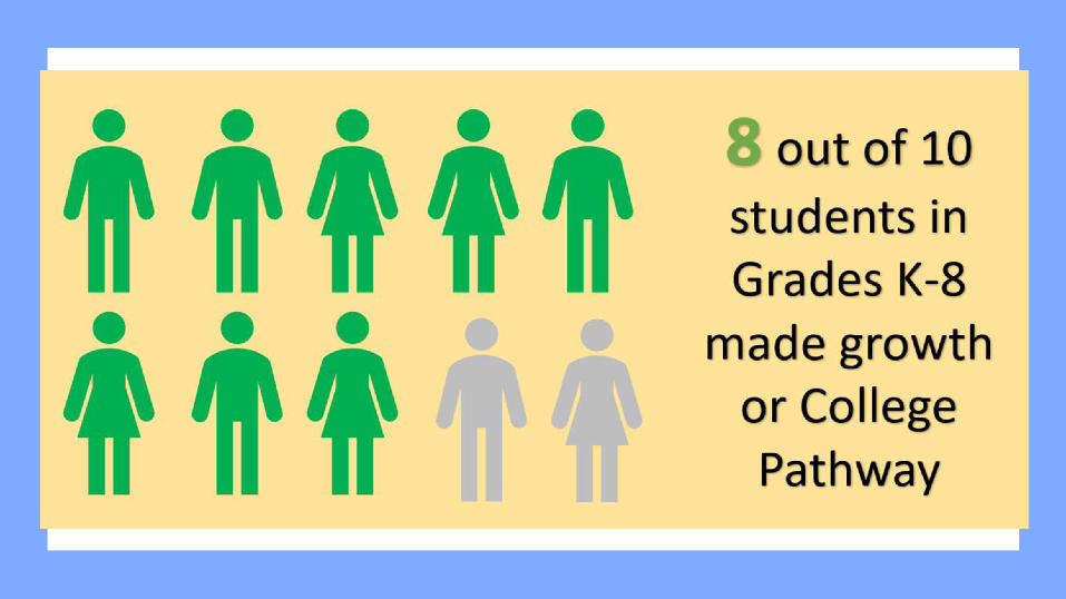
Example: K-3 Students with IRIPs (Individual Reading Improvement Plans)Task: Prepare data for literacy nights with K-3 parents to underscore the need for action

Example: K-3 Students with IRIPs (Individual Reading Improvement Plans)Audience: Parents Intention: Knowledge, Understanding, & Action
We want to create a sense of urgency in increased reading activities at home
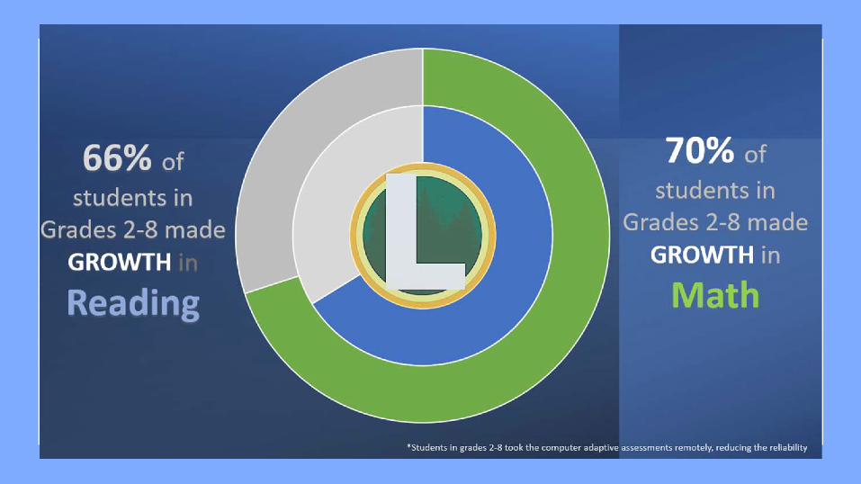
*Focus on a single number; Donut, Ninja Level 1

Example: Return to Learn FeedbackShould we return back to school buildings or remain home?Task: Create a data display for a Board meeting that shows what the majority of our stakeholders want.
Teachers Families Students
Remain at homeReturn to school
Return to schoolRemain at home
Maybe return w/vaccine
Remain at homeReturn to school
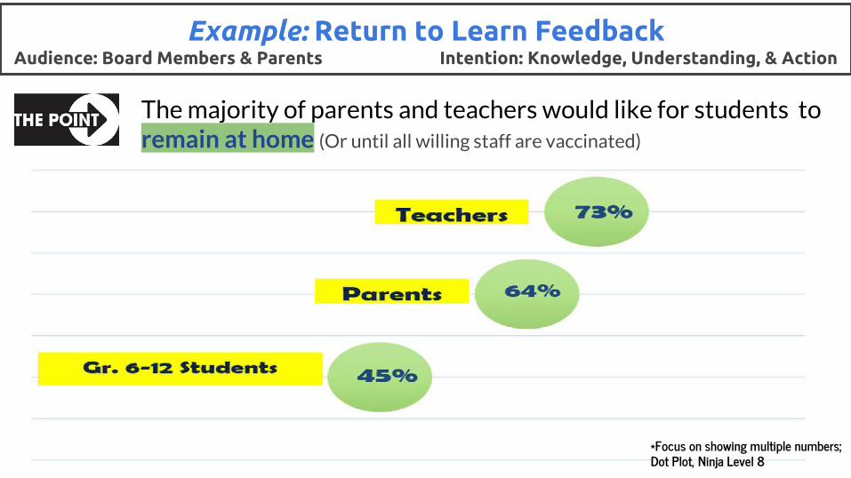
Example: Return to Learn FeedbackAudience: Board Members & Parents Intention: Knowledge, Understanding, & Action
The majority of parents and teachers would like for students to remain at home (Or until all willing staff are vaccinated)
*Focus on showing multiple numbers; Dot Plot, Ninja Level 8
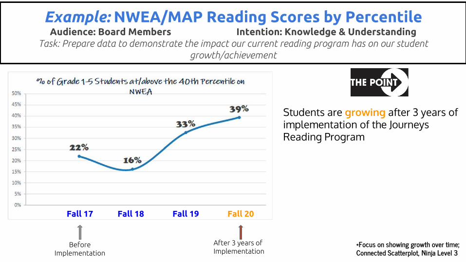
Example: NWEA/MAP Reading Scores by Percentile Audience: Board Members Intention: Knowledge & Understanding
Task: Prepare data to demonstrate the impact our current reading program has on our student growth/achievement
Fall 17 Fall 18 Fall 19 Fall 20
Before Implementation
After 3 years of Implementation
Students are growing after 3 years of implementation of the Journeys Reading Program
*Focus on showing growth over time; Connected Scatterplot, Ninja Level 3
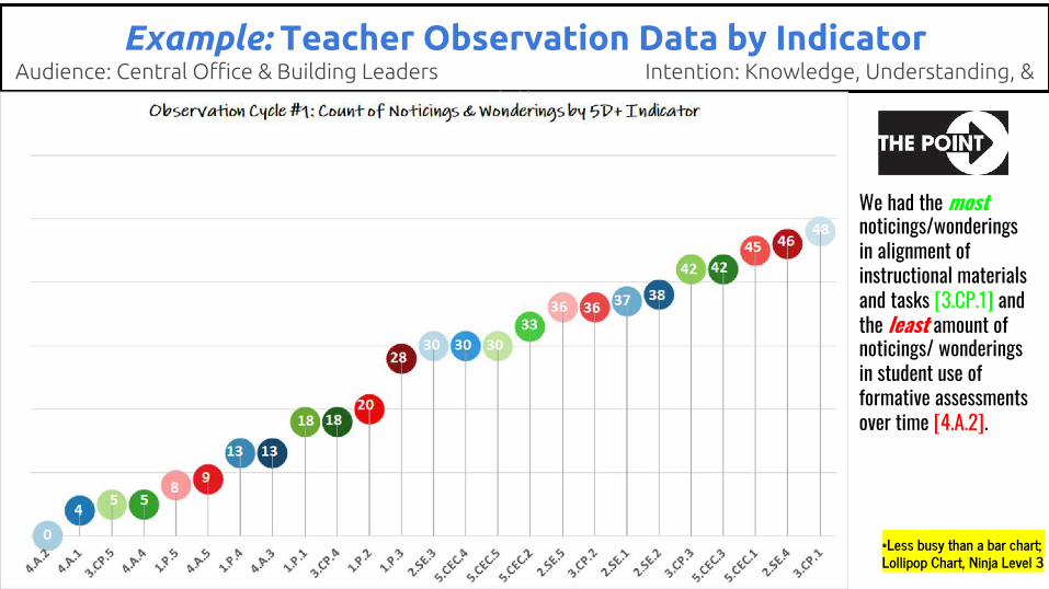
Example: Teacher Observation Data by IndicatorAudience: Central Office & Building Leaders Intention: Knowledge, Understanding, &
Action
We had the most noticings/wonderings in alignment of instructional materials and tasks [3.CP.1] and the least amount of noticings/ wonderings in student use of formative assessments over time [4.A.2].
*Less busy than a bar chart; Lollipop Chart, Ninja Level 3
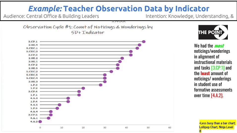
Example: Teacher Observation Data by IndicatorAudience: Central Office & Building Leaders Intention: Knowledge, Understanding, &
Action
We had the most noticings/wonderings in alignment of instructional materials and tasks [3.CP.1] and the least amount of noticings/ wonderings in student use of formative assessments over time [4.A.2].
*Less busy than a bar chart; Lollipop Chart, Ninja Level 8

Before Meeting Dr. Evergreen’s Work:
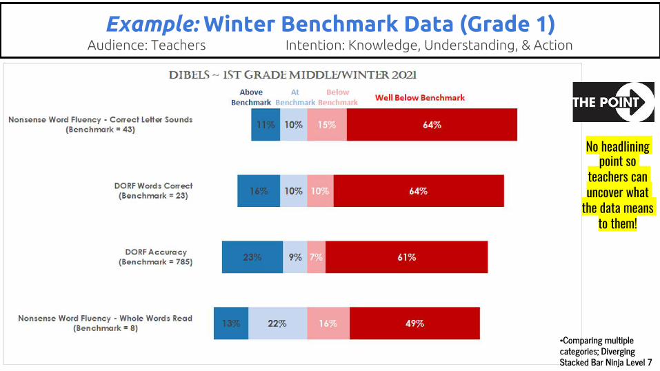
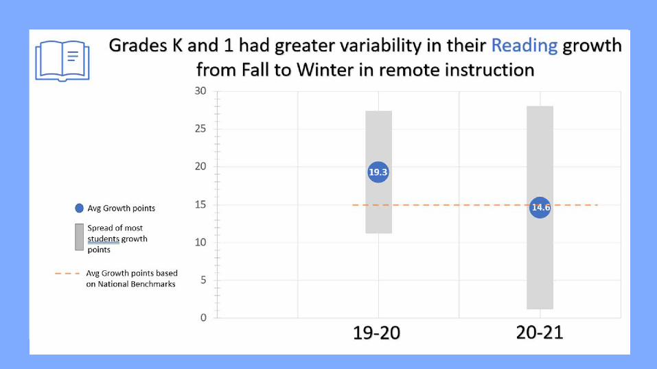
Example: Winter Benchmark Data (Grade 1)Audience: Teachers Intention: Knowledge, Understanding, & Action
No headlining point so
teachers can uncover what
the data means to them!
*Comparing multiple categories; Diverging Stacked Bar Ninja Level 7
Data Visualizations used in Lake Orion Community Schools
Missy

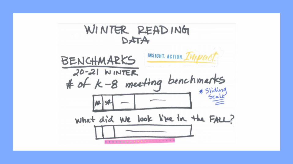
The journey towards visualization

Chapter 2, Donut Graph, Excel Ninja Level 1

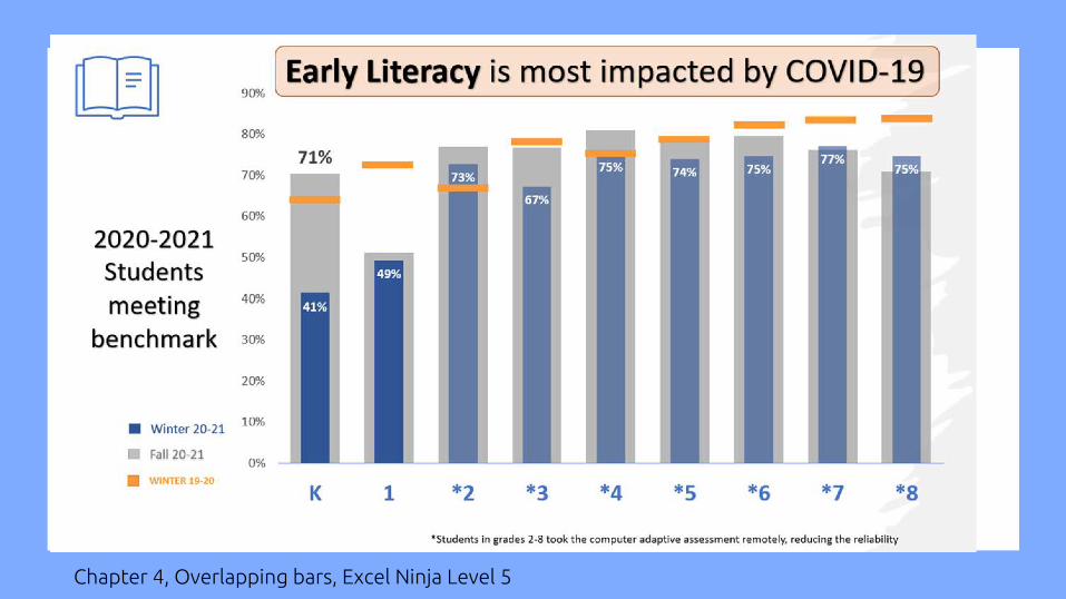
Chapter 4, Overlapping bars, Excel Ninja Level 5


Scale is important


Data Visualizations used in Oakland Schools
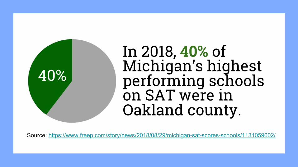
In 2018, 40% of Michigan’s highest performing schools on SAT were in Oakland county.
40%
Source: https://www.freep.com/story/news/2018/08/29/michigan-sat-scores-schools/1131059002/
What are you taking away from this session?

Thank you!Shana Murphy - [email protected] Butki - [email protected] Snead - [email protected]