MOO Optimizing the experience of the DYO & FU flow in ... · can browse the design templates, or...
27
Optimizing the experience of the DYO & FU flow in Template Browse MOO Activities UI/UX, RESEARCH Timeline 4 - 6 weeks Launched September 2017
Transcript of MOO Optimizing the experience of the DYO & FU flow in ... · can browse the design templates, or...

Optimizing the experience of the DYO & FU flow in Template Browse
MOO
Activities
UI/UX, RESEARCH
Timeline
4 - 6 weeks
Launched
September 2017

MOO customers use the e-commerce website to create unique designs for their businesses. They can browse the design templates, or use the DYO (Design Your Own) or FU (Full Upload) flows.
Background & Context
Due to the fact that the old page was not mobile responsive and used the old CMS, a redesign in the Template Browse page was necessary. After the redesign there was a significant drop of customers who were choosing the FU flow (higher AOV), resulting in high bounce rates and loss in revenue.
The DYO and FU build flows allow customers to either start designing with a blank template or upload a full design they have created without the tools from MOO.

DYO & FY Before
Make it easy for customers to discover the 2 build flows
1.
Make sure they have a clear understanding what’s being offered by the 2 flows
2.
Reduce the bounce rate and increase the revenue generated by those flows
3.
The Challenge

As the Product Designer of the TnT Crew (Templates and Tools) who owns the Template Browse experience at MOO, I led the redesign of the DYO & FU build flow experience.
In addition, I worked alongside a Researcher, a Product Manager and a UX Copy Writer.
https://www.moo.com/uk/templates/postcards
My Role
The new design was launched globally September 2017.
Design Approach
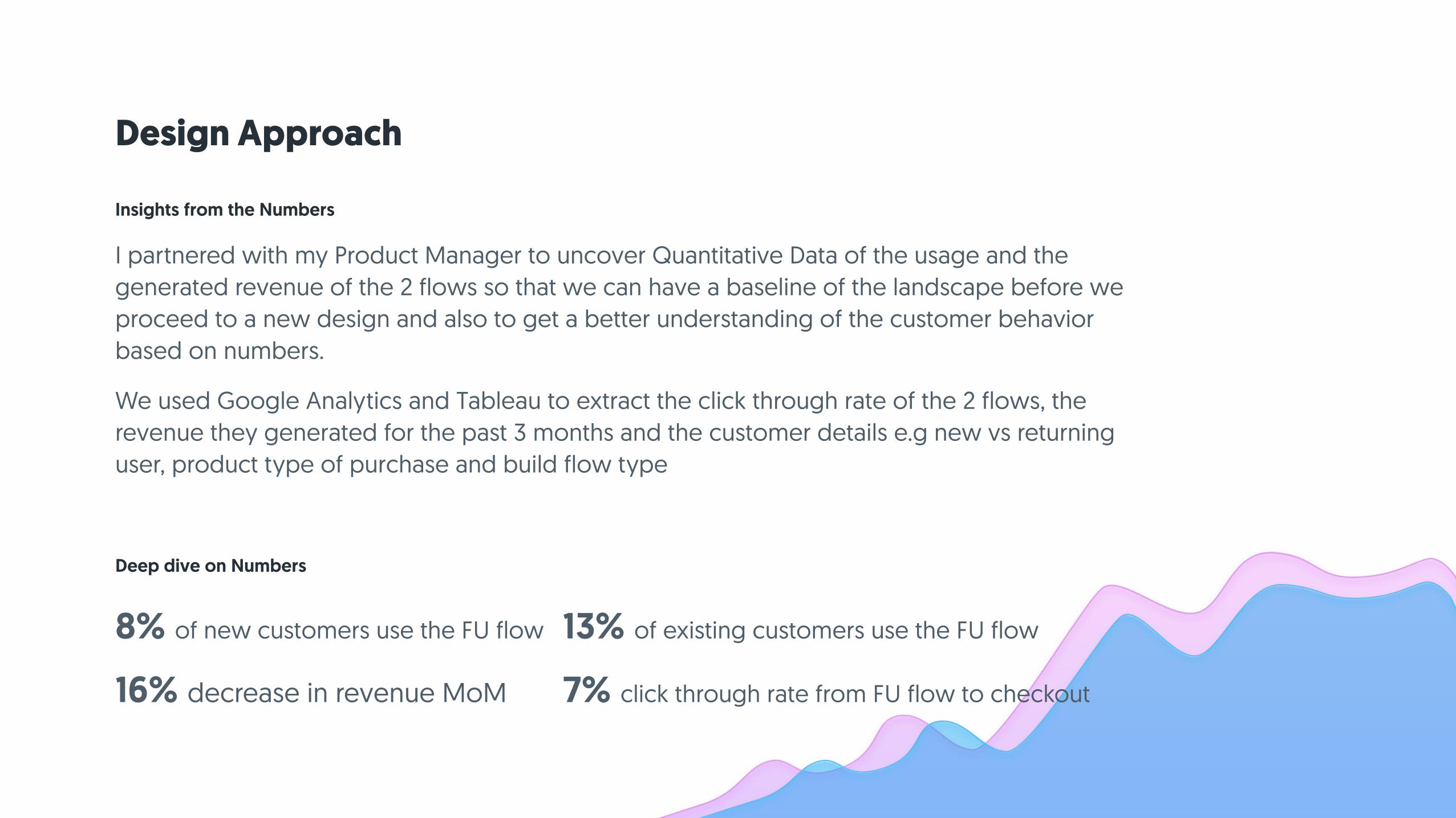
I partnered with my Product Manager to uncover Quantitative Data of the usage and the generated revenue of the 2 flows so that we can have a baseline of the landscape before we proceed to a new design and also to get a better understanding of the customer behavior based on numbers.
We used Google Analytics and Tableau to extract the click through rate of the 2 flows, the revenue they generated for the past 3 months and the customer details e.g new vs returning user, product type of purchase and build flow type
Insights from the Numbers
Deep dive on Numbers
8% of new customers use the FU flow 13% of existing customers use the FU flow
16% decrease in revenue MoM 7% click through rate from FU flow to checkout

Design Approach
I partnered with one UX Researcher to plan a customer research activity. Our goal was to get a better understanding of the mental model of the users, to uncover any pain point in regarding the 2 flows and identify any opportunities to increase the AOV (Average Order Value) and reduce the bounce rate.
We tested with 20 participants with UT.com, 10 from US and 10 from UK and we split the test to 50% MOO customer and 50% non MOO customer.
Insights from Customer Research Deep dive on Customer Research
existing MOO customer
“Oh that one - I hadn’t seen that”
non MOO customer
“Are you sure the guidelines are in this page?”
non MOO customer
“What’s the difference between the two (flows)?”

Main Hypothesis
We believe that by placing the 2 flows close
to each other and utilizing the UX Copy,
we can improve the discoverability, the
comprehension of what is being offered and
increase the revenue from the FU and DYO.
Design Approach
After the Research phase was over I started formulating Hypothesis on how might we improve the build flows so that we can:
Formulating Hypothesis
Make it easy for customers to discover the 2 build flows
1.
Make sure they have a clear understanding what’s being offered by the 2 flows
2.
Reduce the bounce rate and increase the revenue generated by those flows
3.

Design Approach
Sketching solutions
Wireframes
I kept the screen real estate as in was in the previous iteration and using the Gestalt Principle of Grouping, I split the first tile in 2 options, one for the DYO and the other for the FU flow.
Concept 1:
I began exploring high level ideas and solutions on paper and then mocking them up in more detail using Sketch.
I partnered with a UX copy writer to make sure that the micro - copy of the detailed mockups would resonate with the MOO tone of Voice and mental model of the users

Design Approach
Sketching solutions
To make the 2 options more prominent, I used one tile for each build flow but kept them close to each other (again using the Gestalt Principle of Grouping) and utilized the strength of a good UX Copy to explain better what is being offered.
Concept 2:
Wireframes
I began exploring high level ideas and solutions on paper and then mocking them up in more detail using Sketch.
I partnered with a UX copy writer to make sure that the micro - copy of the detailed mockups would resonate with the MOO tone of Voice and mental model of the users

Split tile with the 2 flows
One explicit tile for each flow
Concept 1
Concept 2

Design Approach
Validating our ideas was the most important part of the process. The biggest challenge I faced in this project was the concept phase.
Balancing moving forward with designs and managing the feedback from Product Marketing which had strong feelings about one concept and from Product Management who had strong feeling about the other felt like a swinging pendulum of viewpoints.
Having 2 competing concepts I managed to get the buy-in from both parties to extend the deadline for an extra week and test both ideas.
De - risking our Solutions
Managing feedback from both parties was
challenging and felt like a swinging pendulum
of viewpoints.
Main Challenge

Design Approach
I tested the 2 Concepts with 12 users, 50% from UK and 50% from US using UT.com and split the two segments in new and existing MOO customers.
The results were almost identical. All users understood what is being offered to them and what would the next steps be in the flow.
The key differentiating factor was discoverability. The first concept with the split tile was overlooked by some users because of its subtle UI characteristics. Some users would scroll up and down searching for the 2 options.
From Ambiguous to Obvious
The split tile was overlooked by some users
unlike the 2 explicit tiles which were very
prominent
Key Insight
http://www.usertesting.com/c/b7ef1701-ea13-45f3-bdc4-6a549848aa05?note_id=clip-1396370&shared=Ley9akZU

It’s still early days for the 2 new tiles, yet the results have exceeded our expectations. Since the launch of this design (September 2017), the total number of customers who use the FU flow has increased from 16.3% to 46.7%.
The Impact
Our customers have a clear understanding of what is being offered to them and can find the 2 flows with ease.
1.
The increase in the customers using the FU flow translates to 38k revenue in one month alone
2.
The click through rate of customers form FU to check-out has increased from 7% to 23%
3.

Optimizing the Onboarding experience of the Researcher Persona
Pollfish
Activities
UX STRATEGY, UI/UX,
RESEARCH
Timeline
8 - 10 weeks
Launched
March 2017

Pollfish is a survey platform which gives researchers the ability to create surveys and collect results online through mobile apps and the mobile and desktop web.
Background & Context
Focusing on the Researcher funnel, our numbers showed that 79% of the customers who landed on the sign up page continued to the product and from those who continued (new-sign ups) only 22% completed the journey to check out (buy the survey).
The two main personas of the platform are the Researcher - someone who wants to create a survey and the Publisher - someone who wants to utilize monetization through their app or website.

Before the Onboarding
Reduce the number of new customes boucning from the sign up page
1.
Reduce the friction in the flow of creating a new survey for newly signed up customers
2.
Help customers understand that they succesfully paid for a survey
3.
The Challenge

As the Product Designer of Pollfish, I led the initiative for designing the Onboarding experience of the platform. I conducted user interviews, mapped out user journeys and designed small progressive quick wins so that we could iteratively enhance the onboarding experience.
I worked alongside a Product Manager, a Sales Manager and a Customer Support Manager.
https://www.pollfish.com/signup/researcher
My Role
The design solutions were launched globally in February 2017.

Design Approach
By observing our analytics MoM we saw that we had a broken funnel with a drop-off at key points in the user journey:
Observing the Gap - Quant Data
Landed on Sign up
Signed Up
What happened there?
Created Survey
Added DemographicsAdded Survey Qestions
Buy Survey

Design Approach
I partnered with the Customer Support Manager to get insights from support tickets and find opportunities to invest in onboarding based on current painpoints.
In addition, I partnered with the Product Manager to craft a survey and get direct feedback from bounced customers. We focused both on the sign up page and on the rest of the journey.
Launching the survey, 60% of boucned customers responded and of those, 10% agreed for a phone interview.
Understanding the Researcher Persona Deep dive on Qual Data
“The sign up page doesn’t look trustworthy”
“I am a Reseracher and I couldn’t find how to sign up”
“After sign up, I was left wondering in the dashboard”
“After I paid I was directed to a blank page and didn’t
know what to do!”

Design Approach
I partnered with the Sales Manager to get a better understading of how they approach potential customers.
I participated in 3 personalized demos in order to pick up details on the type of language and keywords the customers use in order to explain the product and also get an understading on what cutomers are looking for when searching for platforms like Pollfish.
Understanding the Researcher Persona Deep dive on Qual Data
• Customers would sign up in order to play around and discover whether they could target audiences by age, gender and other demographic criteria.
• They were very interested in the different question types that we offered as well as the Screening Question logic that we use.

Design Approach
I partnered with the Product Manager and the Customer Support Manager to formulate hypotheses, based on our findings, on how might we optimize the journey with small progressive quick wins so that we:
Reduce the number of new customes boucning from the sign up page
1.
Reduce the friction in the flow of creating a new survey for newly signed up customers
2.
Help customers understand that they succesfully paid for a survey
3.
Crafting the new User Journey - Hypothesis

Design Approach
We believe that by redesigning the sign up page and communicating our value proposition better, we will reduce the number of customers bouncing from that page and create a sense of trust.
Utilizing the split screen UI pattern, I was able to enhance the value proposition through a gallery of images combined with copy and keywords that resonate with customers and inspires trust by showcasing high profile clients.
Also, using tabs I was able to expose the other persona of Pollfish, the Publisher.
Crafting the new User Journey - Sign up page

Design Approach
We believe that by directing newly signed up customers to a welcome page where they can create a new survey, we will reduce the friction and increase the number of new customers buying a survey.
Displaying a welcoming message and exposing the primary job to be done, which is to create a survey, instead of directing newly signups to the dashboard where it is easy to get lost and adds an extra step.
Crafting the new User Journey - Create survey

Design Approach
We believe that by showing a success page after a customer buys a survey, we will reassure them that their action has been processed and we will see an increase in people coming back for more surveys.
By celebrating the moment when a customer has completed the most important task, to create a survey, and then buy it, we will be able to forge a positive emotional connetion.
Crafting the new User Journey - Payment success page

Design Approach
Before progressing further in our Onboarding Project we had to first evaluate our designs based on our hypotheses. We shiped our ideas and monitored the changes.
The biggest challenge through the whole project was to get the buy in for the concept of quick progressive wins rather than a big bang solution from key stakeholders such as the Product Manager and the CEO. I had to articulate very clearly and present a “road map” of milestones in order to make them feel comfortable with incremental solutions towards the end goal.
Ship and Evaluate experiment
Buy-in for the concept of quick progressive
wins rather than a big bang solution from key
stakeholders
Main Challenge

After launching the new designs in February we monitored the changes for a month and saw an increase in most of our KPI’s. Since the launch ( February 2017), we saw a 3.8% increase in revenue MoM for the next 2 months which translates to ~18.000£ 🤑
The Impact
The bouche rate from the sign up page was reduced from 79% to 98% of users landing in that page and signing up.
1.
From the 98% of new users who signed up, 92% created a new project and 43% of that completed the journey to check out (buy a survey).
2.
We stoped getting support tickets from custmers who paid for a survey that they don’t know what to do next.
3.
At that point our data didn’t suggest that the Success Page was acting as a retantion factor for our customers but rather helped them understand that their action has been processed from our end.
4.
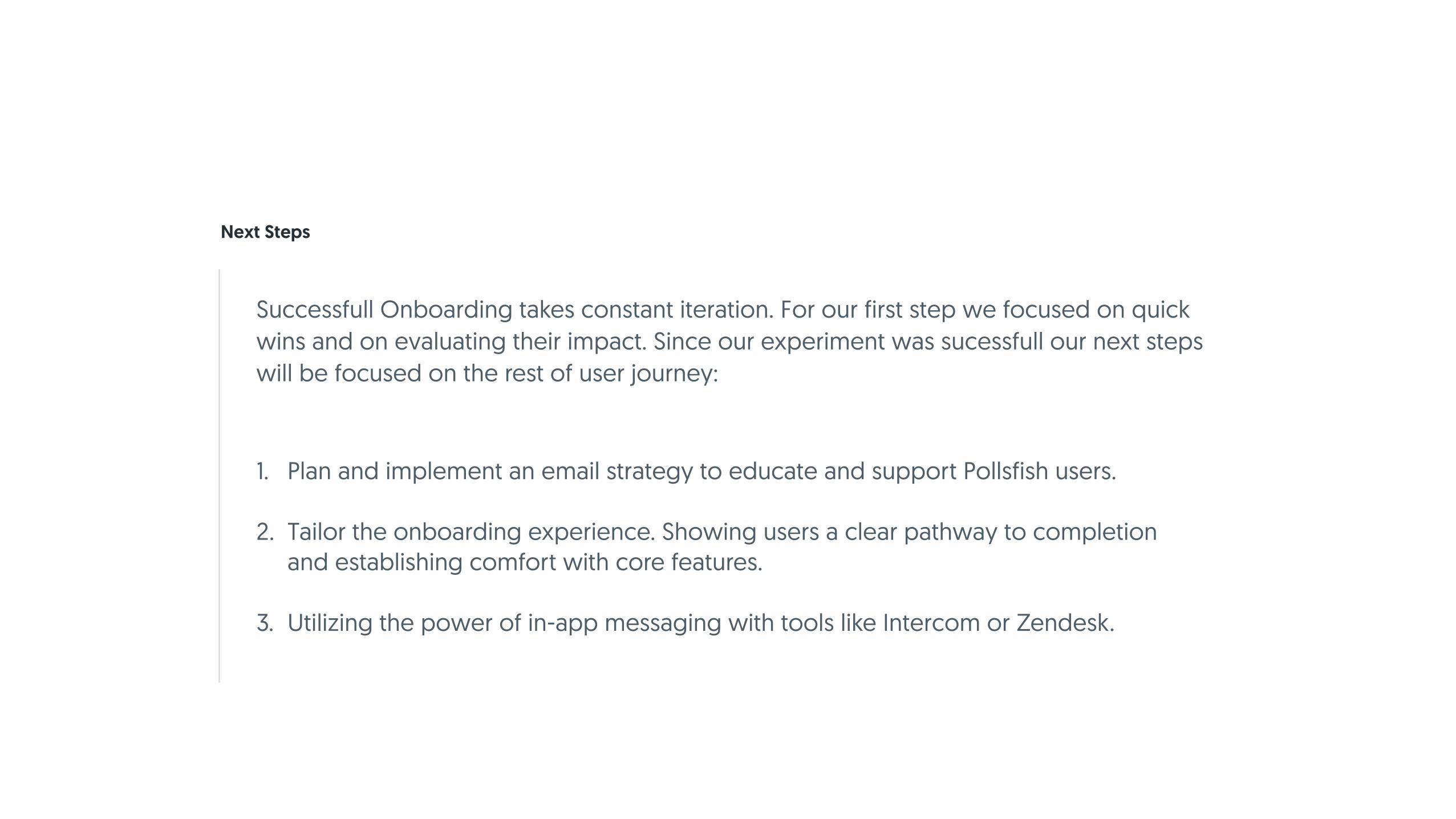
Successfull Onboarding takes constant iteration. For our first step we focused on quick wins and on evaluating their impact. Since our experiment was sucessfull our next steps will be focused on the rest of user journey:
Next Steps
Plan and implement an email strategy to educate and support Pollsfish users. 1.
Tailor the onboarding experience. Showing users a clear pathway to completion and establishing comfort with core features.
2.
Utilizing the power of in-app messaging with tools like Intercom or Zendesk.3.


![Ce [MoO ][MoO ]andCe[MoO : Two New Cerium Oxomolybdates, Each Exhibiting a Special ...znaturforsch.com/s66b/s66b0763.pdf · 2014. 12. 15. · Ce 2 [MoO 5][MoO 4]andCe 5 [MoO 4] 8:](https://static.fdocuments.us/doc/165x107/612bf67e5d9d87214d0e167f/ce-moo-moo-andcemoo-two-new-cerium-oxomolybdates-each-exhibiting-a-special.jpg)