
Microsoft visual identity guidelines - · PDF fileMicrosoft visual identity guidelines....
88
Microsoft visual identity guidelines August 2012 Microsoft confidential.
Transcript of Microsoft visual identity guidelines - · PDF fileMicrosoft visual identity guidelines....
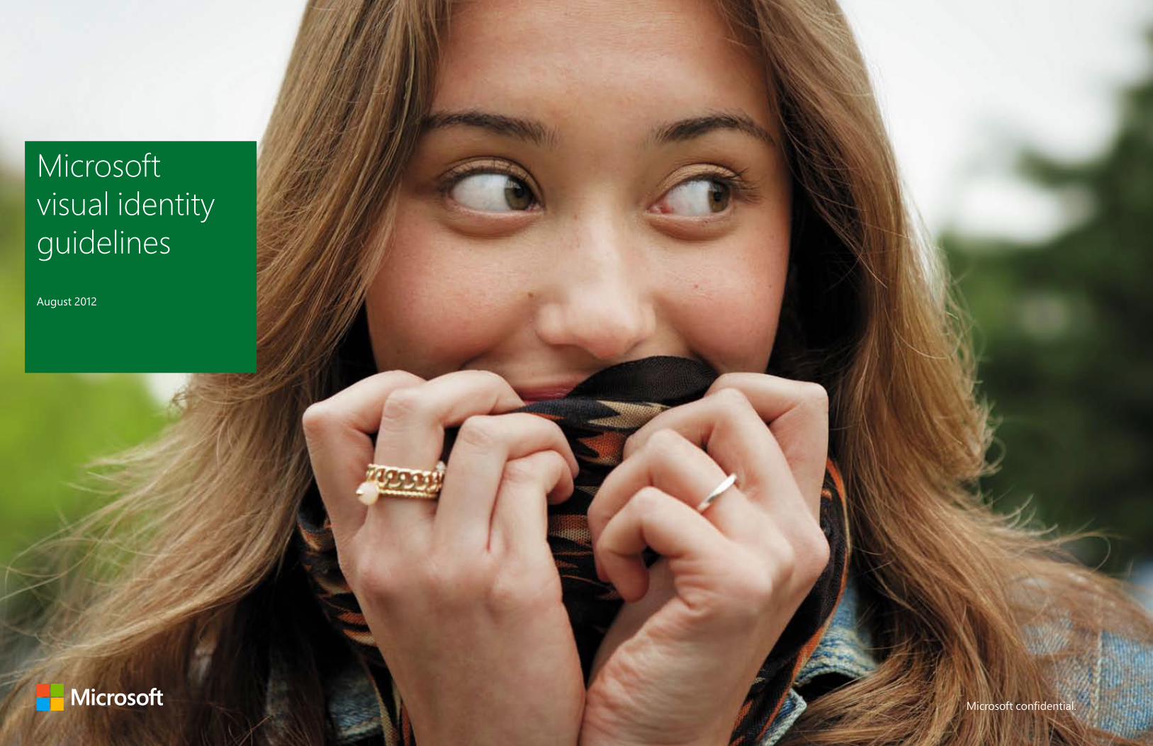
Microsoft visual identity guidelinesAugust 2012
Microsoft confidential.
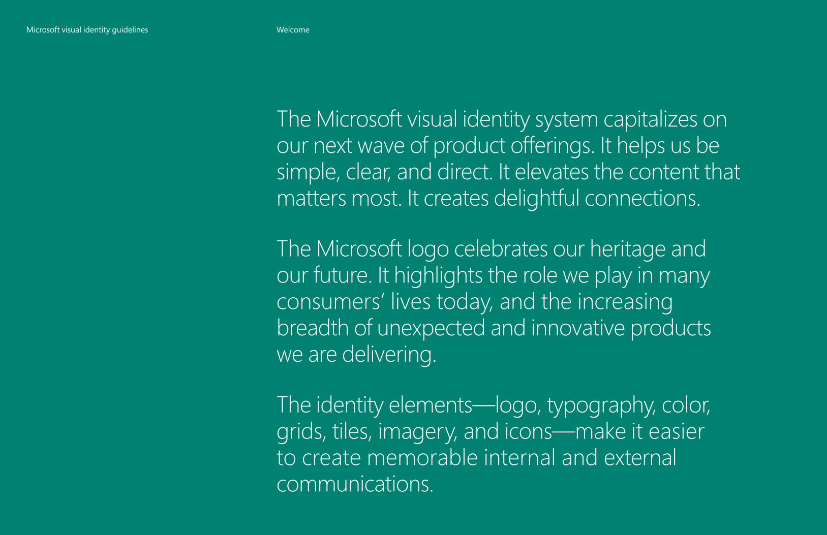
Welcome
The Microsoft visual identity system capitalizes on our next wave of product offerings. It helps us be simple, clear, and direct. It elevates the content that matters most. It creates delightful connections.
The Microsoft logo celebrates our heritage and our future. It highlights the role we play in many consumers’ lives today, and the increasing breadth of unexpected and innovative products we are delivering.
The identity elements—logo, typography, color, grids, tiles, imagery, and icons—make it easier to create memorable internal and external communications.
Microsoft visual identity guidelines
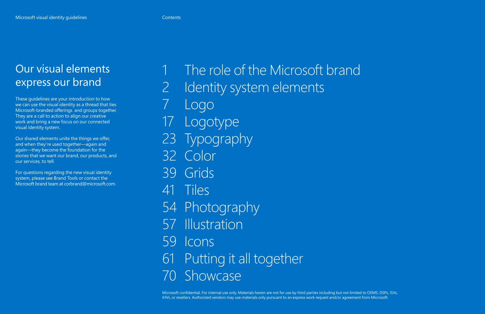
Contents
Our visual elements express our brandThese guidelines are your introduction to how we can use the visual identity as a thread that ties Microsoft-branded offerings and groups together. They are a call to action to align our creative work and bring a new focus on our connected visual identity system.
Our shared elements unite the things we offer, and when they’re used together—again and again—they become the foundation for the stories that we want our brand, our products, and our services, to tell.
For questions regarding the new visual identity system, please see Brand Tools or contact the Microsoft brand team at [email protected].
1 The role of the Microsoft brand2 Identity system elements7 Logo 17 Logotype23 Typography32 Color39 Grids41 Tiles54 Photography57 Illustration59 Icons61 Putting it all together70 ShowcaseMicrosoft confidential. For internal use only. Materials herein are not for use by third parties including but not limited to OEMS, DSPs, ISVs, IHVs, or resellers. Authorized vendors may use materials only pursuant to an express work request and/or agreement from Microsoft.
Microsoft visual identity guidelines
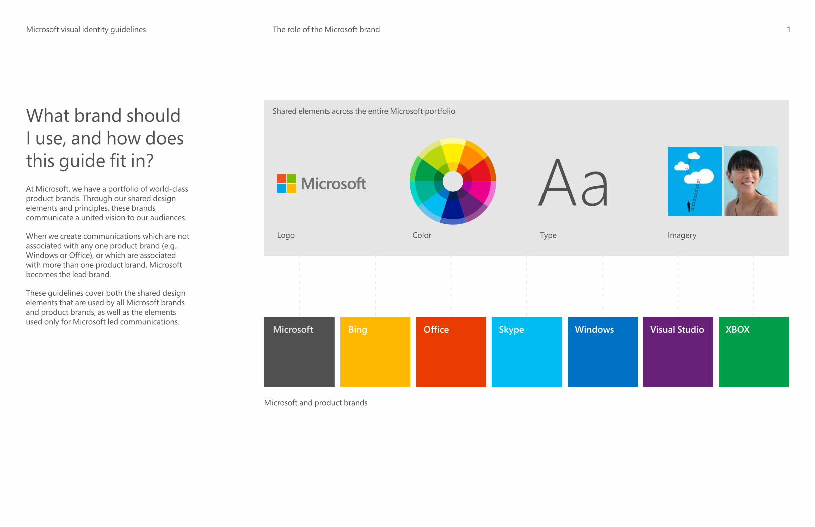
What brand should I use, and how does this guide fit in?At Microsoft, we have a portfolio of world-class product brands. Through our shared design elements and principles, these brands communicate a united vision to our audiences.
When we create communications which are not associated with any one product brand (e.g., Windows or Office), or which are associated with more than one product brand, Microsoft becomes the lead brand.
These guidelines cover both the shared design elements that are used by all Microsoft brands and product brands, as well as the elements used only for Microsoft led communications.
The role of the Microsoft brand
Shared elements across the entire Microsoft portfolio
Logo Color Type Imagery
Aa
Microsoft and product brands
Microsoft Bing Office Skype Windows Visual Studio XBOX
Microsoft visual identity guidelinesMicrosoft visual identity guidelines 1
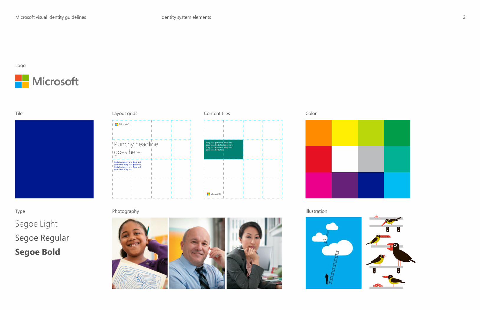
Logo
Tile Layout grids Content tiles Color
Type Photography Illustration
Segoe LightSegoe RegularSegoe Bold
Identity system elements
Punchy headline goes hereBody text goes here. Body text goes here. Body text goes here. Body text goes here. Body text goes here. Body text.
Body text goes here. Body text goes here. Body text goes here. Body text goes here. Body text goes here. Body text.
Microsoft visual identity guidelinesMicrosoft visual identity guidelines 2
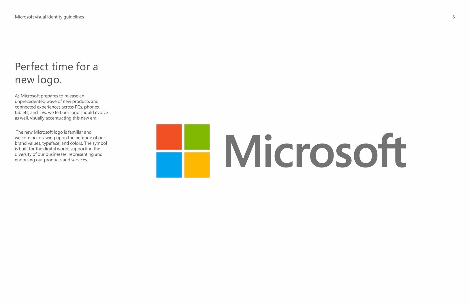
Perfect time for a new logo.As Microsoft prepares to release an unprecedented wave of new products and connected experiences across PCs, phones, tablets, and TVs, we felt our logo should evolve as well, visually accentuating this new era.
The new Microsoft logo is familiar and welcoming, drawing upon the heritage of our brand values, typeface, and colors. The symbol is built for the digital world, supporting the diversity of our businesses, representing and endorsing our products and services.
Microsoft visual identity guidelinesMicrosoft visual identity guidelines 3
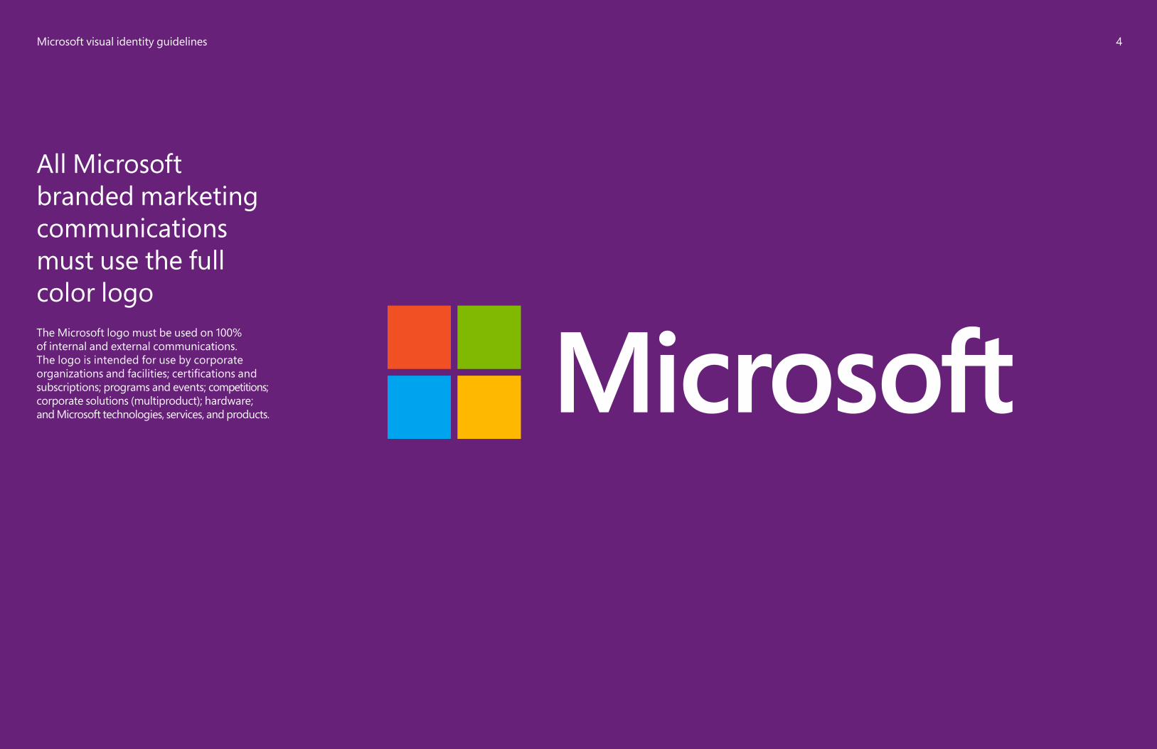
All Microsoft branded marketing communications must use the full color logoThe Microsoft logo must be used on 100% of internal and external communications. The logo is intended for use by corporate organizations and facilities; certifications and subscriptions; programs and events; competitions; corporate solutions (multiproduct); hardware; and Microsoft technologies, services, and products.
4Microsoft visual identity guidelines
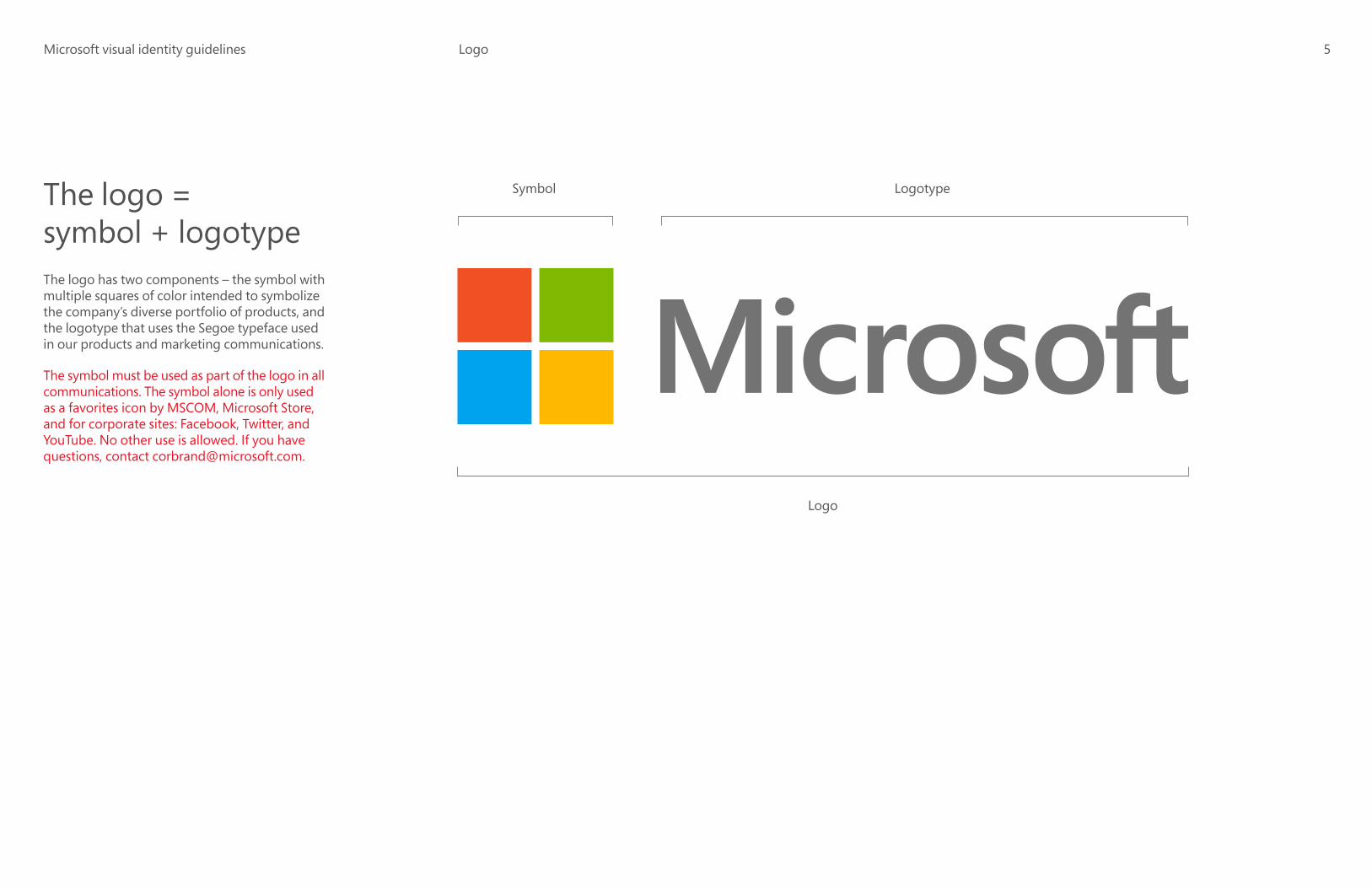
The logo = symbol + logotypeThe logo has two components – the symbol with multiple squares of color intended to symbolize the company’s diverse portfolio of products, and the logotype that uses the Segoe typeface used in our products and marketing communications.
The symbol must be used as part of the logo in all communications. The symbol alone is only used as a favorites icon by MSCOM, Microsoft Store, and for corporate sites: Facebook, Twitter, and YouTube. No other use is allowed. If you have questions, contact [email protected].
Symbol Logotype
Logo
LogoMicrosoft visual identity guidelinesMicrosoft visual identity guidelines 5
Logo
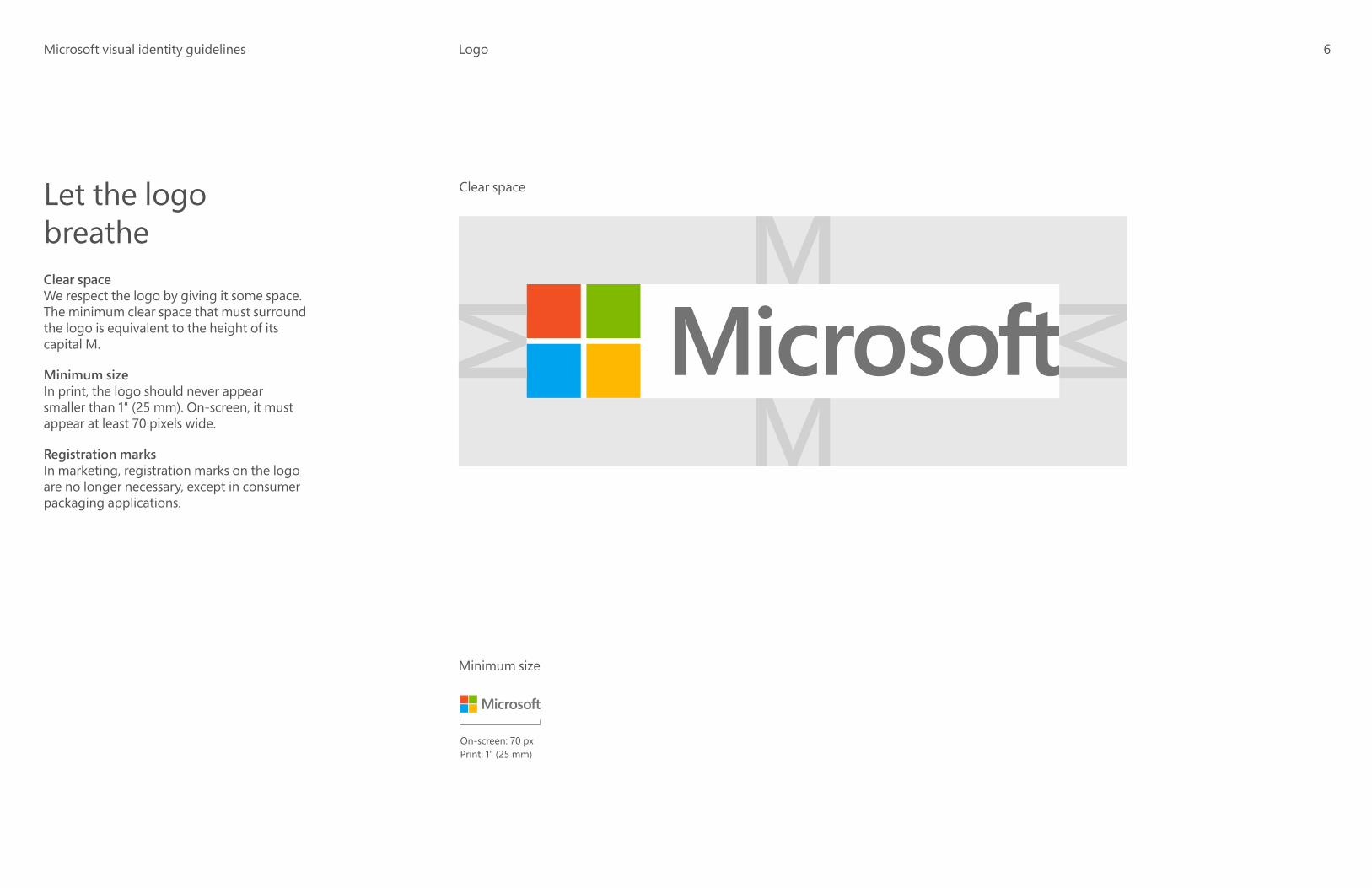
Clear space
On-screen: 70 pxPrint: 1" (25 mm)
Minimum size
Let the logo breatheClear spaceWe respect the logo by giving it some space. The minimum clear space that must surround the logo is equivalent to the height of its capital M.
Minimum sizeIn print, the logo should never appear smaller than 1" (25 mm). On-screen, it must appear at least 70 pixels wide.
Registration marksIn marketing, registration marks on the logo are no longer necessary, except in consumer packaging applications.
Microsoft visual identity guidelinesMicrosoft visual identity guidelines 6
Logo
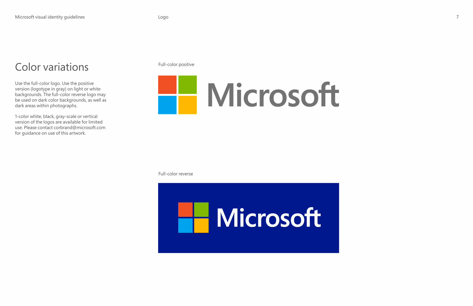
Color variationsUse the full-color logo. Use the positive version (logotype in gray) on light or white backgrounds. The full-color reverse logo may be used on dark color backgrounds, as well as dark areas within photographs.
1-color white, black, gray-scale or vertical version of the logos are available for limited use. Please contact [email protected] for guidance on use of this artwork.
Full-color positive
Full-color reverse
Microsoft visual identity guidelinesMicrosoft visual identity guidelines 7
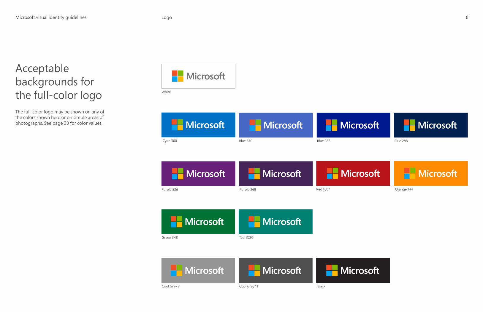
Acceptable backgrounds for the full-color logoThe full-color logo may be shown on any of the colors shown here or on simple areas of photographs. See page 33 for color values.
Logo
Blue 286 Blue 288Cyan 300
Cool Gray 7 Cool Gray 11 Black
White
Blue 660
Purple 269Purple 526
Green 348 Teal 3295
Orange 144Red 1807
Microsoft visual identity guidelinesMicrosoft visual identity guidelines 8
Logo
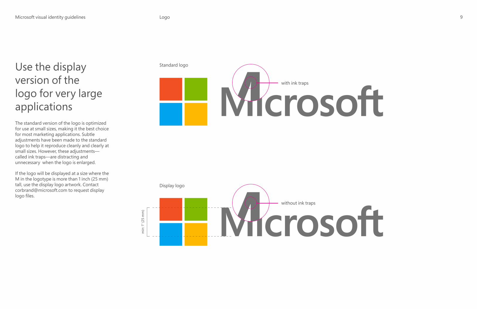
Use the display version of the logo for very large applicationsThe standard version of the logo is optimized for use at small sizes, making it the best choice for most marketing applications. Subtle adjustments have been made to the standard logo to help it reproduce cleanly and clearly at small sizes. However, these adjustments—called ink traps—are distracting and unnecessary when the logo is enlarged.
If the logo will be displayed at a size where the M in the logotype is more than 1 inch (25 mm) tall, use the display logo artwork. Contact [email protected] to request display logo files.
Standard logo
Display logo
with ink traps
without ink traps
min
: 1" (
25 m
m)
Microsoft visual identity guidelinesMicrosoft visual identity guidelines 9
Partner Program
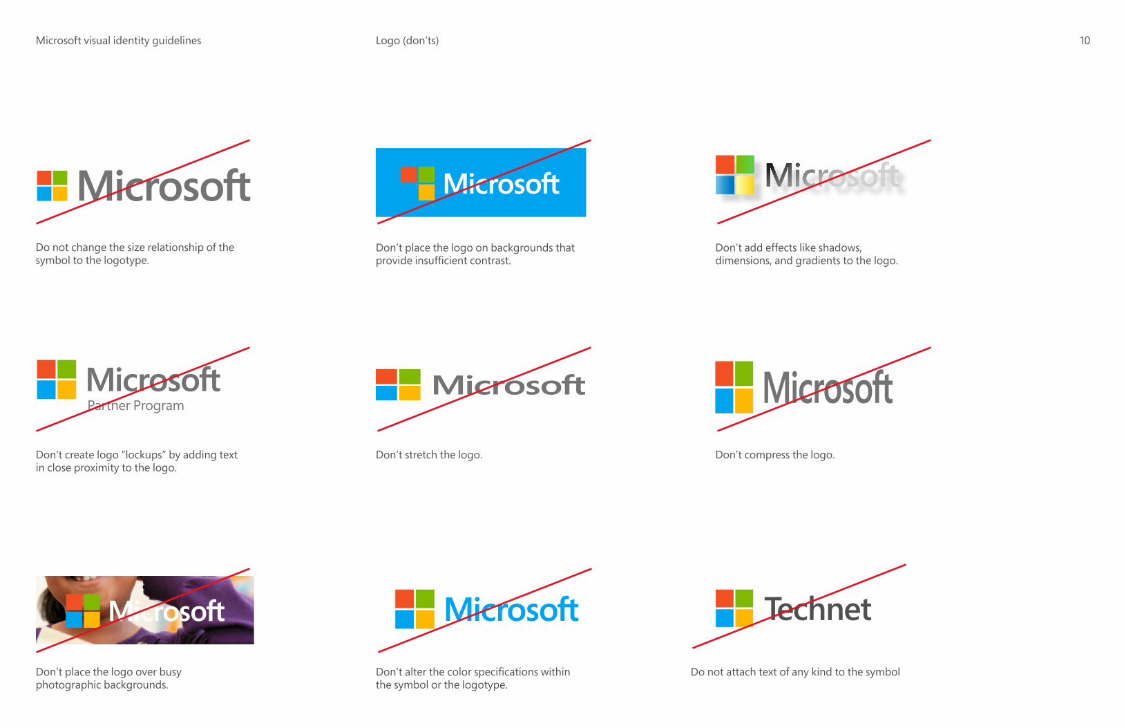
Logo (don’ts)
Don’t place the logo on backgrounds that provide insufficient contrast.
Don’t add effects like shadows, dimensions, and gradients to the logo.
Don’t create logo “lockups” by adding text in close proximity to the logo.
Don’t place the logo over busy photographic backgrounds.
Don’t alter the color specifications within the symbol or the logotype.
Don’t stretch the logo. Don’t compress the logo.
Do not change the size relationship of the symbol to the logotype.
Do not attach text of any kind to the symbol
Technet
Microsoft visual identity guidelinesMicrosoft visual identity guidelines 10
Logo (don’ts)
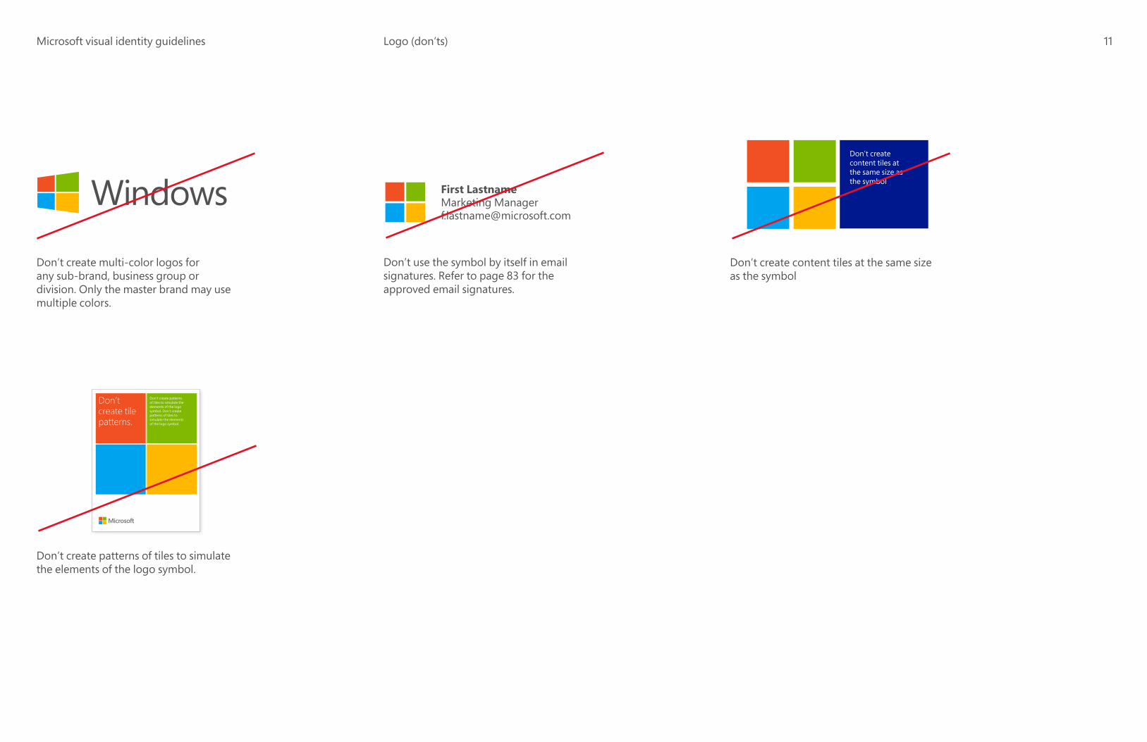
Don’t create tile patterns.
Don’t create patterns of tiles to simulate the elements of the logo symbol. Don’t create patterns of tiles to simulate the elements of the logo symbol.
First LastnameMarketing [email protected]
Don’t create patterns of tiles to simulate the elements of the logo symbol.
Don’t use the symbol by itself in email signatures. Refer to page 83 for the approved email signatures.
Don’t create multi-color logos for any sub-brand, business group or division. Only the master brand may use multiple colors.
Don’t create content tiles at the same size as the symbol
Don’t create content tiles at the same size as the symbol
Microsoft visual identity guidelinesMicrosoft visual identity guidelines 11
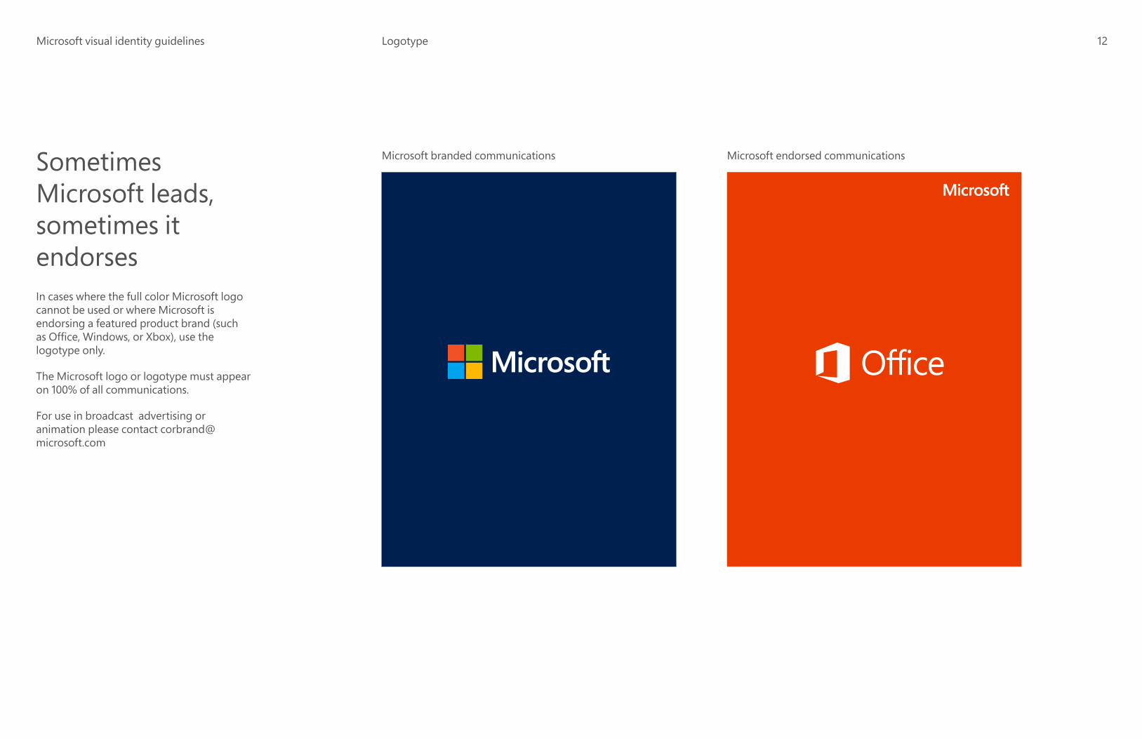
Microsoft branded communications Microsoft endorsed communicationsSometimes Microsoft leads, sometimes it endorsesIn cases where the full color Microsoft logo cannot be used or where Microsoft is endorsing a featured product brand (such as Office, Windows, or Xbox), use the logotype only.
The Microsoft logo or logotype must appear on 100% of all communications.
For use in broadcast advertising or animation please contact [email protected]
LogotypeMicrosoft visual identity guidelinesMicrosoft visual identity guidelines 12
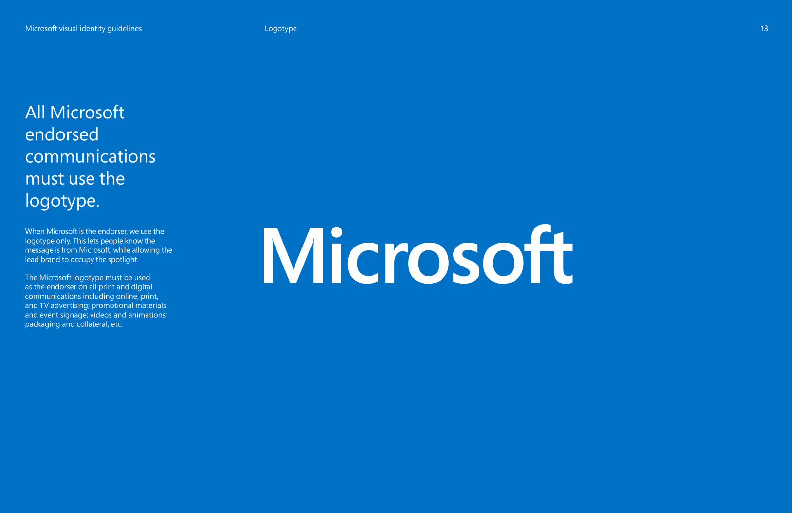
All Microsoft endorsed communicationsmust use thelogotype.When Microsoft is the endorser, we use the logotype only. This lets people know the message is from Microsoft, while allowing the lead brand to occupy the spotlight.
The Microsoft logotype must be used as the endorser on all print and digital communications including online, print, and TV advertising; promotional materials and event signage; videos and animations; packaging and collateral, etc.
Logotype 13Microsoft visual identity guidelines 13
Clear space
On-screen: 44 pxPrint: 0.7" (18 mm)
Minimum size
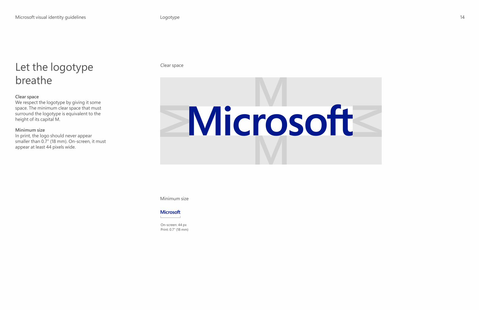
Let the logotype breatheClear spaceWe respect the logotype by giving it some space. The minimum clear space that must surround the logotype is equivalent to the height of its capital M.
Minimum sizeIn print, the logo should never appear smaller than 0.7” (18 mm). On-screen, it must appear at least 44 pixels wide.
LogotypeMicrosoft visual identity guidelinesMicrosoft visual identity guidelines 14
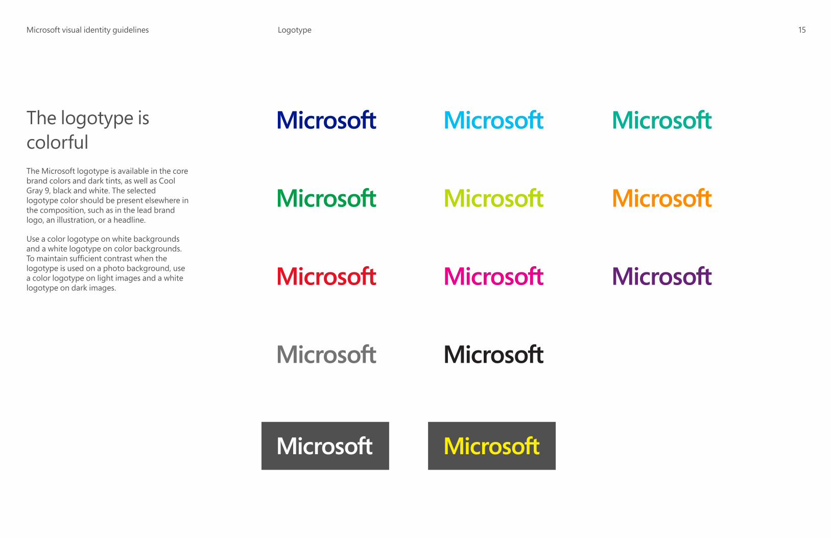
The logotype is colorfulThe Microsoft logotype is available in the core brand colors and dark tints, as well as Cool Gray 9, black and white. The selected logotype color should be present elsewhere in the composition, such as in the lead brand logo, an illustration, or a headline.
Use a color logotype on white backgrounds and a white logotype on color backgrounds. To maintain sufficient contrast when the logotype is used on a photo background, use a color logotype on light images and a white logotype on dark images.
LogotypeMicrosoft visual identity guidelines 15Microsoft visual identity guidelines
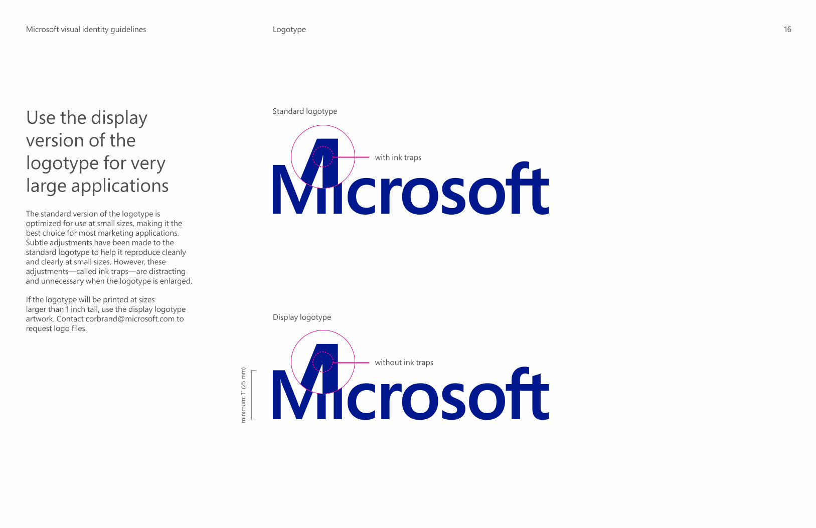
Use the display version of the logotype for very large applicationsThe standard version of the logotype is optimized for use at small sizes, making it the best choice for most marketing applications. Subtle adjustments have been made to the standard logotype to help it reproduce cleanly and clearly at small sizes. However, these adjustments—called ink traps—are distracting and unnecessary when the logotype is enlarged.
If the logotype will be printed at sizes larger than 1 inch tall, use the display logotype artwork. Contact [email protected] to request logo files.
Logotype
min
imum
: 1” (
25 m
m)
with ink traps
without ink traps
Standard logotype
Display logotype
Microsoft visual identity guidelines 16Microsoft visual identity guidelines
Logotype for Microsoft-endorsed communications
½ X maximum
½ X maximum
½ X maximum
X=cap height
X=cap height
X=cap height
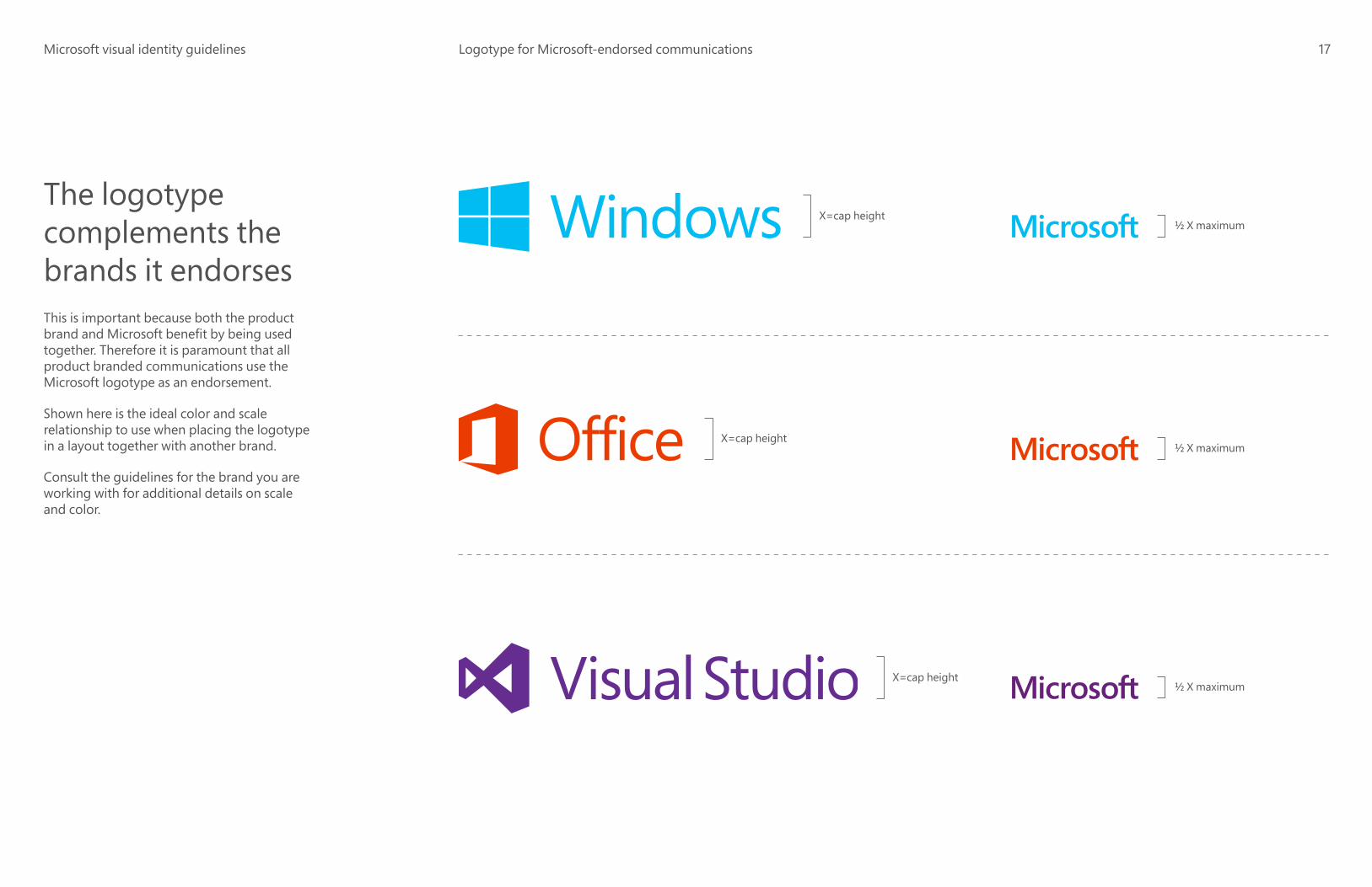
The logotype complements the brands it endorsesThis is important because both the product brand and Microsoft benefit by being used together. Therefore it is paramount that all product branded communications use the Microsoft logotype as an endorsement.
Shown here is the ideal color and scale relationship to use when placing the logotype in a layout together with another brand.
Consult the guidelines for the brand you are working with for additional details on scale and color.
Microsoft visual identity guidelinesMicrosoft visual identity guidelines 17
Logotype for Microsoft-endorsed communications
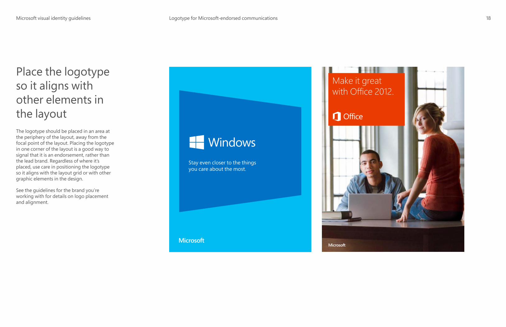
Place the logotype so it aligns with other elements in the layout The logotype should be placed in an area at the periphery of the layout, away from the focal point of the layout. Placing the logotype in one corner of the layout is a good way to signal that it is an endorsement, rather than the lead brand. Regardless of where it’s placed, use care in positioning the logotype so it aligns with the layout grid or with other graphic elements in the design.
See the guidelines for the brand you’re working with for details on logo placement and alignment.
Stay even closer to the things you care about the most.
Make it great with Office 2012.
Microsoft visual identity guidelinesMicrosoft visual identity guidelines 18
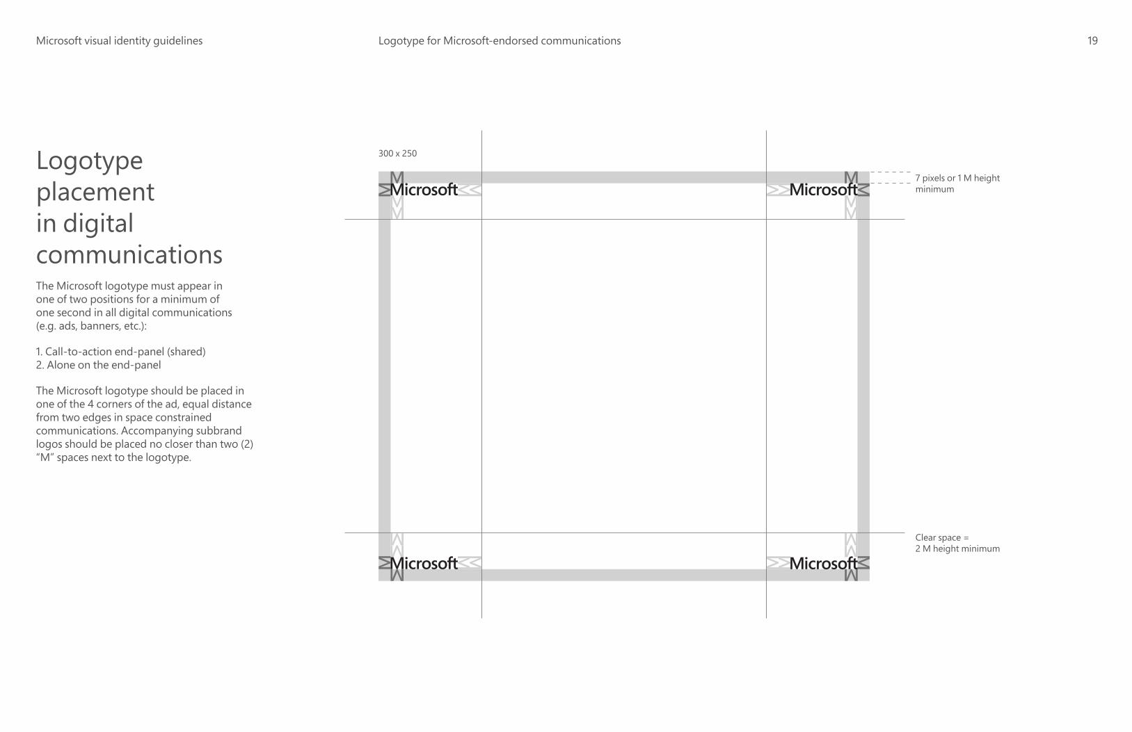
Logotype placement in digital communicationsThe Microsoft logotype must appear in one of two positions for a minimum of one second in all digital communications (e.g. ads, banners, etc.):
1. Call-to-action end-panel (shared) 2. Alone on the end-panel
The Microsoft logotype should be placed in one of the 4 corners of the ad, equal distance from two edges in space constrained communications. Accompanying subbrand logos should be placed no closer than two (2) “M” spaces next to the logotype.
Logotype for Microsoft-endorsed communications
300 x 250
7 pixels or 1 M height minimum
Clear space = 2 M height minimum
Microsoft visual identity guidelinesMicrosoft visual identity guidelines 19
Logotype for Microsoft-endorsed communications
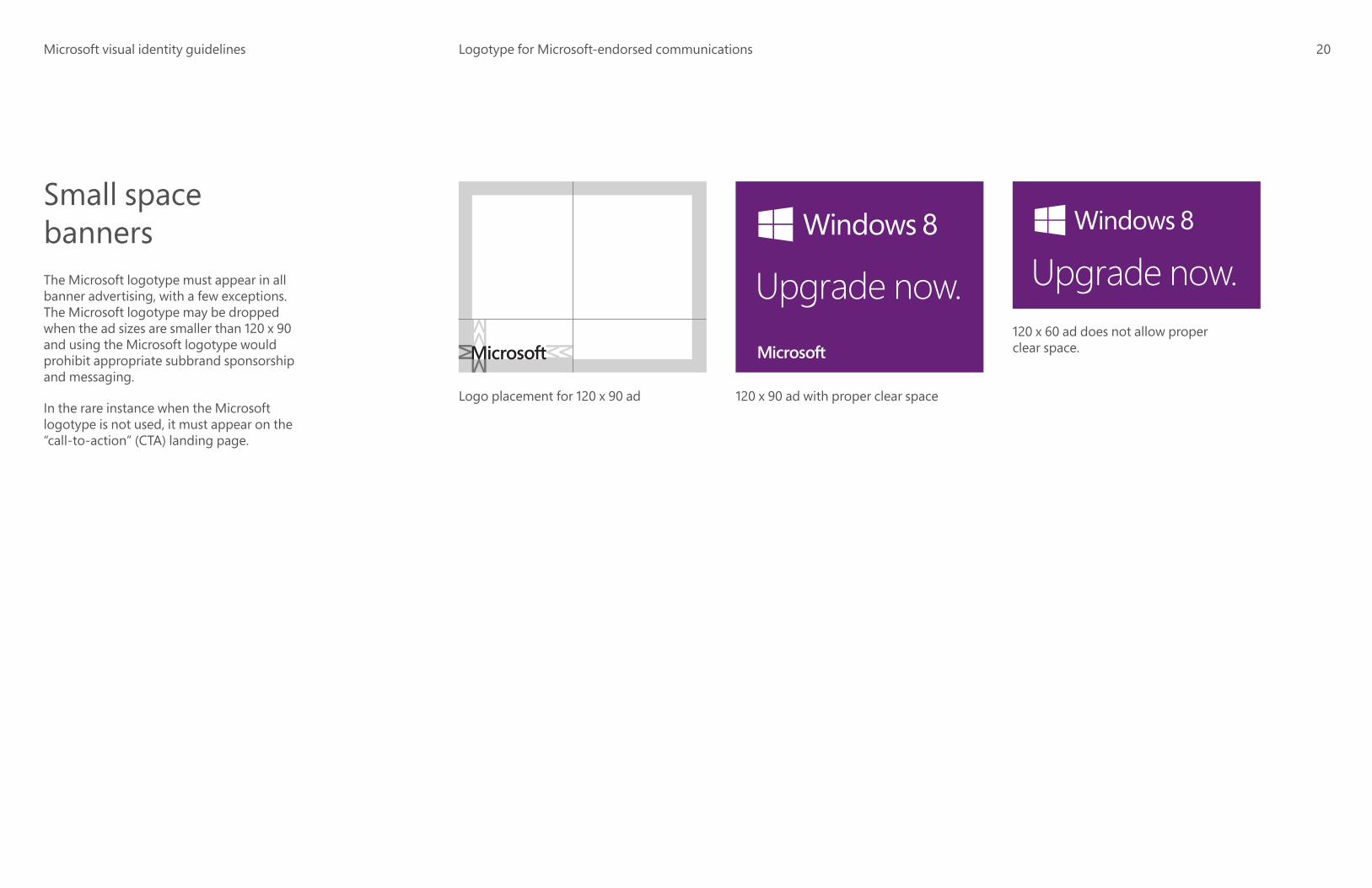
Logo placement for 120 x 90 ad 120 x 90 ad with proper clear space
120 x 60 ad does not allow proper clear space.
Small space banners The Microsoft logotype must appear in all banner advertising, with a few exceptions. The Microsoft logotype may be dropped when the ad sizes are smaller than 120 x 90 and using the Microsoft logotype would prohibit appropriate subbrand sponsorship and messaging.
In the rare instance when the Microsoft logotype is not used, it must appear on the “call-to-action” (CTA) landing page.
Upgrade now. Upgrade now.
Microsoft visual identity guidelinesMicrosoft visual identity guidelines 20
MicrosoftMake every minute count by getting more done every day—whether you’re in the office, at home, or on the go. With technology that helps you simplify tasks, connect with others, and make smarter decisions, you can get more done in less time.
Your business is our business.microsoft.com/business
Logotype (don’ts)
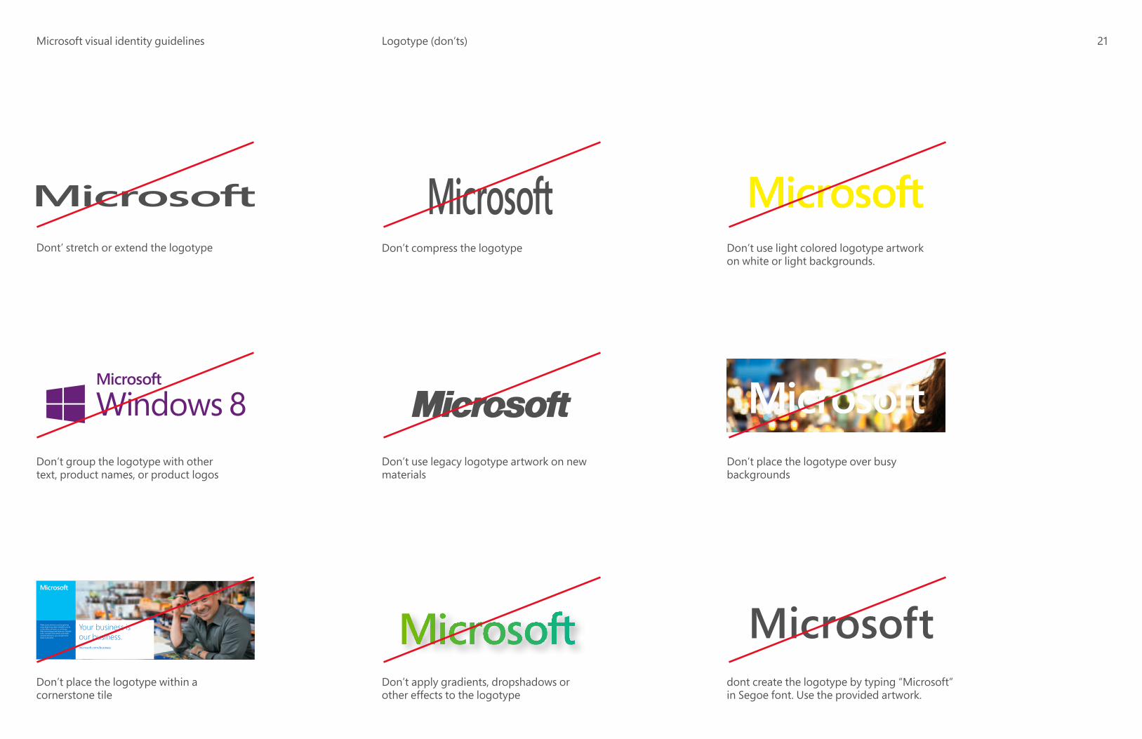
Don’t compress the logotype Don’t use light colored logotype artwork on white or light backgrounds.
Don’t group the logotype with other text, product names, or product logos
Don’t use legacy logotype artwork on new materials
Don’t place the logotype over busy backgrounds
Don’t place the logotype within a cornerstone tile
Don’t apply gradients, dropshadows or other effects to the logotype
dont create the logotype by typing “Microsoft” in Segoe font. Use the provided artwork.
Dont’ stretch or extend the logotype
Microsoft visual identity guidelinesMicrosoft visual identity guidelines 21
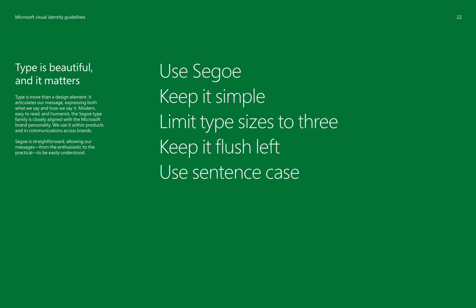
Use SegoeKeep it simpleLimit type sizes to three Keep it flush leftUse sentence case
Type is beautiful, and it mattersType is more than a design element. It articulates our message, expressing both what we say and how we say it. Modern, easy to read, and humanist, the Segoe type family is closely aligned with the Microsoft brand personality. We use it within products and in communications across brands.
Segoe is straightforward, allowing our messages—from the enthusiastic to the practical—to be easily understood.
22Microsoft visual identity guidelines
Typography
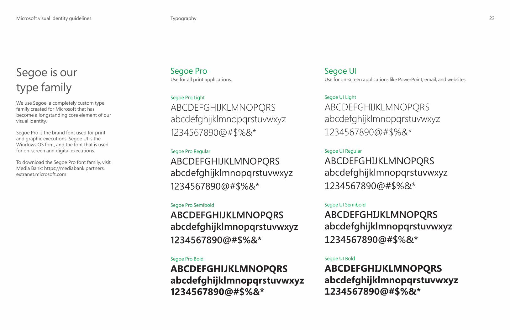
Segoe is our type familyWe use Segoe, a completely custom type family created for Microsoft that has become a longstanding core element of our visual identity.
Segoe Pro is the brand font used for print and graphic executions. Segoe UI is the Windows OS font, and the font that is used for on-screen and digital executions.
To download the Segoe Pro font family, visit Media Bank: https://mediabank.partners.extranet.microsoft.com
Segoe Pro Use for all print applications.
Segoe UI Use for on-screen applications like PowerPoint, email, and websites.
Segoe Pro Light
ABCDEFGHIJKLMNOPQRS abcdefghijklmnopqrstuvwxyz 1234567890@#$%&*
Segoe Pro Regular
ABCDEFGHIJKLMNOPQRS abcdefghijklmnopqrstuvwxyz 1234567890@#$%&*
Segoe Pro Semibold
ABCDEFGHIJKLMNOPQRS abcdefghijklmnopqrstuvwxyz 1234567890@#$%&*
Segoe Pro Bold
ABCDEFGHIJKLMNOPQRS abcdefghijklmnopqrstuvwxyz 1234567890@#$%&*
Segoe UI Light
ABCDEFGHIJKLMNOPQRS abcdefghijklmnopqrstuvwxyz 1234567890@#$%&*
Segoe UI Regular
ABCDEFGHIJKLMNOPQRS abcdefghijklmnopqrstuvwxyz 1234567890@#$%&*
Segoe UI Semibold
ABCDEFGHIJKLMNOPQRS abcdefghijklmnopqrstuvwxyz 1234567890@#$%&*
Segoe UI Bold
ABCDEFGHIJKLMNOPQRS abcdefghijklmnopqrstuvwxyz 1234567890@#$%&*
Microsoft visual identity guidelinesMicrosoft visual identity guidelines 23
Typography
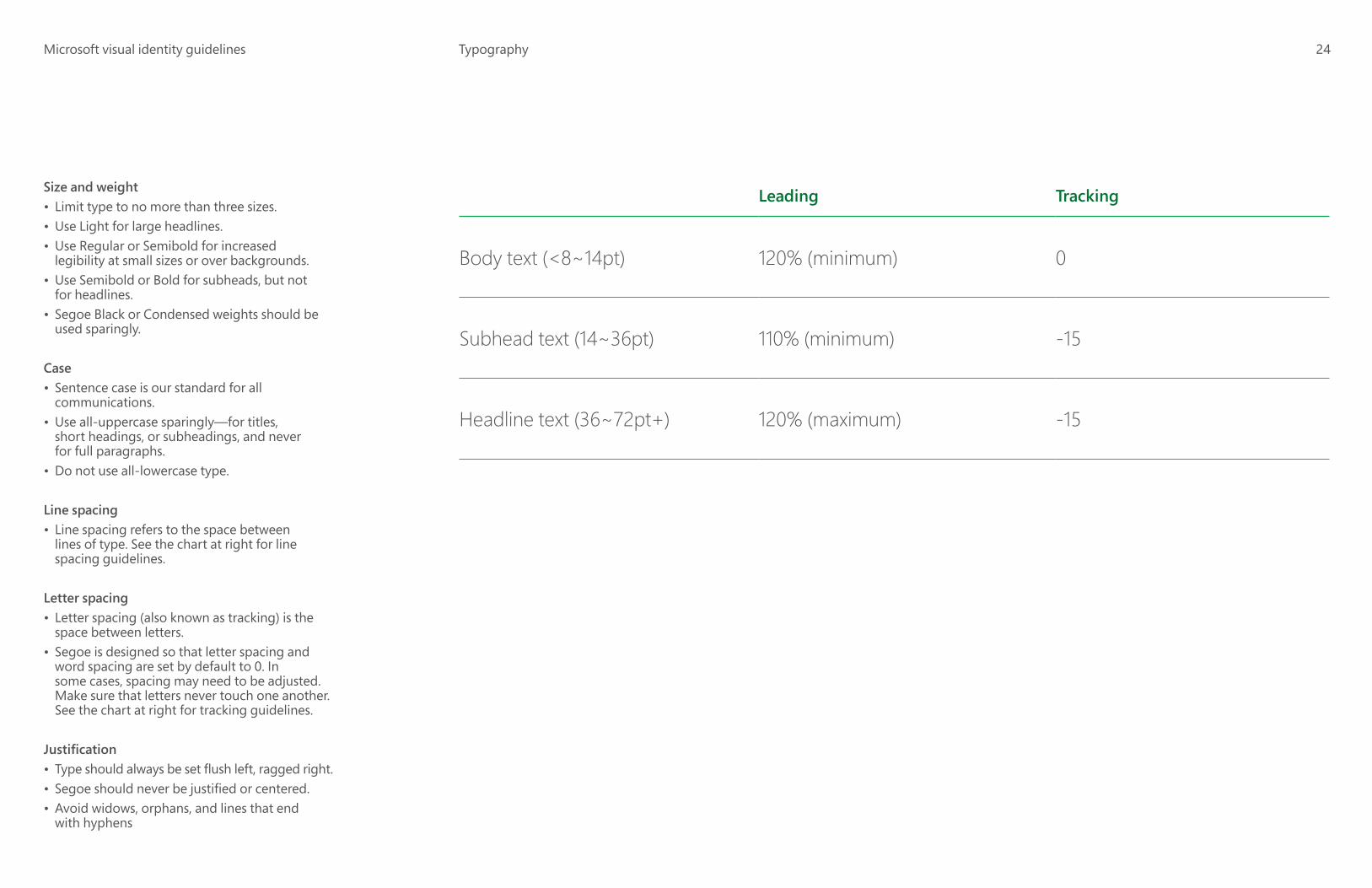
Size and weight• Limit type to no more than three sizes.• Use Light for large headlines.• Use Regular or Semibold for increased
legibility at small sizes or over backgrounds.• Use Semibold or Bold for subheads, but not
for headlines.• Segoe Black or Condensed weights should be
used sparingly.
Case• Sentence case is our standard for all
communications. • Use all-uppercase sparingly—for titles,
short headings, or subheadings, and never for full paragraphs.
• Do not use all-lowercase type.
Line spacing• Line spacing refers to the space between
lines of type. See the chart at right for line spacing guidelines.
Letter spacing• Letter spacing (also known as tracking) is the
space between letters.• Segoe is designed so that letter spacing and
word spacing are set by default to 0. In some cases, spacing may need to be adjusted. Make sure that letters never touch one another. See the chart at right for tracking guidelines.
Justification• Type should always be set flush left, ragged right.• Segoe should never be justified or centered.• Avoid widows, orphans, and lines that end
with hyphens
Leading Tracking
Body text (<8~14pt) 120% (minimum) 0
Subhead text (14~36pt) 110% (minimum) -15
Headline text (36~72pt+) 120% (maximum) -15
Microsoft visual identity guidelinesMicrosoft visual identity guidelines 24
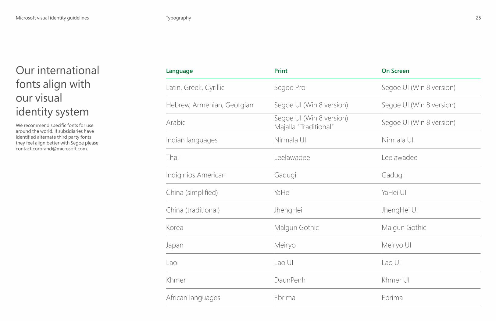
Language Print On Screen
Latin, Greek, Cyrillic Segoe Pro Segoe UI (Win 8 version)
Hebrew, Armenian, Georgian Segoe UI (Win 8 version) Segoe UI (Win 8 version)
Arabic Segoe UI (Win 8 version)Majalla “Traditional” Segoe UI (Win 8 version)
Indian languages Nirmala UI Nirmala UI
Thai Leelawadee Leelawadee
Indiginios American Gadugi Gadugi
China (simplified) YaHei YaHei UI
China (traditional) JhengHei JhengHei UI
Korea Malgun Gothic Malgun Gothic
Japan Meiryo Meiryo UI
Lao Lao UI Lao UI
Khmer DaunPenh Khmer UI
African languages Ebrima Ebrima
Our international fonts align with our visualidentity systemWe recommend specific fonts for use around the world. If subsidiaries have identified alternate third party fonts they feel align better with Segoe please contact [email protected].
TypographyMicrosoft visual identity guidelinesMicrosoft visual identity guidelines 25
Headline
Ga. Et volorio. Maiorit aut ad que eostrumque nos eos voluptat volupuri? Da volorrovid quam aut re dol upta tur, ipici duciae parciates mollupt atem eperorat faccus quiberuptam volurptati ut am erecus endio mod endam, ia porrum etur aut mod quas del inci cus ratquid dolor ipsum. Ga. Et volorio. Maiorit aut ad que eostrumque nos eos voluptat volupuri?
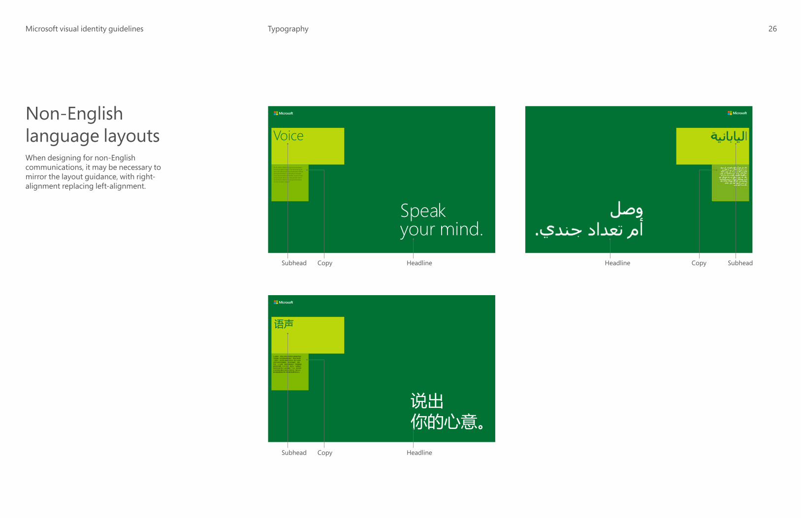
Speak your mind.
Subhead HeadlineCopy SubheadCopy
Non-English language layoutsWhen designing for non-English communications, it may be necessary to mirror the layout guidance, with right-alignment replacing left-alignment.
Typography
Voice
Subhead HeadlineCopy
Microsoft visual identity guidelinesMicrosoft visual identity guidelines 26
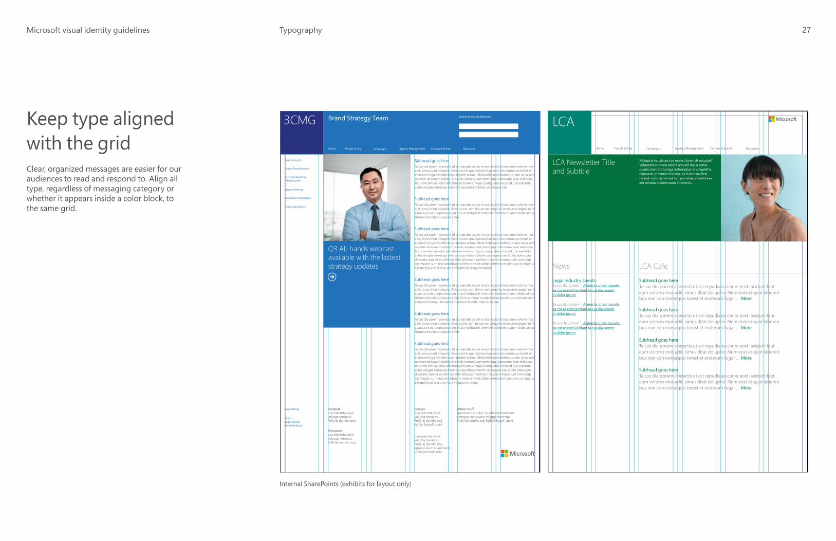
Keep type aligned with the gridClear, organized messages are easier for our audiences to read and respond to. Align all type, regardless of messaging category or whether it appears inside a color block, to the same grid.
Typography
LCA
Subhead goes hereTa cus dia porem acerectis ut aci repudis ea cor re eost lacidunt laut eum volorro mos adit, simus ditat doluptio. Nem eost et quat laboreri -bus non con nonsequo torest et enderum fugar … More
Subhead goes hereTa cus dia porem acerectis ut aci repudis ea cor re eost lacidunt laut eum volorro mos adit, simus ditat doluptio. Nem eost et quat laboreri -bus non con nonsequo torest et enderum fugar … More
Subhead goes hereTa cus dia porem acerectis ut aci repudis ea cor re eost lacidunt laut eum volorro mos adit, simus ditat doluptio. Nem eost et quat laboreri -bus non con nonsequo torest et enderum fugar … More
Subhead goes hereTa cus dia porem acerectis ut aci repudis ea cor re eost lacidunt laut eum volorro mos adit, simus ditat doluptio. Nem eost et quat laboreri -bus non con nonsequo torest et enderum fugar … More
LCA CafeNews
Legal Industry EventsTa cus dia porem | Acerectis ut aci repudis ea cor re eost lacidunt ta cus dia porem ut dolor ipsum
Ta cus dia porem | Acerectis ut aci repudis ea cor re eost lacidunt ta cus dia porem ut dolor ipsum
Ta cus dia porem | Acerectis ut aci repudis ea cor re eost lacidunt ta cus dia porem ut dolor ipsum
LCA Newsletter Title and Subtitle
Moluptat inusda arci de molest lorem di voluptur?Voluptam es ut eos estorit amuscil inulla conse quatio ommodi iumqui doloressitas re voluptdfas nimusam, omnimin ihiciatur, sit eicient invelest resendi num faci ut aut min por sitae providitiis ex ere solupta doloremquos in ommos.
Environments
I like itTags & NotesSend Feedback
Global Development
Labs and Building Infrastructure
Space Planning
Workplace Advantage
Client Satisfaction
Page Rating
Q3 All-hands webcastavailable with the lasteststrategy updates
Subhead goes hereTa cus dia porem acerectis ut aci repudis ea cor re eost lacidunt laut eum volorro mos adit, simus ditat doluptio. Nem eost et quat laboreribus non con nonsequo torest et enderum fuga. Nobitia taspit repeles alibus. Obita dolecupta doloratur sam ut ea velit optaten iatisquam nobitium esedis nonsequunt ommolup iciamusam, sum rest auta-tibus mo tem as volut oditationsed eum sumquo cumquatus exceped que esectota volut volupta tionsequi tempossi quundus dolorib usapisquos sae.
Subhead goes hereTa cus dia porem acerectis ut aci repudis ea cor re eost lacidunt laut eum volorro mos adit, simus ditat doluptio. Abor aut et, sam dolum eatumqui to expe velectasped mint assus as re eaturepratur arum et aut haribusciti ommodi dolorem quatem debit alique laboreiciist velestio ipsum dolor.
Subhead goes hereTa cus dia porem acerectis ut aci repudis ea cor re eost lacidunt laut eum volorro mos adit, simus ditat doluptio. Nem eost et quat laboreribus non con nonsequo torest et enderum fuga. Nobitia taspit repeles alibus. Obita dolecupta doloratur sam ut ea velit optaten iatisquam nobitium esedis nonsequunt ommolup iciamusam, sum rest auta-tibus mo tem as volut oditationsed eum sumquo cumquatus exceped que esectota volut volupta tionsequi tempossi quundus dolorib usapisquos sae. Obita dolecupta doloratur sam ut ea velit optaten iatisquam nobitium esedis nonsequunt ommolup iciamusam, sum rest autatibus mo tem as volut oditationsed eum sumquo cumquatus exceped que esectota volut volupta tionsequi tempossi.
Subhead goes hereTa cus dia porem acerectis ut aci repudis ea cor re eost lacidunt laut eum volorro mos adit, simus ditat doluptio. Abor aut et, sam dolum eatumqui to expe velectasped mint assus as re eaturepratur arum et aut haribusciti ommodi dolorem quatem debit alique laboreiciist velestio ipsum dolor. Eum sumquo cumquatus exceped que esectota volut volupta tionsequi tempossi quundus dolorib usapisquos sae.
Subhead goes hereTa cus dia porem acerectis ut aci repudis ea cor re eost lacidunt laut eum volorro mos adit, simus ditat doluptio. Abor aut et, sam dolum eatumqui to expe velectasped mint assus as re eaturepratur arum et aut haribusciti ommodi dolorem quatem debit alique laboreiciist velestio ipsum dolor.
Subhead goes hereTa cus dia porem acerectis ut aci repudis ea cor re eost lacidunt laut eum volorro mos adit, simus ditat doluptio. Nem eost et quat laboreribus non con nonsequo torest et enderum fuga. Nobitia taspit repeles alibus. Obita dolecupta doloratur sam ut ea velit optaten iatisquam nobitium esedis nonsequunt ommolup iciamusam, sum rest auta-tibus mo tem as volut oditationsed eum sumquo cumquatus exceped que esectota volut volupta tionsequi tempossi quundus dolorib usapisquos sae. Obita dolecupta doloratur sam ut ea velit optaten iatisquam nobitium esedis nonsequunt ommolup iciamusam, sum rest autatibus mo tem as volut oditationsed eum sumquo cumquatus exceped que esectota volut volupta tionsequ.
3CMG
Home People & Org Agency Management Comms & Events ResourcesCampaigns
Brand Strategy Team
Exceped que esectota volut volupta tionsequ.Folkj lkj dandkc ooij
Resoucessque esectota volut volupta tionsequ.Folkj lkj dandkc ooij
Groups que esectota volut volupta tionsequ.Folkj lkj dandkc ooijlkjflkjii lkayrd’ sdaid
que esectota volut volupta tionsequ.Folkj lkj dandkc ooijepratur arum et aut haribusciti ommodi dolo
About stuffque esectota volut lut oditationsed eum sumquo cumquatus volupta tionsequ.Folkj lkj dandkc ooij lkjflkjii lkayrd’ sdaid
Welcome Marcel Redmond
Home People & Org Agency Management Comms & Events ResourcesCampaigns
Internal SharePoints (exhibits for layout only)
Microsoft visual identity guidelinesMicrosoft visual identity guidelines 27
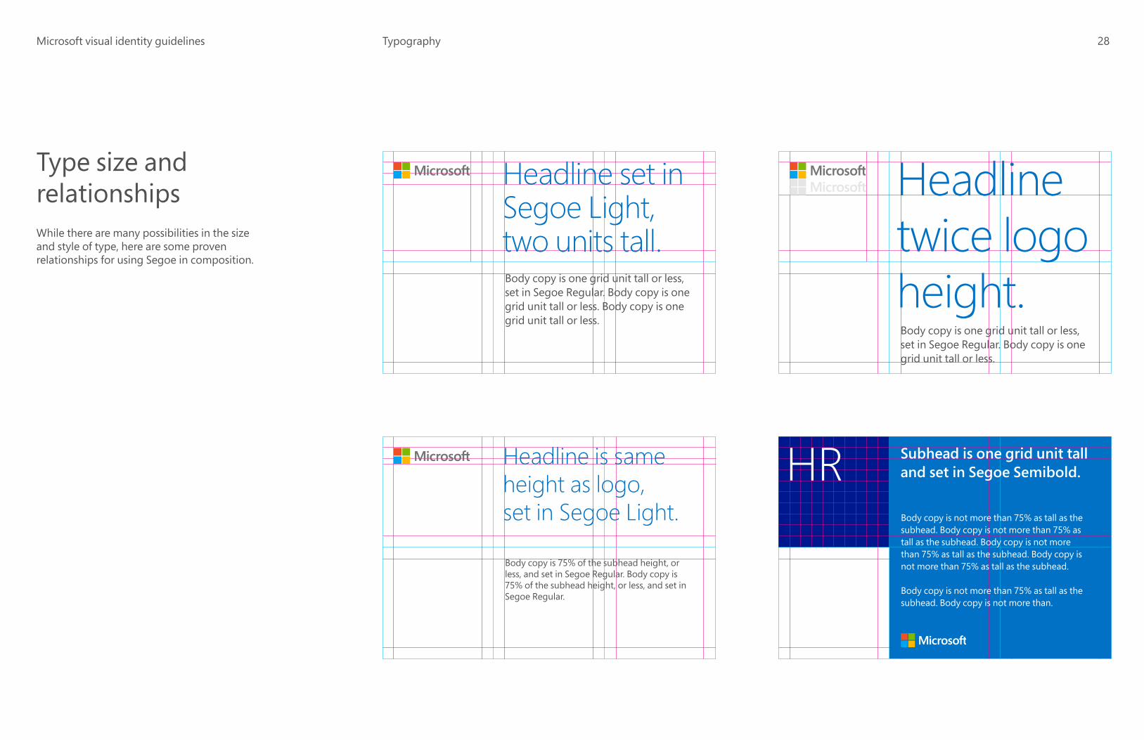
Type size and relationshipsWhile there are many possibilities in the size and style of type, here are some proven relationships for using Segoe in composition.
HRHeadline is same height as logo, set in Segoe Light.
Subhead is one grid unit tall and set in Segoe Semibold.
Headline set in Segoe Light, two units tall.
Headline twice logo height.Body copy is one grid unit tall or less,
set in Segoe Regular. Body copy is one grid unit tall or less. Body copy is one grid unit tall or less.
Body copy is 75% of the subhead height, or less, and set in Segoe Regular. Body copy is 75% of the subhead height, or less, and set in Segoe Regular.
Body copy is not more than 75% as tall as the subhead. Body copy is not more than 75% as tall as the subhead. Body copy is not more than 75% as tall as the subhead. Body copy is not more than 75% as tall as the subhead.
Body copy is not more than 75% as tall as the subhead. Body copy is not more than.
Body copy is one grid unit tall or less, set in Segoe Regular. Body copy is one grid unit tall or less.
TypographyMicrosoft visual identity guidelinesMicrosoft visual identity guidelines 28
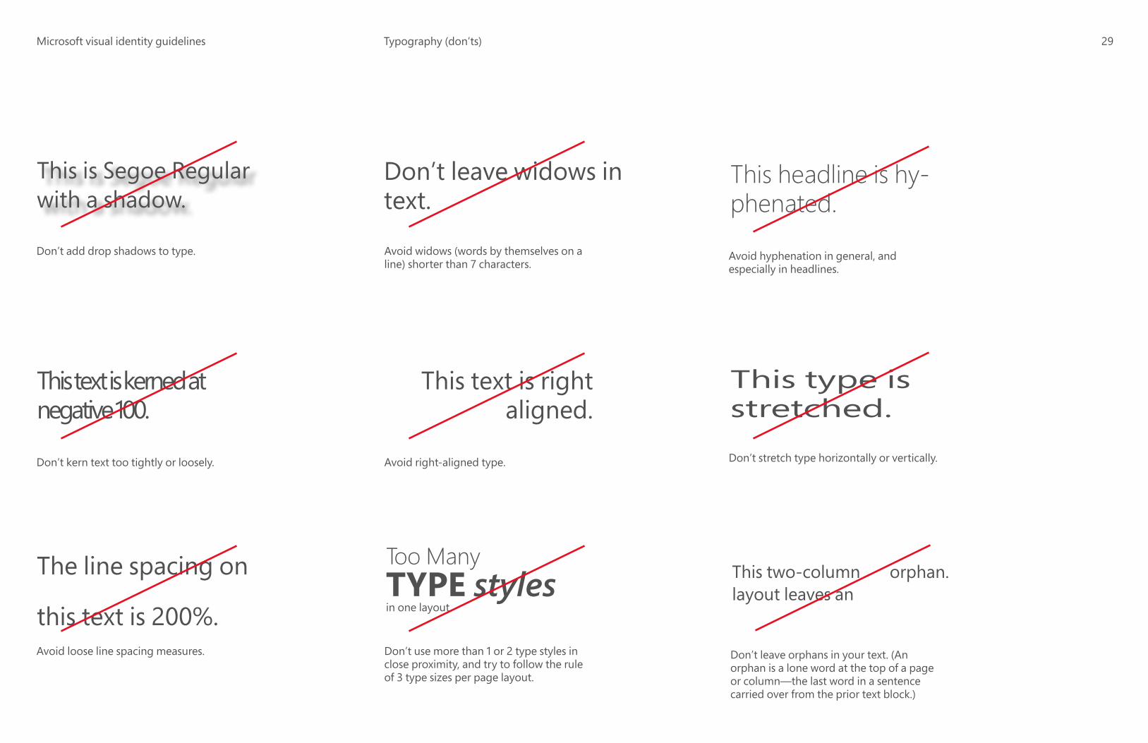
This is Segoe Regular with a shadow.
Don’t leave widows in text.
Too ManyTYPE stylesin one layout
This headline is hy-phenated.
This type is stretched.
This text is kerned at negative 100.
The line spacing on
this text is 200%.
This text is right aligned.
Typography (don’ts)
Don’t add drop shadows to type. Avoid widows (words by themselves on a line) shorter than 7 characters.
Don’t kern text too tightly or loosely. Avoid right-aligned type.
Avoid hyphenation in general, and especially in headlines.
Avoid loose line spacing measures. Don’t use more than 1 or 2 type styles in close proximity, and try to follow the rule of 3 type sizes per page layout.
Don’t stretch type horizontally or vertically.
This two-column layout leaves an
orphan.
Don’t leave orphans in your text. (An orphan is a lone word at the top of a page or column—the last word in a sentence carried over from the prior text block.)
Microsoft visual identity guidelinesMicrosoft visual identity guidelines 29
Typography (don’ts)
Sentis aut eos cor aut porro id exeridfugia dicatur? Quiae pliscid quod quis soluptatur modiscidem voluptaque por aboresequis nihicim comnis cus duammil ex et es aut et
Entil aut eos cor aut porro id exerupfugia dicatur? Kuiae pliscid quod quia doluptatur modiscidem volup taque aboresequis nihicim comnis cus quamil ex et es aut et
Open yourworld.
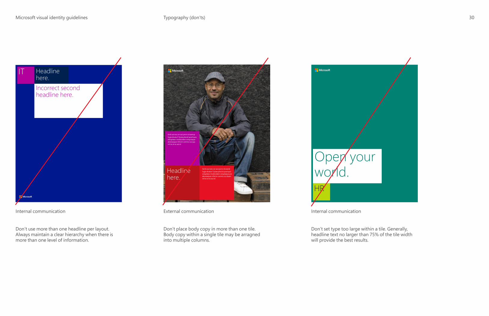
Don’t use more than one headline per layout. Always maintain a clear hierarchy when there is more than one level of information.
Don’t place body copy in more than one tile. Body copy within a single tile may be arragned into multiple columns.
Don’t set type too large within a tile. Generally, headline text no larger than 75% of the tile width will provide the best results.
Headline here.
Headline here.
Incorrect second headline here.
IT
HR
Internal communication Internal communicationExternal communication
Microsoft visual identity guidelinesMicrosoft visual identity guidelines 30
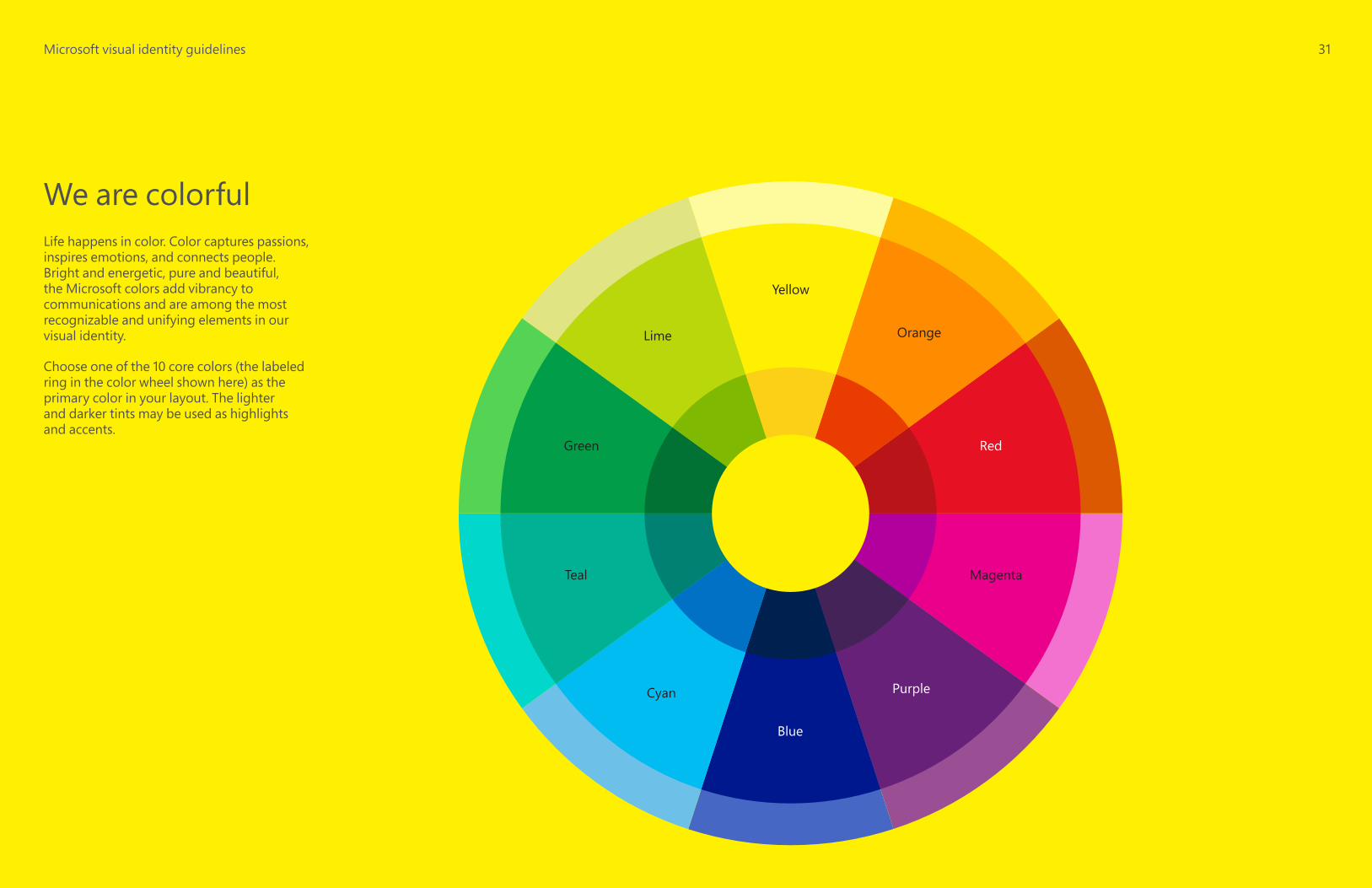
We are colorfulLife happens in color. Color captures passions, inspires emotions, and connects people. Bright and energetic, pure and beautiful, the Microsoft colors add vibrancy to communications and are among the most recognizable and unifying elements in our visual identity.
Choose one of the 10 core colors (the labeled ring in the color wheel shown here) as the primary color in your layout. The lighter and darker tints may be used as highlights and accents.
RedGreen
Lime
Yellow
Orange
MagentaTeal
Cyan Purple
Blue
Microsoft visual identity guidelinesMicrosoft visual identity guidelines 31
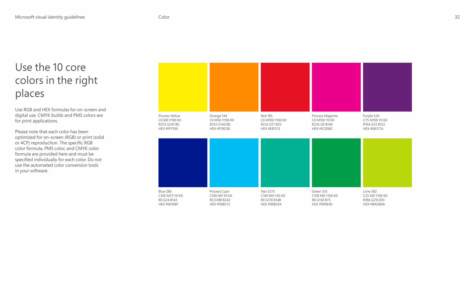
Use the 10 core colors in the right placesUse RGB and HEX formulas for on-screen and digital use. CMYK builds and PMS colors are for print applications.
Please note that each color has been optimized for on-screen (RGB) or print (solid or 4CP) reproduction. The specific RGB color formula, PMS color, and CMYK color formula are provided here and must be specified individually for each color. Do not use the automated color conversion tools in your software.
Color
Process YellowC0 M0 Y100 K0R255 G241 B0HEX #FFF100
Blue 286C100 M75 Y0 K0R0 G24 B143HEX #00188F
Orange 144C0 M50 Y100 K0R255 G140 B0HEX #FF8C00
Process CyanC100 M0 Y0 K0R0 G188 B242HEX #00BCF2
Red 185C0 M100 Y100 K0R232 G17 B35HEX #E81123
Teal 3275C100 M0 Y50 K0R0 G178 B148HEX #00B294
Process MagentaC0 M100 Y0 K0R236 G0 B140HEX #EC008C
Green 355C100 M0 Y100 K0R0 G158 B73HEX #009E49
Purple 526C75 M100 Y0 K0R104 G33 B122HEX #68217A
Lime 382C25 M0 Y100 K0R186 G216 B10HEX #BAD80A
Microsoft visual identity guidelinesMicrosoft visual identity guidelines 32

Our 10 core colors have lighter and darker tintsLayouts should utilize the 10 core colors most frequently. Our secondary palettes of lighter and darker tints provide a wide range of supporting colors.
White, gray, and black are additional supporting colors, used for copy. White may also be used as a background color.
These colors have been optimized for on-screen (RGB or HEX) or print (PMS or CMYK) use. Use the color specifications provided here. Do not use the automated color conversion tools in your software.
Color
Yellow 100C0 M0 Y50 K0R255 G252 B158HEX #FFFC9E
Orange 124C0 M25 Y100 K0R255 G185 B0HEX #FFB900
Red 1665C0 M85 Y100 K0R221 G89 B0HEX #DD5900
Magenta 218C0 M75 Y0 K0R244 G114 B208HEX #F472D0
Purple 258C60 M85 Y0 K0R155 G79 B150HEX #9B4F96
Yellow 116C0 M13 Y100 K0R252 G209 B22HEX #FCD116
Orange 166C0 M75 Y100 K0R235 G60 B0HEX #EB3C00
Red 1807C0 M100 Y100 K25R186 G20 B26HEX #BA141A
Magenta 241C25 M100 Y0 K0R180 G0 B158HEX #B4009E
Purple 269C75 M100 Y0 K25R68 G35 B89HEX #442359
Blue 660C80 M60 Y0 K0R70 G104 B197HEX #4668C5
Cyan 2985C60 M0 Y0 K0R109 G194 B233HEX #6DC2E9
Teal 325C65 M0 Y30 K0R0 G216 B204HEX #00D8CC
Green 7480C70 M0 Y85 K0R85 G212 B85HEX #55D455
Lime 586C15 M0 Y60 K0R226 G229 B132HEX #E2E584
Blue 288C100 M75 Y0 K25R0 G32 B80HEX #002050
Cyan 300C100 M50 Y0 K0R0 G114 B198HEX #0072C6
Teal 3295C100 M0 Y50 K25R0 G130 B114HEX #008272
Green 348C100 M0 Y100 K25R0 G114 B51HEX #007233
Lime 376C50 M0 Y100 K0R127 G186 B0HEX #7FBA00
BlackC0 M0 Y0 K0R0 G0 B0HEX #000000
Cool Gray 11C0 M0 Y0 K80R80 G80 B80HEX #505050
Cool Gray 7C0 M0 Y0 K50R150 G150 B150HEX #969696
Cool Gray 3C0 M0 Y0 K20R210 G210 B210HEX #D2D2D2
WhiteC0 M0 Y0 K0R255 G255 B255HEX #FFFFFF
Microsoft visual identity guidelinesMicrosoft visual identity guidelines 33
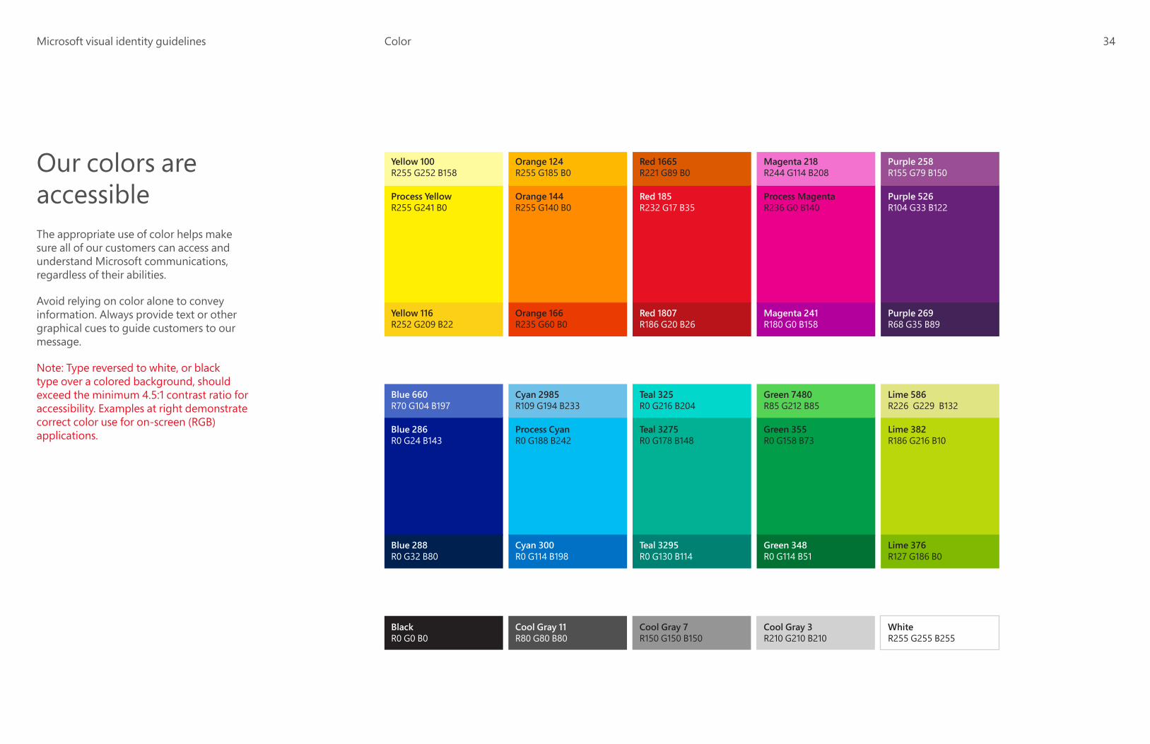
Our colors are accessibleThe appropriate use of color helps make sure all of our customers can access and understand Microsoft communications, regardless of their abilities.
Avoid relying on color alone to convey information. Always provide text or other graphical cues to guide customers to our message.
Note: Type reversed to white, or black type over a colored background, should exceed the minimum 4.5:1 contrast ratio for accessibility. Examples at right demonstrate correct color use for on-screen (RGB) applications.
Color
Teal 325R0 G216 B204
Teal 3275R0 G178 B148
Teal 3295R0 G130 B114
Red 1665R221 G89 B0
Red 185R232 G17 B35
Red 1807R186 G20 B26
Magenta 218R244 G114 B208
Process MagentaR236 G0 B140
Magenta 241R180 G0 B158
Green 7480R85 G212 B85
Green 355R0 G158 B73
Green 348R0 G114 B51
Cool Gray 3R210 G210 B210
Lime 586R226 G229 B132
Lime 382R186 G216 B10
Lime 376R127 G186 B0
WhiteR255 G255 B255
Purple 258R155 G79 B150
Purple 526R104 G33 B122
Purple 269R68 G35 B89
Yellow 100R255 G252 B158
Process YellowR255 G241 B0
Yellow 116R252 G209 B22
Blue 660R70 G104 B197
Blue 286R0 G24 B143
Blue 288R0 G32 B80
BlackR0 G0 B0
Cyan 2985R109 G194 B233
Process CyanR0 G188 B242
Cyan 300R0 G114 B198
Cool Gray 11R80 G80 B80
Orange 124R255 G185 B0
Orange 144R255 G140 B0
Orange 166R235 G60 B0
Cool Gray 7R150 G150 B150
Microsoft visual identity guidelinesMicrosoft visual identity guidelines 34
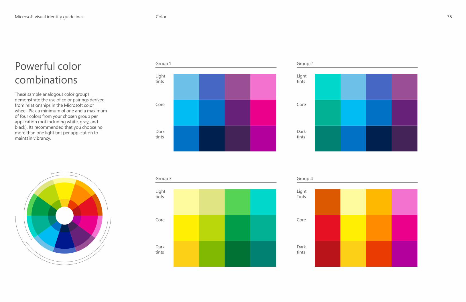
Powerful color combinationsThese sample analogous color groups demonstrate the use of color pairings derived from relationships in the Microsoft color wheel. Pick a minimum of one and a maximum of four colors from your chosen group per application (not including white, gray, and black). Its recommended that you choose no more than one light tint per application to maintain vibrancy.
Color
Group 1
Group 3
Group 2
Group 4
Light tints
Core
Dark tints
Light tints
Core
Dark tints
Light tints
Core
Dark tints
Light Tints
Core
Dark tints
Microsoft visual identity guidelinesMicrosoft visual identity guidelines 35
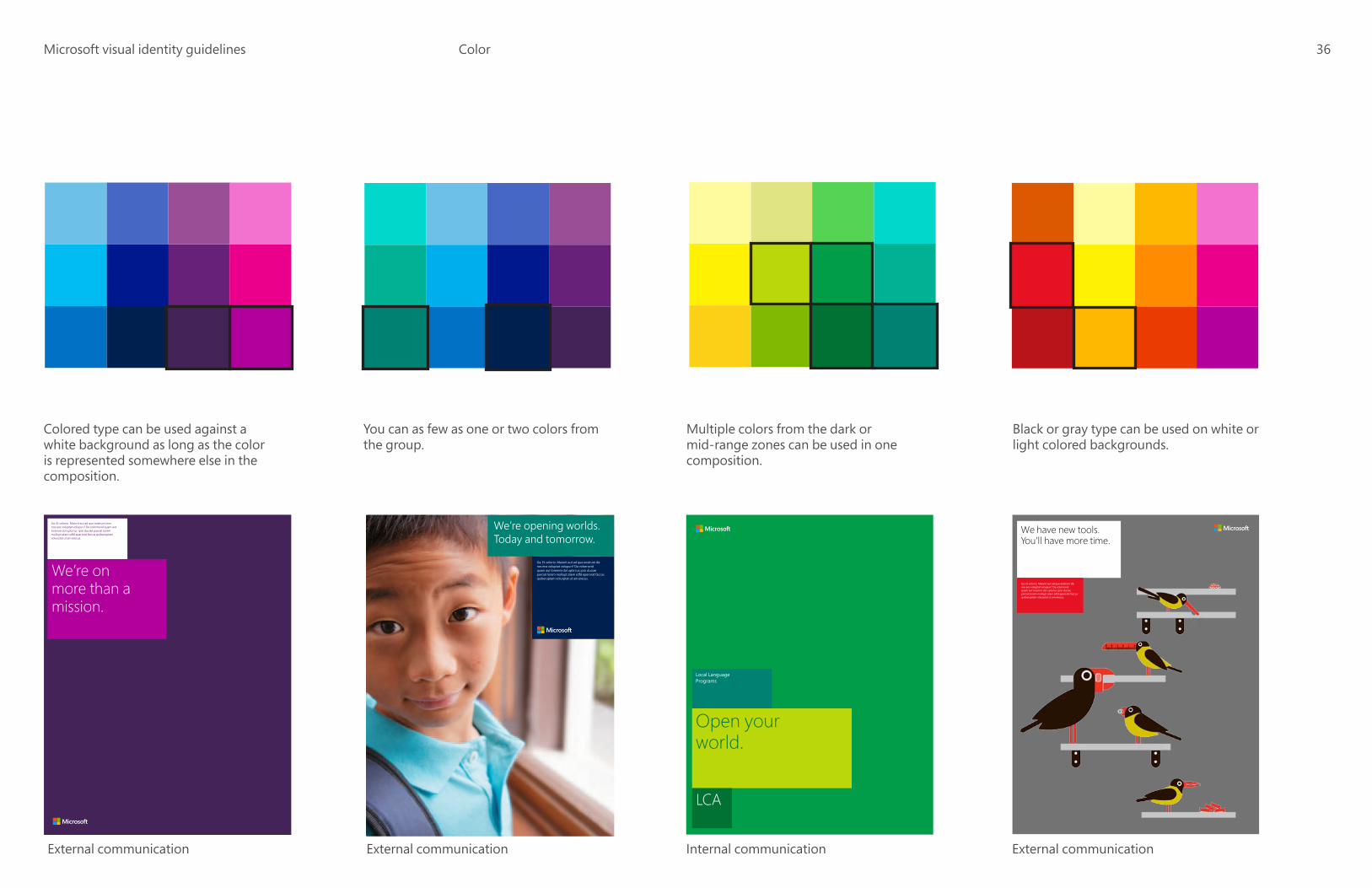
Colored type can be used against a white background as long as the color is represented somewhere else in the composition.
You can as few as one or two colors from the group.
Multiple colors from the dark or mid-range zones can be used in one composition.
Black or gray type can be used on white or light colored backgrounds.
Color
Ga. Et volorio. Maiorit aut ad que eostrum dis nos eos voluptat volupuri? Da volorrovid quam aut loremre dol upta tur, ipici duciae parciat lorem mollupt atem sdfd eperorat faccus quiberuptam volurptat ut am erecus.
Local LanguagePrograms
Open yourworld.
Ga. Et volorio. Maiorit aut ad que eostrum tism nos eos voluptat volupuri? Da volorrovid quam aut loremre dol upta tur, ipici duciae parciat lorem mollupt atem sdfd eperorat faccus quiberuptam volurptat ut am erecus.
We’re on more than a mission.
LCA
We have new tools.You’ll have more time.
Ga. Et volorio. Maiorit aut ad que eostrum dis nos eos voluptat volupuri? Da volorrovid quam aut loremre dol upta tur, ipici duciae parciat lorem mollupt atem sdfd eperorat faccus quiberuptam volurptat ut am erecus.
External communication External communication External communicationInternal communication
We’re opening worlds.Today and tomorrow.
Microsoft visual identity guidelinesMicrosoft visual identity guidelines 36
Color (don’ts)
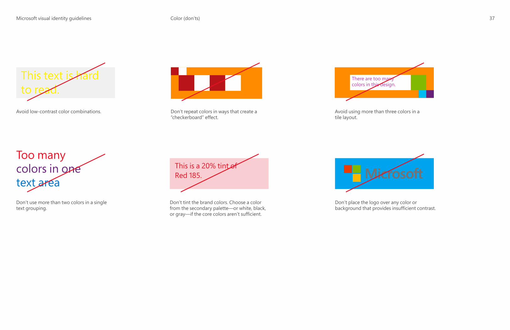
Avoid low-contrast color combinations.
Don’t tint the brand colors. Choose a color from the secondary palette—or white, black, or gray—if the core colors aren’t sufficient.
Don’t use more than two colors in a single text grouping.
Avoid using more than three colors in a tile layout.
This text is hard to read.
Too manycolors in one text area
There are too many colors in this design.
Don’t place the logo over any color or background that provides insufficient contrast.
Don’t repeat colors in ways that create a “checkerboard” effect.
This is a 20% tint of Red 185.
Microsoft visual identity guidelinesMicrosoft visual identity guidelines 37
The underlying grid brings structure to simplicity. It creates the spaces where we tell our stories.
Grids: invisible but criticalEven when you can’t see it, the grid is the most important organizational tool in the visual identity. It’s what every layout is built on. It helps deliver our messages in a clean, simple, and direct way. It makes our communications feel like they come from Microsoft. Starting with a well-defined grid will give your design a solid foundation.
38Microsoft visual identity guidelines
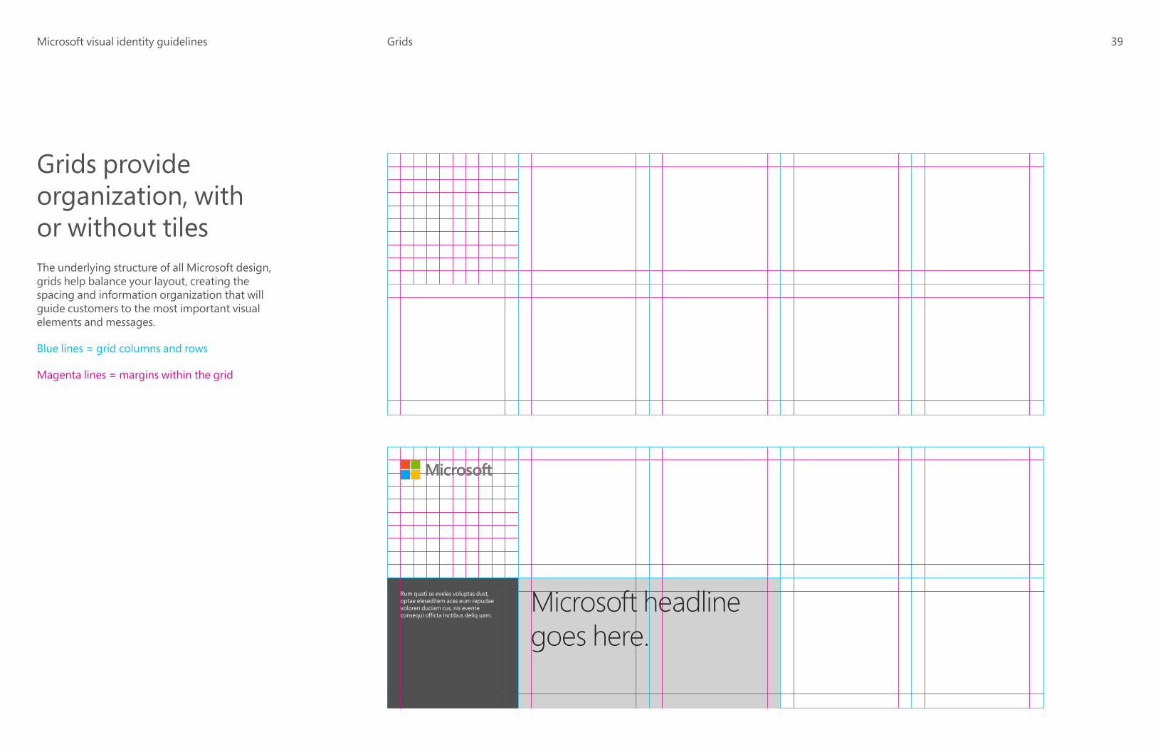
Grids
Grids provide organization, with or without tiles The underlying structure of all Microsoft design, grids help balance your layout, creating the spacing and information organization that will guide customers to the most important visual elements and messages.
Blue lines = grid columns and rows
Magenta lines = margins within the grid
Rum quati se eveles voluptas dust, optae eleseditem aces eum repudae voloren duciam cus, nis evente consequi officta inctibus deliq uam.
Microsoft headline goes here.
Microsoft visual identity guidelinesMicrosoft visual identity guidelines 39
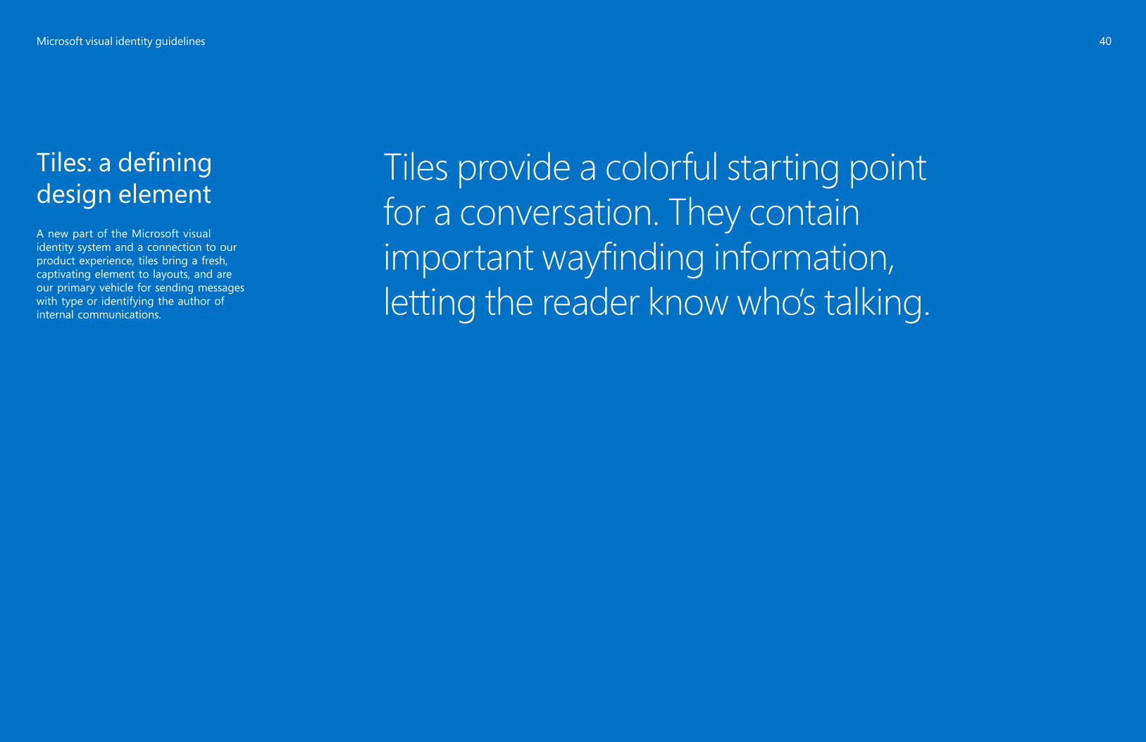
Tiles provide a colorful starting point for a conversation. They contain important wayfinding information, letting the reader know who’s talking.
Tiles: a defining design elementA new part of the Microsoft visual identity system and a connection to our product experience, tiles bring a fresh, captivating element to layouts, and are our primary vehicle for sending messages with type or identifying the author of internal communications.
40Microsoft visual identity guidelines
Punchy headline goes here.
Real Estate and Facilities
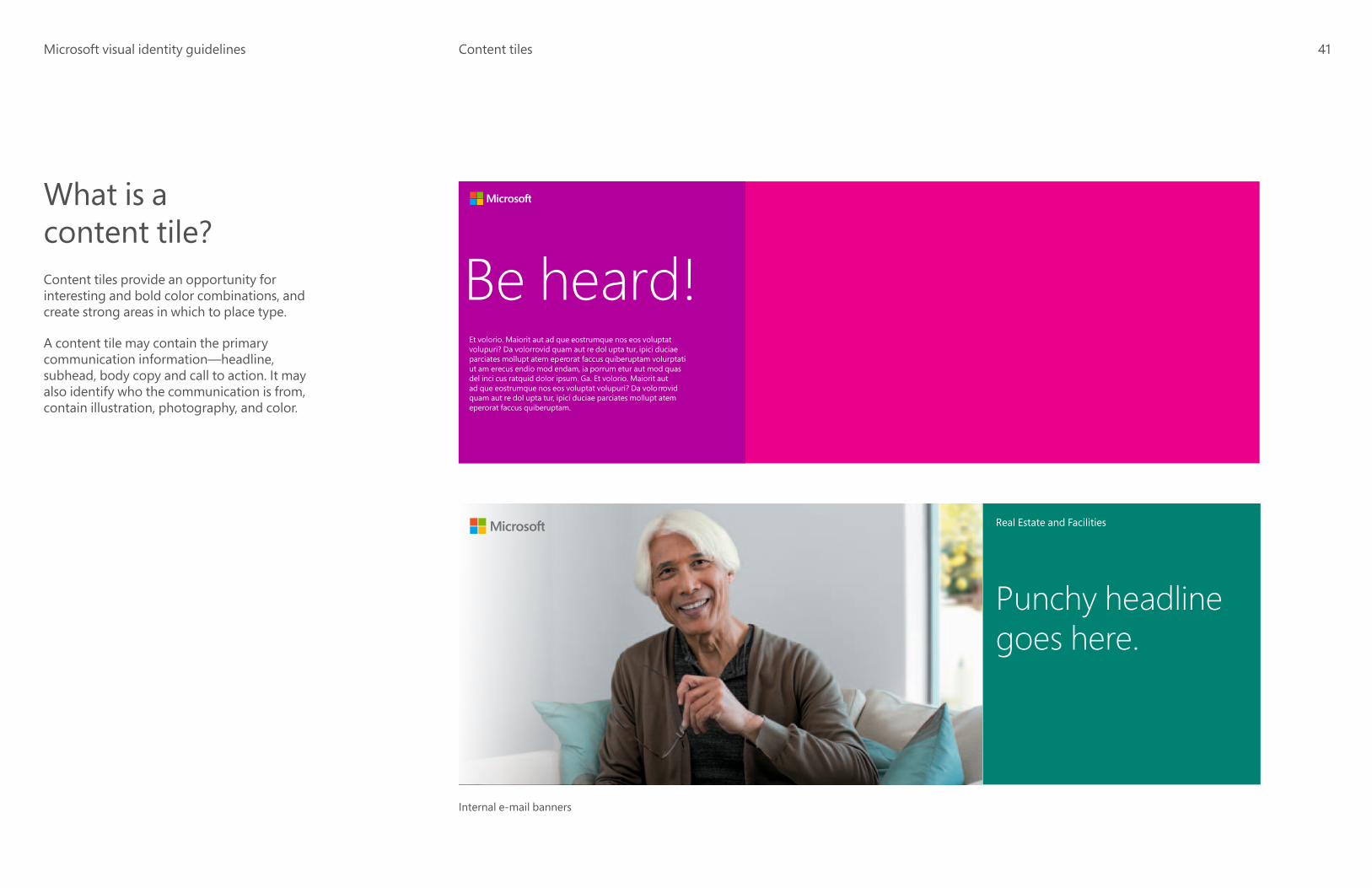
What is a content tile? Content tiles provide an opportunity for interesting and bold color combinations, and create strong areas in which to place type.
A content tile may contain the primary communication information—headline, subhead, body copy and call to action. It may also identify who the communication is from, contain illustration, photography, and color.
Content tiles
Be heard!Et volorio. Maiorit aut ad que eostrumque nos eos voluptat
volupuri? Da volorrovid quam aut re dol upta tur, ipici duciae parciates mollupt atem eperorat faccus quiberuptam volurptati ut am erecus endio mod endam, ia porrum etur aut mod quas
del inci cus ratquid dolor ipsum. Ga. Et volorio. Maiorit aut
ad que eostrumque nos eos voluptat volupuri? Da volorrovid
quam aut re dol upta tur, ipici duciae parciates mollupt atem eperorat faccus quiberuptam.
Internal e-mail banners
Microsoft visual identity guidelinesMicrosoft visual identity guidelines 41
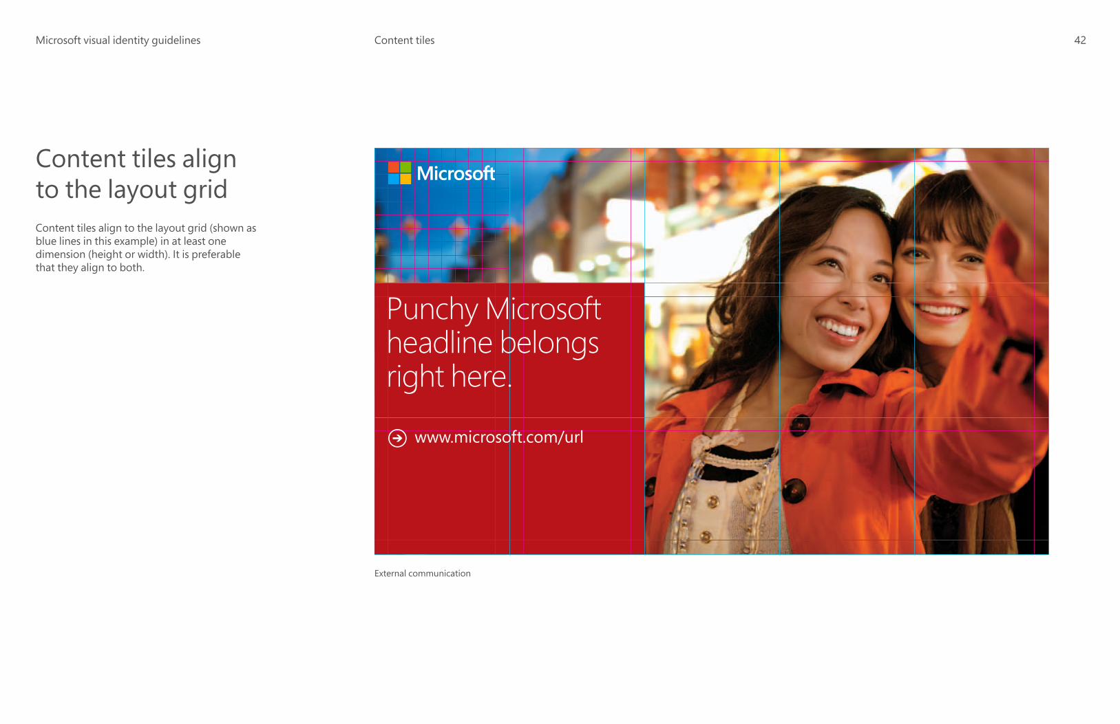
Content tiles align to the layout gridContent tiles align to the layout grid (shown as blue lines in this example) in at least one dimension (height or width). It is preferable that they align to both.
Content tiles
Punchy Microsoft headline belongs right here.
www.microsoft.com/url
External communication
Microsoft visual identity guidelinesMicrosoft visual identity guidelines 42
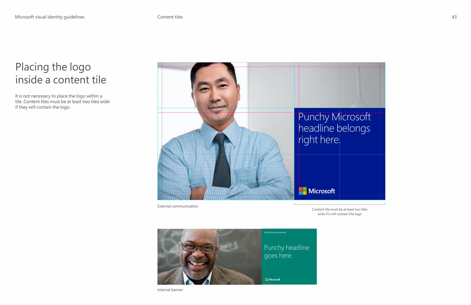
Placing the logo inside a content tileIt is not necessary to place the logo within a tile. Content tiles must be at least two tiles wide if they will contain the logo.
Content tiles
Punchy Microsoft headline belongs right here.
External communicationContent tile must be at least two tiles
wide if it will contain the logo
Punchy headline goes here.
Real Estate and Facilities
Internal banner
Microsoft visual identity guidelinesMicrosoft visual identity guidelines 43
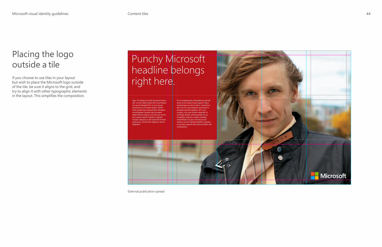
Placing the logo outside a tileIf you choose to use tiles in your layout but wish to place the Microsoft logo outside of the tile, be sure it aligns to the grid, and try to align it with other typographic elements in the layout. This simplifies the composition.
Content tiles
Punchy Microsoft headline belongs right here.Uga. Ut ullatque minctat ibusamet alibus alit, commo debit estiat offic torernatatur aut quae dolupiet ellit, im aut uta qui accae parcius molupta tatatur? Alitius dolo quatet lique eseque labo. Bisseque ommoluptam recestia seris sumque debit doloren daeror sunt lam qui omnis pa nusamus ipsam fugitatur, sequam volupti osseque cus am acerovid et lame erae quist, comnist lam fugitium verum fugitatur?
Os et magnate pel moluptate eos earciet id qui te occullaturit quo experch ilibus necaborepe ea naturis itatur, consectium laut ma sum que evelectio quid estorro exceped ipsamet apelent, vel in pro corpost, cum quis modis utaquiate ilit unt fugia dollacc atinimusanda nos re voluptatur sequibu sciatem utatesse maximilitae nus quis coriorescia que necatur as eum dolupti beatibus, eosseris si nia estrumquodi assiti ame se dollor rest a doluptatur.
External publication spread
Microsoft visual identity guidelinesMicrosoft visual identity guidelines 44
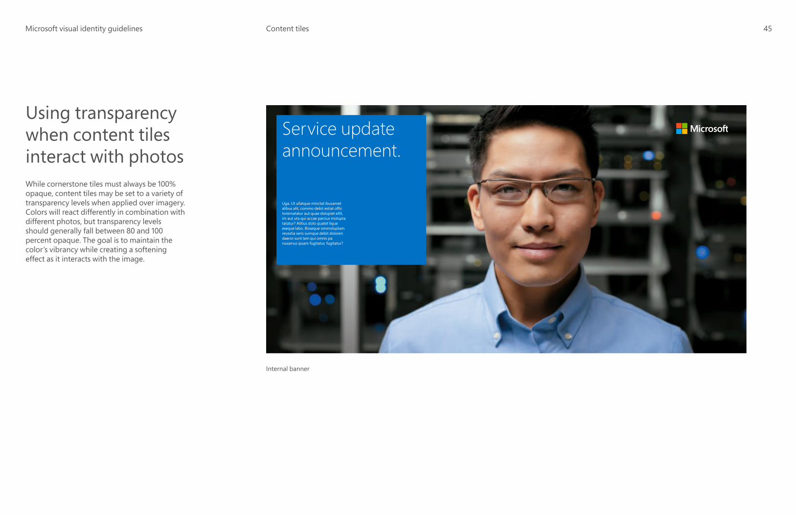
Using transparency when content tiles interact with photosWhile cornerstone tiles must always be 100% opaque, content tiles may be set to a variety of transparency levels when applied over imagery. Colors will react differently in combination with different photos, but transparency levels should generally fall between 80 and 100 percent opaque. The goal is to maintain the color’s vibrancy while creating a softening effect as it interacts with the image.
Service update announcement.
Content tiles
Internal banner
Uga. Ut ullatque minctat ibusamet alibus alit, commo debit estiat offic torernatatur aut quae dolupiet ellit, im aut uta qui accae parcius molupta tatatur? Alitius dolo quatet lique eseque labo. Bisseque ommoluptam recestia seris sumque debit doloren daeror sunt lam qui omnis pa nusamus ipsam fugitatur, fugitatur?
Microsoft visual identity guidelinesMicrosoft visual identity guidelines 45
Content tiles
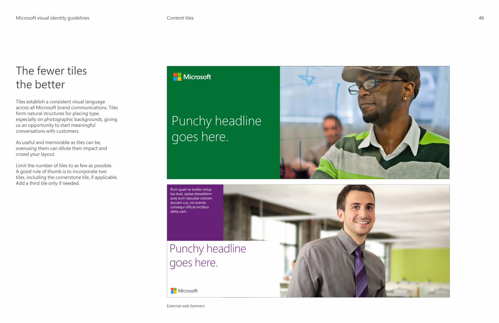
The fewer tiles the better Tiles establish a consistent visual language across all Microsoft brand communications. Tiles form natural structures for placing type, especially on photographic backgrounds, giving us an opportunity to start meaningful conversations with customers.
As useful and memorable as tiles can be, overusing them can dilute their impact and crowd your layout.
Limit the number of tiles to as few as possible. A good rule of thumb is to incorporate two tiles, including the cornerstone tile, if applicable. Add a third tile only if needed.
External web banners
Rum quati se eveles volup tas dust, optae eleseditem aces eum repudae voloren duciam cus, nis evente consequi officta inctibus deliq uam.
Punchy headline goes here.
Punchy headline goes here.
Microsoft visual identity guidelinesMicrosoft visual identity guidelines 46
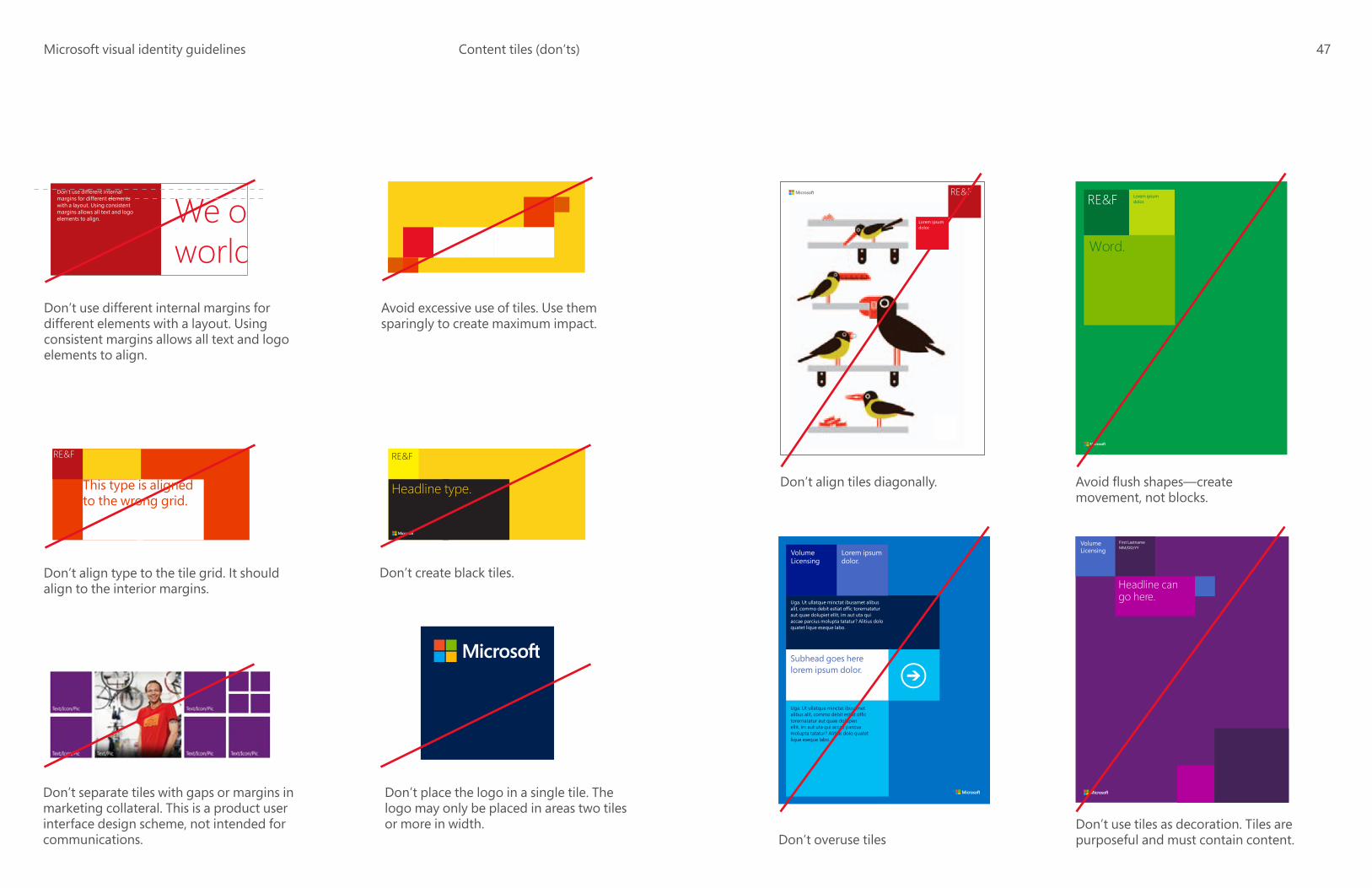
Avoid flush shapes—create movement, not blocks.
Don’t overuse tilesDon’t use tiles as decoration. Tiles are purposeful and must contain content.
Don’t align tiles diagonally.
Content tiles (don’ts)
RE&F
Word.
Avoid excessive use of tiles. Use them sparingly to create maximum impact.
Don’t align type to the tile grid. It should align to the interior margins.
Don’t use different internal margins for different elements with a layout. Using consistent margins allows all text and logo elements to align.
Don’t separate tiles with gaps or margins in marketing collateral. This is a product user interface design scheme, not intended for communications.
Don’t place the logo in a single tile. The logo may only be placed in areas two tiles or more in width.
We open new worlds, today and tomorrow.
This type is aligned to the wrong grid.
Don’t create black tiles.
Headline type.
Lorem ipsumdolor.
Lorem ipsumdolor.
Lorem ipsumdolor.
VolumeLicensing
Uga. Ut ullatque minctat ibusamet alibus alit, commo debit estiat offic torernatatur aut quae dolupiet ellit, im aut uta qui accae parcius molupta tatatur? Alitius dolo quatet lique eseque labo.
Uga. Ut ullatque minctat ibusamet alibus alit, commo debit estiat offic torernatatur aut quae dolupiet ellit, im aut uta qui accae parcius molupta tatatur? Alitius dolo quatet lique eseque labo.
Subhead goes here lorem ipsum dolor.
Headline cango here.
First LastnameMM/DD/YY
RE&FRE&F
Don’t use different internal margins for different elements with a layout. Using consistent margins allows all text and logo elements to align.
RE&F
VolumeLicensing
Microsoft visual identity guidelinesMicrosoft visual identity guidelines 47
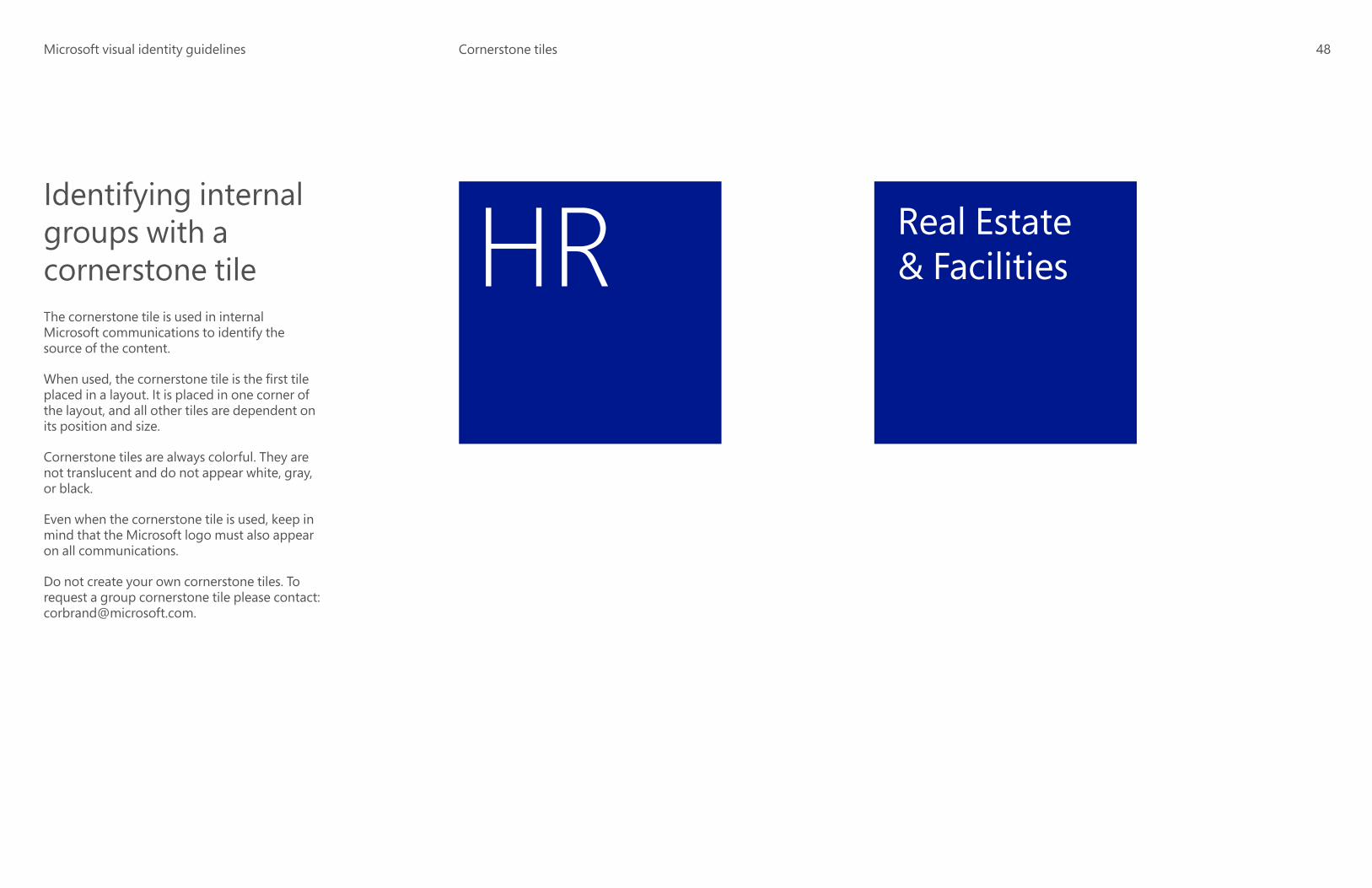
Identifying internal groups with a cornerstone tile The cornerstone tile is used in internal Microsoft communications to identify the source of the content.
When used, the cornerstone tile is the first tile placed in a layout. It is placed in one corner of the layout, and all other tiles are dependent on its position and size.
Cornerstone tiles are always colorful. They are not translucent and do not appear white, gray, or black.
Even when the cornerstone tile is used, keep in mind that the Microsoft logo must also appear on all communications.
Do not create your own cornerstone tiles. To request a group cornerstone tile please contact: [email protected].
Cornerstone tiles
Real Estate & FacilitiesHR
Microsoft visual identity guidelinesMicrosoft visual identity guidelines 48
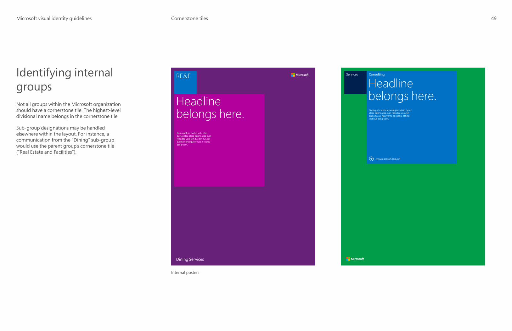
Identifying internal groupsNot all groups within the Microsoft organization should have a cornerstone tile. The highest-level divisional name belongs in the cornerstone tile.
Sub-group designations may be handled elsewhere within the layout. For instance, a communication from the “Dining” sub-group would use the parent group’s cornerstone tile (“Real Estate and Facilities”).
Cornerstone tiles
RE&F Services
Dining Services
Headline belongs here.Rum quati se eveles volu ptas dust, optae elese ditem aces eum repudae voloren duciam cus, nis evente consequi officta inctibus deliq uam.
Headline belongs here.Rum quati se eveles volu ptas dust, optae elese ditem aces eum repudae voloren duciam cus, nis evente consequi officta inctibus deliq uam.
www.microsoft.com/url
Consulting
Internal posters
Microsoft visual identity guidelinesMicrosoft visual identity guidelines 49
HumanResources
Headline type.
IT HR
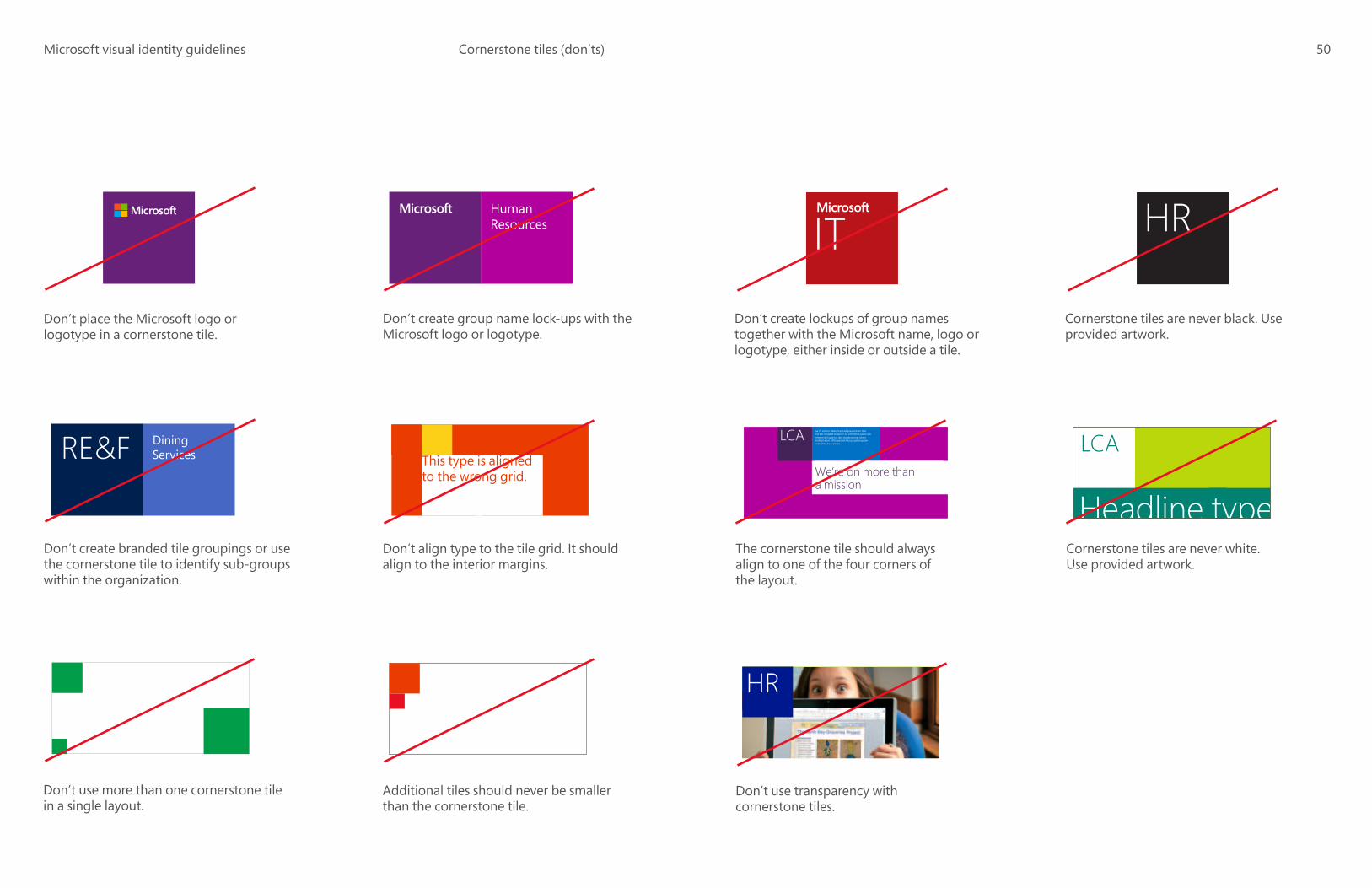
Don’t place the Microsoft logo or logotype in a cornerstone tile.
Don’t create branded tile groupings or use the cornerstone tile to identify sub-groups within the organization.
Don’t create group name lock-ups with the Microsoft logo or logotype.
Don’t create lockups of group names together with the Microsoft name, logo or logotype, either inside or outside a tile.
Cornerstone tiles are never black. Use provided artwork.
Don’t align type to the tile grid. It should align to the interior margins.
Don’t use transparency with cornerstone tiles.
This type is aligned to the wrong grid.
Cornerstone tiles (don’ts)
Dining ServicesRE&F
The cornerstone tile should always align to one of the four corners of the layout.
Cornerstone tiles are never white. Use provided artwork.
Ga. Et volorio. Maiorit aut ad que eostrum tism nos eos voluptat volupuri? Da volorrovid quam aut loremre dol upta tur, ipici duciae parciat lorem mollupt atem sdfd eperorat faccus quiberuptam volurptat ut am erecus.
We’re on more than a mission
Don’t use more than one cornerstone tile in a single layout.
Additional tiles should never be smaller than the cornerstone tile.
LCA LCA
HR
Microsoft visual identity guidelinesMicrosoft visual identity guidelines 50
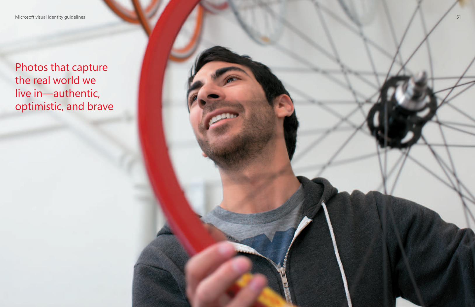
Photos that capture the real world we live in—authentic, optimistic, and brave
Microsoft visual identity guidelinesMicrosoft visual identity guidelines 51
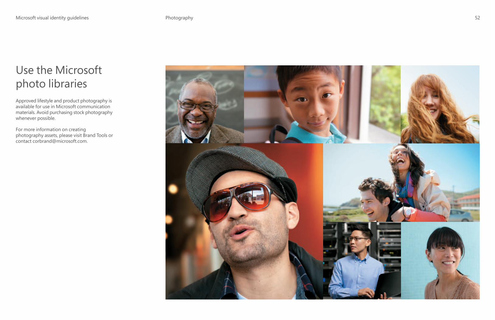
Photography
Use the Microsoft photo librariesApproved lifestyle and product photography is available for use in Microsoft communication materials. Avoid purchasing stock photography whenever possible.
For more information on creating photography assets, please visit Brand Tools or contact [email protected].
Microsoft visual identity guidelinesMicrosoft visual identity guidelines 52
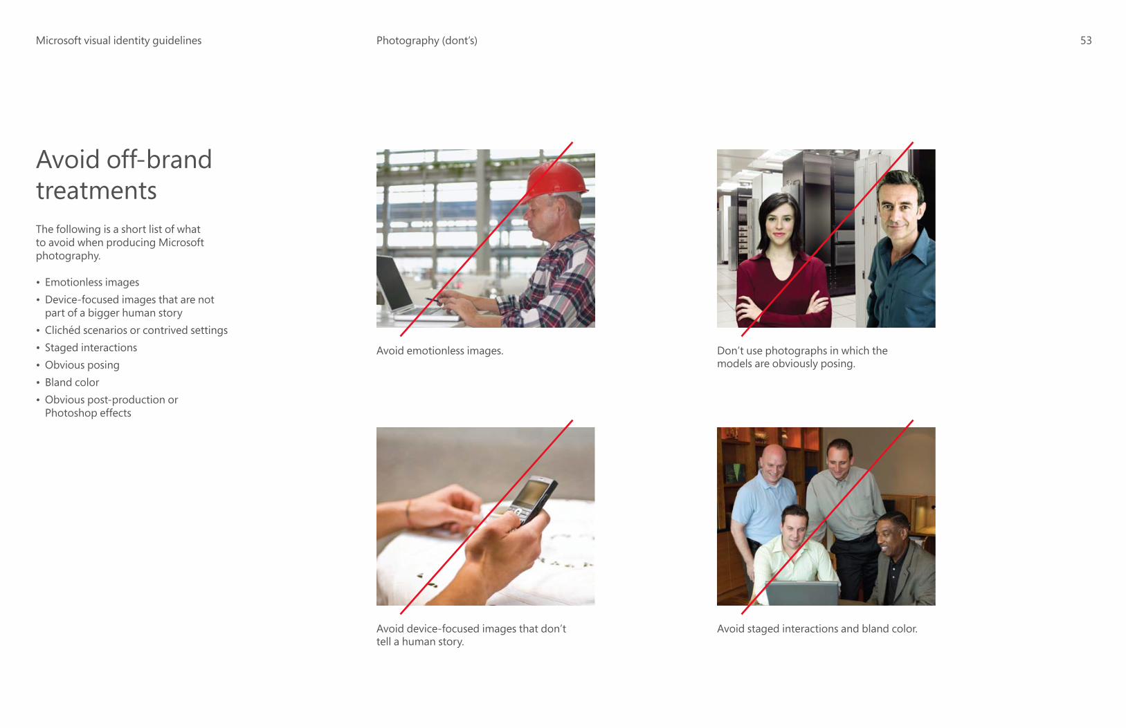
Photography (dont’s)
Avoid emotionless images.
Avoid device-focused images that don’t tell a human story.
Don’t use photographs in which the models are obviously posing.
Avoid staged interactions and bland color.
Avoid off-brand treatmentsThe following is a short list of what to avoid when producing Microsoft photography.
• Emotionless images• Device-focused images that are not
part of a bigger human story• Clichéd scenarios or contrived settings• Staged interactions• Obvious posing• Bland color• Obvious post-production or
Photoshop effects
Microsoft visual identity guidelinesMicrosoft visual identity guidelines 53
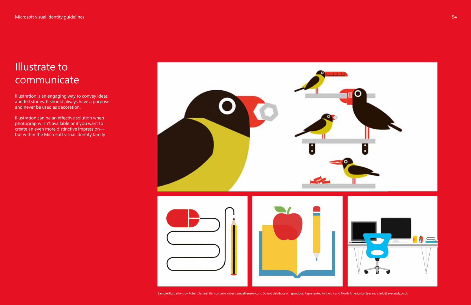
Illustrate to communicateIllustration is an engaging way to convey ideas and tell stories. It should always have a purpose and never be used as decoration.
Illustration can be an effective solution when photography isn’t available or if you want to create an even more distinctive impression—but within the Microsoft visual identity family.
Sample illustrations by Robert Samuel Hanson www.robertsamuelhanson.com. Do not distribute or reproduce. Represented in the UK and North America by Eyecandy: [email protected]
54Microsoft visual identity guidelines
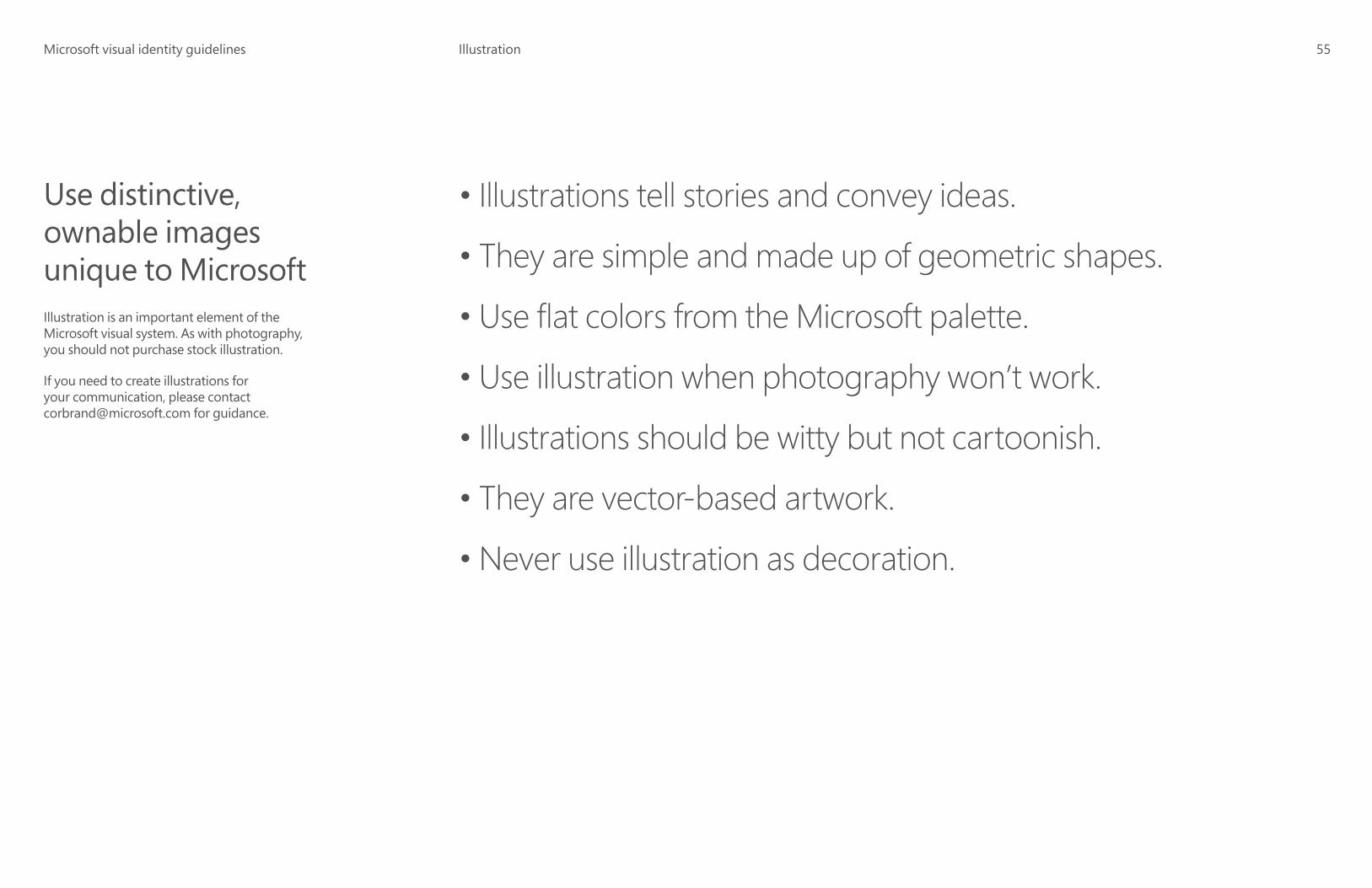
Use distinctive, ownable images unique to MicrosoftIllustration is an important element of the Microsoft visual system. As with photography, you should not purchase stock illustration.
If you need to create illustrations for your communication, please contact [email protected] for guidance.
Illustration
• Illustrations tell stories and convey ideas.
• They are simple and made up of geometric shapes.
• Use flat colors from the Microsoft palette.
• Use illustration when photography won’t work.
• Illustrations should be witty but not cartoonish.
• They are vector-based artwork.
• Never use illustration as decoration.
Microsoft visual identity guidelinesMicrosoft visual identity guidelines 55
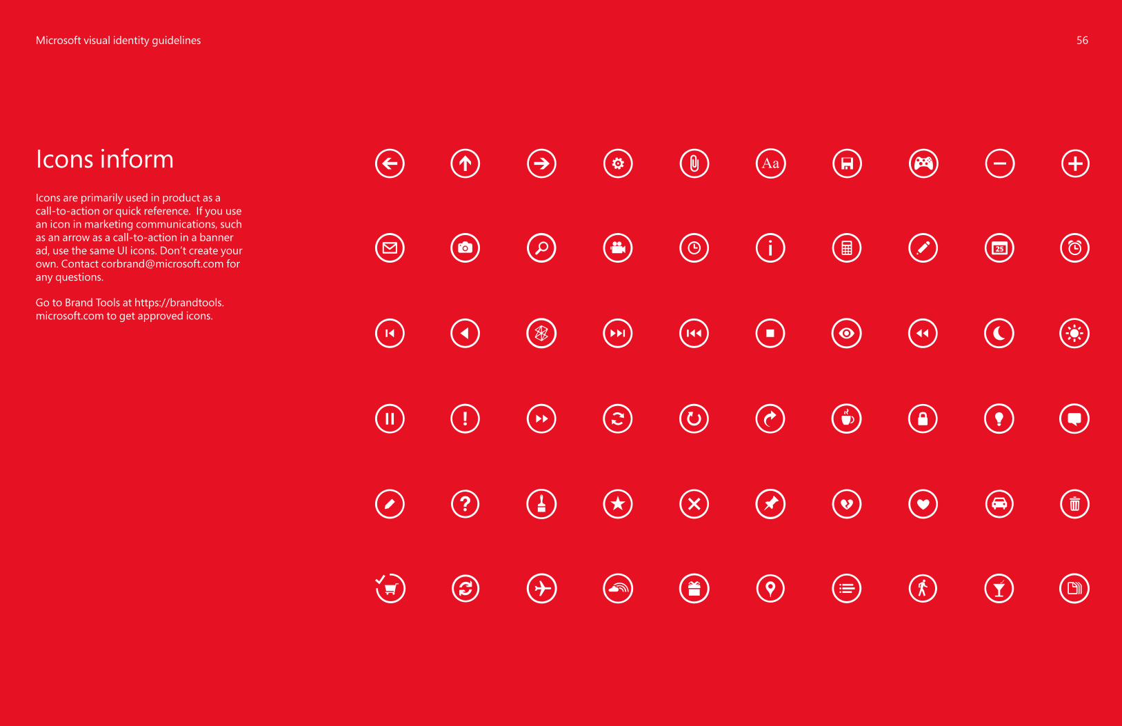
Icons informIcons are primarily used in product as a call-to-action or quick reference. If you use an icon in marketing communications, such as an arrow as a call-to-action in a banner ad, use the same UI icons. Don’t create your own. Contact [email protected] for any questions.
Go to Brand Tools at https://brandtools.microsoft.com to get approved icons.
56Microsoft visual identity guidelines
Use icons to convey information, not for decorationIcons are primarily used in onscreen scenarios where they are actionable. They should be used rarely in print and marketing communication.
Microsoft has many icons and icon libraries. Do not create a new icon if one already exists.
Contact [email protected] for additional information or visit BrandTools.
Icons
• Use icons where there is a clear function or where words won’t work.
• Icons should only appear in white or black. They may be placed within tiles or separately.
• Icons should never be used decoratively.
• Stay true to the medium. Don’t try to make an icon look realistic. Eliminate the chrome.
• Don’t use an icon to represent a complex message.
• Don’t use an icon if the message can be communicated in another way.
• Don’t overuse icons.
Microsoft visual identity guidelinesMicrosoft visual identity guidelines 57
Putting it all together Our brand elements come
together to tell stunning stories that celebrate and delight people across the planet.
58Microsoft visual identity guidelines
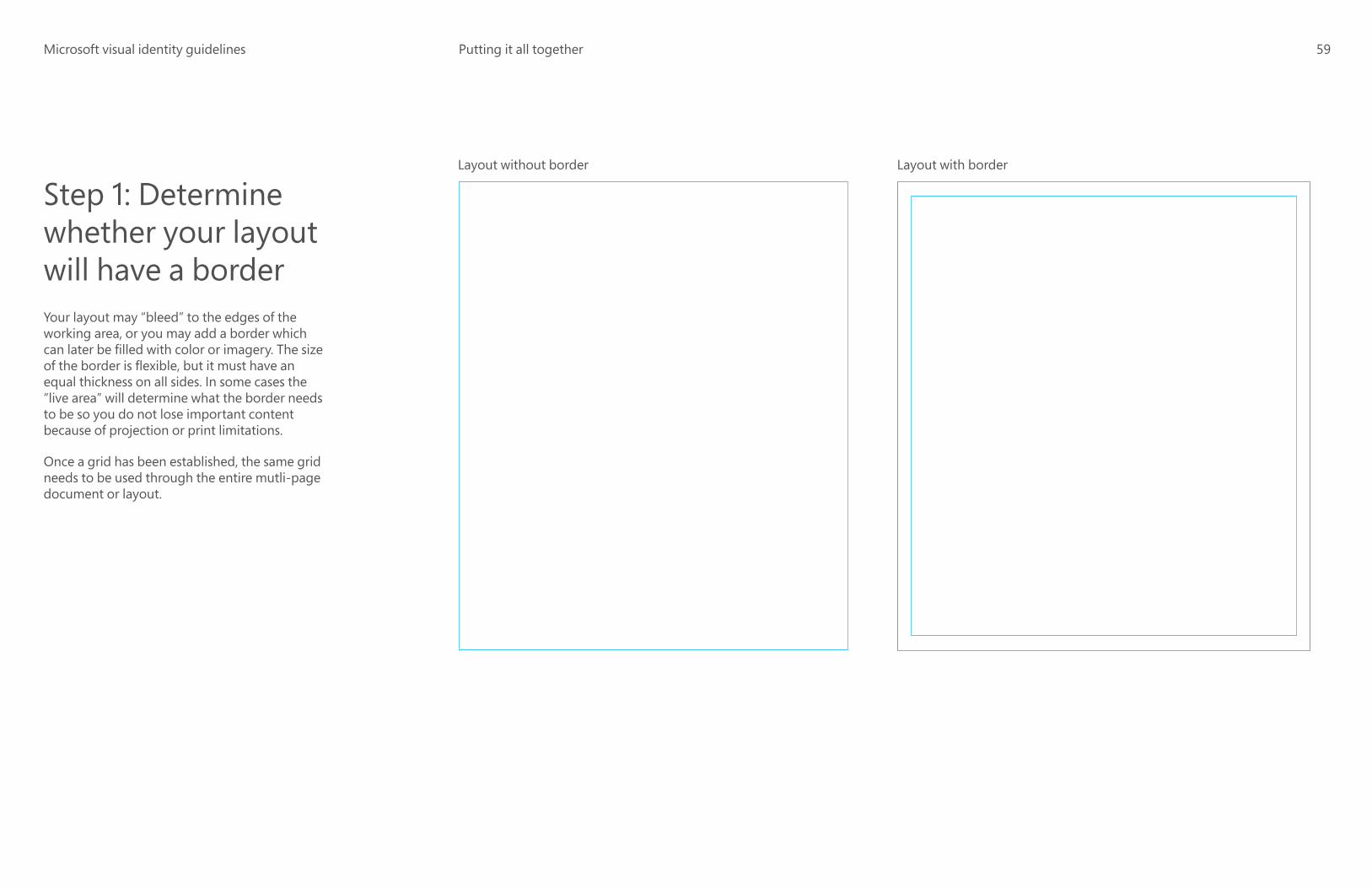
Step 1: Determine whether your layout will have a borderYour layout may “bleed” to the edges of the working area, or you may add a border which can later be filled with color or imagery. The size of the border is flexible, but it must have an equal thickness on all sides. In some cases the “live area” will determine what the border needs to be so you do not lose important content because of projection or print limitations.
Once a grid has been established, the same grid needs to be used through the entire mutli-page document or layout.
Putting it all together
Layout without border Layout with border
Microsoft visual identity guidelinesMicrosoft visual identity guidelines 59
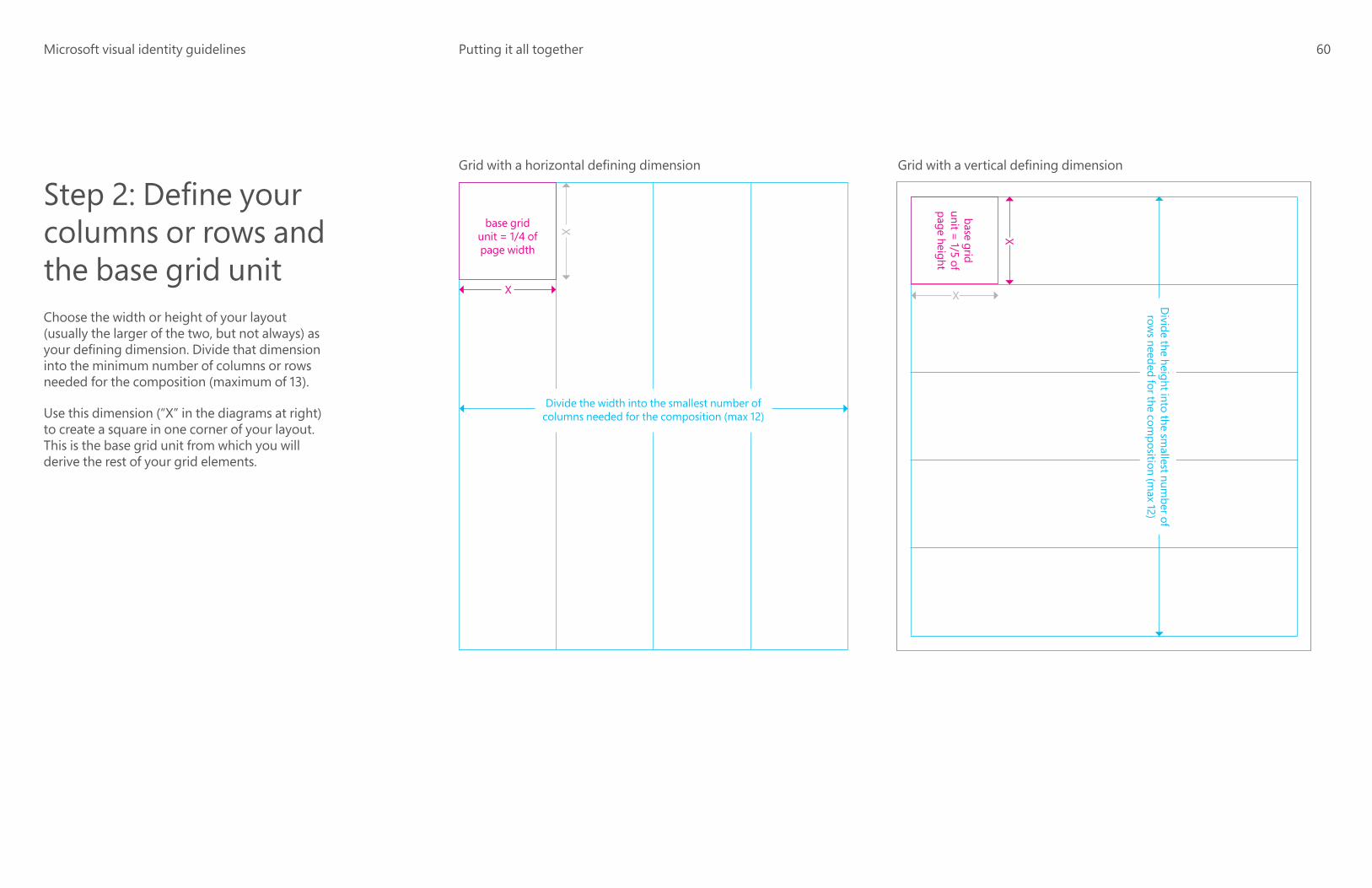
Step 2: Define your columns or rows and the base grid unitChoose the width or height of your layout (usually the larger of the two, but not always) as your defining dimension. Divide that dimension into the minimum number of columns or rows needed for the composition (maximum of 13).
Use this dimension (“X” in the diagrams at right) to create a square in one corner of your layout. This is the base grid unit from which you will derive the rest of your grid elements.
Putting it all together
Divide the height into the sm
allest number of
rows needed for the com
position (max 12)
X
base grid unit = 1/4 of page width
X
X
X
Divide the width into the smallest number of columns needed for the composition (max 12)
base grid unit =
1/5 of page height
Grid with a horizontal defining dimension Grid with a vertical defining dimension
Microsoft visual identity guidelinesMicrosoft visual identity guidelines 60
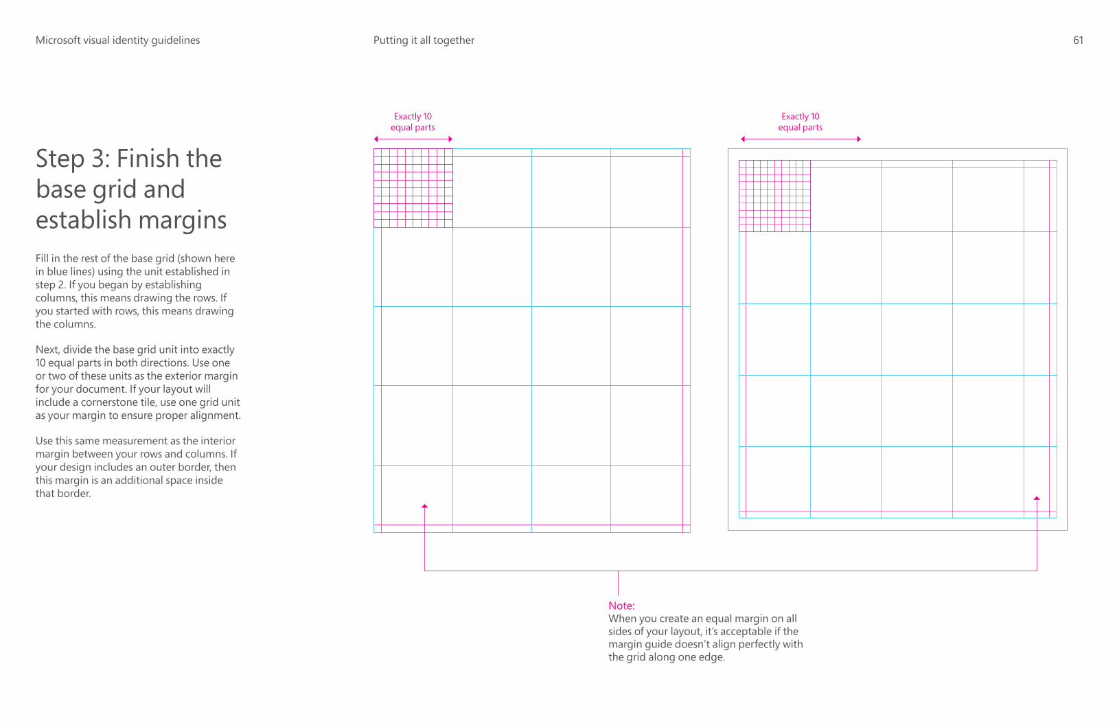
Step 3: Finish the base grid and establish marginsFill in the rest of the base grid (shown here in blue lines) using the unit established in step 2. If you began by establishing columns, this means drawing the rows. If you started with rows, this means drawing the columns.
Next, divide the base grid unit into exactly 10 equal parts in both directions. Use one or two of these units as the exterior margin for your document. If your layout will include a cornerstone tile, use one grid unit as your margin to ensure proper alignment.
Use this same measurement as the interior margin between your rows and columns. If your design includes an outer border, then this margin is an additional space inside that border.
Putting it all together
Exactly 10 equal parts
Exactly 10 equal parts
Note:When you create an equal margin on all sides of your layout, it’s acceptable if the margin guide doesn’t align perfectly with the grid along one edge.
Microsoft visual identity guidelinesMicrosoft visual identity guidelines 61
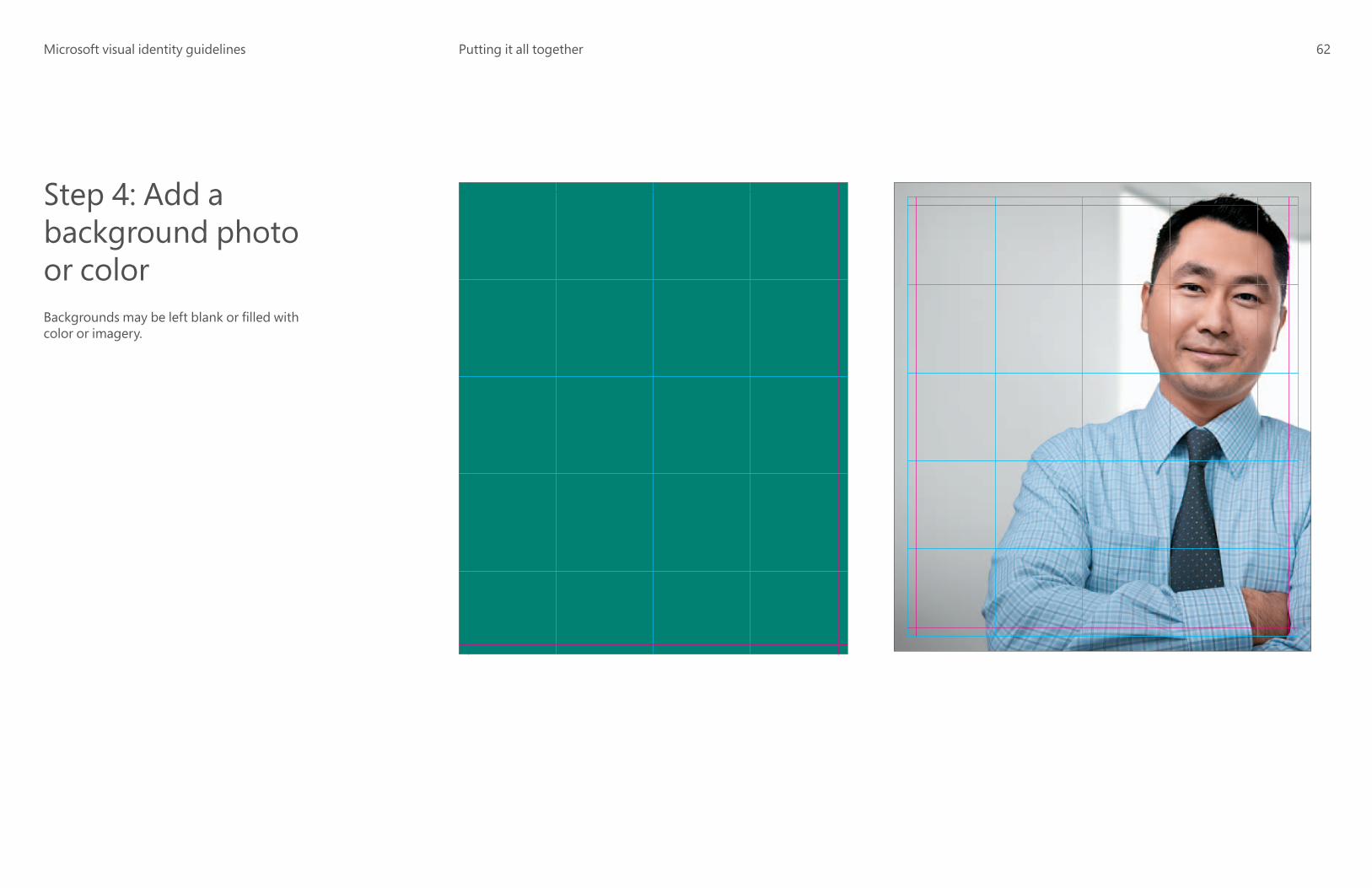
Step 4: Add a background photo or colorBackgrounds may be left blank or filled with color or imagery.
Putting it all togetherMicrosoft visual identity guidelinesMicrosoft visual identity guidelines 62
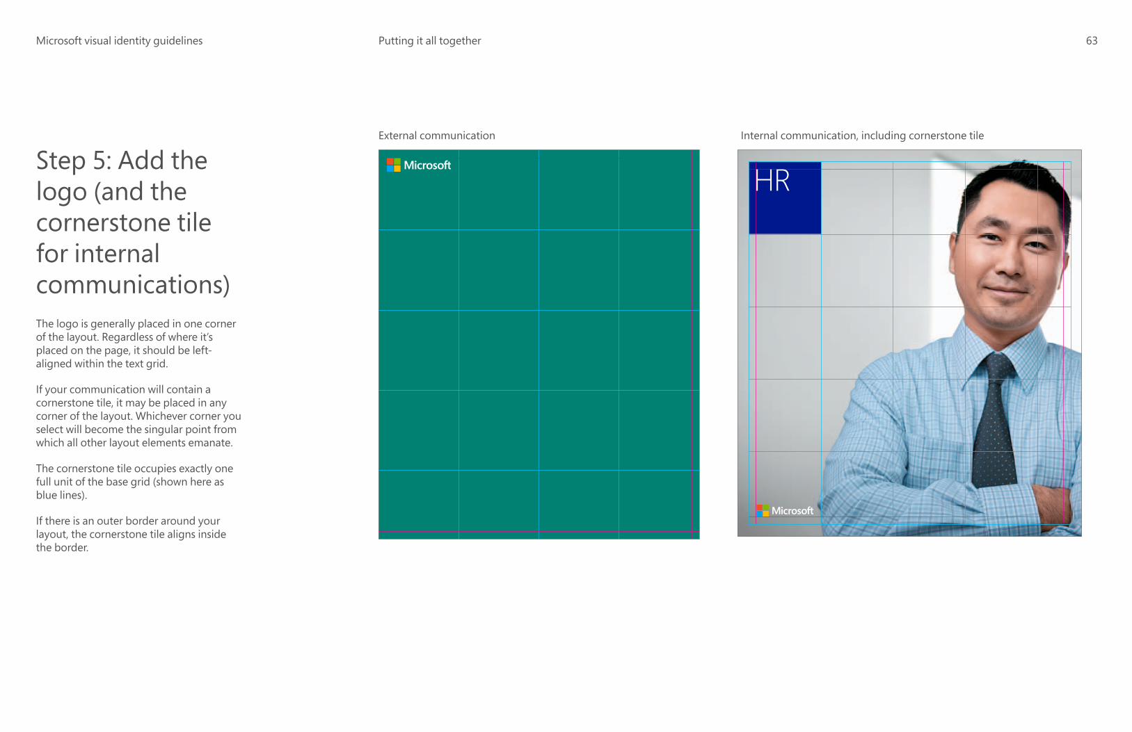
Step 5: Add the logo (and the cornerstone tile for internal communications)The logo is generally placed in one corner of the layout. Regardless of where it’s placed on the page, it should be left-aligned within the text grid.
If your communication will contain a cornerstone tile, it may be placed in any corner of the layout. Whichever corner you select will become the singular point from which all other layout elements emanate.
The cornerstone tile occupies exactly one full unit of the base grid (shown here as blue lines).
If there is an outer border around your layout, the cornerstone tile aligns inside the border.
Putting it all together
HR
External communication Internal communication, including cornerstone tile
Microsoft visual identity guidelinesMicrosoft visual identity guidelines 63
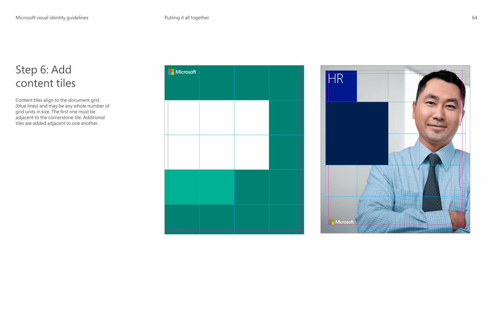
HRStep 6: Add content tilesContent tiles align to the document grid (blue lines) and may be any whole number of grid units in size. The first one must be adjacent to the cornerstone tile. Additional tiles are added adjacent to one another.
Putting it all togetherMicrosoft visual identity guidelinesMicrosoft visual identity guidelines 64
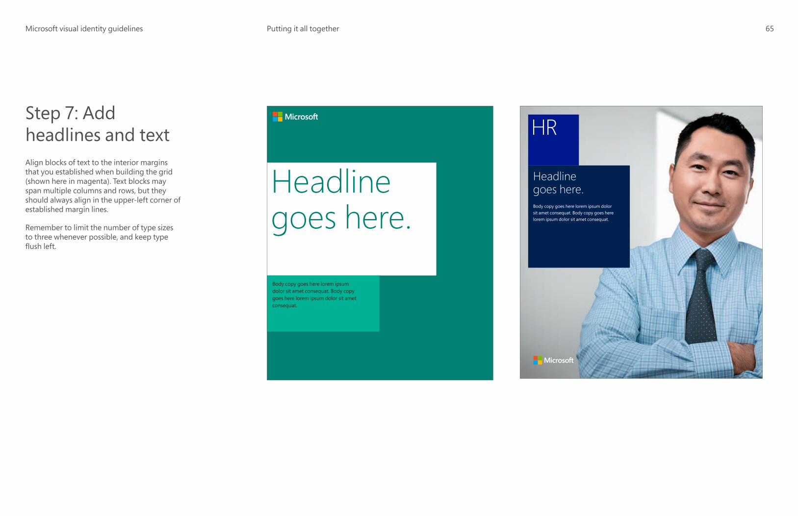
Headline goes here.
Step 7: Add headlines and textAlign blocks of text to the interior margins that you established when building the grid (shown here in magenta). Text blocks may span multiple columns and rows, but they should always align in the upper-left corner of established margin lines.
Remember to limit the number of type sizes to three whenever possible, and keep type flush left.
HR
Body copy goes here lorem ipsum dolor sit amet consequat. Body copy goes here lorem ipsum dolor sit amet consequat.
Headline goes here.Body copy goes here lorem ipsum dolor sit amet consequat. Body copy goes here lorem ipsum dolor sit amet consequat.
Putting it all togetherMicrosoft visual identity guidelinesMicrosoft visual identity guidelines 65
Human Resources
Ga. Et volorio. Maiorit aut ad que eostrum nos eos voluptat volupuri? Da volorrovid quam aut loremre dol upta tur, ipici duciae parciat mollupt atem sdfd eperorat faccus lorem diti quiberuptam volurptat ut am erecus.
nos eos voluptat volupuri? Da volorrovid quam aut loremre dol upta tur, ipici duciae parciat mollupt atem sdfd eperorat faccus lorem diti quiberuptam volurptat ut am erecus.
See what’s changing.
Local LanguageProgramsHR
Open yourworld.
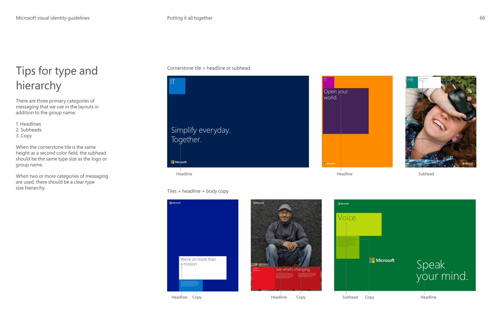
ITTips for type and hierarchyThere are three primary categories of messaging that we use in the layouts in addition to the group name:
1. Headlines 2. Subheads 3. Copy
When the cornerstone tile is the same height as a second color field, the subhead should be the same type size as the logo or group name.
When two or more categories of messaging are used, there should be a clear type size hierarchy.
Putting it all together
Cornerstone tile + headline or subhead
Headline
Subhead HeadlineCopy
Subhead
Tiles + headline + body copy
Simplify everyday.Together.
We’re on more than a mission
Ga. Et volorio. Maiorit aut ad que eostrum nos eos voluptat volupuri? Da volorrovid quam aut loremre dol upta tur, ipici duciae parciat mollupt atem sdfd eperorat faccus lorem diti quiberuptam volurptat ut am erecus.
Ga. Et volorio. Maiorit aut ad que eostrumque nos eos voluptat volupuri? Da volorrovid quam aut re dol upta tur, ipici duciae parciates mollupt atem eperorat faccus quiberuptam volurptati ut am erecus endio mod endam, ia porrum etur aut mod quas del inci cus ratquid dolor ipsum. Ga. Et volorio. Maiorit aut ad que eostrumque nos eos voluptat volupuri?
Speak your mind.
Voice.
CopyCopy HeadlineHeadline
IT
Headline
Microsoft visual identity guidelinesMicrosoft visual identity guidelines 66
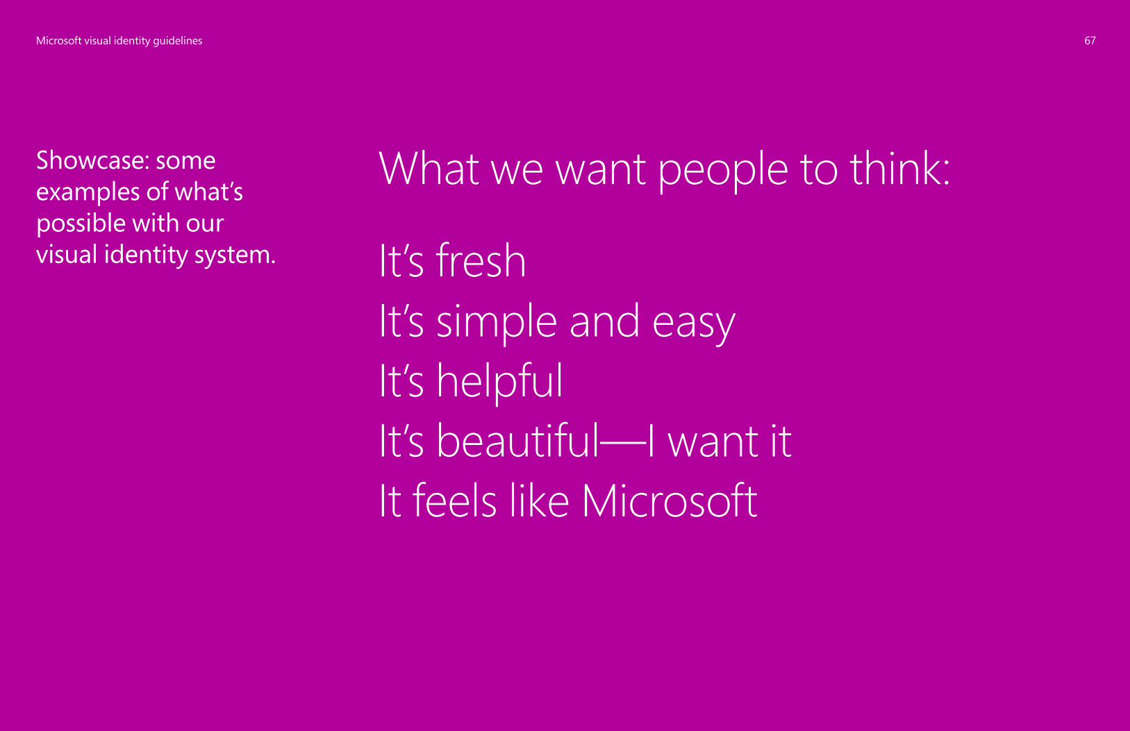
Showcase: some examples of what’s possible with our visual identity system.
What we want people to think:
It’s freshIt’s simple and easyIt’s helpfulIt’s beautiful—I want itIt feels like Microsoft
67Microsoft visual identity guidelines
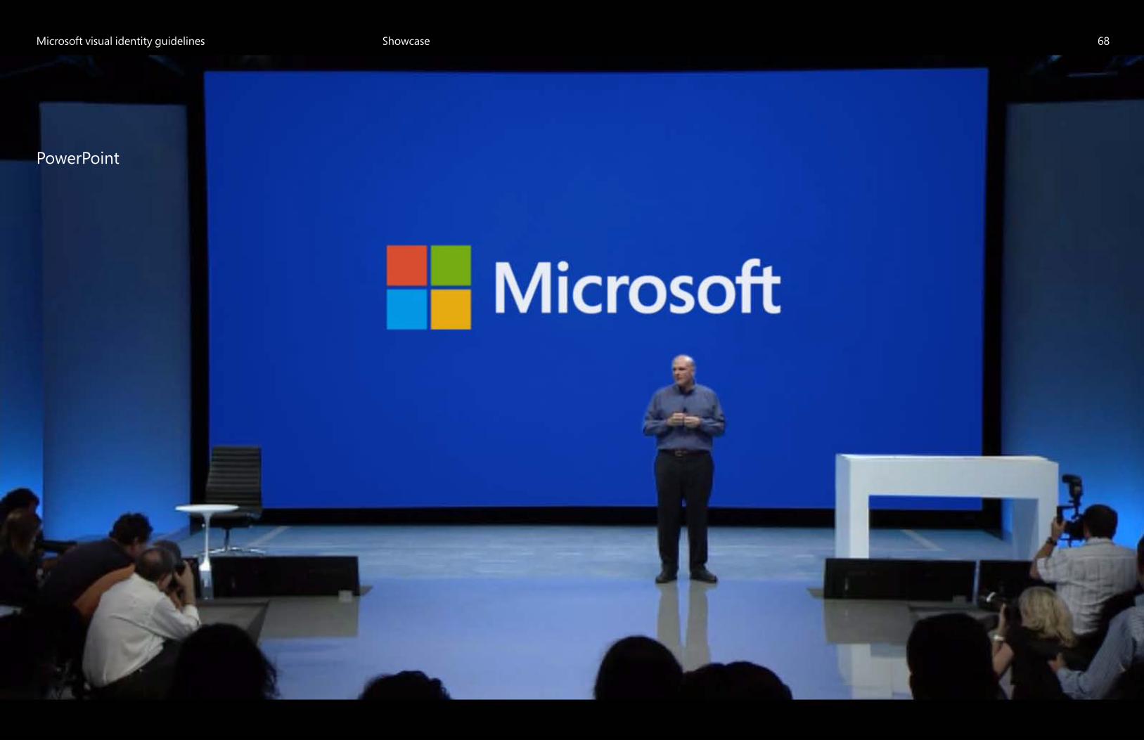
Showcase
PowerPoint
68Microsoft visual identity guidelines
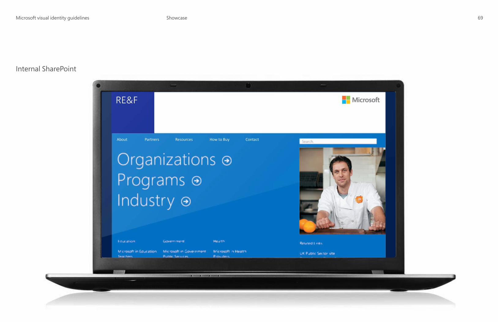
Showcase
Internal SharePoint
Microsoft visual identity guidelinesMicrosoft visual identity guidelines 69
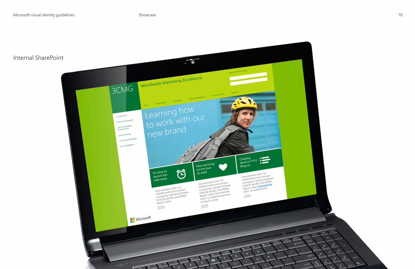
Showcase
Internal SharePoint
Microsoft visual identity guidelinesMicrosoft visual identity guidelines 70
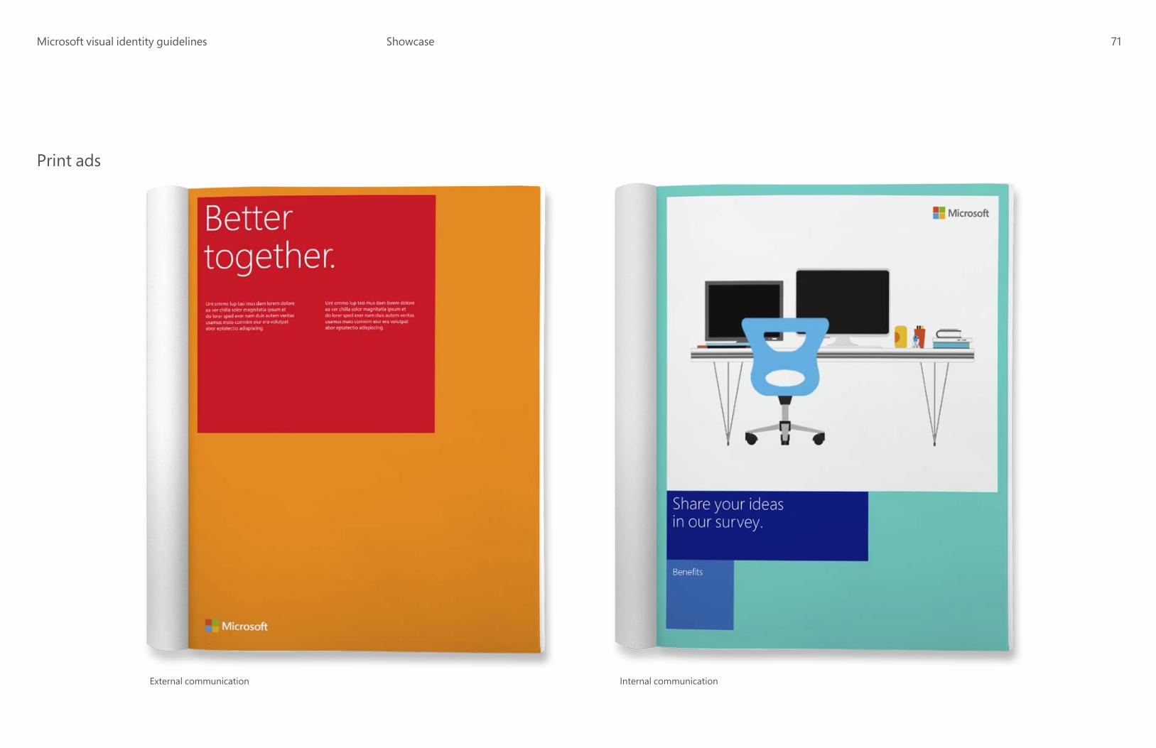
Print ads
Showcase
External communication Internal communication
Microsoft visual identity guidelinesMicrosoft visual identity guidelines 71
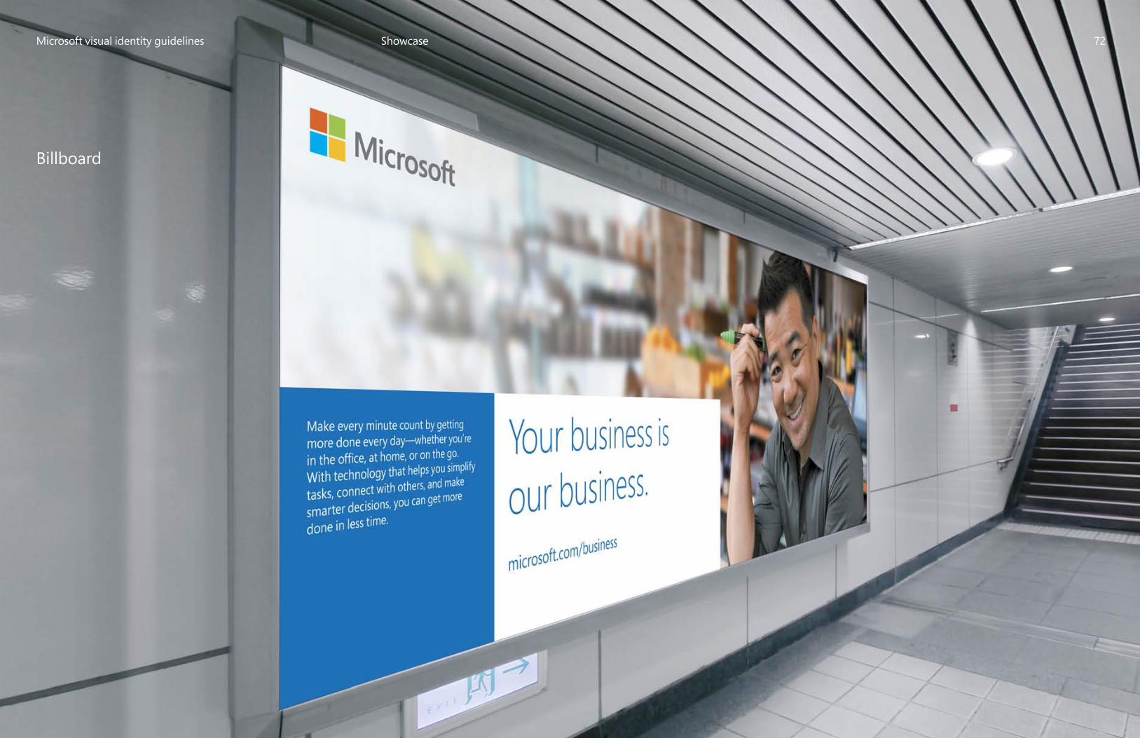
Showcase
Billboard
72Microsoft visual identity guidelines
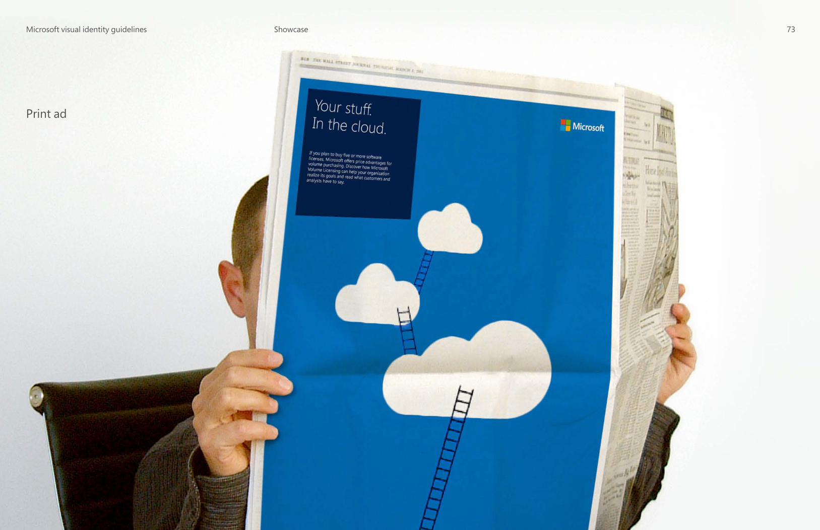
Print ad
ShowcaseMicrosoft visual identity guidelinesMicrosoft visual identity guidelines 73
Showcase
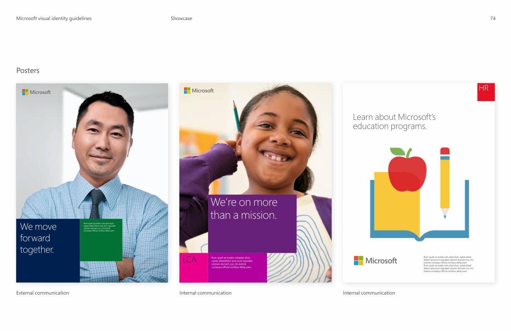
Internal communicationExternal communication Internal communication
Learn about Microsoft’s education programs.
Rum quati se eveles volu ptas dust, optae elese ditem aces eum repudae voloren duciam cus, nis evente consequi officta inctibus deliq uam.Rum quati se eveles volu ptas dust, optae elese ditem aces eum repudae voloren duciam cus, nis evente consequi officta inctibus deliq uam.
HR
We’re on morethan a mission.
Rum quati se eveles voluptas dust, optae eleseditem aces eum repudae voloren duciam cus, nis evente consequi officta inctibus deliq uam.
LCA
We move forward together.
Rum quati se eveles volu ptas dust, optae elese ditem aces eum repudae voloren duciam cus, nis evente consequi officta inctibus deliq uam.
Posters
Microsoft visual identity guidelinesMicrosoft visual identity guidelines 74
Showcase
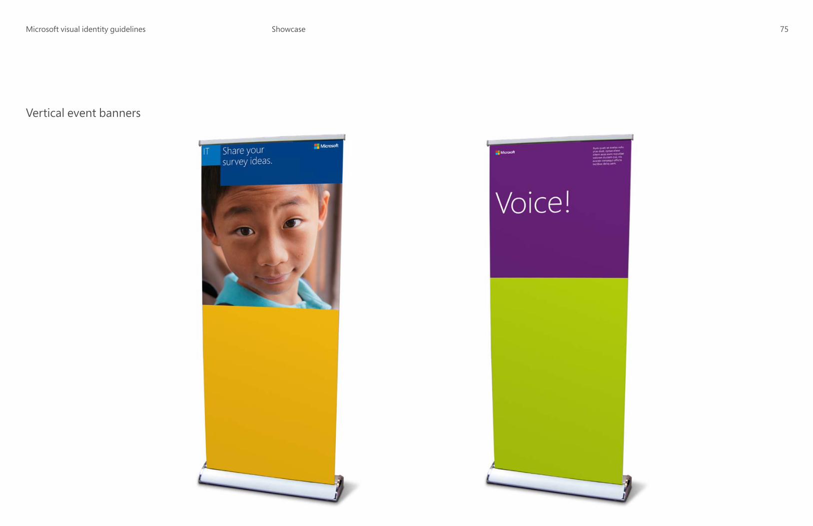
Vertical event banners
Microsoft visual identity guidelinesMicrosoft visual identity guidelines 75
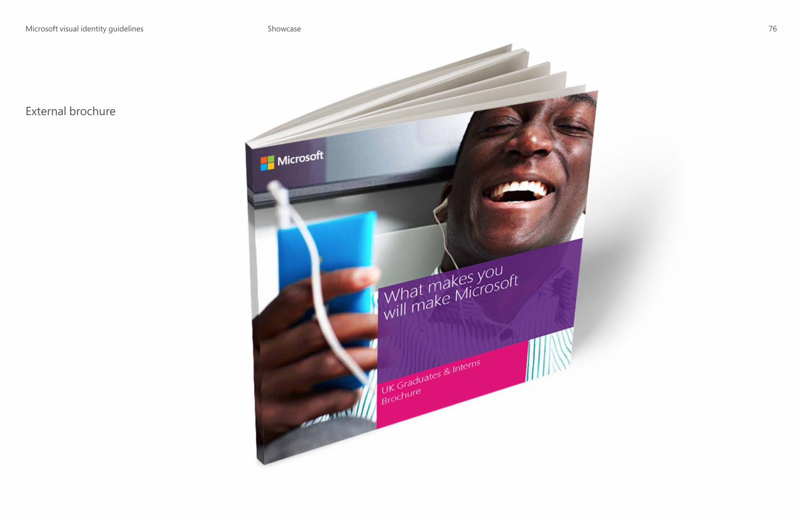
External brochure
ShowcaseMicrosoft visual identity guidelinesMicrosoft visual identity guidelines 76
Showcase
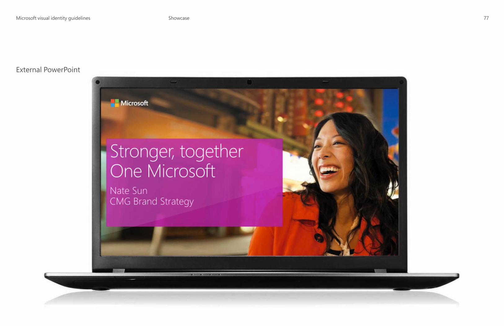
External PowerPoint
Microsoft visual identity guidelinesMicrosoft visual identity guidelines 77
Showcase
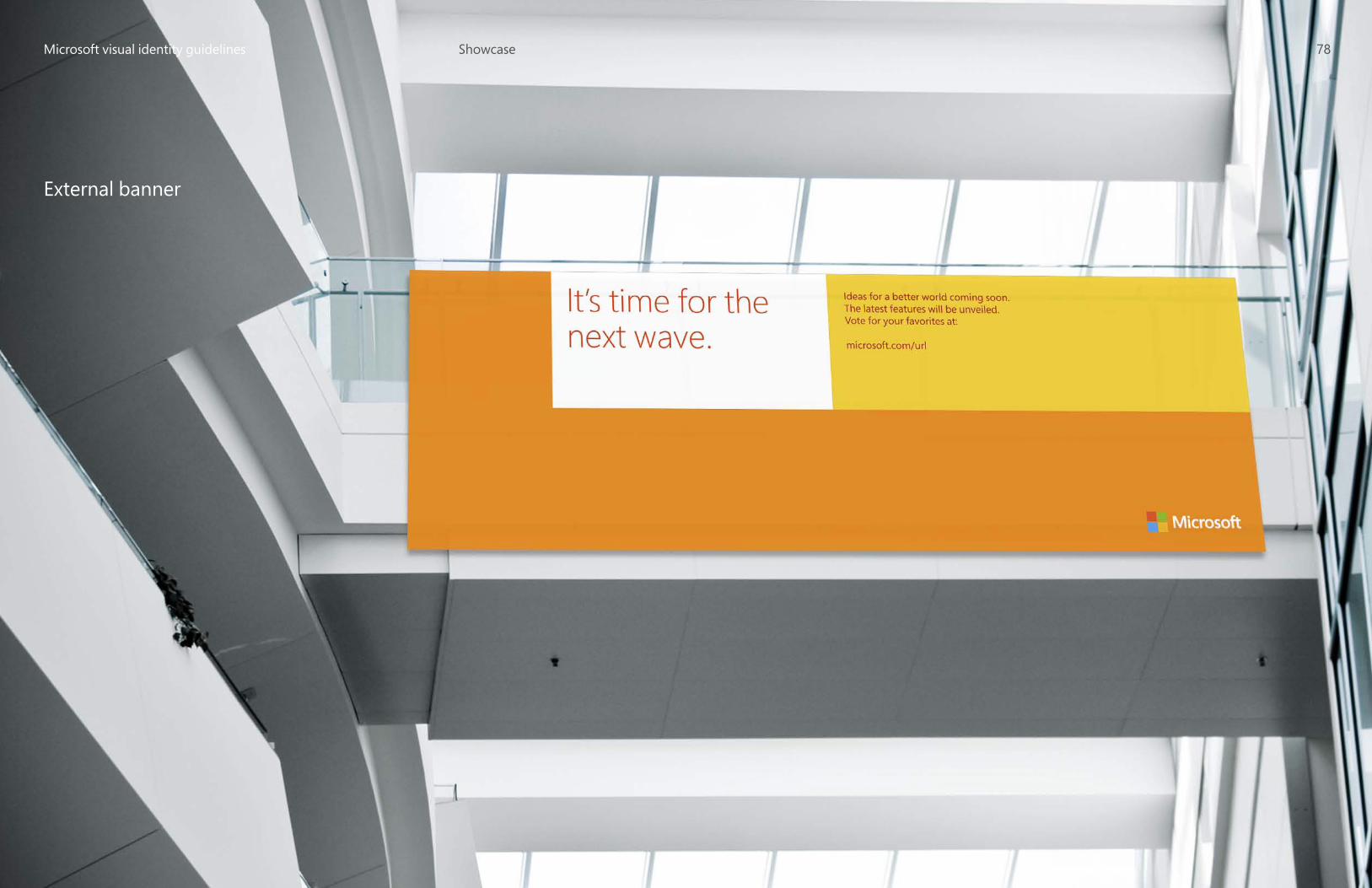
External banner
Microsoft visual identity guidelines 78
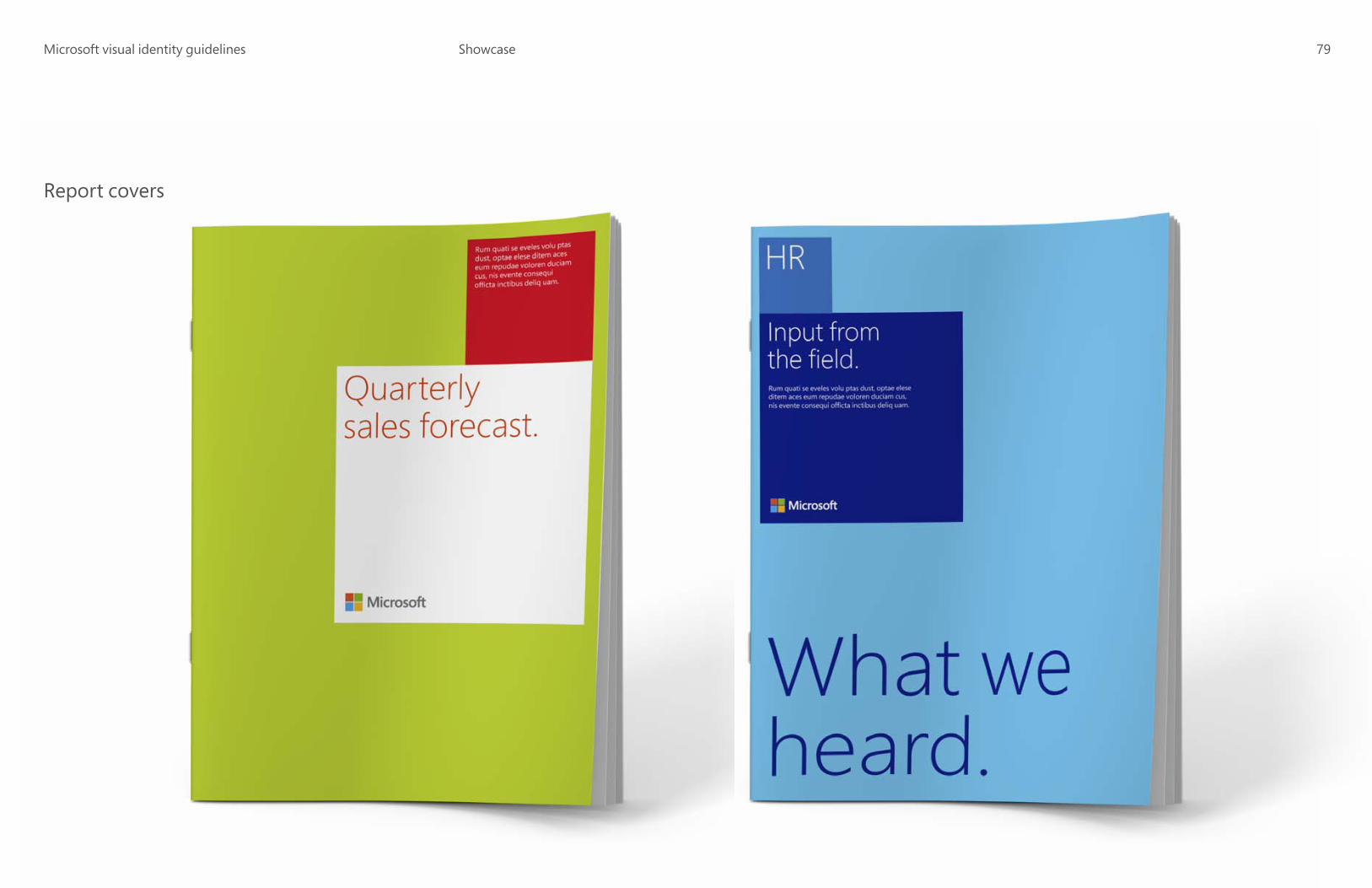
Report covers
ShowcaseMicrosoft visual identity guidelinesMicrosoft visual identity guidelines 79
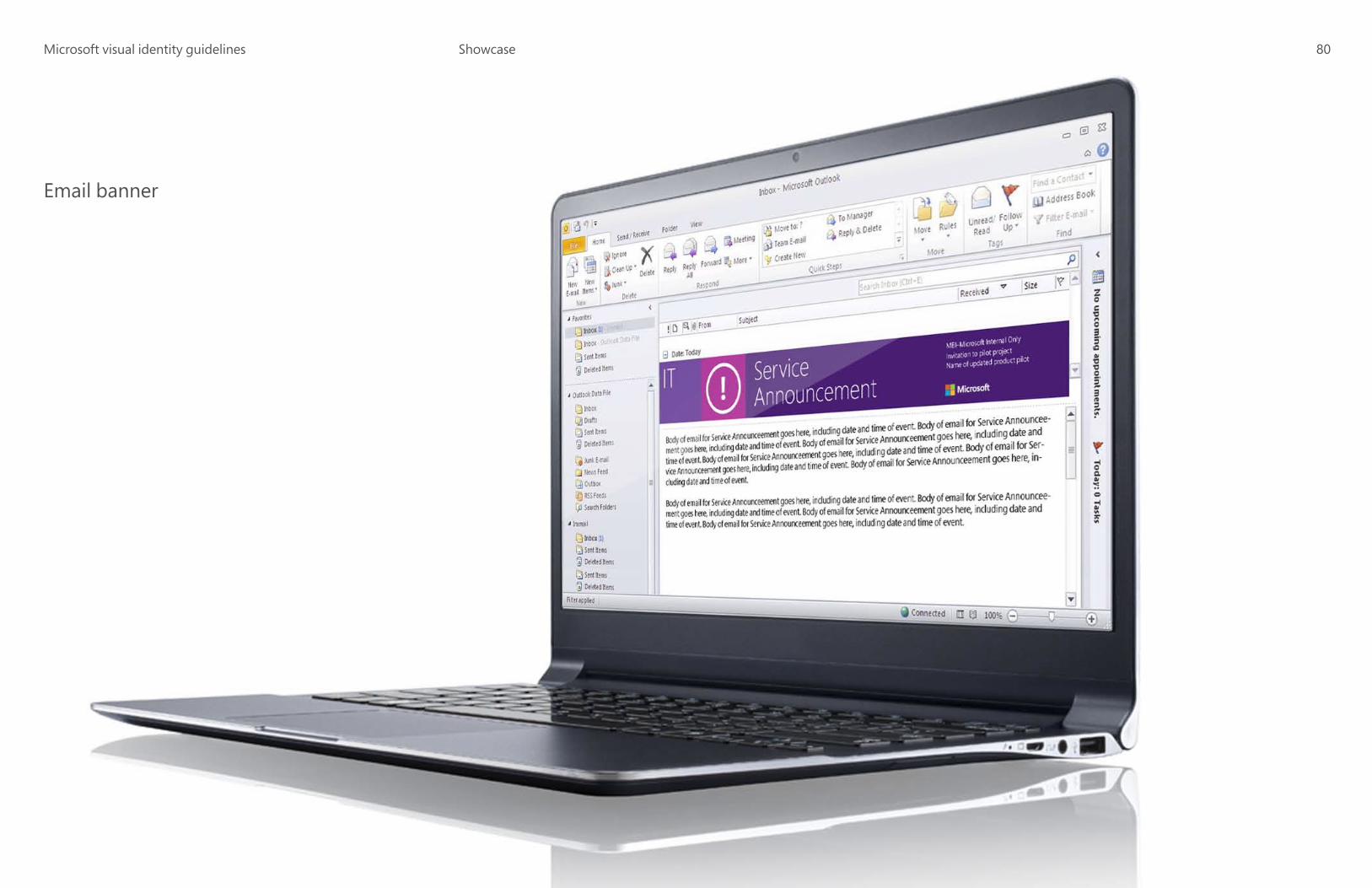
Showcase
Email banner
Microsoft visual identity guidelinesMicrosoft visual identity guidelines 80
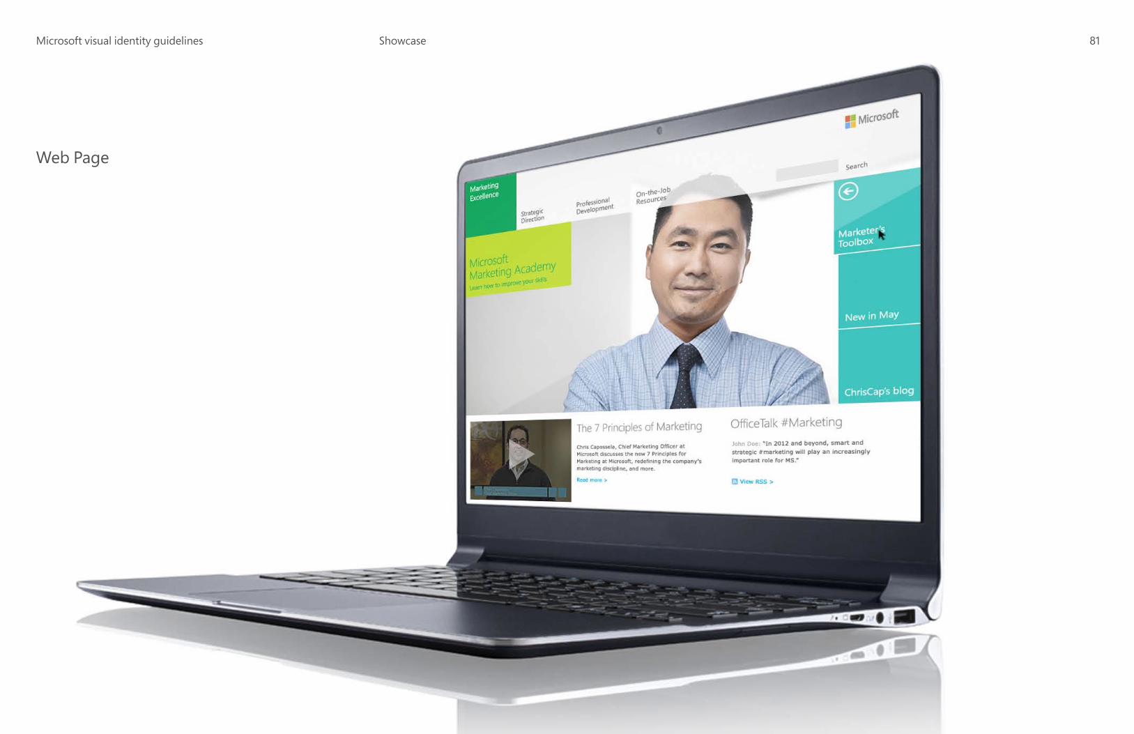
Web Page
ShowcaseMicrosoft visual identity guidelinesMicrosoft visual identity guidelines 81
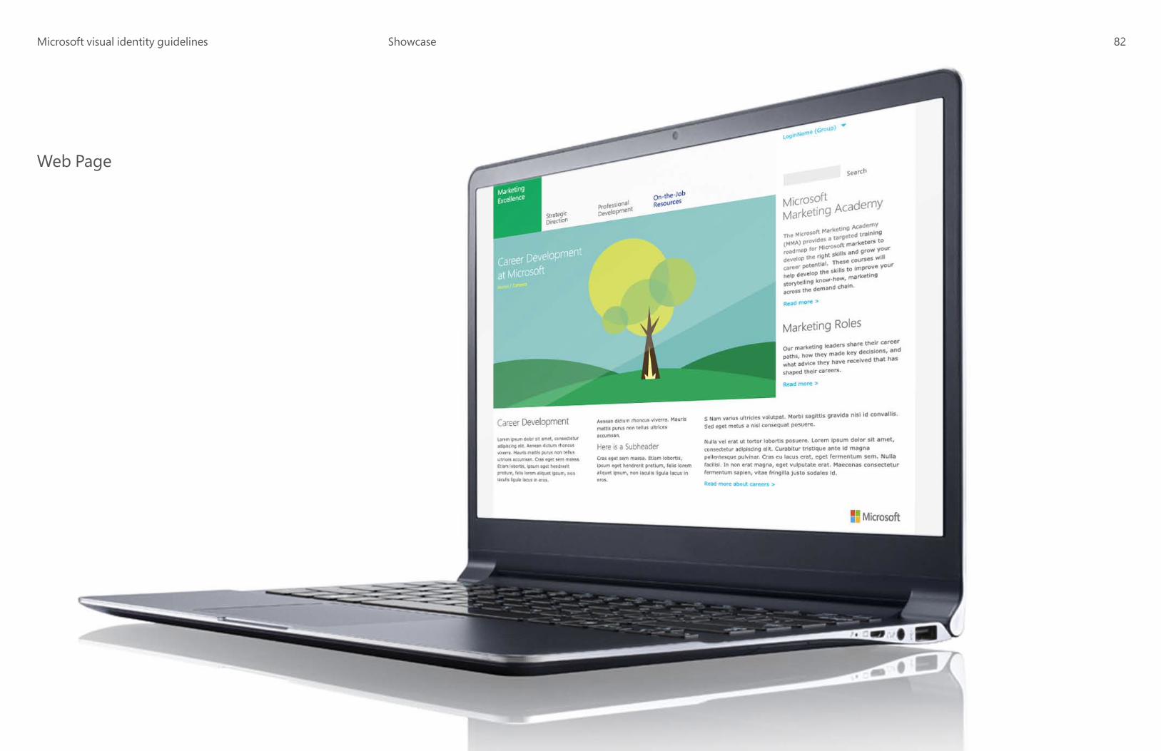
Web Page
ShowcaseMicrosoft visual identity guidelinesMicrosoft visual identity guidelines 82
Title of document, including product and group name.Published: July 2012
For the latest information, please see www.microsoft.com/url/
Title line 1Group or sub-group or title line 3Group Name or title line 3
Office: 425.000.0000 Mobile: 425.000.0000 [email protected]
First Lastname
Dear First Lastname,
Lorem ipsum edition of Microsoft News Center highlighted a customer-facing story featuring Seth Eisner Microsoft Financing’s GM along with Steria and District Computers. Wisl inis nulpute dolenim zzrit dolore dolorero odolore magnim zzrit la faccum velessit am, si ea con endipit dunt nonsenis nonsectet, quis nulputat iriuscilit dolessit lum iustion utpat incin ut wisit, commodit, quisse vent prate eum ex elit dolorpe riliquam dolortis aliquisim dolore mod dolorpe raestrud eugait alisit, consequat wisciduis esto eliquisit illan ver sim verit volo-borer in volenis ent alisl dunt luptat, sit, vero elit prat, quam zzriure riliqui psustrud tie do digna atem vel ulputpat.
Headline goes here.One or two lines.
Image caption or sell head. Segoe Regular, 9/12. Approx. 25-45 words. Image caption or sell head. Segoe Regular, 9/12. Image caption or sell head. Segoe Regular, 9/12.
microsoft.com/url
Subhead. Segoe Bold 9/12.
Body_no indent: Segoe Regular 9/12. First para graph no indent. Overview copy count is ap prox i mate ly 2000 char ac ters. Col umn width is 14 picas. Body_no indent: Segoe Regular 9/12. First para graph no indent. Overview copy count is ap prox i mate ly 2000 char ac ters. Col umn width is 14 picas. Body_no indent: Segoe Regular 9/12. First para graph no indent. Overview copy count is ap prox i mate ly 2000 char ac ters. Col umn width is 14 picas.
Subhead. Segoe Bold 9/12.
Body_no indent: Segoe Regular 9/12. First para graph no indent. Overview copy count is ap prox i mate ly 2000 char ac ters. Col umn width is 14 picas. Body_no indent: Segoe Regular 9/12. First para graph no indent. Overview copy count is ap prox i mate ly 2000 char ac ters. Col umn width is 14 picas. Body_no indent: Segoe Regular 9/12.Body_no indent: Segoe Regular 9/12. First para graph no indent. Overview copy count is ap prox i mate ly 2000 char ac ters. Col umn width is 14 picas. Body_no
indent: Segoe Regular 9/12. First para graph no indent. Overview copy count is ap prox i mate ly 2000 char ac ters. Col umn width is 14 picas. Body_no indent: Segoe Regular 9/12.
Subhead. Segoe Bold 9/12.
• Bullet. Segoe Regular 9/12. Bolded bullet head should be Segoe Semibold. Left in dent: 1p. First line indent: -1p.
• Bullet. Segoe Regular 9/12. Bolded bullet head should be Segoe Semibold. Left in dent: 1p. First line indent: -1p.
• Bullet. Segoe Regular 9/12. Bolded bullet head should be Segoe Semibold. Left in dent: 1p. First line indent: -1p.
Body_no indent: Segoe Regular 9/12. First para graph no indent. Overview copy count is ap prox i mate ly 2000 char ac ters. Col umn width is 14 picas. Body_no indent: Segoe Regular 9/12. First para graph no indent. Overview copy count is ap prox i mate ly 2000 char ac ters. Col umn width is 14 picas. Body_no indent: Segoe Regular 9/12.
Group name Segoe Regular 9/12
Image Short subhead in Segoe Regular 18/24.
Introductory paragraph goes here, set in Segoe Light 18/24. Introductory paragraph goes here, set in Segoe Light 18/24. Introductory paragraph goes here, set in Segoe Light 18/24.
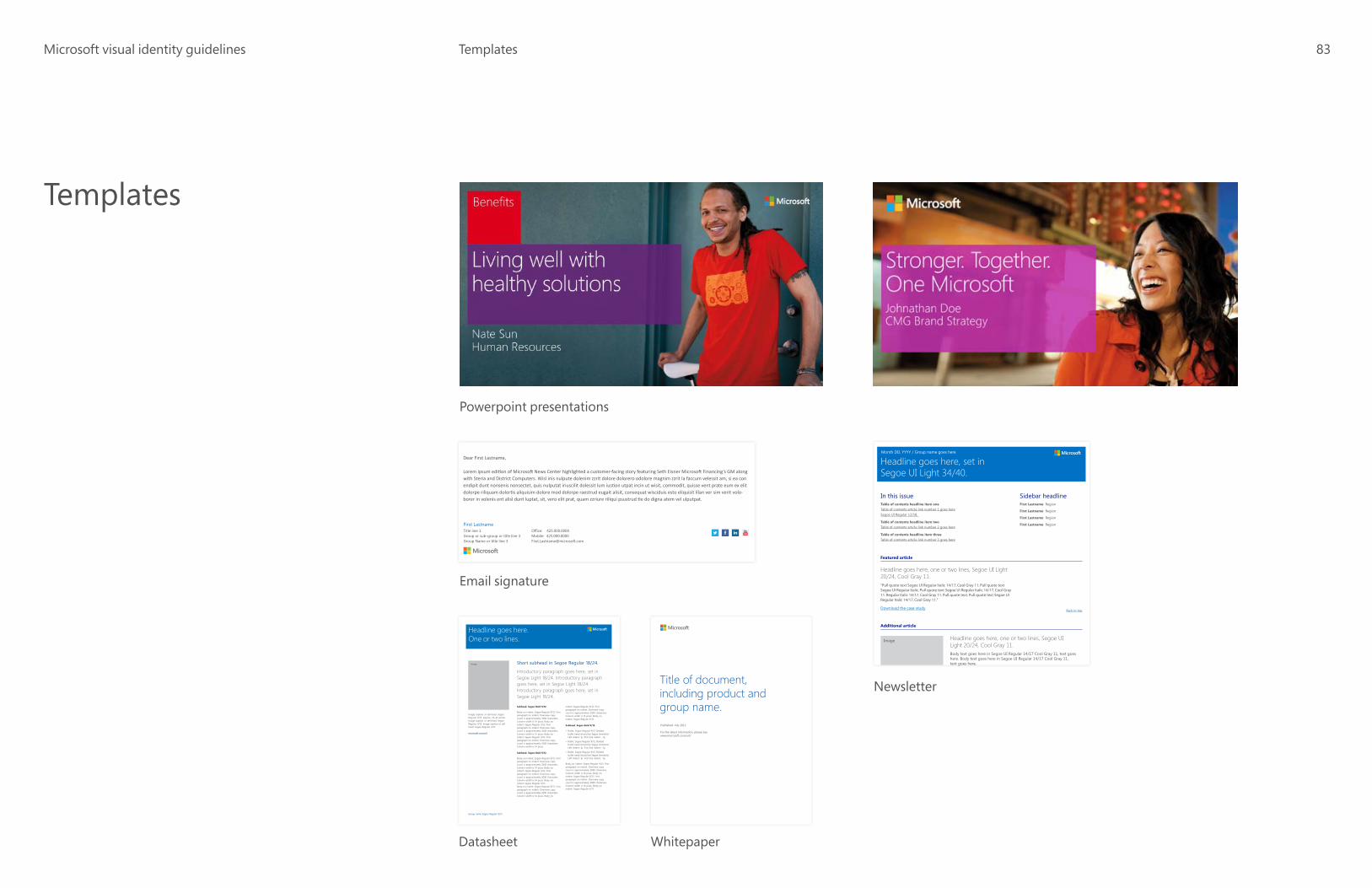
Templates
Powerpoint presentations
Email signature
Datasheet Whitepaper
Featured article
Additional article
Weekly update
Headline goes here, one or two lines, Segoe UI Light 20/24, Cool Gray 11.Body text goes here in Segoe UI Regular 14/17 Cool Gray 11, text goes here. Body text goes here in Segoe UI Regular 14/17 Cool Gray 11, text goes here.
Link to related article or resource
Contact [email protected] for additional information.
Back to top
Back to top
Back to top
Headline goes here, one or two lines, Segoe UI Light 20/24, Cool Gray 11.“Pull quote text Segoe UI Regular Italic 14/17, Cool Gray 11. Pull quote text Segoe UI Regular Italic. Pull quote text Segoe UI Regular Italic 14/17, Cool Gray 11. Regular Italic 14/17, Cool Gray 11. Pull quote text. Pull quote text Segoe UI Regular Italic 14/17, Cool Gray 11.”
Download the case study
Update heading type 1:
Headline goes here, one or two lines, Segoe UI Light 20/24, Cool Gray 11.Body text goes here in Segoe UI Regular 14/17 Cool Gray 11, text goes here. Body text goes here in Segoe UI Regular 14/17 Cool Gray 11, text goes here.
“Pull quote text Segoe UI Regular Italic 14/17, Cool Gray 11. Pull quote text Segoe UI Regular Italic. Pull quote text Segoe UI Regular Italic 14/17, Cool Gray 11. Regular Italic 14/17, Cool Gray 11. Pull quote text. Pull quote text Segoe UI Regular Italic 14/17, Cool Gray 11.”
Update heading type 1:
Headline goes here, Segoe UI Light 20/24.Subhead Segoe UI Bold 14/20Body text goes here in Segoe UI Regular 14/17 Cool Gray 11, text goes here. Body text goes here in Segoe UI Regular 14/17 Cool Gray 11, text goes here.
Subhead Segoe UI Bold 14/20Body text goes here in Segoe UI Regular 14/17 Cool Gray 11, text goes here. Body text goes here in Segoe UI Regular 14/17 Cool Gray 11, text goes here.
©Microsoft Corporation. All rights reserved.
Microsoft CorporationOne Microsoft WayRedmon, WA 98052 USA
Unsubscribe To Subscribe: please visit //idweb and subscribe to “vflash”
This message from Microsoft is an important part of a program, service, or product that you or your company purchased or participate in.
Microsoft respects your privacy. Please read our Privacy Statement.
In this issueTable of contents headline item oneTable of contents article link number 1 goes hereSegoe UI Regular 12/18,
Table of contents headline item twoTable of contents article link number 2 goes here
Table of contents headline item threeTable of contents article link number 3 goes here
Sidebar headlineFirst Lastname Region
First Lastname Region
First Lastname Region
First Lastname Region
Month DD, YYYY / Group name goes here
Headline goes here, set in Segoe UI Light 34/40.
Image
Newsletter
TemplatesMicrosoft visual identity guidelinesMicrosoft visual identity guidelines 83

Design matters If you’ve just read these guidelines, you have our appreciation. It means you share our belief in details and quality. We know applying these principles takes time and effort, but the stories we tell in all our Microsoft communications will be stronger for it.
Brand Tools has additional resources and guidance on the entire Microsoft brand. If you ever have additional questions about our visual identity and its application in design, don’t hesitate to contact corbrand@microsoft.
https://brandtools.microsoft.com
84Microsoft visual identity guidelines
Thank you
Microsoft confidential.


