
Microinteractions
93
dan saffer // @odannyboy #microinteractions microinteractions
-
Upload
dan-saffer -
Category
Design
-
view
1.589 -
download
0
Transcript of Microinteractions

dan saffer // @odannyboy#microinteractions
microinteractions

design is not only about solving wicked problems
Over the last decade, designers have been encouraged to think big, to solve “wicked problems,” to use “design thinking” to tackle massive, systemic issues in business and in government. No problem is too large to not apply the tools of design to,

focus on details that delight
But by working at such a macro scale, an important part of design is often lost: the details that delight. Products that we love show an attention to detail: the beautiful curve, the satisfying click, the understandable mental model, or a piece of feedback that makes you smile. This are hard to accomplish when you are working on a big scale.

change the world from the bottom-up
This is another way to work: not through grand, top-down design projects, but from the bottom up, by crafting—lovingly, with care—small things. This is something designers can do quite well, with immediate, tangible results. This is another way to change the world: by making seemingly inconsequential moments into instances of pleasure.

microinteractions do one task well
Microinteractions are contained product moments that revolve around a single use case—they have one main task. They are everywhere: in the devices we carry, the appliances in our house, the apps on our phones and desktops, even embedded in the environments we live and work in.

microinteractions are contained product moments...
change a setting
sync your data/devices
log in
set a status message
favorite or like something
give a rating
export
format
make a calendar event
add a contact
search
make a comment
These are the kinds of interactions we often overlook or save until last, as an afterthought. All of these could be boring, nothing moments, or they could be thoughtful moments of delight.

Every one of these is a Trigger for a microinteraction

microinteractions are good for...
accomplishing a single task
managing an ongoing task
connecting devices together
interacting with a single piece of data
controlling an ongoing process
adjusting a setting
viewing or creating a small piece of content
turning a feature/function on or off

Microinteractions fit well into our multi-platform existence. Small interactions work well on small devices.
Microinteractions are the glue that can tie together features across mobile, TV, desktop, appliances, and web. While the microinteractions could vary by platform, their small size allows for a consistency that you might not have with large features. Twitter is an excellent example of a microinteraction that has scaled across devices.

!
When someone posts on your Facebook page in a language that isn’t your default, Facebook offers to translate.

On YouTube, the favicon changes based on whether the video is buffering, playing, or paused.

OS X Mountain Lion - When you trigger the Speech & Dictation dialogue, the fans on your machine immediately go to minimum speed to prevent background noise.
The history of technology is also the history of the microinteractions that frame, manage, and control them.
Indeed, as technologies have changed, the microinteractions that support them have also changed.

these were once novel microinteractions...
cut and paste
opening multiple windows
joining a network
drag and drop
drop-down menus
The tiny things we unthinkingly interact with every day on desktops, laptops, and mobile devices were once novel microinteractions: everything from saving a document to organizing files into folders to connecting to a wifi network were all microinteractions that needed to be designed. Even "basics" like scrolling and opening multiple windows needed to be designed and engineered.

an OS is a collection of microinteractions...
install and launch applications
manage files
connect software to hardware
manage open applications/windows
and so on
Almost all operating systems, be they mobile or desktop, do basically the same things: install and launch applications, manage files, connect software to hardware, manage open applications/windows, etc. But the difference between operating systems—at least from a user's perspective—are the microinteractions you have with it on a daily, even hourly, basis.

Scrolling, for example. Look at how thin the scrollbar gets with the appearance of it on a touch device.

features
are multi-faceted
have multiple use cases
are longer in duration
require a large cognitive load
can be complex
microinteractions are
shallow
thin
rapid
often forgettable
frequently overlooked
So why bother with them?

The difference between a product you love and one you tolerate are often the microinteractions you have with it.
If you care about user experience, you should care about microinteractions. They can make our lives easier, more fun, and just more interesting if done well.

People notice when you care! It sends a message of quality.

Slate has identified two microinteractions – reduced pagination and in-place comments – as premium features they believe customers will recognize as desirable and worthy of some fraction of the $5/month purchase price.

If you care about user experience, you should care about microinteractions.

Microinteractions arethe “feel” in “look and feel.”
If microinteractions are poor, the main features, no matter how nicely done, are surrounded by pain and frustration.
Pebbles in your shoe
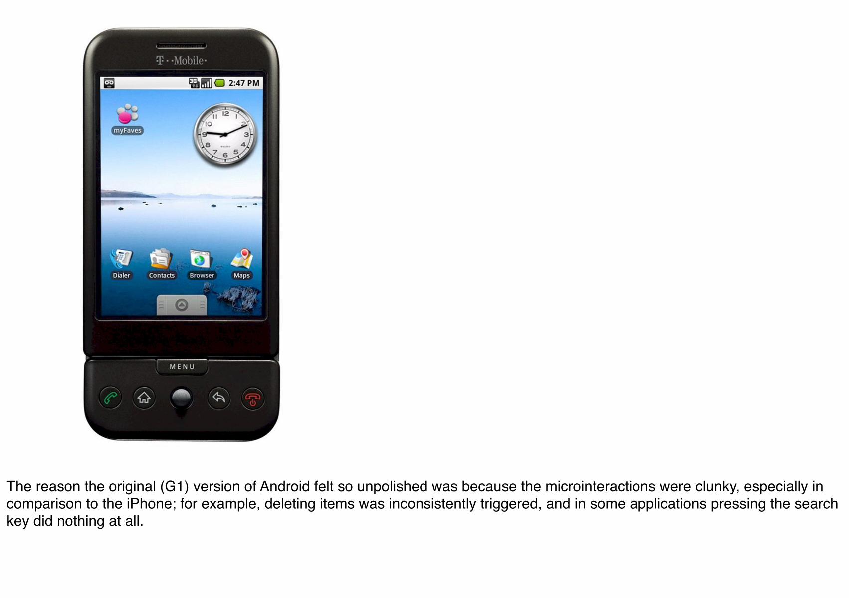
The reason the original (G1) version of Android felt so unpolished was because the microinteractions were clunky, especially in comparison to the iPhone; for example, deleting items was inconsistently triggered, and in some applications pressing the search key did nothing at all.

Paying attention to the details as well as the big
picture so that users have a great experience
using the product.
experience design
In competitive markets, microinteractions are even more important. When there is feature parity, it is the experience using the product that increases adoption and brand loyalty. The overall experience of a product relies heavily on its microinteractions. They are the "feel" in look-and-feel. One reason Google Plus fell so flat against Facebook was that its microinteractions, such as sorting users into circles, became tiresome and gimmicky.

If done well, microinteractions can be signature moments that increase adoption and customer loyalty.
Like Button or You've Got Mail! They can create a differentiator that isn't just a feature and is thus harder to replicate, and they provide something highly marketable that clearly sets brands apart.

Now that I’ve hopefully convinced you of the importance of microinteractions, how should we go about designing them? What makes effective microinteractions is not only their contained size, but also their form. A beautifully-crafted microinteraction pays attention to all four parts of a microinteraction.
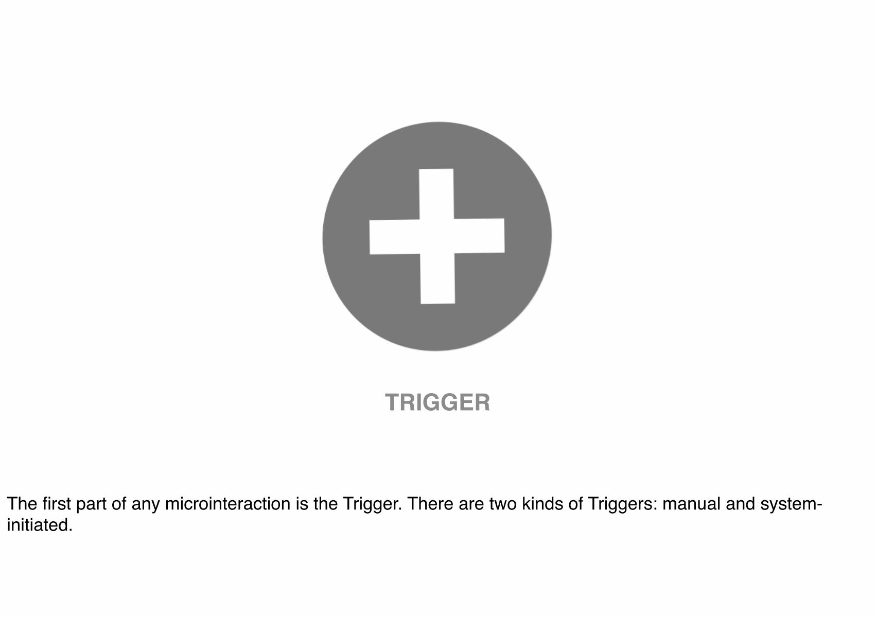
TRIGGER
The first part of any microinteraction is the Trigger. There are two kinds of Triggers: manual and system-initiated.
What is the proper control for context and
user need?
manual triggers

An example of a Trigger. Adding to Control Center and the quick-launch Camera icon, Apple has built a new kind of shortcut into the Lock screen. You can’t start any old app this way, but location services will plug your iPhone into the world so that when you walk into a Starbucks or Apple Store, the appropriate icon will appear in the bottom-left corner. As with the camera icon, just slide up and you’re in business. Of course, Slide to Unlock is its own Trigger as well.
!
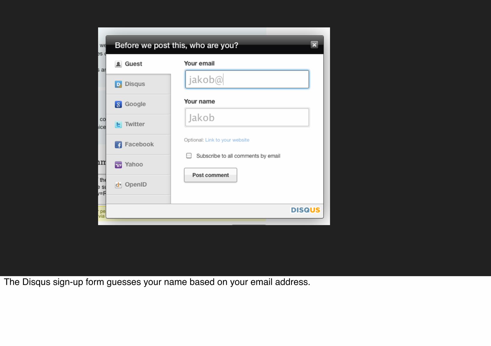
The Disqus sign-up form guesses your name based on your email address.

When you type a question-mark in Tumblr a “Let people answer this”-checkbox appears.

Tumblr for Android - pressing the “create" button for a long time lets you easily choose one of the two most frequent kind of posts (photo or text

!
!
Some Triggers are invisible (touchscreens). Akismet has a clever invisible Trigger. When someone right-clicks on their logo (presumably to save it), Akismet shows a window with several different resolutions.

What can the system intuit about need from user
behavior?
system triggers

Nest Protect’s Nightly Promise. It’s a quick green glow when the lights go out that means the batteries and sensors are working. It also means no chirps at midnight. If there’s an issue, like the batteries need replacing, the light ring will glow yellow. Also has a manual trigger: Just wave at Nest Protect and it will tell you what’s wrong.
!
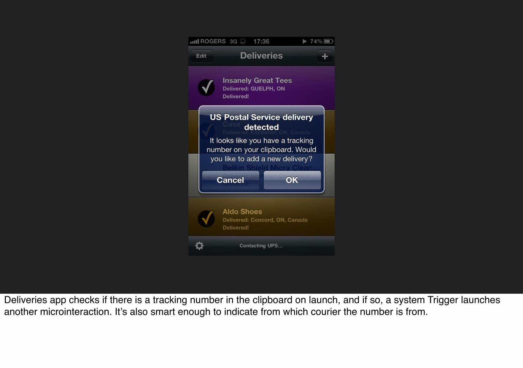
Deliveries app checks if there is a tracking number in the clipboard on launch, and if so, a system Trigger launches another microinteraction. It’s also smart enough to indicate from which courier the number is from.
!
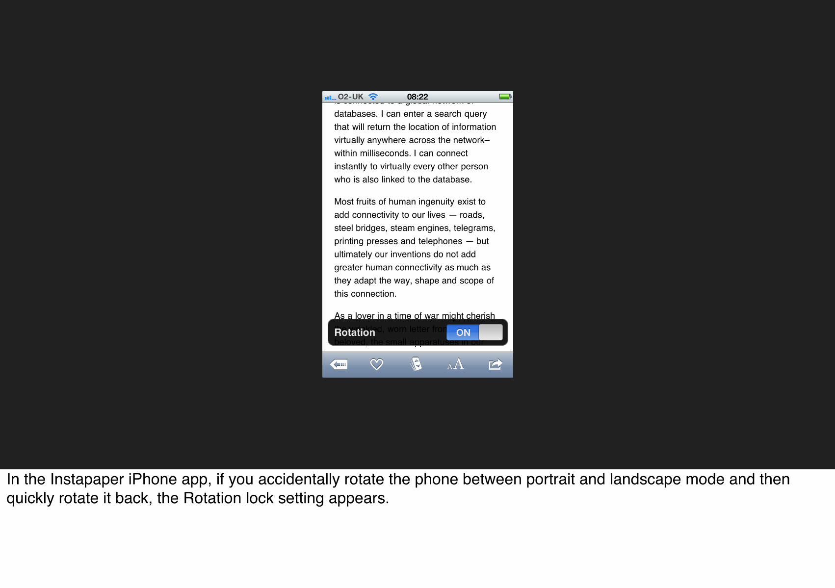
In the Instapaper iPhone app, if you accidentally rotate the phone between portrait and landscape mode and then quickly rotate it back, the Rotation lock setting appears.

Bring the data forward

Apple’s weather app infuriates me because it’s such a missed opportunity to bring the data forward. Would putting the high temperature on there kill you?

!!
Windows Phone, the messaging icon (a Trigger) changes to a sad face if there was an error sending a message.

!
Google’s Chrome browser icon (the Trigger to launch it) also indicates active downloads and download progress.

Amazon brings the data forward here, showing you what the most common delivery time is.

TaskRabbit brings the data forward here, answering the question, “How much should I offer?”

RULES
Once a microinteraction has been initiated, it engages a set of rules and behavior of the microinteraction. In other words: something happens. This usually means turning a feature or a set of features on, but it might show the current state of the application or device. It might use data to guess what the user wants to do. In whatever case, it turns on (at least one) rule, and those rules can usually be defined by a designer.

The Rules determine what can be done and what cannot.
The invisible constraints of the system. Rules may or may not be entirely known to the user, and they reveal themselves in two ways: by what can be done and by what cannot. Both of these can be an occasion for Feedback.

rules determine
how the microinteraction responds to the Trigger being activated
what control the user has (if any) over a microinteraction in process
the sequence in which actions take place and the timing thereof
what data is being used and from where
the configuration and parameters of any algorithms
what Feedback is delivered and when
when to switch Modes
if the microinteraction repeats and how often (Loops)
what happens when the microinteraction ends

the rules of a lamp
1. turn on when switch is flipped
2. stay on at full brightness until switch is flipped again
Take what is probably the simplest microinteraction there is: turning on a light. Once you use the trigger (a light switch), the light turns on. In a basic light set up, there is a single rule: the light stays on and fully lit until the switch is turned off. You can change that rule, however, by adding a dimmer or a motion-detector that turns the light off when no motion is detected. But the basic turn on switch/turn on light rule is very simple rule, and one that becomes apparent to anyone who uses a light, even a child.
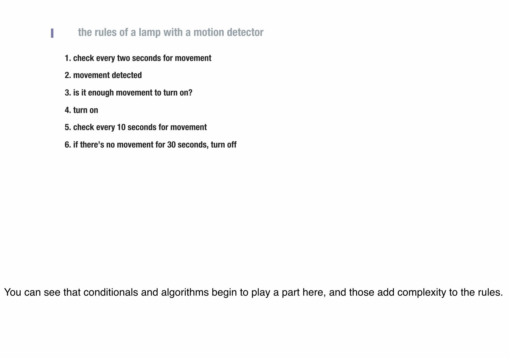
the rules of a lamp with a motion detector
1. check every two seconds for movement
2. movement detected
3. is it enough movement to turn on?
4. turn on
5. check every 10 seconds for movement
6. if there’s no movement for 30 seconds, turn off
You can see that conditionals and algorithms begin to play a part here, and those add complexity to the rules.
!
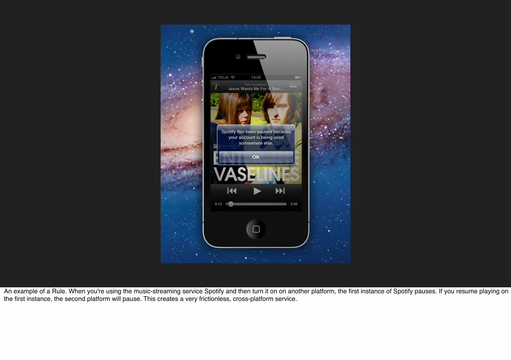
An example of a Rule. When you're using the music-streaming service Spotify and then turn it on on another platform, the first instance of Spotify pauses. If you resume playing on the first instance, the second platform will pause. This creates a very frictionless, cross-platform service.

Example of a Rule. HelloFax when you cross the limit of pages you can still send with one page, you can send the last page for free.

Rules can stop users from abusing your microinteraction. On What Do You Love? if you put in a word like Sex, it gives you results for Kittens instead.

Prevent Human Error

Rules can also help prevent human errors. Gmail- Notification before sending email

!
If you press the search button on Make Me a Cocktail with nothing in the search field, instead of displaying an error message or nothing, it shows a random cocktail.

Meetup.com - When there are no results within a particular distance, the search distance expands until it can find a result.

Don’t start from zero.
In almost every microinteraction, you know SOMETHING about the context of use, even if it’s just the time.

Navigation app Waze knows when I open the app in the late afternoon, I’m probably driving home and presents this as an option.

!
Pro Flowers uses the date to show you the next big holiday when selecting a delivery date.

Rules can also help make selections. Why do you ever need to select a credit card type??
Github - Credit card autodetection by number

FEEDBACK

Feedback (or the lack of) is what allows us to learn the Rules.

!
Twitter’s password form is a great microinteraction, with very clear feedback.

!!
!
An example of Feedback showing the Rules. MailChimp shows you what can’t be done, by having the poor chimp’s arm stretch so far, it pops off when you try to make an email too wide.

Feedback doesn't have to be visual. Sounds from GE's high-end professional brand, Cafe.

Use the overlooked.

!
Since rules are invisible, it’s up to feedback to let user know what’s going on. In Coda2, the Process My Order button becomes a progress bar when pressed.

!
When trying to find a word on a page, Chrome indicates in the scrollbar where instances of that word appear.

Cornerstone - The number of segments in the spinning activity indicator equals to the number of running activities.

Speak human.

!!
The Threadless shopping cart face turns from frowning to happy when you put items in it.

!
Humans respond to faces. The Boxee logo turns orange and “goes to sleep” when there is no internet connection.

!
The gMail iPhone app shows what not to do: randomly put a smiley face for a message that isn’t necessarily a happy one.
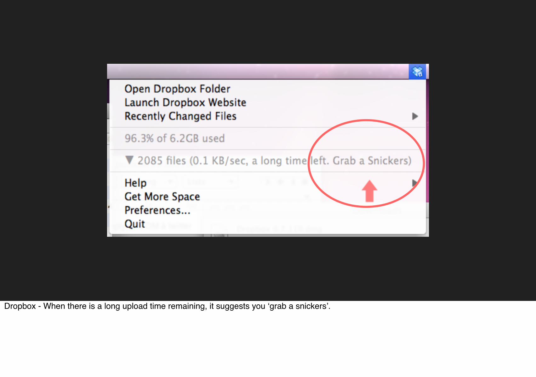
Dropbox - When there is a long upload time remaining, it suggests you ‘grab a snickers’.
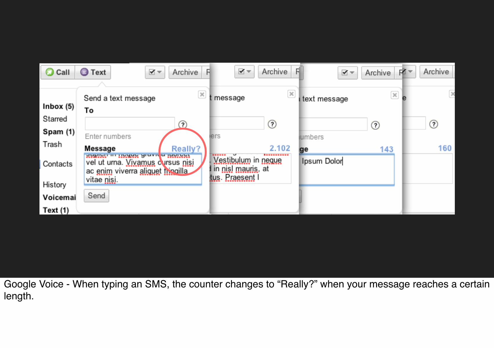
Google Voice - When typing an SMS, the counter changes to “Really?” when your message reaches a certain length.

LOOPS & MODES
The last part of microinteractions are the Loops and Modes that make up its meta rules. What happens over time with the microinteraction: do the interactions remain until manually turned off (as is the case with the mute switch) or do they expire after a while? What happens during an interruption or when conditions change?

!
A mode from Apple’s Weather App. The best reason to have a mode is when there is an infrequent action that would otherwise clutter the microinteraction's main purpose.

!
If a video is buffering for too long, the TED site offers users the option to download it for later.

When you click multiple Add Friend buttons too fast, Facebook shows a warning.

Use long loops.
What happens when people use the microinteraction for the first time? For the seventh time? For the 700th time?

Spotify - The “Added” column on spotify fades as it gets older.

Loops over long periods of time. Foursquare thanks you on your anniversary.

Chrome - Update indicator turns brownish color (originally green) when its been neglected for a long time. Reminiscent of fruit going bad.

!
On eBay, if you've bought the same item in the past, the button changes from "Buy it now" to "Buy another."

Threadless - Knows whats in your shopping cart and sends an email to notify that some of the cart’s products are running out of stock.

Progressive Reduction from LayerVault. A user’s understanding of your application improves over time and your application’s interface should adapt to your user.

Now that I’ve hopefully convinced you of the importance of microinteractions, how should we go about designing them? What makes effective microinteractions is not only their contained size, but also their form. A beautifully-crafted microinteraction pays attention to all four parts of a microinteraction.

Look for microinteractions...
When, during the course of design project, try to identify any possible microinteractions. Make a list of them, then treat each as such. For each one, deliberately consider the structure as outlined in this book, and see if you can polish each individual component. You'll wind up with elegant microinteractions.

...or treat everything as a microinteraction.
Reduce more complex applications to individual products that are each built around one microinteraction. This is microinteractions as product strategy: your product does one thing and one thing well. Reduce the produce to its essence, its Buddha Nature. If you find you want to add another feature to your product, that other feature should be its own product. Many appliances, apps, and devices including the original iPod follow this model. This is how many startups work (or at least began), from Instagram to Nest. The "minimum viable product" is usually one microinteraction.

The details are the design.Charles Eames

This is hard. Duh.
Most places, particularly agencies, aren’t set up to work this way.

Thank you!http://microinteractions.com
Special thanks to Little Big Details and
its contributors for many of these examples.
Microinteractions matter, that the designer's job is to take the tasks that could otherwise be frustrating and difficult and make them otherwise. Details demonstrate that some care, some thought, some attention has been paid. Think small, and change the world.