![From Document Type Definitions to Metamodels: The WebML ...language, i.e., the Unified Modeling Language (UML) [24], and meta-modeling lan-guage, i.e., the Meta Object Facility (MOF)](https://static.fdocuments.us/doc/165x107/5f6bb6a5abf64134cc714286/from-document-type-definitions-to-metamodels-the-webml-language-ie-the.jpg)
Meta and the Emergence of Digital Type
16
Meta and the Emergence of Digital Type
-
Upload
michelle-nahmad -
Category
Documents
-
view
230 -
download
3
description
A book on the history and characteristics of Erik Spiekermann's Meta typeface.
Transcript of Meta and the Emergence of Digital Type

Meta and the Emergence
of Digital Type

Erik Spiekermann,

1
born in 1947,
calls himself an information architect.
Erik Spiekermann,

Even as a child, Spiekermann was drawn to the typographic arts. “I had a little printing press and taught myself to set type when I was twelve,” he recalls. “Years later, when I went to university to study art history, I made a living as a letterpress printer and hot metal typesetter.”
When it comes to the design of typefaces, Spiekermann sees himself as more of a problem solver than an artist. His process for beginning a new typeface is simple and straightforward. “Identify a problem — like space saving, bad paper, low resolution, on-screen use — then find typefaces that almost work but could be improved,” he explains. “Study them. Note the approaches and failings. Sleep on it, then start sketching without looking at anything else.”

3
In 1984, the German State Post Office, the Budespost, was persuaded by Erik Spiekermann of MetaDesign to commission a new, exclusive font for use on all of it’s printed material. The aim of the project was to develop a face that was easy to read in small sizes, available in several weights, unmistakable as an identity, and technologically up-to-date. Although the font was digitized, tested, and approved in the summer of 1985, the project was canceled. The Bundespost returned to using one of its many previous typefaces, Helvetica, assuming that digital type would not catch on.
In 1989, after design software made creating new fonts more efficient, MetaDesign refined the Bundespost typeface for its own exclusive use, renaming it Meta. Initially, Meta was just used for in-house projects, but soon MetaDesign began to use it in mail-order catalogs for FontShop, a digital type foundry cofounded by Erik Spiekermann. Released as FF Meta, it has become one of the most successful typefaces available from FonFont, a subsidiary of FontShop.
Origins of the Typeface

Q R W Z z 76
u l b y 1 1 12 13 14
C E G J K 1 2 3 4 5

7
8 9 Q R W Z z
10
Angled finials, wider openingExtended base, angled finialsNo spur, angled finials No loop One junctionWavy tailSlightly curved tail Flat base and junction Angled finials on both endsUpright and angeled finialsSlightly bent spurCurved tailBent ascenderSlightly angled finials, offset junction
Characteristics of the Typeface
1. 2. 3. 4. 5. 6. 7. 8.9.
10.11.12.13.14.
5
u l b y

Other distinguishing features include the double-storied g that has a highly unusual open bowl. This is a feature shared by the transitional typefaces Baskerville and Cheltenham; only a few other sans-serif typefaces, such as Kabel, have this feature.

7
Baskerville by John Baskerville, 1757Gill Sans by Eric Gill, 1927 (Lefthand drawing by Eric Gill)Futura by Paul Renner, 1932Univers by Adrian Frutiger, 1957
1. 2.
3. 4.
g g g g g 1 2 3 4
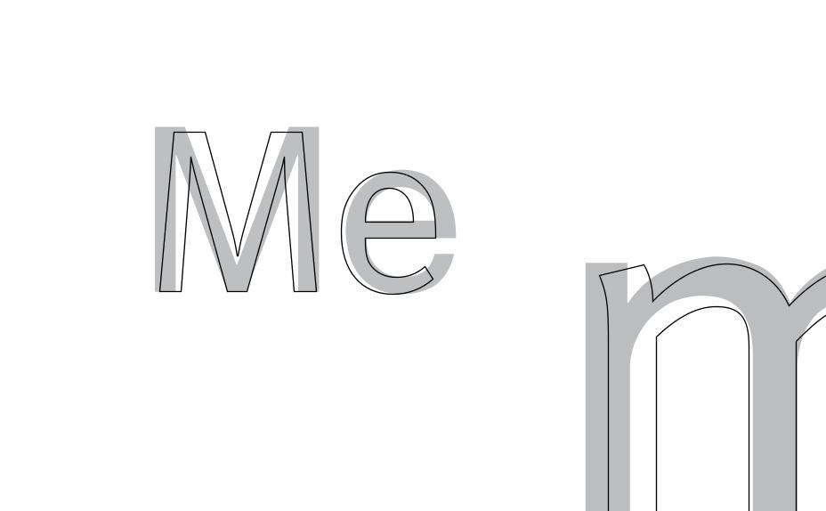
Me m

9
jMeta has capitals with flat apices, similar to those of Helvetica. Like Helvetica, the junction of the M rests on the baseline, except that Meta stems are oblique. Overall, Meta is a more condensed face than Helvetica, and it has only a slightly lower x-height. Both Meta and Helvetica have thin shoulders. While the dots of Meta letterforms and punctuation are rounded, Helvetica has square dots. The nuanced construction of the Meta typefaces sets it apart from Helvetica’s regularized structure, creating the face’s appealing personality.
Meta and Helvetica
Neue Helvetica by Linotype, 1983a digital recut of the 1957 by Max Miedingerm

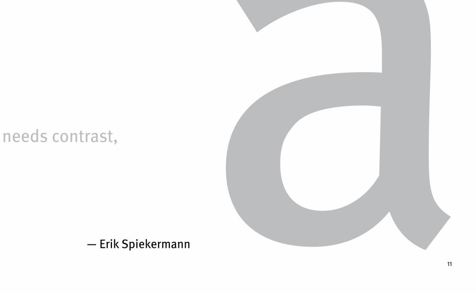
needs rhythm, needs contrast,
A real typeface
Helvetica hasn’t got any of that.
11
— Erik Spiekermann
needs rhythm, needs contrast, aA real typeface

Spiekermann currently holds a professorship at the Academy of Arts in Bremen, is vice president of the German Design council, president of the International Institute of Information Design, president of the International Society of Typographic Designers and a board member of ATypI. His book, Stop Stealing Sheep, first published in 1993, has sold over 150,000 copies and is currently in its second edition. He withdrew from the management of Meta-Design in 2000 to work on a new project: The United Designers Network, a collaboration of many designers he has worked with over the years.
13
Harling, Robert. The Letter Forms and Type Designs of Eric Gill. N.p.: Eva Svensson, 1976. Print.
Sweet, Fay. MetaDesign: Design from the Word up. New York: Watson-Guptil Publications, 1999. (A&A: VNC999.6.G4 M48 1999 and Vault)
Spiekermann, Erik and Ginger, E.M. Stop Stealing Sheep & Find out how Type Works. USA: Hayden, 1993. (Vault)
Revival of the Fittest: Digital Versions of Classic Typefaces/essays by Carolyn Annand ... [et al.]; edited by Philip B. Meggs and Roy McKelvey, New York: RC Publications, c2000.(A&A: Z250 .R45 2000)
http://www.linotype.comhttp://www.fonts.comhttp://www.fontfont.comhttp://www.typography.comhttp://spiekermann.com
Bibliography

This book was designed by Michelle Nahmad at Washington University in St. Louis in the fall of 2012.