Media evaluation question 1
7
In what ways does your media product use, develop or challenge forms and conventions of real media products? EVALUATION : QUESTION 1
Transcript of Media evaluation question 1

In what ways does your media product use, develop or challenge
forms and conventions of real media products?
EVALUATION : QUESTION 1

My magazine uses many forms of key conventions of existing music magazines. To produce a successful ‘pop’ magazine I have
researched many pop magazines such as, ‘Billboard’ and ‘We Love Pop’. I created a similar layout to these magazines, which consisted of having a bold and striking masthead to grab the
readers attention. Furthermore pop magazine also have a busy front cover to connote that there is lots of information; they also have an eye grabbing central image which is usually of the artist
or band that the double page article is about.
I have included three coverlines, a striking central image, splash (overlapping the central image) and puffs. These are all common
features used in pop magazines.
I called my magazine ‘Roar’ as it connotes loud and vibrant. I also thought that this title is short and snappy making the
magazine easy to remember, as well as unique.
I used a font from ‘DaFont’ ,this font connotes a pop theme, current style, fun and youth. I have coloured the ‘O’ pink similar to Billboard magazine to connote femininity and the pop genre, I used the same font style for the heading of my contents page to
maintain continuity in my house style.

PHOTOGRAPHS & MIS-EN- SCENE
The mis-en-scene for my photographs are a typical convention of pop magazines. From my research I found out that a wide variety of images were used
both ‘studio’ images and ‘home made’ images. Therefore I ensured that my photographs have a professional, clean-cut aesthetic, I also included
images with a rural background to make the magazine more interesting and diverse.
The facial expressions in these images apart from the central image for the front cover connote
happiness; their body language connotes playfulness which targets my target audience.
The clothing of models are similar to current youthful artists, which connote youth and fashion.
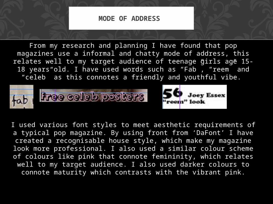
From my research and planning I have found that pop magazines use a informal and chatty mode of address, this relates well to my target audience of teenage girls age 15-18 years old. I have used
words such as “Fab”, “reem” and “celeb” as this connotes a friendly and youthful vibe.
MODE OF ADDRESS
I used various font styles to meet aesthetic requirements of a typical pop magazine. By using front from ‘DaFont’ I have
created a recognisable house style, which make my magazine look more professional. I also used a similar colour scheme of colours like pink that connote femininity, which relates well to my target audience. I also used darker colours to connote
maturity which contrasts with the vibrant pink.

All magazines include a barcode, the barcode enables people to recognise my
magazine as a magazine, so it was essential that I used added one. I downloaded a barcode font from
‘DaFont’ which allowed me to create my own. I also added the date and price which are common features of any
magazineFrom my resarch and planning I found that a common feature of enticing the
reader was to use puffs. The puff consisted of advertising for competitions to win free items signed by an artist or
band, as well as free tickets to a concert. I chose to advertise free tickets to see Jessie J and Rihanna live as they are currently well known and popular.
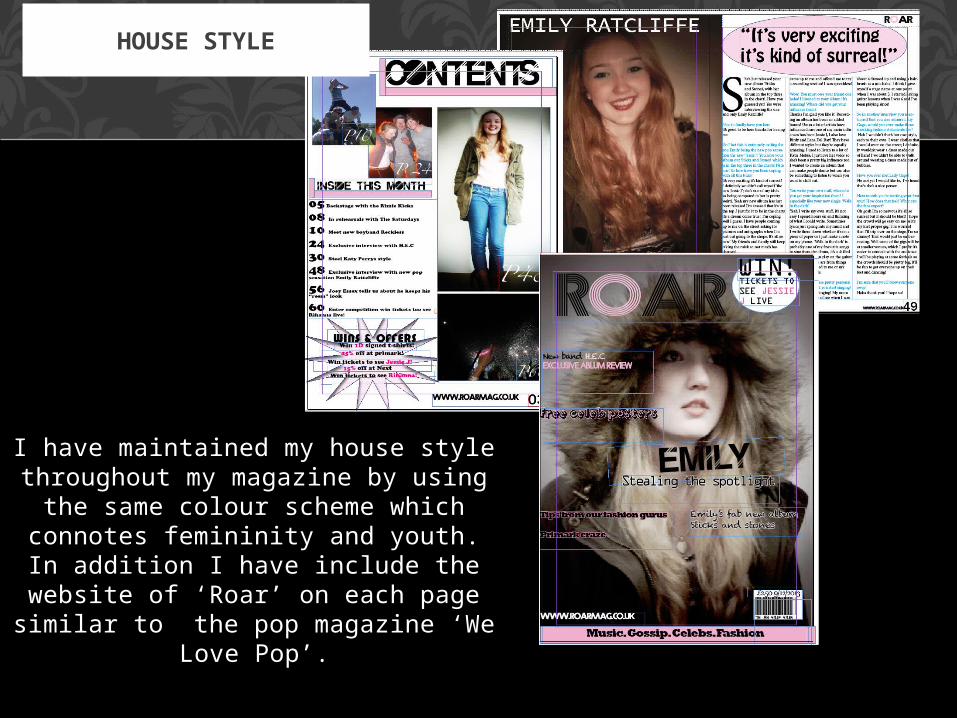
I have maintained my house style throughout my magazine by using
the same colour scheme which connotes femininity and youth. In
addition I have include the website of ‘Roar’ on each page similar to the pop magazine ‘We Love Pop’.
HOUSE STYLE

I have not challenged the forms and conventions of existing pop magazines, as I am targeting a
mainstream audience as opposed to a niche audience. Therefore I though that it would be
suitable to use the forms and conventions that are found in real pop magazines to make my magazine
recognisable.
CHALLENGING FORMS AND CONVENTIONS OF REAL MEDIA
PRODUCTS