Media evaluation
16
MEDIA EVALUATION
-
Upload
annabellemediaevaluation -
Category
Education
-
view
31 -
download
0
Transcript of Media evaluation
MEDIA EVALUATION
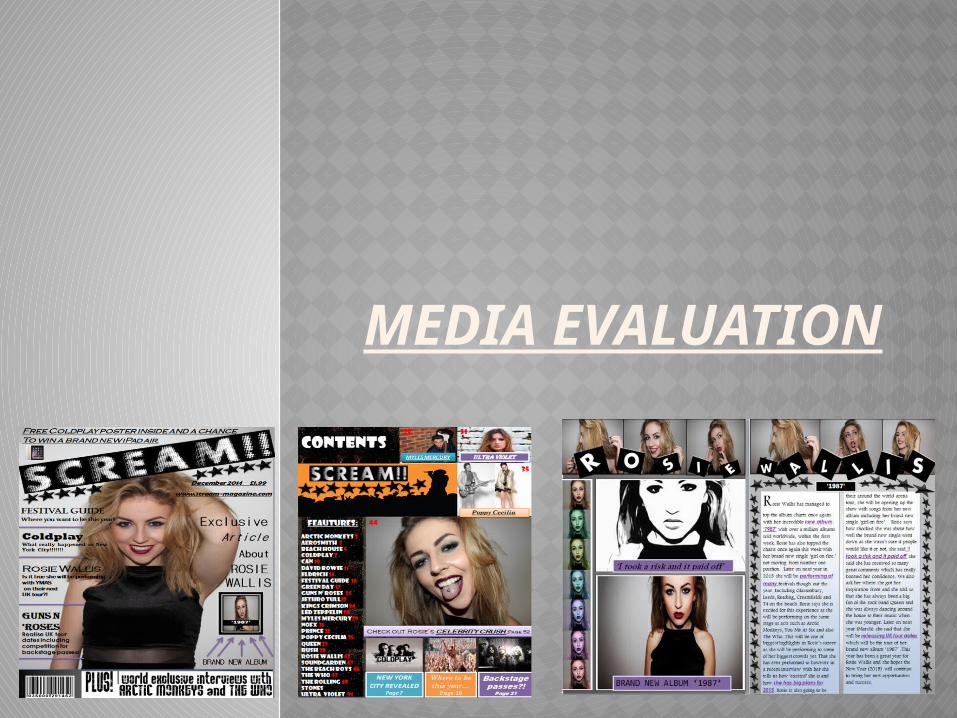
1) IN WHAT WAYS DOES YOUR MEDIA PRODUCT USE, DEVELOP OR CHALLENGE FORMS AND CONVENTIONS OF REAL MEDIA PRODUCTS?

The magazines named ‘NME’ and ‘KERRANG’ are both professional magazines which I have used when creating my final magazines. Both of these magazines include all the forms and conventions that a professional magazine should have, these are things such as a masthead, buzz words, cover-lines, sell lines, barcode, heading, central images and thumb nail images. I have used these magazines to put together my final magazine, the first thing that I used on my magazine was the big bold masthead that they had used, however instead of placing my masthead in a straight line I decided to adapt this and place the masthead diagonal directly over the central image. I have also followed the typical placing of the cover-lines and strap lines on the left hand side of the page and have placed this in different sized fonts as I feel that this makes the magazine stand out more. I have then also placed buzz words all over my magazine such as ‘exclusive, win, world’ which I feel will stand out to people who are looking at the magazine. I have then also only used one central image as from doing all my research I found that the majority of all other genres of magazines only used one main central image which will therefore draw the reader in and try and grab their attention. I then also followed the forms and convention of the image looking directly into the reader’s eyes as this could give a sense of the image looking directly into the reader’s eyes. The shot that I used was a natural medium-shot, I am really pleased with this shot and the way the model has positioned herself as we can see her facial expressions really well but also due to the background it also makes the typography really easy to read. I then decided to add in a sell-line as this could make people interested and then therefore buy the magazine, I also tried to use one main cover-line as from my research I found that this is also what the majority of magazine genres do and then use smaller cover-lines to share other stories that are going on in the magazine. However I made sure that the central image and the main cover-line linked together along with the article in the double page spread.

The contents page that I used to inspire me when creating my magazine is called ‘Drummer’ magazine. I choose this contents page as when I was doing my research on contents pages this one stood out to me the most as looks very professional and also has a lot of key features on the magazine as well. The professional magazine also includes all the key forms and conventions which is what I want to therefore include on mine these are features such as a masthead, central image, heading, cover-lines and images. I have used all of this to put together my final contents page and to try and make it look as much like a real media product. I have used the professional contents page layout and then tried to copy the same layout for my magazine; however I have also adapted it at the same time. I have placed the masthead in the same place as the professional magazine and also placed the main central image in the same spot although I have developed this media product and decided to add cover-lines which also include buzz words onto the contents page. I then also placed small images onto the page which should catch people’s attention as I have also placed a small cover-line under the image to which has not been used in the professional magazine. I then also decided to link in the forms and conventions that I used on the front cover into the contents page. However on the contents page I also decided to use images above the cover-lines used. The main form and conventions that is one of a key feature on real media products for contents pages is the page numbers. I decided to use the same colour numbers that the professional magazine used as I felt that the red is really eye-capturing and stands out a lot.
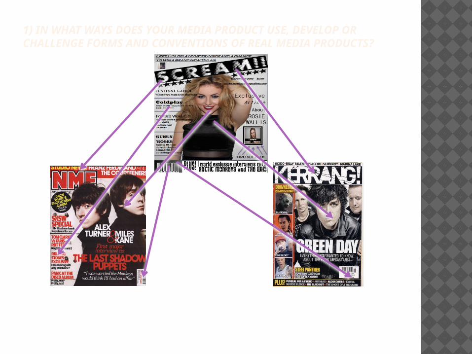
On this ‘Kerrang’ magazine I really liked the forms and conventions that were used on the photos along the left hand side of the page. I have decided to use the same forms and contents in my double page spread instead of my front cover which is what the ‘Kerrang’ magazine is. I decided to use this on my double page spread as I tried it out on my front cover but I felt like it looked to overcrowded and then I asked my fellow peers what they thought and they all agreed with me that the photo strip would look a lot better on the double page spread than what it would on the front cover. The professional magazine also used different pictures however I have challenged this form and convection and decided to adapt this and instead of using different pictures I decided to use a close-up picture of my main central image and then place all the pictures in different colours and I think that this looks really effective and works really well. I then also used this double page spread from a real professional magazine to give me an idea; from this the main forms and conventions that stood out to me were the amount of pictures that were used on the page. I really liked this idea that is why I decided to use a lot of pictures on my double page spread however instead of placing the pictures in the same layout of the magazine I adapted it and place all the pictures on the left hand side of the page. Although thinking about it now this might have been a bad idea as usually if people are flicking through the magazine they tend to look more at the right hand side of the page for pages that stand out. I then also followed the forms and conventions of how the magazine have used columns when writing their article, I also decided to use columns when writing mine up as this is the most professional way of writing it and also it will make the magazine look more like a real media product.
2) WHAT HAVE YOU LEARNT ABOUT TECHNOLOGIES FROM THE PROCESS OF CONSTRUCTING THIS PRODUCT?
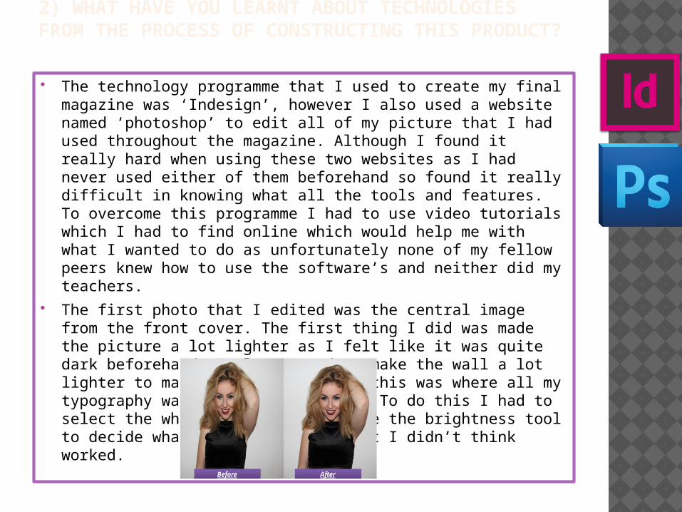
The technology programme that I used to create my final magazine was ‘Indesign’, however I also used a website named ‘photoshop’ to edit all of my picture that I had used throughout the magazine. Although I found it really hard when using these two websites as I had never used either of them beforehand so found it really difficult in knowing what all the tools and features. To overcome this programme I had to use video tutorials which I had to find online which would help me with what I wanted to do as unfortunately none of my fellow peers knew how to use the software’s and neither did my teachers.
The first photo that I edited was the central image from the front cover. The first thing I did was made the picture a lot lighter as I felt like it was quite dark beforehand, I also wanted to make the wall a lot lighter to make it look whiter as this was where all my typography was going to be placed. To do this I had to select the whole photo and then use the brightness tool to decide what looked best and what I didn’t think worked.
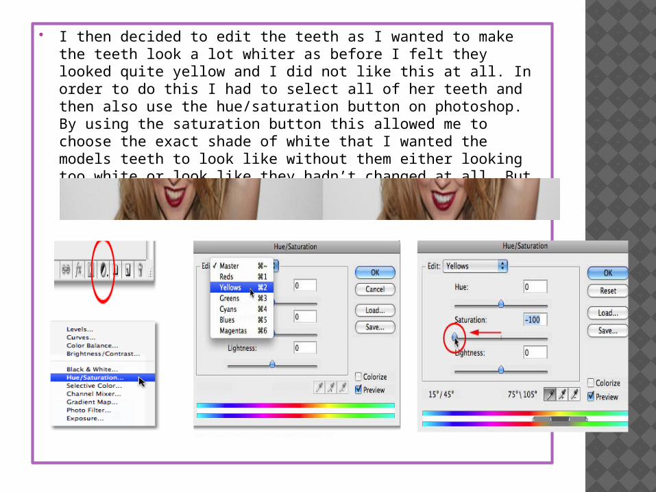
I then decided to edit the teeth as I wanted to make the teeth look a lot whiter as before I felt they looked quite yellow and I did not like this at all. In order to do this I had to select all of her teeth and then also use the hue/saturation button on photoshop. By using the saturation button this allowed me to choose the exact shade of white that I wanted the models teeth to look like without them either looking too white or look like they hadn’t changed at all. But overall I was really pleased with the difference from the before and after picture of the model.

I then decided to make the models eyes a lot brighter, I wanted to do this as I wanted the eyes to stand out on the front of the magazine and for them to capture the readers attention. I did this by using the same tools as I did for the editing of the teeth however instead of clicking on ‘yellow’ I clicked on ‘blues’ instead as I felt like blue eyes would have really suited the model and I felt that It did really suite the model. I was really pleased with the editing of the central image as overall I didn’t want it to look like the picture had been edited and I think that I achieved this via my editing and especially that I had never used photoshop before.
After then developing my knowledge on photoshop I decided to edit another photo that would be going onto my double page spread. I am really pleased with this edit as I can really see the difference from before and after. The first thing that was zoom in more on the central image herself and by doing this it made the model look a lot more taller but also skinner at the same time. I then really wanted to contrast this picture so I made the contrast really low and the brightness really bright. I really liked this tool as it allowed me to mess around with different shades and to see what I felt looked best on the model. Finally I decided to add in some shadows around the outside of the model as I wanted to really make sure that she stood out and I believe that I achieved this through this picture and it looks really good on my final magazine. (next slide)

For this picture that was going on my double page spread, I decided to only edit the colour of each individual picture and then group them all together in a vertical line. This was one of the easiest things to do and I did not need to use a tutorial to achieve this as all I had to do to edit this picture was edit the colour of the overall picture.
3) LOOKING BACK AT YOUR PRELIMINARY TASK, WHAT DO YOU FEEL YOU HAVE LEARNT IN THE PROGRESSION FROM IT TO THE FULL PRODUCT?
In order to create a magazine for my final genre of ROCK, I had to do a lot of research beforehand to see what the ROCK genre was like, especially if I was going to put together a magazine for it.. The first task that I got given was to create a school magazine, I started off by finding out all the conventions that had to be placed on a magazine. This was the forms and conventions such as the masthead, headings, central image, cover-lines, sell-lines and the basic features such as a barcode, price and date which I was going to include on my magazine.
The genre for the magazine on the left hand side of the page is a school magazine. I decided to name the magazine the ‘eye of the misbourne’ as the school that I would be creating my magazine for was called ‘The Misbourne’. I also wanted to be different and unique when creating my masthead. So instead of writing the word ‘eye’ I decided to use a graphic image as I felt this looked better on the magazine. I then wrote the rest of the masthead out however I wanted to be different and use two different colours for the masthead. The main reason that I did this though was because I felt that it looked a lot better on the central image that I had used. Although looking back on it now it is actually really unclear and looking at my final task I can really see a difference in how far I have come when creating a magazine. My final task was to create a music magazine and from doing all my research beforehand on magazines I decided to follow the genre of ‘ROCK’ magazine as I felt this would let me be the most creative but also the funniest out of all the genres. I placed my masthead on a black rectangle background and for my font I went onto a website named ‘DAFONT’ and I found a really bold font which is named ‘Experimento’ I really liked this font especially how it stands out on the page but also works really well with the central image that I decided to use. From looking at my first attempt of my masthead on the school magazine I can really see the difference in the masthead being clear and then the masthead being really unclear. I am really pleased with how well it has come out on my music magazine.
Above the masthead I placed a heading that was stretched along the top of the page, this also included a sell-line which was placed on a black background with white typography so therefore it would be easy to read as if it wasn't easy to read then this may have reflected on the magazine for looking poor and unprofessional meaning people would not want to buy the magazine. In the heading I decided to place all the key information such as the website of the school for people that wanted to find out more information but then also the date of the magazine as this would tell people if it was a weekly or monthly magazine. I decided for my magazine to be a monthly magazine as I felt like I could therefore provide more information each month for the students and parents. I then also looked at previous school magazines to see what they had priced there magazine and I decided to price my magazine at £1.50 as I felt this was not too expensive. However instead of just looking at previous rock magazines for my heading for my final magazine, I decided to do a questionnaire to find out what the best price would be voted for my final magazine. I think doing a questionnaire was a really good idea as it therefore helped me and told me what price would be best which was £1.99. I also placed the headings underneath the masthead this time as I felt this looked a lot better but was also a lot more visible especially as it was on a grey background meaning I decided to use a black font for the typography.
Another big difference is the difference between the central images, the picture on the school magazine was taken by an iPhone which at the time on the iPhone it came out really clear and looked really professional however looking back on the picture now I can see that it is really blurry and I had not taken any thought into the picture at all, especially as in the background I can see a picture of a bin and the majority of the picture is stairs which looks really bad. The picture also clashes really bad with all the typography on the page and overall makes the magazine look really unprofessional and messy. However for the ROCK magazine the camera that was used was a professional camera and from this I am really pleased with how the picture has come out, especially as it looks really clear on the computer. It also reflect on the magazine looking really professional looking which I am really pleased about. The typography on the page also doesn’t clash at all with the central image on the page which I am really glad about, this is because from doing all my previous research I saw that all the typography should be placed on a clear background so I have used all the key forms and conventions and made sure they do not clash with my central image.
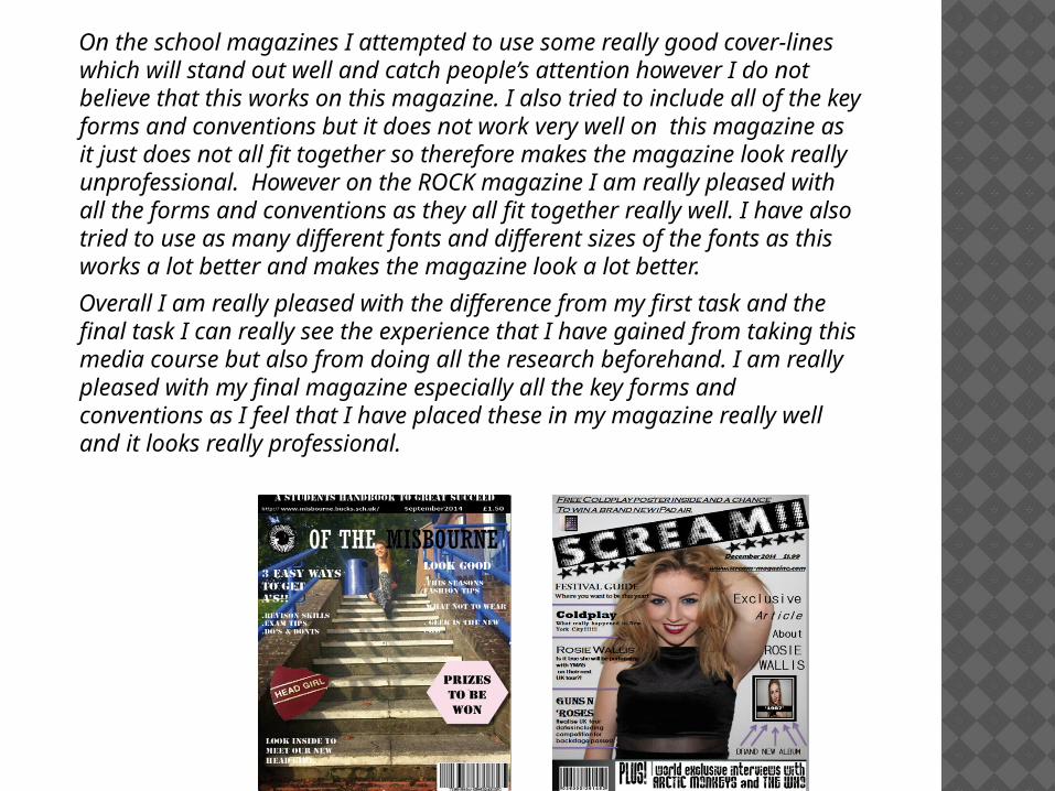
On the school magazines I attempted to use some really good cover-lines which will stand out well and catch people’s attention however I do not believe that this works on this magazine. I also tried to include all of the key forms and conventions but it does not work very well on this magazine as it just does not all fit together so therefore makes the magazine look really unprofessional. However on the ROCK magazine I am really pleased with all the forms and conventions as they all fit together really well. I have also tried to use as many different fonts and different sizes of the fonts as this works a lot better and makes the magazine look a lot better.
Overall I am really pleased with the difference from my first task and the final task I can really see the experience that I have gained from taking this media course but also from doing all the research beforehand. I am really pleased with my final magazine especially all the key forms and conventions as I feel that I have placed these in my magazine really well and it looks really professional.

4) WHO IS THE AUDIENCE FOR YOUR FINAL MEDIA MAGAZINE?
The audience that I have chosen for my final media magazine are males and females who are aged between 16-23 years old and who are also into the music genre of ROCK. I felt that this was the correct age for my final magazine as I did not think anyone younger would be into the music magazine and I do not think people over the age of 23 would buy my magazine even though it would be a bonus. Inside the magazine it includes lots of different information from different celebrities so the audience that might buy the magazine might also therefore be interested in these celebrities a long with the main central image on my magazine. I have also used buzz words on my final magazine to attract people and also used a sell-line with a thumb nail picture at the top of the magazine to try and attract people to want to read and buy the magazine as well. I am pleased with this target audience age and feel that the content inside of this magazine will suite them a lot but also suite the majority of people who also love rock as well.
5) HOW DID YOU ATTRACT / ADDRESS YOUR AUDIENCE?
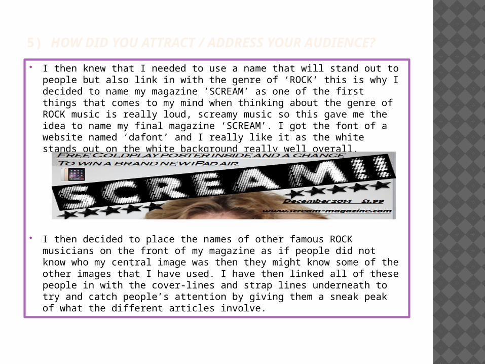
I then knew that I needed to use a name that will stand out to people but also link in with the genre of ‘ROCK’ this is why I decided to name my magazine ‘SCREAM’ as one of the first things that comes to my mind when thinking about the genre of ROCK music is really loud, screamy music so this gave me the idea to name my final magazine ‘SCREAM’. I got the font of a website named ‘dafont’ and I really like it as the white stands out on the white background really well overall.
I then decided to place the names of other famous ROCK musicians on the front of my magazine as if people did not know who my central image was then they might know some of the other images that I have used. I have then linked all of these people in with the cover-lines and strap lines underneath to try and catch people’s attention by giving them a sneak peak of what the different articles involve.

6) WHAT KIND OF MEDIA INSTITUTION MIGHT YOU DISTRIBUTE YOUR MEDIA PRODUCT TO AND WHY? IPC Media: IPC Media which stands for international Publishing Corporation is
one of the biggest leading magazine and digital publishing institutions in the UK which sells over 350 million copies each year. It is owned by Time Inc and It was founded it 1968 and its main headquarters are located in London.
The Bauer Media Group is Europe’s largest privately owned publishing group. The group also offers 300 magazines in 15 countries meaning it is pretty well known all around the world. It also have its own website online and advertises through tv and radio stations. One of the institutions that is part of the media group is Bauer Media which joined the organisation in 2008. The group also employees around 6400 people. The Bauer Media Group is also a large-European media company which its main headquarters are located in Germany, Hamburg. The group was founded In 1875 and in 2013 it made an approximate revenue of 2,4 billion euros.
The institution in which I would want my magazine to be sold at is the Bauer Media Group, I have decided to use this group as it is one of the most well-known institutions all around the world meaning it would already have very loyal customers who buy the magazines that they produce and sell to the public audience. It would also help me in the future when designing my magazines about what works well and what wouldn’t work well and due to the fact that they produce magazines to around 15 countries this will mean that in the future if my magazine were to be successful then I could start realising magazines in countries other than the UK. The Bauer Media Group also advertises their magazines through different social media groups but also other technologies such as tv and radio stations. I believe that if they were to agree in being the distribution organisation then my magazine could be a huge hit and have huge potential. It would also allow my magazine to attract a lot of readers that follow the Bauer Media Group Magazines.